What is Anghami?
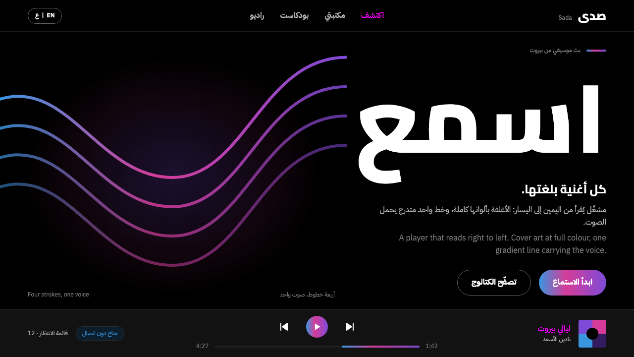
Anghami's player is a black room that reads from right to left: album art at full strength, one flowing purple-pink-blue line, and Arabic and Latin type set as true equals.
Anghami in brief
Anghami is a music-streaming service that started in Beirut in 2012 as the first legal one in the Arab world, and in 2022 became the first Arab tech company listed on Nasdaq. As a design style it takes the player rather than the marketing site: a black screen, album art shown at full strength, and a single flowing gradient line that runs from purple through pink to blue. Nothing else on the screen competes with the music and its covers.
The style reads right to left by default. That is not a translation layer applied afterwards but the starting premise of the layout. Controls, chevrons and progress indicators all mirror with the text, so a back arrow points the way a reader's eye returns, and a progress bar fills in the direction the language flows. A viewer who reads Arabic experiences the interface as native instead of flipped.
Typography follows the same principle of equality. Arabic is set in real Arabic typefaces, not in a fallback, and at the same optical size as the Latin letters beside it. The two scripts share a line without one being a guest in the other's design. The combination makes the style suitable for bilingual and Middle East-facing media products where the screen has to be at home in both scripts.

Where does Anghami come from?
Anghami began in Beirut, Lebanon, in 2012. The origin notes describe it as the first legal music-streaming service in the Arab world, which gives the product a pioneering position: it was building not only an app but a legitimate way of listening to music for Arabic-speaking audiences. The notes name Eddy Maroun and Elie Habib among its key figures and list its movement as MENA streaming and Arabic pop distribution.
In February 2022 the company was listed on Nasdaq, the first Arab tech company to be so. The origin notes tie the current visual identity to a rebrand dated 3 March 2022, shortly after the listing. The Chinese-language source adds a vivid detail about its flagship image: the flowing gradient line that now defines the style is the light that was projected over the Burj Khalifa skyline at night at the time of the 2022 rebrand. A graphic device that began as a beam of light on a building became the line on the player.
The notes record that the company is now run across the Middle East and North Africa from Abu Dhabi and Dubai, so the style belongs to a business that began in Beirut and later gathered its operations in the Gulf. That geography explains the audience the style is built for: bilingual users who move between Arabic and Latin scripts, are served by a catalogue of Arabic pop distribution, and expect an interface that does not treat the right-to-left direction as an afterthought.
Three design movements are named in the notes: MENA streaming and Arabic pop distribution, right-to-left interface design, and bi-script type systems that combine Arabic and Latin. Together they define the technical agenda of the style. It is not simply a dark music-player theme with Arabic text added; it is a system in which direction, script and brand identity were considered together, with a small number of visual signals, a black ground, full-strength artwork and one gradient line, doing the branding work. BigSmall is listed among the key figures of that identity.
What defines the Anghami look?
A black room
The ground is a pure black, deeper than the usual dark grey of many dark themes. It works as a room with the lights down: the interface recedes and the content glows. Everything else on the screen is subordinate to that darkness, which also lets the artwork carry the colour. The style is a dark one by definition, not a light theme with the colours swapped.
Album art at full strength
Cover images are shown large, saturated and unfiltered, with no dimming overlay or decorative frame. They are the only source of rich colour in the interface, so the colour of the screen changes with the music being played. The surrounding interface is deliberately quiet so that this single variable does the visual storytelling.
One flowing voice line
The only gradient in the system is a single line running from purple through pink to blue. It appears as a progress trace, a divider or an accent, and it is the visual signature of the brand: a ribbon of sound. Its power depends on being unique. Used on backgrounds, buttons and icons all at once, it would stop being a line and become a decoration.
Right-to-left by default
The layout begins from the right. Primary content aligns to the right edge, lists flow from right to left, and the eye enters the screen from the side where an Arabic reader's eye begins. A left-to-right version is the adaptation, not the other way round. This reverses the habit of most software, in which the right-to-left version is a late mirror of a Latin original.
Mirrored controls
Not only the text is mirrored. Chevrons, back arrows, playback controls and progress bars all flip with the reading direction. The mirror is applied to direction-bearing elements, so a skip-forward button points where the language moves. The effect is of a coherent interface rather than a translated one, where no element contradicts the direction of reading.
Bi-script type
Arabic is set in a real Arabic typeface, and at the same optical size as the Latin beside it. Because Arabic and Latin letters have different proportions, equal optical size is not equal numerical size; the Arabic is tuned so that the two scripts look like peers on the same line. The aim is a mixed line that reads as one voice.
The player as the unit
The style is drawn from the player screen, not from the marketing site. The core pieces are the cover, the track title, the progress line and a small set of controls. That focus keeps the system practical: it can be extended to other media interfaces such as podcasts, video or radio, because the underlying unit is a piece of content held by a quiet frame of controls.

Who shaped Anghami?
Named in the origin notes as a key figure of Anghami, the service that started in Beirut in 2012 and listed on Nasdaq in February 2022. His name stands for the company-level ambition behind the style: to make a legal, local streaming service for the Arab world and then to present it with an identity as confident as its listing.
The second company name among the key figures. Together with Maroun, he anchors the story of a Beirut start-up that became a regional platform operating from Abu Dhabi and Dubai. For designers, the interest lies in the product problem that story implies: building an interface that feels native to users of a region and its languages.
Listed in the origin notes among the key figures of the identity, which is dated to the rebrand of 3 March 2022. The notes give no further detail, so the safest reading is as the name attached to the current look: the black ground, the full-strength artwork and the single gradient line that this style documents.
How do you use Anghami today?
Anghami's style suits products that live in a dark, immersive, content-first setting: music, podcasts, video, radio, reading and any bilingual media product with Arabic users. Its strength is its restraint. The screen is black, the content provides the colour, and a single gradient line gives the brand its voice. Applying it well means protecting that restraint and treating direction and script as part of the design, not as localisation.
On slides, use a black background, a large image as the cover and a single gradient line as the only decorative element. For an Arabic or bilingual audience, build the deck right to left from the start: titles on the right, the flow of content moving leftward, and arrows and progress markers mirrored. Content slides should keep type light on a black ground with generous space, and data slides can use the gradient line as the main series of a chart, so the trend itself becomes the brand moment.
In web interfaces the style belongs in players, playlists, album and artist pages, radio and podcast apps, and dashboards for media or analytics teams. Keep surfaces black, let covers carry colour, and keep controls simple and mirrored. For pricing pages, put plan cards on black with minimal chrome and use the gradient line as a subtle accent on the recommended plan only. Navigation should switch direction with the language, and numerals, icons and labels should be checked in both orientations.
For editorial and marketing work, the style favours cover-first storytelling. Album launches, artist features, event pages and campaign microsites can lead with a single large visual on black and a short line of type, with the gradient line acting as a divider between sections. Bilingual copy should show Arabic and Latin at matching optical size, side by side or stacked, so neither reads as a footnote to the other.
The most common mistake is mirroring only the text. A right-to-left screen whose arrows, progress bars and layout still point left to right feels broken to a native reader. Other errors are spreading the gradient across buttons, backgrounds and icons until it loses its meaning as a line, dimming or tinting album art, setting Arabic in a fallback typeface or at a smaller optical size than the Latin beside it, and softening the black into a muddy grey.

Anghami — FAQ
What is Anghami, and why does it have its own design style?
Anghami is a music-streaming service that started in Beirut in 2012 as the first legal one in the Arab world and became the first Arab tech company listed on Nasdaq in 2022. Its player has a distinctive, coherent look: a black ground, full-strength album art, a single gradient line, mirrored controls and bi-script type. Those are enough rules to form a design system, which is why the style is documented here.
Where does the gradient line come from?
The origin notes date the current identity to the rebrand of 3 March 2022. The Chinese-language source describes the gradient line as the light that was projected over the Burj Khalifa night skyline at that moment. Whether you treat it as a beam of light or as a ribbon of sound, the line moves from purple through pink to blue and appears as one element rather than as a general background.
Is the style only for Arabic or right-to-left products?
No. It is built right to left, but the logic extends to any bilingual or multilingual product that needs to treat two scripts as equals. The black ground, full-strength artwork and single gradient line work in a left-to-right layout too. What matters is that the direction is a decision made at the start, so that every control, arrow and progress marker agrees with the way the text moves.
Can I use a light version of the style?
The documented style is dark. The black room is the premise: the interface recedes, the artwork carries the colour, and the gradient line stands out only against darkness. A light version would remove that contrast and push the style toward a generic music interface. If you need a light surface for a specific context, keep it as a small, contained exception rather than a new default.
How should Arabic and Latin text be balanced on the same line?
By optical size, not by number. The style sets Arabic in a real Arabic typeface and tunes it to match the visual weight and height of the Latin beside it, so the two look like equals. Using the same numerical size for both usually makes the Arabic look small. Check mixed lines by eye, in context, and keep the baselines and spacing consistent.
Related design styles
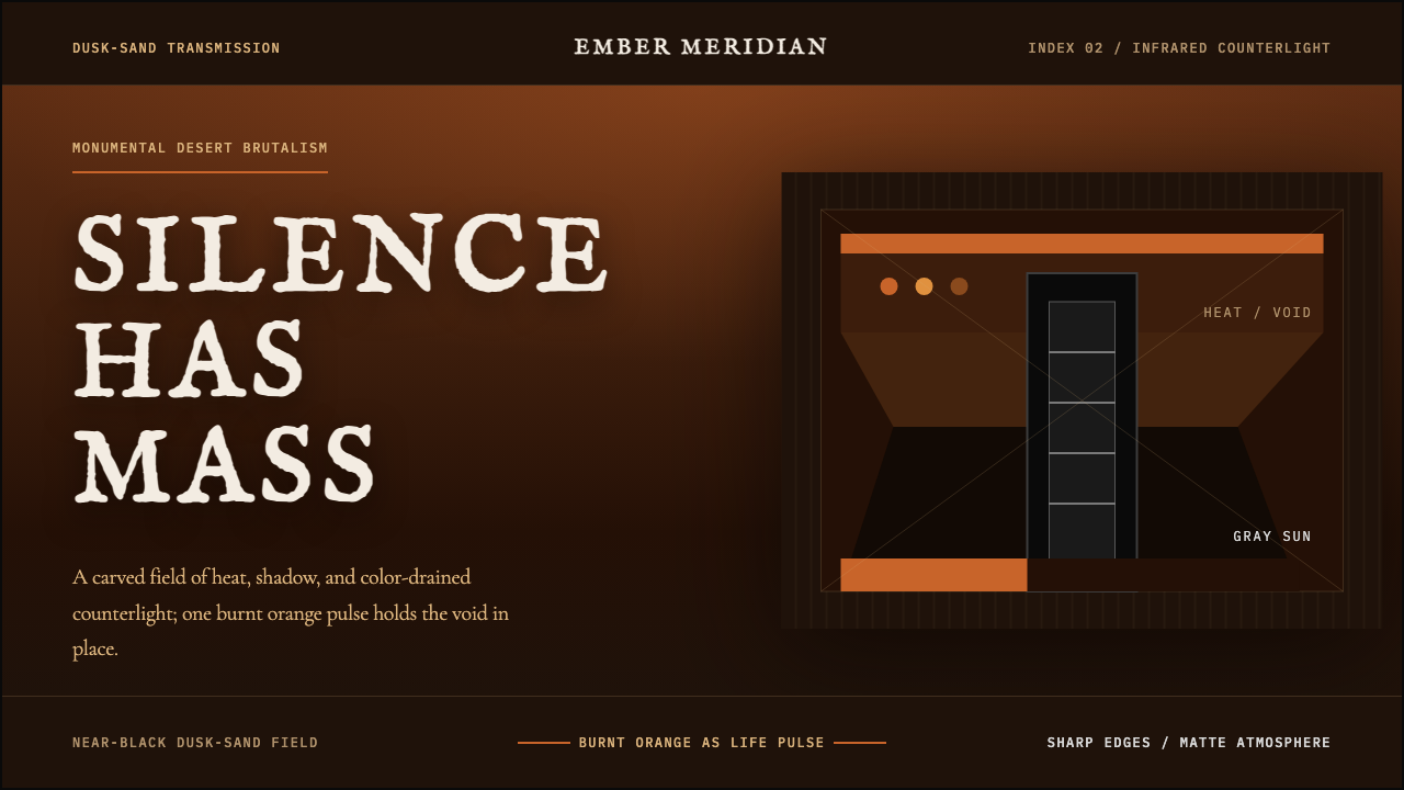 Dune Part Two BrutalistMonumental silence. Burnt sand orange on dusk-black, split by infrared graysc…
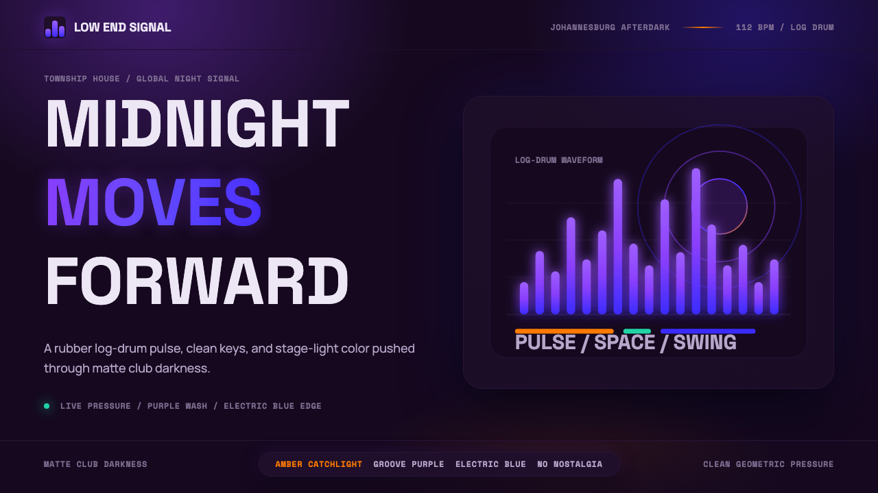 AmapianoClub darkness, fully awake. Purple-blue waveforms pulse through geometric typ…
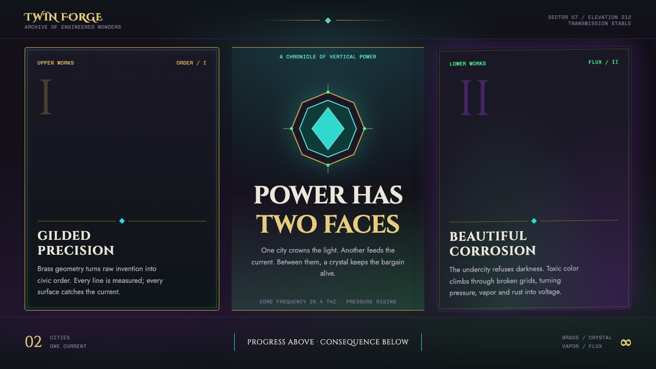 Arcane Hextech (2021)Progress and rot share a current. Brass symmetry meets teal crystal and toxic…
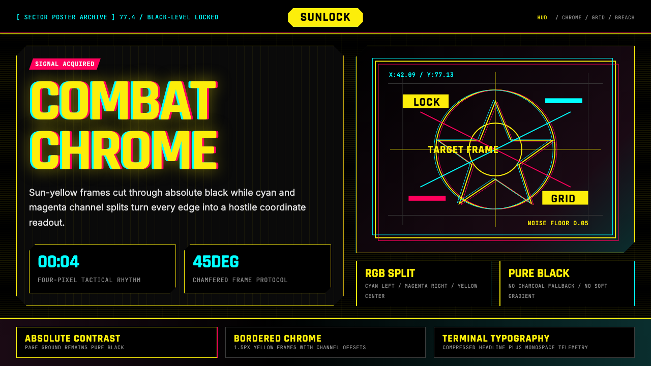 Cyberpunk 2077 Night City YellowCombat HUD on black. Sun-yellow chrome splits into magenta-cyan coordinate gr…
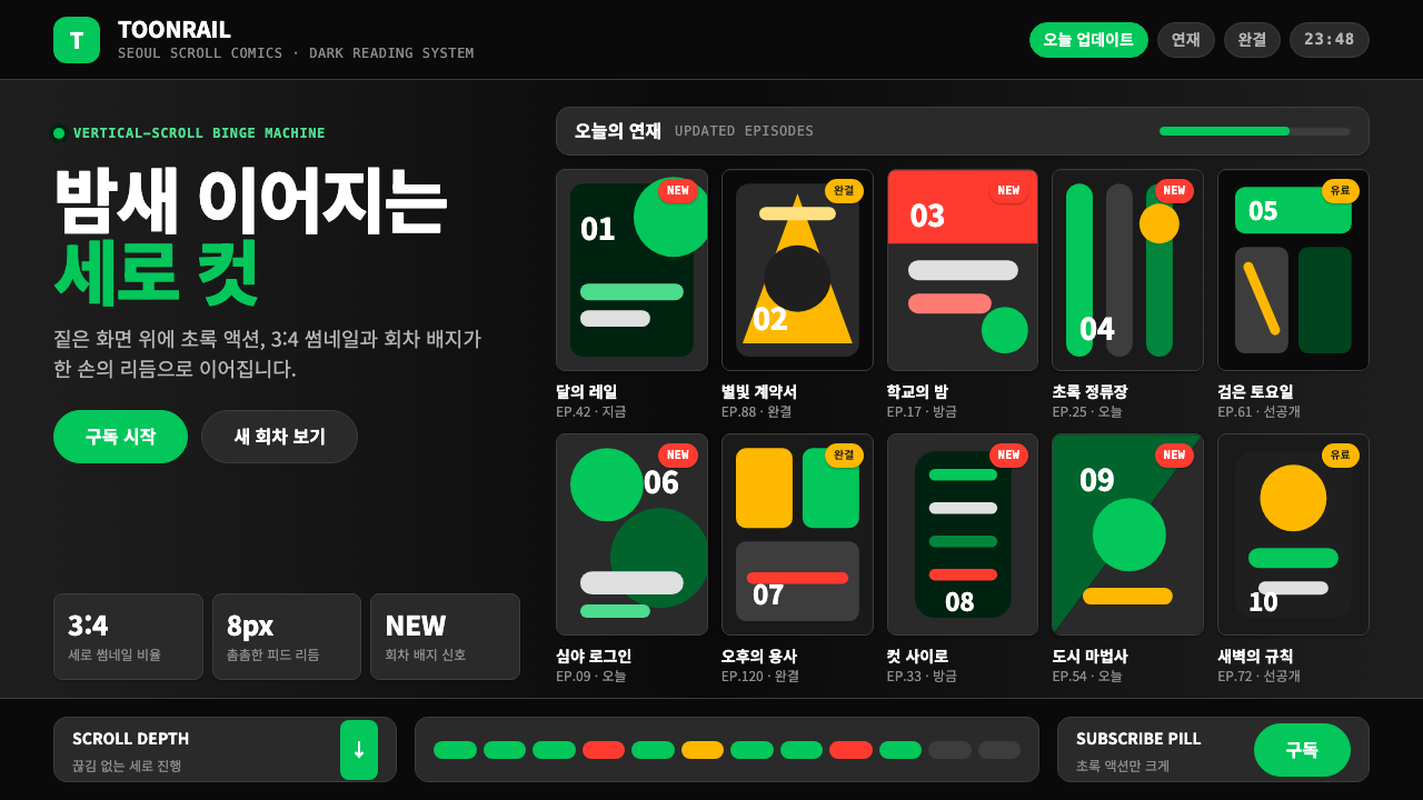 Naver Webtoon (2024)Built for late-night scroll. Charcoal grids, Noto Sans KR, and green episode…
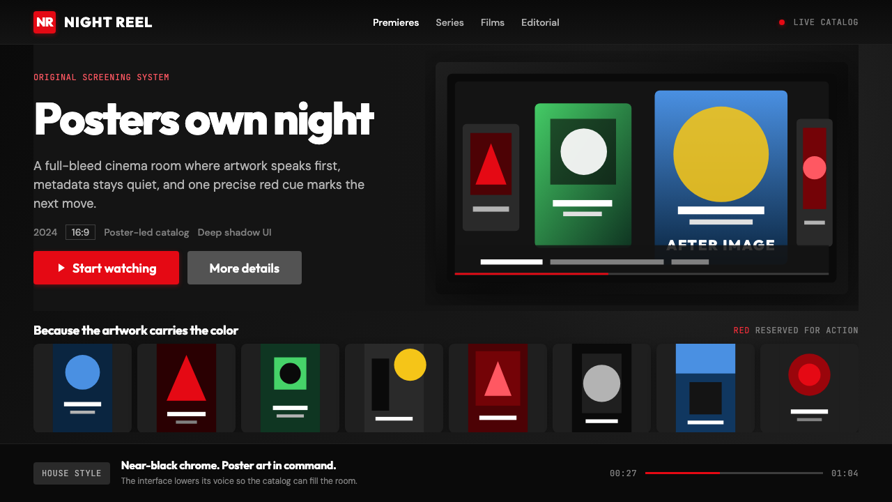 Netflix 2024Cinema UI goes dark. Near-black chrome, poster rails, and one surgical red ac…