What is Solo Leveling?
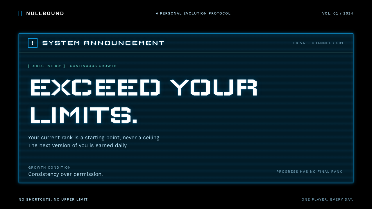
Solo Leveling turns a single imaginary interface, the System window only its hero can see, into a whole visual language of cold commands, quest-blue frames and glowing glass.
Solo Leveling in brief
The Solo Leveling System Window style is a dark, game-interface aesthetic drawn from the Korean fantasy story Solo Leveling and its 2024–2025 anime adaptation. Its core image is the System: a deep navy-teal pane, half transparent and faintly scanlined, edged in hairlines of glowing blue, floating over a black field and issuing daily quests, level-ups and penalties in flat, impersonal game language.
What makes the look distinctive is that the interface is not decoration around the story; it is the story's most memorable object. Only the protagonist can see the window, so every panel feels like a private channel between a machine and one person. The design carries that intimacy as restraint: few colors, strict roles for each of them, and text that announces rather than explains.
Visually, expect stencil-style display lettering, white text with a soft bloom of light, frames that glow rather than cast shadows, and a page that is mostly darkness. Blue means system and confirmation, red is reserved for penalties and warnings, and a rarer purple, borrowed from the dungeon Gates, appears only when something exceptional happens.

Where does Solo Leveling come from?
The story began as a web novel by Chugong, published in 2016, and reached a far larger audience as a webtoon from 2018 to 2021, illustrated by Jang Sung-rak under the studio name DUBU. That webtoon is a landmark of Korean serialized comics going global, and it popularized a particular fantasy: an ordinary, weak person who is suddenly handed a game-like power system and levels up alone.
The anime adaptation brought the story to a worldwide audience across two seasons in 2024 and 2025. Shunsuke Nakashige is credited among its key creative figures, and the composer Hiroyuki Sawano is credited for the music, whose swelling, electronic-orchestral character shaped how the series feels as well as how it sounds. Much of the visual identity that this design system borrows comes from the way the anime renders the System: crisp, luminous and unemotional against dark, cinematic scenes.
The aesthetic sits at the meeting point of several traditions. Korean web-novel and webtoon intellectual property going global is the commercial and cultural current behind it. System game-fantasy storytelling, in which characters see stats, quests and rankings the way a player does, is the narrative convention it relies on. And the heads-up-display graphics long familiar from anime and video games give it its formal vocabulary: floating panels, status bars, notification chimes translated into type and light.
Because the source work spans Korea and Japan, the style also inherits a bilingual, multi-script habit. Headlines favor a digital stencil letterform, while body text stays plain and neutral, with companion typefaces for Japanese and Korean so the window can speak in any of the story's languages without losing its cold, mechanical voice.
What defines the Solo Leveling look?
The System window as architecture
Everything is built from one object: a translucent navy-teal panel with a thin glowing edge. Content lives inside such panels, panels float over a black page, and nothing else is needed to organize the layout. Where other styles use cards, grids or sections, this one uses windows that appear to have been summoned.
Quest blue as the single voice
The leading color is a cool, luminous blue used for frames, focus states and confirm buttons. It signals that the System is speaking. Because it is almost the only chromatic color in a field of black and navy, it carries instant authority and never needs to be loud.
Red for penalty, purple for rarity
Secondary colors are assigned jobs, not moods. Red is held back for penalties and warnings, so when it appears the reader feels consequence. Purple, echoing the dungeon Gates, is saved for rare events, level badges and special states, which keeps it feeling like a reward rather than a theme.
Stencil display type
Headlines use a stencil-cut, digital-looking display face, with gaps in the letterforms like a machine-cut plate. It reads as official and automated at once. Body text pairs it with a plain, neutral sans-serif, so the contrast between announcement and explanation is built into the type itself.
Glow instead of shadow
White text carries a soft bloom, and frames shine outward rather than casting darkness below. Depth is created by light on a dark ground, never by shadows on a light one. The result feels like a screen in a dim room, which is exactly the situation the story imagines.
Scanlines and translucency
Panels are only half opaque and carry a faint scanline texture, so the black page can be sensed through them. This suggests a projection rather than a solid object, and it keeps dense information from feeling heavy even when several windows overlap.
Flat, impersonal copy
The tone of voice is part of the visual system. Messages are short, imperative and unsentimental: a quest is assigned, a level is reached, a penalty is applied. Layouts leave room for this rhythm, with generous margins around single lines of text so each announcement lands alone.

Who shaped Solo Leveling?
Chugong wrote the original web novel in 2016, inventing the premise of a weak hunter who gains a private game-like System. Every later adaptation, and therefore this entire interface aesthetic, grows out of that one conceit of a window only one person can see.
Working under the studio name DUBU, Jang Sung-rak illustrated the webtoon adaptation, which ran from 2018 to 2021. The webtoon is where the System's panels first became recognizable images, and it established the story's dark, high-contrast, glowing look.
Nakashige is credited among the key figures of the anime adaptation. The anime translated the webtoon's System panels into moving, luminous screen graphics, and that screen version is the closest reference for this design system's glass-and-glow behavior.
The composer Hiroyuki Sawano is credited for the anime's music. His soaring electronic-orchestral style gives the series an emotional register that the cold interface deliberately withholds, and the contrast between the two is part of why the System feels so detached.
How do you use Solo Leveling today?
In slides, this style suits covers and section dividers that want a sense of progression. A dark full-bleed slide with a single glowing panel, one stencil headline and one line of quiet text reads like a level-up notification. For content slides, treat each key idea as its own window, and keep to a single column so the panels never compete. Data slides work well as stat panels: a large figure, a small label, a thin glowing frame, and nothing more.
On the web, it is a natural fit for dashboards, progress trackers, onboarding flows, achievement pages and gamified products. Pricing and plan pages can present each tier as a System window, with quest blue marking the recommended one. Navigation should be sparse, because the style relies on empty darkness around its panels. Event landing pages and campaign microsites for games, fitness or learning apps can use daily-quest framing for tasks and streaks.
In editorial and marketing work, the style shines in launch announcements, season recaps, leaderboard graphics and social cards. Short imperative copy is its best partner: a headline that sounds like a notification will always look more at home than a long, warm paragraph. Keep image content dark and cinematic so the glowing frames sit naturally on top of it.
Use the accent colors by job. Blue for system, focus and confirmation; red only for warnings and penalties; purple only for rare or special states. If every panel glows in three colors, the language stops meaning anything and the style collapses into generic neon.
The most common mistake is washing the style out. Placing these panels on a light page, adding heavy drop shadows, or filling every panel with dense paragraphs destroys the effect, which depends on darkness, light and brevity. A second mistake is overusing glow: reserve the bloom for text and frames that matter, and leave the rest flat.

Solo Leveling — FAQ
What is the Solo Leveling System Window style?
It is a dark game-interface style based on the System window from Solo Leveling. It uses half-transparent navy-teal panels with thin glowing blue frames, stencil-style headlines, white text with a soft bloom and a mostly black page. It is built for interfaces that should feel like progression, quests and notifications.
Where does the style come from?
It comes from the Korean web novel by Chugong, first published in 2016, its webtoon adaptation illustrated by Jang Sung-rak (DUBU) from 2018 to 2021, and the anime adaptation of 2024 and 2025. The look specifically follows the System interface that only the protagonist can see, as rendered on screen in the anime.
What kinds of projects suit it best?
Dashboards, progress trackers, onboarding flows, gamified apps, event landing pages, launch announcements and leaderboards. Anything where information should arrive as a short, authoritative notification on a dark ground fits well. It is a poor match for warm, text-heavy, or light-toned content such as long-form reading pages.
Why is red used so rarely?
In the story's interface, red signals penalties and warnings, so the style treats it as a consequence color. Using it sparingly means that when it does appear, it is felt. If red is used decoratively, the reader can no longer tell a warning from a design choice, and the system loses its meaning.
Can it work in a light theme?
Not convincingly. The look depends on light emitted over darkness: glowing frames, bloomed white text and translucent panels over a black field. On a white page those same elements read as flat and washed out. If you need a light surface, keep the stencil type and blue accent but accept that it will feel like a different, quieter style.
Related design styles
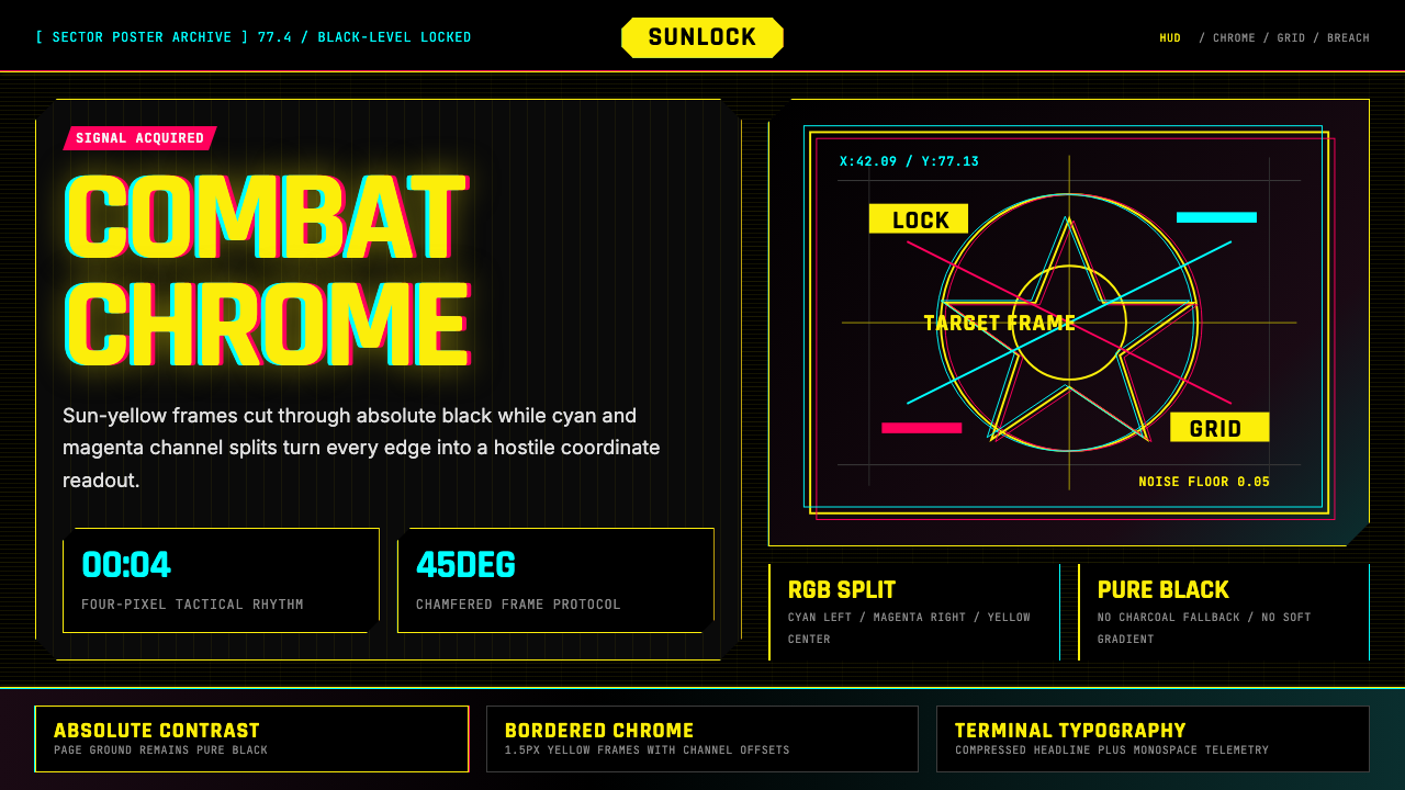 Cyberpunk 2077 Night City YellowCombat HUD on black. Sun-yellow chrome splits into magenta-cyan coordinate gr…
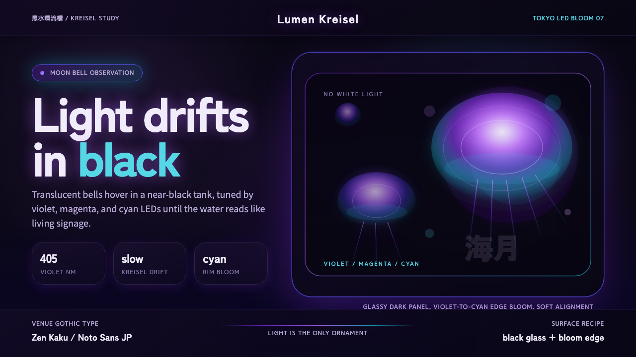 Jellyfish Aquarium StudyLight is the ornament. Violet-cyan glow floats in black glass with venue-goth…
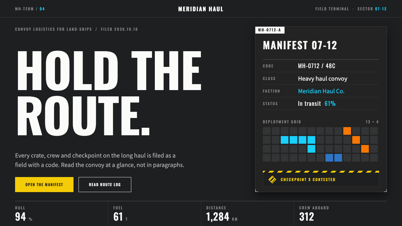 ArknightsEvery color has one job. Charcoal panels, wide-tracked caps, hazard yellow on…
 F1 Formula One LiverySpeed is legible. Ferrari red and papaya speed-lines cut through black teleme…
 Blade Runner 2049Noir with tectonic weight. Orange dust, cyan hairlines, and monumental Inter…
 Dead Space IshimuraLast light in the dark. Near-black rust cut by aqua holographic panels.