What is Don Quijote?
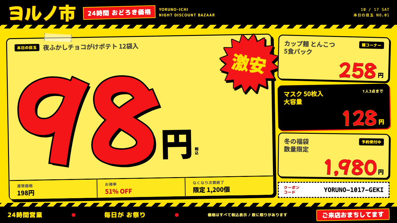
Don Quijote POP signage is shop-floor design turned up to maximum: process-yellow price cards, giant marker-red numbers and thick black outlines that refuse to whisper.
Don Quijote in brief
Don Quijote POP signage style is a visual language lifted directly from the sales floor of Don Quijote, the Japanese discount chain famous for staying open around the clock. The page itself becomes a single yellow POP card: a flat process-yellow ground, prices in the red of a marker pen, and every shape wrapped in a thick black outline. POP here means point-of-purchase, the hand-lettered signs that sit next to products and tell shoppers what to buy and why.
The style is loud on purpose, and it is honest about it. Cards are tilted and overlap one another as if taped up in a hurry. Burst stickers carrying words like gekiyasu and kyōyasu, which promise shocking bargains, break out of the grid. Prices run enormous, filling much of a card, with only a tiny yen sign and a small note about tax included tucked beside them. Where other retail design hides the price, this one makes the price the hero.
It is a style about density and appetite. Shelves in these stores are stacked to the ceiling in what the company calls compression display, and the signage is designed to survive in that clutter by being louder than everything around it. When translated to the screen, it makes a product feel like a treasure hunt rather than a catalogue entry.

Where does Don Quijote come from?
The first Don Quijote store opened in 1989 in Fuchu, Tokyo, founded by Takao Yasuda. It was a small shop built on an unusual premise: sell a wild variety of goods at low prices, keep late hours, and make the shopping itself feel like an adventure. Over the 1990s and 2000s the format spread nationwide as a 24-hour discount chain, and the signage look associated with it settled into the form we recognise today, with the current POP style taking shape in the 2010s and 2020s.
That look rests on a long Japanese tradition of hand-written POP, known as te-gaki POP. Instead of printed corporate labels, retail staff write product cards by hand with marker pens, using rounded, friendly lettering and bright colour to catch a passing eye. Each Don Quijote store employs one to three dedicated POP writers, and the plump, rounded lettering that shoppers think of as Donki lettering is produced by their hands, one stroke at a time. A digital system cannot reproduce a person, so it substitutes a rounded pop display typeface with a similar bubbly personality.
The second root is the store layout itself. Compression display, in which goods are stacked and hung so densely that there is almost no empty wall or shelf, makes whitespace a foreign idea. The signage inherits that logic: cards are crammed in, overlapped and tilted, and the page is expected to be full. Along with it comes the late-night, discount-amusement mood of the chain, a retail space designed to be wandered through at odd hours and to reward curiosity.
A small mascot completes the picture. A blue penguin, known as Donpen, appears in corners of the signage as a friendly signature, but never takes centre stage. The star is always the offer itself. In design terms, the system takes a physical medium made by human hands and turns it into a repeatable set of rules for colour, outline, tilt and scale.
What defines the Don Quijote look?
Process-yellow ground
The base colour is a flat, strong process yellow, the kind of yellow that comes from a printing press rather than from the sky. It turns the whole page into a POP card. Because the yellow is so assertive, the page needs no decorative texture or gradient; the colour itself is the attention-grabber.
Marker-red giant prices
Prices are set in a red that recalls a felt-tip marker, at a scale that dominates the card. The number is the loudest element on the page, and the currency mark beside it is deliberately tiny. This inversion, with the figure huge and the unit small, is the clearest signature of the style.
Thick black outlines
Every card, button, burst and headline carries a heavy black contour, and shadows, where they appear, are hard offset shapes rather than soft blurs. The outline gives each element a cut-out, sticker-like presence and keeps loud colours from bleeding into one another.
Tilted, overlapping cards
Cards are rotated by small amounts and layered over each other, as though taped to a shelf edge by different hands at different times. This breaks any rigid grid and gives the layout a hand-placed energy that no perfectly aligned column can match.
Rounded pop lettering
Headlines and labels use a plump, rounded pop display face that echoes the hand-written Donki lettering. The letterforms are friendly rather than authoritative, which keeps the extreme volume of the page from feeling hostile.
Bursts and sticker badges
Starburst shapes carrying words such as gekiyasu or kyōyasu are slapped on at random angles, and they are allowed to break the edge of the grid. They work as exclamation points, signalling a special price or limited offer without any need for explanatory copy.

Who shaped Don Quijote?
Yasuda founded Don Quijote and opened the first store in Fuchu, Tokyo, in 1989. His retail philosophy of dense, treasure-hunt shopping is the real source of the visual style: the signage exists to serve that store experience, and the design system is an echo of it.
The unnamed POP writers employed at each store, usually one to three people, are the true authors of the lettering. Their rounded, hurried, marker-drawn hand is what shoppers recognise as Donki style, and the digital typeface used in this system is only a stand-in for their work.
How do you use Don Quijote today?
For slides, this style is at its best on promotional decks, sales kick-offs, campaign recaps, event announcements and anything where enthusiasm matters more than elegance. A title slide can be a single yellow card with an enormous red number and a tilted burst sticker. On content slides, keep one idea per card, rotate cards only slightly, and let two or three overlap rather than filling the page with equal-sized boxes. On data slides, treat the headline figure like a price: huge, red, outlined, with its unit tiny beside it.
For websites and product interfaces, it fits sale pages, coupon sections, ranking lists, flash-deal modules, discount calendars and marketplace landing pages. Product tiles become POP cards, the lowest price becomes the biggest element, and badges announce deadlines or stock. It also works for hero sections of campaigns aimed at bargain hunters. Keep the interactive controls easy to find by giving them the same black outline and flat colour treatment, and keep body copy short, because the density of the style leaves little room for paragraphs.
For editorial and marketing work, it suits posters, flyers, social media promotion cards, email banners and print inserts. A tilted card with a red price and a corner burst reads instantly as a deal, even to someone scrolling quickly. The small blue penguin mascot can appear in a corner as a signature, but it should never compete with the offer.
The most common mistake is to apply the yellow and red without the structure behind them. Without thick outlines, hard shadows, tilted cards and truly oversized prices, the page reads as a generic warning sign rather than a shop-floor card. Another mistake is to tidy it: aligning every card to a grid and adding generous whitespace destroys the compression-display logic the style depends on. A third is overusing the style on products that need calm, such as financial or healthcare services, where the shouting tone undermines trust.
The practical rule is to control chaos with a few constants. Keep the colour set small, keep the outline weight consistent, keep tilt angles modest, and keep one clear hero number per card. Inside those limits, the layout can be as crowded and loud as it likes, and still remain legible.

Don Quijote — FAQ
What does POP mean in Don Quijote POP signage?
POP stands for point of purchase. In Japanese retail it refers to the hand-lettered signs and cards placed next to products to tell customers what an item is and why they should buy it. At Don Quijote, in-store POP writers produce them by hand with marker pens.
When did Don Quijote start and where?
The first Don Quijote store opened in 1989 in Fuchu, Tokyo, founded by Takao Yasuda. The chain later expanded nationwide as a 24-hour discount retailer during the 1990s and 2000s, and the POP look used by this design system reflects the signage style of roughly the 2010s and 2020s.
Why are the prices so large and the yen sign so small?
The price is the offer, and the offer is what the card exists to sell. Making the number enormous and the unit tiny puts attention exactly where the shopper's decision happens. It is also a long-standing habit of hand-written Japanese POP, where the figure is written large and the yen and tax notes are small additions.
Can this style be used for serious or premium brands?
Generally no. The style is built on volume, density and bargain-hunting excitement, which conflict with the calm and restraint premium or sensitive categories require. It is better suited to sales, promotions, coupons, rankings and playful campaigns.
What typeface should be used for the lettering?
The real signage is hand-written, so no font is a perfect match. The system uses a rounded pop display typeface as a stand-in, chosen because its plump, friendly letterforms resemble the Donki hand. Any similar bubbly display face with heavy weight can work if the outline treatment stays strong.
Related design styles
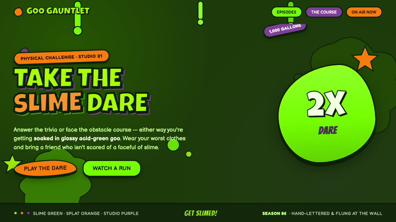 Nickelodeon Double Dare SlimeGet slimed. Glossy acid-green goo on deep slime ground, balloon caps and spla…
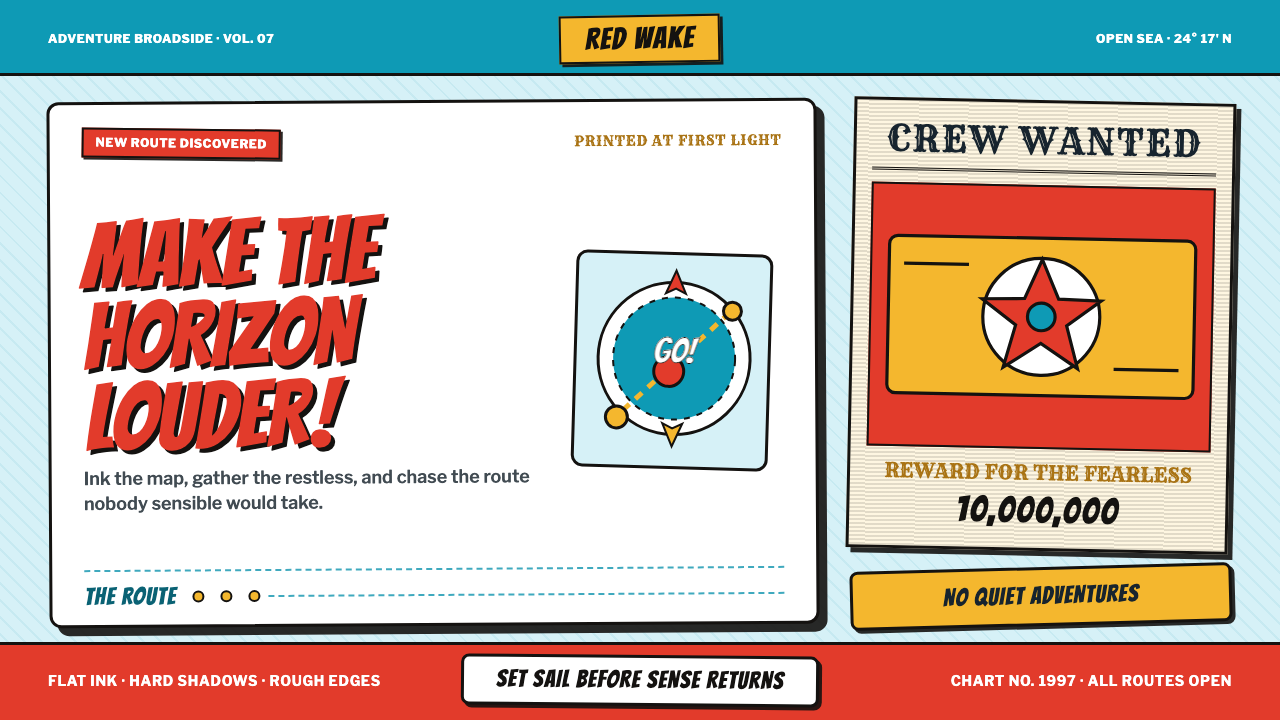 One Piece (Grand Line Adventure)Adventure shouts first. Vermilion splash type and cyan charts collide in hard…
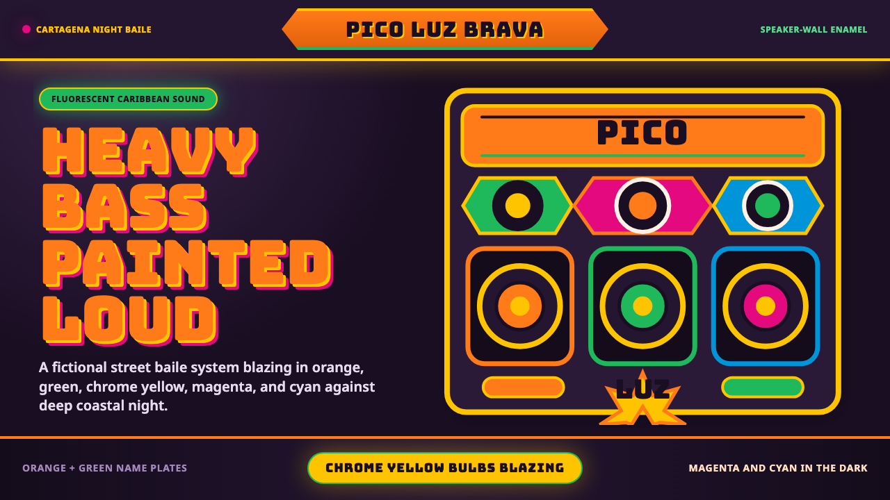 Champeta Picó SoundLoud after dark. Orange-green banners and fat Bungee type glow like a speaker…
 Digimon AdventureSaturday-morning toy energy. Cerulean grid, green frame, outlined katakana, p…
 Dragon Ball (1984)Adventure lands with comic force. Gi-orange panels, amber spheres and crisp h…
 GyaruToo loud to behave. Hot-pink outlined type and silver sticker grids crowd glo…