What is Nickelodeon Double Dare Slime?
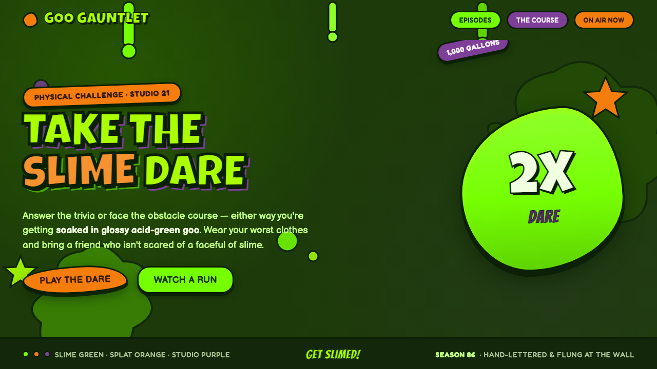
Nickelodeon Double Dare Slime turns cheerful gross-out television into a visual system: glossy acid-green goo, exploding orange splats, purple interruptions, and hand-drawn letters that look as if they have just landed.
Nickelodeon Double Dare Slime in brief
Nickelodeon Double Dare Slime is the visual language associated with Double Dare, the Nickelodeon game show that premiered in 1986 and made green slime a network icon. Its central image is not a tidy logo device or a supporting motif. Slime is the dominant surface: it sheets across the scene, clings to edges, pools in blobs, bursts into splats, and leaves drips hanging where a cleaner visual system would place a border. The result is a world built on deep slime-green ground, with glossy acid-green goo visibly disrupting and energizing everything placed over it.
The style belongs to late-1980s American children's television branding, where broadcast graphics were expected to feel immediate, loud, and physically animated. It combines balloon-like capital letters, thick cartoon outlines, wet highlights, irregular splat-drip shapes, and highly saturated contrast. Orange carries the familiar Nickelodeon splat energy; purple provides another emphatic interruption. Together they make the green field feel unstable in the best sense: a stage for surprise, competition, mess, and delight.
Its apparent chaos is carefully legible. Forms are broad, silhouettes are strong, and type is treated like a painted object rather than neutral information. A word can bulge, wobble, tilt, or appear to have been pushed up through slime, yet it must still read at a glance. This is why the look feels so different from generic neon nostalgia. It is not merely bright color and cartoon mess. It is broadcast graphics drawn by hand and flung at the wall, with enough contrast and outline to survive the impact.
Where does Nickelodeon Double Dare Slime come from?
The immediate origin is Double Dare, which premiered on Nickelodeon in 1986. The show made green slime inseparable from a particular kind of children’s television spectacle: a studio environment where being covered, splashed, or surprised was part of the entertainment. Because slime appeared as a major physical surface within the show, it became more than a prop. It supplied the visual logic for the surrounding graphics. A deep slime-green field establishes the world; glossy acid-green goo performs the action within it.
Its peak slime era ran from 1986 to 1990, within a longer broadcast-graphics lineage stretching from 1950 to 1990. This lineage matters because the look was made for television, not for the calm, modular surfaces of later digital interfaces. It favors forms that can be recognized instantly in motion: oversized letter shapes, broad splats, thick outlines, and large wet highlights. Every feature has the directness of a screen graphic intended to register before the next burst of action arrives.
Nickelodeon, the Double Dare production team, and the 1980s broadcast hand-lettering tradition are the named forces behind the style. Their combined contribution is visible in the tension between network identity and hand-made disorder. The Nickelodeon splat orange reads as a branded accent, while the lettering and dripping shapes resist polished corporate regularity. The work feels authored by a playful hand even when it is functioning as a recognizable television identity.
The larger movements named in its source are late-1980s American children’s TV branding, splat-graphic and gak visual culture, and Pantone-driven network identity. Together they explain why the palette is so declarative and why the imagery is so physical. Color does not quietly establish mood; it announces affiliation and intensity. A splat is not an abstract decoration; it implies impact. A drip is not a subtle texture; it records a mess in progress. The style’s nostalgia comes from that unapologetic commitment to visible, cartoon-scale energy.
What defines the Nickelodeon Double Dare Slime look?
Slime as Surface
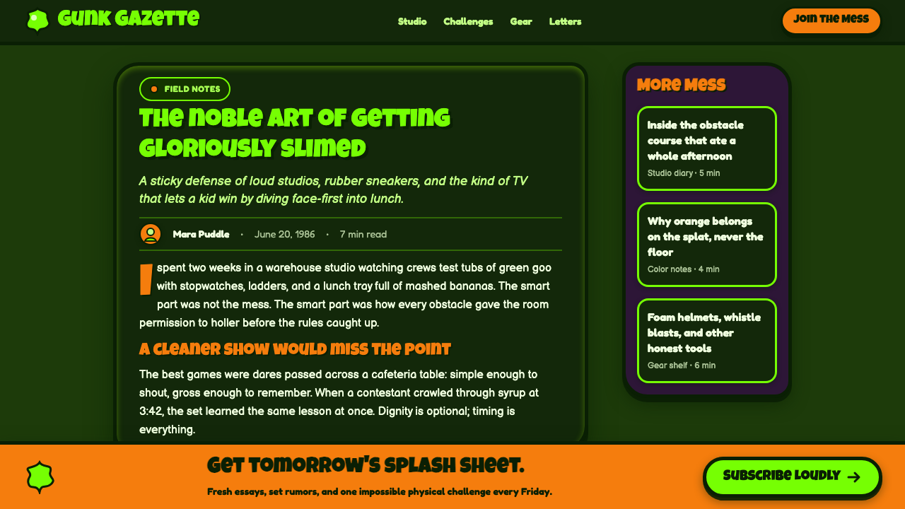
Slime is the governing material, not an occasional embellishment. It should feel as though it can cover, drip over, or burst through the composition. A deep slime-green ground gives the scene its atmosphere, while acid-green goo provides the active foreground event. The distinction matters: the background establishes the world, and the glossy slime makes that world misbehave.
Acid Green, Orange, and Purple
The palette is saturated and confrontational. Acid green is the signature material color, orange acts as the high-energy Nickelodeon splat accent, and purple creates a sharp secondary interruption. These colors work best in large, decisive areas rather than as many tiny decorative signals. The visual hierarchy should still be obvious: green owns the environment, while orange and purple puncture it.
Balloon-Cap Lettering
Lettering is hand-drawn, rounded, inflated, and cartoonishly physical. Capitals should feel as if they contain air, paint, or slime pressure. Their irregularity is expressive rather than careless: slightly uneven contours and playful shifts in stance make the words feel alive, but the overall silhouette must remain bold enough for instant recognition. The type does not sit politely on the page; it performs.
Splat and Drip Silhouettes
Splat-drip blobs supply the style’s vocabulary of impact. Their edges should be visibly irregular, with rounded bursts, hanging drops, and off-balance extensions that imply motion without requiring realistic liquid simulation. A good slime blob has a clear outer contour first and detail second. If the silhouette reads only as an amorphous stain, it loses the buoyant, cartoon-scale force of the source.
Wet Gloss and Thick Outline
Glossy highlights make the slime feel wet, while thick cartoon outlines keep it readable against the deep ground and competing accents. Highlights should look placed and graphic, not softly atmospheric. Outlines are equally important: they separate letters, splats, and goo from one another so the composition can remain crowded without becoming illegible. The finish is shiny, but the drawing stays emphatically hand-made.
Joyful Disorder
The composition should feel loud, saturated, and happily excessive. Elements can tilt, overlap, crowd an edge, or appear to have arrived from outside the frame. Yet disorder needs a focal point, usually the main word, slime event, or orange splat. The style succeeds when it feels like a messy studio game brought to life, not like an interface whose spacing was accidentally abandoned.

Who shaped Nickelodeon Double Dare Slime?
Nickelodeon is the network through which Double Dare turned green slime into a lasting icon. Its signature splat orange provides a branded burst of energy within the darker slime world, helping the style read as television identity rather than a general-purpose cartoon treatment.
The Double Dare production team made the show’s studio mess central to its appeal. By treating slime as a recurring visual event rather than a one-off gag, the production gave surrounding graphics a concrete material reference: drips, splats, gloss, and the sensation that the set itself could be overtaken.
The 1980s broadcast hand-lettering tradition supplies the style’s expressive type behavior. Balloon caps, uneven contours, and thick outlined forms make words feel drawn, painted, and physically present. This tradition keeps the identity lively and prevents its strong network colors from becoming sterile.
How do you use Nickelodeon Double Dare Slime today?
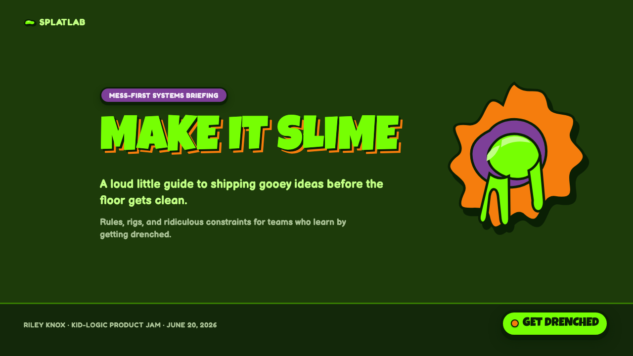
For presentation slides, use the style as a controlled burst of television energy. A cover slide can begin on a deep slime-green field, with a large acid-green drip or splat entering from an edge and a hand-drawn balloon-cap title occupying the strongest open area. Let orange or purple appear as a single disruptive accent rather than filling every corner. The cover should feel as if the topic has been hit by a game-show event, while the title remains unmistakable.
Content slides need more discipline than the source’s exuberance initially suggests. Keep one main heading, short blocks of copy, and a small number of illustrated slime forms around the perimeter. Let thick outlines separate labels from the ground and use glossy highlights only on elements meant to feel wet. For data slides, turn bars, markers, or key callouts into clean cartoon objects, then use splats to identify the most important result. The chart must remain readable before it becomes playful.
For web interfaces, the look is most persuasive in campaign pages, playful dashboards, scoreboards, challenge flows, or pricing pages with a deliberately youthful voice. A deep green environment can frame panels, while acid-green goo marks progress, featured states, or active challenges. Orange splats can call out offers or key actions; purple can distinguish an alternate category. Keep functional controls recognizably functional, even when they are wrapped in thick outlines and lively irregular shapes.
Editorial and marketing layouts benefit from the style’s immediate poster quality. Use a large hand-drawn headline, a central slime silhouette, and short high-contrast pieces of supporting information. On longer pages, alternate dense graphic moments with calmer reading zones so the visual mess does not exhaust the reader. Product promotions work especially well when the copy embraces challenge, surprise, play, or reward, because the style already promises an event rather than a quiet explanation.
The common mistake is to reduce Double Dare Slime to generic green goo. That loses the dark slime-ground world, the Nickelodeon orange and purple energy, the balloon-cap lettering, and the television-scale sense of impact. Another mistake is adding so many drips, highlights, and splats that nothing can be read. The source is joyfully chaotic, not indiscriminate: choose a clear focal event, give every blob a strong silhouette, and make the hand-drawn mess serve the message.
Nickelodeon Double Dare Slime — FAQ
Is this style only about green slime?
No. Green slime is the dominant material and environmental cue, but the complete system also depends on the deep slime-green ground, Nickelodeon splat orange, purple accents, hand-drawn balloon caps, wet gloss, thick outlines, and splat-drip silhouettes. Remove those relationships and the result becomes generic goo rather than Double Dare Slime.
How should the dark background be handled?
Treat it as the show’s slime environment, not as an empty dark canvas waiting for decoration. The deep green ground should make acid-green goo, orange splats, purple accents, and outlined lettering feel like active objects in a studio world. Preserve enough calm area around the main message so the darker field can provide contrast rather than visual congestion.
Can the style work for serious information?
It can, provided the subject benefits from playfulness, challenge, surprise, or a deliberately youthful tone. Use the visual language to frame attention, not to compete with every sentence. For instructional or data-heavy material, reserve the messiest splats and glossiest slime for section openings, featured results, or key calls to action, then give supporting information a steadier reading zone.
What makes the lettering feel authentic to the look?
The essential quality is hand-drawn physicality. Balloon-like capitals should feel inflated, painted, and slightly irregular, with thick outlines that hold them apart from the slime and dark ground. Perfectly neutral lettering may be readable, but it removes the sense that the words themselves have been caught in the same messy game-show action as the splats.
What is the fastest way to make the style fail?
Making every element equally loud. If all text is oversized, all surfaces are glossy, all edges drip, and orange, purple, and acid green appear everywhere, the composition has no event and no hierarchy. Let one slime action lead, let one message dominate, and use the remaining accents as evidence of a larger messy world.
Related design styles
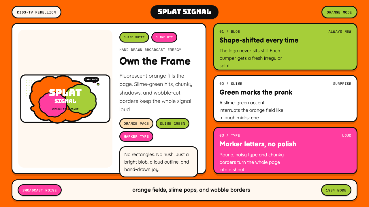 Nickelodeon Orange Splat (1984)Kids own the screen. Orange fields, slime-green pops, and wobble borders do t…
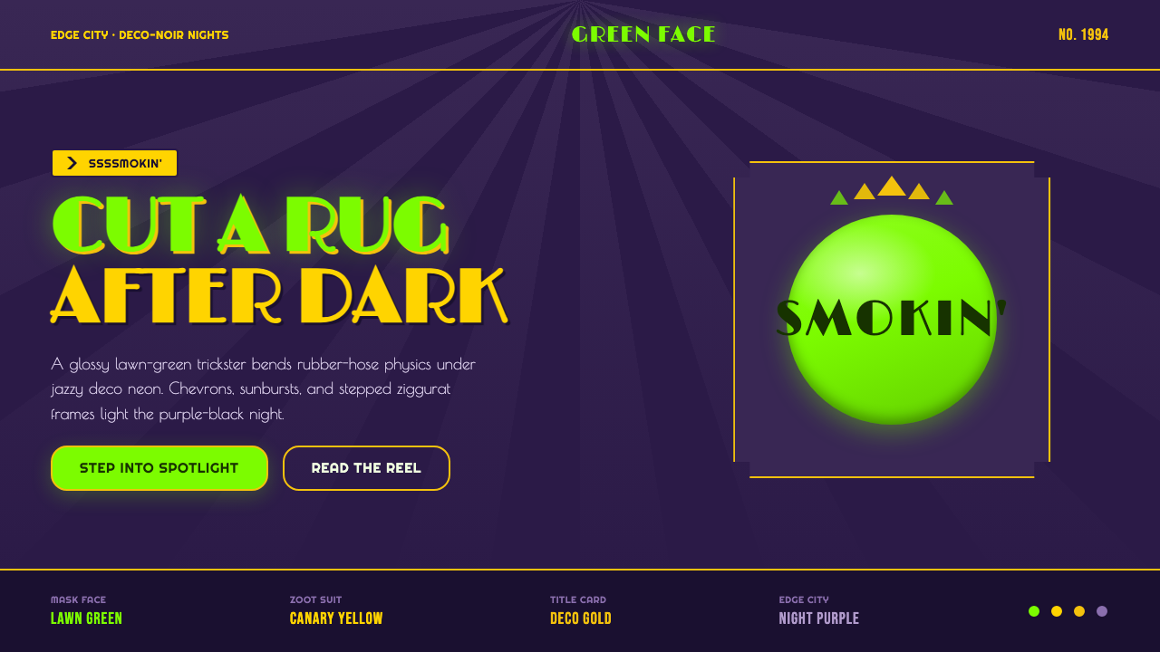 The Mask 1994 Green FaceLoud, theatrical, ssssmokin'. Lawn-green and canary-yellow scream against dec…
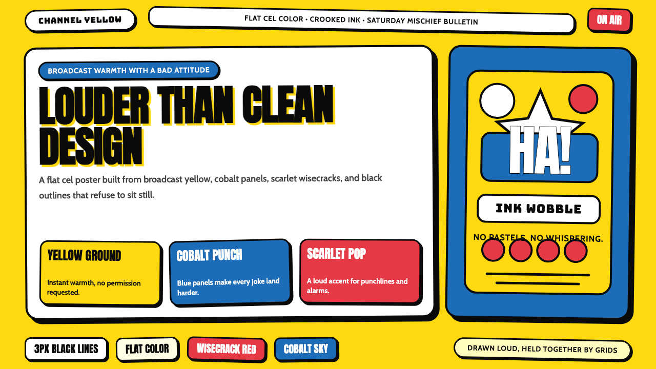 The Simpsons YellowCartoon warmth misbehaves. Yellow ground, cobalt panels, thick wobbly black l…
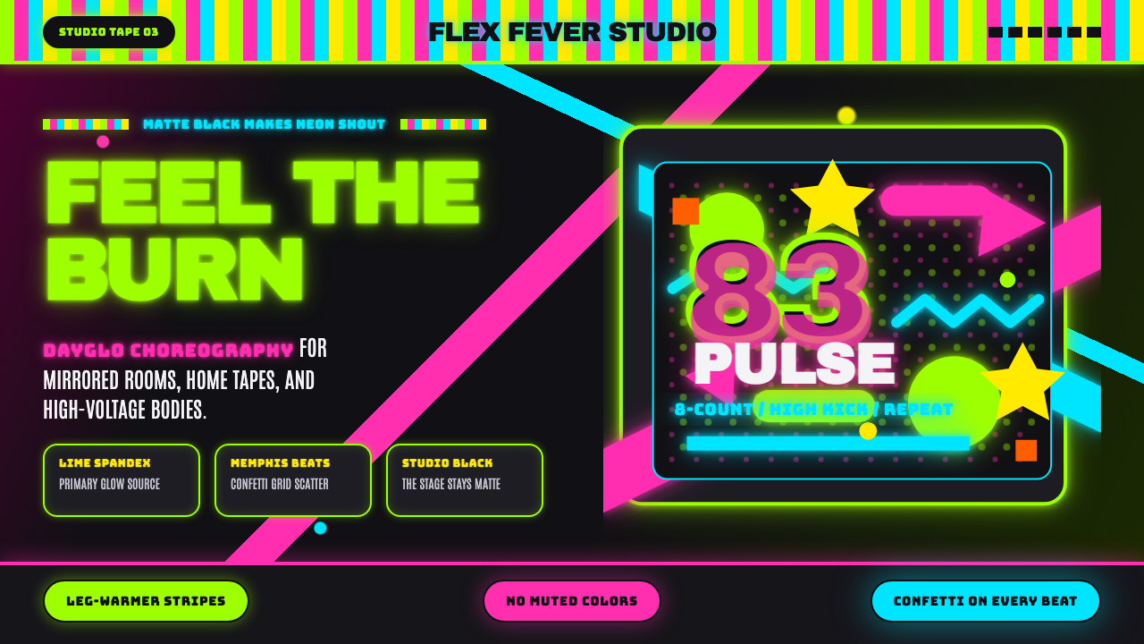 80s Aerobics Fluoro SpandexNeon refuses restraint. Lime spandex, pink-cyan confetti, and black-stage typ…
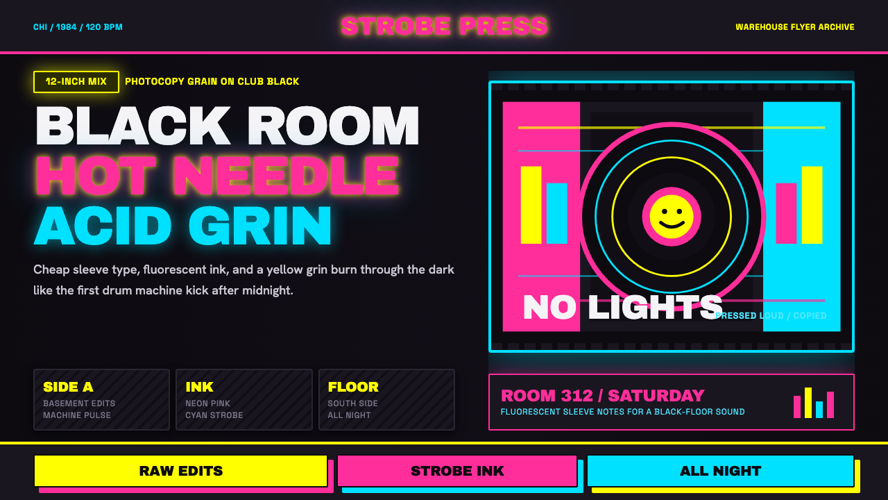 Chicago HouseDarkness starts the track. Neon pink, yellow and cyan hit black like Xerox st…
 Dragon Ball (1984)Adventure lands with comic force. Gi-orange panels, amber spheres and crisp h…