What is Digimon Adventure?
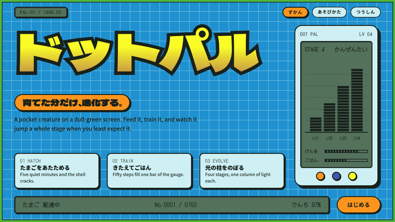
Digimon Adventure design is the look of a late-1990s Saturday morning: a cerulean grid, a green frame, fat outlined katakana and a grey-green pixel screen glowing in the corner.
Digimon Adventure in brief
Digimon Adventure style is a visual language drawn from the 1999 Toei Animation television series of the same name, the story that took Bandai's pocket virtual pets and turned them into an adventure about eight Chosen Children and their Digimon partners. As a design system it does not imitate the animation cels themselves. It imitates the packaging around them: the Toei Video VHS box, with its cerulean panel, its light-cyan grid lines, its green edge and its chunky katakana logo.
The result is a look that feels like a toy and a broadcast at the same time. Surfaces are flat and saturated rather than glossy. Outlines are heavy and dark, so that every button, card and badge reads like a sticker pressed onto a video sleeve. Where a modern interface would reach for a soft shadow or a blur, this style reaches for a thick black contour and a clean colour fill.
Underneath the cheerful surface there is a clear grammar. A bright blue field with a faint grid suggests the digital world the children fall into. A single hot orange, borrowed from the partner Digimon Agumon, marks every primary action. Pale cyan cards recall the shell of the Digivice device, and small dull-green panels in pixel type recall its tiny LCD screen. Each of the eight Crests keeps its own colour, so the palette stays lively without ever becoming muddy.

Where does Digimon Adventure come from?
Digimon Adventure was broadcast on Fuji TV from March 1999 to March 2000, produced by Toei Animation in Tokyo. It grew out of a toy. Bandai's palm-sized LCD virtual pets had already taught a generation of children to feed, train and worry about a creature living on a grey-green screen, and the television series gave those creatures a world, a cast and a reason to evolve. The staff credited in the source material for this system include Hiroyuki Kakudō, Satoru Nishizono, Katsuyoshi Nakatsuru and Kenji Watanabe, all names tied to the show and its creature world.
The visual identity of the series sat at the meeting point of three currents. The first was late-1990s Japanese television anime, with its bold outlines, bright cel colour and loud, rounded titles meant to be read from across a room. The second was the culture of Bandai's LCD virtual pet toys, whose low-resolution screens gave the franchise its pixel readouts and its habit of showing numbers, stages and evolution lines like game statistics. The third was the generic graphic language of the digital world in that decade: grids, circuits, glowing lines and a general belief that a computer was a place you could fall into.
The packaging of the home video releases is where those currents were pulled into a single page. A VHS sleeve in 1999 had to catch a child's eye on a shop shelf, announce a title in a few bold syllables and signal that the contents were energetic and friendly. Toei Video's box art answered with a blue grid panel, a green border and a katakana logo filled in a warm yellow-to-ochre gradient inside a thick black outline. DVD art that followed kept the same idea.
A design system built on that artwork inherits its time and place deliberately. It is not a general retro style. It is specifically Tokyo, specifically the turn from 1999 to 2000, specifically the moment when children's television, toy marketing and the first wave of home internet excitement all shared the same bright vocabulary. That specificity is the reason it is recognisable: anyone who watched the series at the time identifies the era within a second.
What defines the Digimon Adventure look?
Cerulean grid field
The base is a clear, bright cerulean panel ruled with fine light-cyan grid lines. The grid is not decoration for its own sake: it stands for the digital world and gives the page a quiet structure behind the louder elements. The lines stay thin and pale so that cards and headlines still read as the foreground.
Green frame
A green edge wraps the blue field the way the border of a video box wraps its artwork. It separates the screen from the surrounding page, gives the composition a finished, packaged feel, and sets up a lively blue-and-green pairing that reads as friendly rather than corporate.
Outlined katakana display type
Titles are set in heavy, rounded forms filled with a gradient from yellow to ochre and wrapped in a thick black outline. The outline is what makes the lettering feel like a logo rather than text. Headlines are short, punchy and slightly oversized, built to be read at a glance from a shelf.
Agumon orange for action
One saturated orange, taken from the lead partner Digimon Agumon, is reserved for primary actions, and it always carries a dark outline. Using a single hot colour for every important button gives the whole interface an obvious answer to the question of what to press next.
Digivice cards and LCD readouts
Cards take the pale cyan of the Digivice shell, while numerical readouts such as scores, levels and timers sit on a dull grey-green panel in pixel type, like the tiny LCD of the original toy. The contrast between the soft plastic shell and the harsh little screen is a large part of the charm.
Crest colours and evolution lines
Each of the eight Crests keeps its own colour, so categories, tags and characters can be told apart without inventing a new palette. Progress and evolution are shown with vertical beams of light that tie stages together, which suits timelines, level ladders and step-by-step flows.

Who shaped Digimon Adventure?
Listed in the source material among the key figures for this system, Kakudō is one of the Toei Animation creatives tied to the 1999 series. His association with the show helps anchor the system to the specific house look of Toei's television anime at the end of the decade.
Nishizono is another name credited with the series on the Toei side. Together with the rest of the staff he stands for the studio-level decisions about tone, colour and pacing that gave the series its bright Saturday-morning feel.
Nakatsuru appears among the credited figures linked to the Toei production. Names like his remind us that a children's franchise of this kind is a collaboration between animation studio, broadcaster and toy company, not the vision of a single designer.
Watanabe is associated with the creature side of the franchise in the source material. The Digimon themselves, simple enough to read as outlines and distinct enough to be collected, are the reason the design system leans so heavily on strong contours and flat colour fills.
How do you use Digimon Adventure today?
For slides, this style works best on cover and section-break slides, where its loudness is an asset. A cerulean grid slide with a thick-outlined yellow title and one orange call to action sets the mood immediately for a presentation about games, anime, youth culture, nostalgia or any product aimed at people who grew up around the year 2000. On content slides, keep the grid pale and let cards in the Digivice cyan hold the text, so that the page stays legible. On data slides, put the key number in a grey-green LCD panel with pixel type, and use the Crest colours to separate series instead of a generic chart palette.
For websites and product interfaces, the style suits game communities, fan sites, event pages, retro-themed promotions and any dashboard that wants to feel like a collectible toy. Primary buttons should all use the single orange with a dark outline. Cards, modals and menus can use the pale cyan shell. Pricing or status tables become more fun when each tier takes one Crest colour, and progress indicators can borrow the vertical evolution beam. Keep body text on pale surfaces rather than on the saturated blue, because long reading on a strong colour field tires the eye.
For editorial and marketing work, the style gives a campaign an unmistakable era. A launch page for a nostalgic reissue, a poster for a retro gaming night, a newsletter banner or a social card can all lean on the outlined katakana-style title, the blue grid and the green frame. The packaged, video-sleeve composition, with a clear title area and a clear border, is easy to adapt to square and tall formats.
The usual mistake is to treat it as a generic bright children's theme and lose its discipline. The style depends on a few firm rules: thick dark outlines on interactive elements, one hot colour for primary action, a restrained thin grid, and pixel type confined to readouts. If every element gets a different colour and a different outline weight, the page turns into noise and the VHS-box clarity disappears. Another mistake is to let the grid become heavy or dark, which flattens the hierarchy and makes the cards stop standing out.
A final practical note concerns audience. The style signals a specific era and a specific kind of affection. It is a strong choice when the audience shares that memory and a risky one for serious financial or medical products, where its toy-like cheer would undercut trust. Used where it belongs, it is one of the most efficient ways to make a screen feel like Saturday morning.

Digimon Adventure — FAQ
What is the Digimon Adventure design style based on?
It is based on the packaging art of the 1999 Toei Video VHS release of the series, which used a cerulean panel with light-cyan grid lines, a green edge and a katakana logo filled in yellow to ochre inside a heavy black outline. It also borrows details from the Digivice device and the LCD screens of Bandai's virtual pet toys.
Why does the style use an orange accent colour?
The orange comes from Agumon, the lead partner Digimon. Reserving that single hot colour for primary actions, and always giving it a dark outline, makes the most important button on any screen obvious without relying on size alone.
Where does the pixel type belong in this style?
Pixel type is reserved for readouts such as scores, levels, counters and timers, and these sit on a dull grey-green panel that recalls the LCD of the original toy. Headlines use heavy outlined display lettering and body text stays in a plain, readable face.
Is this style suitable for professional or business presentations?
It can work for creative, gaming, media and nostalgia-themed business content, especially on covers and section breaks. It is a poor fit for sober contexts such as finance or healthcare, because its toy-like energy and heavy outlines carry a playful tone that can undermine seriousness.
How is this different from other retro pixel styles?
Most retro pixel styles borrow from game screens. This one borrows from a video box and a television franchise, so it is built around a blue grid panel, a green frame and outlined katakana-style titles, with pixel type used only for small LCD readouts rather than for the whole interface.
Related design styles
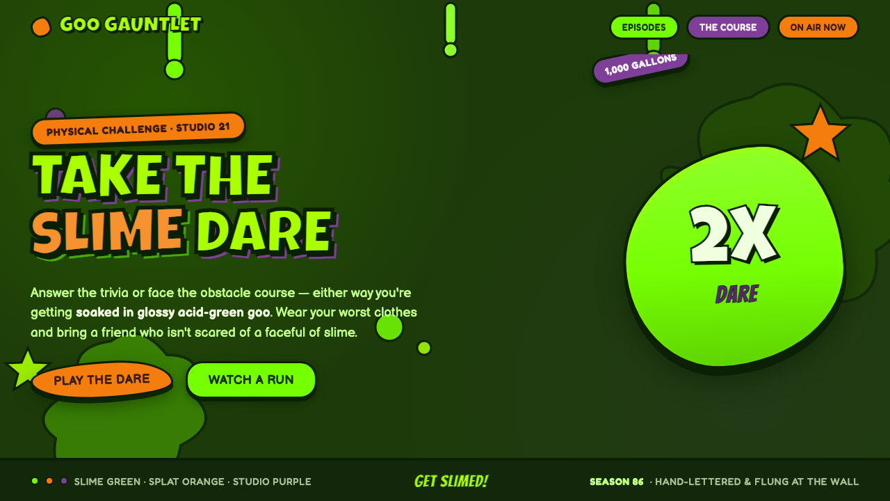 Nickelodeon Double Dare SlimeGet slimed. Glossy acid-green goo on deep slime ground, balloon caps and spla…
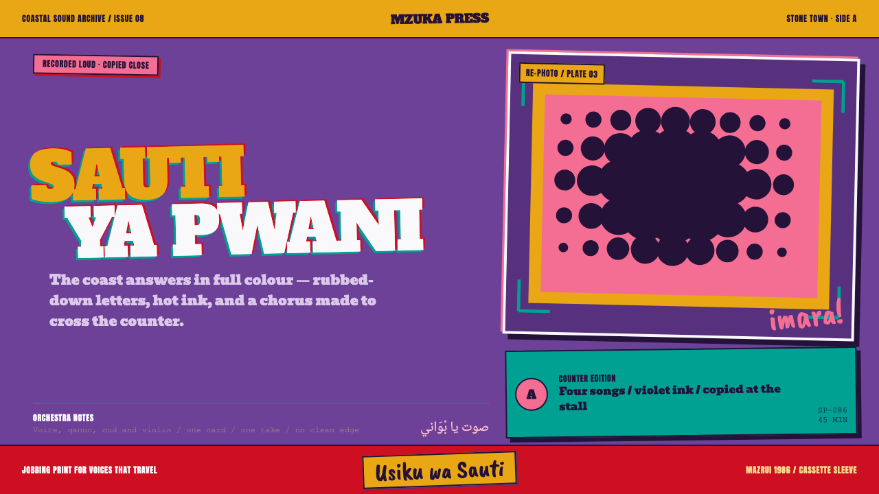 Taarab Cassette SleevePrints at full volume. Violet ink, coarse halftone, and crooked slab letterin…
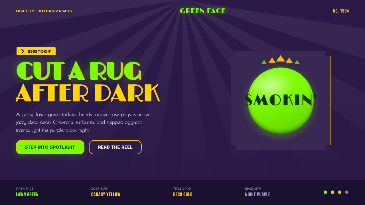 The Mask 1994 Green FaceLoud, theatrical, ssssmokin'. Lawn-green and canary-yellow scream against dec…
 80s Aerobics Fluoro SpandexNeon refuses restraint. Lime spandex, pink-cyan confetti, and black-stage typ…
 Angry Birds (2009)Adorable aggression takes flight. Candy primaries, chunky outlines, and a dot…
 Chicago HouseDarkness starts the track. Neon pink, yellow and cyan hit black like Xerox st…