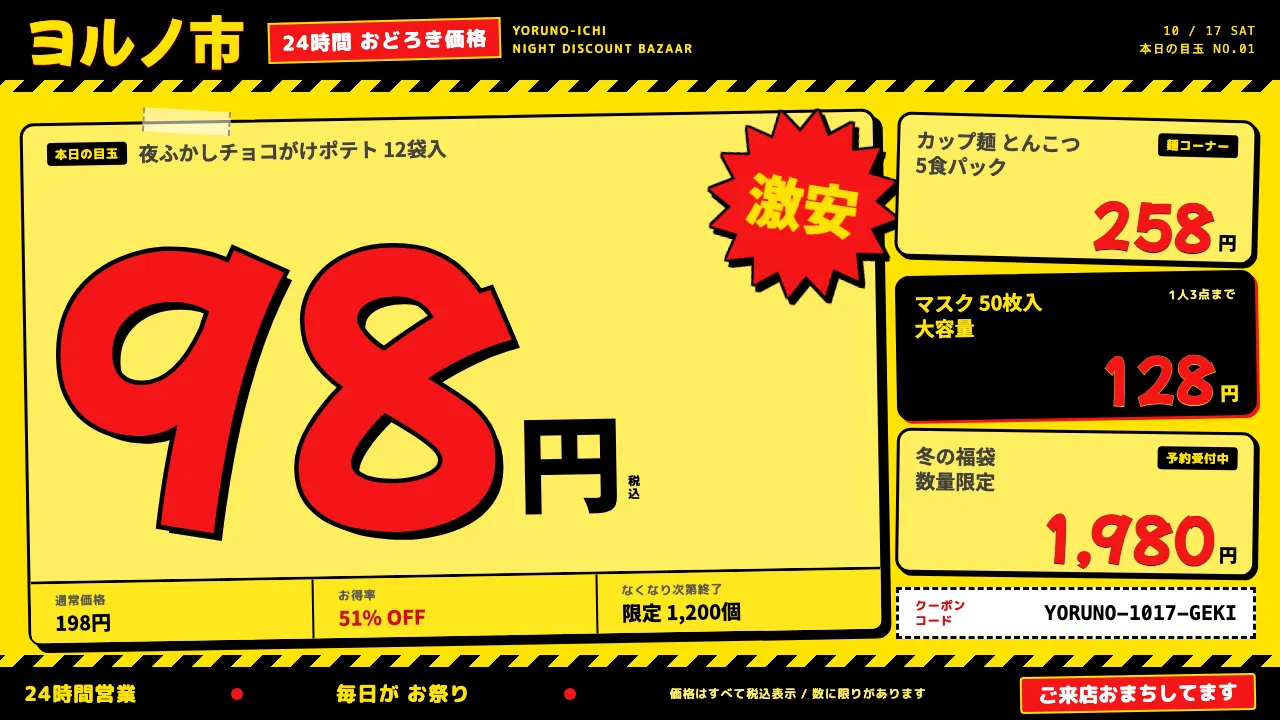
About Don Quijote
A design system lifted from the shop floor of Don Quijote, Japan's 24-hour discount chain. The page is the yellow POP card itself: process yellow #FFE200, with marker-red prices and thick black outlines on top.
Everything is loud on purpose. Cards tilt and overlap like taped-up signage, 激安 bursts break the grid, and prices run enormous next to a tiny 円. Use it when a product should feel like a treasure hunt, not a catalogue.
- Origin
- Fuchu, Tokyo, Japan
- Era
- 1989 first Don Quijote store in Fuchu, Tokyo; 24-hour national roll-out 1990s–2000s; current POP look ~2010s–2020s
- Key figures
- Takao Yasuda (安田隆夫) · Don Quijote in-store POP writers
- Movements
- Japanese hand-written POP (手書きPOP) retail signage · 圧縮陳列 compression display · Late-night discount amusement retail
Don Quijote design spec
Colors
Background
Surface
Primary
Secondary
Accent
Text
Typography
Mochiy Pop OneHeadings
Noto Sans JPBody
ui-monospaceMono
Unlock for 1 credit
The other 11 sections — buttons, cards, spacing, motion, techniques and more — open once you unlock. Download the DESIGN.md or send it to your AI in one click. Unlock once, yours forever.
Sign up nowHave an account? Sign in
Styles similar to Don Quijote
Also inspired by brands & products, with a close feel.
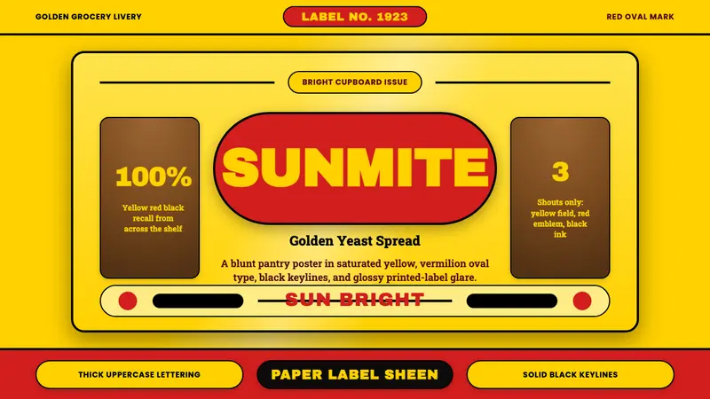 Vegemite Jar Label (1923)Instant pantry recall. Golden yellow, vermilion oval type, and hard black keylines.
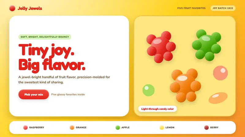 Haribo Goldbears (1922)Childhood joy, precision-molded. Glossy fruit colors tumble across a foil-gold ground.
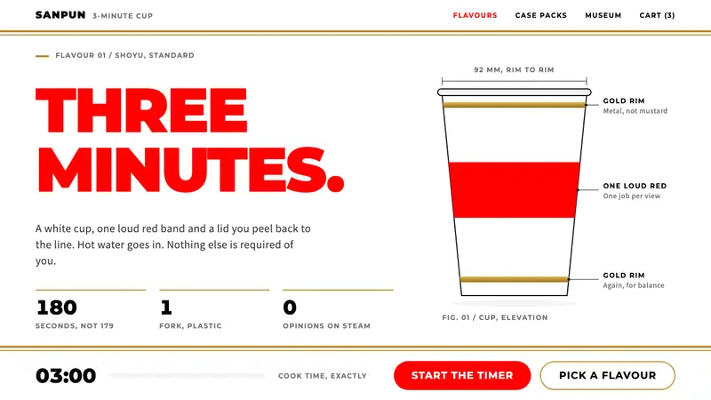 Cup NoodleA straight face on a three-minute meal. White cup, one loud red, gold rim bands, Montserrat caps.
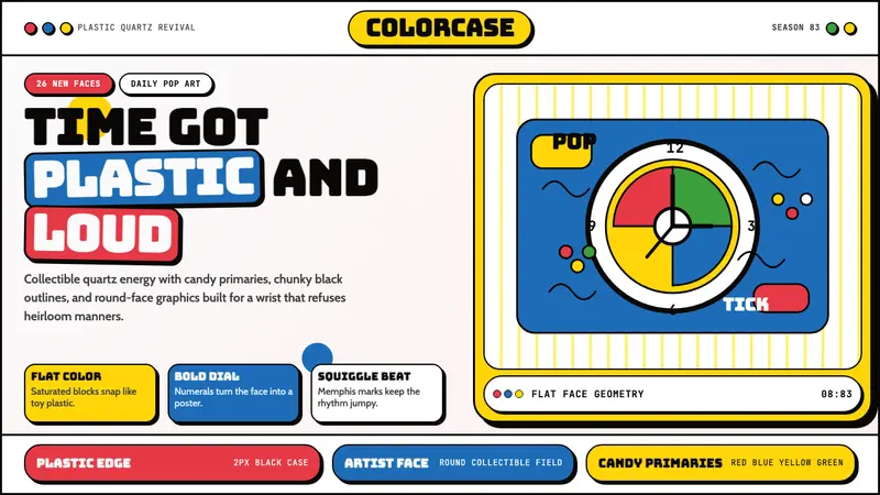 Swatch Watch (1983)Pop plastic optimism. Bungee type, candy primaries, round dials and squiggles snap loud.