What is diptyque?
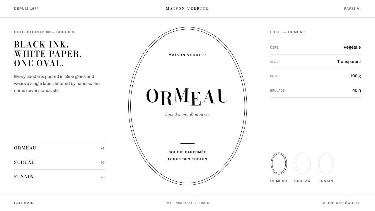
Diptyque’s oval label is design made from almost nothing: a white paper ellipse, a hairline black keyline, and a name drawn so that its letters seem to grow into the thing they describe.
diptyque in brief
The Diptyque oval label is the visual identity of a Paris house of candles and perfumes, and it is one of the most compact brand systems in modern packaging. A white paper oval is pasted onto clear glass. A hairline black keyline runs around its edge. Inside, a name is drawn by hand in capitals that will not sit still on the baseline. There is no colour on the label, no illustration beyond the lettering, and no ornament that is not also information.
The system is built on the house’s own stated code of black against white, solids and voids. Black ink is the only colour, white paper is the ground, and the two are allowed to complete each other rather than blend. One ellipse does all the framing work. Everything else on the page, whether a panel, a button or a product frame, is a plain rectangle, and the line drawings that accompany the labels keep to a single weight. Wide, centred margins give the small amount of content the feel of an object placed alone on a gallery wall.
What makes it unmistakable is the lettering. Each name behaves like a tiny picture: the word for the cypress stretches upward into a tree, the word for the gardenia scatters into petals. This is the old tradition of the calligram, in which words take the shape of what they name. On a label it produces a surface that reads two ways at once, as text and as drawing, and it makes the whole system feel hand-made even when it is reproduced at scale.

Where does diptyque come from?
Diptyque opened in 1961 at 34 boulevard Saint-Germain, in Paris’s sixth arrondissement. It was founded by three people, Christiane Gautrot, Desmond Knox-Leet and Yves Coueslant, whose trades were painting, stage design and architecture, and the shop began by selling fabrics rather than fragrance. That origin matters to the look. The identity grew out of the founders’ own crafts of line, staging and structure, and the label feels like something drawn for a particular wall rather than generated for a product category.
Scent came later. The first three candles date from 1963, and they set the pattern the house has kept ever since: white wax in a clear glass vessel, wrapped in coloured tissue paper, with a white oval paper label on the glass. Colour belongs to the tissue paper and never to the label, so the object can be bright while its identity stays black and white. The names on the labels were drawn by hand by Desmond Knox-Leet, and it is his lettering, with capitals that rise and sink and words that become the plants they describe, that gave the oval its personality.
The label draws on three older traditions, all named in the sources behind this theme. The first is French apothecary labelling: the plain paper labels of pharmacy bottles, which identify the contents by name and little else, and whose sobriety suggests that what is inside deserves care. The second is the eighteenth-century engraved medallion, the oval frame with a fine line around it that surrounded portraits and emblems in old printed books, and which gives the keyline its air of engraving. The third is hand-drawn calligram lettering, where the shape of a word carries part of its meaning. Together they explain why a label made in the 1960s can look both modern and antique: it was never tied to the graphic fashions of its decade.
The most unusual fact about the system is its continuity. The oval label has stayed in use through the 2020s, some six decades, with its logic essentially intact, in a field where packaging is normally redrawn every few seasons. That durability is a design result. A system built from one ellipse, one ink and a hand-drawn name has very little that can go out of date and very little that can be removed without breaking it. Black against white, solids and voids, is less a style guide than a set of constraints that kept every later decision small.
What defines the diptyque look?
Colour
The label has no colour at all. Black ink on white paper is the whole palette, and the theme honours that by keeping chromatic colour off the page entirely. Colour exists in the world of the product, in the tissue paper around the candle, but never in the identity. That makes anything a product brings to the page look more vivid by contrast, and it makes the system immune to colour trends.
The Oval
A single ellipse does all the framing. It is the only curved form in the system and therefore the only one the eye needs to learn; every other container is a plain rectangle. The oval is reserved for what matters most, the name, and treating it as a rare gesture rather than a repeated motif is what keeps it powerful. Used everywhere, it would become wallpaper.
Lettering
Names are set in capitals that ride up and down off the baseline, each letter nudged by hand rather than by rule. In this theme the capitals use a Bodoni-style face, whose sharp contrast between heavy stems and hairline strokes suits the thin keyline, and the irregular lift and drop echoes the drawn originals. Some words go further and turn into the plant they name. The effect is a signature rather than a typeface.
Line
Everything is drawn with a fine line. The keyline around the oval is a hairline, the accompanying illustrations are line drawings of a single weight, and even the button is only a thin outline with no fill. Using one weight everywhere removes hierarchy by thickness and forces hierarchy to come from size, position and the white space around each element.
Space and Rectangles
Margins are wide and centred, and content is laid out as plain rectangles. Nothing is pushed against an edge. The generous empty space around a name is part of the label, not an absence of design, and it is what gives a small piece of text the presence of an exhibited object. Symmetry is allowed here, which sets the system apart from many modernist idioms that avoid it.
Solids and Voids
The house’s own code is black against white, solids and voids. Black appears as weight, in lettering, thin rules and the occasional solid block, while white appears as the open ground that gives the black room to speak. The two are balanced, not blended: there are no greys, tints or gradients that would soften the contrast between them. The result is a page that reads like a printed plate.
Paper on Glass
The oval is a physical object, a paper label pasted onto a clear vessel, and the digital system carries that logic over by staying flat, matte and quiet. There are no simulated glass effects, no glossy highlights and no depth tricks. The page behaves like paper: it has a front, a keyline and a name, and it lets the product behind it supply any richness the identity declines to provide.

Who shaped diptyque?
One of the three founders who opened the shop at 34 boulevard Saint-Germain in 1961. The founding trio brought together painting, stage design and architecture, and the identity they produced shows all three at once: the drawn line of a painter, the staging of a single name against a blank wall, and the clear structure of a built plan. Her place in the record is a reminder that the label was a collective authorship, not the work of a single designer.
The hand behind the lettering. He drew the names on the labels himself, with capitals that rise and sink off the baseline and words that take the shape of the cypress or the gardenia. Because the names were drawn rather than typeset, each carries small irregularities that no font can fully imitate, and this is the quality designers are really borrowing when they work in the style: an impression of a person having written the name.
The third founder of the house, who opened the 1961 boutique alongside Gautrot and Knox-Leet. The shop that began with fabrics grew into a house of candles and scent, but the founders’ taste for plain structure and exact placement carried across the change of product. His name belongs in any account of the style because the label is best understood as the outcome of three people agreeing on how much to leave out.
How do you use diptyque today?
The Diptyque oval label style is best understood as a discipline of subtraction. It suits subjects that have a name, a character and a small amount of copy, and it fails the moment a layout starts adding things for their own sake. Applying it correctly means keeping the one ellipse, the one ink and the one weight of line, and spending all of the design effort on proportion, margin and the quality of the name.
For presentation slides, the style works best on covers and on single-idea content pages. A cover can place a title inside a thin oval on a plain white field, with generous empty space on all sides and nothing else on the slide. Content slides should be treated like pages from a catalogue: one statement, one rectangle, one line drawing at most. Data slides need restraint. Use thin lines, plain black marks and direct labels, and avoid fills; where several series must be told apart, vary the form of the mark rather than introducing colour.
For web interfaces, the style is a natural fit for product pages, collections, gift guides and any storefront where the objects should provide the colour. Keep the page white, the text black and the buttons as simple outlines. Present each product in a plain rectangle with a centred caption, and let the oval appear once, at the key moment, such as the hero name or a section opener. It is less suited to dense dashboards, because the single line weight and the absence of colour leave little room to encode status.
For editorial and marketing work, the style supports slow, confident layouts. A feature article can use a wide centred column, a hand-lettered or Bodoni-style title that drifts slightly off its baseline, and a short line drawing at the head of each section. Campaign material benefits from the style’s refusal to shout: one name, one frame, one line of copy. Seasonal colour belongs in the photography or the product, never in the type or the frame.
The most common mistake is to treat the oval as a decorative badge and repeat it across the layout, or to soften the system with a tint, a gradient or a drop shadow. Both undo what makes it work. A second frequent error is lettering the whole page with irregular baselines; the lift and drop belongs to the name alone, and body text must stay plain and level so that the name can stand out. Finally, do not enlarge the keyline into a heavy border. The strength of the oval lies in how fine its edge is.

diptyque — FAQ
Is this the official Diptyque brand identity?
No. This is a design system that reads the oval label as a visual language: a paper ellipse, a hairline keyline, black against white, and lettering that rides off the baseline. It is not an official brand kit, and the name, logo and artwork of Diptyque belong to the house. Use the style as inspiration for your own layouts and your own names, and do not present your work as a product of the brand.
Why does the system use no colour at all?
Because the house’s own code is black against white, and because colour is kept for the object rather than the identity. The coloured tissue paper wrapped around the candle supplies the vivid note; the label stays neutral so that it can sit beside any colour without clashing. On a screen the same logic gives you a page that can host any product image, any season and any campaign without redesigning the frame.
How do I get the hand-lettered look with ordinary type?
Set the name in capitals using a high-contrast serif such as a Bodoni-style face, then shift individual letters slightly above or below the baseline in an irregular, human-looking rhythm, never a regular wave. Do it for the name only. If a word names something with a recognisable shape, such as a tree or a flower, you can let a few letters lean toward that shape. Everything else on the page, including body text and captions, should stay level and plain.
Can the style work on a dark background?
The system’s premise is white paper and black ink, with a paper label pasted on clear glass, so a dark version changes the premise. If you must invert, keep the discipline: one ink, one ground, the same fine line, and no tints or accent colours. Accept that you are making a related style rather than the original, because the sense of a printed white label sitting on a vessel is lost once the ground goes dark.
What kinds of products and projects suit it best?
It suits anything defined by a name and a quiet sense of craft: candles, fragrance, stationery, boutique goods, small-press publishing, galleries, cultural institutions and personal portfolios. It is a poor fit for products that depend on dense data, loud promotion or rapid status signalling, such as trading screens, operations dashboards and discount-led retail. The style rewards content that can survive being shown alone in a lot of white space.
Related design styles
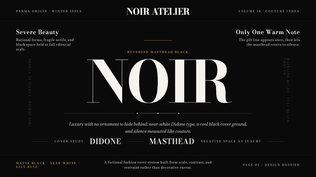 Bodoni Didone Fashion MastheadLuxury as black silence. White Bodoni, tiny coverlines, and one gilt hairline…
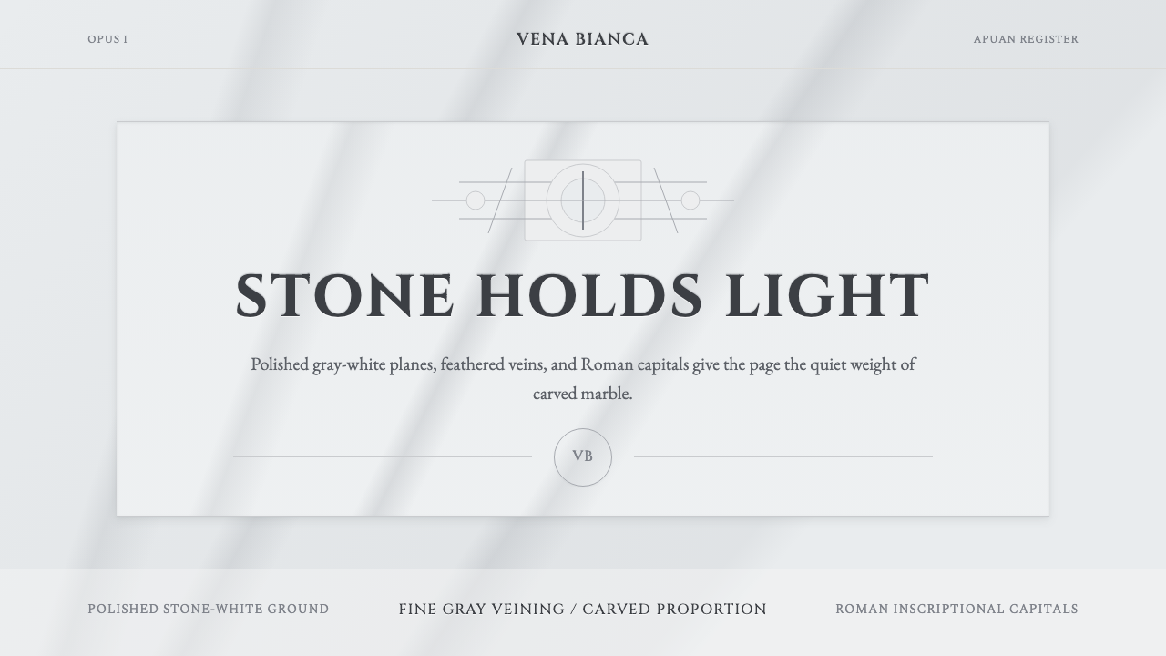 Carrara MarbleLuxury in restraint. Cool stone-white fields, feathery gray veins, and Cinzel…
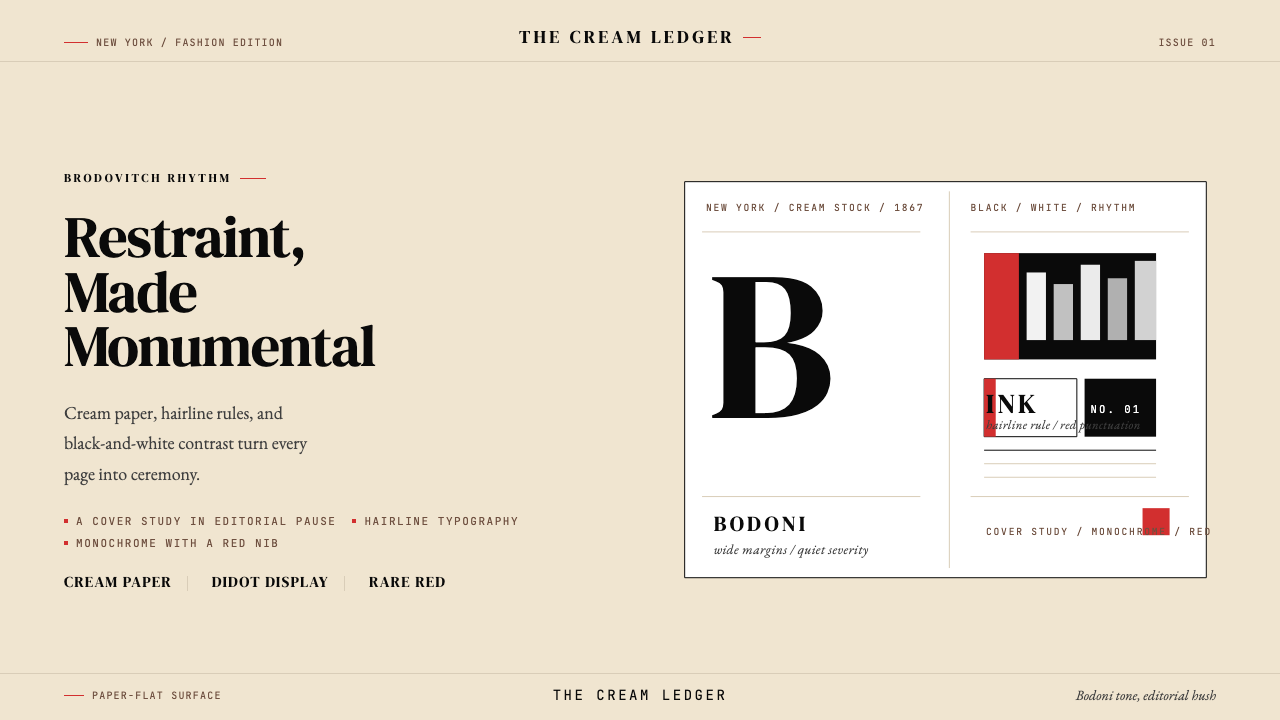 Harper's BazaarLuxury through restraint. Cream paper, Didot scale, and hairline rules carry…
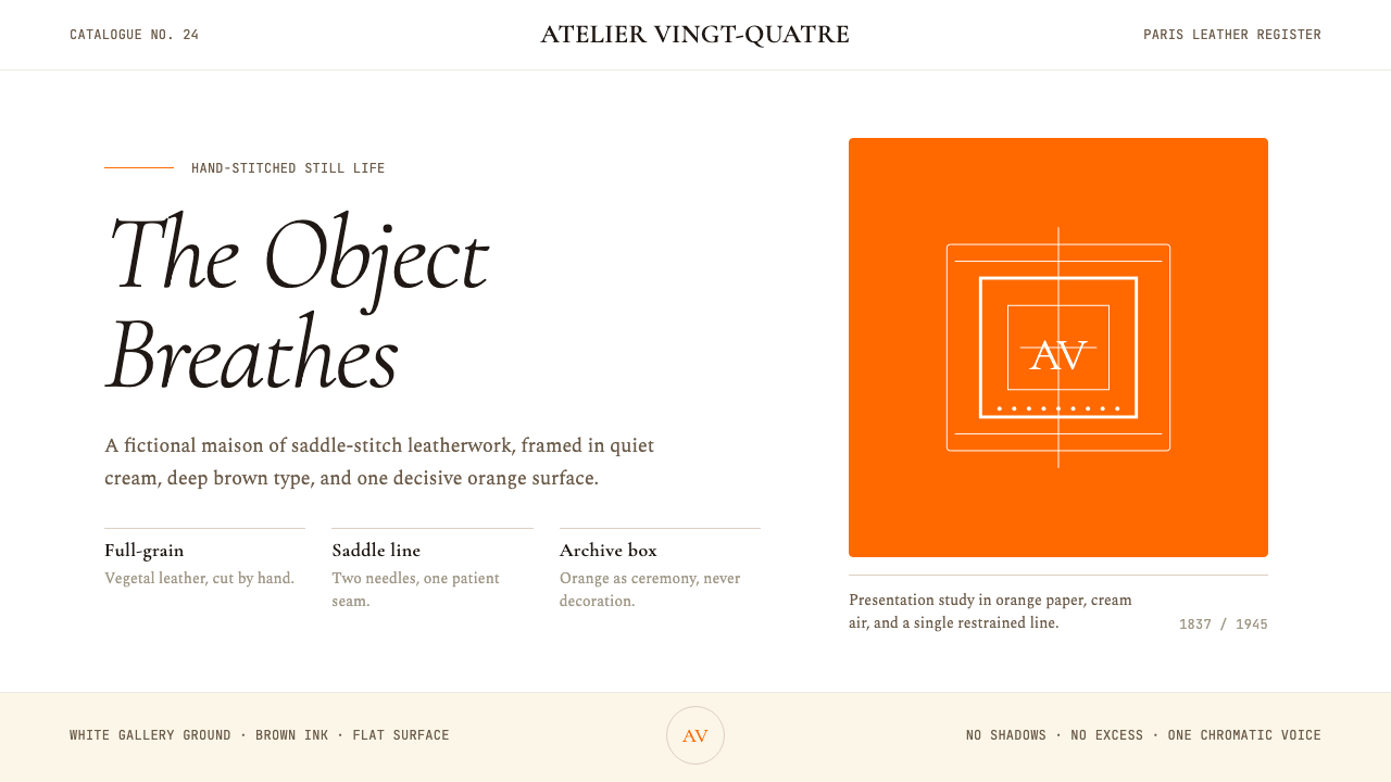 HermèsTwo centuries of restraint in orange. Brown serif on cream, gallery-quiet, ne…
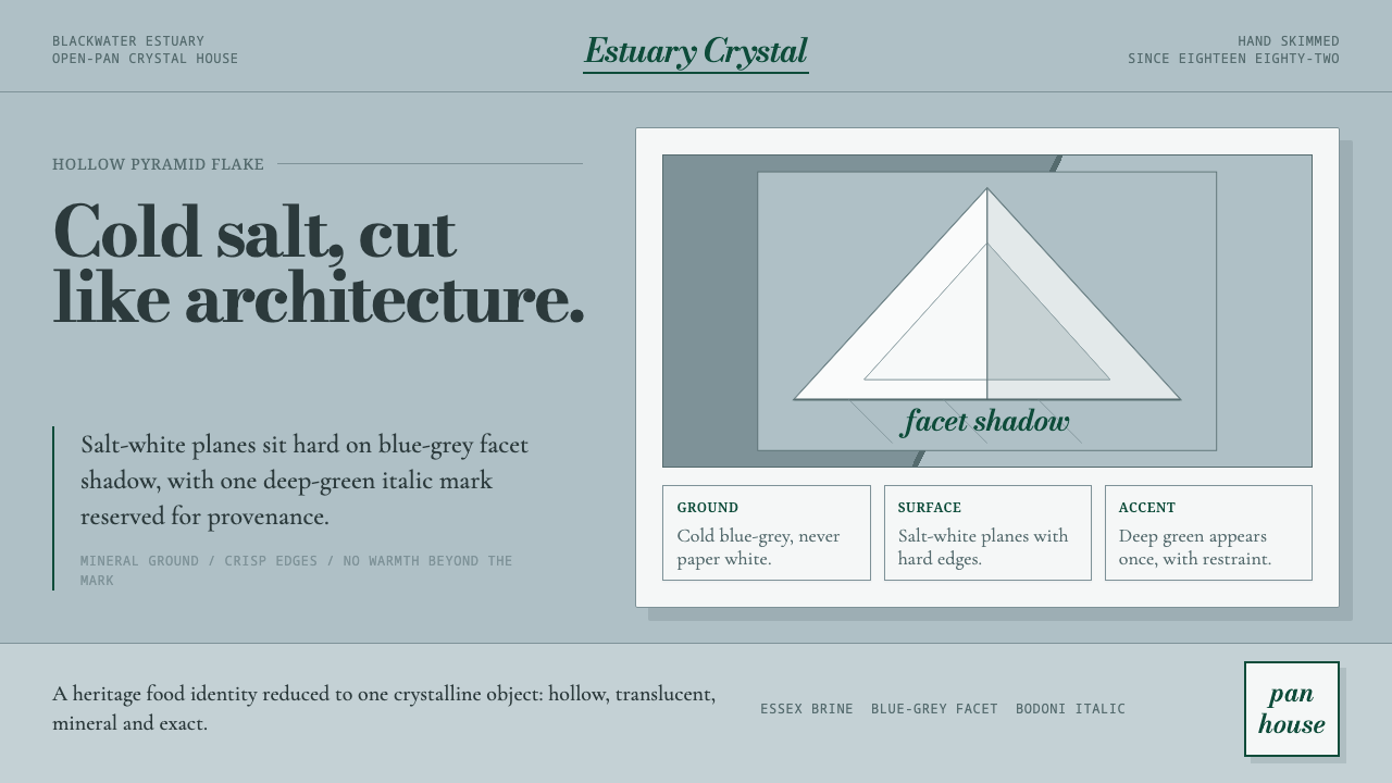 Maldon Sea Salt PyramidCold mineral luxury. Salt-white facets on blue-grey ground, struck once with…
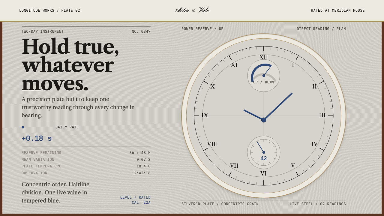 Marine ChronometerPrecision survives motion. Silvered concentric rings yield only to one blued-…