What is Detective Conan?
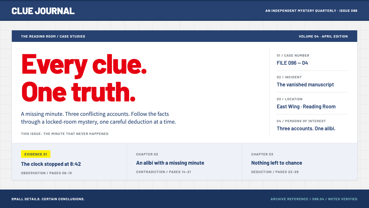
Detective Conan's look is a case file kept in perfect order: a pale grey brick wall, navy bands to divide it, and one red bowtie supplying every title.
Detective Conan in brief
Detective Conan is a design system drawn from the official broadcast site of the long-running Japanese detective franchise: a pale, cool-grey brick wall as the ground, navy bands that cut the page into sections, and a red taken from the hero's bowtie that supplies every title and highlight. Panels stay rectangular and orderly, the way a case file should.
Its color roles are unusually clear. Yellow marks evidence and solved cases. Teal handles gadget readouts and maps. Deep navy takes over the whole layout for the night-sky film sections that arrive every April, when the yearly movie is released. The result reads friendly on first contact but methodical underneath, because everything on the page is a labelled item in a sequence: a number, a place, a suspect, a clue.
It is a style for catalogues of things that have order: episode guides, character relationship boards, gadget directories, case archives and anything that benefits from the feeling of an investigation being sorted into folders. It is warm without being childish and tidy without being cold, which is the balance a mystery series needs in order to feel both inviting and rigorous.

Where does Detective Conan come from?
Detective Conan began as a manga by Gosho Aoyama in 1994. A TV anime adaptation followed in January 1996, and yearly feature films have been released since 1997. The story is set in the fictional Beika district of Tokyo, and its premise, a teenage detective who is physically shrunk and must solve cases in the guise of a child, has remained consistent while the franchise has grown into one of the long-running staples of Japanese popular culture.
The franchise sits at the intersection of several traditions. It belongs to the shonen detective manga line, adventure stories aimed at younger readers that nonetheless demand logical puzzles. It draws on the Japanese honkaku whodunit tradition, in which the mystery is a fair-play puzzle that the reader could in principle solve from the clues offered. And its yearly films are part of the Golden Week anime event-film calendar, which is why spring has its own seasonal visual identity.
Voices and creators matter to the identity. Gosho Aoyama created the series; Minami Takayama voices the title character and Kappei Yamaguchi voices the teenage detective in his original form, a pairing that is central to the character's double life. The visual language is therefore organized around the idea of two selves, a clever youngster and a composed investigator, expressed as a friendly surface over a systematic structure.
The system's immediate reference is the official broadcast site and the film posters of the 2020s. That visual identity has remained steady since the anime began, with the brick wall, the navy bands and the red accent recurring across seasons. The system distills it into a layout grammar in which every panel is a file and every title is a red tab.
What defines the Detective Conan look?
Brick-wall ground
The page sits on a pale, cool-grey brick field, light enough to leave text fully legible and patterned enough to give the layout a sense of place, as if it were a wall in Beika. The brick is a quiet, low-contrast texture, never a photograph. It makes the site feel like a physical setting where a case board might be pinned, without overwhelming the content on top.
Navy bands
Deep navy bands run across the page and divide it into sections. They act as headers, dividers and footers, and give the layout its rhythm of alternating pale and dark stripes. Text inside a band is set in white, which makes section titles easy to find at a glance. The bands are what turn a single long page into a series of orderly chapters.
The red bowtie
Red is the hero's bowtie turned into a color, and it supplies every title and highlight. It marks headings, key labels and the names that matter, with a Barlow-style sans-serif carrying the lettering. Because red is used for emphasis only, it keeps its force: wherever it appears, the reader's eye goes there first, the way it would to a clue.
Yellow and teal accents
Two supporting colors have fixed jobs. Yellow labels evidence and the markers for solved cases, so it signals that something has been found or resolved. Teal handles gadget readouts and maps, the technical side of the story. Keeping these roles strict means a reader can learn the code in a minute and then read any page by color alone.
Rectangular panels
Panels are rectangles with clean edges, arranged in tidy rows and columns, with consistent spacing between them. There are no pills or exaggerated curves. Each panel behaves like a file card with a title strip, a body and a footer, and fields inside it run in a fixed order: number, place, suspect. This orderliness is the point; the layout itself performs the logic of a case file.
Night-sky film mode
Every April, when the yearly film arrives, deep navy takes over the whole layout as a night-sky variant. The brick wall recedes, the navy fills the ground, and titles and highlights remain red and yellow against it. It is a seasonal mode within the same system, proof that the grammar can be inverted without changing its logic.

Who shaped Detective Conan?
Aoyama created Detective Conan as a manga that began in 1994. The franchise's orderly, puzzle-driven structure, in which each case has a place, a set of suspects and a solution, underlies the file-card logic of the visual system.
Takayama voices the child detective in the TV anime that began in January 1996. The voice is part of how the franchise's friendly surface is perceived, and that approachable tone is echoed in the system's warm but orderly look.
Yamaguchi voices the teenage detective in his original form. The contrast between the two voices, a youngster's and a composed investigator's, is central to the double identity that the franchise rests on, and the layout's friendly surface over a methodical structure mirrors that duality.
Beika is the fictional Tokyo district where the stories take place. Its everyday streets and brick-and-concrete setting are the imagined location that the pale brick wall of the visual system evokes, a plain urban backdrop for extraordinary puzzles.
How do you use Detective Conan today?
Detective Conan works best for content that is a collection of labelled items arranged in a meaningful order. Its personality is approachable, so it suits fan sites, media guides and catalogues far better than corporate reporting. The key is to keep the roles of its colors strict: red for titles, navy for structure, yellow for evidence, teal for gadgets.
For presentation slides, a cover can show a pale grey brick ground with a single navy band across the middle, the title in red above it and a short subtitle in navy below. Content slides work as case files: a navy header strip, rectangular panels with numbered items and a yellow tag on whichever point is the conclusion. Data slides suit bar charts in navy with a single yellow bar highlighting the solved or key value, and teal for map-like or technical readouts.
For web interfaces, build episode guides, character boards and item catalogues out of rectangular panels with a title strip and a fixed field order. Use navy bands for section headers and footers, red for headings and primary links, and a quiet brick texture behind the whole page. Detail pages can show a case-file layout, with a numbered header, location, suspect list and a yellow-tagged resolution. Pricing or plan comparisons, if needed, should be rendered as tidy cards of equal width rather than as flashy highlighted boxes.
For editorial and marketing work, use the style for franchise features, event announcements and character profiles. A navy band with white text can carry a section title, a red tab can mark a heading and a yellow label can flag the key reveal. For a seasonal campaign, switch to the night-sky variant, where navy fills the ground and red and yellow carry the emphasis.
The most common mistake is flooding the page with red. The bowtie works because it is rare; when everything is red, the highlights lose meaning. A second mistake is rounding the panels or adding soft shadows, which makes it look like a generic children's app and loses the case-file rigor. Lastly, do not drop the brick ground entirely; without it the system loses the sense of place that distinguishes it from a plain navy-and-white template.

Detective Conan — FAQ
What do the colors mean in this style?
Each color has a job. Red, taken from the hero's bowtie, marks titles and highlights. Navy forms the bands that divide the page and, in the film mode, takes over the entire ground. Yellow labels evidence and solved cases. Teal is for gadget readouts and maps. Pale grey brick is the neutral ground behind all of them. Keeping those roles consistent is what makes the layout readable like a case file.
What is the night-sky film mode?
Each April a new Detective Conan film is released, and the official visual identity shifts to a deep navy night-sky look for that season. In this system it is a variant in which navy replaces the pale brick ground, while red and yellow remain as the emphasis colors. It is a useful template for seasonal campaigns or any page that needs a darker, more cinematic version of the same grammar.
Is this style only for anime or mystery content?
It is strongest there, because its panels, numbers and tagged evidence map directly onto case files, episode guides and character boards. But the underlying idea, a friendly surface with a rigorous structure, transfers to any catalogue-like product: collections, archives, directories and reference sites. It is less suitable for brands that want a sleek, minimal or luxury tone.
Can I remove the brick texture?
You can simplify it, for instance by using a flat pale cool-grey, but the brick is what gives the page a sense of place. If you drop it, compensate with the navy bands and strict panel structure, otherwise the design reads as a generic navy-and-white template.
Which typeface does it use?
Titles are set in a Barlow-style sans-serif in red. Barlow has a slightly industrial, signage-like character that suits the orderly, file-card feel. Body text should stay in a plain, legible sans-serif, with hierarchy built from weight and color role rather than from additional decorative typefaces.
Related design styles
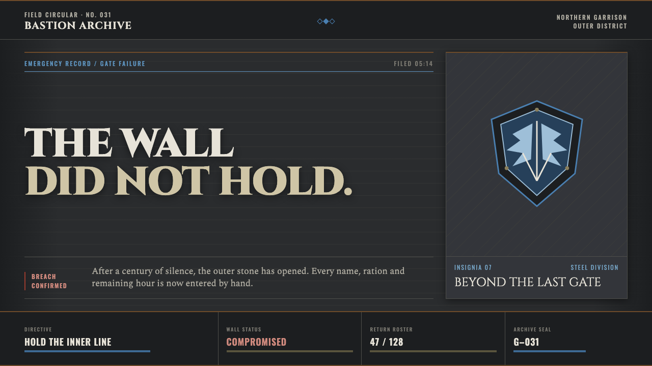 Attack on Titan (2013)Dread becomes duty. Stone-gray bands, engraved caps and one steel-blue crest…
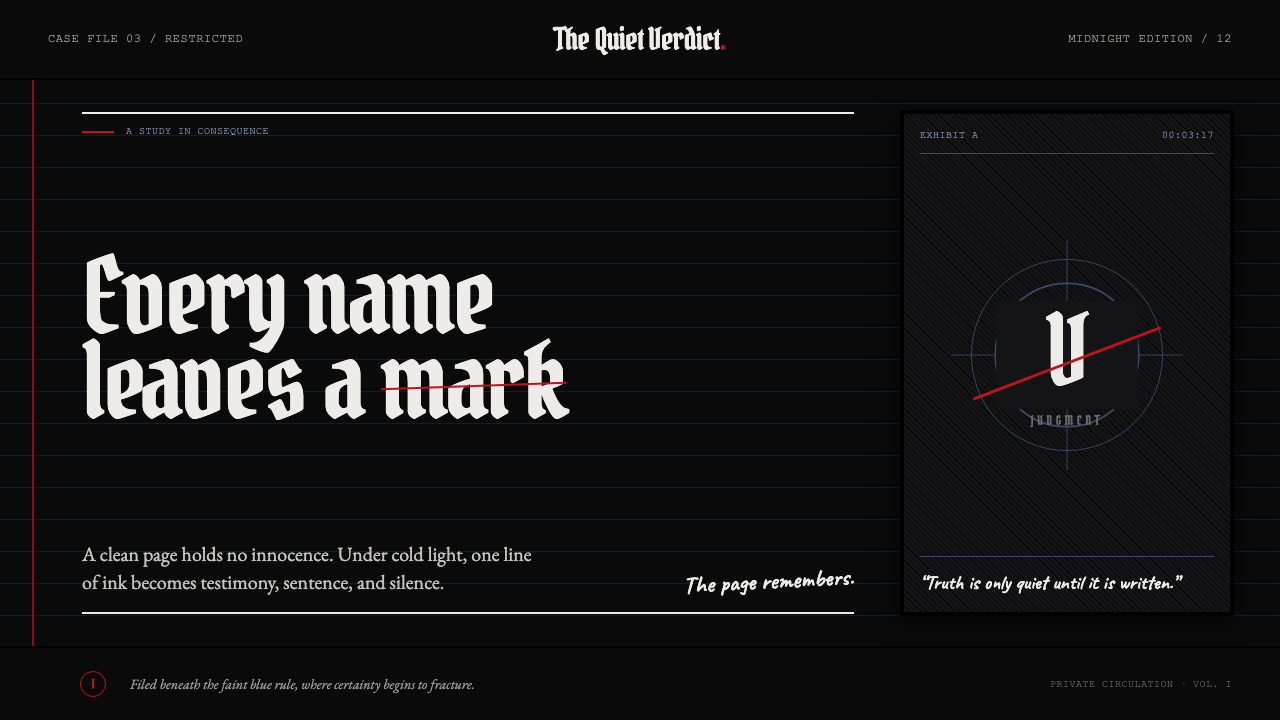 Death Note (2003)Silence becomes judgment. Bone-white blackletter and blue rules break under o…
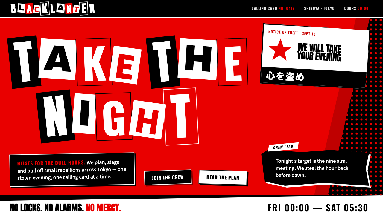 Persona 5Loud on purpose. Red slashes on black, white cut-outs, ransom-note lettering…
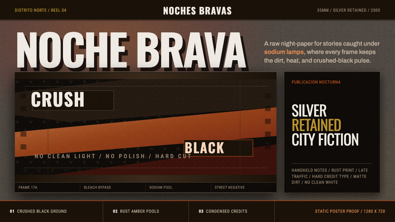 Amores Perros New WaveRaw street cinema. Crushed black, sodium amber, Oswald credits, heavy 35mm gr…
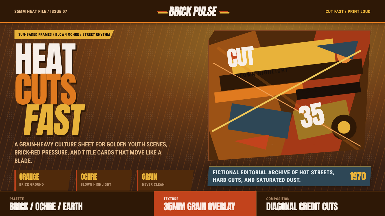 City of God FavelaHeat refuses polish. Orange brick, ochre glare, diagonal cuts, and grain do t…
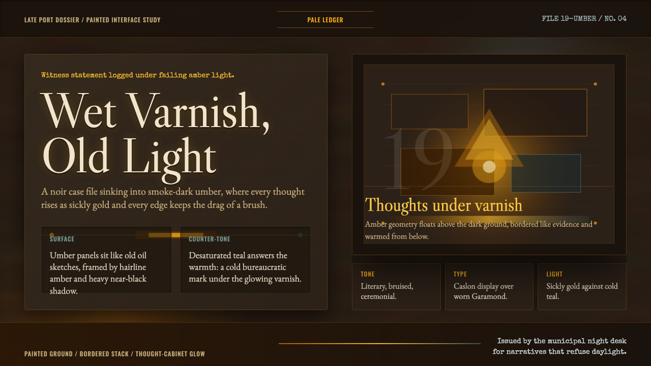 Disco ElysiumNoir rot glows from within. Amber Caslon type cuts through varnish-dark umber.