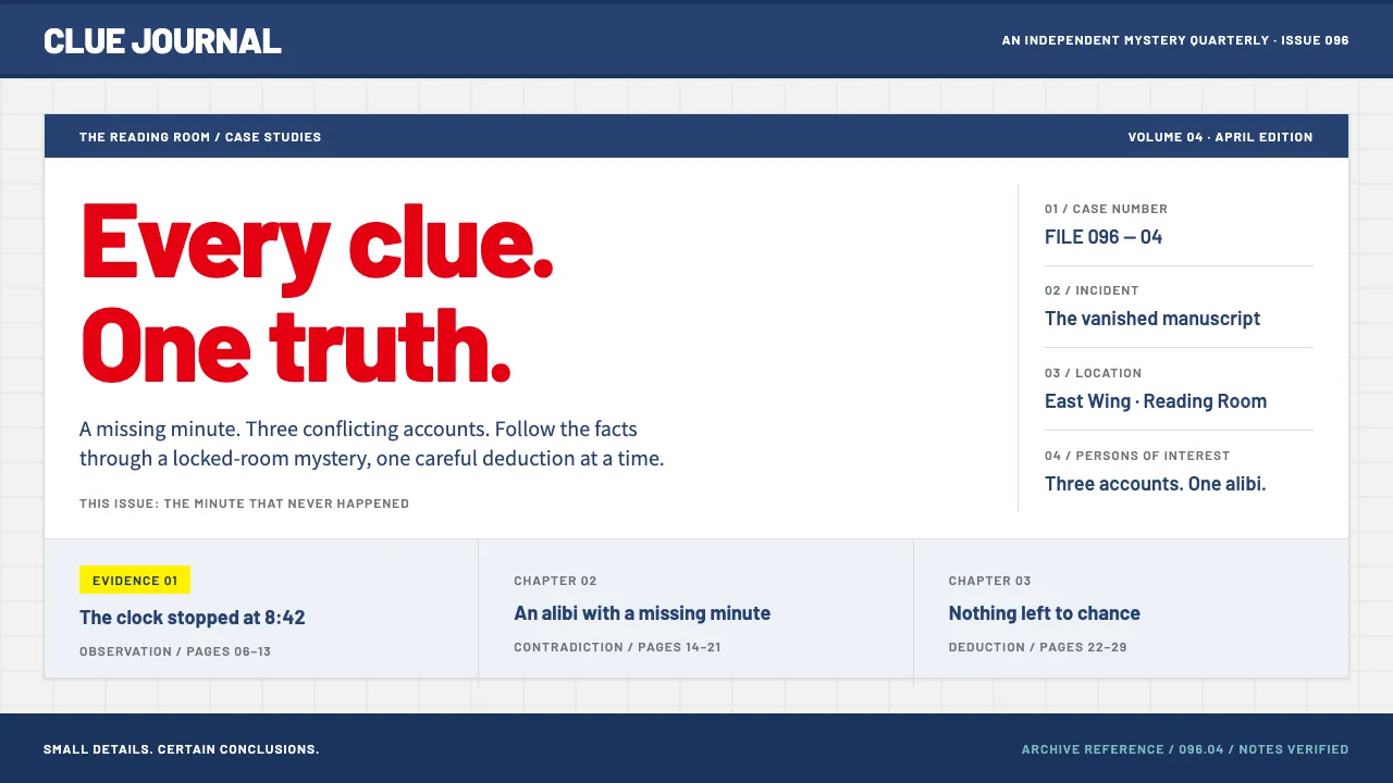
About Detective Conan
A design system drawn from Detective Conan's official broadcast site: a pale cool-grey brick wall split by navy bands, with Conan's red bowtie supplying every title and highlight. Panels stay rectangular and orderly, the way a case file should.
Yellow marks the evidence and the solved cases, teal handles gadget readouts and maps, and deep navy takes over for the night-sky film sections that arrive every April. It reads friendly but methodical, made for episode guides, character boards and catalogues.
- Origin
- Tokyo, Japan (the fictional Beika district)
- Era
- Manga from 1994; TV anime from January 1996; yearly films since 1997; current visual from the 2020s official site and film posters
- Key figures
- Gosho Aoyama · Minami Takayama · Kappei Yamaguchi
- Movements
- Shōnen detective manga · Japanese honkaku whodunit tradition · Golden Week anime event films
Detective Conan design spec
Colors
Background
Surface
Primary
Secondary
Accent
Text
Typography
BarlowHeadings
Noto Sans JPBody
Unlock for 1 credit
The other 11 sections — buttons, cards, spacing, motion, techniques and more — open once you unlock. Download the DESIGN.md or send it to your AI in one click. Unlock once, yours forever.
Sign up nowHave an account? Sign in
Styles similar to Detective Conan
Also inspired by film, games & music, with a close feel.
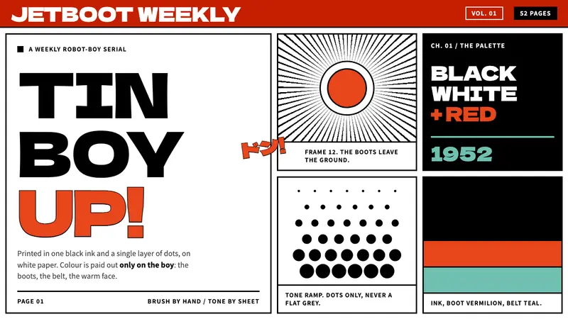 Astro BoyColour only on the boy. Black ink and benday dots on white paper, framed in hard-gutter panels.
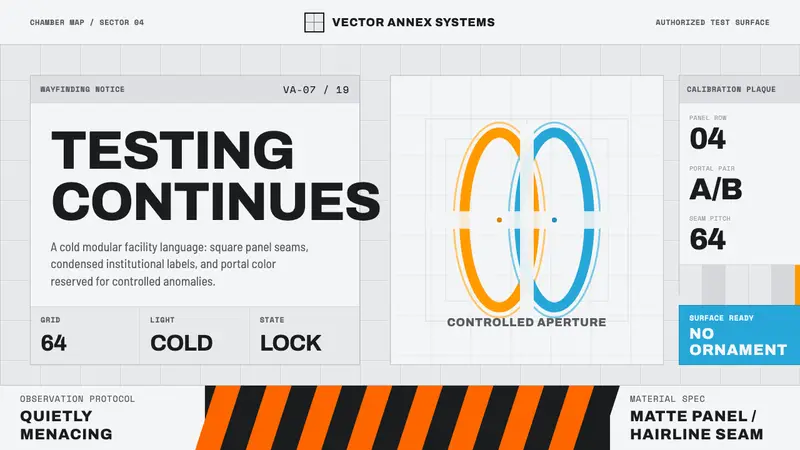 Aperture ScienceSterile authority. Cool panel seams, Archivo signage, and sparse orange-blue rings.
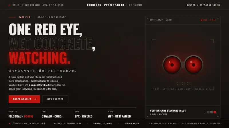 Jin-Roh KerberosSuppression as design. Wet near-black concrete, matte feldgrau, one infrared goggle glow.
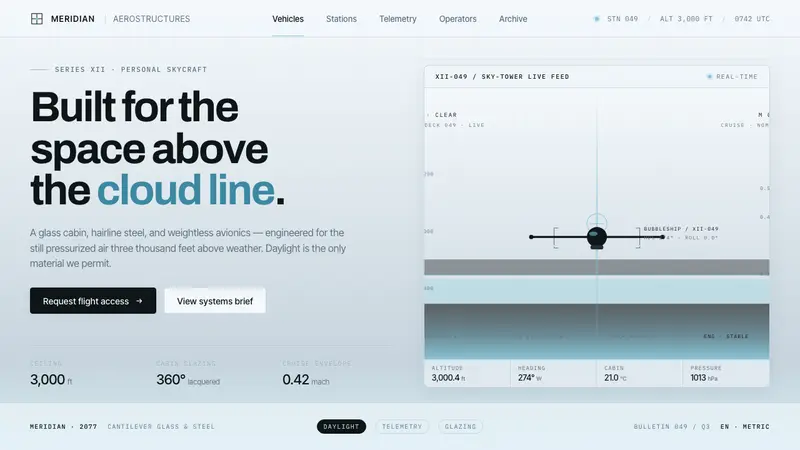 Oblivion Sky TowerSterile daylight futurism. Cool sky-grey glass, hairline steel mullions, a single cloud-cyan glow.