What is Ladislav Sutnar Information Design?
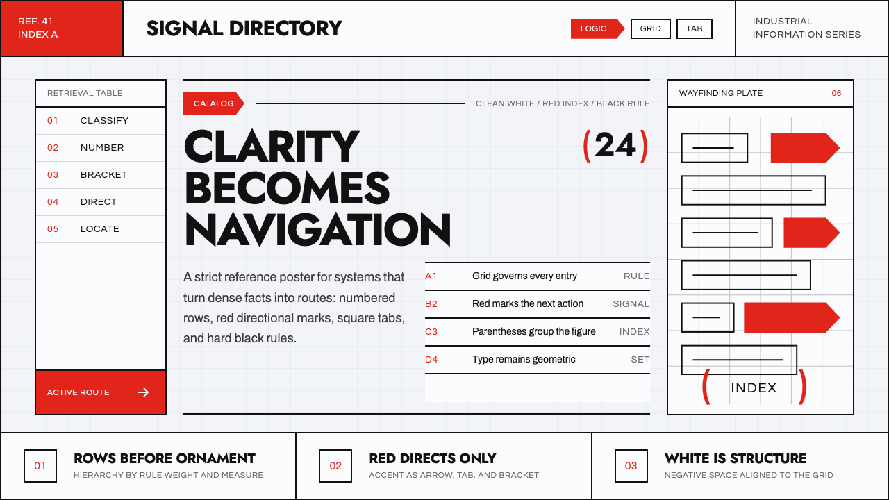
Ladislav Sutnar turned the deadliest kind of document — an industrial parts catalog thousands of pages long — into one of the twentieth century's clearest arguments for how information should look.
Ladislav Sutnar Information Design in brief
Ladislav Sutnar Information Design refers to the visual system Sutnar developed as art director of Sweet's Catalog, the American architectural and industrial product reference, between 1941 and 1960, building on a decade of functionalist graphic design work in interwar Czechoslovakia before that. It is one of the founding case studies of what is now called information design: the discipline of organizing large volumes of technical content so a reader can navigate it quickly, rather than simply illustrating or decorating it.
The underlying idea is that a page full of near-identical technical listings is not a display surface, it is a navigation problem. Sutnar treated hierarchy, color, and numbering as tools for finding things rather than for persuasion — a reader should be able to locate one product among thousands the way they find an entry in a dictionary, not by scanning an illustration. Ornament, illustration, and expressive typography were removed almost entirely in favor of devices that answer a single question: where am I, and where do I go next.
Visually, the system reads as cool and exact: a clean, near-white catalog ground, a single sharp vermilion red used as the one accent color, black carrying structure and body text, and geometric sans-serif letterforms set with generous, deliberate spacing. Tabs, arrows, and Sutnar's signature bracket-like marks sit directly in the grid as functional wayfinding devices rather than decorative flourishes — every graphic element in the system exists to answer a navigation question, never to fill empty space.
Where does Ladislav Sutnar Information Design come from?
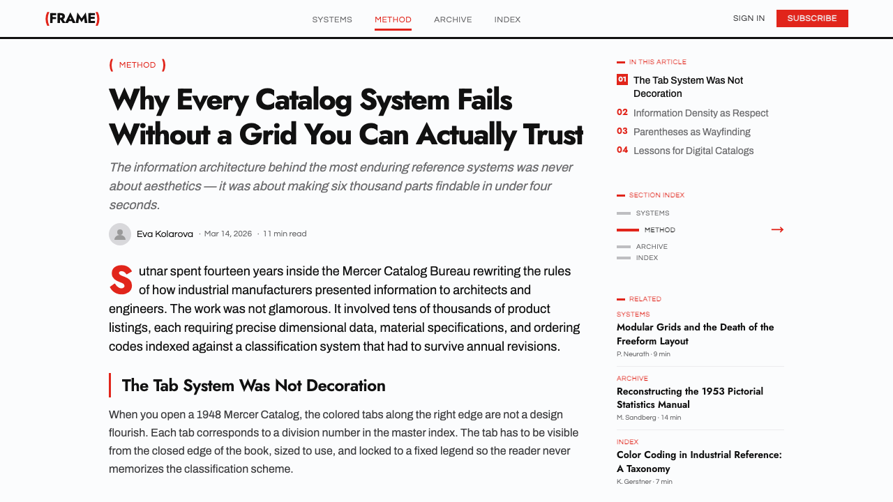
Sutnar was born in 1897 in Plzeň, Bohemia, and trained at the School of Applied Arts in Prague. He rose to become a central figure of Czechoslovak interwar functionalist design, serving from the early 1930s as director of the State School of Graphic Arts in Prague, where he taught a modernist, Bauhaus-adjacent curriculum, and as art director for the publishing cooperative Družstevní práce (Cooperative Work) and its magazine Bytová kultura (Living Culture), which championed a rational, unornamented approach to everyday design.
Exhibition work sharpened his instincts for wayfinding. Sutnar designed Czechoslovak displays for major international expositions, including the Paris International Exposition of 1937 and the New York World's Fair of 1939, developing exhibit graphics — arrows, symbols, wall diagrams — meant to guide a moving crowd through unfamiliar technical content. According to the documented account, he was in New York overseeing the Czechoslovak pavilion when the Nazi occupation of Czechoslovakia made returning home impossible, and he remained in the United States as an émigré designer for the rest of his career.
In America, Sutnar partnered with the Danish-American architect and design theorist Knud Lönberg-Holm at Sweet's Catalog Service, a division of the F.W. Dodge Corporation that published the multi-volume architectural and industrial product reference used by American architects, engineers, and contractors. Sutnar became its art director in 1941 and held the role for roughly two decades, applying the rational, unornamented training he had brought from Prague to a genuinely enormous information problem: making thousands of manufacturers' listings equally, quickly findable.
Sutnar and Lönberg-Holm went on to codify their method in print, most notably in the books Catalog Design Progress and Visual Design in Action: Principles, Purposes (1961), among the first texts to argue explicitly that a designer's job was to organize information for use, not to decorate a page. Sutnar continued into corporate identity and packaging work — including the Vera cosmetics brand — until his death in New York in 1976, by which point the vocabulary he had built at Sweet's Catalog had become a standard reference point for the emerging field of information design.
What defines the Ladislav Sutnar Information Design look?
Single-Accent Color Logic
The palette is deliberately narrow: a near-white ground, black for structure and body text, and one sharp vermilion red reserved entirely for wayfinding — tabs, arrows, index marks, and anything the reader needs to notice first. Because red never appears for decoration, its presence always means something, which is what makes the system fast to scan.
Geometric, Restrained Typography
Letterforms are geometric sans-serif, set with generous, even spacing rather than tight, expressive kerning. Type size and weight are used purely to signal hierarchy — a heading is bigger and heavier because it matters more, not because it is meant to feel dramatic. Nothing in the type system is decorative; every size change corresponds to a step in the reader's search path.
Modular Ruled Grid
Content sits inside a strict modular grid with visible ruled lines separating entries, columns, and sections. The grid is not hidden structure — the rules themselves are drawn and visible, functioning like the lines on a spreadsheet, so a reader always knows which cell of information they are looking at.
Arrows and Wayfinding Marks
Arrows point readers from one section to a related one; numbered tabs mark where a reader is within a sequence; and Sutnar's signature bracket-like marks — a personal device he used almost like a logo — frame key entries the way a highlighter would, but as a printed, permanent part of the layout rather than an added-on emphasis.
Numerals as Structure
Numbers are treated as primary structural devices rather than incidental data — large, prominent numerals mark sections, sequence steps, and entry counts, doing the organizing work that a decorative header or icon might do in a less disciplined system.
Flat, Printed Surface
There is no illustration, no simulated texture, no shading meant to imply depth. Every element sits flat on the page, exactly as it would on a printed catalog sheet — the system's clarity depends on nothing competing with the type and rule lines for the reader's attention.
Density Without Clutter
The system was built to hold an unusually high amount of information per page without feeling crowded, because every piece of content has exactly one place in the grid and one visual weight. Density comes from disciplined repetition of the same few devices, not from cramming varied elements together.

Who shaped Ladislav Sutnar Information Design?
Sutnar led Czechoslovak functionalist graphic design through the 1930s before emigrating to the United States, where as art director of Sweet's Catalog from 1941 to 1960 he applied that training to industrial cataloging at a national scale. His later books on visual design helped establish the vocabulary of what is now called information design as a distinct professional discipline.
A Danish-American architect and design theorist, Lönberg-Holm was Sutnar's closest collaborator at Sweet's Catalog and co-author of their books on catalog and visual design. His background in architectural theory pushed the collaboration toward treating information organization as a structural, almost engineering problem rather than a purely graphic one.
Originally a directory of building-product manufacturers and later a division of the F.W. Dodge Corporation, Sweet's Catalog was the reference American architects and engineers used to specify products. It was the working ground on which Sutnar and Lönberg-Holm built and proved their information-design methodology at genuinely industrial scale.
The Prague publishing cooperative Sutnar art-directed before emigrating, Družstevní práce and its magazine Bytová kultura promoted a functionalist, unornamented approach to everyday design in interwar Czechoslovakia — the direct ancestor of the disciplined, ornament-free vocabulary he later brought to Sweet's Catalog.
As director of this school from the early 1930s, Sutnar taught a modernist curriculum informed by Bauhaus pedagogy, training a generation of Czechoslovak designers in functionalist principles before the Nazi occupation forced him into American exile and redirected that training toward industrial cataloging.
How do you use Ladislav Sutnar Information Design today?
Sutnar-style information design is built for exactly one job: making a large volume of dense, similar content fast to scan and navigate. It applies well anywhere the primary user need is finding something specific quickly, and poorly anywhere the goal is to evoke a mood or tell a story — the system is deliberately indifferent to atmosphere.
On presentation slides, it is strongest on content and data pages rather than covers: a cover benefits from little more than the wordmark-like use of type and a single vermilion mark, while content slides can use the ruled grid directly, with numbered tabs marking each agenda item and arrows guiding the eye between related points. Data slides are where the system shines — tables, comparison charts, and step sequences read cleanly because every number, rule line, and label already has exactly one place to sit.
For web interfaces, the approach is close to ideal for dashboards, admin panels, and pricing pages, where a user is scanning many similar rows or tiers and needs to find differences fast. A pricing table built this way uses black for shared information across every plan and reserves the single accent color for the one plan or feature the reader should notice first; a dashboard uses ruled dividers and numbered sections instead of shadowed cards, so the interface reads like an instrument panel rather than a collection of floating boxes.
In editorial and marketing work, the system suits catalogs, spec sheets, technical guides, and any content built around comparison or lookup rather than narrative flow — tables of contents, index pages, and product comparison spreads all benefit from its wayfinding marks. It is less suited to long-form storytelling or emotionally driven brand marketing, where its clinical restraint can read as cold rather than trustworthy.
The most common mistake is using the accent color decoratively — scattering red across headlines or graphics for visual interest rather than reserving it strictly for navigation. Once red stops meaning 'look here,' the whole system loses its speed advantage. A second common error is softening the grid with rounded corners, drop shadows, or gradient fills; the system's legibility depends on flat, ruled, printed-looking surfaces, and any attempt to make it feel warmer or more contemporary in that particular way undermines the exact discipline that makes it work.

Ladislav Sutnar Information Design — FAQ
Is this the same as Swiss International Style?
They overlap in period and in their shared commitment to grids and sans-serif type, but the goals differ. Swiss International Style, which matured in the 1950s and 1960s, was built primarily for corporate identity and poster communication — a single strong message delivered with typographic elegance. Sutnar's system was built specifically for dense reference content, where the goal is navigating thousands of near-identical entries rather than delivering one clear message. Sutnar's work is arguably a direct ancestor of Swiss Style's grid discipline, but it is narrower and more explicitly functional — closer to a filing system than a poster.
Why is red the only color allowed to carry meaning?
Because a system built for speed cannot afford ambiguity. If a reader has to stop and decide what a color means every time it appears, the navigation advantage disappears. By restricting the palette to black for structure and a single red for 'notice this,' Sutnar made the color code learnable in seconds and then invisible — a reader's eye jumps straight to red without conscious thought, which is exactly what a catalog with thousands of entries needs.
Does this style work for consumer-facing products, or only technical ones?
It works best wherever a user is comparing, filtering, or looking something up — which includes plenty of consumer contexts: pricing pages, account dashboards, order histories, spec comparisons, settings panels. It struggles wherever a consumer product's job is to feel warm, playful, or aspirational, since the system's clinical restraint reads as efficient rather than inviting. The dividing line is not consumer versus technical, but lookup versus persuasion.
What do the bracket-like marks actually do?
In Sutnar's original catalog work, bracket-like marks functioned as a personal, almost logo-like signature that he also deployed functionally, framing an entry to mark it as especially important or as a cross-reference point — a printed, permanent equivalent of circling something on a page. In an applied system, the same device works as a call-out mark: a way to flag one entry among many as worth a reader's extra attention, without breaking the grid or adding illustration.
Is there a risk of this style feeling too rigid or impersonal?
Yes, and that is a real trade-off rather than a misunderstanding of the style. Sutnar's system was designed to disappear in service of the content, not to express personality, so applied without care it can read as sterile in contexts where a brand wants to feel human. The way to soften it without breaking it is to keep the grid, the numerals, and the single-accent color discipline intact while allowing typography size and generous spacing to carry warmth — the system was never meant to be cold for its own sake, only unwilling to let decoration slow a reader down.
Related design styles
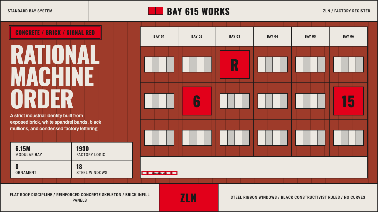 Baťa Zlín Functionalist BrandMachine-age precision. Brick red, concrete bands, and Oswald type lock into a…
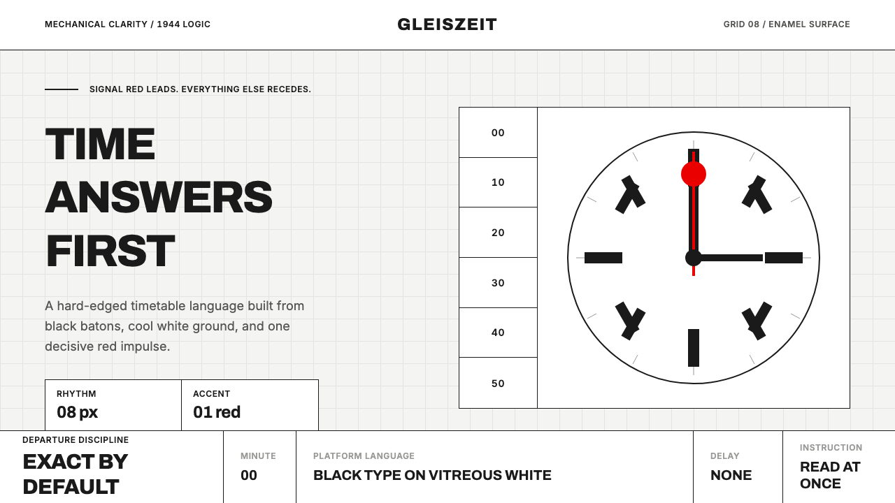 Swiss Railway ClockPrecision refuses decoration. Black batons and one red hand cut through ename…
 Iridescent Scarab DrawerOrder makes the shimmer read. Jewel scarabs pinned in a grid on black foam, m…
 Maritime Signal FlagsLegibility at sea. Red-yellow-blue flag grids cut across deep navy chart grou…
 Tube Map (Beck)Connection beats geography. Blue-red-yellow routes snap to a cool card grid.
 Cairo Metro WayfindingAuthority at speed. Enamel red, Arimo grids, and co-equal Arabic signage.