What is Maritime Signal Flags?
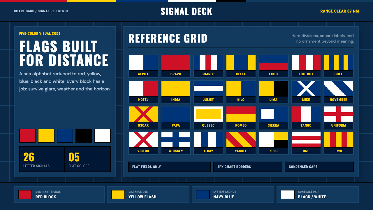
The International Code of Signals is the alphabet of the sea — twenty-six flags built from just five colors, chosen not for beauty but so a ship can be read from miles away.
Maritime Signal Flags in brief
Maritime Signal Flags is a design system built from the International Code of Signals, the standardized set of flags used to communicate between ships and with shore stations at sea. Twenty-six letter flags and ten numeral pennants each carry a distinct, geometric arrangement of blocks, stripes, saltires, or borders, and every single one of them is built from exactly five colors: red, yellow, blue, black, and white.
Nothing about this palette was chosen for visual appeal. Those five colors were selected because they remain distinguishable from one another at distance, against open water, in glare, and under a flat grey sky — conditions that would wash out subtler or closer-toned hues. The result is a visual system engineered entirely around legibility: flat color fields, hard crisp edges, and geometric patterns simple enough to be recognized correctly even when a flag is snapping in the wind and only partially visible.
Displayed as a reference chart — the way the full code is printed on training cards and chart-table references aboard ships — the flags read as a disciplined grid of functional contrast rather than a decorative pattern. This design system keeps that discipline intact: a deep navy ground evokes the chart card itself, and every visual choice is expected to justify itself the way a real signal flag must justify its exact pattern by remaining unmistakable at sea.
Where does Maritime Signal Flags come from?
Ship-to-ship flag signaling as a systematic practice took shape in the early nineteenth century, when naval officers began developing standardized flag vocabularies to replace ad hoc or purely tactical signals with a shared, learnable code. Admiral Sir Home Popham published an influential system, Telegraphic Signals or Marine Vocabulary, in 1803, which British naval forces used during the Napoleonic Wars, including famously at the Battle of Trafalgar. Captain Frederick Marryat followed in 1817 with his own widely adopted code intended for merchant shipping, extending flag signaling beyond naval use into general maritime commerce.
These early, competing systems were eventually consolidated into a single international standard. The British Board of Trade published the first Commercial Code of Signals in 1857, later renamed the International Code of Signals, intended to let ships of any nation communicate a shared vocabulary of navigational, safety, and operational messages regardless of the language spoken aboard. The code underwent major revisions across the twentieth century, including a significant 1934 update and a comprehensive 1965 revision that streamlined the flag vocabulary and clarified single-flag emergency signals — a version that, with subsequent amendments, remains the operational basis for the code used today.
The five-color restriction — red, yellow, blue, black, and white — was settled on because it produced the widest possible perceptual separation between flags at a distance and under poor visibility, rather than for any aesthetic reason. Individual flags carry meanings on their own — a flag commonly known by the phonetic word Oscar signals 'man overboard,' for instance — while sequences of flags can spell out words letter by letter or convey pre-agreed coded messages, giving the system both a fixed vocabulary of urgent single-flag signals and the flexibility of full alphabetic spelling.
Today the International Maritime Organization, the United Nations agency responsible for shipping safety, maintains and periodically updates the code as part of its broader mandate for standardized maritime communication, alongside the complementary voice-based phonetic alphabet used over radio. Beyond operational use, dressing a ship — flying the full set of signal flags for ceremonial occasions — has become a maritime tradition in its own right, and the flags remain a familiar sight in nautical training, yacht racing, and maritime heritage displays.
What defines the Maritime Signal Flags look?
Color
The palette is strictly limited to red, yellow, blue, black, and white — no other hues appear. Each color is used as a flat, fully saturated field rather than a tint or shade, because the entire point of the restriction is maximum perceptual separation at distance, not visual harmony or brand warmth.
Geometric Flag Motifs
Patterns are built from simple, high-contrast geometric arrangements — solid blocks, straight stripes, saltire crosses, and bordered fields — the exact vocabulary used across the twenty-six letter flags and ten numeral pennants. These shapes are chosen for how quickly they can be told apart, not for decorative variety, so the system favors a small number of clearly distinct motifs over an expansive shape library.
Flat Fields and Crisp Edges
Every shape has a hard, precise edge with no gradient, soft shadow, or blur, because a signal flag must be read correctly at a glance from a moving ship in changing light — any softness in the boundary between colors would work directly against its purpose. This carries through to how surfaces and dividers behave across the whole system.
Navy Chart Ground
A deep navy ground stands in for the chart-table reference card on which the full code is traditionally printed for training and shipboard use. This dark, saturated blue backdrop makes the red, yellow, black, and white flag colors read with maximum contrast, the way a printed reference sheet is designed to be scanned quickly under working conditions.
Functional Composition
Content is organized as a reference grid rather than a free-form layout, echoing the way the full alphabet and numeral set is traditionally displayed together for quick lookup. Every element earns its place by carrying identifiable meaning — a letter, a rank, a status — rather than by filling visual space.
No Decoration Without Meaning
The system's most absolute rule, inherited directly from the flags themselves: nothing appears unless it carries information. There are no ornamental borders, no decorative color washes, and no shape included purely for visual balance — every stripe, block, and saltire in the source flags exists because it distinguishes that flag from every other, and the design system holds itself to the same standard.

Who shaped Maritime Signal Flags?
Popham published Telegraphic Signals or Marine Vocabulary in 1803, an influential early flag-signaling system adopted by British naval forces, notably used at the Battle of Trafalgar. His work is among the foundational efforts to turn flag signaling from ad hoc practice into a standardized, learnable code.
Marryat published his own widely used signal code in 1817, extending standardized flag communication beyond naval use into general merchant shipping. His code was one of several competing national systems that the later International Code of Signals eventually consolidated into a single global standard.
The Board of Trade published the first Commercial Code of Signals in 1857, later renamed the International Code of Signals, establishing the first widely adopted single international standard for maritime flag signaling and replacing the patchwork of earlier national systems.
The IMO, a United Nations agency responsible for shipping safety and regulation, maintains and periodically updates the International Code of Signals today as part of its broader mandate for standardized maritime communication, ensuring the code stays current with modern shipping practice while preserving its historical flag vocabulary.
Dressing a ship — flying the full set of signal flags for ceremonial occasions such as holidays or celebrations rather than for operational messaging — turned the code's functional flag vocabulary into a maritime tradition of its own, and remains a familiar practice in naval and yacht-club ceremony today.
How do you use Maritime Signal Flags today?
Maritime Signal Flags works best where a message benefits from absolute legibility and functional authority rather than warmth or ornament, because the entire system is engineered around being read correctly at distance under poor conditions. Applying it well means respecting the five-color discipline and the flat, crisp-edged geometry, rather than treating red-yellow-blue as a generic nautical color scheme.
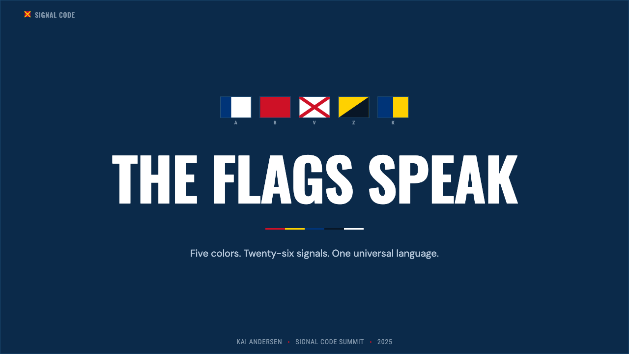
On presentation slides, the system is strong for data-heavy or status-driven content — dashboards of results, operational updates, or anything that benefits from being scanned quickly. A cover slide can use a single bold flag-like block pattern to establish tone, while content slides work best as a grid of flat, high-contrast panels rather than soft cards, echoing how the code itself is displayed as a reference chart.
For web interfaces, the system suits products built around status, monitoring, logistics, or safety-critical information, where dashboards and alert systems benefit from color used purely functionally — a specific hue reserved for a specific state, exactly as each flag reserves its pattern for a specific letter or meaning. Navy backgrounds with flat red, yellow, and white elements carry the system's authority into buttons, badges, and status indicators.
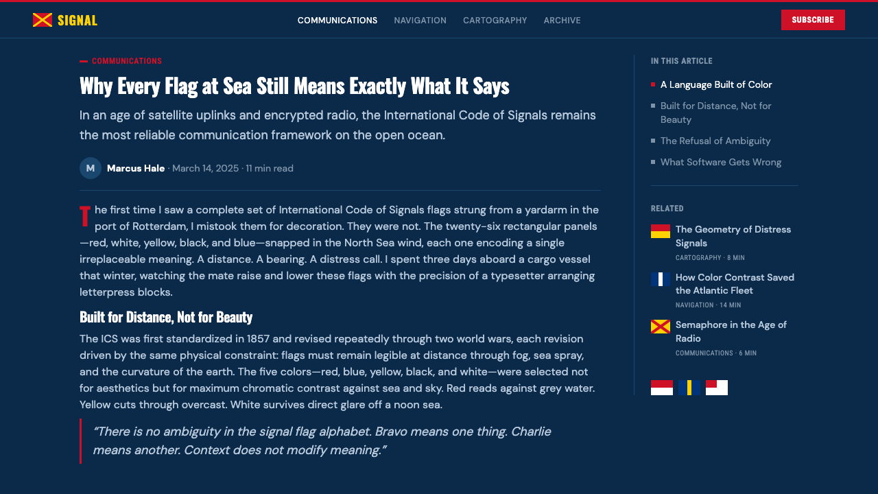
In editorial and marketing contexts, the system supports maritime, nautical, logistics, and adventure-travel storytelling. Long-form layouts benefit from treating section markers like flag pennants — small, geometric, high-contrast icons rather than decorative dividers — and pull quotes can sit inside a bordered field reminiscent of a flag's own frame. Marketing pages for maritime heritage or sailing-adjacent products read naturally within this system's disciplined, chart-like structure.
A common mistake is loosening the five-color restriction to include softer or additional hues for visual variety, which undermines the entire premise of a palette chosen for maximum legibility rather than aesthetic range. A second mistake is softening the crisp edges with gradients or shadows for a more modern feel; the hard edge is not a stylistic default here but a functional requirement borrowed directly from a system that has to be read correctly from a moving ship in changing weather.
Maritime Signal Flags — FAQ
Why do the signal flags use only five colors?
Red, yellow, blue, black, and white were settled on because they produce the widest possible perceptual separation between flags at a distance, in glare, and under a flat grey sky — conditions where subtler or closer-toned colors would blur together. The restriction is a functional engineering choice made for legibility at sea, not an aesthetic preference.
Does each flag mean something on its own, or only when combined?
Both. Individual flags carry standalone meanings — the flag commonly called Oscar, for example, signals 'man overboard' on its own. At the same time, sequences of flags can spell out full words letter by letter or convey longer pre-agreed coded messages, giving the code both instant single-flag emergency signals and the flexibility of complete alphabetic spelling.
How is this different from semaphore flag signaling?
Semaphore is a separate maritime communication system in which a signalman holds and positions two handheld flags in specific angles to represent letters, using body posture rather than a printed flag pattern. The International Code of Signals discussed here instead uses a fixed set of pre-made flags, each with its own permanent geometric design, hoisted on a line rather than held and posed by a person.
Who maintains the International Code of Signals today?
The International Maritime Organization, the United Nations agency responsible for shipping safety and regulation, maintains and periodically updates the code today, building on a lineage that runs from early nineteenth-century naval signal systems through the British Board of Trade's first international code in 1857 and its major twentieth-century revisions.
What is the most common mistake when applying this style to a design?
The most common mistake is loosening the strict five-color palette to add softer or additional hues for visual variety, which undermines the entire logic of a system built for maximum legibility rather than aesthetic range. A close second is softening the hard, crisp edges with gradients or shadows; the flat, sharp-edged look is a functional necessity inherited from real signal flags, not a stylistic flourish to be smoothed over.
Related design styles
 Iridescent Scarab DrawerOrder makes the shimmer read. Jewel scarabs pinned in a grid on black foam, m…
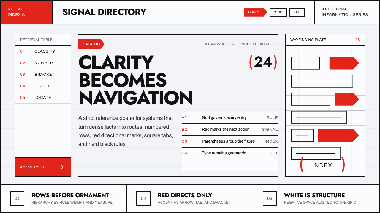 Ladislav Sutnar Information DesignClarity turns navigable. Vermilion tabs and brackets cut through a black rule…
 Swiss Railway ClockPrecision refuses decoration. Black batons and one red hand cut through ename…
 Aluminium Flight CaseRoadproof and exact. Diamond-plate gray, stencil type, black frames, blue-red…
 Asteroid Mining ConsortiumIndustry, not cinema. RAL enamel plates, hazard yellow and monospaced claim l…
 Baťa Zlín Functionalist BrandMachine-age precision. Brick red, concrete bands, and Oswald type lock into a…