What is Trading Pit Hand Signals?
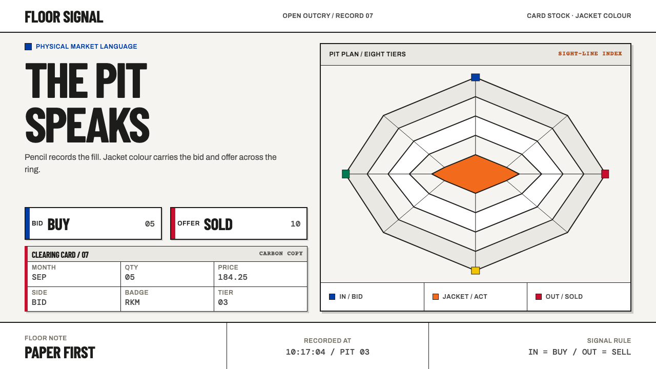
Trading Pit Hand Signals turns an open outcry trading floor into a design language — pale card stock, flat jacket colors, pencil-filled ruled boxes, and a visual grammar built for marks that must be read at speed.
Trading Pit Hand Signals in brief
Trading Pit Hand Signals is a design system drawn from the open outcry commodity pits of Chicago and London, the auction floors where buyers and sellers dealt face to face by shouting and gesturing rather than typing. Its visual language rests on two surfaces and nothing else: the hardened-paper trading card that a trader filled in with pencil, and the colored jacket on the trader's back. The result is a pale field of paper and cloth carrying flat, saturated blocks of orange, blue and red, with hard edges and a ruled grid underneath.
The idea at the heart of the style is that the interface belongs to paper and cloth, not to a terminal. The ground is never a grey screen; it is card stock or white cotton twill. Figures are never gradients or glows; they are solid jacket color cut into flat shapes. Information never floats; it sits in a box, and the box is ruled. Everything a viewer needs to know — price, quantity, month, who stands on the other side of the trade — has a fixed place, and the style makes that place visible.
What makes it unusual among historical styles is that it is a working vernacular rather than an art movement. There is no manifesto and no school. It is the look that accumulated because people in a crowded, loud room needed to pass numbers to each other and write them down before the market moved. Readers who know the pits will recognize the references; readers who do not will still be able to read the system, because its logic — buy side, sell side, five fingers, ten fingers — is legible from the surface.
Where does Trading Pit Hand Signals come from?
Open outcry is among the oldest ways of running an auction market: traders stand in a crowded pit, shout their bids and offers, and settle deals face to face. The tradition behind this theme belongs to the commodity and futures floors of Chicago and London — the Chicago Board of Trade and the Chicago Mercantile Exchange in the United States, and the futures exchange known as LIFFE in Britain — and the source dates the whole culture to the 1950s through the 1990s. What survives in the visual record is strikingly small. Open outcry ran on two surfaces and nothing else: a hardened-paper trading card, and the jacket on the trader's back.
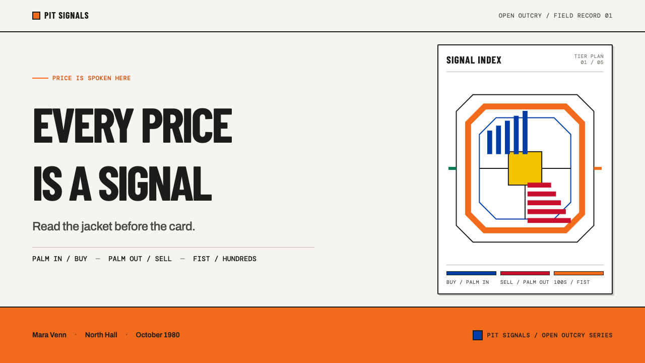
The card was the ledger. Price, quantity, contract month and the badge of the opposite broker went into ruled boxes in graphite — pencil rather than ink, because an entry could be wrong, reversed or amended within seconds, and the market moved faster than the hand. That single constraint explains much of the look: a grid of narrow boxes, a muted lead-grey mark on pale paper, and a layout designed to be filled quickly and corrected without a trace. Everything between the boxes was gesture. Palms turned inward meant buy, palms turned outward meant sell; fingers held vertically counted one to five, fingers held sideways counted six to ten, and a fist tapped against the forehead stood for hundreds. In a room where voices could not be relied on to carry, the body became a second channel, and a signal that could be seen across the pit did the work a voice could not.
Standardization arrived in stages. The source places the color-jacket era from the late 1960s and the standardizing of signalling in the CME pits from the early 1970s, which means that a floor around 1980 — the reference moment suggested by this theme's name — had both already in place. The jacket did something a face and a name could not do in a crowd: it turned a person into a block of color that could be read from a distance. Together with the abbreviations on the badges that identified the opposite broker on the card, the floor developed what the source calls vernacular signage — a system of marks that grew out of use rather than being commissioned as an identity.
The look is therefore a record of working equipment, not of an artistic program. The source names three influences: open outcry auction markets as the setting, floor-trader vernacular signage as the language of badges and abbreviations, and industrial workwear as the origin of the jacket's solid, saturated color. Among its key figures it lists a Chicago firm, PECO Inc., the market-regulation staff of the CME and the CBOT, and the floor locals of LIFFE — institutions and groups, not celebrated individuals. The theme turns that material into a screen-era system by refusing the screen's own habits: no grey terminal backgrounds, no glowing figures, nothing that could not have been printed on card or sewn onto twill.
What defines the Trading Pit Hand Signals look?
Card-Stock Ground
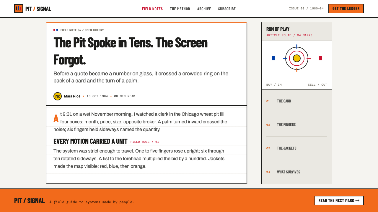
The field is pale and tactile: the off-white of hardened card stock and the cleaner white of cotton twill. It is never the grey of a screen. Because the ground is light, every mark on it reads as an addition — pencil, print or dyed cloth — and the page keeps a handled, physical quality even when it is entirely digital.
Jacket Color
Figures are drawn in solid, saturated jacket colors — orange, blue and red above all — laid down as flat blocks with hard edges. There are no gradients, glows or tints. The color behaves like dyed cloth: opaque, uniform and cut sharply at the boundary, so a shape is one color or another and never a blend of two.
Buy and Sell Logic
Red marks the sold side and blue marks the buy side, because that is how the original trading card was printed. This is not a mood palette but a semantic one. Once the pairing is chosen it must stay fixed across a whole composition, with orange taking the role of the bright workwear accent rather than a decorative extra.
Ruled Fields
Structure comes from ruled boxes and lines, the same rulings that held price, quantity, month and broker badge on the card. Fields are narrow, evenly spaced and identified by their position rather than by decoration. A good composition looks like a form that is half filled in: some boxes complete, some deliberately left empty.
Two Typographic Voices
Only two voices speak. A condensed grotesque sans-serif carries anything that has to be shouted across a pit: headlines, signals, large numerals. A typewriter-style monospaced face fills the fields, the way characters were written into the boxes of the card. The contrast between the compressed loud face and the evenly spaced quiet one is the typographic engine of the whole system.
Gesture as Structure
Direction and quantity are encoded spatially rather than with icons. In and out, vertical and sideways, one-to-five and six-to-ten: the hand-signal code is built from simple oppositions, and the layout borrows that habit — a block pointing into or out of a field, marks grouped in fives, a clear binary between two sides of a page.
Erasable Graphite
Pencil gives the system a second ink: a muted lead-grey line that sits quietly beside the loud jacket colors. Annotations, corrections and working marks belong to it, which keeps a clear hierarchy between what is a committed block of color and what is provisional writing that could still be changed.
Who shaped Trading Pit Hand Signals?
PECO is the first name in the theme's list of key references and is identified as a Chicago firm. Its presence in a list that otherwise names exchange staff and floor traders points to the material side of the pit — the cards, jackets and equipment of the floor — as the true source of this look, rather than any studio or art school.
The CME is where the source places the standardizing of hand signals, from the early 1970s. Market-regulation staff are the people who decide what counts as a valid signal and a valid entry on a card, so the discipline of the style — one fixed place for each datum, one fixed meaning for each gesture — is in effect an administrative artifact. Naming them credits the keepers of the rules rather than the performers.
The Chicago Board of Trade ran the other great Chicago pit complex alongside the CME, and its regulation staff are named as a second source of the floor's discipline. That the look is credited to two Chicago exchanges and a London one suggests a shared vernacular rather than one organization's brand identity.
LIFFE stands for the London side of the tradition. Locals — traders working for their own account — are the people who lived with the card and the jacket every day, so naming them places the look in daily use rather than in an archive. Their presence extends the style across the Atlantic and confirms that the pale card, the colored jacket and the ruled box were not a Chicago peculiarity.
How do you use Trading Pit Hand Signals today?
Trading Pit Hand Signals is best used when the content is made of numbers, sides and decisions: anything that has a buyer and a seller, a before and an after, a count to be kept. Its pale ground and flat color blocks suit work that wants to feel human-handled and accountable rather than sleek. The rule that applies everywhere is to treat the page as a card or a jacket — pale surface, solid color, ruled field — and never as a glowing screen.
For presentation slides, the cover works as a large flat block of jacket color set against a card-stock field, with the title in condensed grotesque type and a small monospaced line beneath it as if written into a box. Content slides should be built as ruled forms: two or three labeled fields, one dominant number set in the loud face, and a thin pencil-grey line holding the rest. Data slides are a natural fit, because the style already thinks in sides — red against blue, sold against bought — so a two-series chart can borrow that meaning directly instead of picking colors at random.
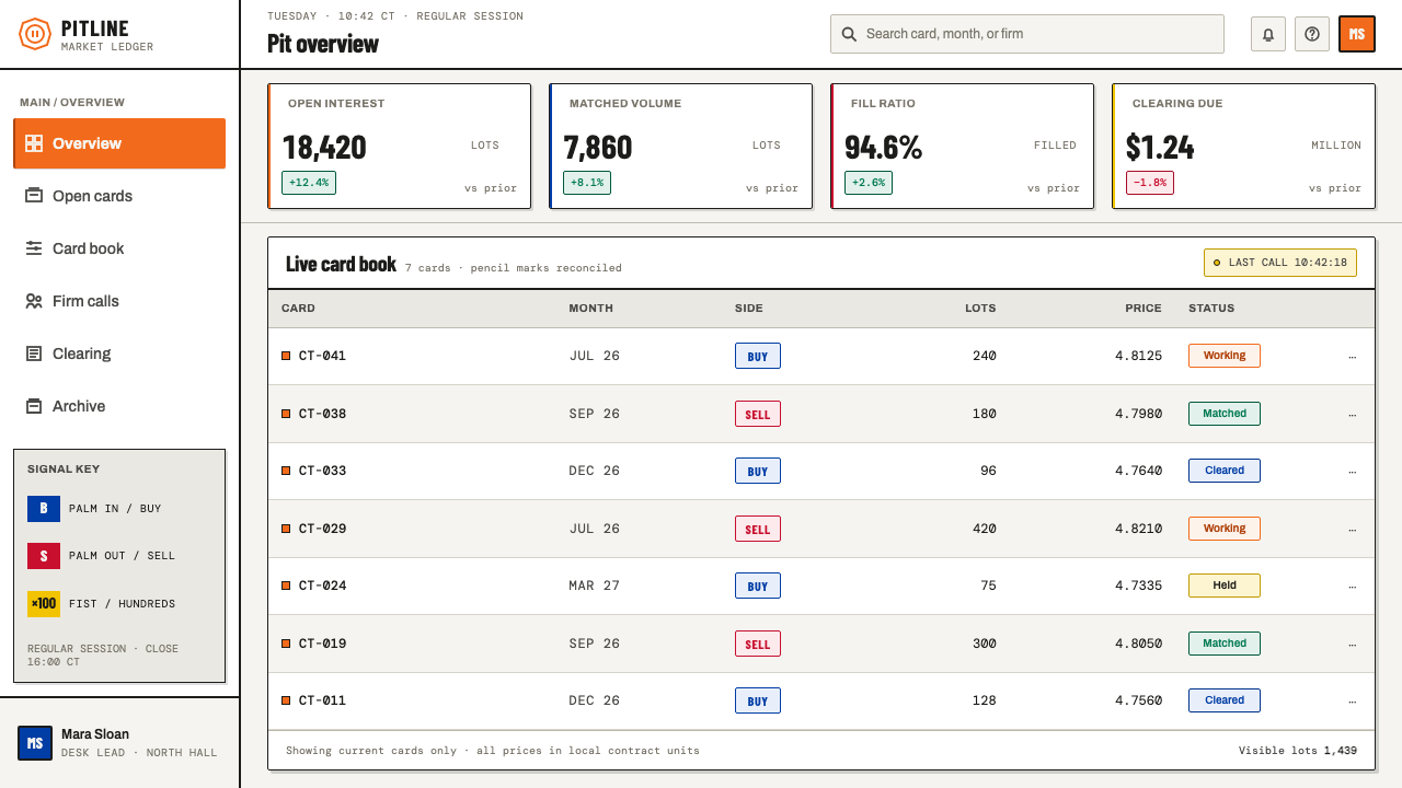
For web interfaces, the style suits order books, ledgers, scoreboards, schedules and dashboards where two sides must be compared at a glance. Keep the page background pale, draw tables with visible rules, set values in the monospaced face, and reserve the three jacket colors for meaning: one for each side of a transaction and one for the single element that needs attention. Pricing pages can use the same logic, treating each plan as a ruled card with its fields filled in. Avoid soft shadows and rounded glossy buttons; a flat block with a hard edge reads as more honest here.
For editorial and marketing work, the style gives a printed-matter voice: a narrow condensed headline, a monospaced caption, and full-width bands of flat color used as section dividers the way a jacket cuts through a crowd. It suits stories about markets, auctions, work done by hand and systems of signals. Captions can be set like card entries — label, value, small note — which gives long articles a strong rhythm of small, precise facts.
The most common mistake is to keep the colors and lose the surfaces: putting orange, blue and red onto a dark, glowing or glassy interface and calling it a trading-floor look. Without the pale ground and ruled fields the colors turn into generic pop. A second mistake is to use red and blue decoratively, which breaks the buy-and-sell meaning the pairing was built on. Choose which color means which side, and hold that choice from the first page to the last.
Trading Pit Hand Signals — FAQ
Is Trading Pit Hand Signals only for finance and trading products?
No, though finance is its natural home. The system is really about two-sided information filled into fixed fields, so it also suits ledgers, auctions, sports scoreboards, logistics boards, inventory sheets and anything built around a count. The things to avoid are products that need softness, glow or atmosphere, because the style depends on a pale ground and flat, hard-edged color.
Why are red and blue assigned to specific sides?
Because that is how the original trading card was printed: red for the sold side, blue for the buy side. The theme keeps the pairing literal, so color works as a label and not as decoration. If you use the style for something other than trading, keep the idea but choose your own two sides, then hold them fixed through the whole piece.
Can I use a dark background?
It is not recommended. The source is explicit that the field is pale, made of card stock and white cotton twill, and never a grey screen. The flat jacket colors only read as cloth when they sit on a light surface; on a dark ground they turn into glowing signals, which is exactly the terminal look the style rejects.
What typefaces does the style call for?
Two kinds, described by character rather than by name. A condensed grotesque sans-serif carries loud content such as headlines and signals, as if shouted across a pit. A typewriter-style monospaced face fills the fields, as if written into a card box. Mixing in a third decorative or serif face would break the two-voice logic.
Do the actual hand signals appear in the design?
Rarely, and they do not need to. The style borrows the logic of the signals — in versus out, vertical versus sideways, counts of five — as a way to organize space and direction, rather than drawing hands. If you do include a gesture illustration, keep it flat and cut-out in jacket color so that it matches the rest of the system.
Related design styles
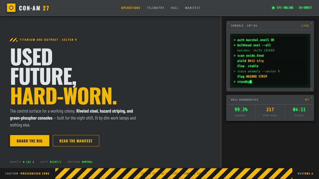 Outland (1981)Used-future industrial grit. Dim steel, caution-yellow hazard stripes, green-…
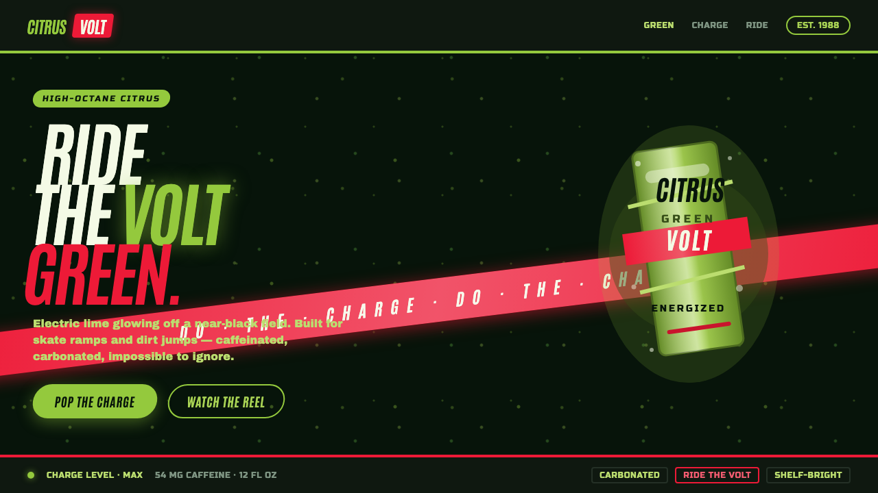 Mountain Dew Citrus GreenDo the Dew, loud. Electric lime glows off a near-black can field, slashed by…
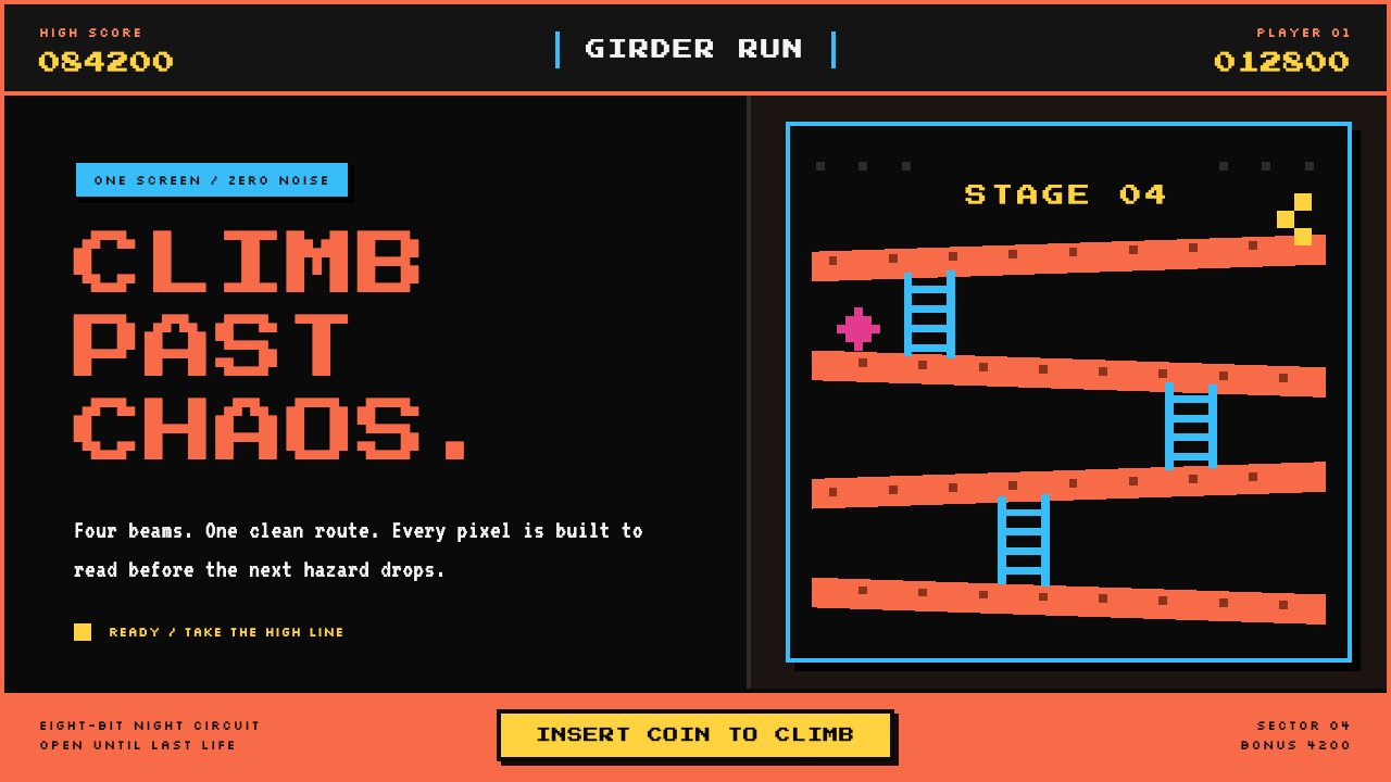 Donkey Kong (1981 Arcade)Built to read through the smoke. Coral girders and cyan ladders cut across a…
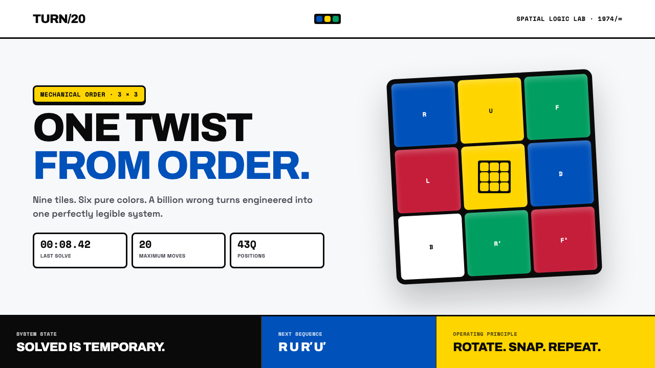 Rubik's Cube (1974)One twist from order. Six pure colors snap into a black-guttered 3×3 grid.
 Bloomberg Terminal (Amber CRT)Hostile data authority. Amber mono grids and four hard panels make black glas…
 Bloomberg Terminal (CRT Green)Hostile density wins. Orange CRT mono, black grids, and four-panel data walls.