What is Napster?
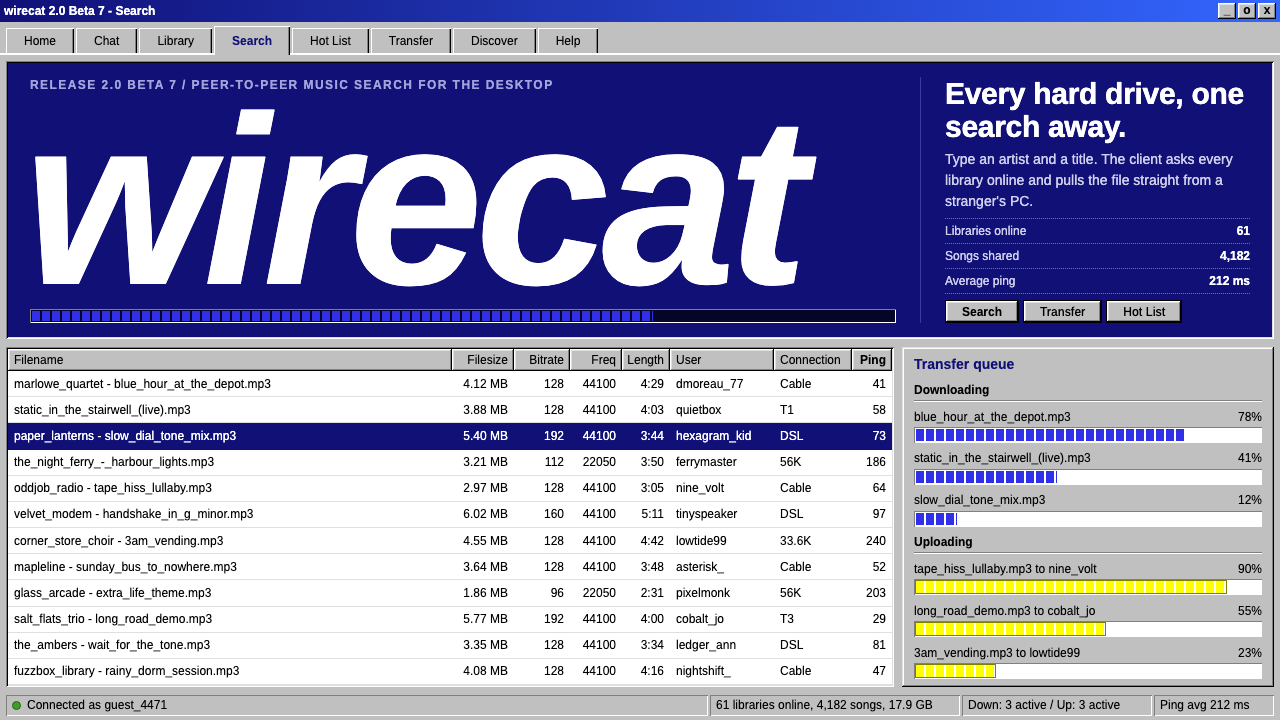
Napster as a design style is not a music app but a piece of Windows desktop software: grey bevelled windows, white sortable lists, and a status bar counting songs online.
Napster in brief
The Napster style recreates the look of the original Napster client from 1999 and 2000, a program that ran on Windows 98 and let people search for and trade music files with one another. It has almost nothing in common with later streaming apps. There is no album art, no like counter and no recommendation shelf. What it has is a grey window with a row of raised tab buttons across the top, and beneath them white list panes filled with file names, file sizes, bitrates, user names and ping times, one song per row.
The visual vocabulary is that of ordinary desktop software of the late 1990s. A neutral grey surface, the kind the operating system used for buttons and dialogs, forms the frame. Edges are square. Controls have a visible raised or sunken bevel, which tells you whether something can be pressed or typed into. Search fields are sunken, tabs are raised, column headers are clickable and sort the list when you click them. Information is dense and literal, and it can be read at a glance by anyone who has used a spreadsheet or a file manager.
Two small touches give the system its personality. Transfers are shown with progress bars, blue for what you are downloading and yellow for what other people are downloading from you, and the status bar at the bottom reports how many songs and libraries are online right now. The only graphic is the mascot, a cat's head wearing headphones, drawn with a dark navy outline, a white face and green eyes. Everything else is function.

Where does Napster come from?
Napster was released in June 1999, created in the United States, with roots in Boston and the San Francisco Bay Area. Its key figures were Shawn Fanning, Sean Parker and John Fanning. Fanning's program made it simple to find MP3 files on other people's computers and copy them directly, and it spread rapidly. The visual design the system recreates belongs to the client of 1999 and 2000, up to version 2.0 Beta 7 from July 2000. The network itself was shut down in July 2001.
Napster belongs to the first wave of peer-to-peer networks, in which users' own machines were both the library and the delivery system. That architecture explains the interface. If every row in a list is a file sitting on a stranger's computer, then the things you need to know are exactly those columns: how big the file is, how well it was encoded, who is sharing it, and how fast the connection is. The interface exposes the plumbing because the plumbing is the product.
The look also reflects the Windows 95 and 98 desktop that surrounded it. Programs of that period shared a common grammar: grey windows, bevelled buttons, tabbed panels, sortable list views and status bars. Napster did not invent that grammar. It simply used it without decoration, so that its client looked like a utility sitting next to a calculator and a file manager, which is how a lot of its users understood it.
Three source movements meet in the style: MP3 file sharing, first-wave peer-to-peer networks and Windows 95/98 desktop software. Together they describe an unusual design moment, in which a cultural turning point for music arrived wrapped in the plainest interface imaginable. The design system keeps that contrast: little visual ornament, a great deal of information, and a mascot who is the only hint of personality.
What defines the Napster look?
Grey bevelled chrome
The window frame, tab buttons and toolbars use the neutral grey that desktop operating systems of the era reserved for controls. Raised bevels mark things you can press, sunken bevels mark things you can type into or read from. The light and shadow on the edges are hard and symmetrical, which makes the surface feel like moulded plastic rather than glass.
White list panes
The main working area is a white pane of black text on rows, with columns for file name, size, bitrate, user and ping. Columns have clickable headers that sort the list. Rows are tightly packed and there is no imagery, so scanning is fast and the eye moves like it would over a spreadsheet.
Blue and yellow transfer bars
Downloads use blue bars and uploads use yellow bars. The two colours are the only strong hues in an otherwise grey and white interface, so they instantly tell you which direction data is travelling. Because they are the main source of colour, they are used sparingly and only for transfers.
Status bar
A strip along the bottom reports live facts, such as how many songs and libraries are currently online. It gives the whole product a sense of being part of a living network, and it follows the convention of desktop programs, where the bottom edge is where small status messages live.
Right angles only
There are no rounded corners, no soft shadows and no gradients. Everything is rectangular and aligned to a regular grid of rows and columns. This gives the interface a stern, industrial legibility, and it is the clearest visual signal that the system belongs to its era.
The headphone cat
The only mascot is a cat's head wearing headphones, drawn with a dark navy outline, a white face and green eyes. It appears small, as a logo and a loading mark, and never as decoration. Used with restraint, it provides a single point of charm against the rest of the utilitarian surface.

Who shaped Napster?
Fanning is listed as a key figure of Napster and the person associated with the original program. The client he built set the pattern the design system reproduces: a utility first, with nothing on screen that was not a working part of the file-sharing process.
Parker is named among the key figures behind Napster. His involvement belongs to the period in which a small utility grew into a service with a very large audience, which is why the client's interface had to be understood immediately by people who had never used peer-to-peer software.
John Fanning is listed as a key figure alongside the two founders of the programme. The source describes a company that took shape in Boston and the Bay Area, and the client's plain, dense look is the visible trace of how quickly the project moved from a personal program into a public network.
How do you use Napster today?
In slides, the Napster style is ideal for decks about the history of the internet, digital culture, music technology or the early web. Treat each slide as a window: a grey frame with a title bar, a row of tab buttons for section names, and a white pane inside. A cover slide can be a single window with the cat mark and a title in the list area. For content slides, a list view with a few columns is an effective way to present a comparison, a timeline or a product inventory.
On the web, the style suits dashboards, admin panels, file managers, log viewers and developer tools where information density is a virtue. Sortable tables with raised headers, sunken search fields and a status bar showing live counts are natural fits. For data presentation, rely on the table itself instead of charts; where a chart is required, use the two transfer colours, blue and yellow, as the only data hues and keep everything else grey.
In editorial and marketing work, it is a powerful nostalgia device. A retro landing page, a campaign about the early internet, or a documentary site can use a Napster-like window as its hero, with the content presented as a list of rows. It reads as authentic because it is not a pastiche of a style but a faithful reproduction of a working tool.
It also works as a deliberately unglamorous skin for personal tools and small utilities, such as a playlist manager, a library catalogue, a download list or a plain archive of files, where users value speed and clarity over polish. The raised and sunken bevels give the interface its sense of what is clickable without any need for colour.
The most common mistake is to modernise it halfway. Rounded corners, soft shadows, translucent panels or a bold brand colour destroy the style at once, because its whole identity is the grey, square and bevelled surface. The second mistake is to add album art and decoration, which turns a dense utility into a streaming app and removes the contrast that makes it interesting. Keep the rows packed, the colour limited to the transfer bars, and the mascot small.

Napster — FAQ
What is the Napster design style?
It is a recreation of the original Napster desktop client of 1999 and 2000: a grey Windows 98 style window with raised tab buttons, white sortable lists of files, blue and yellow transfer bars, a status bar counting songs online and a mascot cat wearing headphones. It is about dense, literal, working software rather than modern streaming design.
Is this the same as a modern music streaming interface?
No, it is nearly the opposite. Modern streaming apps are built around album art, recommendations and smooth surfaces. The Napster style has no album art, no recommendations and no rounded corners, and it presents its content as columns of file details like a spreadsheet or a file manager.
What are the blue and yellow bars?
They are the transfer indicators. Blue bars show files you are downloading from other users, and yellow bars show files other users are downloading from you. They are the main splash of colour in a grey and white interface, so reserve them for transfers or equivalent data flows.
Which design movements does it draw on?
Three: MP3 file sharing, first-wave peer-to-peer networks, and the Windows 95 and 98 desktop software tradition. The last one provides the visual grammar of bevels, tabs, list views and status bars, and the first two provide the content and the reason the interface exposes so much detail.
When should I avoid using it?
Avoid it for products meant to feel soft, premium or image-led, such as lifestyle brands, photography portfolios or consumer-facing storytelling. Its strengths are density, legibility and nostalgia, so it works best for tools, tables, retro projects and anything where users value information over atmosphere.
Related design styles
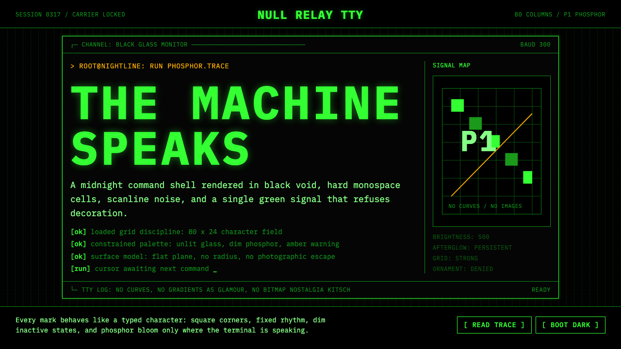 CLI Hacker Phosphor Green (1985)Pure terminal myth. Black glass, P1 green mono type, scanlines, and rigid 80-…
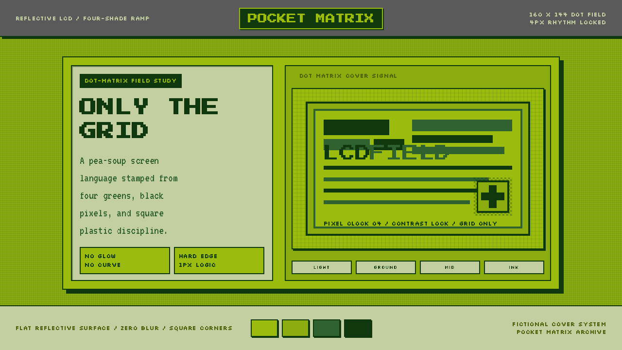 Game Boy DMG Green ScreenOnly the grid remains. Olive LCD tones, pixel type, and hard black borders.
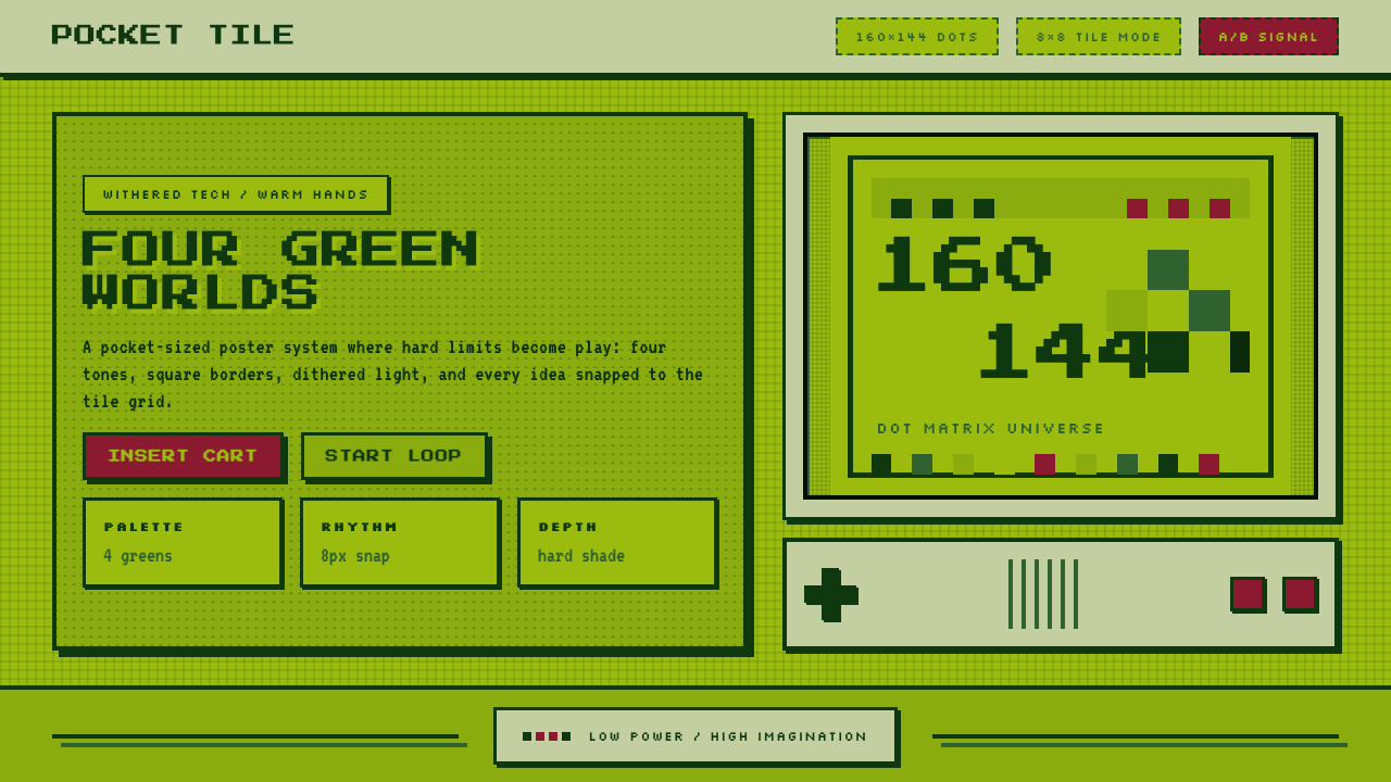 Nintendo Game BoyConstraint becomes play. Four swamp greens, pixel type, and an 8×8 grid do th…
 Trading Pit Hand SignalsThe market speaks in color. Orange, blue and red cut across a ruled card-stoc…
 Alien: IsolationLo-fi dread glows. Amber phosphor and terminal green pulse through bordered C…
 Bloomberg Terminal (Amber CRT)Hostile data authority. Amber mono grids and four hard panels make black glas…