What is Coinbase?
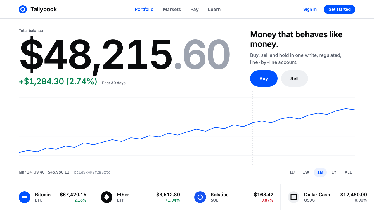
The Coinbase style makes crypto look like a bank balance: hairline-ruled white, tabular figures and one saturated blue that does all of the persuading.
Coinbase in brief
Coinbase set out in 2012 with a modest ambition: to make buying bitcoin feel as ordinary as checking a bank balance. The interface that followed is deliberately unexciting. It uses a white canvas, near-black numbers set in tabular figures, a thin portfolio line, and green or red for every price move. There is no neon, no glow and no suggestion that this is a speculative adventure.
One colour does the persuading. Coinbase Blue, brightened by the 2021 identity work of Moniker and codified in the open-source Coinbase Design System, marks every Buy, Sell and primary action. Everything else stays quiet: hairline rules separate sections, pale grey grouping backgrounds organise content, and there are neither shadows nor lighting effects.
What the style communicates is not the excitement of getting rich but the steadiness of a regulated financial institution. The visual restraint is itself the message. In a field that was long associated with volatility and hype, a calm white interface with a single clear action colour tells the user that the product can be trusted with money.

Where does Coinbase come from?
Coinbase was founded in San Francisco in 2012, and the names most closely associated with it in the source material are Brian Armstrong and Fred Ehrsam. The company belongs to the 2010s cryptocurrency boom, a period when bitcoin and other digital assets moved from the margins of the internet into mainstream conversation. Most services in that world spoke to enthusiasts in the language of technology, exchanges and charts. Coinbase chose to speak in the language of consumer banking.
That choice is the root of the style. It belongs to the tradition of consumer fintech dashboards, where the central design problem is trust. A person depositing real money wants clear numbers, predictable layouts and a sense that nothing is being hidden. Banking apps had already developed a visual grammar for this: white backgrounds, large balances, simple line graphs, and colour used for status rather than decoration. Coinbase adopted that grammar and applied it to an asset class that did not otherwise look like a bank.
The site went through redesigns around 2015 and again between 2017 and 2020, gradually tightening this approach. In 2021 the Moniker SF studio led a rebrand that brightened the blue and sharpened the identity. At about the same time the company published its design system as open source, in line with the broader design-systems culture of the 2010s, in which components, colours and spacing rules are documented so that whole products stay consistent. The current look, roughly 2021 to 2024, is the result of that process.
The design system turns these origins into tokens and conventions: one saturated blue for action, near-black for text and large figures, green and red for gains and losses, grey for grouping, and thin rules for separation. Because everything is so restrained, the system is also very flexible. It can carry a trading screen, a learning article or a settings page without changing its character.
What defines the Coinbase look?
A white canvas
The page is white. This is a deliberate refusal of the dark, glowing aesthetic that many crypto products adopted. White signals daylight, clarity and ordinary finance, and it gives numbers the neutral background they need to be read accurately. Large empty areas are used freely so that individual figures and actions have room to stand without competing with each other.
One saturated blue
Coinbase Blue is the only strong colour in the interface. It marks Buy, Sell, links and primary buttons, and it is applied in flat fills with no gradients. After the 2021 refresh it became brighter and more energetic, but its job did not change: to tell the user, without ambiguity, where the next step is. Because no other hue competes with it, the eye finds the action at once.
Near-black tabular figures
Balances, prices and percentages are set large in near-black, using tabular figures in which every digit has the same width. This keeps columns aligned, prevents numbers from jumping as they change, and makes comparisons effortless. The numbers are the heroes of the page, and the typography treats them with the seriousness that a banking statement would give to an account total.
Green and red for movement
Every price move is marked in green when up and red when down. These colours are functional and small in area: a percentage, a thin arrow, a line segment. They never fill large backgrounds. This restraint matters because it keeps the emotional temperature low. A drop is displayed as information, not alarm.
A thin portfolio line
Portfolio performance is shown as a slender line chart with minimal axes, rather than a dense candlestick display. The line suggests the shape of a balance over time without inviting obsessive micro-analysis. It is the visual equivalent of the savings graph in a banking app, and it belongs to the system’s promise that holding an asset can be calm.
Hairline rules and pale grey grouping
Sections are separated by very thin lines, and related items are grouped on pale grey fields. There are no shadows or glows, so structure comes from alignment and spacing. The page looks like a clean statement, orderly and precise, and the hairlines suggest a regulated, carefully audited environment more than any decorative flourish could.
A quiet, institutional tone
Copy, layout and colour all speak calmly. Labels are plain, button text is direct, and there are no exclamation marks or promises of fast riches. The tone is the tone of a regulated financial institution: it informs, it asks for confirmation, and it does not hurry the user. The visual system and the writing are meant to reinforce each other.

Who shaped Coinbase?
Armstrong is one of the two people most closely connected to Coinbase in the source material. The company he founded in San Francisco in 2012 set the goal of making bitcoin as ordinary as a bank balance, and the whole interface can be read as the visual execution of that sentence.
Ehrsam is the second name linked to the founding of Coinbase. Together with Armstrong he represents the early period when the company defined itself as an approachable on-ramp to digital assets, an approach that shaped the plain, trust-focused character of its interface.
Moniker is the design studio that led the 2021 identity refresh. Its work brightened the blue and sharpened the brand, and the resulting palette was then codified in the open-source Coinbase Design System. The current visual character of the style, around 2021 to 2024, is largely its legacy.
Commonly abbreviated CDS, this open-source system documents the components, colours and spacing that keep Coinbase products consistent. It is less a person than a shared reference, and it ties the style to the wider design-systems culture of the 2010s and beyond.
How do you use Coinbase today?
For slides, the cover can be a clean white field with a large near-black title, a short subtitle in a lighter tone, and a single blue element, such as a button-like label or a thin rule. Content slides should lean on whitespace and hairline dividers. Data slides are where the style shines: set key figures large in tabular numerals, add a slender line chart, use green and red only for change, and apply blue to the one thing you want the audience to act on.
For web and product interfaces, the style suits financial dashboards, wallets, investment and payments products, and any service where users must feel safe handing over money or data. A home screen might show a large balance, a thin performance line, a short list of assets with tabular prices, and one blue primary button. Settings and account pages can use grey grouping fields and hairlines to stay orderly. Avoid shadows and decorative gradients so that nothing competes with the numbers.
For editorial and marketing work, adopt the calm voice. Headlines should be plain and factual, imagery sparse, and layouts generous. A learning article about a financial topic can use large type, short paragraphs and hairline dividers, with blue reserved for the single link or button that moves the reader forward. The aim is to build confidence rather than excitement.
The most common mistake is introducing a second strong colour. The system depends on one blue for action; if purple, orange or gradient accents are added, the hierarchy collapses and the page begins to look like the speculative crypto interface the style was designed to avoid. A related error is using green and red as large background fills, which turns routine movement into drama.
Another mistake is using proportional figures where the numbers need to align, which makes columns look ragged and undermines the feeling of accuracy. A final mistake is adding decoration. Glows, glassy cards or heavy shadows contradict the hairline-ruled, regulated feel. If the layout looks too plain, the answer is better spacing and clearer hierarchy, not more effects.

Coinbase — FAQ
What is the Coinbase design style?
It is a restrained fintech interface style. A white canvas carries near-black tabular figures, a thin portfolio line, green and red for price movement, hairline rules and pale grey groupings, with one saturated blue used for every primary action.
Why is there only one strong colour?
A single action colour makes the next step unmistakable and keeps the emotional tone low. In a field associated with hype, a calm interface with one clear blue signals that the product behaves like a regulated financial institution.
What are tabular figures and why do they matter?
In tabular figures every digit occupies the same width. Columns of prices line up exactly and numbers do not shift as they update, which supports accuracy and makes comparison easy. It is a quiet detail with a large effect on how trustworthy a financial screen feels.
Who shaped the current look?
The company was founded in 2012 by a team associated with Brian Armstrong and Fred Ehrsam. The 2021 rebrand led by Moniker SF brightened the blue, and the open-source Coinbase Design System codified it for the current look, roughly 2021 to 2024.
Which projects suit this style?
Financial dashboards, wallets, payments and investment products, and any service that asks users for trust. It works anywhere numbers must be read quickly and accurately.
Related design styles
 Tableau (Business Intelligence)Enterprise clarity. Navy workbook chrome, hairline panes, and 10-color marks…
 Arctic Terraform StationEvery colour carries a duty. Sky-blue panels, coded modules and hard seams en…
 CircleCI Pipeline-GreenConfidence goes green. Emerald status lines cut through terminal-black pipeli…
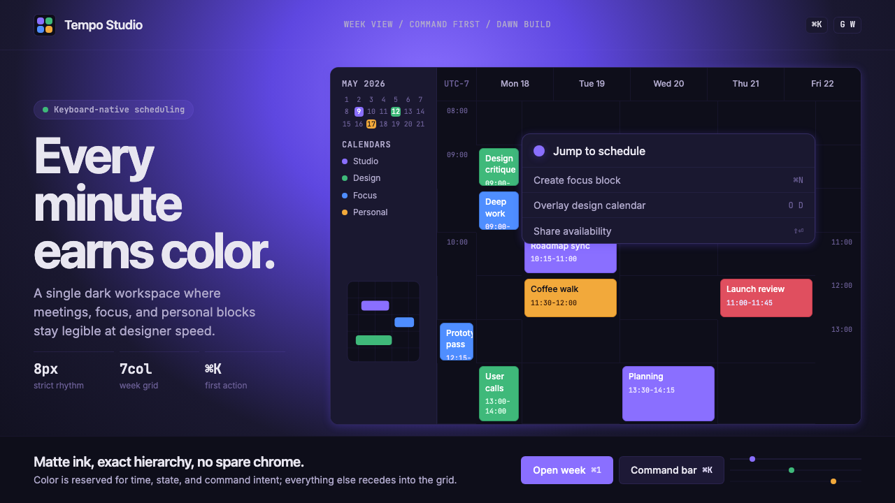 Cron CalendarDesigner-tech restraint. Purple wash, ink grid, mono shortcuts, surgical even…
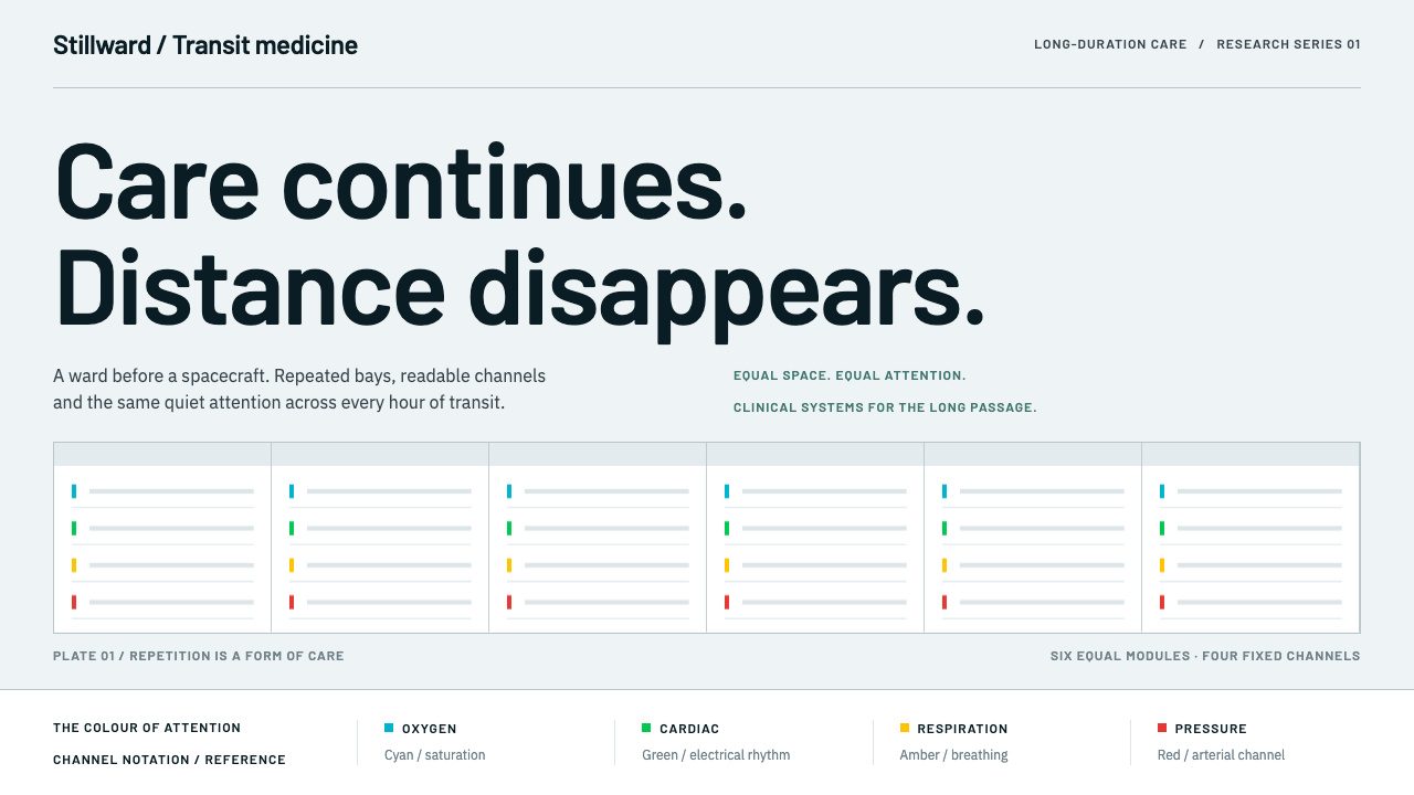 Cryosleep Transit WardCare without spectacle. Clinical white, equal bay grids and the fixed colours…
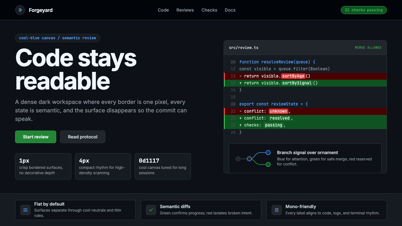 GitHub DarkCode-first darkness. Cool-blue canvas, 1px borders, green/red diff lines.