About Coinbase
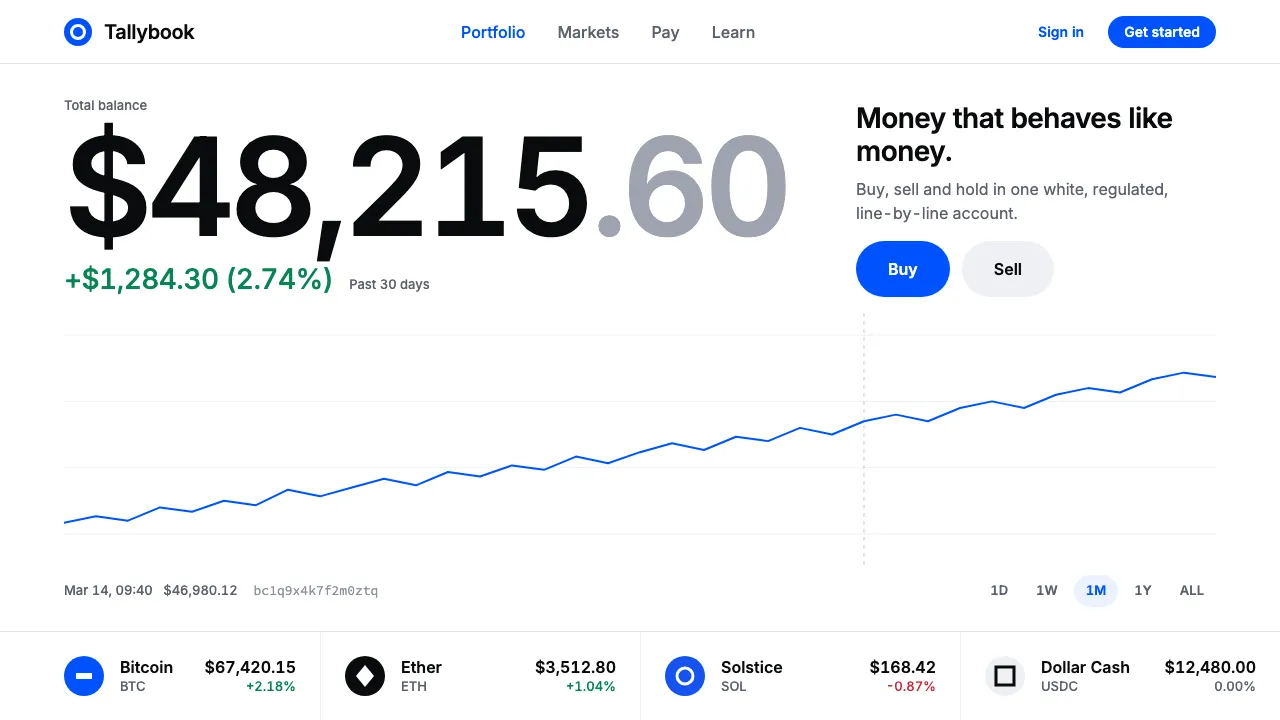
Coinbase set out in 2012 to make buying bitcoin feel as ordinary as checking a bank balance. The interface that followed is deliberately unexciting: a white canvas, near-black numbers set in tabular figures, a thin portfolio line, and green or red for every price move.
One colour does the persuading. Coinbase Blue, brightened by Moniker's 2021 identity and codified in the open-source Coinbase Design System, marks every Buy, Sell and primary action. Everything else stays quiet, hairline-ruled and regulated-looking.
- Origin
- San Francisco, California, USA
- Era
- 2012 founded; site redesigns c.2015 and 2017–2020; Moniker rebrand 2021; current CDS visual ~2021–2024
- Key figures
- Brian Armstrong · Fred Ehrsam · Moniker SF
- Movements
- consumer fintech dashboards · design-systems culture · 2010s cryptocurrency boom
Coinbase design spec
Colors
Typography
The other 11 sections — buttons, cards, spacing, motion, techniques and more — open once you unlock. Download the DESIGN.md or send it to your AI in one click. Unlock once, yours forever.
Sign up nowStyles similar to Coinbase
Also inspired by brands & products, with a close feel.
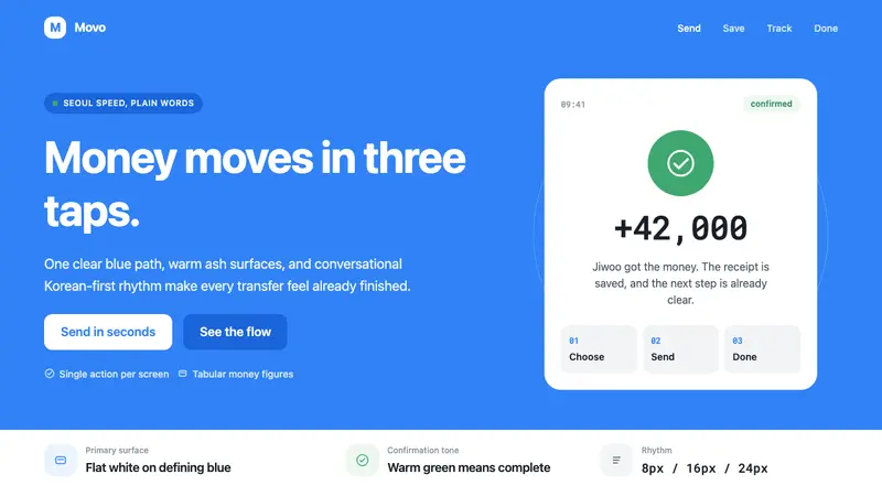 Toss Korean Fintech BlueMoney feels instant. Signature blue, Pretendard scale, and one-screen transfer rhythm.
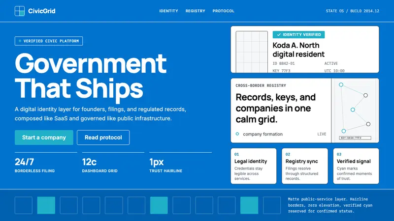 Estonia e-Residency Digital (2014)Trust without weight. Cornflower blue, 12-column grids, and cyan verified signals.
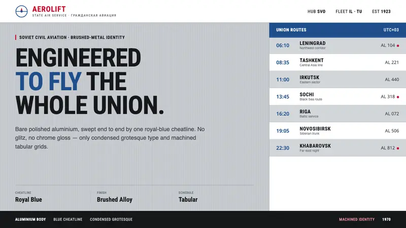 Aeroflot Soviet AirlineEngineered restraint rules. Silver ground, royal-blue cheatlines, and flat grotesque type set order.
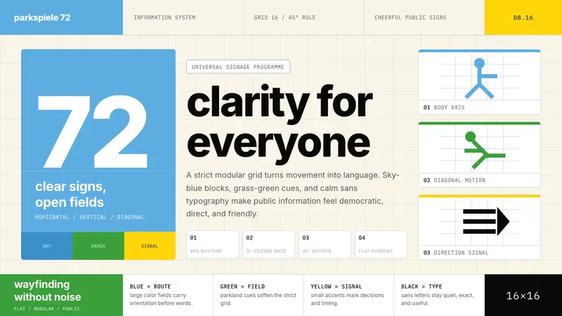 Otl Aicher Munich OlympicsFriendly rigor. Sky-blue grids and straight-line pictograms make public information universal.