What is Climate Loss & Damage Tribunal?
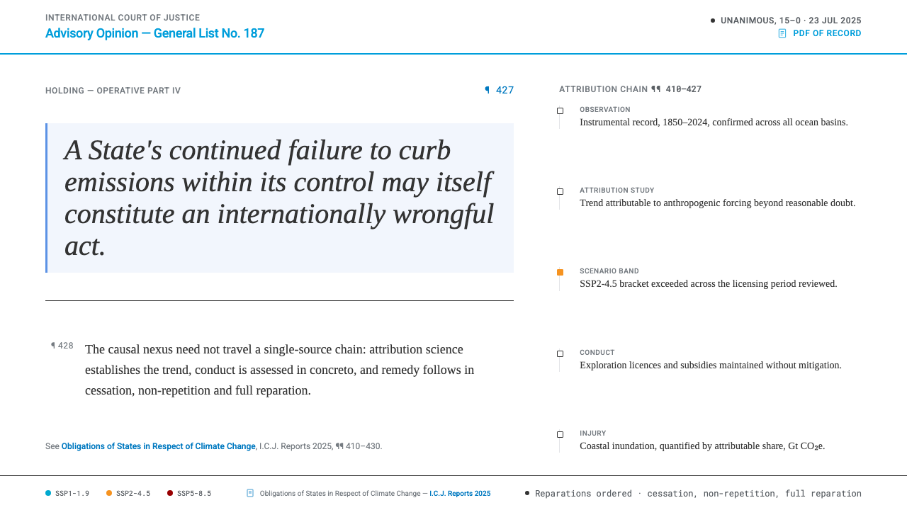
The Climate Loss & Damage Tribunal style takes the printed judgment, not the courtroom, as its model: graphite ink, numbered paragraphs, institutional blue in small doses, and scientific colour used as evidence rather than emotion.
Climate Loss & Damage Tribunal in brief
This style is built around a single artefact: a court document. Its model is the printed advisory opinion, not the courtroom. Graphite ink sits on bleached white stock, body text is set in a Times-style serif following the conventions of the International Court of Justice's published reports, and paragraphs carry numbers marked with the pilcrow sign. The identity is that of a ruling, calm and cumulative, rather than a rally or a campaign. Nothing about it is designed to be shared as a slogan; it is designed to be read and cited.
Colour is rationed and assigned. UN Blue appears only in institutional furniture: the case number, the links to submissions, the rule across the masthead. Everything else is ink. When colour carries data, it is the colour of the IPCC's published scenarios, each used only for its own scenario and never as decoration. Figures in emissions ledgers are set in monospaced numerals, and tonnage is stated in gigatonnes of carbon dioxide equivalent, written Gt CO₂e.
The restraint is the argument. The style refuses the usual iconography of climate communication, such as melting glaciers, burning forests and green leaves. Its evidence is tables, citations and scenario bands. A reader is meant to feel that every mark on the page could be cited, challenged and defended, which is exactly the property a legal text needs.

Where does Climate Loss & Damage Tribunal come from?
On 23 July 2025 the International Court of Justice delivered a unanimous advisory opinion on the obligations of States in respect of climate change. An advisory opinion is not a judgment between named parties, but it states the law with the Court's full authority, and others rely on it. Two findings shape this design system. First, the Court held the causal-nexus standard flexible enough for climate injury. In effect it separates two questions: the scientific one, whether an event can be attributed to human-caused climate change, and the legal one, how a particular State's wrongful conduct connects to specific damage.
Second, the opinion named fossil-fuel licences and subsidies as conduct that can be internationally wrongful, and failure to act can itself count. Wrongful conduct brings the familiar consequences of the law of State responsibility: cessation, assurances of non-repetition and full reparation. A visual system for loss and damage therefore needs a language of accountability rather than a language of lament, and a document that looks like a ruling is the closest available form. The word 'wrongful' sets a tone as well as a rule: it implies a standard against which conduct is measured, which is why the style looks measured itself.
The wider setting is the loss and damage track of climate diplomacy. A Loss and Damage Fund was agreed at COP27 in 2022 and operationalised at COP28. Three places anchor the identity: The Hague, where the Court sits in the Peace Palace; New York, home of the United Nations headquarters; and Port Vila, capital of Vanuatu. They stand for where climate injury is adjudicated, negotiated and felt. The 'tribunal' of the style's name is a projection, reading the developments of 2022 to 2025 forward into a standing body, a design conceit rather than an existing institution.
Four traditions are blended. International legal typesetting supplies the serif body, numbered paragraphs and marginal citations. The UN brand identity supplies the blue as institutional furniture. IPCC scientific visual standards supply the scenario colours and the discipline of treating colour as data. Climate attribution science, the field that estimates how far human-caused warming contributed to a given event, supplies the habit of showing method and uncertainty instead of simply asserting.
What defines the Climate Loss & Damage Tribunal look?
Ink and Paper
Graphite ink on bleached white stock. The black is closer to printed ink than to a screen's harshest black, which gives long passages of text a sober, document-like quality. The ground stays clean and unpatterned. The page is meant to look like something that could be printed, filed and stamped.
Institutional Blue
UN Blue is furniture, not paint. It marks the case number, the links to filed submissions and the rule across the masthead, the parts of a document that identify the institution and its procedure. It is never used to fill large areas, highlight arguments or colour buttons for emphasis. Its scarcity is what keeps it official.
Court Serif
Body text follows the Times-style setting used in the International Court of Justice's published reports: a classical serif in a measured column with ample leading and no decorative variation. Headings are modest. Authority comes from consistency and legibility, not from display type. The pilcrow, the section sign and small capitals for institutional names belong to the same legal-typographic family and can be used sparingly.
Numbered Paragraphs
Every paragraph carries a number marked with the pilcrow sign, so that any passage can be cited by number the way a legal text is cited. The numbering turns a web page into a referable object. It also gives the reader a steady rhythm, one claim per paragraph, in sequence.
Marginal Citations
A margin is reserved for references to pleadings and sources. Footnotes and citations live beside the text they support instead of being hidden behind symbols or collapsed panels. The effect is of an argument that keeps its receipts in view at all times.
Ledger Numerals
Emissions are shown as a ledger: rows of figures in monospaced numerals so that digits align in columns, with quantities settled in Gt CO₂e. Totals, sources and sinks are laid out like accounts. The format treats emissions as a debt that can be recorded and audited, which is the legal and moral premise of the whole system.
Scenario Colour as Evidence
The three scenario colours from the IPCC's Sixth Assessment Report each keep their own place. They are not borrowed for decoration, remixed into gradients or applied to emotional imagery. The pages carry no disaster photography at all. Evidence takes the form of tables, citations and scenario bands. Where three scenarios appear in one chart, direct labels on the lines beat a legend that forces the eye to travel.

Who shaped Climate Loss & Damage Tribunal?
Judge and, at the time of the July 2025 advisory opinion, President of the International Court of Justice. His presiding role ties this identity to the institution that gave the unanimous opinion at its centre, and to the sober register of the Court's published texts.
A cartographer whose ColorBrewer palettes became a reference point for choosing map and chart colours that sequence, diverge and separate categories clearly. Her work stands behind the rule that colour in a data graphic must be chosen for the reader's accuracy and not for the designer's mood.
A scientist known for the scientific colour maps, a family of palettes designed to be perceptually even and readable by people with colour-vision deficiencies. His approach underlies the commitment here that scenario colours are instruments of measurement, not instruments of persuasion.
How do you use Climate Loss & Damage Tribunal today?
The Tribunal style transfers to any context where a reader must trust that a document is careful, citable and neutral. It is not decorative and not persuasive in the advertising sense; its force comes from structure. Applying it means committing to numbered paragraphs, marginal citations, ink-coloured text and disciplined data colour.
On slides, a cover can look like the head of a judgment: a case-style title block, a reference number in UN Blue, a thin rule across the top and the title set in a serif on white. Content slides use numbered paragraphs, one claim each, with sources in a narrow margin column. Data slides present ledgers in monospaced figures and scenario charts in the three IPCC colours, labelled in full, with no photographic backdrops.
For web interfaces, the style suits emissions-accounting tools, loss and damage claim portals, compliance and sustainability reporting, document viewers and public registers. Use a serif body, monospaced figures for every number that sits in a column, blue for links and identifiers only, and anchors on numbered paragraphs so that sections can be shared by address. Tables should be plain, sortable and fully labelled. Forms for filing claims should present each step as a numbered paragraph, with the status of a submission stated in words rather than in colour.
In editorial work such as policy briefs, legal explainers, NGO reports and academic summaries, the style gives a quiet seriousness. Run text in a measured column, put citations in the margin, and let figures and scenario bands stand in for illustration. Headlines should state the finding rather than perform urgency. Because the visual register is already grave, the language can afford to be plain. Where an image is unavoidable, prefer a map, a diagram or a scan of the document itself.
The common mistakes all involve borrowing the look while dropping the discipline. Using UN Blue as a general brand fill makes the page look like an institution's marketing, not its documents. Recolouring scenario hues into gradients or using them for unrelated categories breaks the evidence logic. Adding glaciers, flooded streets or green leaves turns a ruling into a campaign and undoes the point. And setting body text in a generic sans-serif removes the typographic signal that this is a document of record.

Climate Loss & Damage Tribunal — FAQ
Is this the official visual identity of the ICJ or the United Nations?
No. It is a design-system study that borrows document conventions: legal typesetting habits, an institutional blue used as furniture, and published scientific colour standards. It does not reproduce any court's or organisation's official identity, uses no official marks, and should not be used to suggest endorsement by any of them.
What does the causal nexus have to do with the design?
The opinion's treatment of causation separates the scientific attribution of an event from the legal link between a State's conduct and specific damage. The design mirrors that separation: scenario colours and ledger figures present the science, while numbered paragraphs, citations and institutional furniture present the legal reasoning, and the two are never visually blended. Keeping the layers separate also lets a reader challenge one without discarding the other.
Why use numbered paragraphs on a web page?
Numbering makes every passage addressable. A reader can cite paragraph and number in a letter, a brief or a footnote, and another reader can find exactly the same text. It also slows the reading rhythm in a useful way, because each paragraph is expected to make one claim that can stand on its own.
Why does the style avoid imagery of climate impacts?
Impact imagery is built to move feeling, and this system is built to support a finding. A table or a scenario band can be cited, checked and corrected; a photograph of a flood cannot. Leaving emotive imagery out also respects the people affected, who are better served by an accurate record than by a visual shorthand for suffering.
Does a serif body work on screens?
Yes, provided the setting is generous. Use a comfortable column width, ample line spacing and a restrained range of sizes, and avoid ultra-thin weights. The serif here is a deliberate signal of record-keeping, and on modern screens a Times-style face remains highly legible in long-form reading. On small screens, keep the numbering visible in the margin rather than dropping it.
Related design styles
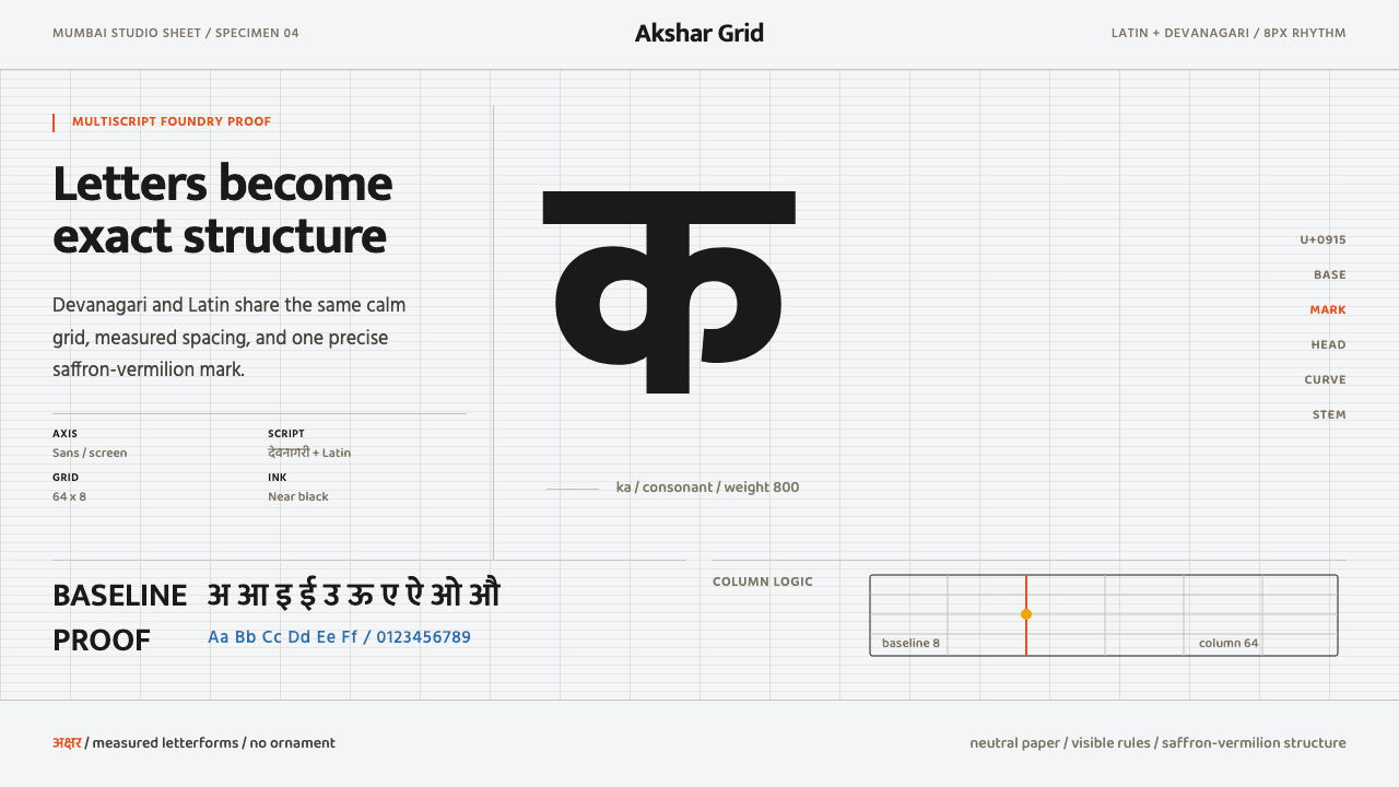 Modern Devanagari TypeType is the subject. Warm off-white grid, giant glyphs, one saffron-vermilion…
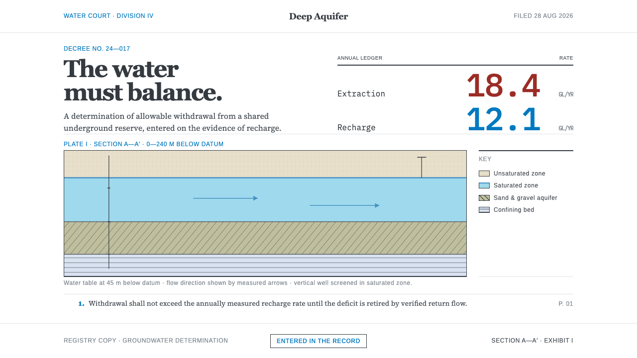 Deep Aquifer Water CourtRestraint makes the deficit undeniable. White bond, book serif, and a keyed a…
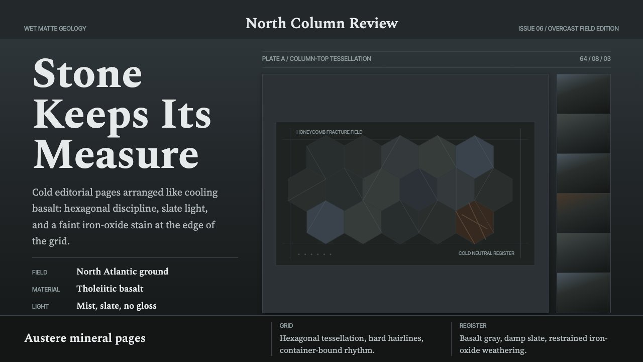 Giant's Causeway BasaltCold stone edits the page. Spectral type locks into slate hex grids and iron-…
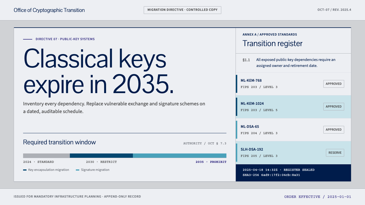 Post-Quantum Crypto AgencyCryptography with a deadline. Cool-grey document grids make every migration d…
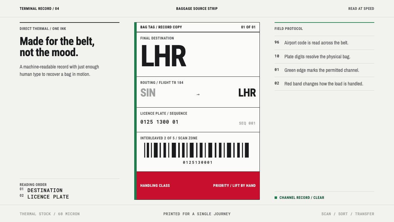 Airport Baggage TagBuilt to be read in motion. Burned-black codes, hard rules and functional cha…
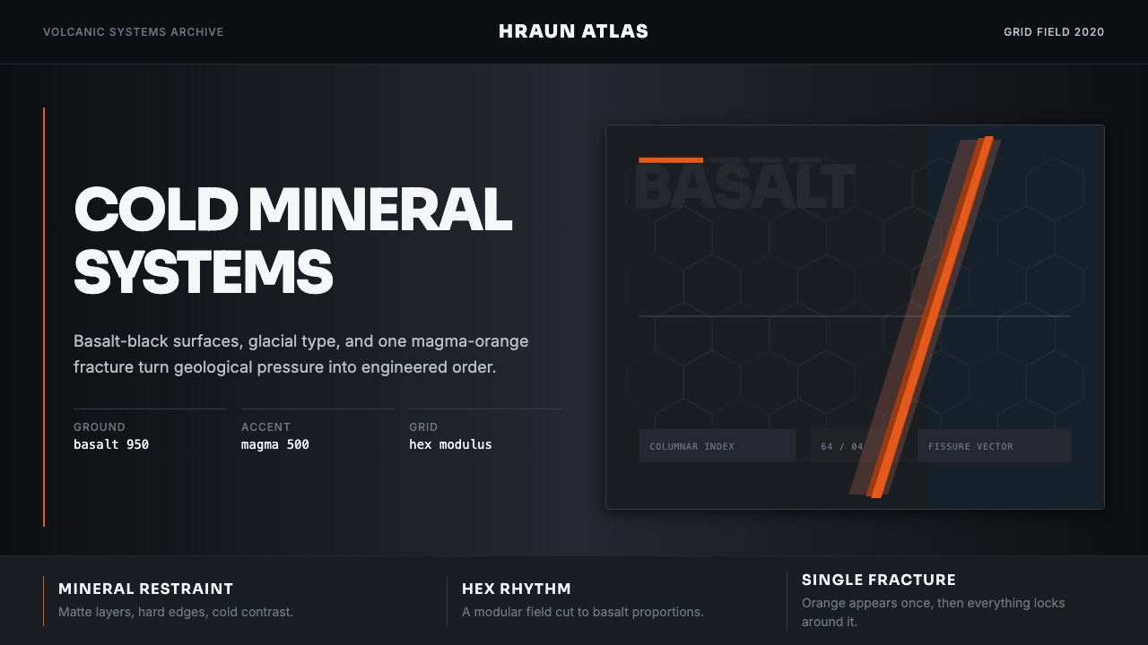 Icelandic Basalt VolcanoCold geology, engineered. Basalt black, Sora type, and one magma fissure hold…