What is Clarendon Slab Serif?
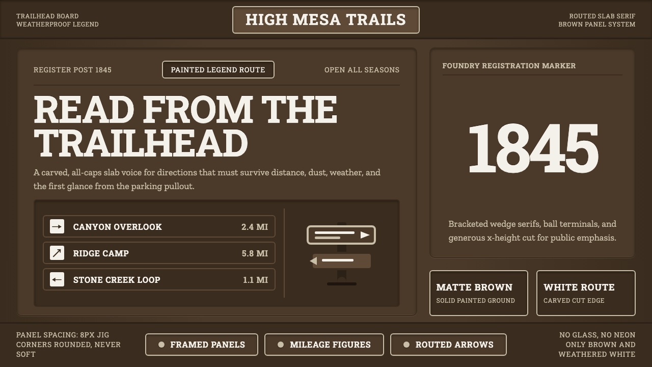
Built for distance, Clarendon turns white routed lettering, dark park-sign brown, and sturdy Victorian serifs into a voice that can cross open ground.
Clarendon Slab Serif in brief
Clarendon is a slab-serif display typeface cut by Robert Besley and Benjamin Fox at London's Fann Street Foundry in 1845. Its bracketed, wedge-cornered serifs, strong contrast between strokes, and generous x-height give it a sturdy presence that remains legible at a distance. It became a workhorse of Victorian posters and later acquired a strong association with the American West.
The style is defined by useful visual force rather than nostalgic decoration. Letterforms are heavy without becoming blunt, serifs create firm horizontal rests, and all-caps setting turns words into unmistakable sign units. The result feels public, durable, and deliberately made for recognition before intimacy.
Its most codified modern expression is the National Park Service's Modified Clarendon: white routed legends cut into dark-brown sign panels. Framed boards, matte paint, directional arrows, and mileage figures complete the system. This is a weatherproof visual language intended to be read at a trailhead, along a road, or across a clearing rather than examined like a screen interface.

Where does Clarendon Slab Serif come from?
Clarendon was created in London in 1845 by Robert Besley and Benjamin Fox at the Fann Street Foundry. Its registration under the UK Ornamental Designs Act gave the typeface a distinctive legal and industrial status: it was the first typeface ever registered under that act. The origin places Clarendon squarely within nineteenth-century type production, where a display face had to be both visually assertive and materially reproducible.
The typeface entered public life through Victorian display typography. Its slab-serif construction, bracketed serifs, wedge-like corners, strong stroke contrast, and generous x-height made it effective on posters, where words had to hold their shape and command attention. Clarendon was not merely a refined reading face; it was a practical instrument for public lettering and large-scale communication.
Its later identity in the American West grew from the same qualities. The face could suggest authority without the ceremonial formality of classical lettering, and its broad, sturdy forms suited signs and poster language associated with open territory. In this context, Clarendon became less a single historical artifact than a recognizable voice: firm, visible, and connected to movement through space.
The National Park Service gave that voice its most codified modern form through Modified Clarendon during the middle and later twentieth century. The system translated the typeface into routed white legends on dark-brown panels, with framed boards, arrows, and mileage figures organized for wayfinding. The historical typeface thus became part of an environmental identity system, where lettering, material, contrast, and direction all had to work together outdoors.
What defines the Clarendon Slab Serif look?
Dark Ground, White Legend
The defining contrast is a white legend against dark park-sign brown. White is not treated as a glow or a decorative highlight; it reads as the exposed face of a routed letter. The dark ground gives every word a stable field, while the restrained palette keeps attention on message, direction, and distance.
Bracketed Slab Serifs
Clarendon's serifs are substantial but connected to the stems through brackets, preventing the letters from feeling mechanically attached. Their wedge-cornered endings add a subtle directional bite. These details make the alphabet feel engineered for public use: firm enough for a sign, yet shaped enough to retain a recognizable typographic character.
Strong Stroke Contrast
The face balances heavy structural strokes with visibly lighter passages. That contrast keeps large lettering from becoming a featureless block and helps each character preserve its internal rhythm. In a sign system, the effect is authoritative without being monotonous: the words carry weight, but their forms remain differentiated.
Generous X-Height
A generous x-height gives the lowercase structure visual presence, even though the strongest sign expression is all caps. It supports quick recognition by keeping the body of the letters substantial and open. Used with generous spacing and a clear field around the words, the face favors reading under distance, weather, and changing light.
Routed Materiality
In the park-sign expression, letters are routed into a panel rather than floating as a digital overlay. The visible legend therefore carries a sense of cut material and physical commitment. Matte paint supports that directness: the surface absorbs attention instead of producing a glossy effect, allowing the letterforms to remain the primary event.
Wayfinding Grammar
Clarendon operates inside a broader grammar of framed panels, directional arrows, and mileage figures. Each element has a communicative job. The frame establishes a contained sign field, the arrow converts lettering into movement, and the mileage figure turns place into measurable distance. Nothing needs to look ornamental when the system already explains where to go.

Who shaped Clarendon Slab Serif?
Robert Besley was one of the two designers who cut Clarendon at London's Fann Street Foundry in 1845. His role belongs to the typeface's foundational act: establishing a slab-serif display face whose sturdy construction, bracketed serifs, and strong contrast could serve public lettering. Clarendon's later life in posters and wayfinding begins with this original cut.
Benjamin Fox worked with Robert Besley on the original Clarendon at the Fann Street Foundry. His name is inseparable from the typeface's 1845 origin and from the industrial setting in which the design was made. Together, Besley and Fox established the letterform character later recognized through Victorian display typography and the American West.
The National Park Service gave Clarendon its most codified modern identity through Modified Clarendon. By specifying white routed legends on dark-brown sign panels, alongside frames, arrows, and mileage figures, the service turned a typeface into a complete wayfinding language. Its contribution is therefore systemic: material, contrast, lettering, and direction operate as one public-facing voice.
How do you use Clarendon Slab Serif today?
For presentation slides, Clarendon is strongest when the cover behaves like a park sign: a dark-brown field, a white all-caps title, a decisive frame, and one clear directional cue. Content slides should keep the same discipline, using the face for section names, destinations, and short statements while leaving the surrounding field calm. Data slides can use mileage-style figures as the visual anchor, turning quantities into large, public information rather than decorative statistics.
For web dashboards and pricing pages, the style works when the interface is treated as a sequence of sign panels. Dark surfaces can hold white legends, while arrows, labels, and figures establish movement through the information. Pricing tiers can be framed like destinations, with Clarendon reserved for plan names, decisive values, and calls to action. Supporting text should remain quieter so the sign-like hierarchy survives repeated scanning.
For editorial and marketing work, Clarendon connects naturally to poster language and the identity of the American West. Article covers can use a broad dark field, a white headline, and a framed composition that feels issued rather than embellished. Inside the article, section markers and pull quotes can retain the all-caps public voice, while photographs or supporting content should not compete with the letterforms. Marketing pages benefit from the sense that each message is a piece of durable public information.
For wayfinding, maps, event signage, and data-led communication, the system should be built around explicit roles. A frame contains the message, an arrow directs attention, and a figure describes distance or quantity. Keep the palette restrained, favor matte-looking surfaces, and make the lettering feel routed or materially present. The style is most convincing when every visual choice helps someone understand where they are, what they are seeing, or what to do next.
The common mistake is to use Clarendon as a generic Western costume: add distressed texture, decorative wood grain, excessive shadows, and ornamental lettering until the sign logic disappears. The stronger approach is to preserve its functional core. Use the dark ground and white legend deliberately, keep the all-caps voice legible, give the letterforms room, and let frames, arrows, and figures carry information instead of turning them into decoration.

Clarendon Slab Serif — FAQ
Is Clarendon a slab serif or a traditional serif?
Clarendon is a slab-serif display typeface. Its substantial bracketed serifs and wedge-cornered endings give it a more structural, public presence than delicate book typography. It still has clear stroke contrast and a generous x-height, so its strength comes from a balance of mass, detail, and readable internal form.
Why is the palette centered on white and dark-brown?
The pairing comes from the National Park Service sign expression: white routed legends set into dark-brown panels. It creates a strong figure-ground relationship that supports distance reading and gives the lettering a material identity. The point is not simply contrast for its own sake; the colors establish a recognizable wayfinding field.
Is Modified Clarendon the same as the original Clarendon?
They are historically connected but should be understood as distinct expressions. Clarendon was cut by Robert Besley and Benjamin Fox at the Fann Street Foundry in 1845. Modified Clarendon is the National Park Service's codified modern life for that voice, expressed through routed white legends, dark-brown panels, frames, arrows, and mileage figures. The later system expands a typeface into an environmental identity.
Can Clarendon work outside park signage?
Yes, provided the underlying logic is preserved. The face suits slides, dashboards, pricing pages, editorial covers, marketing messages, and other contexts where public clarity and distance-oriented hierarchy matter. It becomes less convincing when its Western or park-sign associations are copied as surface decoration without the disciplined contrast, framing, spacing, and directional purpose that make the system coherent.
Related design styles
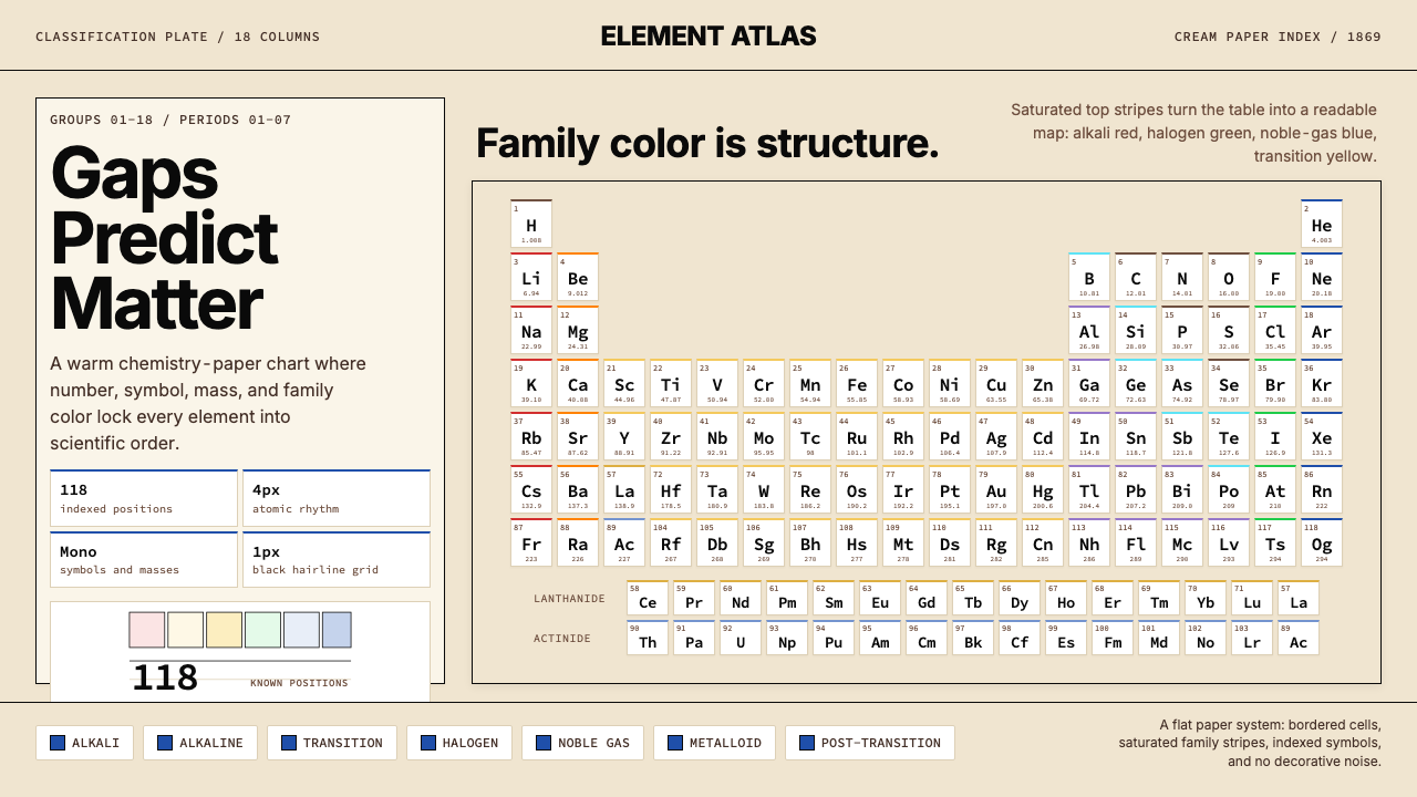 Mendeleev Periodic TableScientific order, saturated. Cream grid, mono symbols, and family color bands.
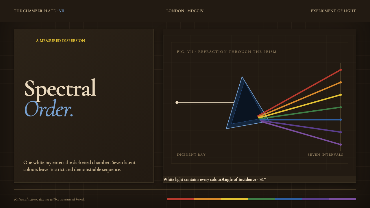 Newton Opticks SpectrumColor becomes evidence. Seven hard-edged pigment bands cross a gridded sepia…
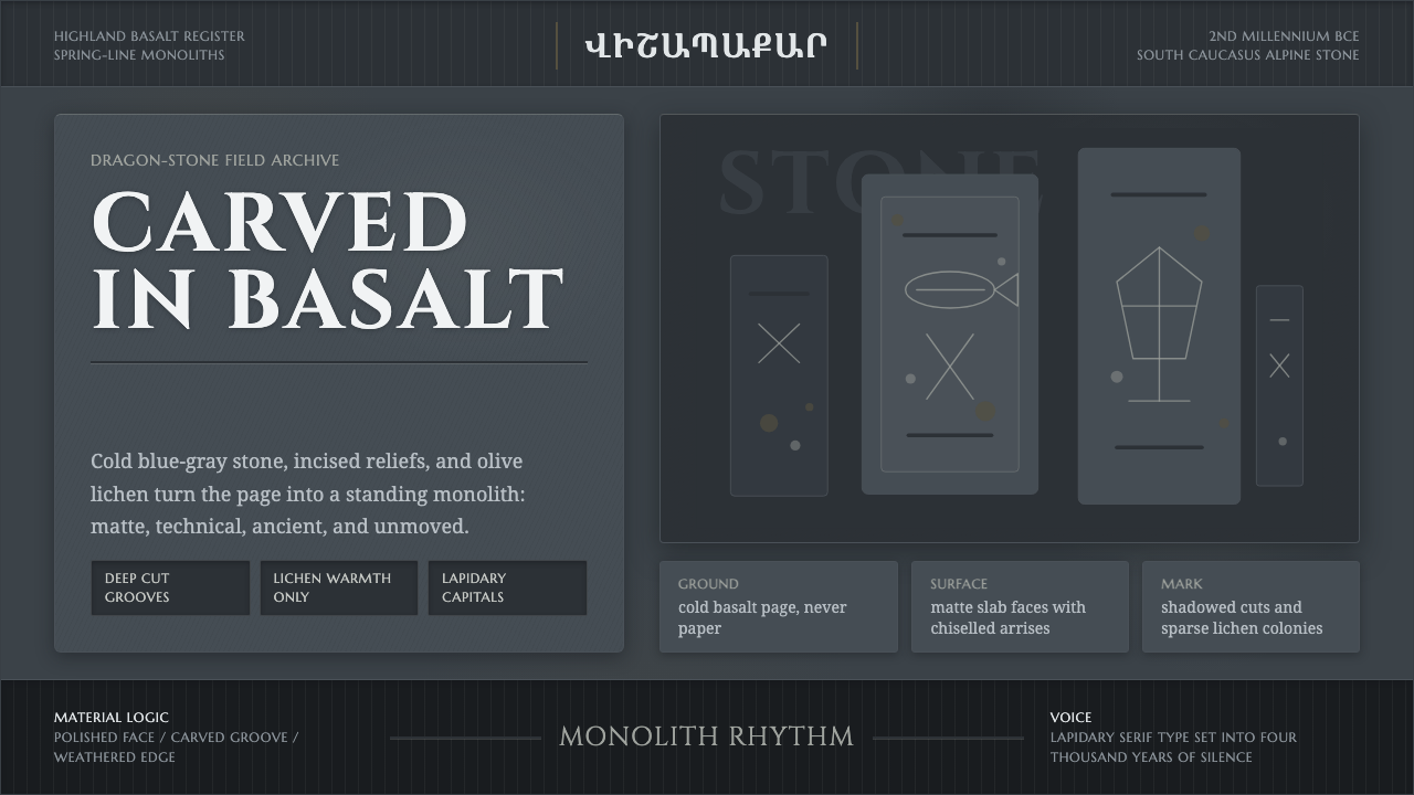 Armenian Vishapakar Dragon StoneAncient, cold, unmoved. Basalt gray slabs, incised grooves, sparse olive lich…
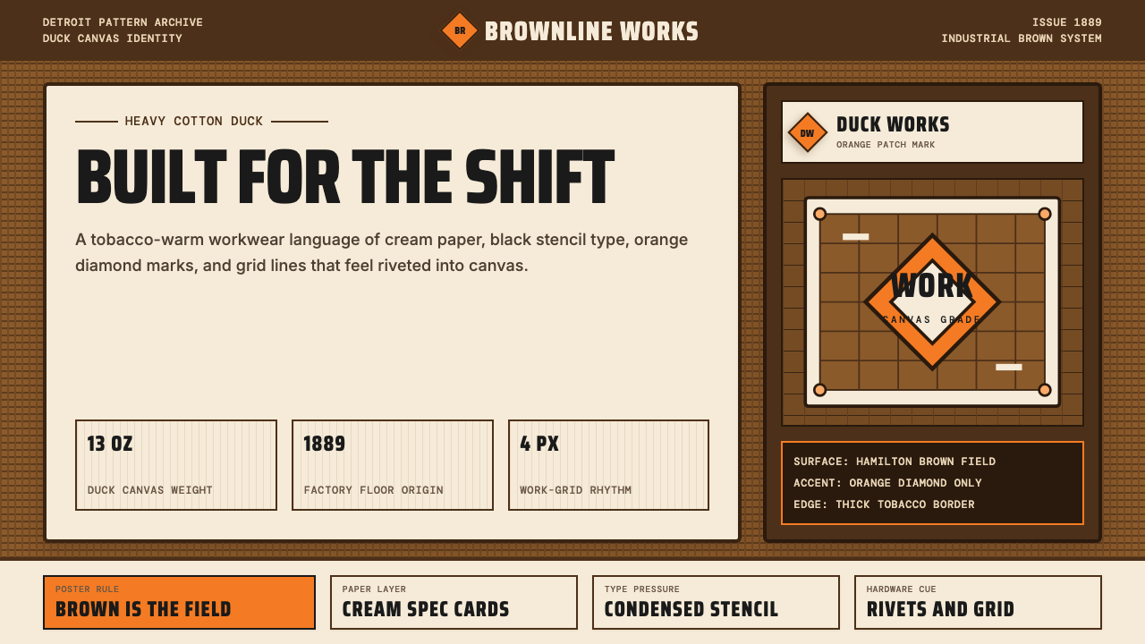 Carhartt Work Jacket Brown (1889)Built like work. Hamilton brown, orange diamond, and condensed type carry can…
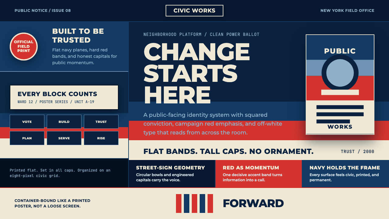 Gotham Geometric SansCivic trust in tall caps. Navy, red, and off-white bands turn geometry into c…
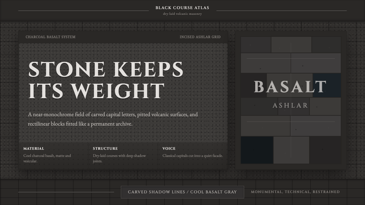 Hauran Basalt StoneMonolith refuses shine. Charcoal Cinzel capitals lock into dry-laid basalt gr…