What is Uelen Walrus Ivory?
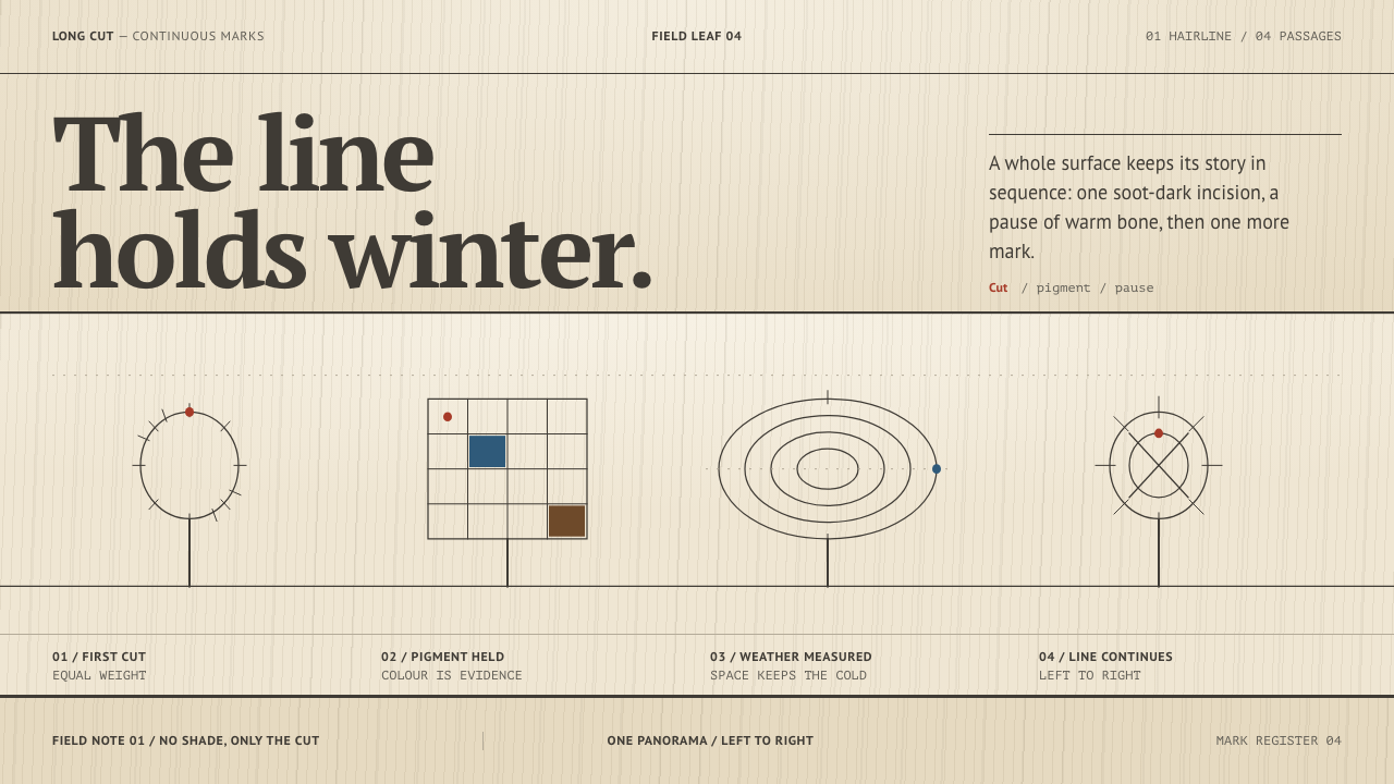
Uelen Walrus Ivory turns an Arctic engraving tradition into a layout rule — one even line, one long horizontal story, a warm bone ground, and colour rationed to three rare tints.
Uelen Walrus Ivory in brief
Uelen walrus ivory engraving is a narrative craft from the Bering Strait coast of Chukotka, in the Russian Far East. The engraver treats a whole curved tusk as a single picture surface. A hairline is cut the full length of the ivory and pigment is rubbed into the cut, so the drawing reads as a soot-dark line on warm pale bone. Nothing is shaded. Uelen Walrus Ivory is the design system that takes this method literally.
Three rules govern it. Everything is an incised outline of even weight, so line carries all of the form. Episodes run left to right along one continuous panorama instead of stacking in boxes. And colour is rationed to brick red, cold blue and hide brown, dropped into the line as a tint rather than spread as a fill. The ivory ground, large, warm and mostly empty, is part of the drawing, not a background behind it.
The tone is calm, patient and story-driven. Subjects such as walrus hunts, yaranga skin tents, dog sleds, seals and polar bears follow one another like clauses in a sentence. The page that results has one long axis, a great deal of quiet space, and the feeling that the entire sequence was drawn by a single steady hand.
Where does Uelen Walrus Ivory come from?
Uelen sits at the far eastern end of Chukotka, on the Bering Strait coast of the Russian Far East, across the strait from Alaska. The reference describes walrus ivory engraving there as about two thousand years old, a tradition kept by Chukchi and Yupik makers. The subjects it draws — the hunt, the tent, the sled, the seal, the bear — are the daily life and working world of that coast, which is why the craft reads as storytelling rather than ornament. The tusk is not a canvas brought in from elsewhere; it comes from the same sea the pictures describe.
In 1931 the first carving workshop in Chukotka was founded at Uelen. The reference files the workshop under the Soviet artel tradition, the cooperative craft workshops of the period, and records that by the late 1930s a recognisable narrative house style had formed there, one it dates from the late 1930s to the present day. What emerged was not a single maker's invention but a shared way of working: the whole tusk as one surface, a line of constant weight, scenes laid end to end.
The method is simple to describe and hard to do well. A fine line is cut along the whole length of the tusk, from the root to the tip, and pigment is rubbed into the cut. The line is dark, the ground is the warm pale colour of the bone, and form is built up by how closely the lines are placed, never by smudged shading. The reference calls the wider tradition Arctic narrative scrimshaw, a reminder that picture-engraving on ivory and bone is a cold-water craft with a long history, here given its own rules by Uelen engravers.
Two names are given as the key figures: Alexander Gorbunkov and Lidiya Teyutina. The reference lists them without further biography, and it is more honest to say so than to embellish. Together with the workshop and the Chukchi and Yupik traditions behind it, they stand for a craft carried by people rather than by a single signature. That is the right lesson for a design system built on it: the line matters, the story matters, and the author disappears into the steadiness of the work.
What defines the Uelen Walrus Ivory look?
Even Incised Line
One line weight carries the whole page. It is constant from the root of the tusk to the tip: no taper, no thick-and-thin flourish, no heavier outline for emphasis. Because weight cannot signal importance, importance has to be signalled by position, spacing and the tints. The line should feel incised, as if cut with a point, rather than drawn with a brush. Icons, borders, rules and illustration all follow the same weight.
Warm Bone Ground
The ground is the pale, warm colour of ivory, not stark white and not cream with texture. It is matte, quiet and large. Wide areas are left blank on purpose, because in the original craft the empty ivory is part of the picture, the sea or the snow or simply the air between episodes. Treat blank space as a drawn element: it sets pace, separates episodes and makes the line legible. A page that fills every gap has misread the craft.
Soot-Dark Ink
The line and the type are a deep, warm, soot-like dark rather than pure black, the colour of pigment rubbed into a cut. Against pale bone it gives high contrast with a softness that pure black on white lacks. Text uses a plain, readable serif in the same dark value, set as quiet captions that sit with the line rather than above it. There is a single ink; the tints are accents laid into it.
Panorama Layout
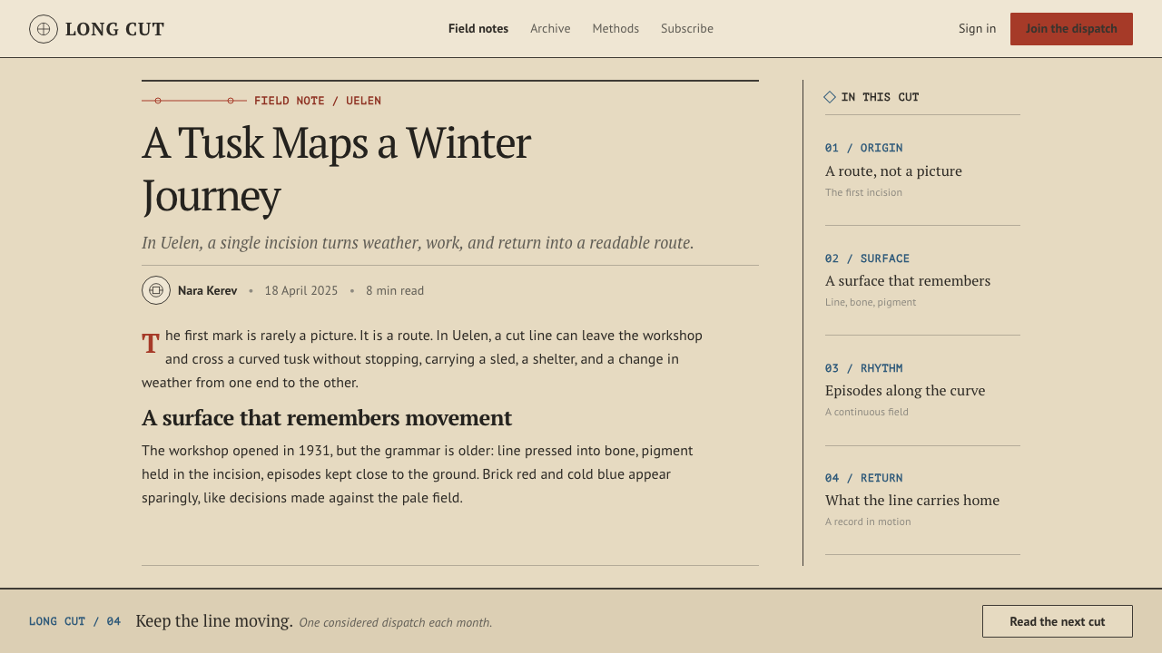
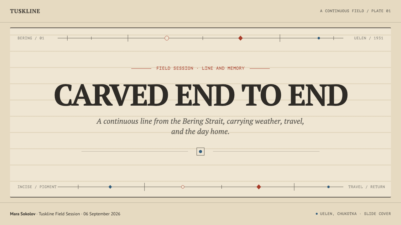
Episodes run from left to right along one continuous banner instead of stacking in boxes. In layout this is a long horizontal strip, a timeline, a sequence of scenes or steps that follow one another and are separated by space, not by frames. Cards, panels and containers are avoided. The reading direction does the organising, and each episode is allowed to breathe along the strip. Where a page must be vertical, the sequence should still read as one unbroken line.
Rationed Colour
Colour is limited to brick red, cold blue and hide brown, and it is always the minority. Each is dropped into the line as a tint, filling a small figure or marking one detail, never flooding an area. An episode may carry one tint, or two at most. The effect is that colour behaves like a rare pigment on a precious surface, and when it appears the eye goes to it at once. Spend it on the one thing the viewer should notice.
Density, Not Shading
Form is built by how closely lines are placed, never by smudging or gradients. Fur, water and ground are shown with short repeated strokes; a darker passage is simply a tighter cluster of lines. This gives the style its graphic clarity, and it means shadows, glows and soft blurs have no place. Everything is either line or bone. Any texture should be earned by drawing more line, not by applying an effect.
Small Figures in a Large Field
Hunters, tents, sleds and animals are drawn small, set along a horizon line in a wide field of bone. Scale carries meaning: the human figure is one detail in a large landscape, not the centre of a poster. In layout this suggests modest-size content blocks sitting in a lot of open ground, with the strip running through. Hierarchy comes from sequence and spacing, and the generous empty field is the style's way of showing the size of the world.
Who shaped Uelen Walrus Ivory?
Gorbunkov is one of the two names the reference gives as key figures of the Uelen engraving style. The reference offers no further biography, so what can be said is limited to what the style itself shows: a line of steady weight, a story told in sequence and a refusal of display. In the design system that attitude becomes a discipline, in which the author does not appear and the line does the work.
Teyutina is the second key figure named in the reference, again without further biography. She belongs to the continuity of the craft: a tradition carried by successive makers, each working to the same rules. For a designer her name is a reminder that this style is a shared practice, so it should be credited to the Uelen tradition and not presented as an anonymous Arctic look.
Founded in 1931 as the first carving workshop in Chukotka, the Uelen workshop is where the narrative house style took shape in the late 1930s. The reference files it under the Soviet artel tradition of cooperative craft workshops. It is the institutional frame that let a shared way of working stabilise, and it is why the style behaves like a system, with its own rules, rather than as a set of individual pieces.
The reference lists Chukchi and Yupik ivory engraving first among the movements behind the style, and the tradition is about two thousand years old. These are the peoples whose life on the Bering Strait coast supplies both the subjects and the method. A faithful use of the system keeps the connection visible: name the place, name the peoples and treat the craft as a living practice, not a historical costume.
How do you use Uelen Walrus Ivory today?
Uelen Walrus Ivory is a style for stories told in sequence. It suits any design where an order of events is the content, and it rewards restraint: one line weight, one ink, a few tints and a lot of open ground. The main discipline is to let the strip and the line do the organising and to resist the urge to fill or frame.
For presentation slides, a cover can be a wide banner with the title at the left in the dark serif and a single engraved-style line running off to the right. Content slides work as a timeline, with steps laid out from left to right and separated by open space instead of boxes. For data slides, line charts are the natural form, since one even line carries the whole story; draw every series at the same weight and drop a single brick-red tint onto the one point the audience must see.
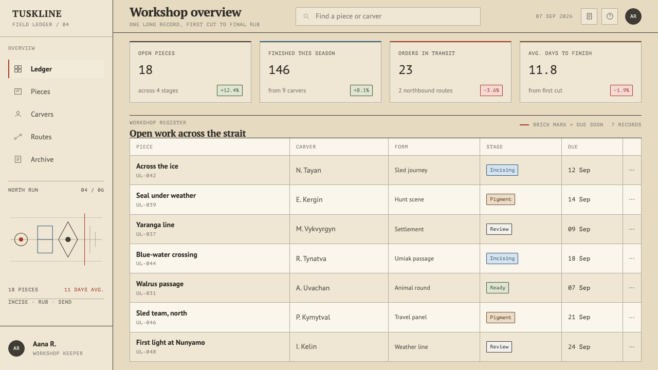
For web interfaces, the style suits horizontal storytelling pages, product tours, case studies, timelines and onboarding flows. Replace cards with open space and thin separators, and give inputs an underline instead of a box. Navigation can be a line with small marks for each episode. Horizontal scrolling must always be reachable by keyboard and have visible controls. Dense dashboards are a poor fit, since they depend on boxes and weights to separate many things at once.
For editorial and marketing work, the style fits long-form narratives, museum and cultural stories, travel writing, ethnographic features and craft brands. Illustrations are outline-only at a single weight, with a rare tint. A caption in the quiet serif can sit along the line like a hand-written note. If photography of carvings is used, credit the workshop and the carvers by name, and tie the image to Uelen and Chukotka instead of to a generic Arctic mood.
The most common mistake is adding shading, because gradients and soft shadows are exactly what the craft refuses. The second is spending all three tints at equal strength, which turns rationed colour into a palette. The third is stacking content in cards and boxes, which destroys the panorama, and the fourth is treating blank ground as unfinished and filling it. Remove effects, return to one line weight, and let the strip run.
Uelen Walrus Ivory — FAQ
What is Uelen ivory engraving?
It is a narrative engraving craft from Uelen on the Bering Strait coast of Chukotka. A fine line is cut along a whole walrus tusk and pigment is rubbed into the cut, so scenes of hunting, tents, sleds and animals appear as a dark line on pale bone. The reference describes engraving there as about two thousand years old, with a workshop founded in 1931 and a narrative house style from the late 1930s to today.
Why is colour limited to three tints?
Because in the craft the line is dark and the ground is bone, and colour is a rare addition dropped into the line. The system rations brick red, cold blue and hide brown so that colour keeps its power. When a page uses all three at full strength it stops reading as engraving and starts reading as a generic illustrated palette.
Can it handle data-heavy or dashboard layouts?
Only partly. The style is at its best for sequences, such as timelines, line charts and step-by-step flows. Dashboards that need many boxes, weights and colours to separate dozens of elements work against its rules. If it must be used there, keep to open space and thin separators, draw all series at one weight and use a single tint for the key figure.
Does it work on a dark background?
The craft is dark line on pale bone, so a dark inversion changes its character. If a dark page is required, keep a bone-coloured panel or strip as the engraved surface and place the dark around it, rather than turning the whole ground dark. That preserves the contrast the style depends on and keeps the line reading as ink in a cut.
How should I credit this style?
Name the source: Uelen, Chukotka, and the Chukchi and Yupik engraving tradition, along with the workshop founded in 1931. Avoid describing it as a generic Arctic or Nordic look, and avoid stock polar bears and snowflakes. If the design refers directly to carved pieces, credit the carvers. Treating it as a living craft with named origins is both more accurate and more persuasive.
Related design styles
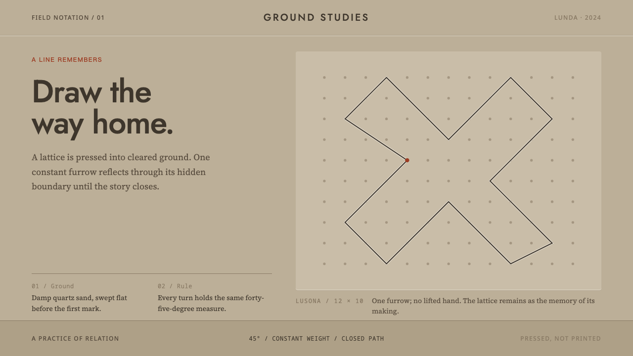 Angolan SonaA story closes in one stroke. A 45° furrow crosses visible dots on damp sand.
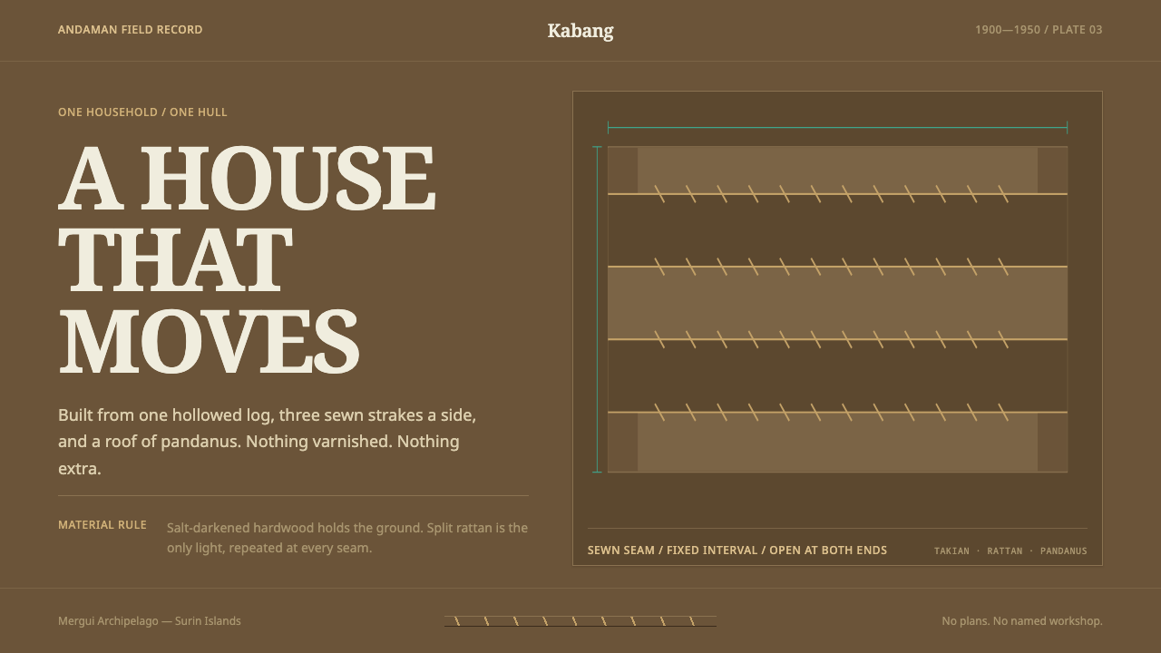 Moken KabangNothing extra survives at sea. Salt-dark wood and rattan seams make a spare m…
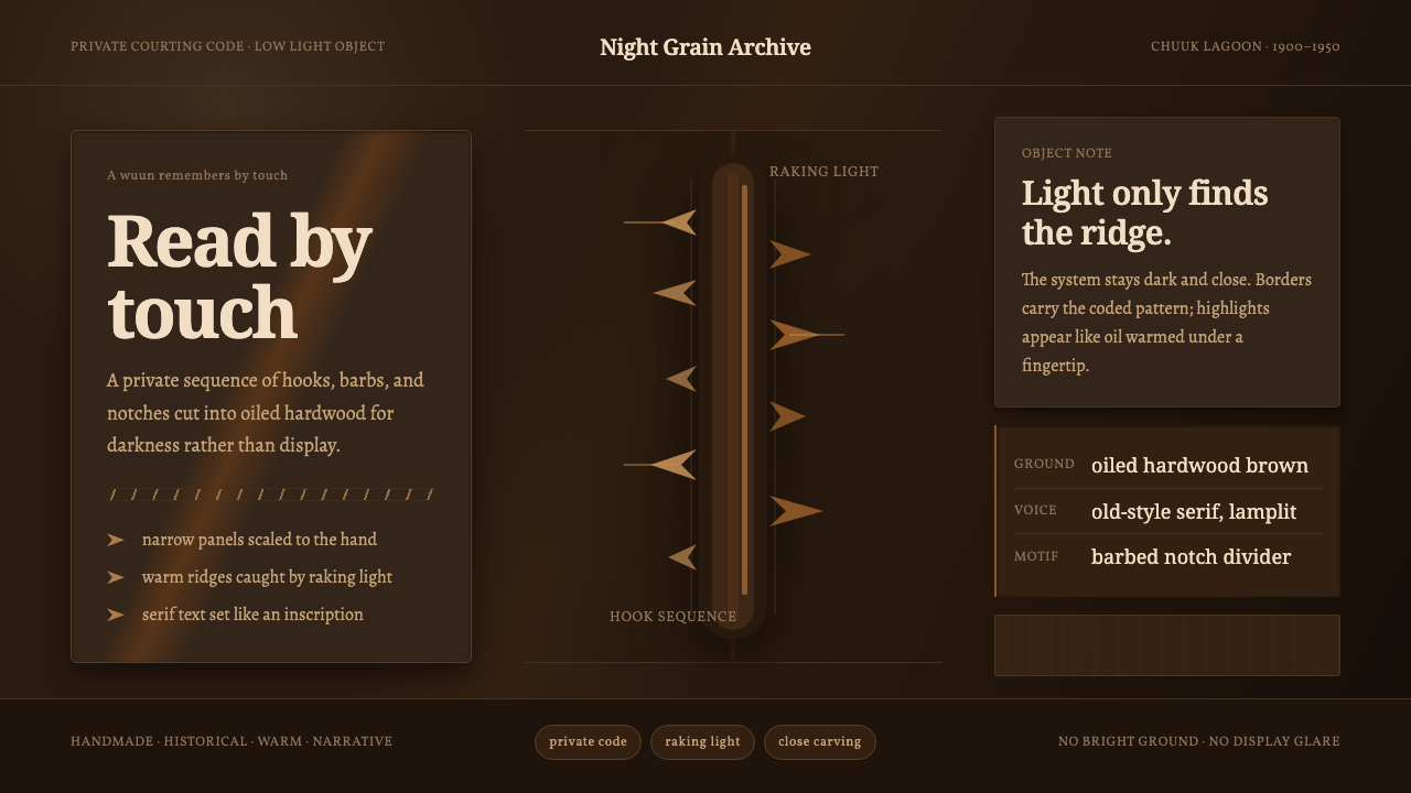 Chuukese Love Stick CarvingIntimacy carved for darkness. Oiled brown grain and hook-notches read by raki…
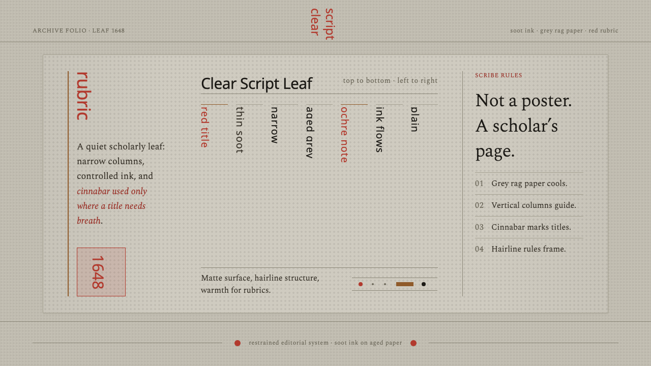 Kalmyk Todo Bichig Clear ScriptRestraint becomes script. Soot columns on grey rag paper, touched by cinnabar…
 Russian LubokFolk print sings. Tan rag paper, black woodcut rules, red and green fills mis…
 Bonsai CultivationQuiet asymmetry. Pine green rests on dark tray earth, sealed by one vermilion…