What is Chilean Lapis Lazuli?
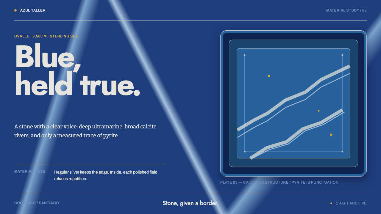
Chilean lapis lazuli design holds a single stone with restraint: a deep ultramarine slab, crossed by white calcite rivers and framed in plain silver.
Chilean Lapis Lazuli in brief
Chilean Lapis Lazuli is a design style taken from a national stone and the craft built around it. Chile is one of only two commercial sources of lapis lazuli in the world, the other being Afghanistan, and the stone is Chile's national stone. The style draws on a polished slab from the Flor de los Andes deposit above Ovalle, in the Coquimbo region, mined high in the Andes and bezel-set in hand-raised sterling silver in a workshop in Santiago.
Chilean material carries more calcite and less pyrite than Afghan lapis, which is why it reads clearer: a deep ultramarine body interrupted by white rivers, with gold flecks placed sparingly. The interface follows the same rule. The settings are regular and silver; the stone inside them is irregular. Order lives in the frame, nature lives in the field, and the two never swap roles.
Dark, cool and quietly precious, the style is meant for products and presentations that want gravity without glitter. It offers a blue so deep it feels like depth itself, a white that is structural rather than decorative, and a gold you can count on one hand. It is a jeweller's logic applied to screens: choose the stone, then build the plainest possible setting around it.
Where does Chilean Lapis Lazuli come from?
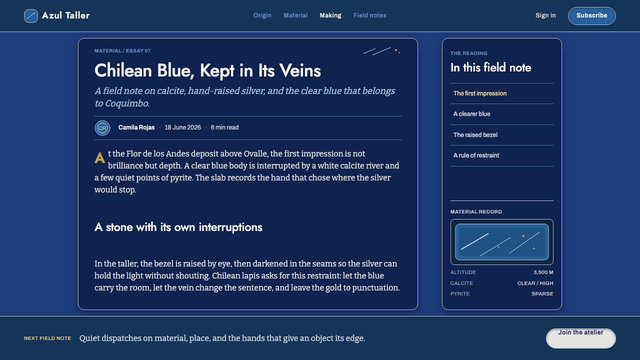
Lapis lazuli has been prized as a blue stone for millennia. Pliny the Elder, the Roman naturalist, wrote in his Natural History of a blue stone sprinkled with points of gold that later readers have generally identified as lapis, and the stone's colour was valued so highly that, ground fine, it became ultramarine, the pigment whose name means 'from beyond the sea'. For most of that long history the classic source was Afghanistan; Chile is the only other commercial source in the world, which is why its stone carries national weight.
The Chilean story as this style tells it belongs to the middle of the twentieth century, and the source places it between 1950 and 1990, a period of organised lapis extraction and of studio silversmithing. In the Coquimbo region, Ovalle mining cooperatives work the Flor de los Andes deposit at great altitude in the Andes. Rough stone then travels to Santiago, where the lapidary and silversmith workshops of the Bellavista district cut, polish and set it. The distance between the mountain and the workbench is part of the material's story.
Two craft strands meet in the finished object. The first is Andean lapidary craft, the cutting and polishing of hard stone into slabs and cabochons. The second is mid-century Latin American studio silversmithing, in which a smith raises a bezel by hand, shaping sterling around the stone so that the metal serves it rather than competing with it. The result is jewellery in which the silver is regular, simple and slightly severe, while the stone is wild, veined and unrepeatable.
A third strand is typographic. Chilean print modernism of the period worked in a geometric sans-serif idiom in the lineage of Futura, a clean, circle-and-line letterform that matches the plain silver setting. The design system pairs that crisp lettering with the rich, irregular stone: a precise frame, a free field. The three strands together explain the style's temperament, which is cool, deliberate and meant to be looked at for a long time.
What defines the Chilean Lapis Lazuli look?
Ultramarine Stone Ground
The body colour is a deep, saturated ultramarine, a blue so dark that it behaves like a ground rather than an accent. It is a stone colour, not a screen blue: slightly mottled, with density that varies as light passes through it. Large panels in this tone feel weighty and calm. Because it carries the whole page, it must be handled as material: very deep at its edges, never a flat, brightly lit fill.
Calcite Rivers
White calcite veins cross the blue like rivers on a map. They are the style's structural element, which means they may be used generously: as dividers, as large diagonal or meandering bands, as the dominant light area of a card or hero. Their edges are soft and irregular, never ruled. A page with no white feels dead; a page with white in broad, flowing passages feels like the stone it comes from.
Sparing Gold Flecks
Chilean lapis has little pyrite, and the style honours that. Gold appears only as tiny flecks, a few on a screen, perhaps a short rule or a single marker. It is never a gradient fill, a large foil panel or a glittering border. One screen should hold gold you can count. This restraint is what keeps the style premium rather than showy, and it makes each fleck read as a deliberate choice.
Silver Settings
Every piece of stone is held in a silver bezel, and the interface does the same. Cards, panels and images sit inside plain, regular rims in a cool, brushed-silver tone: thin, continuous and unornamented. The rim is the order in the system. It is hand-raised in the source, so it can show a faint softness, but it should never be heavily bevelled or mirror-polished.
Regular Frame, Irregular Field
This is the organising rule: geometry belongs to the frame, irregularity to what is inside it. Grids, alignments and spacing stay strictly regular; the interior of a panel, a hero image or a background may flow, vein and vary. A designer who reverses the roles, with a wavy frame around a flat blue, will lose the style immediately. The silver setting is order; the stone is nature.
Geometric Sans Lettering
Type follows the Chilean print-modernist habit: a clean geometric sans-serif in the Futura lineage, with round bowls, simple strokes and crisp spacing. It acts as the printed counterpart of the silver setting: precise, legible and unornamented. Headings may be large and light in feel; body text stays modest. White or pale silver-grey type on the blue ground keeps contrast high without relying on pure white.
Polish and Depth
The stone is polished, so surfaces carry a quiet sheen rather than a matte flatness. Depth comes from the stone's own translucence: deeper blue at the edge, a lighter, veined passage where light enters, soft reflections along the silver. Shadows are minimal and cool. Avoid lens-flare shine or hard glossy highlights; the polish should whisper, as a finished slab does under gallery light.

Who shaped Chilean Lapis Lazuli?
The cooperatives of Ovalle, in Chile's Coquimbo region, are the miners behind the stone, working the Flor de los Andes deposit high in the Andes. They stand for the organised extraction that made lapis a national material between 1950 and 1990. In the design system they are the source of the raw, veined field: the part of the composition that is found, not made.
The small workshops of the Bellavista district in Santiago are where rough lapis becomes jewellery: stone cut and polished by the lapidary, sterling silver raised by hand around it by the silversmith. They are the other half of the system, the maker of the regular silver frame. Their work is the reason the style insists on a plain, hand-raised-looking setting that serves the stone.
Pliny the Elder, the first-century Roman naturalist and author of the Natural History, is named in the source record because his description of a blue stone sprinkled with golden points is generally read as an early account of lapis lazuli. His inclusion ties the Chilean craft to a very long line of admiration for the stone. It reminds a designer that this blue has meant preciousness for two thousand years, and should not be treated lightly.
How do you use Chilean Lapis Lazuli today?
Chilean Lapis Lazuli is a style of one precious thing, carefully set. It rewards the same discipline as jewellery: decide what the stone is, a hero image, a key number, a product, and then build the quietest possible frame around it. The more selective you are with white and gold, the more expensive the result looks.
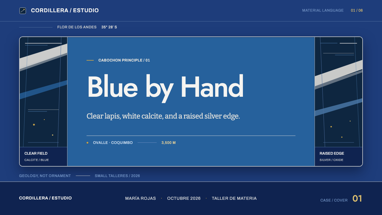
On slides, a cover can be a single deep blue field with a broad white vein running across it, a small gold fleck near the title, and a thin silver rule below. Content slides keep a calm blue ground, regular margins and silver-framed panels, with white veins used as section dividers. For data slides, set charts inside a silver bezel on the blue ground: bars and lines in white or pale silver-grey, one gold marker for the point that matters, and everything else restrained.
For web interfaces, the style suits finance, luxury and fine-craft brands, portfolios, product showcases and dark-themed dashboards where a premium, composed tone is wanted. Use the blue as the page ground; card edges in thin silver; links and focus states in white or pale silver; and gold only for one status marker or a single accent. Pricing pages work well with three or four silver-framed panels and the recommended plan marked by one gold fleck rather than a gradient badge.
In editorial and marketing work, the style supports slow, considered storytelling about craft, materials, mining and origin, and works equally well for jewellery, mineral and stationery brands. Photography should be close, controlled and cool-toned, showing stone and silver in detail. Layouts should be calm and well spaced, with the white vein used as a graphic device across the opening spread of a feature, and the silver line as the standing element of the grid.
The most common mistake is gold excess: a gold gradient on every heading, glittering borders and foil panels turn a restrained stone into costume jewellery. A second mistake is flattening the blue into a plain digital navy with no depth or vein. A third is making the frame irregular, wavy edges and organic shapes around the content, which reverses the logic of the setting. Keep the frame plain and let the stone be wild.
Chilean Lapis Lazuli — FAQ
Why does the style use so little gold?
Because Chilean lapis lazuli has less pyrite than Afghan stone, so its gold flecks are few and small. The source places them sparingly, and the interface follows the stone. In practice this means gold appears as tiny marks, a short rule, a single status dot or a pinpoint accent, never as a broad fill or gradient. Limiting gold also keeps the design premium and makes every gold element feel considered.
Is white in this style only a text colour?
No. White is a structural material here, taken from the calcite veins that run through the stone. It can be a broad flowing band, a section divider, a large light area on a card or a hero. Text in white or pale silver-grey is a secondary use. The point is that white may be generous when it follows the vein logic, while gold must stay tiny.
How is it different from a plain navy or blue luxury theme?
A generic navy theme uses flat blue as a background. Chilean Lapis Lazuli is built on a specific stone: a deep ultramarine with irregular white rivers, a very sparing gold and a regular silver setting around it. Remove the veins and the silver frame and you have an ordinary dark blue page. The irregular field inside a strictly regular frame is the identity.
Does it work in a light mode?
The style is dark by nature, because a deep stone slab is its subject. A light version is possible if you invert the roles: pale calcite white as the ground, deep ultramarine as a large panel or band, and silver rims unchanged. It will feel more like a gallery wall holding a stone than the stone itself. For most products, keeping the blue as the dominant surface and using white as veins is the stronger choice.
What kinds of product suit it?
It suits products that want gravity and refinement without noise: jewellery and craft brands, finance and private banking, fine stationery, portfolios, high-end e-commerce, and dark dashboards for analytics. It is less suited to playful, high-energy or heavily illustrated products, where its restraint would read as cold. It is strongest when a single hero element can be set like a stone in silver.
Related design styles
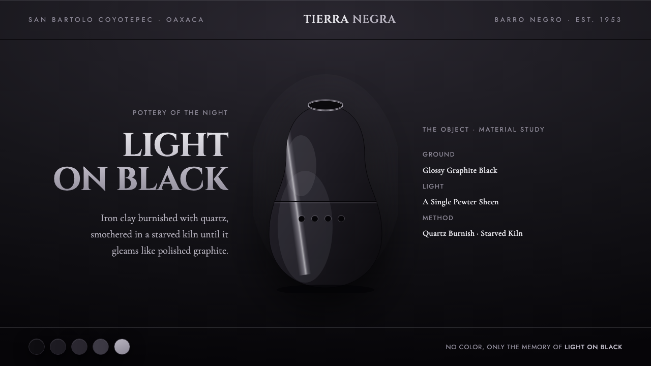 Oaxaca Barro NegroPottery of the night. Glossy graphite on matte black, one pewter sheen on the…
 Sori Yanagi ButterflyQuiet objects speak. Pale plywood and matte porcelain glow on a sumi-charcoal…
 Alvaro Siza WhiteLight makes the form. White planes on cool plaster throw sea-grey shadow and…
 Bengali Jamdani MuslinBreathes like woven air. Indigo ground, ivory butis, and threadline borders s…
 Jamaican Blue Mountain CoffeeOrigin has weight. Mountain blue, estate gold, and stencil type press like a…
 Kashmiri Sozni Shawl EmbroideryNight made luminous. Indigo ground, gold hairlines and silk medallions stitch…