What is Hebron Glass?
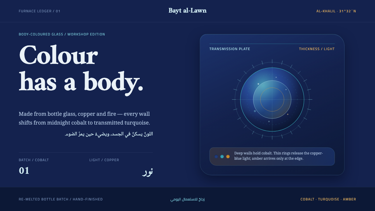
Hebron glass keeps its colour in the body of the vessel, not on its surface — a cobalt mass that reads almost black, deepening to turquoise wherever light passes through, with furnace amber glowing from one side.
Hebron Glass in brief
Hebron glass is hand-blown glassware made in the town of Hebron, known in Arabic as al-Khalil, in Palestine. Its furnaces melt recycled bottle glass together with iron and copper oxides and turn it into colours named after stones: cobalt, turquoise, bottle green, amber and rose. The decisive fact about those colours is where they live. They are in the body of the vessel, a tint carried through the whole thickness of the glass, and not on its surface like paint or glaze.
That fact becomes the logic of this design language. A blown vessel is not stamped from a mould, so its walls thicken and thin across a single form, and the colour follows the thickness, sliding from ink-dark where the glass is heavy to translucent where it is thin. Seeds, which are small trapped bubbles, and striations from the batch are left in rather than polished away. Light plays a part that paint never does, because the same blue changes from near-black to a clear turquoise depending on how much glass the light must cross.
The system is therefore built the way a blown vessel is built. It starts with a deep cobalt mass that reads almost black in the dim of a workshop. Warm furnace amber slants in from one side. A copper-blue turquoise appears only where light passes through. And the objects it describes are not museum pieces: they are household vessels that are still being made and used today. The mood is a working room, warm and slightly dark, with the glow of a furnace somewhere out of sight.

Where does Hebron Glass come from?
The craft's roots reach back to antiquity. Glassmaking in this part of the Levant is associated with Roman and Phoenician times, and Hebron's furnaces belong to that long regional tradition, which also includes the wider Islamic and Levantine glassmaking that supplied lamps, bottles and drinking vessels across the region. The town is known by two names, Hebron and al-Khalil, and the craft is tied to it so closely that its glass is simply called by its name. The history is long enough that the colours feel inherited, not designed.
Documentary evidence for the household trade is firmer from around 1840, when glass production in the town is recorded as an everyday family industry. Earlier outsiders left traces too: Felix Faber, a pilgrim writer who travelled to the Holy Land, is the name usually cited among those who noticed the town's glass. What matters for the design language is the picture that emerges across these sources. Glass in Hebron was a household craft, made in workshops, often by families, and sold for use rather than for display.
A defining feature of the local practice is the recycled batch. Rather than starting from fresh raw materials, makers melt discarded bottle glass, adding iron and copper oxides to shape the colour. This is folk glass in the strict sense: economical, resourceful and dependent on what is at hand. The consequence for appearance is a rich, slightly irregular character. Colour varies from batch to batch, trapped seeds and swirling striations remain, and no two vessels are quite identical. Those traits are the visible record of the process, and a faithful design keeps them.
The Natsheh family is among the families associated with Hebron's glassmaking, and their name is a reminder that the craft is carried by people, passed along within workshops from one generation to the next. Today Hebron glass is recognised as part of Palestinian craft heritage, a living tradition and not a closed historical chapter. That status matters when a designer borrows its look. The respectful way to do so is to learn from how the material behaves, name the source, and avoid reducing a working craft to a decorative flourish.
What defines the Hebron Glass look?
Colour in the Body
The defining principle is that colour is volume, not coating. In an interface this means avoiding a flat, opaque fill with a coloured overlay on top. Instead the colour should feel as if it passes through a thickness: deeper where there is more of it, lighter where there is less. A panel should look like it has substance behind its surface, not a skin laid over nothing.
A Cobalt Mass that Reads Almost Black
The ground is a deep cobalt that looks nearly black in dim light, the way a thick glass vessel looks in a dark workshop. It is dark first and blue second, and its blueness reveals itself at the edges and in thinner places. This makes the system a dark theme with a hidden chroma: quiet at a glance, richer on closer reading.
Walls that Thicken and Thin
A blown vessel is not uniform. Its walls are heavy in one place and delicate in another, and the colour moves with them across a single form. Design can borrow this with gradients that follow shape, not a decorative sweep: a surface darkens where it is thick and opens where it is thin. The variation is structural, as if the form itself decided where the colour deepens.
Seeds and Striations
Small trapped bubbles and faint swirling streaks remain in the glass from the batch. In a design they become fine speckle and soft linear variation, kept subtle and never repeated in a mechanical pattern. They tell the viewer that the surface was made, and they stop a deep dark ground from looking like a flat digital void.
Turquoise that Needs Light
The copper-blue turquoise does not sit on the surface as an accent. It shows itself only where light passes through the glass, which suggests using it for the glow inside an active element, a selected state or a thin edge, never as a flat button colour. It has to look as if the light is behind it.
Furnace Amber from One Side
Light in this system comes from one direction: a warm furnace amber slanting in from the side. It is not ambient light spread evenly over everything. The directional glow gives forms a lit side and a dark side, and the rest is left to refraction, so a surface may carry a soft amber edge while the other edge sinks back into blue.
A Palette Named After Stones
The colours are cobalt, turquoise, bottle green, amber and rose, each named for a stone or a familiar object and each a mineral tone rather than a screen-saturated primary. They work best as a family in which one colour leads and the others support. Bottle green and rose are quieter alternates, appropriate where the page needs a different mood without breaking the glass logic.

Who shaped Hebron Glass?
The Natsheh family is one of the families associated with glassmaking in Hebron. Its name stands for the way the craft is held: by people and workshops, passed from one generation to the next, rather than by an institution. For a designer, the lesson is to treat the look as a practice of makers, to name the source, and to remember that the vessels are household objects that are still in production.
Faber was a pilgrim writer who travelled to the Holy Land, and he is the name usually cited among early outside observers who noticed Hebron's glass. He is included here as a reminder that the town's glassmaking is old enough to appear in travellers' accounts. The weight of that history explains why the colours feel inherited, and why a design based on them should have the patience of something long established.
Beyond any individual name, the style belongs to the working glassblowers of Hebron, who melt recycled bottle glass in their furnaces and blow it into vessels used in ordinary homes. Their practice is the real source of the design logic: colour in the body, walls that thicken and thin, seeds and striations left in. A faithful design simply tries to behave as their material behaves.
How do you use Hebron Glass today?
Hebron Glass is a dark, atmospheric style, and it succeeds when it behaves like a material rather than a filter. The test of a good application is whether a surface seems to have thickness, whether light seems to pass through it, and whether imperfection has been left in. If a layout only swaps its colours for blue and amber, it has missed the point.
For presentation slides, a cover can be a deep cobalt field that reads almost black, with a slim turquoise glow along one edge and a warm amber edge on the opposite side, and a single plain title in the middle. Content slides work as panels of varying depth, with the key panel brighter and thinner and supporting panels darker and thicker. Data slides suit this style when the chart colour is a translucent turquoise or amber seen against the dark, so the data seems lit from within.
For web interfaces, the style fits products where atmosphere and craft matter: gallery sites, product showcases, music and audio tools, hospitality, perfume and drinks brands, and any narrative-driven experience. Use cobalt as the page ground, turquoise for the active state and focus glow, and amber for a directional edge light. Cards should have gradual, shape-following depth instead of drop shadows. Keep text high in contrast and generous in size so the dark mood does not cost legibility.
For editorial and marketing work, the style gives craft, travel, design-history and heritage stories a warm, hand-made seriousness. A feature can open on a deep blue spread with a thin amber edge, and pull-quotes can sit in a lit panel as if held up to a window. Product pages for handmade or recycled goods are a natural fit, since the story of recycled bottle glass matches the story of the material. Photography of real glass, light and workshop scenes will support the look more than stock backgrounds.
The most common mistake is to mistake it for glassmorphism. Frosted translucent cards over a blurred background are a surface effect and do not reproduce the body colour, uneven thickness or directional light that define this style. Other errors include using all five colours at once at full strength, polishing away every seed and streak, and flattening the cobalt into a plain navy. Finally, avoid treating the craft as exotic wallpaper; name the tradition and the place, and let the design honour what the material does.

Hebron Glass — FAQ
What is Hebron glass?
It is hand-blown glassware made in Hebron, also called al-Khalil, in Palestine. Makers melt recycled bottle glass with iron and copper oxides to produce colours named after stones, such as cobalt, turquoise, bottle green, amber and rose. The colour runs through the body of the vessel, and trapped bubbles and streaks are left in. It is a household craft with roots in antiquity that is still made and used today.
How is this different from glassmorphism?
Glassmorphism is a surface effect: a frosted, blurred, translucent card floating over a background. Hebron Glass is about body colour, meaning pigment carried through a thickness, along with uneven walls and directional light. The first imitates the look of a frosted window, while the second imitates how a blown vessel holds and transmits colour. The two can look similar in screenshots but are built on different ideas.
Why keep the bubbles and streaks instead of making the glass perfectly clean?
Because they are the evidence of how the glass was made. Recycled batches produce seeds and striations naturally, and they set folk glass apart from industrially clear glass. In a design, a small amount of speckle and soft linear variation keeps a dark surface from looking like a flat digital void, and it signals that the surface has material presence. The key is restraint: subtle and unpatterned.
Is it only suitable for dark interfaces?
It is built as a dark system, since the cobalt mass reads almost black and the glow comes from within. A light variant is possible if the glass is treated as thin and clear, with the colour concentrated at edges and in the thicker places. But the character of the style, depth and furnace-lit warmth, is strongest in dark mode, and a light version should keep at least one deep cobalt element to hold that character.
How should a designer approach the cultural source respectfully?
Learn from how the material behaves, rather than copying surface motifs, and name the source: Hebron, al-Khalil, and the glassmaking families who keep the craft alive. This is part of Palestinian craft heritage and a living practice, so avoid decorative clichés or using the look as generic exotic styling. If the work is commercial, consider supporting the makers directly or crediting them where it is natural to do so.
Related design styles
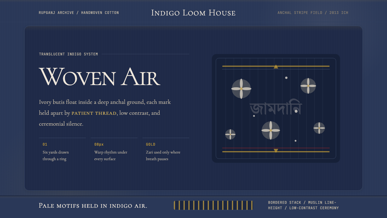 Bengali Jamdani MuslinBreathes like woven air. Indigo ground, ivory butis, and threadline borders s…
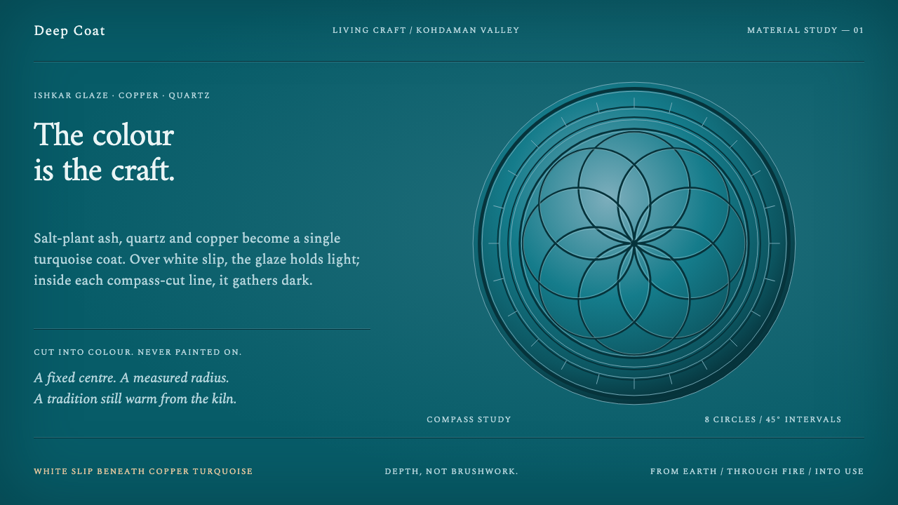 Istalif PotteryColour has depth. Copper-turquoise fields pool dark around compass-cut circle…
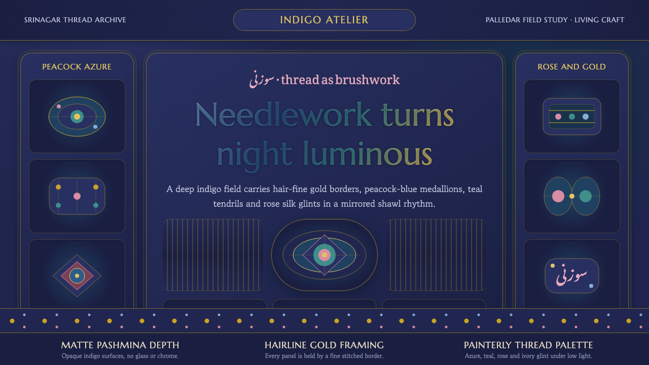 Kashmiri Sozni Shawl EmbroideryNight made luminous. Indigo ground, gold hairlines and silk medallions stitch…
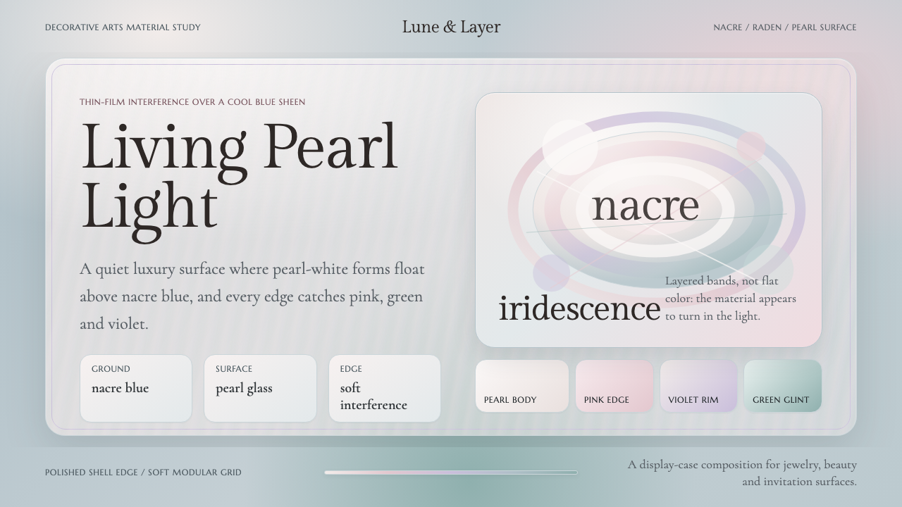 Mother-of-Pearl NacreQuietly expensive shimmer. Nacre blue ground with pearl panels and pink-viole…
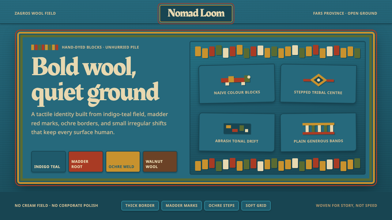 Persian Gabbeh RugBold wool, quiet ground. Indigo-teal field, ochre borders, madder block motif…
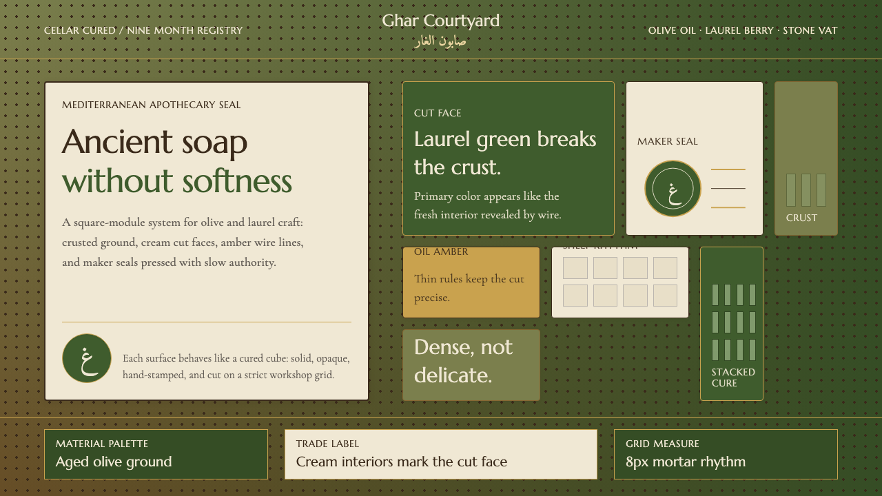 Syrian Aleppo Laurel SoapAncient without softness. Olive crust, laurel green, and stamped circles hold…