What is Chefchaouen Blue Medina?
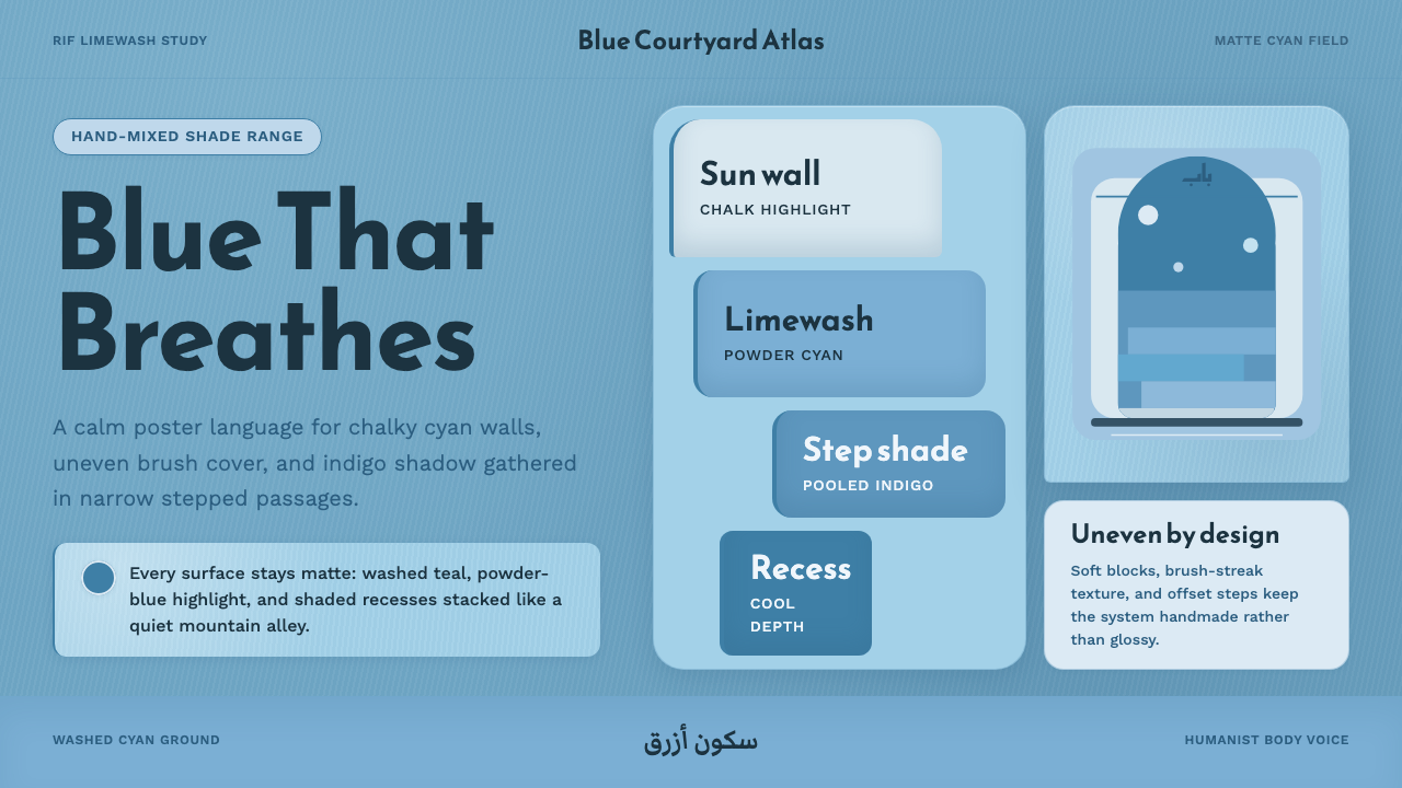
Chefchaouen Blue Medina turns a whole mountain town painted by hand into a design system — chalky washed cyan, uneven brushwork, and the cool hush of shaded stone stairways.
Chefchaouen Blue Medina in brief
Chefchaouen Blue Medina is drawn from a real place with no design brief: the medina of Chefchaouen, a small town tucked into Morocco's Rif Mountains where residents have, for generations, whitewashed their walls, stairways, and doorframes in shades of blue mixed by hand at the household level. There is no single official blue — that is the point. Every wall is the product of one family's judgment about how much pigment to add to lime, repeated across an entire town until the whole place reads as a single, coherent, but never uniform color field.
The resulting visual language is a chalky, matte cyan-teal ground, applied with visible brush texture rather than flat, even coverage, deepened by pooling indigo shadow wherever the geometry of a stairway or an archway blocks direct light. Because the paint is limewash rather than industrial coating, it is porous and slightly uneven by nature — it chalks, streaks, and wears differently on every surface, and this system treats that imperfection as the whole aesthetic rather than something to smooth away.
Typographically and structurally, the system pairs that hand-painted warmth with a Maghrebi-influenced display register for headlines and a calmer, humanist Latin sans for body text — a deliberate echo of the medina itself, where Arabic script signage and French colonial-era Latin lettering have coexisted on the same walls for decades. The combination signals a place that is simultaneously ancient, hand-made, and quietly cosmopolitan.
Where does Chefchaouen Blue Medina come from?
Chefchaouen was founded in 1471 as a small fortress town in the Rif Mountains of northern Morocco, built partly as a defensive outpost against Portuguese incursions along the coast. Its population grew significantly in the years following 1492, when Muslims and Jews expelled from Spain during the Reconquista settled in North African towns like Chefchaouen, bringing Andalusian building traditions, craft practices, and — in some accounts — the blue-washing tradition itself with them, though the precise origin of the blue is debated rather than settled fact.
The most commonly told explanation traces the blue to the town's historic Jewish community, who associated the color with religious symbolism connecting sky and divinity, a tradition also seen in blue-painted elements of some synagogues and Jewish quarters elsewhere in the Mediterranean world. This account is widely repeated in guidebooks and by the town itself, but it functions more as a cultural memory passed down through generations than as a single documented decree, and it coexists with more practical explanations circulating locally — that the color was believed to repel mosquitoes, or that it simply kept surfaces looking cool and clean in a hot climate. The honest answer is that no single origin story is definitively proven; what is certain is that the practice became widespread and self-sustaining regardless of why it began.
For centuries, Chefchaouen was also notably closed to outsiders — the town restricted access to non-Muslims for much of its early history, and it was only opened to European visitors in the twentieth century, following French and Spanish colonial-era administration of parts of Morocco. This relative isolation is part of why the blue-washing tradition developed and persisted as an internal, community-driven practice rather than one shaped by tourism or external commercial pressure — the town was, for most of its history, painting itself for itself.
The scale and consistency of today's blue medina is largely a mid-to-late-twentieth-century phenomenon: while blue accents existed earlier, the practice of washing entire buildings — walls, stairs, doorframes, alley floors — in graduated shades of blue became widespread roughly from the 1950s through the 1980s and has been actively maintained since, repainted regularly by residents and, more recently, reinforced by the town's tourism economy, which now depends on the blue as much as the blue once depended only on tradition.
What defines the Chefchaouen Blue Medina look?
Color
The palette centers on a washed, powdery cyan-teal that reads as chalky rather than glossy, ranging within the family from paler, almost whitened tints near ground level and in direct sun to deeper, more saturated washed blues in shaded corners and lower stairwells. There is no single 'correct' shade — the system embraces a range within the blue family the way the real medina does, with variation from wall to wall treated as authentic rather than inconsistent.
Surface Texture
Coverage is deliberately uneven, evoking hand-applied limewash rather than a sprayed or printed flat color: visible brush streaks, thinner patches where paint has worn away to reveal underlying stone or plaster, and a slightly powdery, matte finish rather than any sheen. This unevenness is not noise to be cleaned up — it is the texture that makes the color read as physically painted rather than digitally generated.
Shadow
Shadow is treated as a compositional actor rather than a lighting afterthought. Because the medina is built as a dense stack of narrow alleys, stepped stairways, and keyhole archways, indigo-toned shadow pools deeply in recesses and corners even at midday, creating strong internal contrast within an otherwise cool, low-saturation scene. This system leans into that — using deep indigo shadow deliberately at junctions, steps, and doorway thresholds — rather than flattening everything into even, shadowless light.
Typography
Headlines lean into a display register with Maghrebi warmth — letterforms that carry some of the calligraphic character associated with Arabic-influenced signage in the region — while body text shifts to a calmer, more neutral humanist Latin sans for legibility. This pairing mirrors the medina's own bilingual signage culture, where decorative Arabic lettering and plain Latin street names have long shared the same painted walls.
Composition
Because the medina is built on a steep mountainside, its architecture is defined by offset, stepped forms — staircases that shift direction, doorways set at slightly different heights, walls that step back and forward as the terrain demands. This system favors that same offset, non-grid-aligned rhythm over perfectly regular layouts, letting elements sit at deliberately staggered heights the way real buildings do on a slope.
Materials
Limewash over stone and plaster is the defining material relationship: a breathable, mineral-based coating applied over rough masonry, rather than a synthetic paint over smooth drywall. This choice explains why the color always appears slightly diffused into its surface rather than sitting crisply on top of it, and why cooler, weathered patches naturally appear at points of frequent touch or wear, like stair edges and door handles.
Mood
The overall feeling is calm rather than vibrant — a cooling, shade-seeking hush appropriate to a mountain town built to stay cool in a hot climate. Unlike design systems that use blue for corporate trust or digital clarity, this one uses blue as literal thermal and psychological relief, and that sense of quiet, unhurried coolness should carry through even when the palette is applied far from its architectural origin.
Who shaped Chefchaouen Blue Medina?
There is no single architect or authority behind Chefchaouen's blue — the look is the aggregate result of individual families independently mixing and repainting their own walls over generations, which is precisely why the shade varies subtly from house to house rather than presenting as one manufactured, uniform color.
Refugees from the Reconquista who settled in Chefchaouen after 1492 brought Andalusian building and craft traditions from the Iberian Peninsula into the town's early development, contributing to its distinctive architectural character within the wider Rif-mountain building vernacular.
Among the most commonly cited (though not definitively proven) explanations for the blue tradition is its association with the town's historic Jewish community and the symbolic connection between blue and the divine seen elsewhere in Jewish religious and decorative practice around the Mediterranean.
The practical craft of mixing pigment into lime and applying it to porous stone and plaster surfaces is a regional building skill particular to Rif-mountain vernacular architecture, distinct from industrial paint application and requiring periodic reapplication as the mineral coating weathers.
How do you use Chefchaouen Blue Medina today?
Chefchaouen Blue Medina works best wherever a brand wants to signal calm, coolness, and handmade authenticity rather than digital polish — travel and hospitality, wellness and spa brands, artisanal goods, and any editorial content about slow travel or craft tourism. Its washed, matte quality reads as inherently unhurried, which makes it a poor fit for anything that needs to feel urgent, fast, or high-tech.
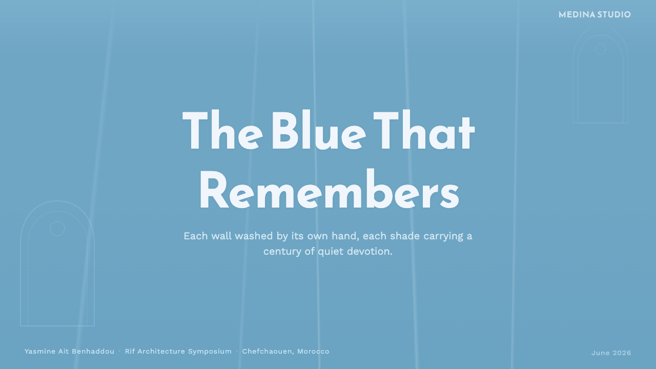
For presentation slides, the style is strong for cover pages and mood-setting section breaks: a full-bleed washed-blue field with visible brush texture, deep indigo shadow pooling toward one edge, and a title set in the restrained Latin sans keeps the composition calm and legible. Content slides should keep large areas of flat washed-blue for backgrounds and reserve deeper indigo shadow tones for framing rather than for body text, since low contrast between mid-blue text and a blue ground quickly becomes illegible. Data slides work best when the data itself is rendered in a warmer neutral (like the oak or stone tones adjacent to the palette) against the cool blue field, so numbers stand out rather than blending into the wash.
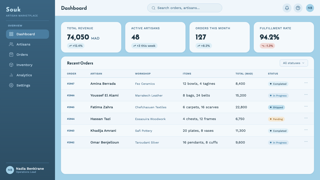
For web interfaces, this style suits travel-booking sites, boutique hotel or riad landing pages, and hospitality dashboards where the brand wants warmth without generic 'tropical' cliché. It is a weaker fit for dense productivity dashboards or data-heavy admin panels, where the low-contrast washed texture competes with the need for crisp, scannable numbers — if used there at all, confine the texture to a header or sidebar and switch to flatter, higher-contrast surfaces for the working area.
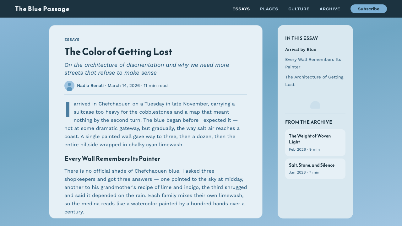
For editorial and marketing content, the style excels at long-form travel writing, photo-essay layouts, and destination marketing — pull quotes and section breaks can borrow the offset, stepped composition idea from the medina's own staircases, giving a page visual rhythm without needing decorative icons. Marketing pages benefit from letting the washed texture run large, the way a real alley wall does, rather than confining it to small swatches or icon backgrounds.
A common mistake is treating this as a flat, single hex of 'travel blue' rather than a range with texture and shadow variation. Applying one perfectly even, glossy blue loses the hand-painted, sun-bleached quality that makes the style recognizable, and risks reading as generic coastal or nautical branding instead. Keep some tonal variation across a surface, let shadow pool at corners and edges rather than disappearing entirely, and avoid pairing the blue with bright, saturated accent colors that would break the calm, mineral mood.
Chefchaouen Blue Medina — FAQ
Is there an official 'Chefchaouen blue' color?
No. That is one of the defining facts about this tradition — the blue is the aggregate result of individual households mixing their own limewash over generations, which means the town's actual walls span a range from pale, almost whitened cyan to deeper washed blue rather than one fixed shade. Design work drawing on this tradition should embrace that range rather than trying to lock onto a single, official-feeling color.
Is the blue-washing tradition definitely tied to the town's Jewish history?
It is the most commonly cited explanation and worth naming, but it is not the only one, and it is not documented as a single settled fact. Local accounts also point to practical reasons — cooling effect, insect deterrence — and the honest position is that the tradition's origin is genuinely debated rather than definitively known. Treat the Jewish-symbolism account as significant cultural context, not proven history.
Why does shadow play such a large role in this style compared to other pastel or light-toned systems?
Because the medina's actual architecture — narrow alleys, stepped stairways, keyhole doorways — creates deep shadow pockets even in bright daylight, and that contrast between washed-light walls and pooled indigo shadow is a large part of what photographs and reads as distinctively 'Chefchaouen' rather than generically pastel-blue. A version of this style with flat, shadowless lighting loses that architectural specificity.
How literally should the Maghrebi display typography be interpreted?
It should read as a qualitative register — warmth, some calligraphic character in headline treatment, a nod to the region's bilingual signage culture — rather than a literal instruction to use Arabic script or a specific named typeface. The pairing with a calmer humanist Latin sans for body text is the more important structural idea: a warmer, more expressive display layer over a neutral, legible working layer.
Related design styles
 Kibbutz HaggadahHandmade harvest page. Olive stencil stock, wheat serif, deckled linocut geom…
 Estonian Folk Tapestry (Anu Raud)Quiet wool carries memory. Banded fleece browns and Alegreya type move like a…
 Indian Jamun Violet HandloomHandspun, never glossy. Jamun-violet dyed cotton figured with pale natural-th…
 Irish Aran Island Cable KnitMaterial honesty raised in wool. Bone ground, moss ink, and cable columns cas…
 NZ Pōhutukawa SummerSummer arrives in one red stroke. Pacific blue and Fraunces type frame cream…
 Sri Lankan BatikCloth that remembers its making. Indigo grounds, saffron motifs, veined with…