What is Vainakh Tower?
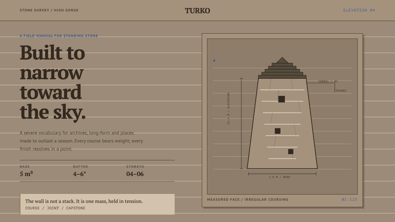
The Vainakh tower is architecture reduced to one rule: stone gains force by narrowing, and everything ends in a point.
Vainakh Tower in brief
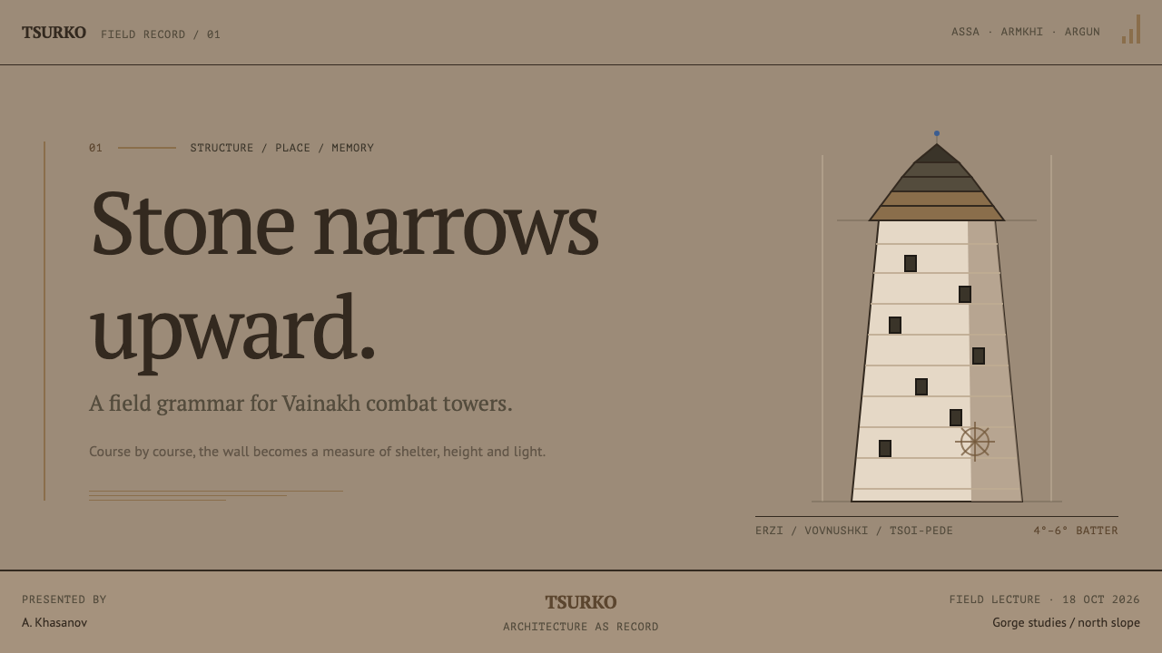
A Vainakh combat tower is a free-standing stone tower built by the Vainakh peoples, the Chechens and Ingush, in the gorges of the North Caucasus. It rises four to six storeys from a small square base, so that its height is several times its width. It is made of marl, sandstone and boulders gathered on the spot, and it served as a clan stronghold and a lookout in one.
Its identifying feature is the taper. Every wall leans inward, so the shaft thins as it climbs and the whole tower reads as one tapering mass rather than a stack of floors. The crown repeats the idea in miniature: courses of corbelled stone step in toward a pointed capstone, called a tsurko. Nothing decorative is added. The silhouette is the ornament.
As a design style, Vainakh Tower is light, warm and monumental. Surfaces are irregular coursed rubble in warm stone tones, divided by a pale line of lime mortar; a single hard mountain light falls from one direction; and containers, headers and frames narrow as they rise and finish in stepped or pointed forms. It is the logic of the towers translated into interface and page: things narrow as they go up, and they finish with a point.
Where does Vainakh Tower come from?
The towers stand in the Assa, Armkhi and Argun gorges of Ingushetia and Chechnya, in the high country of the North Caucasus. Groups such as Erzi, Vovnushki and Tsoi-Pede are among the best-known places where they survive. The tradition is medieval and pre-1900 in date, with its great building period reaching a peak between the fifteenth and seventeenth centuries. The towers rise out of steep valleys where space is scarce and visibility matters, and their narrow footprint is partly an answer to that ground.
The towers are made of local stone, marl and sandstone together with boulders gathered from slopes and riverbeds, laid in courses of uneven size, with a pale band of lime mortar between layers. The masonry belongs to the Caucasian dry-stone tradition of fitting one stone to the next by eye and hand. Four to six storeys are raised from a base barely wide enough to stand in, with walls that lean inward on all four sides. This is why the towers feel less like boxes than like single carved shafts: the taper is built into the structure, not painted onto it.
Tower-building was a specialised craft carried by families. The Barkinkhoyev and Dyskiev master-builder lineages are the names attached to the work, and the towers themselves belong to what the source calls a clan-fortress vernacular: a building type tied to the defence and standing of an extended family. The crown was the builder's signature. Four to sixteen corbelled courses could be stacked into a stepped roof, finished with a pointed capstone, and the number and proportion of the steps varied from tower to tower.
The design system takes two facts literally and leaves the rest alone. The first is that things narrow as they rise; the second is that they finish with a point. Everything else follows from those: irregular coursed rubble for the body, a pale mortar line for the joints, a dark stepped cap for the crown, and one hard directional light, short and undiffused, such as falls on a mountain at midday. It is architecture used as a layout principle, with no pastiche of towers drawn on the page.
What defines the Vainakh Tower look?
Taper (Inward Lean)
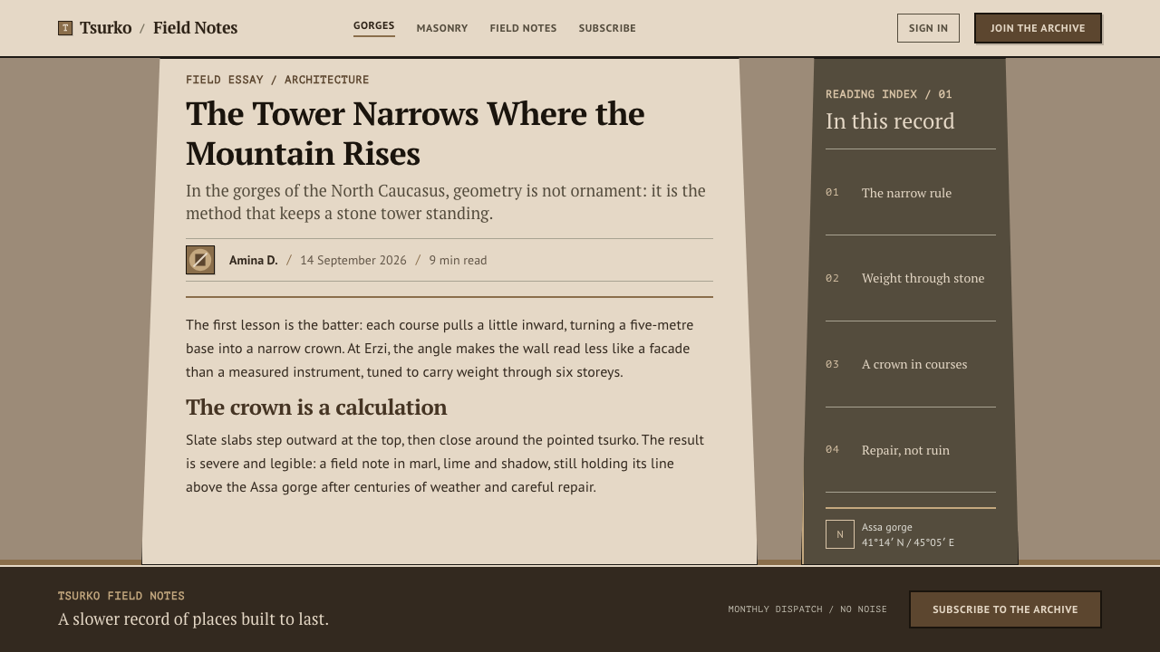
The governing form is the taper. Walls lean inward a few degrees on every side, so the shaft is wider at the foot than at the crown. Translated to layout, headers, containers, hero blocks and image frames narrow as they rise, and the overall silhouette of a page or section should feel like a single mass thinning toward the top. A stack of identical full-width bands is the opposite of the style.
Stepped Crown and Capstone
The top of the tower is the signature. Corbelled courses step inward, one smaller than the last, until a single pointed capstone closes the form. In design terms this gives you stepped corners, tiered headings and a small pointed finial or marker used as the final accent. The steps should be few, clearly legible and slightly uneven, as if laid by hand. A smooth ramp or a rounded dome would lose the character.
Irregular Coursed Masonry
The body is built of stones of different sizes, laid in rough horizontal courses that never quite match. This irregularity is the style's surface texture: subtle blocks of slightly different tone and scale, held in horizontal order. It gives large areas life without any decoration, and it should stay low in contrast so that text remains easy to read. Perfectly uniform brick patterns or glossy tiles are not the same thing.
The Pale Mortar Line
Between the stone courses runs a pale line of lime mortar. It is the style's quiet structural rule: a thin, light, continuous horizontal that separates layers and carries the eye across. In an interface, it becomes the hairline between sections, rows and list items, light against the darker warm stone. It should be consistent and a little uneven rather than razor-straight, and it should never be thickened into a heavy border.
Warm Stone and a Dark Cap
The palette is mostly warm, light stone tones, grey-ochre and weathered buff, rising to a darker stepped cap. Colour is nearly all material: the pale mortar, the shadow under each corbelled course, the darker crown that closes the form. Accent colours are rare. The effect is of a sunlit stone face with the darkest values gathered at the top, which gives a natural hierarchy: light body, dark finish.
One Hard Mountain Light
Light comes from a single direction and is hard, short and undiffused, like a mountain midday. Shadows fall as crisp wedges under the corbels and along one side of the shaft; there are no soft glows or ambient blur. This single-source lighting gives depth to a flat page cheaply and honestly: a hard shadow is just another stone-edged shape. Keep all shadows consistent in direction across the whole composition.
Vertical Proportion and Heaviness
Even at a small base, the towers read as heavy: the walls are thick, the courses are broad, and the narrowing makes the mass feel more concentrated rather than lighter. The style carries this into spacing and proportion. Elements are compact at the base and generous in height, and type is plain and weighty rather than airy. A sense of load-bearing, with each element visibly resting on the one below, is the goal.
Who shaped Vainakh Tower?
The Barkinkhoyev are one of the two master-builder lineages named in the record of Vainakh tower construction. Their place in the story is that of the specialist family: builders who understood how to raise a tapering shaft of irregular stone and finish it with a corbelled crown. For a designer, the lineage is a reminder that the style comes from a craft with rules, passed from builder to builder, not from improvisation.
The Dyskiev are the second master-builder lineage associated with these towers. Together with the Barkinkhoyev, they show that tower-building in the Argun, Assa and Armkhi gorges was a trade with its own families, standards and signature details, above all the crown. The towers differ in the number and proportion of their steps, which suggests the lineages worked within a shared grammar while leaving room for individual character.
The towers were raised by and for Vainakh clan communities, which is what the source means by a clan-fortress vernacular. A tower was not a monument to an individual but a standing structure of family defence and prestige, built where it could watch a valley. That social role explains the style's seriousness: it is a way of presenting strength through structure and position rather than through display.
How do you use Vainakh Tower today?
Vainakh Tower works best where a message needs to feel structural, durable and elevated. Think of it as a hierarchy system disguised as architecture: it tells you what sits at the base, what rises, and what finishes. The discipline is to let narrowing and finishing govern the layout, instead of decorating pages with literal tower images.
On slides, a cover can be a tapering block of stone-toned colour set low on the page, with a stepped dark cap above it that carries the title. Content slides use a few stacked bands that narrow slightly from the foot to the top, with the pale mortar line as the only divider. For data slides, treat charts as masonry: horizontal bars like courses, a hard single-direction shadow under each, and the key figure placed at the narrow, dark crown where the eye finishes.
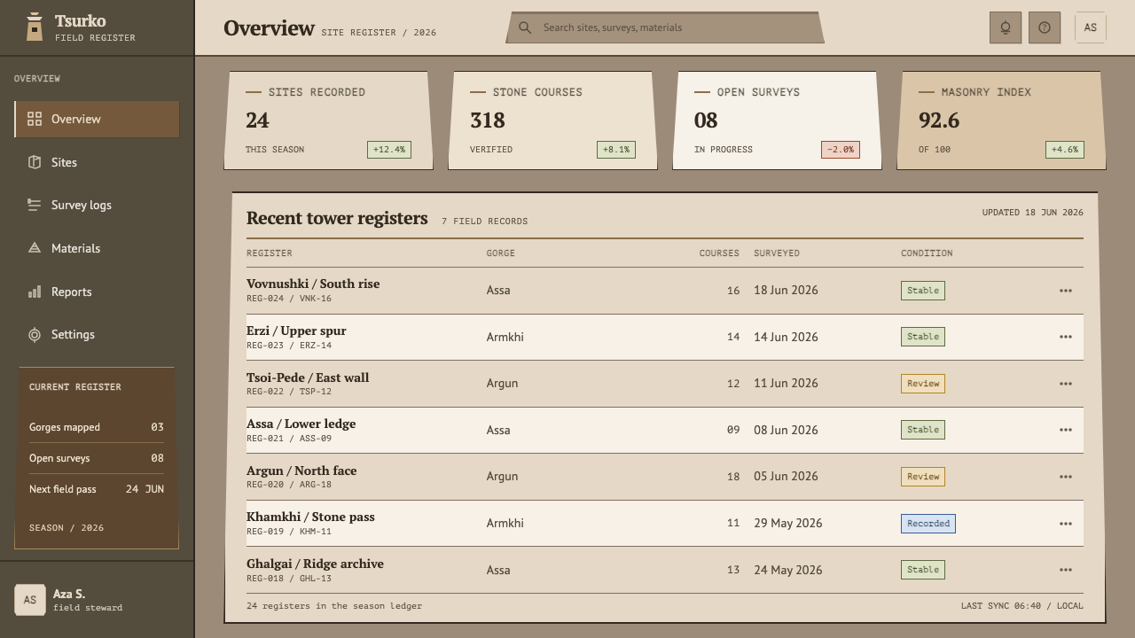
For web interfaces, the style is a good fit for documentation, institutional and heritage sites, security and infrastructure tools, and pricing pages that want to feel solid. Use narrowing hero blocks, stepped section corners, and the pale hairline between rows and list items. Cards can have a single hard offset shadow, consistent across the product. Navigation should be plain and weighty, with the current section marked by the dark cap tone rather than an icon.
In editorial and marketing work, the style supports confident, grounded storytelling about places, craft, defence and endurance. Photography should be sharp, mid-day and high in contrast, with stone, weather and structure in the frame, cropped upright so that vertical taper is visible. Headlines are strong and plain, set as blocks that step in at the end of the last line rather than ragged centred poetry.
The most common mistake is to read the style as a request for a literal castle motif: crenellations, tower icons, fake rock textures with heavy bevels. What matters is the rule, not the picture. A second mistake is softening the light with blurred shadows and glows, which removes the one-sun character. A third is letting every element narrow and point at once: the style needs a wide, calm body below to make the crown meaningful.
Vainakh Tower — FAQ
What does 'taper' actually mean in a UI layout?
It means the visual mass of a section gets narrower toward the top, instead of staying the same width all the way up. In practice: a wide foundation row at the bottom, a narrower middle, and a compact header or hero at the top, or a stepped corner that cuts inward as it rises. You do not need to literally draw a triangle. The goal is for the eye to read the whole layout as one mass that is thicker at the foot and finishes in a point.
Is this style only for light backgrounds?
The style is designed as a light one, with warm stone-toned ground and a darker stepped cap as the finish. A dark mode is possible, but it must keep the single hard light and the pale mortar line, which then reads as a bright hairline against dark stone. The danger in a dark version is losing the contrast that gives the crown its meaning; keep the cap the darkest or the most distinct value on the page.
How is it different from a generic stone or rustic style?
A generic stone style is about texture: a rock photo behind the content. Vainakh Tower is about structure: the narrowing, the finish and the single light. The masonry texture is deliberately subtle and low in contrast, and the real identity lives in proportions and silhouette. If you take away the taper and the stepped cap and keep only the stone surface, you have left the style.
Where does the style come from historically?
It comes from the medieval combat towers of the Vainakh peoples in Ingushetia and Chechnya, in the Assa, Armkhi and Argun gorges of the North Caucasus. The tradition predates 1900, with its great building period peaking between the fifteenth and seventeenth centuries. The towers were built by master-builder lineages, including the Barkinkhoyev and Dyskiev, and belong to a clan-fortress vernacular within the wider Caucasian dry-stone masonry tradition.
What kinds of product suit it?
It suits products that want to look sturdy, structured and long-lived: documentation and developer-tool sites, institutional and heritage brands, infrastructure and security products, craft and construction companies, and pricing pages that benefit from a clear hierarchy of tiers. It is less suited to playful, ephemeral or highly personal products, where its weight and severity could feel heavy-handed.
Related design styles
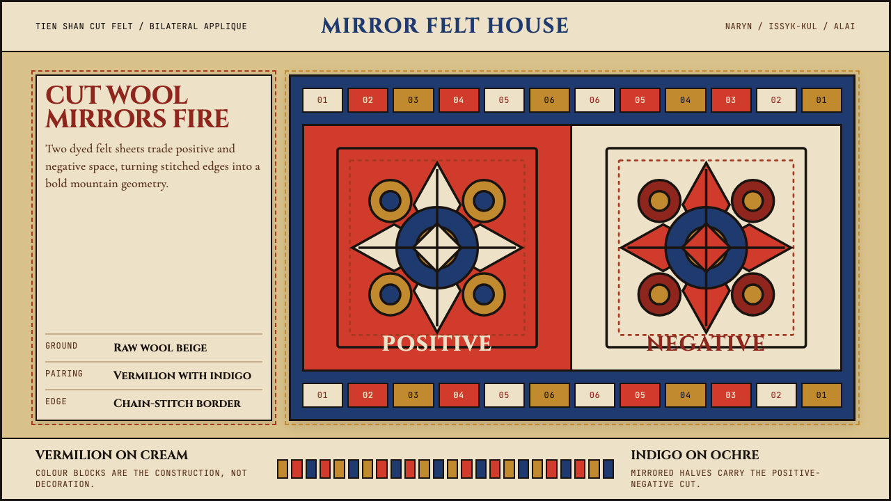 Kyrgyz Shyrdak Felt RugCut felt becomes structure. Vermilion-indigo mirror blocks stitch positive to…
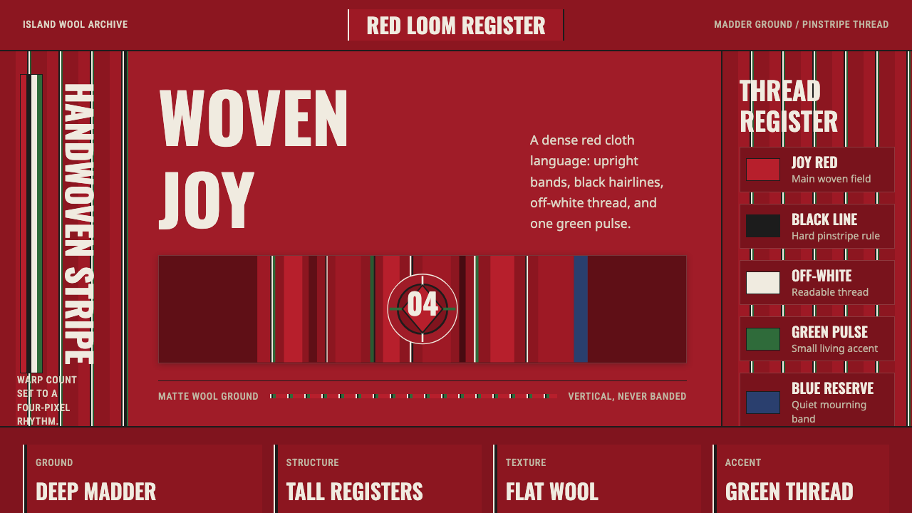 Estonian Kihnu Island SkirtJoy is woven vertical. Madder red ground, Oswald stripes, black and green pin…
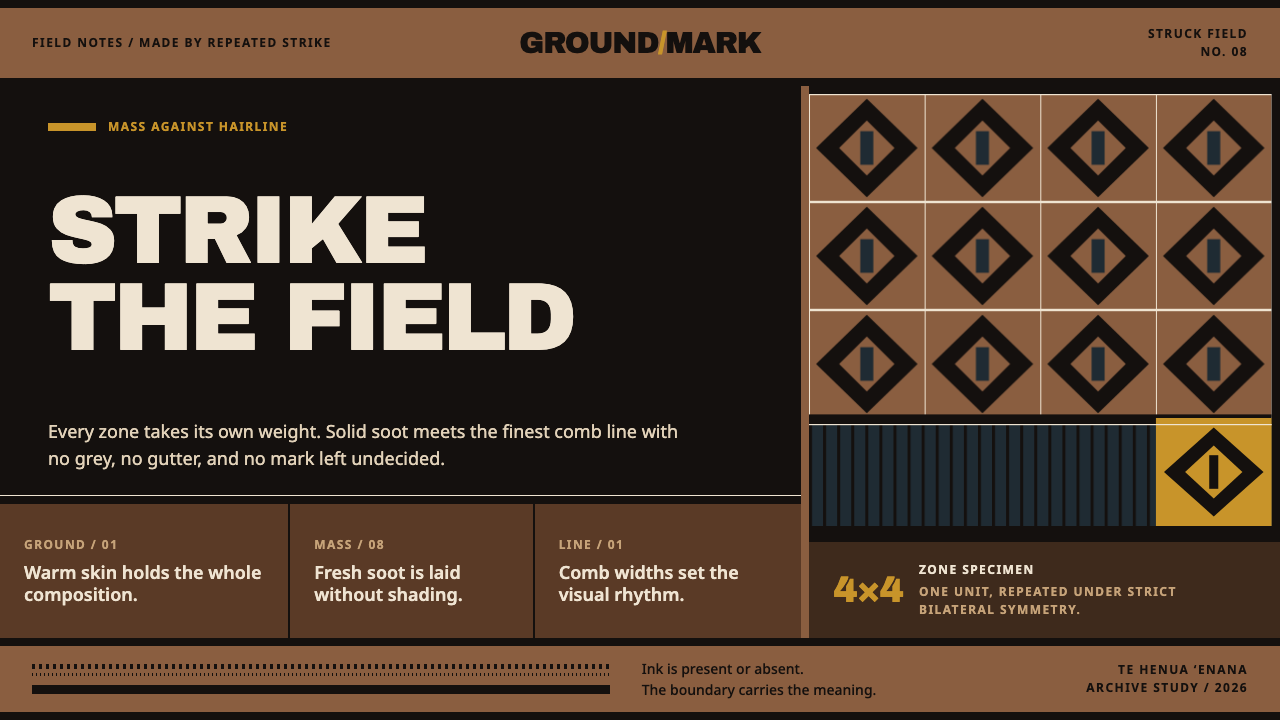 Marquesan PatutikiSoot meets skin without compromise. Solid black zones collide with comb-struc…
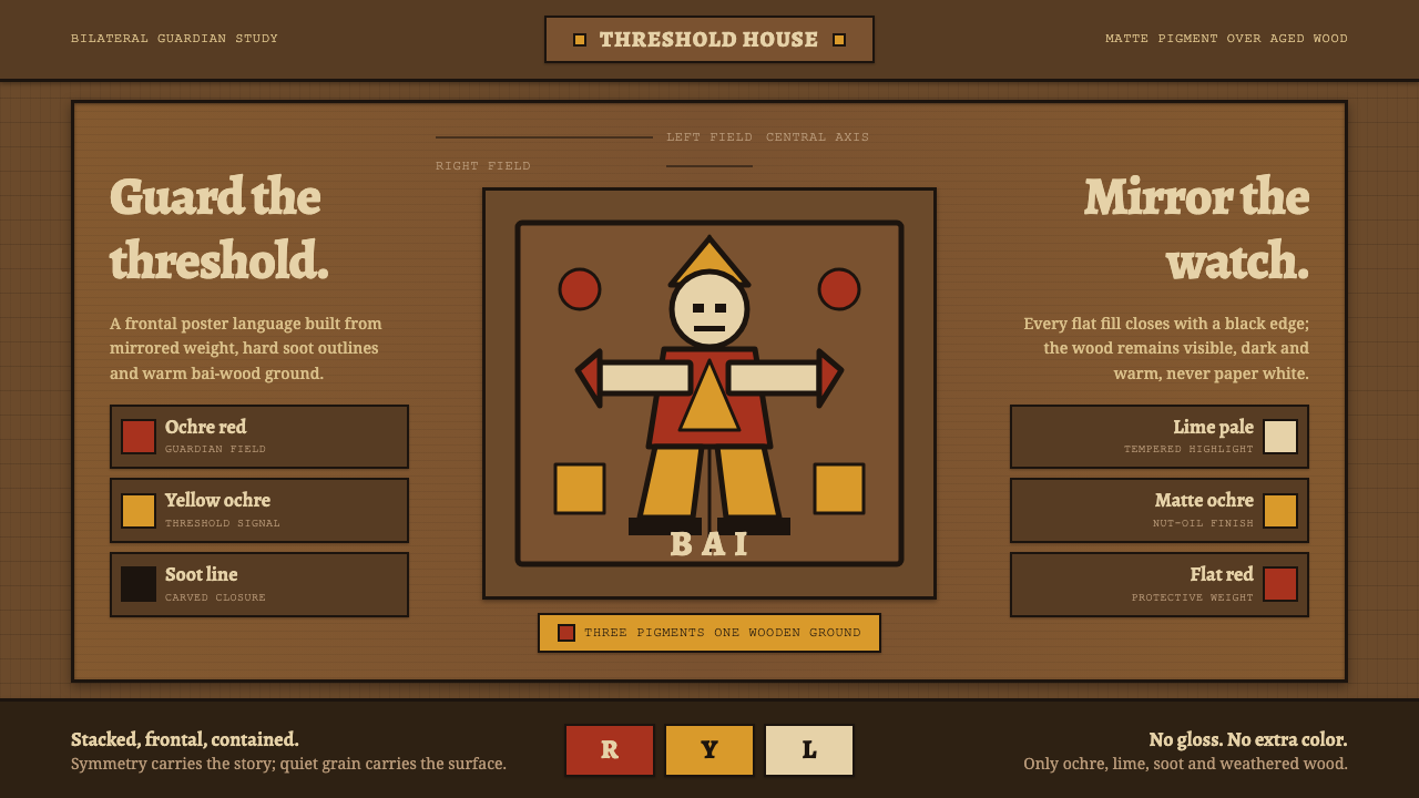 Palauan Dilukai Gable FigureGuardian symmetry on old wood. Ochre red, yellow and soot black lock each fla…
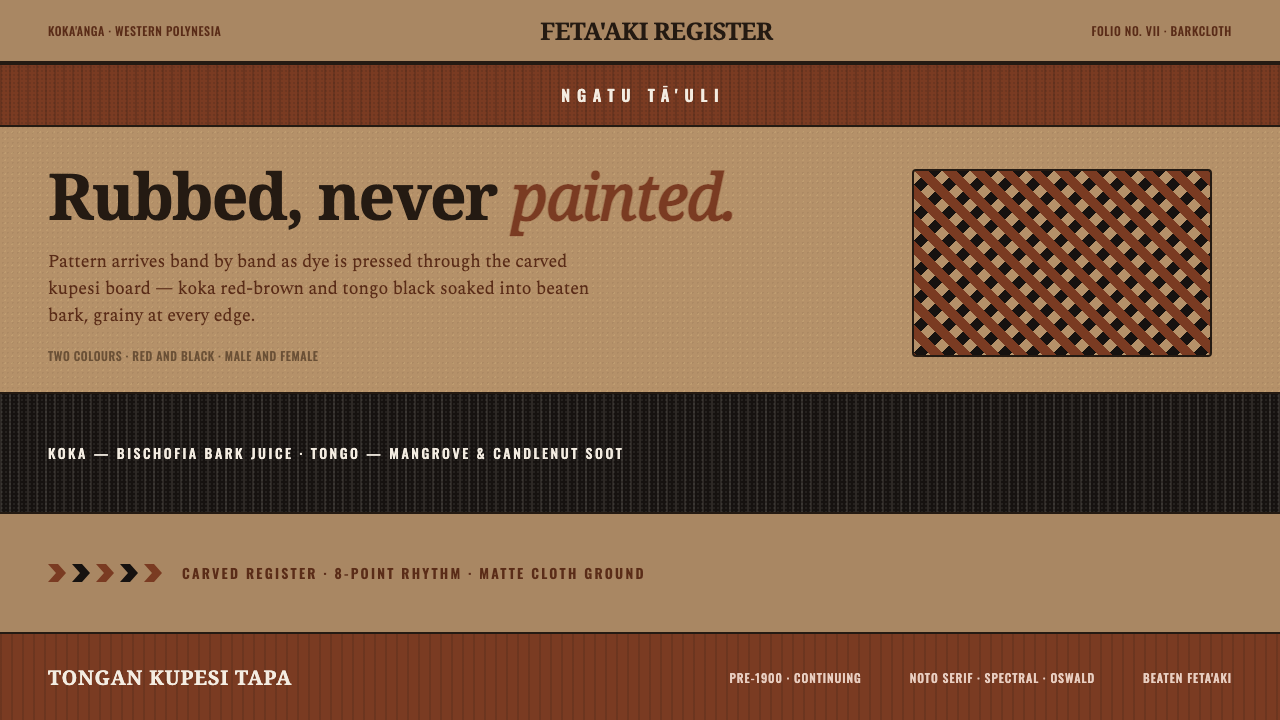 Tongan Kupesi TapaRubbed, never painted. Koka red and tongo black soak into beaten tan bark as…
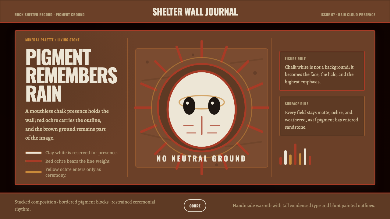 Aboriginal Wandjina KimberleyAncestral presence in stone. Chalk white haloes and red ochre outlines sit on…