What is Chamorro Latte Stone?
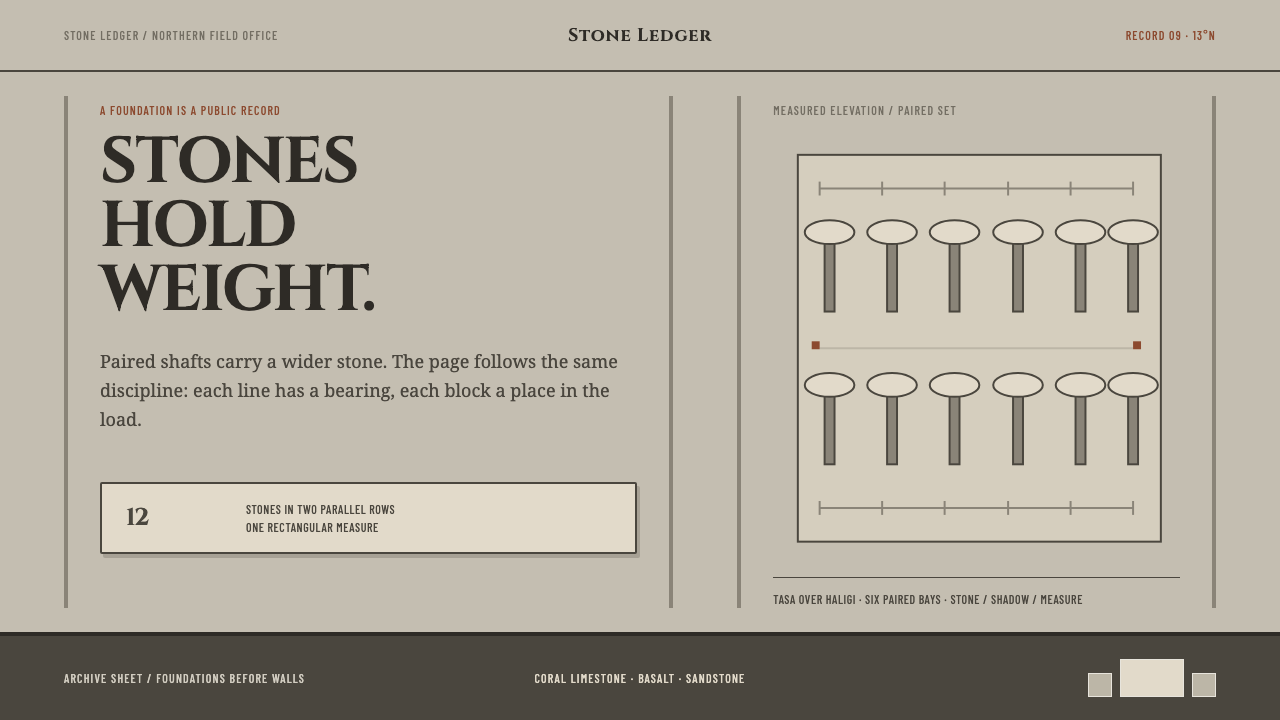
Chamorro Latte Stone takes its grammar from the stone house pillars of the ancient Marianas — paired verticals, capstones resting on shafts, hard midday shadows, and nothing that does not bear weight.
Chamorro Latte Stone in brief
Latte stones are the house foundations the ancient CHamoru raised across the Mariana Islands: a quarried shaft called the haligi carries a hemispherical capstone called the tasa, and the shafts are set in strictly parallel pairs, six to fourteen in all, to frame a rectangular dwelling. Chamorro Latte Stone is the design system that carries this structure into layout. Content stands between paired verticals, wide elements rest on narrower ones, and nothing is decorative unless it holds something up.
The key idea is load. A latte set exists because a house has to stand, and every part is shaped by what it carries. The shaft is plain and upright because it supports; the capstone is broad and rounded because it receives the weight above. Translated to a page, every element should have a visible job — to carry content, to separate it, to frame it — and anything that does none of these is removed. The result is not austere for its own sake. It is the calm of a structure in which nothing is there by accident.
The look follows from the materials. Reef limestone, basalt and sandstone, weathered in jungle clearings to a pale, warm grey, give the palette its character: stone tones with a faint warmth, one darker value for strong marks, and no saturated colour doing decorative work. Shadows are hard-edged, as they are at equatorial midday, when the sun stands overhead and a stone casts a short, crisp shape directly beneath itself. There are no gradients and no gloss. Surfaces are matte, like weathered rock.
Where does Chamorro Latte Stone come from?
Latte stones belong to what archaeologists call the Latte Period, reckoned in the reference as roughly 900–1700 CE, in the Mariana Islands of Micronesia: Guam, Rota, Tinian and Saipan. The CHamoru people who lived there built their houses on these stone sets, and because the timber and thatch of the houses themselves did not survive the centuries, the stones are what remains of the villages. Walking among them today means reading a plan with the building taken away — rows of paired pillars in clearings where a structure once stood.
Making a latte set was a feat of quarrying and transport. Shafts were cut from reef limestone, basalt or sandstone, and a capstone was sometimes not carved at all but taken from the reef as a single brain coral, a ready-made dome. The reference names the CHamoru quarry workers of As Nieves, on Rota, as the key figures of the style: a collective rather than an individual author, which suits a design language about shared structure. Left in the open for centuries, the stone weathered to the pale, warm grey that the system uses as its ground.
The logic of the set is geometric and strict. Shafts stand in two parallel rows facing each other across the width of the house, and the number of shafts, from six to fourteen, sets the length of the dwelling. Each shaft is topped by its capstone, so the set reads as two lines of regular, matching units. That repetition is the template for the system's rhythm: even counts, parallel lines, and a rectangular frame around a human-scaled space.
The Latte Period is reckoned to end around 1700, as the Spanish mission, which arrived in the 1660s, reshaped island life. But the form did not vanish from memory. The reference lists three movements behind the style: Micronesian megalithic building, Latte Period village architecture, and the CHamoru cultural revival. In modern times the latte has become one of the most recognisable emblems of CHamoru identity, widely used to signal heritage in the Marianas. For a designer that history is a reason for care. The form is not an ancient curiosity; it is a living symbol that belongs first to the people it comes from.
What defines the Chamorro Latte Stone look?
Paired Verticals
The latte set is defined by two parallel rows of upright shafts. In layout that becomes content held between a pair of vertical lines or margins rather than floating in the middle of the page. The verticals can be literal — rules, borders, column edges — or implied by aligned left and right edges. Either way the eye reads a frame with a purpose: this content stands here, between these supports. Pairs matter more than singles; a lone vertical looks like a stray post.
Capstone on Shaft
A wide element resting on a narrower one is the system's signature relationship, borrowed from the tasa on the haligi. A broad title band sits on a narrower text column; a wide card header caps a slim list; a rounded or domed form appears only where one thing sits on top of another. The proportion is deliberate: the support is visibly narrower than what it carries, and it still reads as strong.
Load-Bearing Rule
Nothing is decorative that does not hold something up. Every rule, block, margin and gap must carry content, separate content or frame content, and if it does none of these it goes. This applies to spacing as much as to marks: gaps are structural intervals, not leftovers. The discipline is closer to engineering than to minimalism. The page is not sparse because emptiness is fashionable; it is sparse because each remaining element is doing work.
Weathered Stone Palette
Reef limestone, basalt and sandstone weathered in the open give a family of related stone tones: a pale, warm grey as the dominant ground, a darker basalt value for text and structure, and a faint sandstone warmth for secondary surfaces. The palette is intentionally narrow. There is no accent colour in the usual sense; emphasis comes from value contrast and from position, the way one stone stands out from its neighbours by being larger or darker, not by being brighter.
Midday Shadow
Shadows are hard-edged, as at equatorial midday, when the sun is overhead and a stone casts a short, crisp shape directly beneath itself. In the system a shadow is a solid shape sitting close under an object and offset in one consistent direction, with no blur and no gradient. It reads as contact with the ground, the weight of an object resting on something, rather than a glow or a lift. Elements look set down, not floating.
Matte Quarried Surfaces
Surfaces are matte and uniform, like quarried stone, with no polish and no ambient sheen. Type follows the same attitude: sturdy, simple letterforms with no flourish, set in regular blocks and read as structure first and voice second. Imagery, if present, should feel just as unadorned: weathered stone, reef, clearings, shaded in the same flat way. The overall surface should feel like a material that has been standing outdoors for centuries.
Even Repetition
The latte set repeats identical units along a line. The system turns this into even counts and regular intervals: two-up, four-up and six-up arrangements rather than odd groupings, equal gaps between repeated cards or columns, and a steady beat down a page. Regularity is not monotony here. When units are truly alike, the single departure from the pattern, such as a larger capstone block, becomes immediately legible as the one thing that matters.
Who shaped Chamorro Latte Stone?
The reference names these quarry workers as the key figures of the style, and they are a collective rather than a single author. Cutting shafts, moving stone and setting them in parallel pairs was shared labour with a shared plan. For a designer the lesson is that this language belongs to a method, not a signature: any element placed in the right relationship to its neighbours, and doing real work, belongs to it.
The haligi is the upright quarried shaft, the supporting half of the latte. It is plain, strong and narrower than what it carries. In the system it is the model for every structural element that holds something up: the column edge, the rule, the narrow text column beneath a wide header. A good haligi-like element does not draw attention to itself. It earns its place by being visibly strong enough for the job.
The tasa is the hemispherical capstone that sits on the shaft and receives the weight above. It is the one rounded form in an otherwise rectilinear system, and it appears only where something rests on something else. As a motif it is the reason the style allows a domed or rounded shape: a cap, a lid, a header block placed on a narrower support, never a curve scattered for softness.
The reference lists the CHamoru cultural revival among the movements behind the style. In modern times the latte has been adopted as a sign of CHamoru identity and continuity, which gives the form a living meaning beyond archaeology. Using the style well means keeping that in view: name the source, link it to Guam and the Marianas rather than to a generic tropical idea, and let the structure of the stone, not surface imagery, carry the reference.
How do you use Chamorro Latte Stone today?
Chamorro Latte Stone is a structure-first style, which makes it unusually portable. It asks a designer to decide what each element carries and what carries it, and to remove the rest. That question improves almost any layout, whatever the surface treatment.
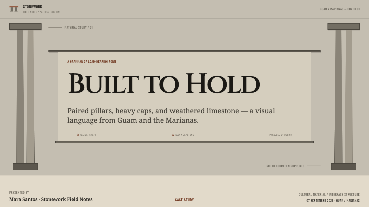
For presentation slides, a cover can set the title between two tall vertical rules with a wider band across the top like a capstone, all on a pale warm-grey ground. Content slides work as paired columns: two supports and the content between them, with the heading as the cap. For data slides, bar charts become rows of shafts, evenly spaced and equally wide, with the single value that matters marked by a heavier cap. Keep shadows hard and close under the bars, as if they stand on the ground.
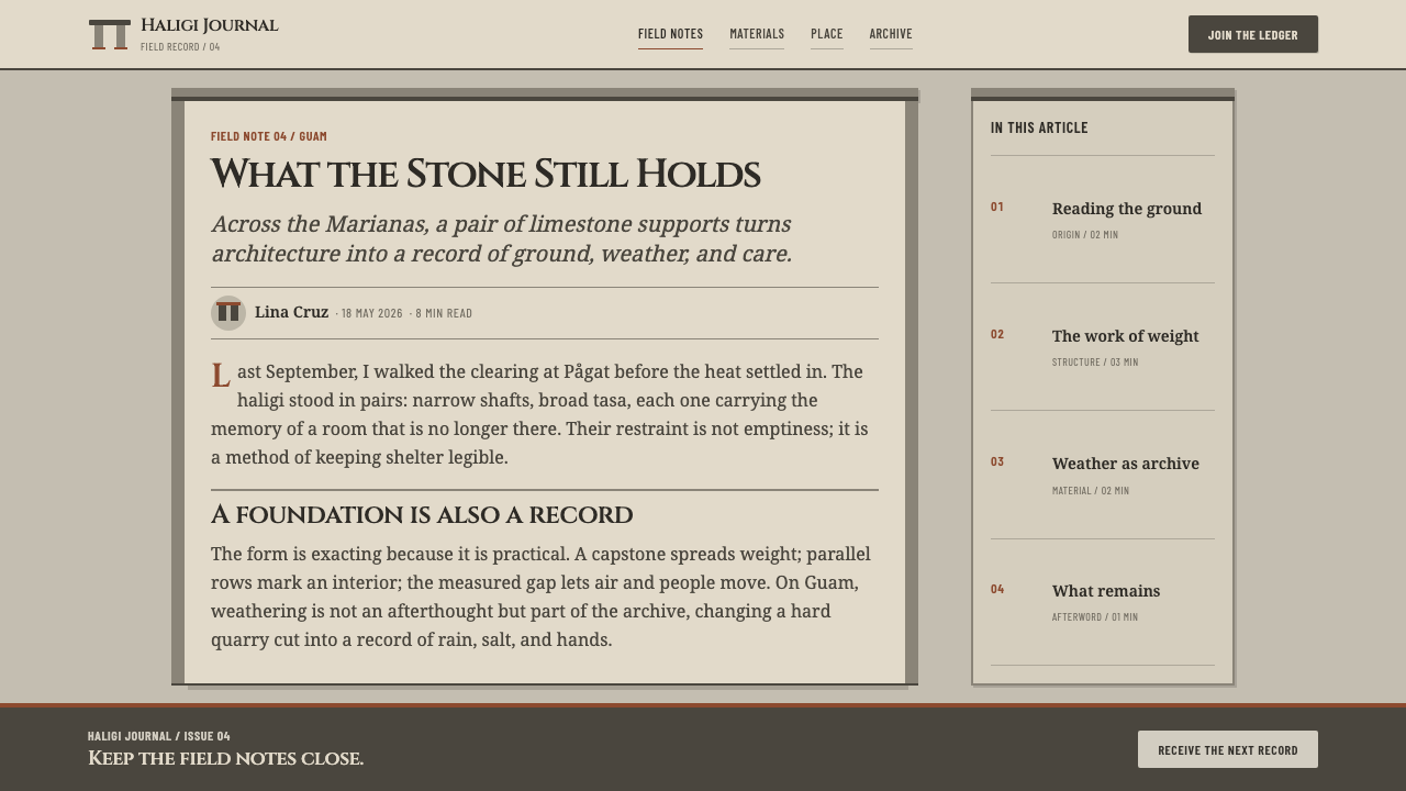
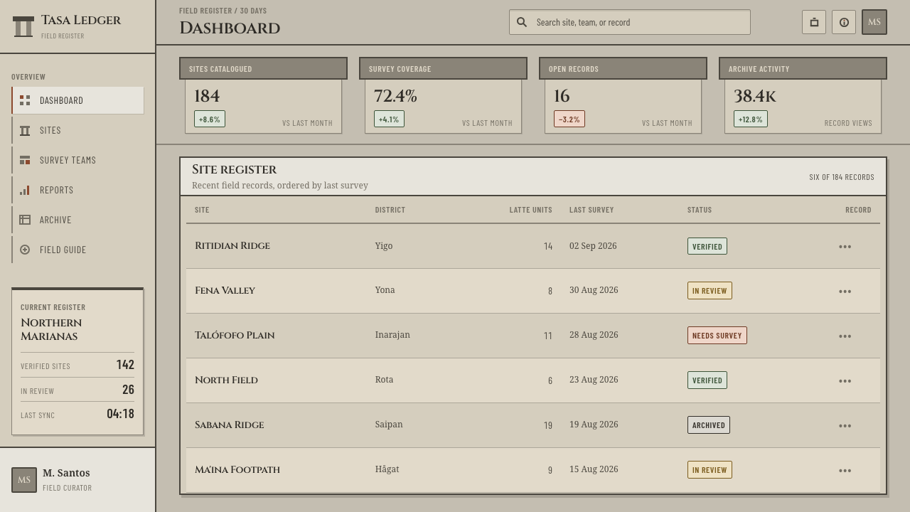
For web interfaces the style suits documentation, settings, reference tools and dashboards, anywhere that clear structure matters more than delight. Use a two-column or four-column frame with strong edges, put the primary heading on a broad band over a narrower body, and give cards a short hard shadow beneath them. Navigation can read as a post: a tall narrow strip carrying labels, with the content standing beside it. Keep colour to stone tones, and let size, value and position do the emphasis.
For editorial and marketing work, hold the article body between two margin rules and let the headline sit across them like a capstone. Section breaks are blocks of space or a single short rule, not ornaments. Marketing pages can be built as latte sets: a broad hero band at the top, then a row of paired feature columns beneath, each carrying a plain statement. Photography of weathered stone, reef limestone, jungle clearings and Marianas heritage sites fits, ideally credited to the people who made or maintain them.
The most common mistake is to read the style as a generic 'tropical' theme and add palm leaves, bright blues or beach imagery; the system has none of that and the reference is a stone architecture, not a holiday. The second mistake is centring everything, which loses the paired supports that are the point. The third is soft, blurred shadows, which turn stone into foam. Remove anything that is not bearing weight, and the style recovers.
Chamorro Latte Stone — FAQ
What is a latte stone?
A latte stone is a stone house foundation raised by the ancient CHamoru in the Mariana Islands. It consists of an upright quarried shaft, the haligi, topped by a hemispherical capstone, the tasa. Sets of six to fourteen shafts were arranged in strictly parallel pairs to frame a rectangular dwelling. The Latte Period is reckoned as roughly 900–1700 CE.
Should it be spelled Chamorro or CHamoru?
Both spellings are in circulation. Chamorro is the older, Spanish-derived spelling, and the theme name uses it. CHamoru reflects the language's own orthography with its distinctive capital letters, and it is the form used throughout this article. When writing about the people and their heritage, CHamoru is the safer choice.
Is this just neo-brutalism in grey?
The two share hard shadows and flat surfaces, but the logic differs. Here the shadow is a midday cast shadow, short and grounded in one consistent direction, and the layout logic is paired load-bearing supports rather than provocation. The palette is narrow stone tones, not saturated colour. If the page is loud, it is not this style.
Can it work on a dark background?
The reference is a light system: pale weathered stone is the ground and hard shadows need a light surface to fall on. A dark inversion is possible, using a basalt value as the ground and pale stone for structure, but the shadows lose their job and the style depends more on value contrast and alignment to hold its structure. Keep it to a restrained set of stone tones and avoid glow effects.
Is it respectful to use the latte stone as a design reference?
The latte is a living emblem of CHamoru identity, so respect is a matter of approach. Credit the source by name, tie it to Guam and the Marianas, and use the structure of the stone, paired supports, capstones and load, rather than turning the form into a decorative logo. Avoid generic island clichés and avoid using the shape casually on products with no relation to its meaning.
Related design styles
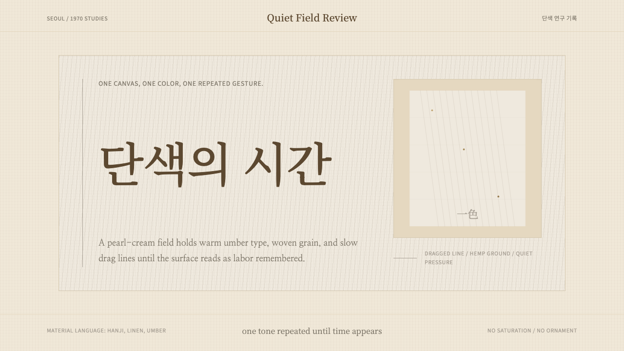 Korean Dansaekhwa MonochromeLabor becomes stillness. Umber serif type and drag lines on pearl cream.
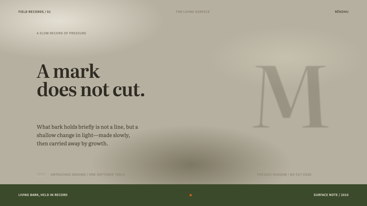 Moriori Rakau MomoriPressure, not incision. Literata shadows sink softly into pale, lichened bark.
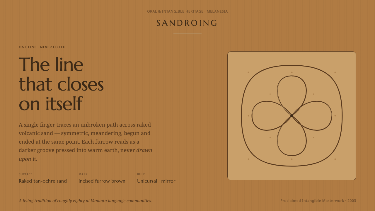 Vanuatu Sand DrawingOne finger-line, never lifted. Furrow-brown grooves a symmetric lattice into…
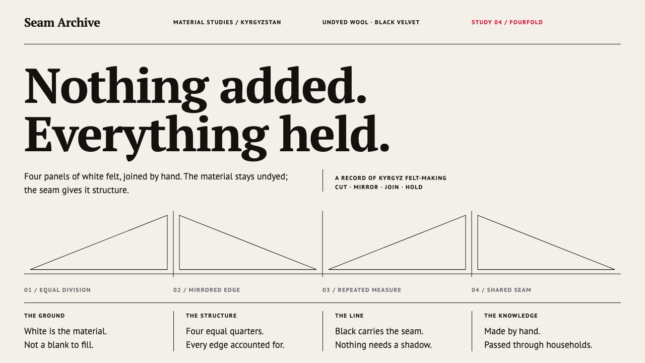 Ak-Kalpak Felt HatWhite does the work. Undyed felt tones, black hairline seams and four mirrore…
 Basque LauburuMemory cut into stone. Warm grey planes and four measured turns build depth f…
 Beni Ourain Berber CarpetRestraint feels tactile. Greige wool field, Oswald type, and a loose charcoal…