What is G-SHOCK?
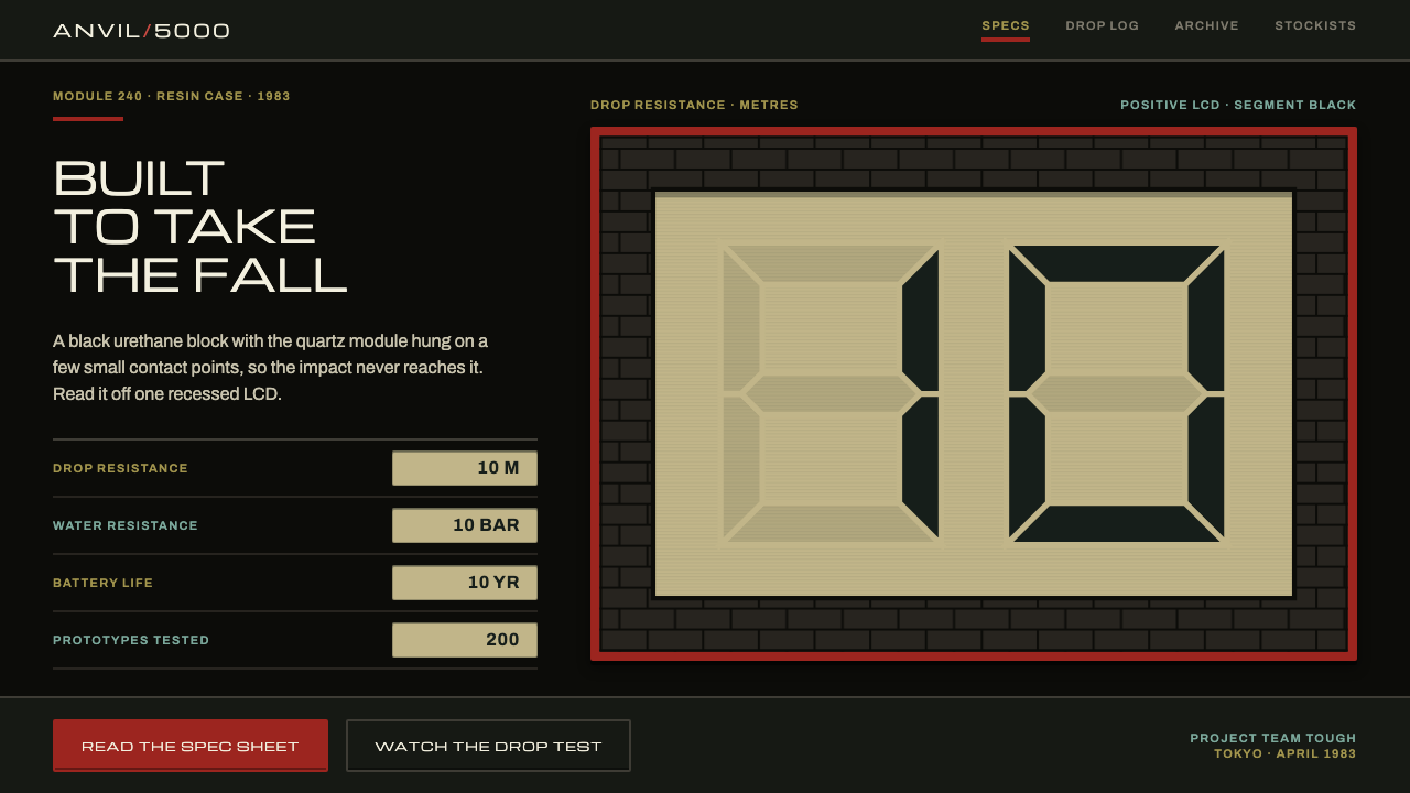
The G-SHOCK style is a matte resin-black page with a pale LCD readout inside a brick-red frame: a design built from a watch that was engineered to be dropped.
G-SHOCK in brief
The Casio G-SHOCK style comes from the first watch in the line, the 1983 DW-5000C. Its identity is easy to describe: a matte black urethane case, a recessed positive LCD in the middle, and a red frame, nicknamed the brick wall, running around the original readout. Small printed labels in gold and teal sit beside the display, and a wide capital inscription runs along the bezel.
Translated into a design system, the page becomes the black case. Cards become strap black. Every important number is placed inside a pale cream window with dark segment-style digits, framed in brick red, so the reader’s eye is drawn to the figure the way it is drawn to the display on the watch. Headings are set in wide Michroma capitals that imitate the PROTECTION lettering on the bezel, while body text and specifications use Archivo.
The overall impression is hard-edged, matte and practical. Corners are only slightly rounded, borders are heavy, and there is no metallic shine or glassy reflection. It looks like a tool, not like jewellery. That is the point of the original object, and it is the point of the style: a product page or interface that feels built to survive rough handling and not merely to look expensive.

Where does G-SHOCK come from?
The G-SHOCK story belongs to early-1980s Japanese consumer electronics, and it starts in Tokyo at Casio. The key figure is Kikuo Ibe, an engineer who set out to build a watch that would not break, and who worked with a group named Project Team Tough. The idea was unusual at the time, because digital quartz watches were being marketed on thinness, sleekness and novelty. Ibe’s goal pointed in the opposite direction: toughness first, and appearance as a consequence of that toughness.
The period matters for the look. Between 1981 and 1983 the digital LCD quartz watch was a symbol of modernity, and the design vocabulary of the moment was made of segment digits, small printed labels and plastic cases. The DW-5000C, released in April 1983 on the module numbered 240, took that vocabulary and built it into a thick shell of black resin which wrapped the movement so that the mechanism could survive shocks. The casing was not a decoration around the watch; it was the engineering solution, and its form was dictated by function.
That is why the visual identity carries so much honest structure. The positive LCD is recessed because it needs protection. The red frame around the readout is a bold way of making the display legible inside a thick body. The bezel print announces the product’s promise in capital letters. Small gold and teal labels do the work of the case printing, giving the user information about modes and features in a compact, functional way.
The design continued beyond the first model. The shape and logic of the DW-5000C were carried into the DW-5600 and into the reissues of the DW-5000 in the 2010s, which shows how durable the original look turned out to be. The style belongs to three overlapping movements: early-1980s Japanese consumer electronics, digital LCD quartz watches, and rugged tool-watch design. When you use it on a website or a deck, you borrow that long, consistent lineage of toughness.
What defines the G-SHOCK look?
Matte resin-black ground
The page itself is the black case of the watch: a deep, matte black with no gloss and no gradient. Cards sit on it in a slightly different black, called strap black, so panels are distinguished by a quiet tonal step instead of a shadow. This gives a very heavy, grounded feel. Because there is so little contrast within the dark surfaces, the lighter elements, especially the LCD windows, stand out sharply.
The pale LCD readout window
Key numbers are always placed in a pale cream box with dark, segment-style characters, imitating the positive LCD of the original watch. This is the style’s most recognisable device. It turns a figure such as a price, a spec or a countdown into an object you can read from across a room. It also makes a clear rule for the writer: if a number matters, it goes in the window, and if it does not, it stays in ordinary text.
The red brick-wall frame
Around each readout runs a brick-red frame, drawn from the red surround that framed the original display. It is thick and unapologetic, and it makes the window feel recessed into a protective body. The frame is the main accent colour of the system. Because it is tied to the LCD windows, red is not scattered across the page; it appears where a number deserves protection and attention.
Wide Michroma capitals
Headings use Michroma, a wide, squared sans in capitals, in imitation of the PROTECTION print on the bezel. The wide letterforms read as industrial and slightly technical, and they take up generous horizontal space, which suits short, forceful labels. Body copy and specifications switch to Archivo, a more compact and practical face. The pairing separates the voice of the product’s promise from the voice of its documentation.
Gold and teal case-print labels
Small labels in gold and teal act as the case printing around the display. They are used for categories, units and mode names, never for body copy. Each colour has a stable meaning within a page, so a viewer can scan across a dense spec sheet and quickly match labels to values. The colours are muted enough to feel like printed ink rather than light on a screen.
Small radii and heavy borders
Corners are only slightly rounded and borders are thick. This produces the sense of a solid mass with clean edges, as opposed to the soft pill shapes of friendly consumer apps. Buttons and cards feel like parts of a casing that have been moulded rather than drawn. The thick border is also a practical device, because it keeps components distinct on a very dark background without needing any glow.
No shine, no glass
The style avoids chrome highlights, glass reflections and soft shadows. Surfaces are flat and matte, like moulded resin. This restraint is central to its meaning. A product that is meant to be dropped, rained on and worn on a wrist all day cannot also be seen as precious. The interface therefore signals honesty and durability by what it leaves out.

Who shaped G-SHOCK?
Ibe is the Casio engineer associated with the idea of a watch that would not break. His project led to the first G-SHOCK, the DW-5000C of 1983. The whole logic of the style, with its thick protective body, recessed display and absence of ornament, is a visual consequence of his engineering goal.
This is the name of the Casio group credited alongside Ibe. Its inclusion is a reminder that the watch was the product of a team solving a durability problem, not of a stylist drawing a case. The style’s emphasis on function over decoration echoes that origin.
Released in April 1983 on module 240, the DW-5000C is the first G-SHOCK and the direct source of the style. Its black resin case, recessed positive LCD and red surround provide almost every element of the design system. Later models such as the DW-5600 and the 2010s DW-5000 reissues carried its look forward.
How do you use G-SHOCK today?
For slides, the cover can be a full-bleed matte black field with a title in wide capitals and a single cream readout window holding one number, framed in brick red. Content slides work best when each slide has one such window, with the supporting text in Archivo below it and small gold or teal labels naming the category. Data slides can turn each key metric into its own readout, arranged in a grid like the modes of a watch face, which makes comparison very easy.
For websites and hardware product pages, the style is a natural match for specification tables, product comparisons, outdoor equipment and tools with a faint eighties-electronics flavour. A comparison page might give every product a dark card, a readout window for price or battery life, and a plain row of attributes below. A call-to-action button can be a heavy-bordered rectangle with a small radius, in the same family as the frames around the windows.
For editorial and marketing work, build around contrast between matte darkness and the small bright window. A hero image can show a rugged product on a black ground with a single number overlaid in a readout box. Headlines should be short and capitalised, because wide capitals take up room. Copy should speak plainly about what the thing can survive, not about how beautiful it is.
The most common mistake is to treat the red frame as a general accent and spread it across buttons, links and headings. The frame belongs to the readout windows. Using it everywhere dilutes the focus on numbers and makes the page look noisy rather than tough. A related error is adding shine, such as glossy gradients or soft drop shadows, which contradicts the matte resin character.
Another mistake is overusing the cream windows. If every line of text is boxed, none of them stands out. Reserve the window for the one figure per section that a reader must not miss. Finally, avoid mixing in rounded, friendly shapes. The style gets its personality from hard edges and small radii, and large rounded corners would turn it into a generic dark theme.

G-SHOCK — FAQ
What is the G-SHOCK design style?
It is a design system based on the 1983 Casio DW-5000C, the first G-SHOCK. The page is matte resin black, cards are strap black, and key numbers sit in pale cream LCD-style windows framed in brick red. Headings are in wide Michroma capitals and body text is in Archivo.
Who designed the original G-SHOCK?
The key figure is Kikuo Ibe, a Casio engineer who aimed to build a watch that would not break, working with a group called Project Team Tough. Their result was the DW-5000C, released in April 1983 on module 240.
Why is there a red frame around the numbers?
The frame comes from the red surround, nicknamed the brick wall, that enclosed the readout on the original watch. In the design system it marks the numbers that matter, so red is not spread around the page as a general accent.
What kinds of projects suit this style?
Hardware product pages, specification comparisons, outdoor gear, and utilitarian tools, especially those with a slight early-1980s electronics character. It works well wherever numbers need to be the focus.
How do I keep it from looking like a generic dark theme?
Keep the cream readout windows with their red frames, use wide Michroma capitals for headings, keep radii small and borders heavy, and avoid any gloss or soft shadows. The combination of matte black, hard edges and one bright window per section is what gives it character.
Related design styles
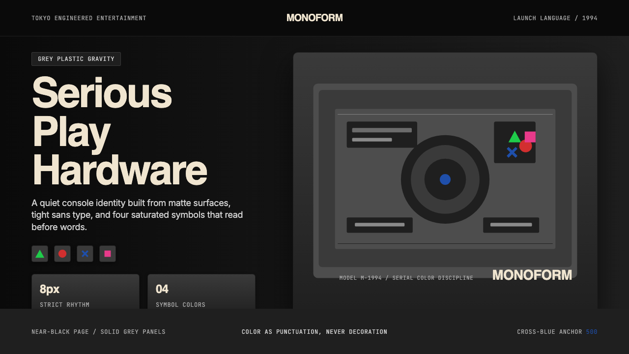 PlayStation (1994 Original)Quiet power, engineered. Grey plastic and four saturated symbols punctuate ti…
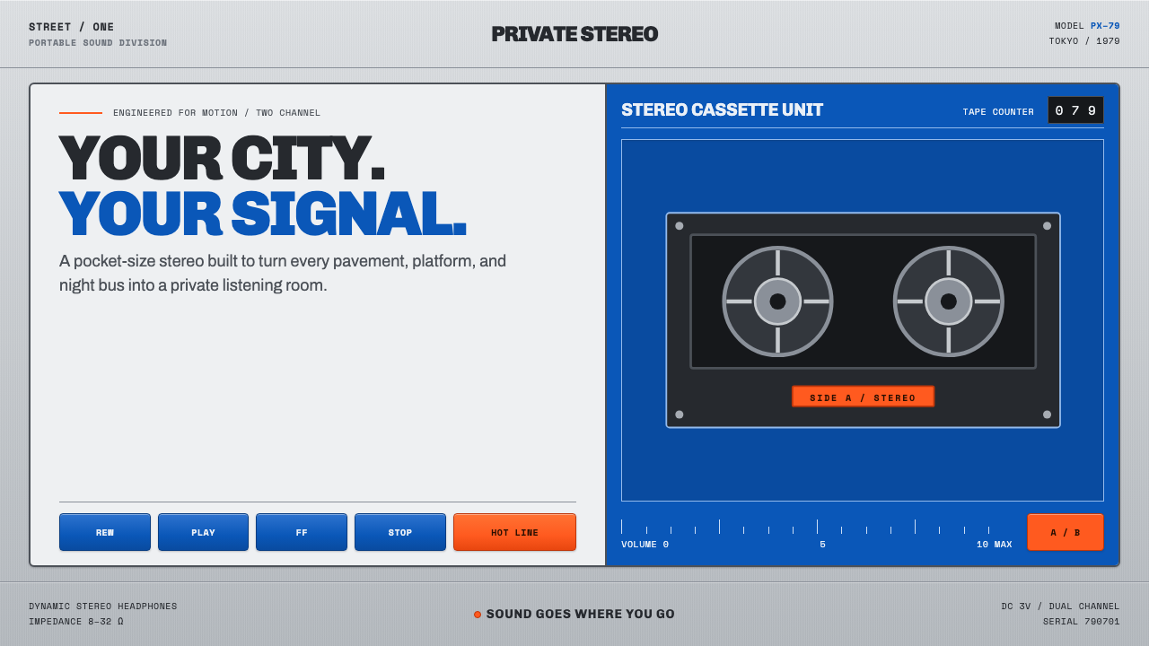 Sony Walkman (1979)The street turns private. Cobalt panels, silver grain and orange controls mak…
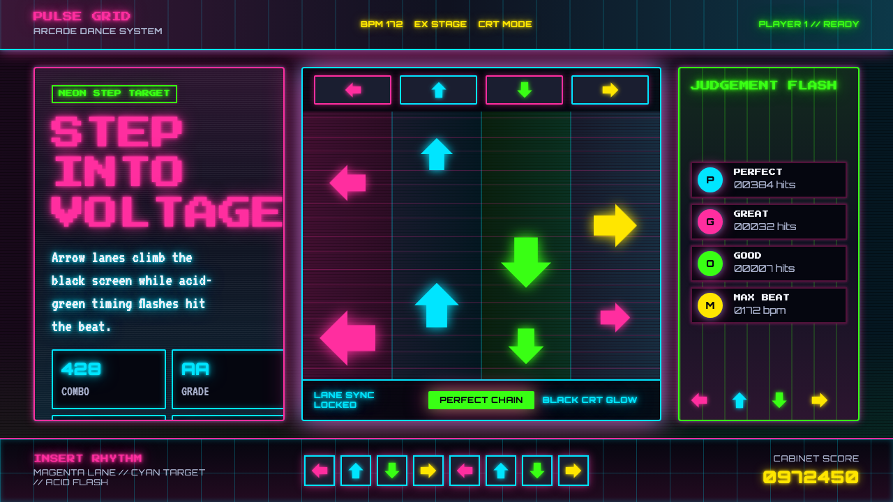 Dance Dance Revolution ArrowsPure arcade voltage. Magenta, cyan, and acid-green arrows climb a black CRT g…
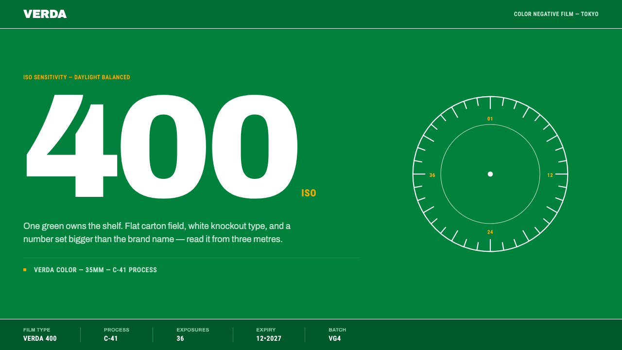 Fujicolor GreenOne green owns the shelf. White knockout type and an ISO numeral bigger than…
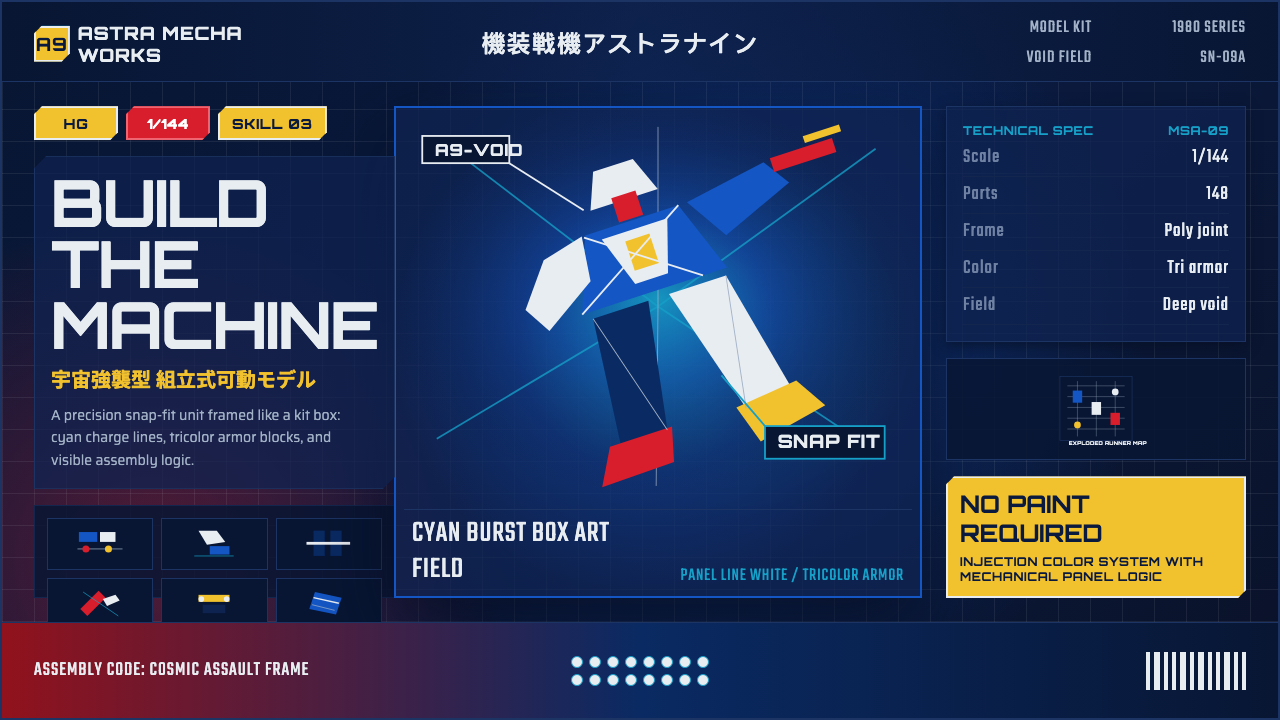 Gunpla Model BoxBuild-sheet drama. Cosmic navy, cyan burst, tricolor armor, and spec-panel gr…
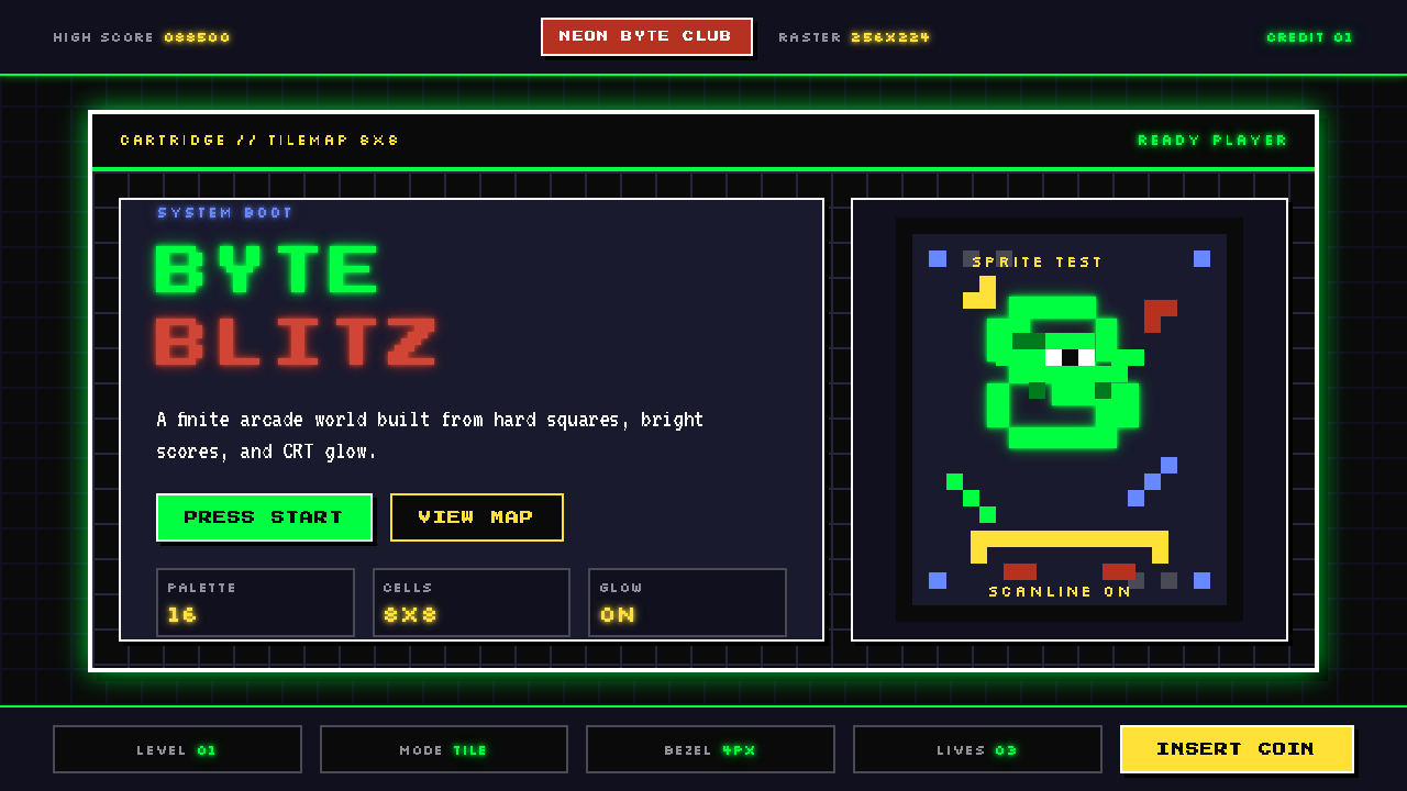 Pixel Art / 8-bit RetroHard-edged digital joy. CRT black, phosphor green, and 8x8 grids snap every p…