What is Cardcaptor Sakura?
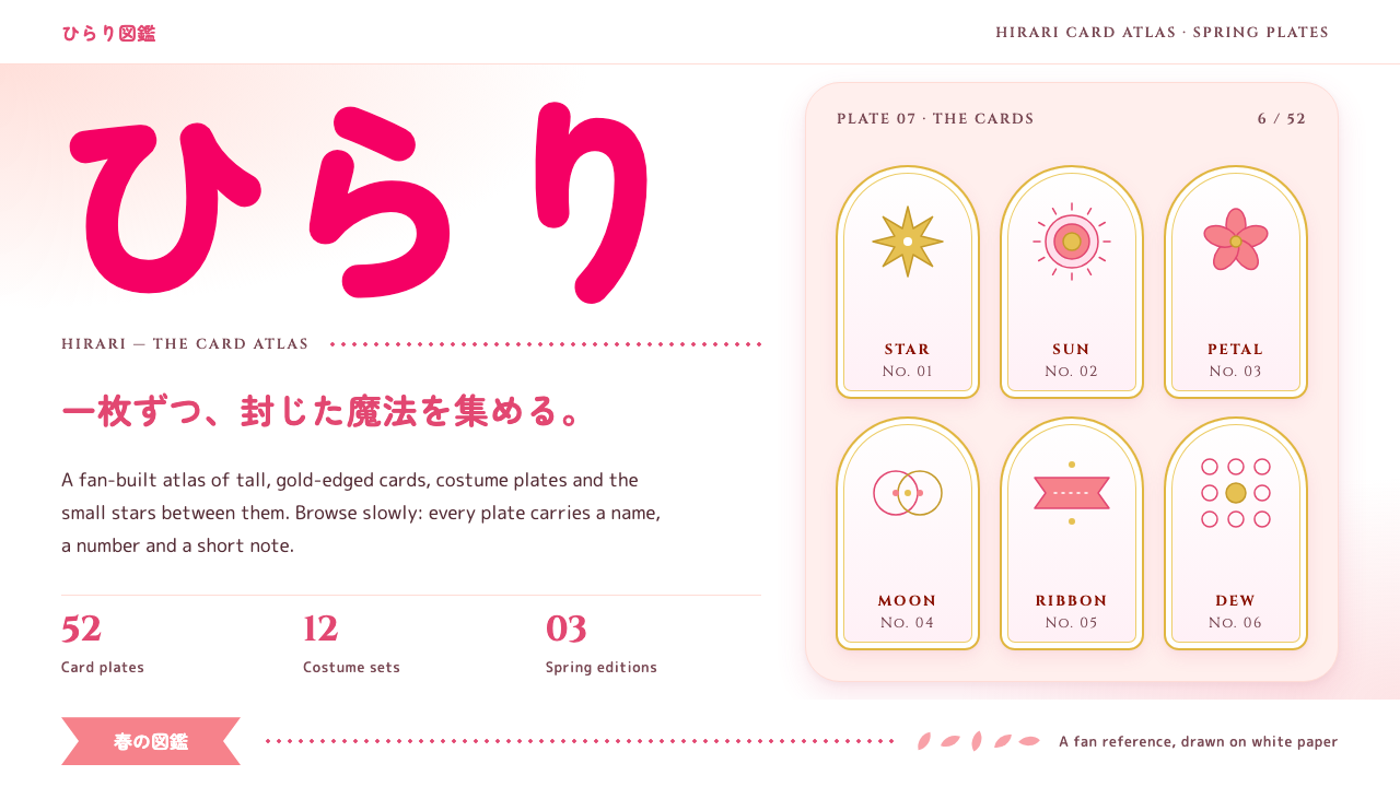
Cardcaptor Sakura style is a white-paper world of pale sakura washes, rounded magenta kana and gold-trimmed card tiles, soft and sparkling without ever turning loud.
Cardcaptor Sakura in brief
Cardcaptor Sakura style is a visual language drawn from the CLAMP magical-girl franchise of the late 1990s, and specifically from the printed paper and promotional identity around it. The foundation is a white field, the colour of a manga volume cover, with pale sakura-pink washes drifting in from the edges as if the page had been lightly watercolored and then left to dry.
Two typographic voices share the page. Headlines are set in heavy, rounded kana, the soft and friendly lettering typical of girls' manga titles, and the magenta-pink さくら logotype is the loudest thing anywhere. Latin text sits underneath in a small-caps classical serif, which gives the system a slightly storybook, spellbook quality, as if the page were a catalogue entry for a magical object.
Colour is divided by role. Gold belongs to the cards: their trims, the wing-and-star emblem, the head of the sealing wand. A deep Clow red is reserved for card backs and the Clow book. Everything else is soft, airy and a little sparkly. It is a style built for fan archives, character galleries and event pages, where the goal is affection and delight rather than urgency or authority.

Where does Cardcaptor Sakura come from?
The source is Cardcaptor Sakura, a magical-girl story created by the collective CLAMP and serialized in the girls' manga magazine Nakayoshi between 1996 and 2000. Its writer was Nanase Ohkawa and its artist Mokona, and the series follows a schoolgirl who must recapture a set of scattered magical cards. The style belongs to the broader tradition of shōjo manga ornament, with its flowers, sparkles, screentone gradients and decorative frames.
In April 1998 the story was adapted into a television anime by the studio Madhouse, and it ran until March 2000. This anime era is the heart of the visual memory: it was drawn in the late cel-animation period, when colour was painted by hand on transparent sheets and backgrounds had a soft, gouache-like quality. The luminous pastel look that fans associate with the series comes from that material world.
The franchise did not stop at its first run. A continuation arc, Clear Card, appeared between 2016 and 2018, and a 25th-anniversary campaign between 2021 and 2024 produced the current official key visual. Each revival kept the white ground and the sakura wash, which is why the system feels timeless rather than tied to one decade.
As a design system, Cardcaptor Sakura sits at the meeting point of three currents: 1990s mahō shōjo anime, shōjo manga ornament and screentone, and the final stretch of hand-painted cel animation at Madhouse. It does not imitate a screenshot. It translates the printed paper, the logotype and the card designs into a calm, reusable page language.
What defines the Cardcaptor Sakura look?
Color
The ground is plain white, and colour arrives as pale sakura washes along the edges rather than as solid blocks. Magenta-pink is the voice of the logotype and the key accent. Gold is the reward colour, spent only on card trims, wing-and-star marks and the sealing wand. Clow red is a rare, deep note kept for card backs and the Clow book. The overall effect is airy and high-key, never saturated across a whole screen.
Typography
Headlines use heavy rounded kana with generous, friendly curves, the lettering that girls' manga have used for decades. The magenta さくら logotype is the loudest element on any page. Latin text is set in a classical serif, with small capitals under headings, which adds a formal, storybook counterweight to the soft Japanese display type. Body copy stays quiet so the headline carries the personality.
Paper and ground
The whole system is modelled on paper, specifically the white covers of the Kodansha volumes. Surfaces are matte and bright. There are no dark backgrounds, no glass effects and no heavy gradients. The wash of pink along the edges behaves like a stain from a damp brush, which keeps the centre of the page clean for reading while still giving the frame a gentle glow.
Card tiles
The signature component is the card: an arch-topped tile with a thin gold edge, sitting quietly on the white field. Cards are the natural container for characters, episodes, items or events. Their gold trim marks them as precious objects, and they are arranged in calm rows rather than cluttered piles, so a gallery feels like a collector's album.
Ornament and sparkle
Decoration comes from the shōjo manga vocabulary: small stars, petals, wings, ribbons and soft sparkles. They are scattered lightly and drift slowly, never crowding the text. Ornament is allowed here, unlike in strict modernist styles, but it is restrained by the white space around it, so the page feels sparkly rather than busy.
Shape and edge
Forms are rounded and gentle. Lettering has soft terminals, containers have softened corners, and the arch-topped card shape repeats the idea of a curve at the head of every tile. Shadows, when present, are faint and diffuse, closer to a breath on paper than to a drop shadow. Nothing in the system is hard, sharp or aggressive.

Who shaped Cardcaptor Sakura?
Ohkawa is the writer within CLAMP and the author of the story of Cardcaptor Sakura. Her scripts gave the franchise its gentle emotional rhythm: small magical adventures grounded in school, family and first affection. That warmth is what the visual system tries to preserve, which is why it favours softness over spectacle.
Mokona is the artist of the manga, responsible for the delicate linework, the costume invention and the ornamental detail that define the printed look. The white paper, the sparkle and the decorative frames of this system all descend from the manga page as Mokona drew it.
Asaka directed the Madhouse television anime that ran from 1998 to 2000. His adaptation carried the manga into motion, with the pastel palette and unhurried pacing that fans remember. The anime era is the main reference for the system's luminous, hand-painted atmosphere.
Takahashi is associated with the character design of the anime, translating Mokona's drawings into forms that could be animated by hand. Her work shaped the rounded faces and costume shapes that the franchise is recognised by, and which inform the system's soft, rounded geometry.
How do you use Cardcaptor Sakura today?
In slide decks, the cover works best as a white page with a pink wash drifting in from one corner and a single magenta title in a heavy rounded face. Content slides keep the white ground and use gold-edged card tiles to hold each idea, one per tile, in a calm row. Data slides should stay light: thin lines, soft pink as the single series colour, and gold only to mark the one number that matters. A deck in this style suits fan presentations, character profiles, event proposals and anything that wants to feel affectionate.
In web interfaces, the strongest application is a gallery or archive. Cards become the primary component, with gold trims and arched tops marking each entry. Navigation stays quiet, set in the classical small-caps serif, so the magenta logotype remains the single loud voice. Pricing or comparison pages are possible but should be gentle: use cards for tiers, reserve gold for the recommended one, and avoid dense tables that would break the airy mood.
In dashboards the style needs care, because a dashboard wants density and this system wants air. It works for lightweight, friendly dashboards such as fan-club statistics, collection trackers or event schedules, where the white ground and soft pink series give a pleasant, low-pressure read. For heavy analytics, a different, more neutral system is a better home.
For editorial and marketing work, the style suits anniversary pages, character profiles, festival announcements and merchandise catalogues. Let the logotype and a generous wash do the work, keep copy short and warm, and let sparkles drift rather than cluster. Product pages can borrow the card tile as a display case, treating each item as a collectable.
The most common mistake is turning the sparkle up too far. When stars, petals and gold appear everywhere, the page loses its calm and starts to look like a sticker sheet. Keep gold for the cards, keep Clow red rare, keep the white ground dominant, and remember that the system works because of what it leaves empty. A second mistake is using dark backgrounds, which break the paper illusion entirely.

Cardcaptor Sakura — FAQ
What is the Cardcaptor Sakura design style?
It is a soft, bright visual language built on a white paper ground, pale sakura-pink washes, heavy rounded kana headlines, a magenta logotype, and gold-edged arch-topped card tiles. It is based on the printed look of the CLAMP manga and the late 1990s Madhouse anime, and it is meant for fan archives, galleries and celebratory pages.
Why is gold used only for the cards?
In the franchise the cards are the precious objects, so the colour that signals preciousness is reserved for them: their trims, the wing-and-star mark and the sealing wand. Restricting gold keeps it meaningful. If it appeared on every border and button, nothing would stand out as special and the page would lose its sense of reward.
Can this style be used for serious or professional content?
It is possible in small doses, but it is not the natural fit. The system is built around warmth, softness and affection, so legal, financial or highly technical pages tend to feel mismatched. It works much better for community, cultural, entertainment and celebration contexts, or for products that want a gentle, personal tone.
How does it differ from a generic pastel or kawaii style?
A generic kawaii style tends to pile on stickers, saturated pinks and cartoon icons. Cardcaptor Sakura style is more disciplined: the ground is plain white, colour is assigned by role, the serif small capitals add a formal counterweight, and gold is rationed. It feels like a printed volume cover rather than a sticker sheet.
Does the style work in dark mode?
Not well. The identity depends on the illusion of white paper with a pale wash, and gold trims and magenta lettering lose their delicacy on a dark ground. If a dark mode is needed, a very soft, warm night paper tone could be explored, but the result is a different mood from the original light, airy system.
Related design styles
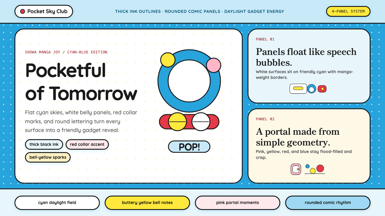 DoraemonChildhood joy, inked bold. Cyan fields, white panels, red collars, and rounde…
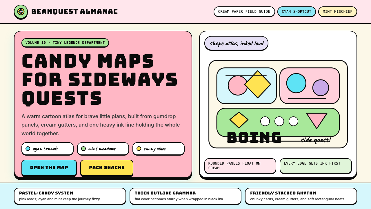 Adventure TimeCartoon warmth, inked loud. Cream gutters, candy pink, cyan and mint lock int…
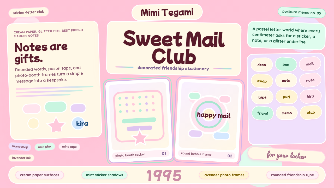 Kawaii Japanese Letter PurikuraCuteness fills every inch. Pink cream paper, mint stickers, lavender frames.
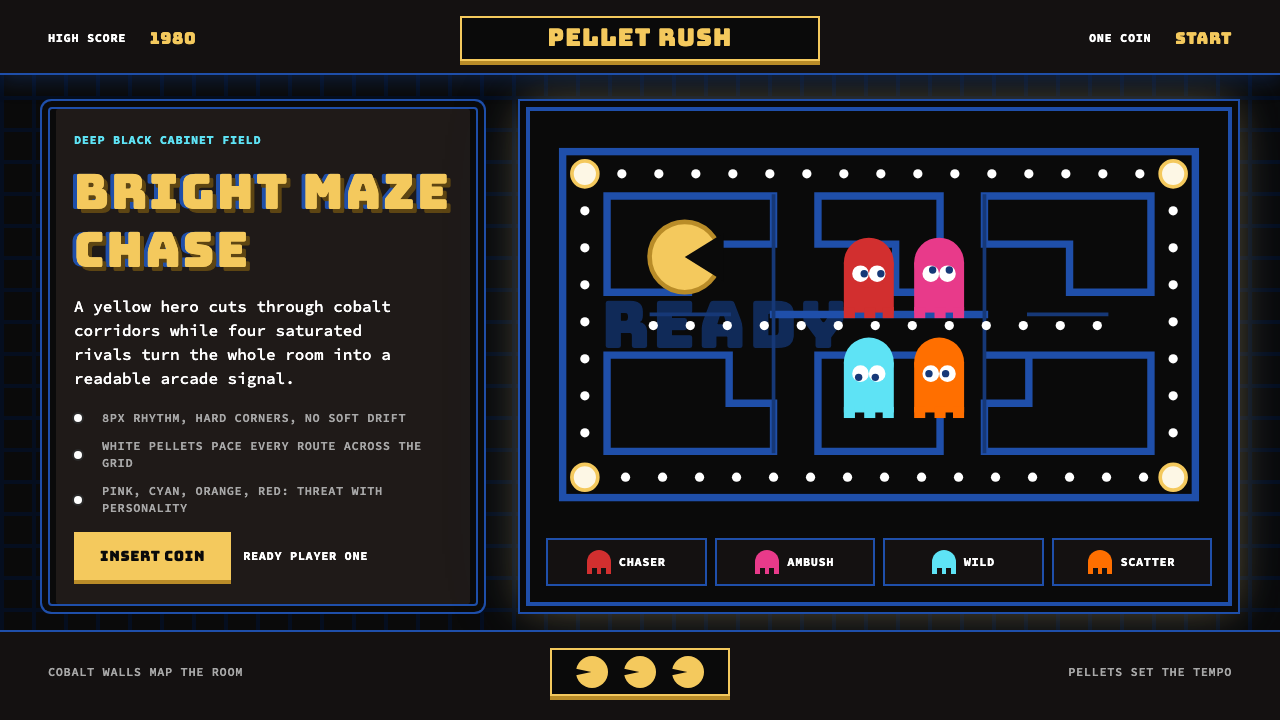 Pac-Man (Namco 1980)Arcade joy burns bright. Yellow disc, cobalt maze, and four ghost hues snap o…
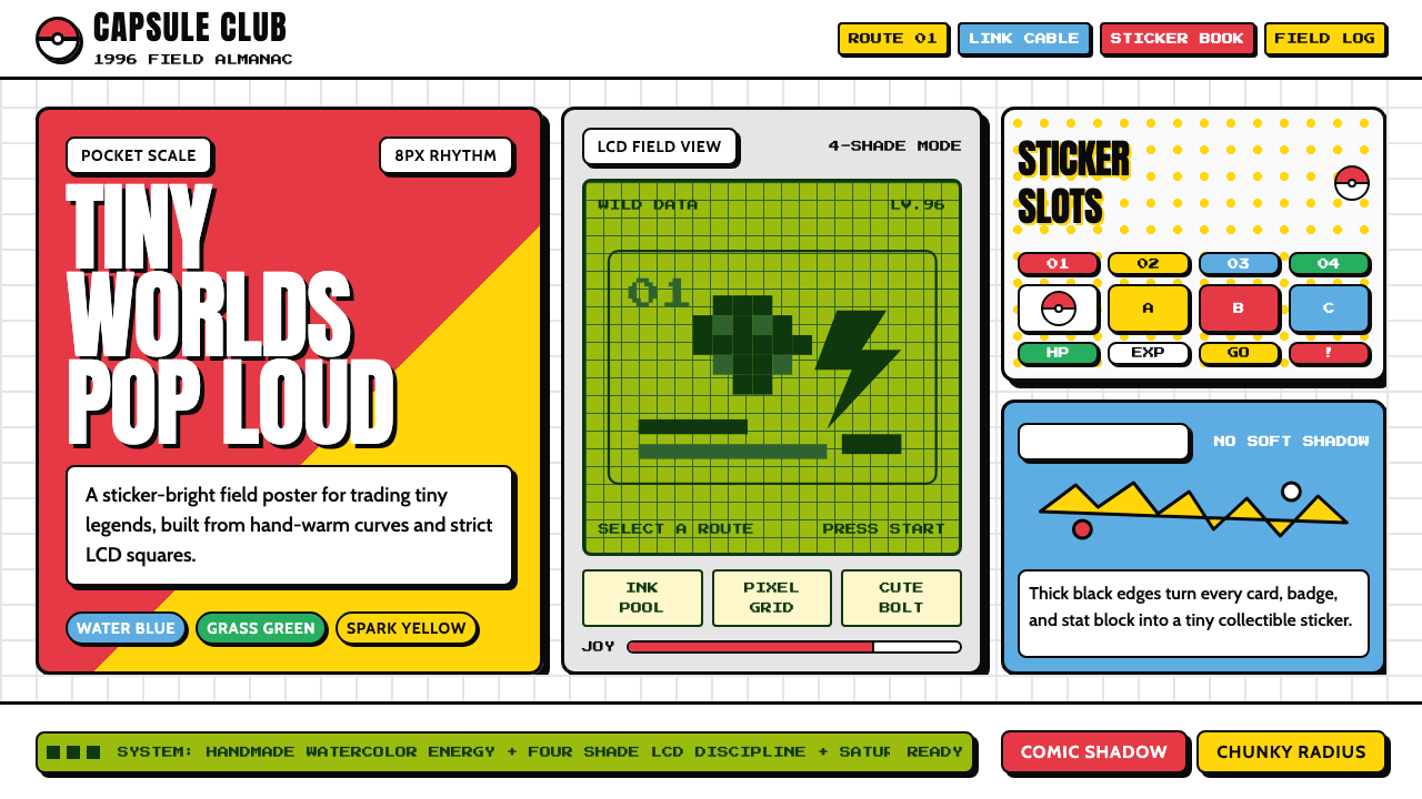 Pokémon Game BoyKawaii meets cartridge logic. Capsule red, LCD green, Anton heft, and 8px gri…
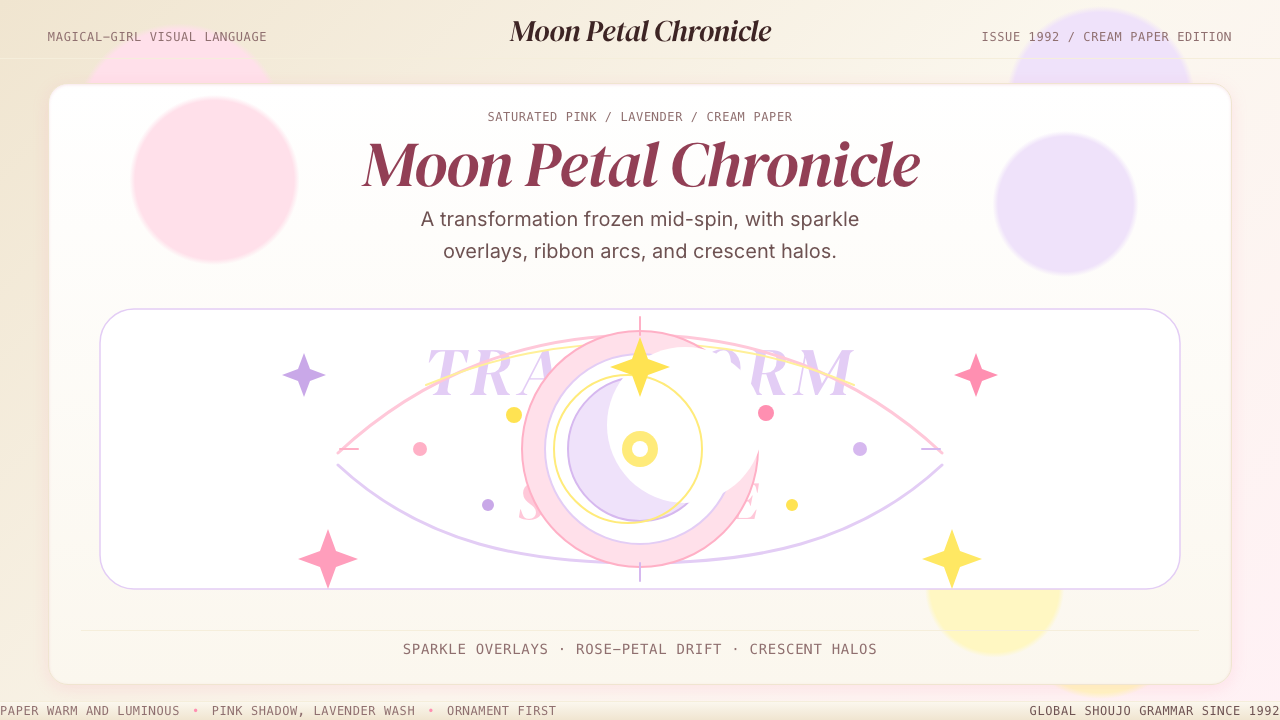 Sailor Moon ShoujoSweet and ornate. Pink, lavender, and cream with sparkle, ribbons, and cresce…