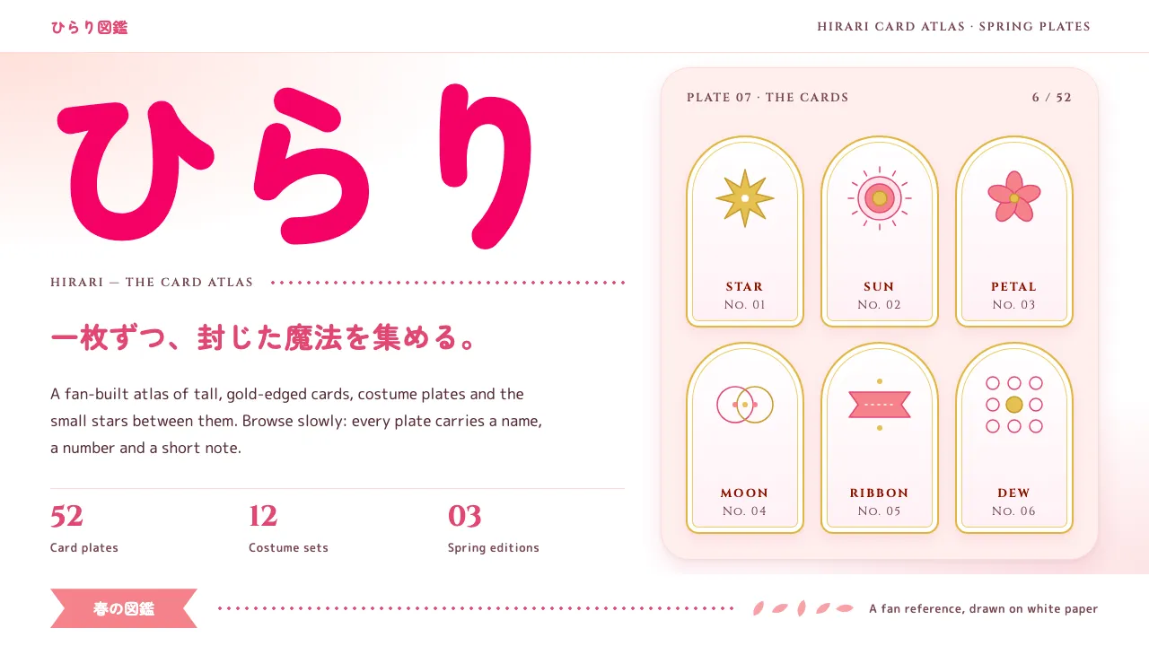
About Cardcaptor Sakura
A design system taken from Cardcaptor Sakura's own paper: the white field of the Kodansha volume covers, pale sakura washes along the edges, and the magenta-pink さくら logotype doing the shouting. Headlines are heavy rounded kana; Latin sits underneath in small-caps classical serif.
Gold belongs to the cards: trims, wing-and-star marks, the head of the sealing wand. Clow red is kept for card backs and the Clow book. Everything else is soft, airy and a little sparkly, made for fan archives, character galleries and event pages.
- Origin
- Tokyo, Japan
- Era
- Manga 1996–2000 in Nakayoshi; Madhouse TV anime April 1998 – March 2000; Clear Card arc 2016–2018; current visual from the 25th-anniversary campaign (2021–2024)
- Key figures
- Nanase Ohkawa · Mokona · Morio Asaka · Kumiko Takahashi
- Movements
- 1990s mahō shōjo anime · Shōjo manga ornament and screentone · Late cel-animation era at Madhouse
Cardcaptor Sakura design spec
Colors
Typography
The other 11 sections — buttons, cards, spacing, motion, techniques and more — open once you unlock. Download the DESIGN.md or send it to your AI in one click. Unlock once, yours forever.
Sign up nowStyles similar to Cardcaptor Sakura
Also inspired by film, games & music, with a close feel.
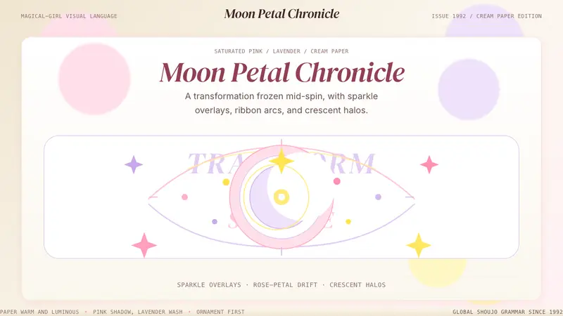 Sailor Moon ShoujoSweet and ornate. Pink, lavender, and cream with sparkle, ribbons, and crescent halos.
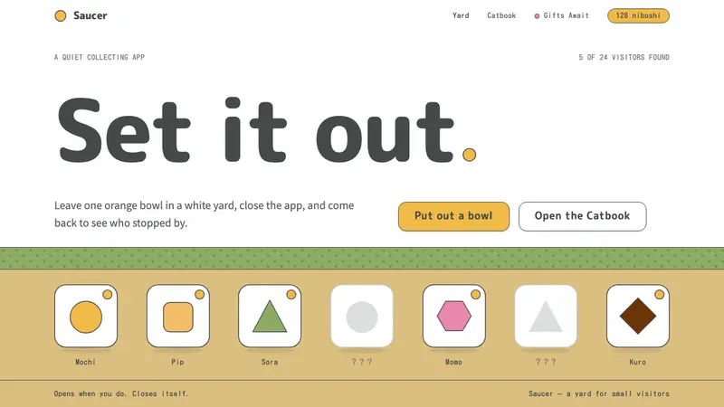 Neko AtsumeA quiet white yard, one orange bowl. Thin charcoal outlines, rounded type, orange only as fill.
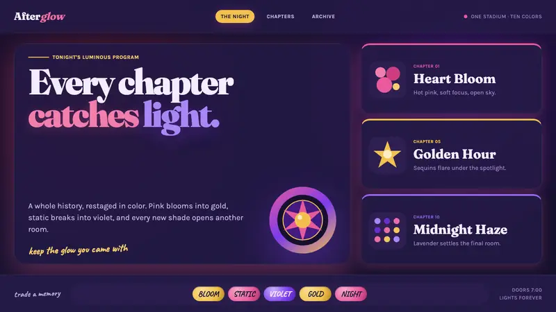 Taylor Swift Eras (2023)Every chapter catches light. Hot pink, lavender, gold and beadwork glow on midnight.
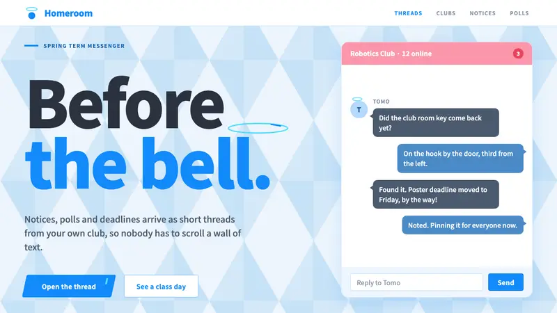 Blue ArchiveSchool-day brightness. White panels on a faceted sky, one bright Blue for every key button.