What is BYREDO?
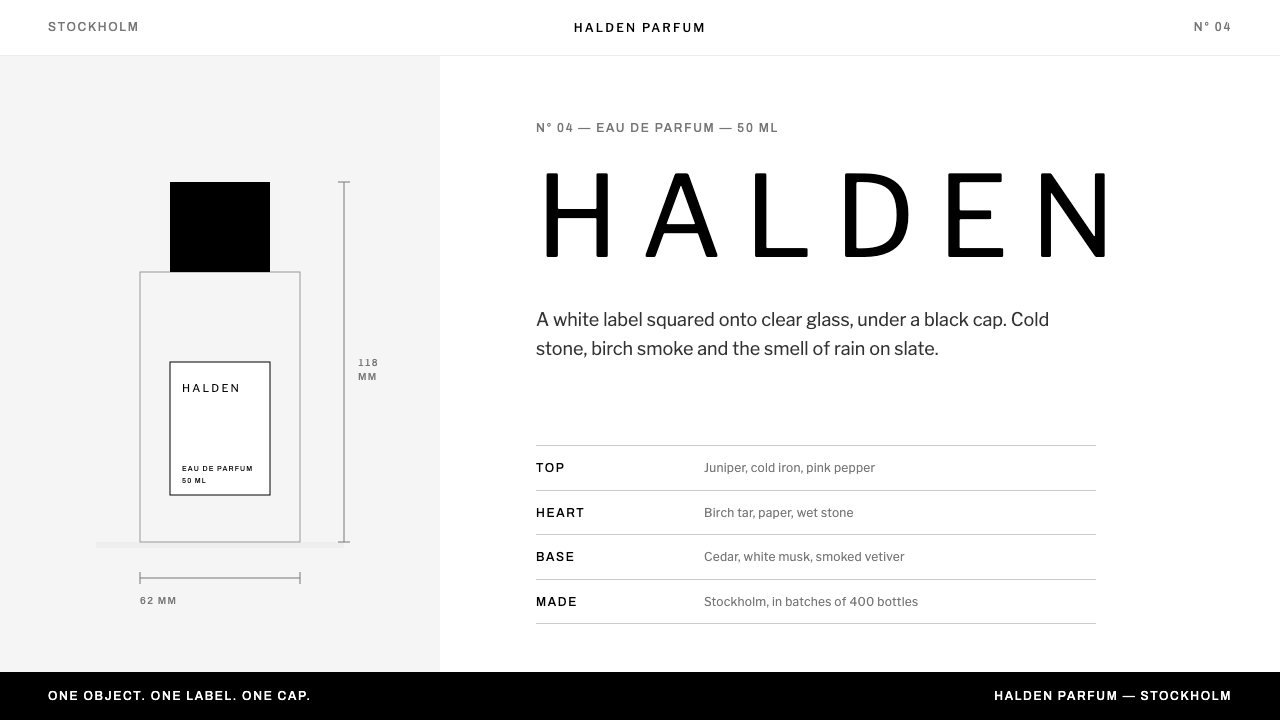
Byredo reduces a perfume house to a white label, a black cap and a line of wide-set capitals, with luxury expressed entirely through what has been left out.
BYREDO in brief
The Byredo label style is the visual language of a Stockholm niche perfume house, reduced to a single idea: a white paper label squared onto clear rectangular glass, beneath a black cylindrical cap, photographed on a white sweep. Everything else follows from that object. Pure black type sits on pure white, a short ramp of greys handles secondary information, every corner is square, and a gothic sans-serif is set in widely spaced capitals.
The governing principle is subtraction. Nothing in the original frame is dark except the cap and the type, so the system treats black as something that has to be earned. One object appears per screen. Fragrance notes are plain grey text divided by hairline rules. There are no label pills, no gold foil, no botanical illustration, and no colour at all unless something has actually gone wrong, such as a failed payment or a missing field. That discipline extends to behaviour: hover states, empty states and confirmations are all handled with type and line, never with ornament.
The result looks less like a shop than like a specimen catalogue or a gallery wall label. Product names are always capitalised and spaced out the way they would be printed on the bottle, which gives even a checkout page the quiet formality of packaging. The restraint is the luxury: the page signals value by declining to shout.

Where does BYREDO come from?
Byredo was founded in Stockholm in 2006, and its label identity dates from that first year. It belongs to the world of niche perfumery: small, independent houses that compete with mainstream designer fragrance not through celebrity advertising but through authorship, ingredients and a strong point of view. In that world the bottle and its label do much of the persuading, because a scent cannot be photographed. The founder, Ben Gorham, set a template early, and the house has held to it with unusual consistency. The label is therefore not packaging wrapped around a product; it is the product's public face, the one surface that has to carry a name, a promise and a mood at once.
The second root is Scandinavian minimalism: the Nordic habit of white rooms, daylight, honest materials, and furniture or graphic design that earns its place through function. Design culture in Stockholm treats emptiness as a positive material rather than an absence. Applied to perfume, that attitude produces a packaging language in which negative space is the main ornament and a single object is given the whole frame. In a market crowded with ornate flacons, a plain rectangle and a paper label read as a statement of confidence.
The typography draws on the revival of early-twentieth-century gothic sans-serifs. The system uses Libre Franklin, a Franklin-era gothic whose sturdy, slightly irregular forms came out of newspaper headlines and trade printing. Set in wide capitals, those workaday letters take on the feel of apothecary labels, archive tags and museum captions: institutional, precise and unsentimental. It is an old industrial voice put to work on something intimate.
The digital layer is studied rather than invented. The grey ramp is lifted from the brand's own compiled stylesheet, and the screen rules mirror the physical label: square corners, hairline dividers, no decorative shadows. The current site expression dates from the 2020s, but its logic has not changed since 2006. That continuity is part of the style, because a label that never redecorates reads as certain of itself.
What defines the BYREDO look?
Colour
Black and white do nearly all the work. Type is pure black on a pure white ground, with a short ramp of greys for secondary text, captions and disabled states. Chromatic colour is reserved for fault: an error message may turn red, and nothing else on the site is allowed to. Because colour is so rare, it carries urgency the instant it appears.
Typography
A gothic sans-serif in the Franklin lineage, set in capitals with generous letter spacing for product names and headings. The weight stays steady rather than dramatic; hierarchy comes from spacing, size and the grey ramp instead of bold. Body copy returns to ordinary sentence case so that capitals stay special and long text stays readable. Numerals are set plainly in the same face, so prices and volumes feel like part of the label rather than a sales device.
Corners and Edges
Every corner is square. Buttons, inputs, image frames and cards share the same hard rectangular geometry as the bottle and its label. There are no pills, rounded chips or soft capsules, and no drop shadows lifting one surface above another. Surfaces are separated by line and by space.
Hairline Rules
Thin ruled lines do the structural work that boxes, tinted panels and cards do elsewhere. They divide fragrance notes, separate specification rows and underline inputs. A rule is the typographic equivalent of the label's edge: a precise, quiet boundary that organises information without adding mass.
One Object per Screen
Each screen presents a single thing: one bottle, one label, one block of text. The white sweep behind it is treated as real material, not leftover space. Photography is straight-on, evenly lit and uncluttered, with no props, flowers or lifestyle scenes. The viewer is invited to imagine the scent rather than being told what it is.
Notes as Plain Text
Top, heart and base notes are listed as plain grey text with ruled separators, like a specification sheet. There are no icons of petals or woods and no mood-board imagery. The vocabulary of the notes carries the atmosphere, which is why the writing has to be precise and why the layout leaves it alone.
Refused Luxury Codes
The system is defined as much by what it forbids as by what it contains. Gold foil, ornamental flourishes, floral motifs, script typefaces and textured paper backgrounds are all absent. This refusal is deliberate positioning: the brand signals confidence by dropping the conventional symbols of prestige.

Who shaped BYREDO?
Founder of Byredo, which he started in Stockholm in 2006. His decision to give the house one disciplined packaging idea, a white label on clear glass under a black cap, produced an identity so consistent that it can be rebuilt as a screen system years later. He is the author of the restraint this style codifies.
A perfumer associated with the house. Naming a perfumer beside the founder matters here, because the visual system is built to stay quiet so that the fragrance, which a page can never show, remains the lead author of each product's character.
Listed among the figures tied to this identity alongside Gorham and Epinette. The material behind this article records no specific role for him, so only a structural point can be made: an identity this quiet is rarely a solo performance, and his name signals the shared work of adjusting margin, spacing and weight until nothing more needs adding.
How do you use BYREDO today?
The Byredo label style transfers well because its rules are few and strict. Treat it as a discipline rather than a skin: black, white, grey, capitals, hairlines and one subject at a time. It works best for products where the object, the material or the story is strong enough to stand alone on an empty page.
On slides, a cover can be a single object or a single phrase on pure white, centred or flush left, with the title in tracked capitals and a thin rule beneath it. Content slides follow the label's logic: one idea per slide, grey secondary text, hairline dividers between rows. Data slides work as ruled tables with plain numerals; if a chart is unavoidable, draw it in black and one or two greys and emphasise the key figure with weight rather than hue. Speaker notes and appendices can carry the detail, leaving the slide itself almost empty.
For web products the style suits boutique e-commerce, product catalogues, booking and membership pages, and any dashboard where calm legibility matters more than energy. Use square black buttons with white text, white buttons with a black hairline outline, ruled inputs and a generous grid. Navigation stays typographic. Hover and focus states should be expressed through underlines, black-and-white inversion or a step in the grey ramp, never through colour or shadow. Product pages should show the bottle large and the specification small, with the price set in the same grey as other facts rather than in a highlight colour.
In editorial and marketing work the style yields lookbooks, press kits, invitations, packaging inserts and campaign pages with museum-label gravity. Keep a narrow text column, leave wide margins, and let one photograph or object take the page. Copy should be short and concrete. Because the layout offers nothing to hide behind, vague language shows immediately. Captions can be set like museum wall labels: a name in capitals, then a line or two in grey.
The most common mistake is adding a warm accent colour, rounded corners or a script typeface to make the look feel more luxurious; each one breaks the logic that makes the style feel expensive. The second is tracking everything: wide-spaced capitals suit names and headings, and long sentences set that way become tiring. Finally, resist filling the white. The emptiness is part of the product.

BYREDO — FAQ
Is this the official Byredo brand kit?
No. It is a design-system study of the discipline visible in Byredo's label and website, written so that designers and AI tools can apply the same logic. It is not an official asset set, and using it does not imply any affiliation with the perfume house.
Why is colour reserved for errors?
Because colour that appears only when something is wrong becomes a signal rather than decoration. In a palette that is otherwise black, white and grey, one red message cannot be missed. The rule also keeps product photography, which is usually pale and neutral, from competing with interface colour. Success states are shown with a change in wording or a ticked line of text, not a green flash.
How is it different from generic minimalism or Swiss style?
Generic minimalism often keeps a bright accent and soft, rounded components; this system has neither. Swiss typography also uses a grid and sans-serif type but typically embraces colour, photography and dramatic scale contrast. The Byredo label style is narrower and quieter: tracked capitals, a single object, and rules instead of containers, all tied to the specific physical label it was drawn from.
Can it work in dark mode?
It is built on a white ground that mirrors the white sweep behind the bottle, so a full inversion would change its character. If a dark surface is unavoidable, keep it to small areas and retain the square geometry, hairline rules and capital typography. In the original photograph the black cap is the only dark mass, which suggests black should remain an accent of weight rather than a wash.
What kinds of product does it suit?
Objects with a strong material presence and a story that benefits from restraint: fragrance, skincare, ceramics, publishing, furniture, galleries and boutique hospitality. It struggles with busy, high-frequency tools that need dense colour coding, and with brands whose personality is playful or warm. Its natural home is any context where trust is built by calm authority.
Related design styles
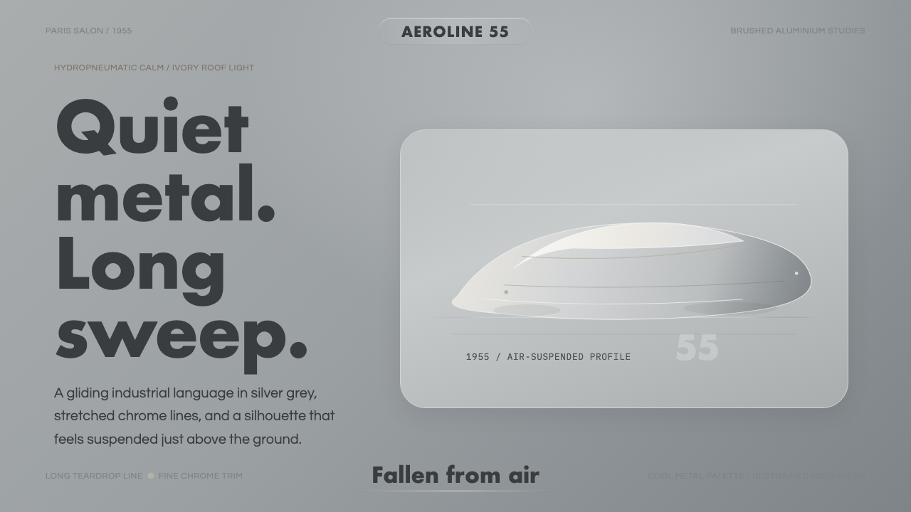 Citroën DSSilence made aerodynamic. Silver-grey ground, chrome hairlines, one long glid…
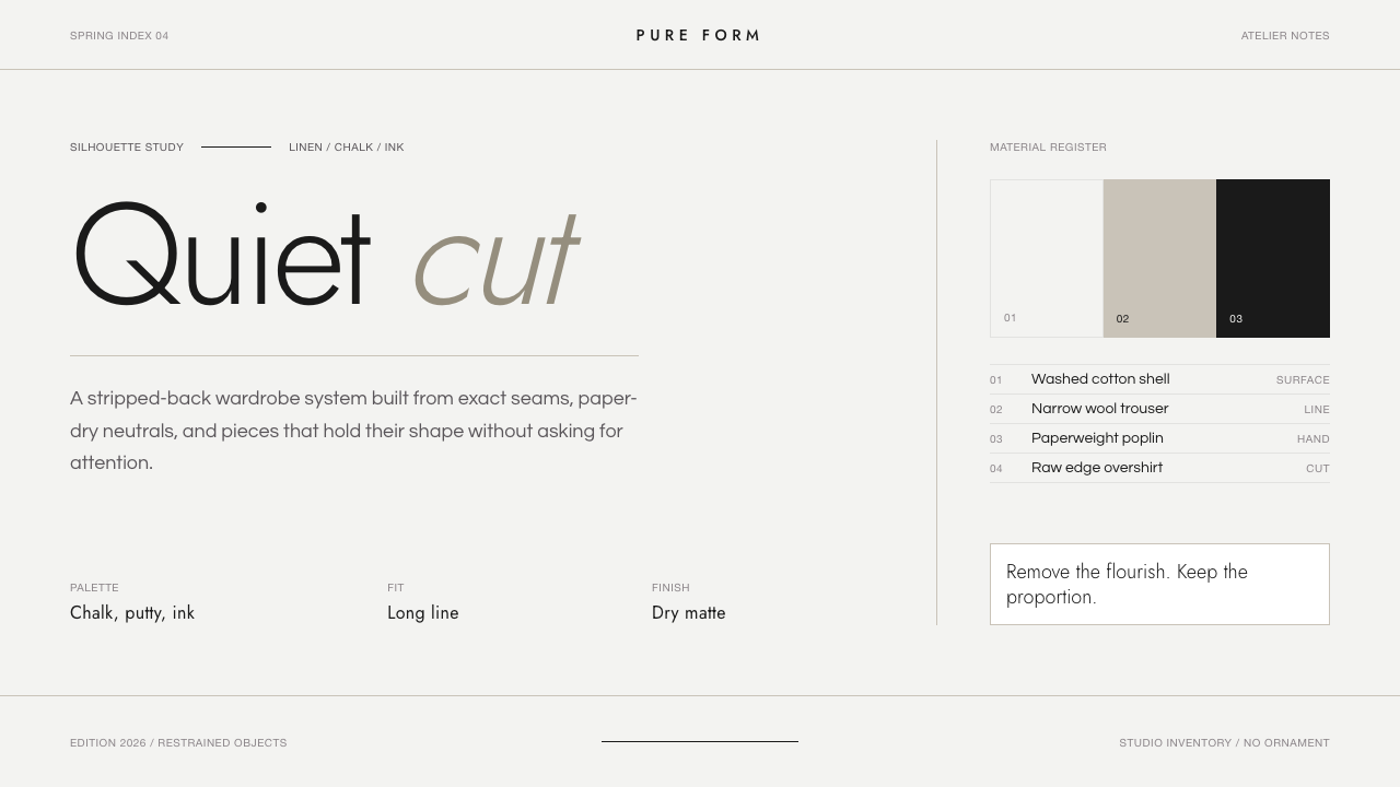 Jil Sander PurePrecision feels luxurious. Near-black geometric sans on curated near-white, w…
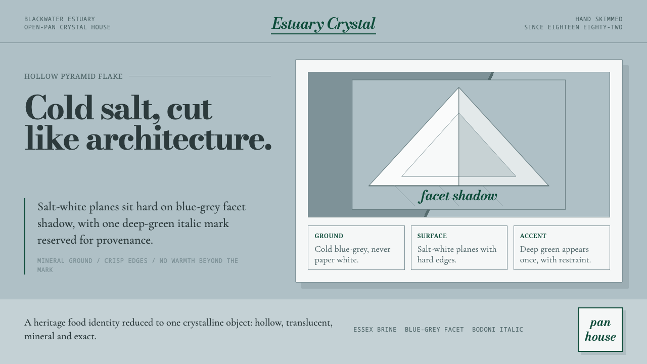 Maldon Sea Salt PyramidCold mineral luxury. Salt-white facets on blue-grey ground, struck once with…
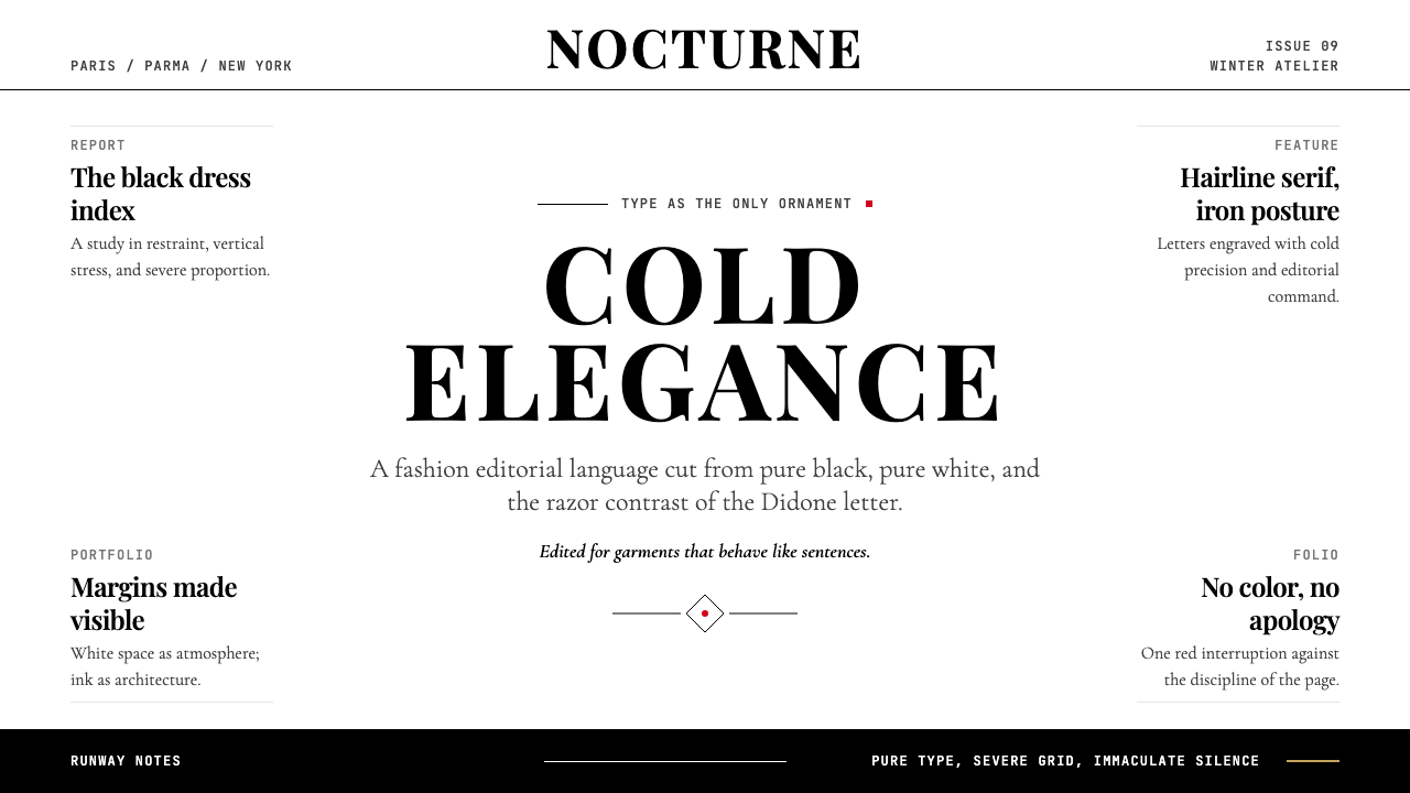 Vogue DidoneCold authority. Black-on-white Didone, red accent, and vast editorial whitesp…
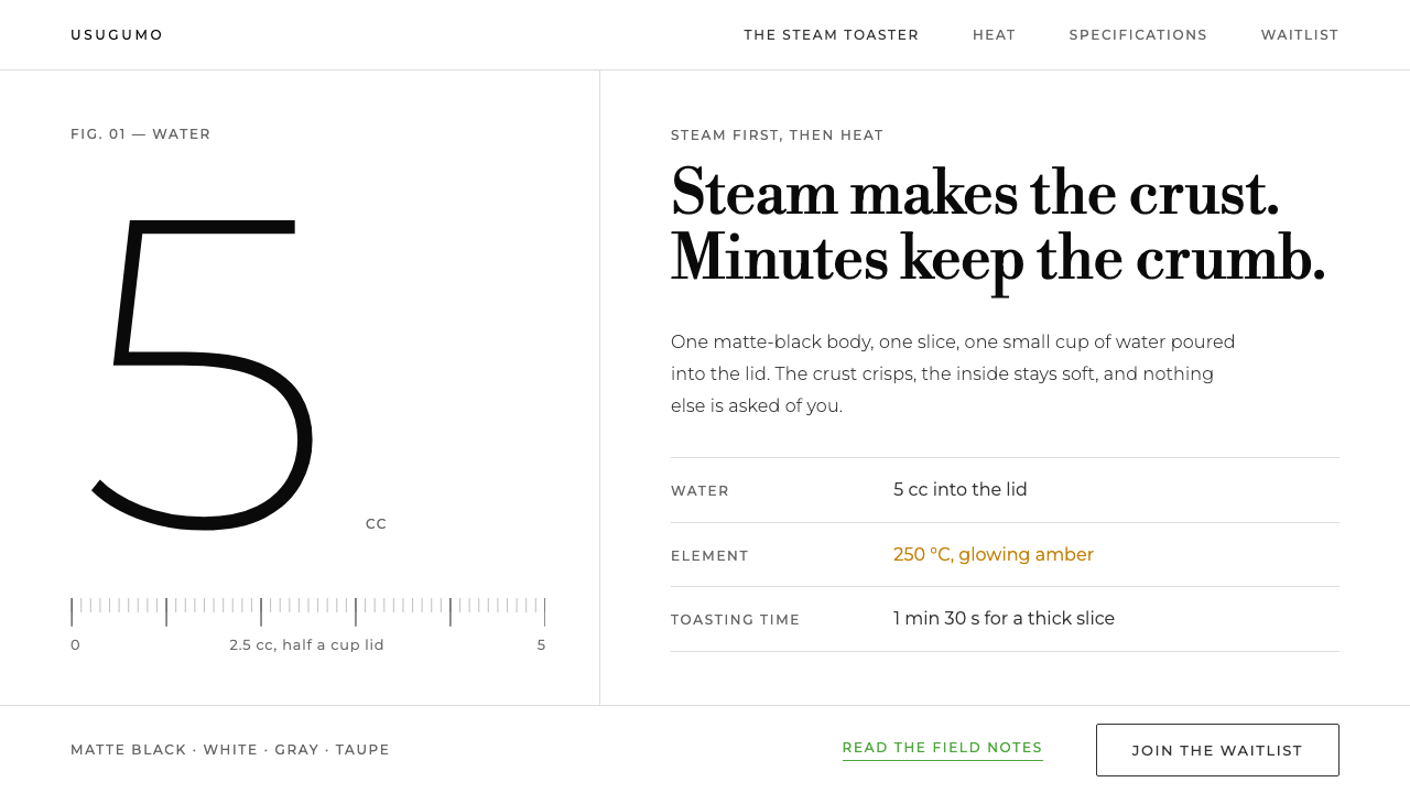 BALMUDA The ToasterOne object, one white room. Grey ink, Bodoni lines, huge light numerals, gree…
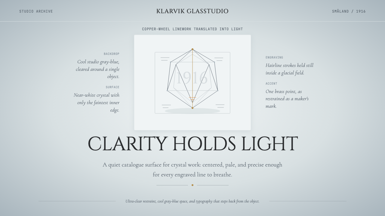 Swedish Orrefors Crystal (1916)Quiet luxury in glass. Gray-blue space, Cinzel capitals, and brass hairlines…