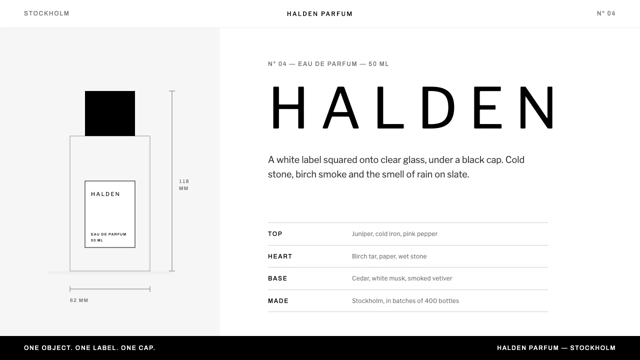
About BYREDO
BYREDO's whole identity fits on one object: a white paper label squared onto clear rectangular glass, under a black cylindrical cap, shot on a white sweep. Nothing else in the frame is dark except the cap and the type.
This system keeps that discipline. Pure black on pure white, a grey ramp lifted straight from the brand's compiled CSS, zero radius, and a Franklin-era gothic set in wide capitals. One object per screen, notes as plain ruled text, and no colour unless something has actually gone wrong.
- Origin
- Stockholm, Sweden
- Era
- 2006 founded; label identity 2006, current site ~2020s
- Key figures
- Ben Gorham · Moses Voigt · Jérôme Epinette
- Movements
- Scandinavian minimalism · 1900s gothic revival typography · Niche perfumery
BYREDO design spec
Colors
Background
Surface
Primary
Secondary
Accent
Text
Typography
Libre FranklinHeadings
ArchivoMono
Unlock for 1 credit
The other 11 sections — buttons, cards, spacing, motion, techniques and more — open once you unlock. Download the DESIGN.md or send it to your AI in one click. Unlock once, yours forever.
Sign up nowHave an account? Sign in
Styles similar to BYREDO
Also inspired by brands & products, with a close feel.
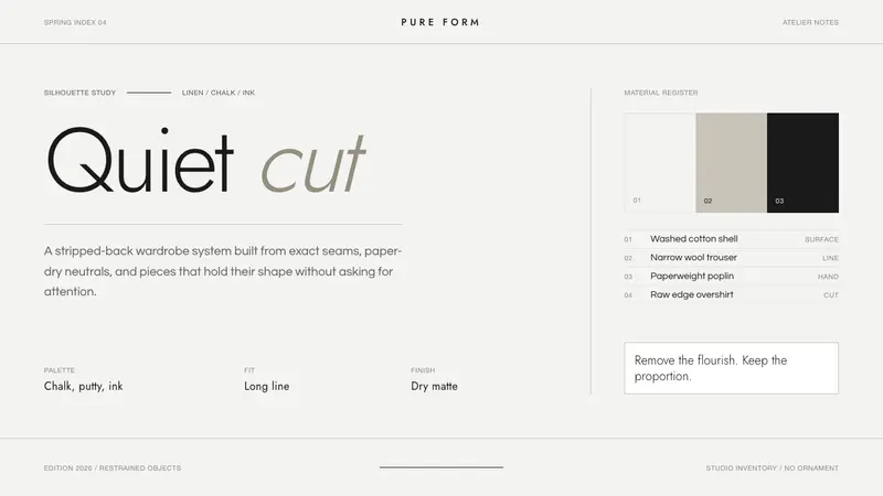 Jil Sander PurePrecision feels luxurious. Near-black geometric sans on curated near-white, with exact alignment.
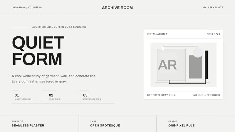 COS Gallery MinimalSilence has structure. Cool gallery white, Archivo uppercase, and concrete-gray hairlines.
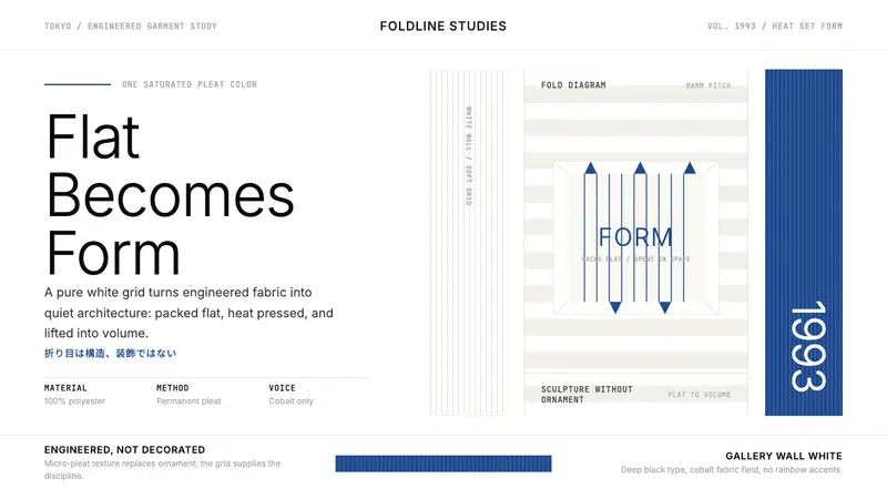 Issey Miyake Pleats PleaseEngineering wears white. Cobalt pleat stripes and a strict Inter grid turn fabric into form.
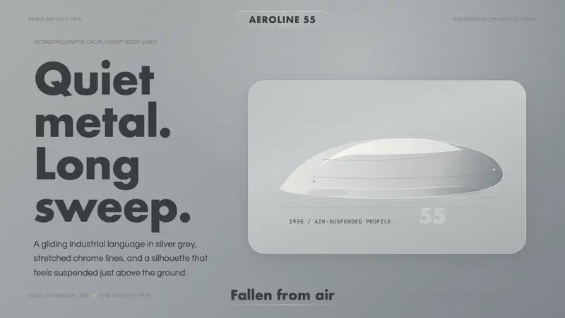 Citroën DSSilence made aerodynamic. Silver-grey ground, chrome hairlines, one long gliding profile.