What is FESPACO Poster?
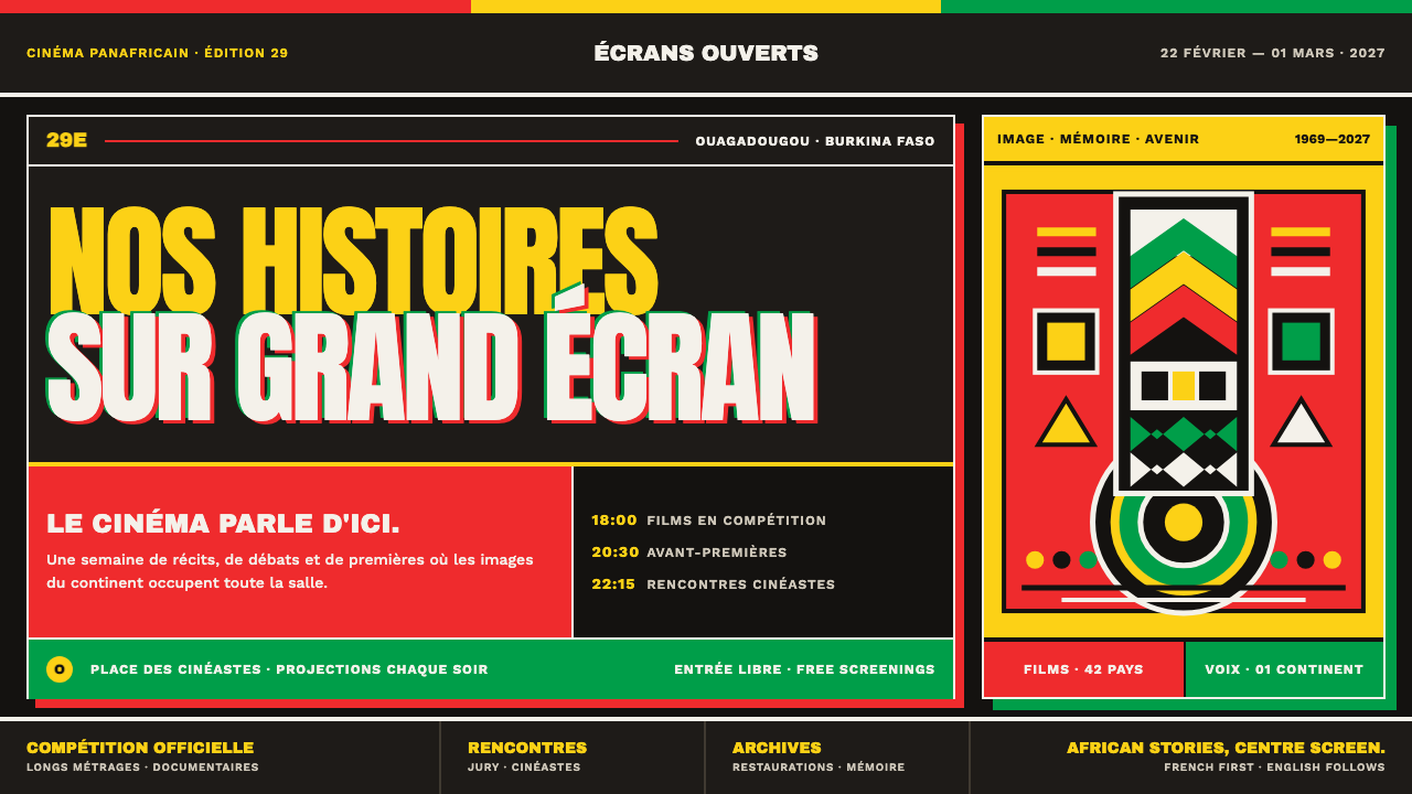
FESPACO's poster tradition puts African cinema at the center of its own frame: flag-exact spot color, screen-printed grain, and type set so large it argues with the edge of the sheet.
FESPACO Poster in brief
FESPACO — the Pan-African Film and Television Festival of Ouagadougou — is the continent's own cinema festival, and its poster tradition is the visual language it uses to speak to African audiences rather than to a foreign market. The style is built from a charcoal-dark ground, flat areas of spot color rather than gradients or photographic blends, and a festival wordmark set at a scale large enough to press against the edges of the sheet.
The palette is not a mood board choice; it is fixed to the Burkinabè national flag — yellow-gold, red, and green — with the gold carrying particular weight because it is the color of the Étalon d'or de Yennenga, the golden stallion trophy awarded to the festival's best film. Figurative elements draw on Bwa plank-mask carving from Burkina Faso rather than generic pattern-making, giving the posters a graphic vocabulary that is locally sourced rather than imported.
Because the posters are conceived as screen prints, the system carries the physical qualities of that process: colors sit in flat registered layers, edges can show slight misalignment between passes, and ink texture picks up the grain of the paper beneath it. Text is bilingual and ordered deliberately, French set before English, reflecting the festival's own linguistic identity.
Where does FESPACO Poster come from?
FESPACO was founded in 1969, initiated at a gathering in Carthage, Tunis, and has run as a biennial festival every March of every second year since. It established a permanent headquarters in Ouagadougou, Burkina Faso, in 2005, and the visual language described here reflects the festival's current identity, roughly from 2019 through 2025.
The festival sits within several overlapping movements: pan-Africanism as a political and cultural project, African cinema as a body of work asserting its own aesthetic independence, West African screen-printed poster practice as a production method, and Bwa mask carving as a source of figurative form. Each of these threads shows up directly in the poster system — the pan-African ambition in the festival's continental scope, African cinema in its subject matter, screen-printing in its production texture, and Bwa carving in its graphic motifs.
The name Yennenga anchors the festival's central symbol. Yennenga is remembered as a warrior figure connected to the founding of the Mossi kingdom; the festival's top prize, the Étalon d'or de Yennenga, takes the form of a golden stallion in her honor. Gidéon Vink is associated with the visual identity that carried this symbolism into the festival's poster tradition, part of the lineage of West African screen-print designers whose work established FESPACO's recognizable house style.
The result is a poster tradition that reads as neither purely commercial advertising nor purely fine-art printmaking, but something built specifically for a festival whose mission is asserting African cinema's place on its own continent, in its own colors, using its own craft traditions.
What defines the FESPACO Poster look?
Charcoal Ground
The dominant background is a dense, near-black charcoal tone rather than pure black or a photographic backdrop. It functions as a stage that flat spot colors and cut-out figures sit on top of, keeping every other element legible without competing with a busy or textured backdrop.
Flag-Exact Spot Color
Yellow-gold, red, and green are used as fixed spot colors matched to the Burkinabè flag rather than as a freely adjustable palette. Gold carries the most symbolic weight, tied directly to the festival's golden-stallion trophy, and is used with more restraint than red or green.
Edge-Fighting Type
The festival wordmark and key titling are set at a scale that pushes against, or slightly crops into, the edges of the frame. This creates a sense of a graphic that cannot be fully contained by its own format — the title claims the whole sheet rather than sitting politely within a margin.
Bwa Mask Motifs
Figurative pattern draws directly on Bwa plank-mask carving: vertical panels traditionally painted in geometric zigzags, chevrons, checks, and concentric circles, historically rendered in black and white with touches of red. These forms are used as a source of authentic local graphic vocabulary rather than invented decoration.
Screen-Print Registration
Color layers behave like screen-printed passes: flat, opaque, and occasionally slightly out of register with one another, with ink picking up the texture of the paper stock underneath. This gives the system a handmade, physical quality distinct from a smooth digital gradient.
Bilingual, Ordered Text
Text appears in both French and English, with French set first, reflecting the festival's own linguistic identity rather than treating either language as a secondary translation. This ordering is a deliberate identity choice, not a default.
Who shaped FESPACO Poster?
Yennenga is remembered as a warrior figure connected to the founding of the Mossi kingdom; her name and image anchor the festival's top honor, the Étalon d'or de Yennenga, a golden stallion trophy, and by extension the gold that dominates the poster palette.
Ouedraogo is remembered as Yennenga's son, his name meaning stallion — the direct link between her story and the golden-stallion form the festival's top prize takes, and a reminder that the poster palette's gold is tied to a specific piece of oral history rather than a generic color choice.
Vink's name recurs in the lineage of West African screen-print designers who established FESPACO's recognizable poster identity — the charcoal ground, flag-exact spot color, and edge-filling type that later editions of the festival's posters continue to draw on.
How do you use FESPACO Poster today?
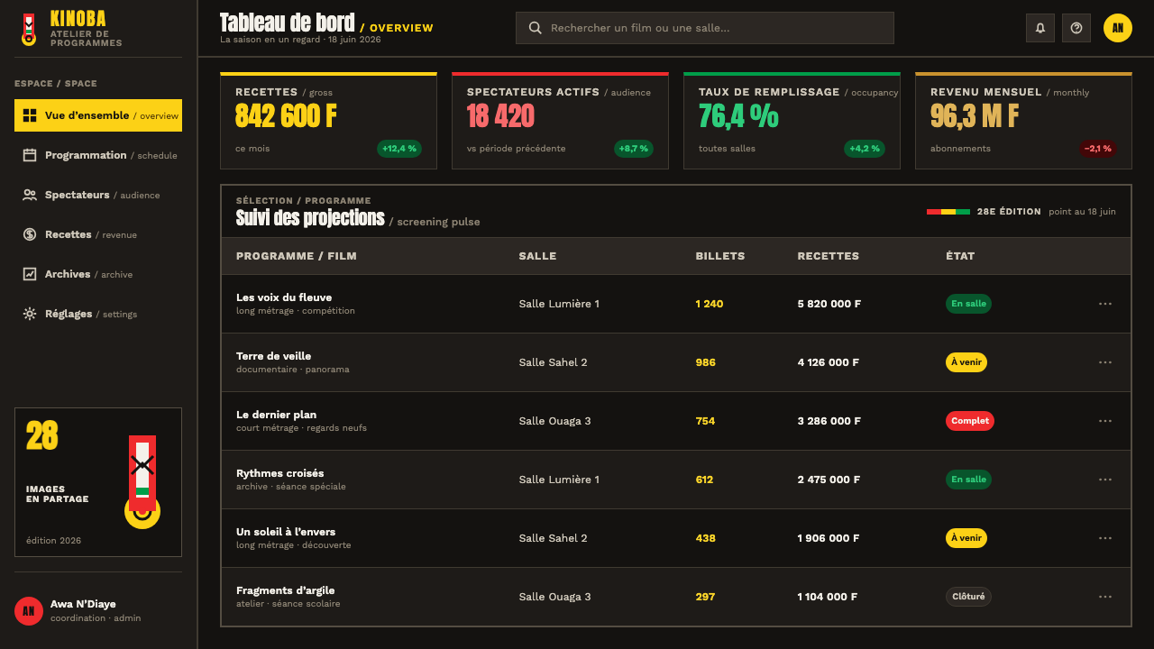
This system is built for bold, singular statements rather than dense information display, so it works best wherever a project needs one confident graphic gesture: festival identities, cultural event branding, and any context celebrating a specific regional or national craft tradition.
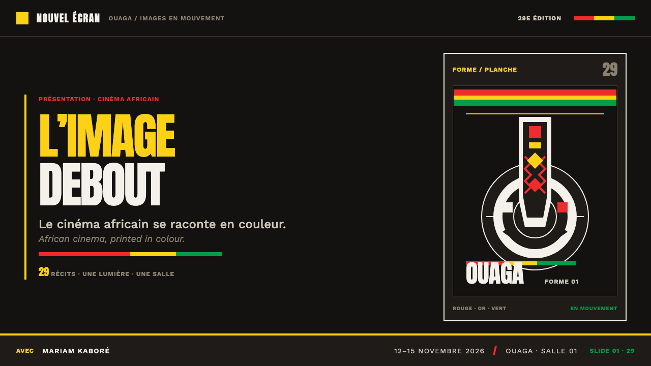
For presentation slides, a cover page can use the full charcoal ground with a single large title set in flag-exact gold or red, pushed close to the frame's edges, and a Bwa-inspired geometric motif anchoring one corner. Content slides should limit themselves to one accent color per slide rather than deploying gold, red, and green simultaneously, keeping the flat, poster-like clarity of the source material.
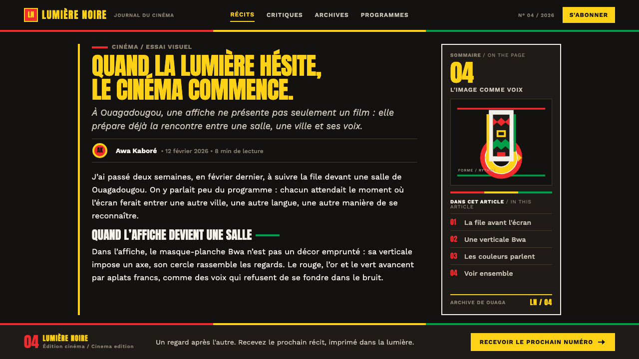
For web interfaces, the style suits landing pages, event microsites, and cultural or arts-organization branding where a strong first impression matters more than dense navigation. Hero sections benefit from the charcoal ground and oversized type treatment; supporting UI elements should stay restrained so the hero graphic keeps its poster-like authority.
For editorial and marketing collateral, this system works well as full-bleed poster-style spreads: a single dominant motif, flag-exact color blocking, and bilingual or multilingual text treated as a structural element rather than an afterthought. Section dividers can borrow the screen-print registration quality — slightly offset color layers — to reinforce the handmade production texture.
A common mistake is treating the flag colors as an interchangeable warm palette and substituting arbitrary oranges or ambers for the gold, or softening the charcoal ground toward a neutral gray. Both moves erase the specific symbolism — the gold's tie to the festival's trophy, the charcoal's function as a graphic stage — that gives the system its identity.
FESPACO Poster — FAQ
Why is the gold in this palette so specific rather than a general warm accent?
Because it refers to a specific object — the Étalon d'or de Yennenga, the golden stallion awarded to the festival's best film — which in turn refers to a specific piece of oral history about Yennenga and her son Ouedraogo. Treating the gold as an interchangeable warm tone removes that chain of reference and turns a symbol into decoration.
Do the Bwa mask motifs need to be literal masks, or can they be abstracted?
The motifs can be abstracted into their component parts — zigzags, chevrons, checks, concentric circles — without depicting a literal mask, as long as the geometric vocabulary is drawn from that carving tradition rather than invented generically. The goal is a graphic language that traces back to a real regional craft practice, not a specific pictogram that must appear every time.
Should the French-before-English text order always be followed?
It reflects the festival's own linguistic identity and is worth preserving whenever a project is explicitly channeling FESPACO's specific poster tradition, since the ordering itself is part of what signals the festival's continental, non-foreign-market orientation. For projects using the visual system more loosely, the underlying principle — treat whichever language matters most to the audience as primary, not automatically default to English — matters more than the exact language pair.
Can this style work on a light background instead of the charcoal ground?
A light-ground variant is possible but changes the system's core dynamic: the charcoal ground is what lets the flat spot colors and cut-out Bwa motifs read as luminous, stage-lit forms. On a light background, gold and red lose contrast and the screen-print registration texture becomes far less visible, so the poster loses much of its graphic punch unless the color values are deliberately rebalanced for the new ground.
Related design styles
 Oppenheimer Trinity (2023)Dread waits in the dark. Incandescent orange ruptures IMAX black and classifi…
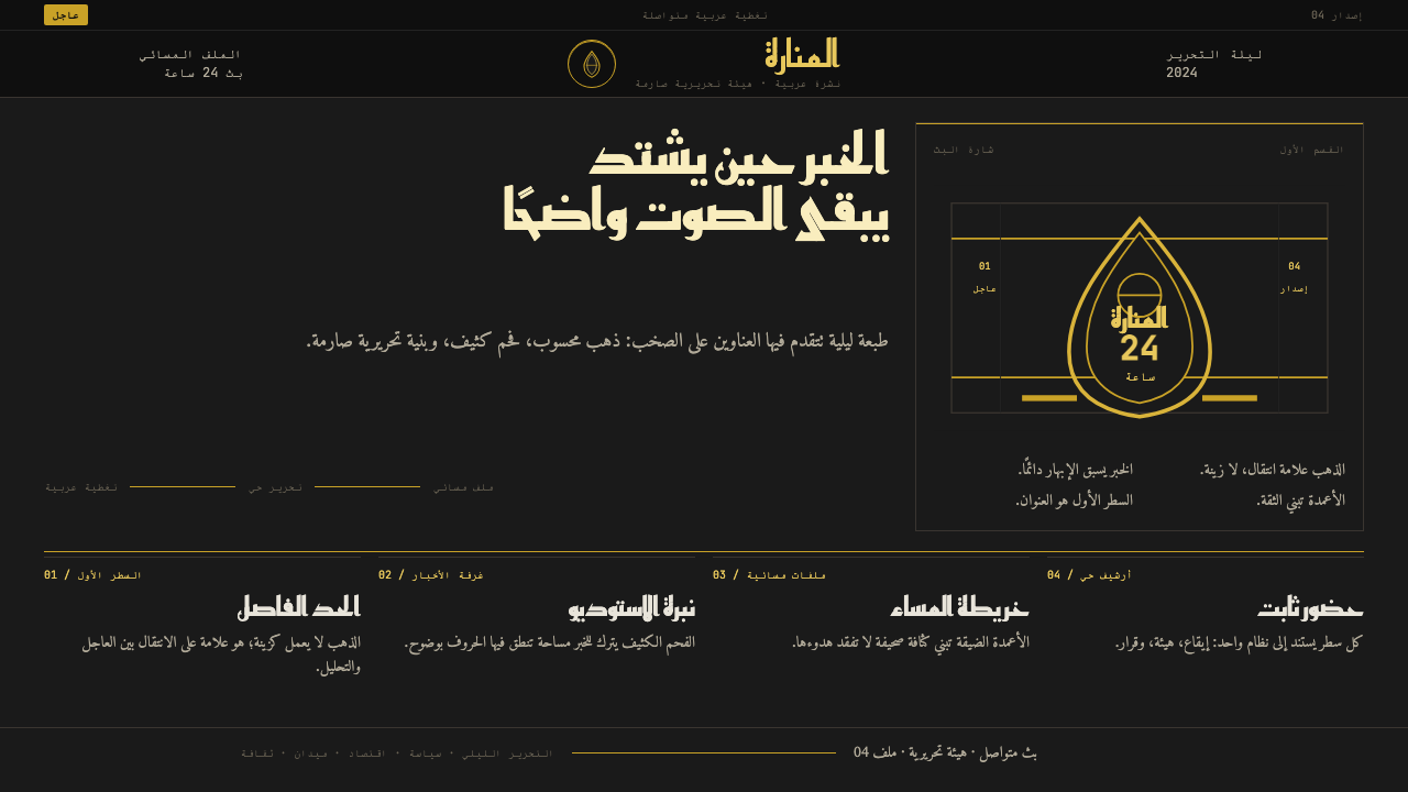 Al Jazeera Arabic NewsAuthority, stripped bare. Gold seal, dense Arabic type, matte charcoal.
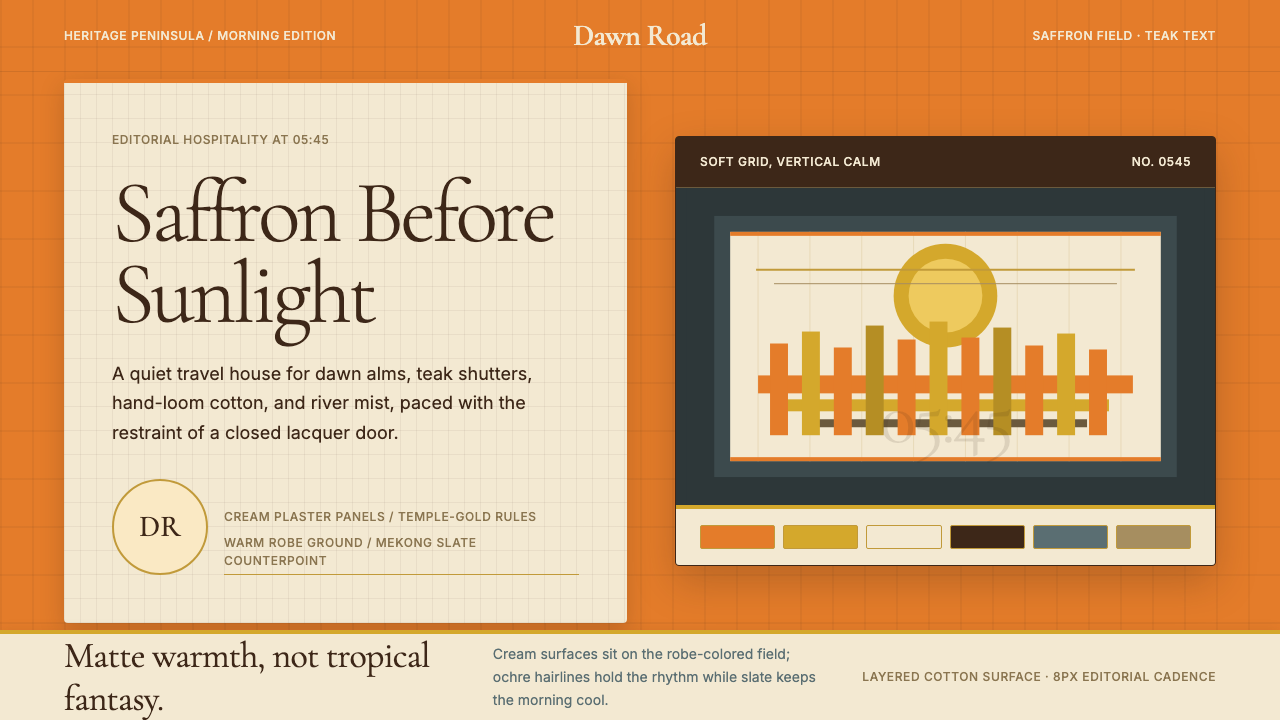 Luang Prabang Temple TourismReverent dawn luxury. Saffron field, cream panels, and teak serif type carry…
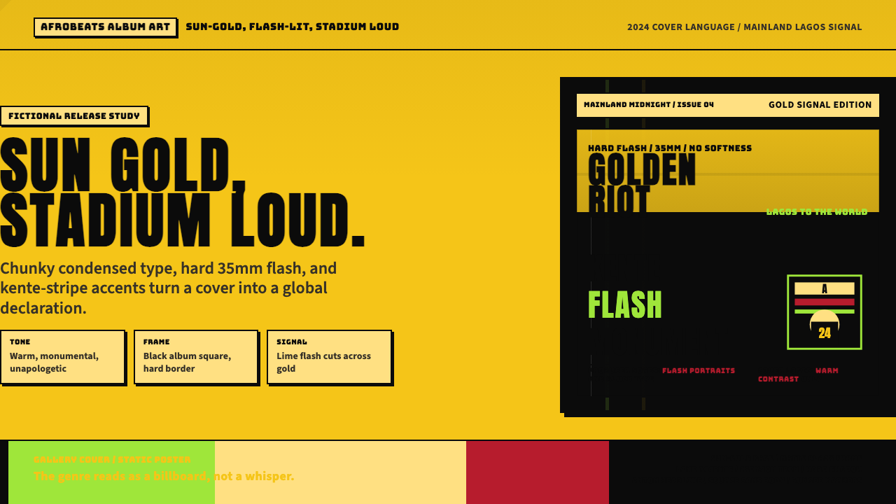 Afrobeats Album Art 2024Sun-gold and stadium loud. Anton type, kente stripes, and hard flash drive th…
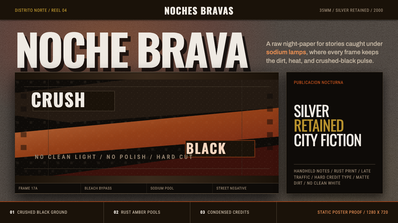 Amores Perros New WaveRaw street cinema. Crushed black, sodium amber, Oswald credits, heavy 35mm gr…
 Aramco World MagazineMatte Gulf modernism. Desert green, gold sun-discs, classic serif, and naskh…