What is Oppenheimer Trinity (2023)?
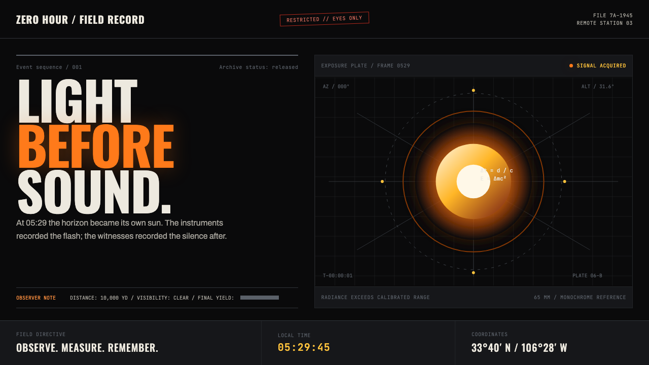
Dread waits in the dark, until an incandescent rupture turns silence, science, and catastrophe into a single frame.
Oppenheimer Trinity (2023) in brief
Oppenheimer Trinity is a dark cinematic design system drawn from the visual grammar of Christopher Nolan’s 2023 film Oppenheimer. Its core image is the desert before dawn: an almost unbroken field of darkness, held in suspense until orange-white combustion tears through it. The visual language is not merely dramatic darkness with a bright accent. It is a controlled contrast between containment and rupture, between institutional restraint and an event too immense for its frame.
The style combines several visual registers that normally carry different meanings. Large-format cinema supplies scale, grain, darkness, and the sensation of being physically close to overwhelming light. Scientific notation contributes chalk-white equations and the provisional logic of a blackboard. Classified-document typography introduces bureaucracy, secrecy, and the cold pressure of official records. Together, these elements make information feel consequential: a headline is not simply read, but disclosed; a diagram is not simply explanatory, but implicated.
Its emotional rhythm depends on delay. Most of the composition remains quiet, sparse, and dark enough that every luminous mark matters. A fire-like glow, a white equation, a thin rule, or a block of condensed type becomes an interruption rather than decoration. The result is austere but not neutral. It carries heat, scrutiny, anticipation, and the uneasy sense that something irreversible has already been set in motion.
Where does Oppenheimer Trinity (2023) come from?
The system originates in Oppenheimer, released in July 2023 and centered on the Trinity test of July 16, 1945. Its historical frame reaches from 1926 to 1954, but its visual atmosphere concentrates attention on a smaller, more charged interval: the dark desert before the test, the fireball against the night sky, and the institutional aftermath suggested by hearings, documents, and surveillance. Los Alamos and the Jornada del Muerto desert in New Mexico provide the geographic and emotional terrain: remote, dry, exposed, and suspended between scientific work and military consequence.
Christopher Nolan’s film establishes the style’s central contradiction. The imagery can be immense without becoming decorative, because spectacle is continually bound to private anxiety and institutional procedure. Darkness is not a neutral backdrop. It functions as waiting room, void, archive, and witness. Against it, bright combustion reads simultaneously as discovery, force, and dread. A design derived from this grammar should preserve that ambiguity rather than treating the fireball only as a visually exciting motif.
Hoyte van Hoytema’s large-format cinematographic approach informs the system’s sense of scale and extreme tonal separation. Near-total black fields make light feel materially present, while the glow of fire and chalk-like markings suggests images discovered inside darkness rather than placed comfortably upon it. This is why empty space is essential. It recreates the long visual pause before illumination arrives, allowing a single bright region or line of type to feel charged with narrative weight.
Ruth De Jong’s production-design context and the film’s mid-century scientific-bureaucratic setting supply the second half of the vocabulary. Dark panels recall blackboards and sealed interiors; condensed grotesques suggest formal announcements; monospaced, typewriter-like text evokes memos subject to review or redaction. Ludwig Göransson’s contribution reinforces the idea of pressure accumulating before release. In design terms, the system should feel composed rather than noisy: evidence, notation, and institutional language are held under tension until one incandescent event reorganizes the whole page.
What defines the Oppenheimer Trinity (2023) look?
Darkness as Structure
The dominant field is near-total darkness, closer to an IMAX theatre before projection than to an ordinary dark interface. It creates room around every element and makes absence legible. Dark areas should remain visibly intentional, not be filled with decorative texture, weak secondary information, or repeated interface chrome. The page gains force by withholding visual evidence until a component genuinely needs to speak.
Incandescent Rupture
Orange-white light is used as an event rather than an ambient palette. It should feel like combustion piercing a sealed frame: concentrated, abrupt, and surrounded by enough darkness to retain its danger. A luminous region may anchor a hero image, a key metric, or a call to action, but it should not be scattered evenly across the composition. When light becomes constant, it stops feeling like Trinity.
Classified Typography
Headlines use condensed grotesque letterforms with the vertical pressure of an official notice or a physics lecture title. Supporting text shifts into a monospaced, typewriter-like register when the content needs to read as evidence, a memo, a transcript, or a redacted record. The contrast is semantic as well as visual: condensed display type announces consequence, while mono text implies process, custody, and institutional distance.
Chalkboard Evidence
Chalk-white equations and marks sit on dark, blackboard-green haze rather than on clean paper-like grounds. They should look provisional, scrawled, and partially emergent from the surface, as if thought is still being tested in public. Mathematical notation is most effective when it supports a real hierarchy or a thematic cue. Used indiscriminately, it becomes a generic science decoration and loses the atmosphere of intellectual pressure.
Negative Space and Delay
Large unoccupied regions are not empty leftovers; they create the interval before impact. Content should arrive in measured clusters, with isolated headlines, rules, labels, and light sources allowed to hold their own territory. This pacing mirrors the source material’s emotional sequence: silence first, perception second, fear afterward. Dense pages can use the vocabulary, but they must retain pockets of darkness where anticipation can accumulate.
Forensic Composition
Rules, labels, document blocks, and panels should imply examination rather than ornament. The composition feels assembled from testimony, equations, classified pages, and fragments of observation. Alignment is disciplined, but the experience need not feel sterile: a glow can break the grid, and chalk notation can cross a panel edge. The point is controlled evidence under stress, not a retro office imitation.
Who shaped Oppenheimer Trinity (2023)?
Nolan directed Oppenheimer and provides the system’s overarching visual and emotional grammar. The design language inherits his use of temporal pressure, silence, large-scale image making, and institutional consequence. For designers, the important lesson is not to imitate a film still but to preserve the collision between intimate anxiety and overwhelming historical force.
Van Hoytema’s large-format cinematography informs the treatment of darkness, combustion, and scale. The relevant quality is not technical display for its own sake, but the way deep shadow makes a bright event feel physical and immediate. His influence appears in the system whenever light is allowed to occupy the frame as a force rather than a cosmetic highlight.
De Jong’s production-design context grounds the aesthetic in places of work, research, scrutiny, and containment. Blackboard surfaces, enclosed dark rooms, formal documents, and scientific environments give the style its material credibility. Her contribution helps prevent the system from becoming abstract apocalypse imagery by keeping it connected to the spaces where decisions, records, and calculations are made.
Göransson’s contribution is useful as a model for visual pacing. The system should behave like pressure gathering before release: sparse signals, a held breath, then a concentrated disturbance that changes the perceived scale of everything around it. Even in a static interface, this principle can guide the sequence of emphasis, disclosure, and motion.
How do you use Oppenheimer Trinity (2023) today?
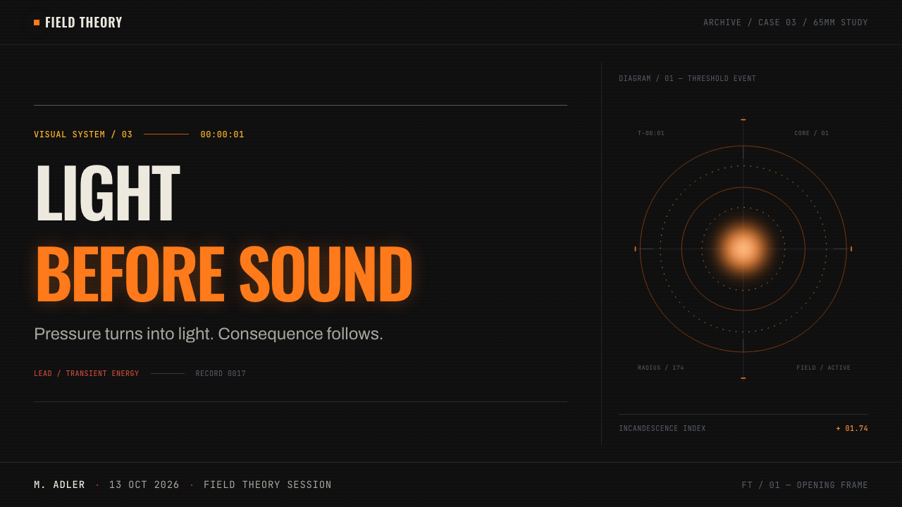
For presentation covers, let darkness do most of the work. Place a condensed title with the authority of a classified heading, then give one incandescent element enough surrounding silence to feel dangerous. Avoid turning the cover into a literal explosion poster. The strongest version suggests an approaching event through a narrow glow, a fragment of notation, or a document-like label. Content slides should divide lecture-like explanation from evidence-like annotation, using a calm reading field before introducing a bright interruption.
Data slides can use the system especially well when the subject involves thresholds, uncertainty, risk, research, or consequential decisions. Treat a chart as an instrument panel or a piece of examined evidence, not as a decorative infographic. Keep most data restrained in chalk-white or muted document tones, then reserve the incandescent accent for the one comparison, break, or outcome that deserves attention. Formula fragments can frame a data story when they clarify the subject, but should never substitute for labels and readable values.
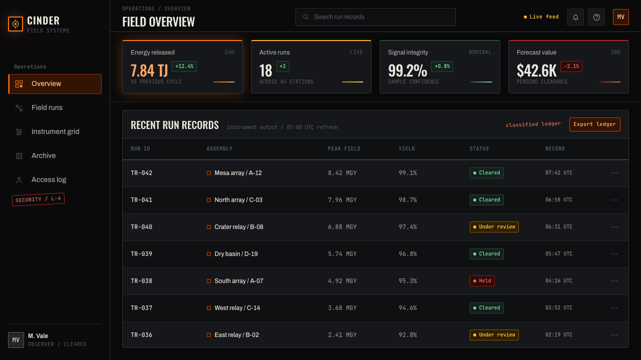
For web interfaces, this language fits dashboards, research tools, analytical products, launch pages, and pricing pages that need gravity without corporate blandness. A dashboard can use dark panels to separate evidence streams, monospaced labels for source-like metadata, and condensed display type for primary findings. A pricing page can make one decision point luminous against an otherwise quiet field. In both cases, interaction states must remain unmistakable; mystery is useful for atmosphere, but never for basic navigation or task completion.
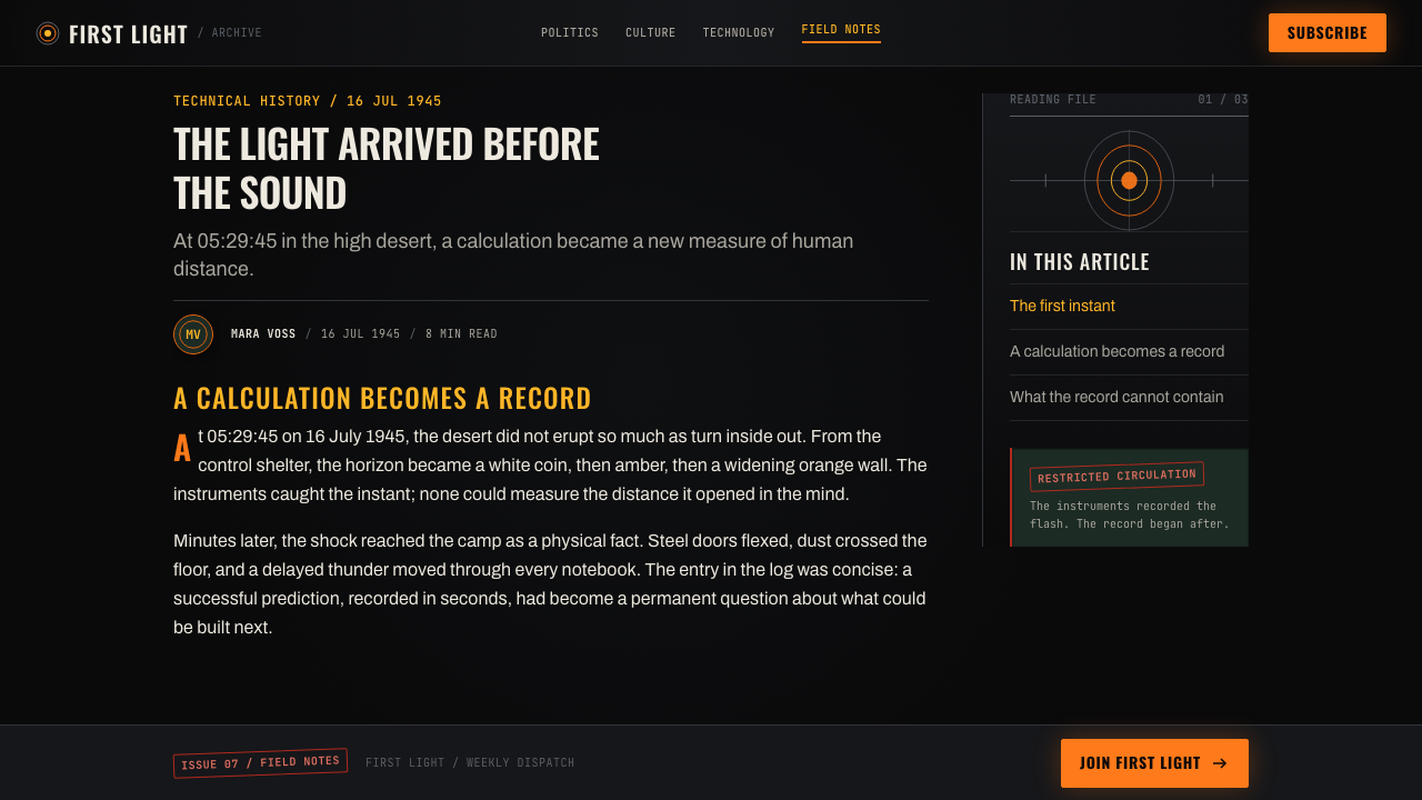
Editorial and marketing layouts benefit from its ability to stage disclosure. Start an article with a large dark field, a precise title, and a single image or glowing fragment that creates unresolved tension. Within long-form content, use document-like side notes, equations, rules, and isolated pull lines to mark shifts in evidence. Campaign pages can alternate between deep dark sections and brief zones of visual release, but each bright moment should correspond to a meaningful claim, proof point, or invitation rather than a generic flourish.
The most common mistake is using black, orange, equations, and monospaced type as interchangeable surface effects. That produces a familiar science-fiction mood, but not the disciplined dread of Oppenheimer Trinity. The system works only when contrast has narrative purpose: darkness holds back information, typography establishes authority or record, notation suggests inquiry, and light marks an irreversible disclosure. If every card glows, every sentence looks classified, and every empty area is filled, the tension disappears.
Oppenheimer Trinity (2023) — FAQ
Is Oppenheimer Trinity simply a dark science-fiction style?
No. Its visual cues can resemble science fiction, but its source is a historical drama shaped by scientific work, classified procedure, and the Trinity test. The defining quality is not futurism. It is moral and institutional pressure: bright discovery appears inside darkness that feels procedural, watchful, and irreversible. A generic futuristic interface usually adds abundant glow and technological ornament, while this system gains force through restraint and evidence-like composition.
Can the style work without imagery of fire or an explosion?
Yes, and it often works better that way. The incandescent event can be represented by a narrow field of light, a bright data point, an isolated line, or a revelation in the information hierarchy. Dark space, condensed titles, document-like annotation, and chalkboard evidence establish the system before any literal image appears. Using the fireball too directly can flatten a complex mood into a single familiar symbol.
How should equations and typewriter text be used responsibly?
Use them when they describe a real layer of meaning: research, calculation, documentation, review, or evidence. Equations can frame a scientific or analytical idea, while typewriter-like text can distinguish notes, sources, transcripts, or procedural detail from the main narrative. They should remain readable and secondary to the user’s task. When used only to make a page look intellectual or secretive, they become decorative shorthand and weaken trust.
Does the visual system suit a pricing page?
It can, particularly for products positioned around research, analysis, serious tools, or high-consequence decisions. The style can make plan comparison feel deliberate by holding most information in a quiet document-like structure and reserving light for one clear action or key distinction. It is less suitable when the product needs warmth, playfulness, or immediate reassurance. The atmosphere should support the product’s promise, not overwhelm it with borrowed gravity.
What makes a design feel authentic to this system rather than merely cinematic?
Authenticity comes from sequence and meaning. Darkness must create waiting, not merely contrast; light must announce an event, not merely add polish; document and chalkboard cues must clarify how knowledge is recorded or tested. The composition should make viewers feel that they are approaching evidence with consequences. If every visual decision can be explained as part of restraint, scrutiny, inquiry, or rupture, the system will feel coherent rather than costume-like.
Related design styles
 NASA Artemis ProgramCrewed return, engineered. Mission black, crescent-blue arc, flame orange, ri…
 Al Jazeera Arabic NewsAuthority, stripped bare. Gold seal, dense Arabic type, matte charcoal.
 Clarendon Slab SerifBuilt for distance. Routed white slab legends cut into dark park-sign brown.
 Film Noir ChiaroscuroLight is the crime. Silver serif cards, blind stripes, and grain carve drama…
 Robert Frank The AmericansReportage, polish stripped off. Warm sooty charcoal, crushed near-black shado…
 Anglerfish Lure BioluminescenceLight is scarce. Old serifs and hairline rules frame one cold green-cyan lure.