What is Niemeyer Concrete Grayscale?
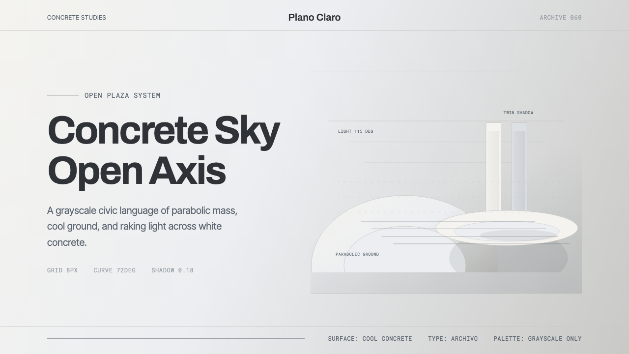
Niemeyer Concrete Grayscale turns Brasília's sweeping curves into a design language of restraint — grayscale concrete, open sky, and enough negative space for every line to breathe.
Niemeyer Concrete Grayscale in brief
Niemeyer Concrete Grayscale is drawn from the architectural photography of Oscar Niemeyer's buildings in Brasília — the National Congress with its paired dome and inverted dome, the hyperboloid crown of the Cathedral, the slender colonnades of the Itamaraty Palace — almost always documented in black-and-white images shot against open sky, where raking light turns the curved concrete surfaces into a gradient of soft gray shadow.
The style's core move is translating that documentary photographic treatment directly into an interface language: a cool, concrete-toned grayscale ground, parabolic and curved forms standing in for the sharp rectangles more common in modernist design, and clean geometric sans labels that stay out of the way of the architecture doing the visual work. Color is not so much avoided as considered irrelevant — the buildings' drama comes from form, light, and shadow, not hue.
Generous negative space is as essential to the mood as the concrete itself. Niemeyer's buildings were designed to be seen against open sky and empty plaza, and the design system preserves that emptiness rather than filling it — every curve is given enough surrounding space to read as a distinct gesture rather than competing with neighboring elements. The overall effect is quiet, confident, and monumental without ever raising its voice.

Where does Niemeyer Concrete Grayscale come from?
Oscar Niemeyer (1907–2012) was a Brazilian architect who became the defining figure of Brazilian modernism, developing a signature style built from sweeping, free-form curves in reinforced concrete rather than the strict right angles favored by much of the International Style. He famously explained his approach by rejecting the straight line in favor of the 'free and sensual curve' he saw in the mountains, rivers, and clouds of his native landscape and in the body of the woman he loved — a philosophy that put sculptural form, not structural orthodoxy, at the center of his architecture.
Niemeyer's career-defining commission came from Brazilian president Juscelino Kubitschek, who set out in the late 1950s to build an entirely new capital city, Brasília, from open ground in the country's interior — a statement of national modernization and forward momentum. Urban planner Lúcio Costa designed the city's overall Pilot Plan, its now-famous airplane-shaped layout, while Niemeyer designed nearly all of its major civic buildings: the twin towers and paired domes of the National Congress, the soaring hyperboloid structure of the Cathedral, the colonnaded Itamaraty and Alvorada palaces, and more.
Brasília was inaugurated in 1960, built at a pace — roughly four years from groundbreaking to opening — that startled observers, and it became an instant international symbol of modernist urban planning and civic ambition. Niemeyer's buildings there were extensively documented by architectural photographers working in black and white, a format that stripped away material color and let the buildings' curved forms, and the way daylight modeled them, carry the entire visual argument.
That photographic record is central to why this design system reads the way it does: Brasília is remembered as much through gray-toned architectural photography as through direct experience of the city itself, and the style translates that remembered, documentary grayscale directly into an interface palette. Brasília's significance was formally recognized when UNESCO designated it a World Heritage Site in 1987, cementing Niemeyer and Costa's work as a landmark of twentieth-century civic modernism.
What defines the Niemeyer Concrete Grayscale look?
Concrete Grayscale
The palette runs entirely through tones of gray, from near-white highlight to deep charcoal shadow, with no hue introduced at any point. This is not a monochrome filter applied over a colorful design — it is the native palette, matching the black-and-white photographic tradition the style is drawn from.
Parabolic Curves
Sweeping, free-form curves — parabolas, arcs, and hyperboloid silhouettes — stand in for the rectangles and grids more typical of modernist design systems. Every major shape reads as a single continuous gesture rather than an assembly of straight segments.
Raw Concrete
Surfaces suggest painted or bare reinforced concrete — matte, slightly porous, cool to the eye rather than glossy or reflective. This material honesty grounds the sweeping curves in something structural and civic rather than decorative or lightweight.
Raking Daylight
Shadow is soft and gradual rather than hard-edged, the way daylight models a curved concrete surface over the course of a day — gentle gradients rather than sharp cut-offs. This softness is specific to curved form; flat surfaces cannot produce it.
Generous Negative Space
Elements are surrounded by substantial empty space, echoing the open sky and plaza settings in which Niemeyer's buildings were designed to be seen and photographed. Crowding is treated as a loss of monumental quality, not an efficient use of area.
Clean Geometric Labels
Labels and text use a plain, geometric sans-serif treatment that stays visually quiet, functioning the way a museum wall label functions next to a sculpture — present, legible, and entirely subordinate to the form it is describing rather than competing with it.

Who shaped Niemeyer Concrete Grayscale?
Niemeyer designed nearly all of Brasília's major civic buildings — the National Congress, the Cathedral, the Itamaraty and Alvorada palaces among them — developing a signature language of free-form reinforced-concrete curves that rejected the straight line as the default unit of modernist architecture. His work made curved, sculptural concrete form synonymous with Brazilian modernism internationally.
Costa won the competition to design Brasília's overall urban Pilot Plan, laying out the city's famous airplane-shaped form and the broad axes along which Niemeyer's individual buildings were sited. His planning gave the buildings the open, monumental settings — wide plazas and long sightlines — that make their curves and the sky around them so central to how they are photographed.
The broader movement Niemeyer worked within, Brazilian modernism combined the formal vocabulary of European modernist architecture with a distinctly local sensibility — sculptural curves, tropical light, and a willingness to treat concrete as an expressive rather than purely structural material. It gave Brazilian architecture an international identity separate from its European origins.
Brasília itself stands as a distinct chapter within mid-century modernism — an entire capital city built from open ground specifically to project a nation's modernity and ambition. Its UNESCO World Heritage status recognizes the city, not just individual buildings within it, as a coherent modernist civic composition — the scale at which the parabolic forms and open plazas this style draws from were originally conceived.
How do you use Niemeyer Concrete Grayscale today?
Niemeyer Concrete Grayscale communicates monumental calm, institutional trust, and considered restraint, which makes it well suited to contexts that want to feel serious and enduring rather than trendy or loud. Its central discipline is negative space: the style depends on room to breathe around every curved element, and any application that crowds the layout undermines the entire effect.
On presentation slides, the style is strong for cover slides and section dividers where a single large curved shape, rendered in gray tones against an open field, can carry the entire page. Content slides should keep text minimal and let a small number of parabolic accent shapes organize the hierarchy rather than color or decorative rules; data slides work well when charts themselves adopt soft, curved forms — rounded bar caps or arced progress indicators — rather than sharp rectangular bars.
For web interfaces, the style suits dashboards and pricing pages that want to project institutional trust and calm authority — financial products, civic or government-adjacent platforms, and premium tools where a sense of gravity matters more than playfulness. Grayscale as a base palette also has a practical benefit: it forces hierarchy to be built through scale, spacing, and shape rather than color, which tends to produce cleaner information architecture.
In editorial and marketing work, the style suits long-form journalism, architecture and design writing, and any brand that wants to associate itself with permanence, craftsmanship, and civic seriousness rather than speed or novelty. A grayscale layout with generous white space and a single large curved motif reads as considered and confident rather than plain or unfinished.
A common mistake is introducing color 'for interest' — a single accent hue breaks the grayscale logic that gives the style its calm, and once one color is present, the eye starts asking why others are absent. A second common mistake is filling the negative space with additional content to seem more efficient; that crowding directly contradicts the open-plaza, open-sky quality the entire style is built to evoke.

Niemeyer Concrete Grayscale — FAQ
Is this style the same as brutalism?
They share a material — exposed or painted concrete — but differ sharply in form and mood. Brutalism, which emerged mainly in Britain and continental Europe from the 1950s onward, favors blocky, angular, often deliberately raw and imposing masses. Niemeyer's work, and this style with it, favors the opposite: sweeping curves, lightness of gesture even at monumental scale, and a sense of grace rather than confrontation. Both use concrete honestly, but brutalism reads as weighty and severe where this style reads as fluid and calm.
Can color be introduced into this style without breaking it?
The style's coherence depends specifically on staying within grayscale — that restriction is what forces hierarchy to be built through form, scale, and space rather than hue, and it matches the black-and-white photographic tradition the whole system is drawn from. Introducing a hue, even a muted one, tends to pull attention away from the curves and shifts the mood from monumental calm toward something more conventional. If an accent color is genuinely required by a broader brand system, it should be used with extreme restriction — a single small mark, not a fill.
Does an all-grayscale interface create accessibility problems?
Not inherently — grayscale itself is not the accessibility risk; insufficient contrast is. Because the style's hierarchy already depends on scale, spacing, and shape rather than color, it is well positioned to meet strong contrast standards deliberately: dark charcoal text against a near-white ground, or the reverse, can meet or exceed the contrast levels many color-dependent designs struggle to achieve. The discipline is making sure tonal steps between elements are deliberate and sufficiently distinct, not assuming grayscale automatically solves contrast on its own.
Why do parabolic and curved forms matter so much to this style, rather than just using a gray color scheme on a conventional grid?
A gray palette on a conventional rectangular grid would only borrow the color of Niemeyer's work, not its underlying idea — his entire architectural philosophy was built around rejecting the straight line as the default unit of design. The curved forms are not decoration layered on top of a grid system; they are the structural logic the style is built from. Applying the grayscale palette to sharp rectangles produces something closer to generic minimalism than a design genuinely descended from Niemeyer's civic modernism.
What kinds of products or content are a poor fit for this style?
Anything that depends on bright, energetic, or playful signaling will struggle here — the grayscale palette and generous negative space read as serious and unhurried, which works against products that want to feel fast, fun, or impulsive, such as flash-sale retail, children's entertainment, or youth-oriented social apps. The style also demands enough content maturity to justify its restraint; a sparse layout with little genuine substance behind it can read as empty rather than monumental if the negative space is not backed by something worth the room it is given.
Related design styles
 Brazilian Bossa Nova Cool 1958Twilight cool. Ocean blue, sand-gold Inter, one black silhouette with LP-slee…
 Karl Gerstner ProgrammesDesign becomes a programme. Black hairlines and a strict matrix turn paramete…
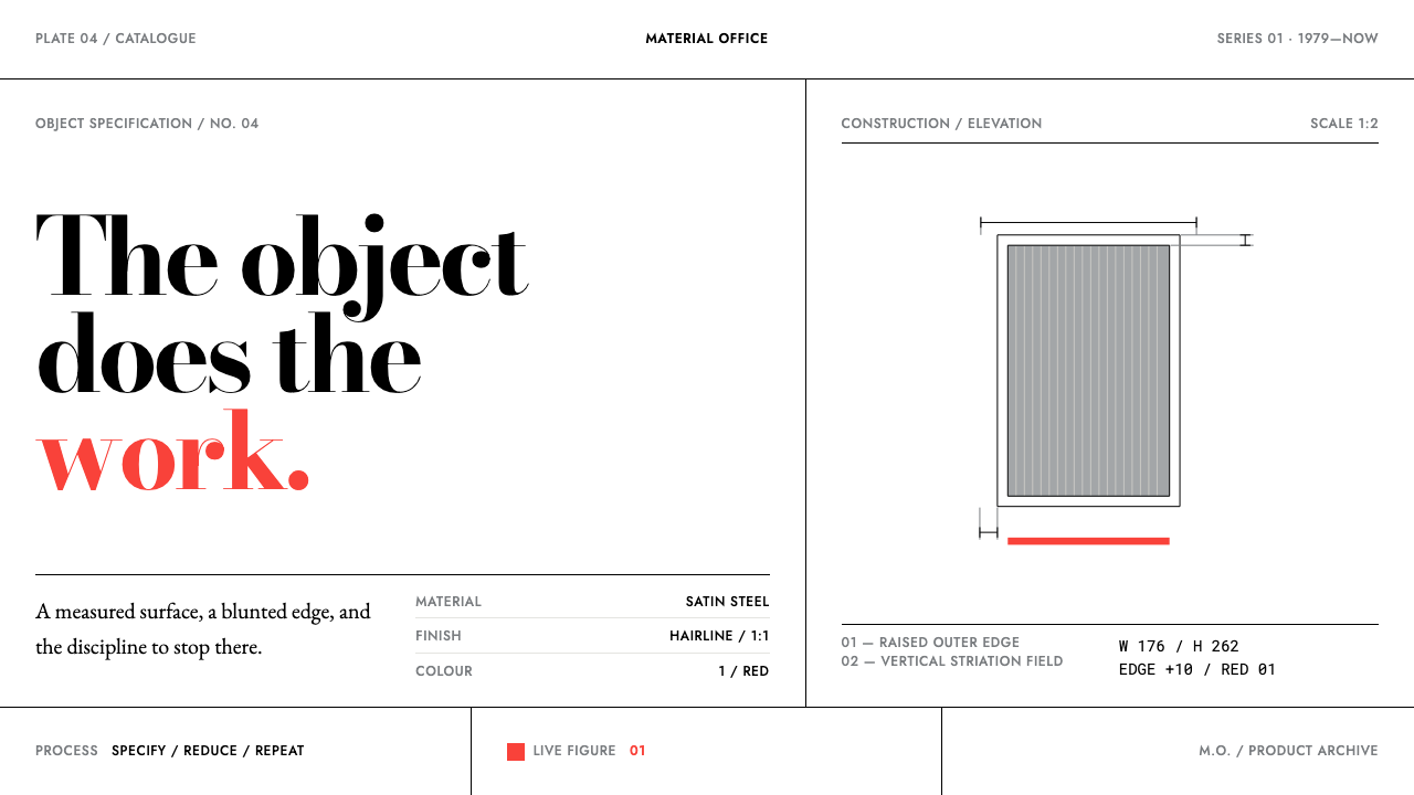 Lella Vignelli ProductNothing added, nothing lost. Satin steel, hairline rules, and one full-streng…
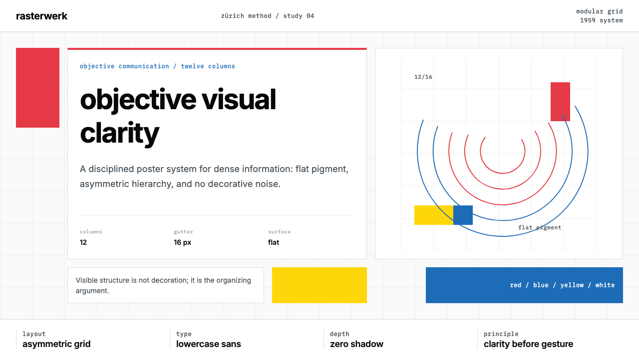 Müller-Brockmann SwissClarity is the system. Inter grids, red-blue blocks, and concentric arcs make…
 NID Ahmedabad ModernismStructure earns trust. Black rules and equal-weight scripts hold craft color…
 Swiss Alps GraubündenAlpine precision, restrained. Glacier white, pine rules, and tight Inter grid…