What is Lella Vignelli Product?
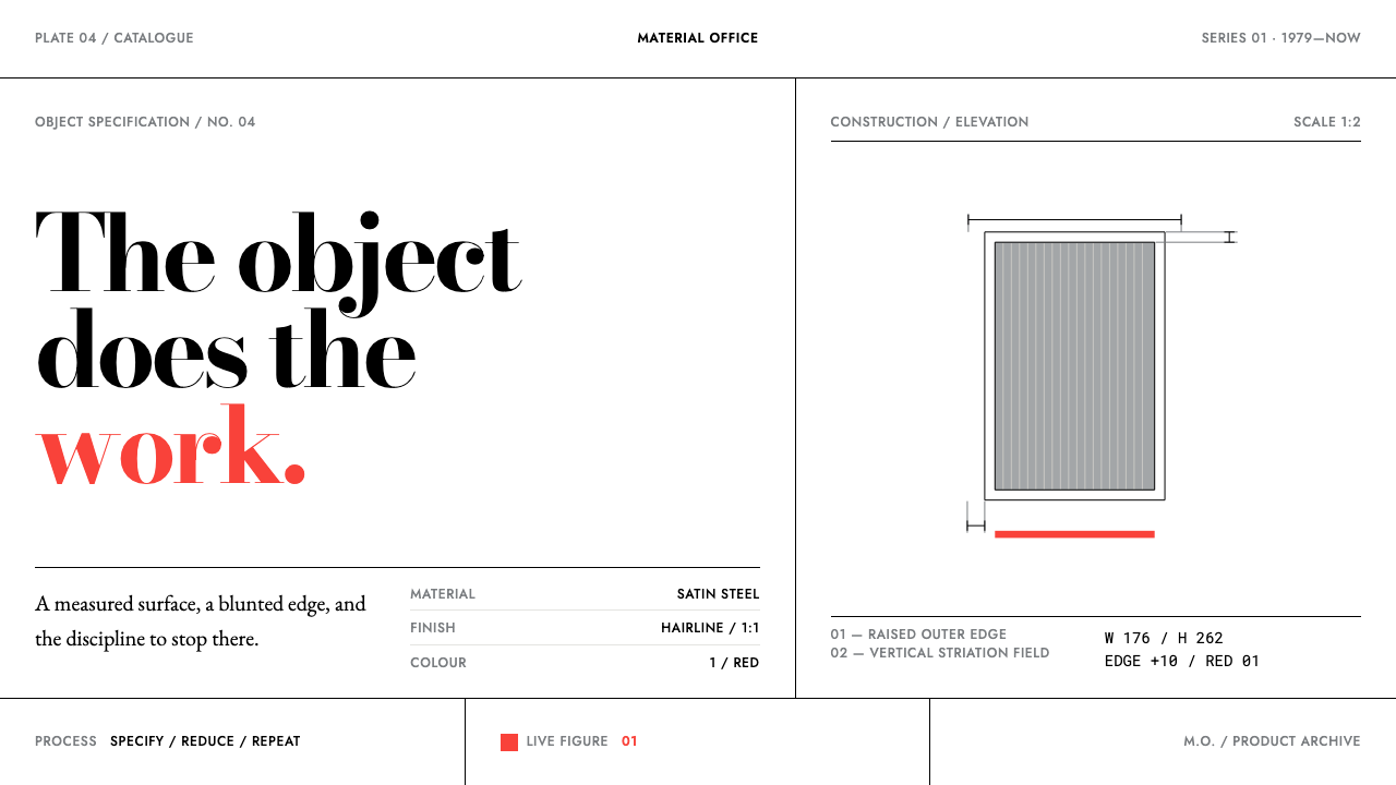
Nothing added, nothing lost: Lella Vignelli's objects get their whole effect from one or two decisive moves, and this design system works the same way.
Lella Vignelli Product in brief
Lella Vignelli Product is a design language drawn from the object-making side of the Vignelli practice: flatware, hollowware, dinnerware and jewellery. It deliberately leaves the printed work aside. What it keeps is the way the objects behave. White paper, satin stainless steel, black hairline rules, and a single colour, Vignelli Red, which appears either at full strength or not at all.
The system is built on subtraction. Two type sizes carry most of the hierarchy. Text is set flush left. The measure, meaning the width of a column of text, is derived from the proportions of the object or page rather than chosen arbitrarily. There are no shadows, so zones are divided by line and by white space instead. The approach is closer to specifying an object than to decorating a page, and it produces layouts that look precise and slightly austere.
What makes it distinctive is that it comes from an architect's way of working. Lella Vignelli trained as an architect, and it shows in the objects: a form is reduced to a few structural decisions and then left alone. A design in this style asks of every element whether it is doing structural work, and removes it if it is not.
Where does Lella Vignelli Product come from?
The system's period runs from 1950 to 1990, and its geography is given as Milan and then New York. Within that span the source points to three dated works. The Heller Stacking Dinnerware dates from 1964, the San Lorenzo jewellery from 1972, and the Ciga Hotels flatware from 1979. The route from Milan to New York matters, because the practice carries a European rationalist training into American working conditions, and the design language keeps the clarity of the first while meeting the scale of the second.
Three movements are named as the system's setting. Italian rationalism supplies the architect's habit of deriving form from structure and proportion. Swiss modernism in American practice supplies the typographic discipline of flush-left text, strict scale and white space. Compasso d'Oro industrial design is the third, and it places the work in the world of industrial design, where an object is judged as a product as well as an artefact. Together they describe a practice that is rational in method, Swiss in its typographic habits and industrial in its ambitions.
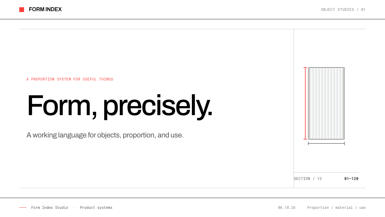
The objects themselves are the best explanation of the method. The Ciga Hotels flatware takes its whole effect from two moves: the ends are blunted, and the outer edges are raised so that they encircle the handles. Nothing else is added. The San Lorenzo hollowware, made in Milan in silver, is a regular cylinder with walls of closely set vertical striations, and the water jug held by the Victoria and Albert Museum under the number M.67-1996 is made this way. In each case, one geometry and one surface treatment are enough.
The colour follows the same logic. Vignelli Red is the studio's own, and the rule governing it is the same as for the forms: at full strength, or left off the page. It is never tinted, never diluted, never used as a wash. Black hairline rules divide the page into zones, white is the paper, and satin steel grey is the surface of the objects. Everything outside that short list has to justify itself.
What defines the Lella Vignelli Product look?
Subtraction as Method
The effect of each object comes from a very small number of decisions. The Ciga Hotels flatware needs only two moves, and nothing else is allowed to dilute them. In a layout this becomes a working rule: decide what the two or three structural moves are, then remove everything that does not serve them. A page that has had one more thing added is a page that has been weakened.
Satin Steel Grey
The system's main surface colour is satin stainless: a cool, neutral grey with a matte sheen, not a mirror polish. It sits between the white of the paper and the black of the rules, and it carries most of the tonal range. Because it is a material colour, it should read as a surface and not as a tint, which means large flat areas of it work better than gradients.
Vignelli Red at Full Strength
Red is the only chromatic colour, and it follows an all-or-nothing rule: it appears at full strength or it is left off the page. There are no tints and no half-measures, which is why a single red element on a white and grey page can carry such weight. It works best as one decisive mark, not as a recurring accent scattered across the layout.
Hairline Rules
Black hairline rules divide the page into columns and zones. They do the job that shadows, boxes and tinted backgrounds do in other systems, and they do it with less. A hairline marks a boundary without adding weight to either side of it, so the white space around a rule remains active. The rule should be thin, black and used consistently, with no decorative variation.
Two Sizes, Flush Left
Two type sizes carry most of the hierarchy, and every line is set flush left. A reader finds order by comparing the two sizes, not by weighing a spread of weights, colours and styles. Flush-left setting keeps the left edge as a single clear line that matches the vertical logic of the rules, and it leaves the ragged right to breathe. Adding a third size should be a rare and justified event.
Measure from the Object
The width of a text column is not picked from a template. It is derived from the proportions of the object or page being specified, in the way that an architect derives a wall from the room. The result is that text blocks feel inevitable rather than arbitrary, and different layouts share a family resemblance without sharing a grid.
Cylinder and Striation
The San Lorenzo hollowware gives the system its most characteristic surface idea: a regular geometric body whose wall is made of closely set vertical lines. Repetition is used as texture, and it is exact. In a layout, this suggests rhythmic runs of fine vertical rules, evenly spaced, that form a quiet pattern without any ornament beyond the line itself.
Who shaped Lella Vignelli Product?
The designer for whom the system is named. She trained as an architect, and the objects show it: the Ciga Hotels flatware reduces a form to two moves, and the San Lorenzo hollowware reduces a vessel to a cylinder and a surface of striations. The system takes the object side of her practice, from the Heller Stacking Dinnerware of 1964 through jewellery for San Lorenzo from 1972 to the Ciga Hotels flatware of 1979, and leaves the printed work aside.
Named alongside Lella as a key figure of the system. The studio's colour, Vignelli Red, and its typographic habits of flush-left text and few sizes belong to the practice they shared between Milan and New York. The source places this theme on the product side of the practice and deliberately away from the printed work, so his role here is as part of the studio that stands behind the system's rules.
David Law is listed among the key figures of this system, in the company of the two Vignellis. His place in the reference set marks the work as studio output rather than the signature of a single hand. The system itself keeps to the objects and the rules, and leaves the biographies out.
The Milan maker that produced the silver hollowware and gave its name to the jewellery of 1972 onward. In the system's account it is the workshop behind the regular cylinder with closely set vertical striations, the object type that supplies the system's pattern of fine, regular verticals. The relationship of designer and workshop is why these objects feel both authored and exactly made.
The museum that holds the water jug numbered M.67-1996, the reference example of the San Lorenzo hollowware method. That a piece made this way sits in a major collection is part of the system's argument that reduction can produce lasting objects. For a designer it is also a practical anchor: a numbered object that can be looked up and studied.
How do you use Lella Vignelli Product today?
This style is a good fit when a product wants to look specified rather than styled, with authority that comes from precision and not from decoration. It rewards restraint more than any other quality: the discipline is to keep only the structural moves and to leave the page alone afterwards.
For presentation slides, a cover can be white paper with a single hairline rule and a title set flush left in the larger of the two sizes, with a small block of text in the smaller one and, at most, one element in Vignelli Red. Content slides should use the same two sizes throughout, with hairlines separating columns and no boxes or tinted panels. Data slides work in black, white and satin grey, with red kept for the single value the audience must see.
For web interfaces, the style suits dashboards and spec-driven pages where information needs to be compared quickly. Hairline rules divide the layout into zones, cards have no shadows, and the hierarchy comes from the two sizes and from where each block sits on the page. Pricing pages and product pages for physical objects benefit especially: a table of specifications set flush left with fine rules reads like a technical drawing. The one call to action can take the red, and everything else stays steel and black.
For editorial and marketing work, the style belongs to product catalogues, specification sheets, tableware, hardware and furniture brands, architecture practices and any company that sells objects. Photography of a single object on white, with a caption set flush left, is its natural register. Long-form pages can establish a measure from the object's own proportions and hold it throughout, so that every article feels like part of a single, consistent specification.
The most common mistake is to treat the red as an accent colour that can be repeated or softened. It is all or nothing: a tinted red, a second red or a red wash undoes the rule that makes it powerful. Other frequent errors are to add shadows to lift a card, to use a third or fourth type size for variety, to centre text, and to confuse this theme with the printed side of the studio's work, which is a different register. When in doubt, take something away.
Lella Vignelli Product — FAQ
How is this different from the Vignellis' printed work?
This theme takes the product side of the practice and leaves the printed work aside. Its references are the objects: the Ciga Hotels flatware, the San Lorenzo hollowware and the Heller Stacking Dinnerware. The visual result is white paper, satin steel and hairline rules, set with two type sizes, rather than the language of the printed side of the practice.
Why does the system allow only one colour?
Because the red is the studio's own, and the discipline is that it appears at full strength or not at all. With a surface palette of white, steel grey and black, a single red mark has a lot of power, and that power depends on there being nothing else competing for it. A second or tinted colour would remove the very effect that the system is designed to produce.
Why use hairline rules instead of boxes or shadows?
A hairline marks a boundary without adding weight to either side of it, so the zones remain light and the white space stays active. Boxes add enclosure and shadows add depth, and both bring a visual presence that this system deliberately avoids. The page is divided by line and by white space, which is closer to how an architect would draw a plan.
Can the red be used as a tint or in more than one place?
It should not be tinted, and it should be used sparingly. The rule is full strength or left off the page, so lighter versions are not part of the system. It can appear more than once if the layout calls for it, but each use should be a decisive mark, not a repeating decoration. If the page reads well without red, leave it out.
Does this style work for digital products as well as objects?
Yes, because its rules are structural rather than material. Two type sizes, flush-left setting, a measure derived from proportion, hairline rules and a single full-strength colour translate cleanly to dashboards, specification pages and product sites. It works best where information must be compared quickly and where the product wants to look exact. It is less suited to warm, playful or highly decorative brands.
Related design styles
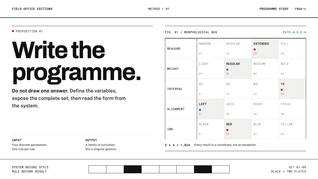 Karl Gerstner ProgrammesDesign becomes a programme. Black hairlines and a strict matrix turn paramete…
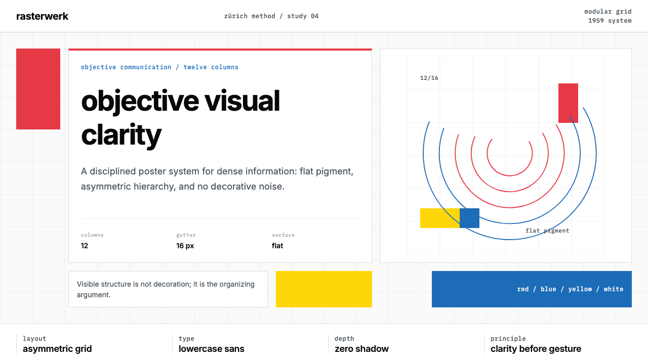 Müller-Brockmann SwissClarity is the system. Inter grids, red-blue blocks, and concentric arcs make…
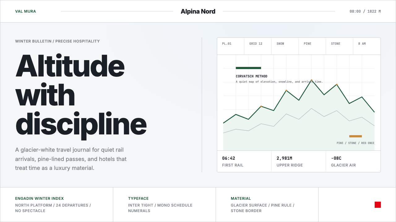 Swiss Alps GraubündenAlpine precision, restrained. Glacier white, pine rules, and tight Inter grid…
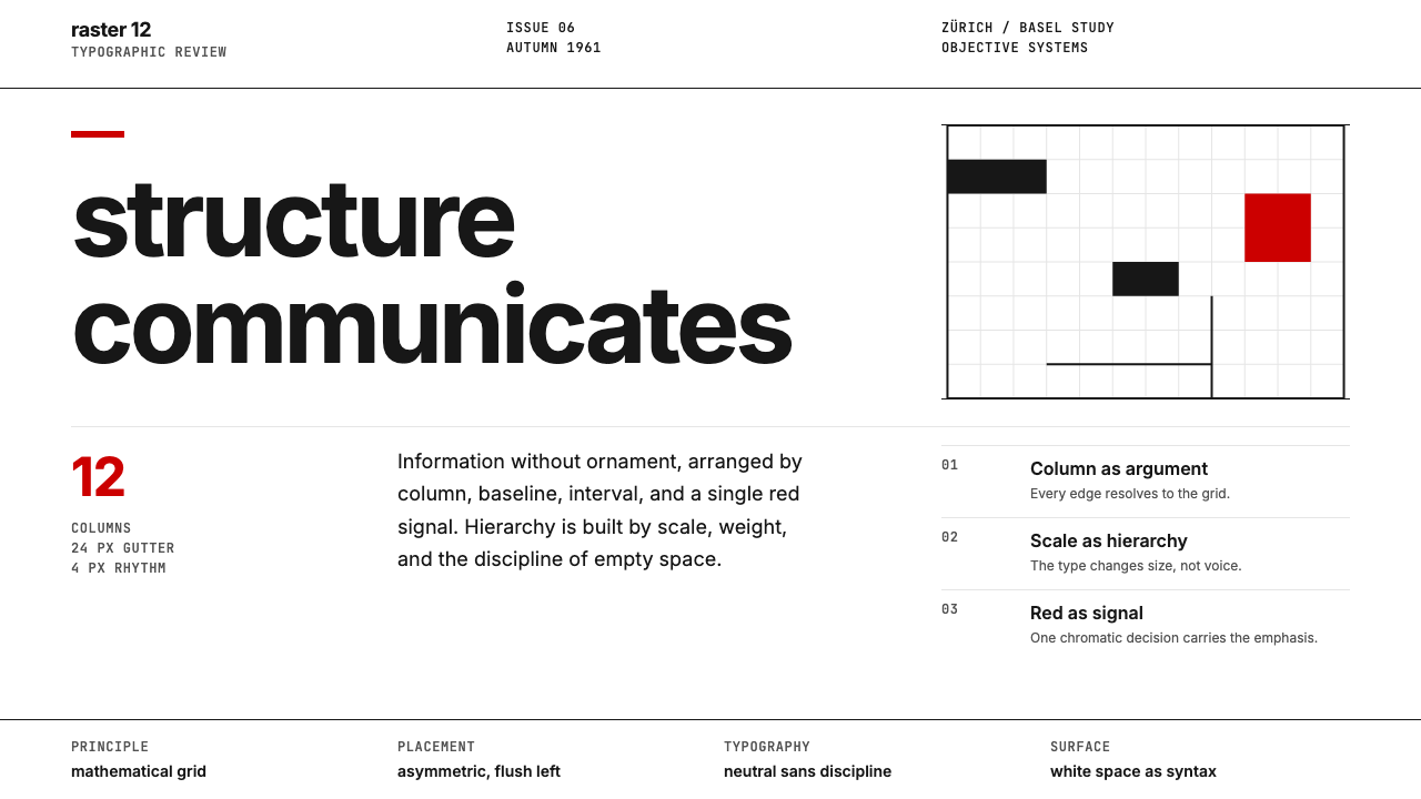 Swiss International StyleObjectivity made visible. Inter scale, white space, and one red block expose…
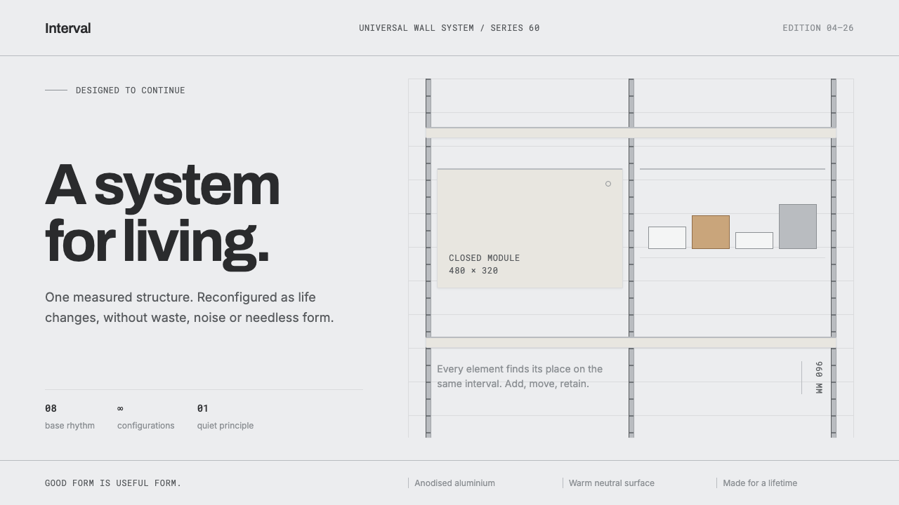 Vitsœ 606 ShelvingQuiet form, built to endure. Brushed silver rails impose rhythm on cool plast…
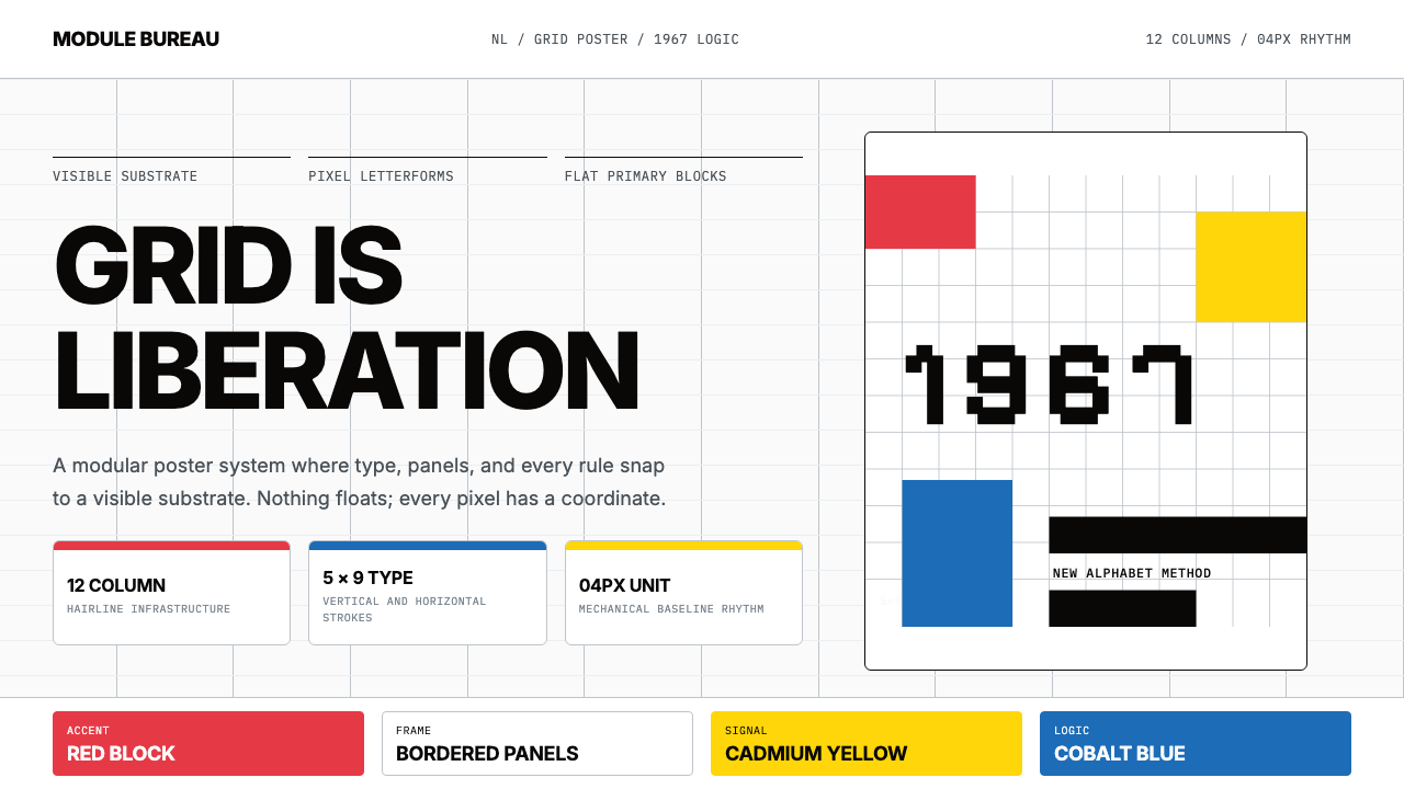 Wim Crouwel GridGrid becomes freedom. Cobalt, red and yellow blocks lock Inter type to a 12-c…