What is Bougainville Upe?
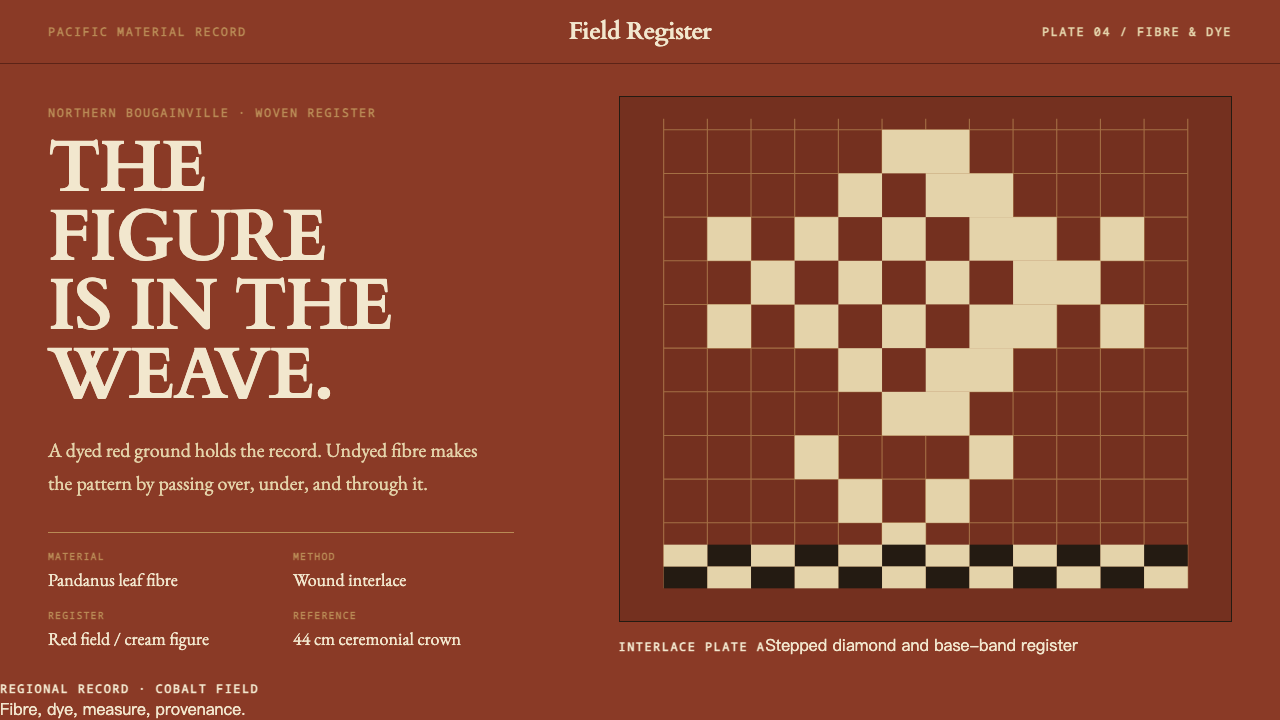
The upe is a hat where the pattern is the structure: cream fibre woven into a matte red ground, never painted on, and a museum catalogue's quiet voice around it.
Bougainville Upe in brief
The upe is a tall cylinder of tightly wound pandanus leaf, worn by initiates on Buka Island and in northern Bougainville. It is worn through a period of seclusion that can run as long as three years, during which women are not permitted to see the wearer. The crown is dyed a deep red with water-based dye. The pattern is undyed cream fibre worked into the weave, never painted on, so the figure on the hat is the absence of dye rather than the addition of paint.
That relationship, red as the field and cream as the figure, is the entire logic of the style. Every motif, whether zigzag, lattice or stepped diamond, is built from the over-under grid of interlaced strands. The pattern is not placed on the structure; it is the structure. A narrow band at the base repeats the idea in smaller scale, with black-and-white zigzag or white lattice on red.
As a design system, the upe translates into a matte red ground, cream figures built on a visible grid, and a typographic voice borrowed from the ethnographic catalogue in which these objects are published. It is restrained, specific and serious. It avoids tribal flourishes and tropical clichés, and aims instead for the precision of a well-made museum record.
Where does Bougainville Upe come from?
The upe belongs to Buka Island and northern Bougainville, in the Autonomous Region of Bougainville, Papua New Guinea. Places such as Selau, Wakunai and Teau are named in the record of where the hats were made and collected. It is catalogued as Melanesian initiation regalia, an object that marks a young person's passage and carries social meaning far beyond decoration. The hat's origins predate 1900, and the practice of making it continues.
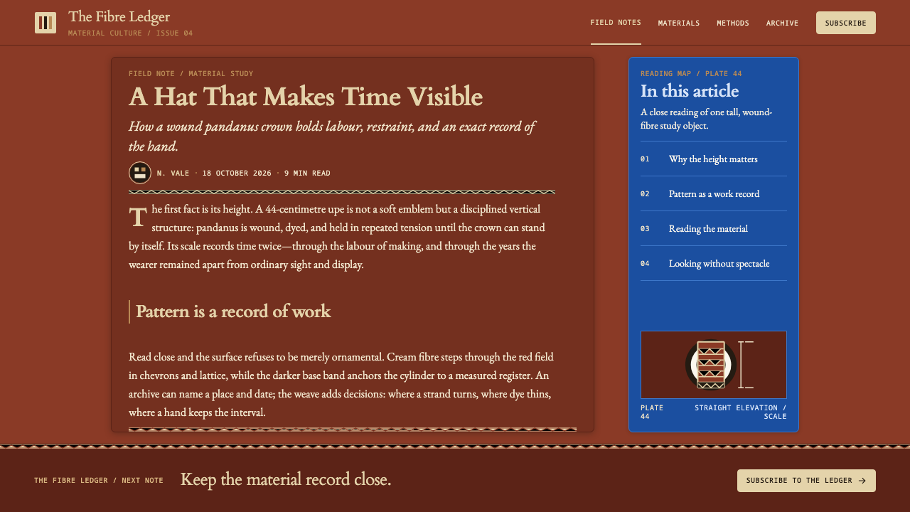
Much of what the wider world knows of the upe comes through museums. Examples were collected between 1918 and 1949, and the Australian Museum and Museums Victoria both hold ethnographic collections that include them. These collections matter to the design system in two ways. They are the documentary source for the object's appearance, and they set the register in which it is described: dated, measured, numbered and labelled. The system borrows that register directly.
The making is a craft of fibre and structure. Pandanus leaf is prepared and wound tightly into a tall cylinder; the crown is dyed deep red; the pattern is introduced by weaving undyed cream strands into the over-under structure. The tradition is also catalogued alongside barkcloth wrapping, another fibre technique of the region. Buka and northern Bougainville upe weavers are the makers, and their skill is what the whole visual language comes from.
The lesson for designers is the discipline of making pattern out of structure. The style rejects painted ornament and asks that every mark come from the grid. Because the hat belongs to initiation, a ceremony tied to seclusion, it should be handled with care: name the upe and its place of origin, and treat the form as a reference to be understood rather than a costume to be worn.
What defines the Bougainville Upe look?
Matte pandanus red
The field is a deep, matte red, the colour of pandanus leaf dyed with water-based dye. It is not glossy and not bright; it has the softness of fibre. Because the red is the ground rather than an accent, it sets the mood of the whole system: grave, warm and concentrated. This is also why the style counts as dark: its field is deep and its figures are the light ones.
Cream as figure
Pattern is undyed cream fibre, so figure and ground are made of the same material in two states: dyed and undyed. Cream is therefore not a decorative highlight but the leaf's natural colour showing through. In layout terms, the cream carries every meaningful mark, including motifs, rules and captions, while red stays quiet behind them.
Interlace grid
Every motif is built from the over-under grid of interlaced strands. Zigzag, lattice and stepped diamond are not drawn and then fitted to a grid; they are what the grid does when the strands are shifted. The result is pattern with an internal logic, in which each edge is stepped and each shape is a consequence of the weave rather than an outline laid on top.
Tall cylinder proportion
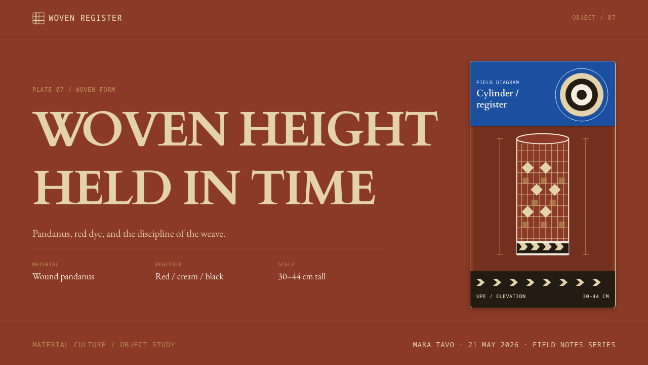
The upe is a tall cylinder, and the proportion carries into the system as a preference for vertical emphasis, upright columns and narrow measures. Tightly wound, it suggests stacked courses of fibre, and layouts can echo this with a steady vertical rhythm of ruled sections.
Base band
A narrow band at the foot of the hat carries black-and-white zigzag, or a white lattice on red. In design terms this is the border or footer: a thin, high-contrast strip that finishes the form and restates the grid at small scale. It is the one place where black enters the palette in force.
Catalogue typography
The typographic voice is that of the ethnographic catalogue these objects are published in: a classical serif for titles, a readable book serif for body text, and a plain sans for accession-style numbers and measurements. Typography is quiet, exact and labelled, and it does the work that decoration does in other systems.
No tribal flourish
The system declines the usual shortcuts: no invented tribal ornament, no palms and sunsets. Where pattern is needed, it comes from the weave grid; where emphasis is needed, it comes from cream against red. This restraint is what keeps the style respectful and recognisably specific.
Who shaped Bougainville Upe?
The makers of the hats, working on Buka Island and in northern Bougainville, including the places Selau, Wakunai and Teau. Their command of pandanus fibre, dye and interlace is the source of the entire visual language and the primary credit for any design that draws on it.
A museum collection that holds ethnographic material from the region, including upe examples collected in the first half of the twentieth century. It is a key documentary source for the hat's form and the catalogue conventions the system borrows.
A second museum collection holding upe examples, among the objects collected between 1918 and 1949. Together with the Australian Museum, it provides the dated, measured and labelled record that shapes the system's typographic voice.
How do you use Bougainville Upe today?
The upe system suits subjects that benefit from gravity and precision: museum and archive projects, academic and educational material, cultural publishing, craft and textile brands, and documentation-heavy products. It is not a decorative theme to be sprinkled on casual content; its strength is the discipline of making every mark meaningful.
For slides, a cover can be a flat matte red field with a single cream title and a narrow base band along the bottom edge. Content slides keep the red ground, with cream text and ruled lines forming a visible grid, and captions set like catalogue entries. For data slides, charts can be built from cream marks on red, with bars and cells aligned to the grid, and numbers labelled with plain catalogue-style captions rather than decorative callouts.
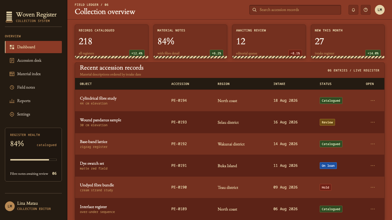
For web interfaces, the style fits archives, collection browsers, reference tools and documentation sites. A dashboard can use red as the background of a navigation rail or header while keeping reading areas on a lighter field, and tables can be set like catalogue listings with an item number, a name and a measurement. Pricing pages should stay plain: the style does not ask for cards with ornament, only for clear rows and clean rules.
For editorial and marketing work, the catalogue voice is the asset. Long-form essays, exhibition pages and product stories can adopt a classical headline, a book-serif body and a small, quiet caption style. Photography should be documentary in manner, with neutral backgrounds and straightforward framing, so that the object and its structure are what the viewer sees.
The most common mistake is to add what the system deliberately omits: tribal-style display lettering, faux ethnic borders, palm trees and island sunsets. A second mistake is to paint the pattern, using gradients, drop shadows or outlines that suggest a surface laid over the red. The cream must read as fibre woven into the structure, so keep edges stepped and fills flat. Finally, remember that the object is initiation regalia and credit its origin.
Bougainville Upe — FAQ
What is an upe?
An upe is a tall cylindrical hat of tightly wound pandanus leaf, worn by initiates on Buka Island and in northern Bougainville in Papua New Guinea. It is worn during a seclusion that can last up to three years. The crown is dyed a deep red, and the pattern is undyed cream fibre woven into the structure. It is catalogued as Melanesian initiation regalia.
Why does the pattern need to be woven in rather than painted on?
Because that is how the object is made, and the style keeps faith with it. Cream fibre is left undyed while the surrounding strands are dyed red, so the pattern is part of the structure. In design terms, this means motifs should arise from a visible grid with stepped edges and flat fills, and should avoid outlines, gradients or shadows that imply a layer sitting on top.
Why does the system use catalogue-style typography?
Because museum catalogues are how many people outside the region encounter these objects. Examples collected between 1918 and 1949 sit in ethnographic collections such as those of the Australian Museum and Museums Victoria, where they are described, numbered and measured. Setting titles in a classical serif, body text in a book serif, and numbers and sizes in a plain sans carries that record's calm precision into the interface.
Why is a red, cream and black style considered dark?
Because the field is a deep matte red and the figures are the light elements. Text and motifs are cream on red, which is the pattern of a dark theme: light marks on a dark ground. If you need a lighter surface for long reading, keep it as a small, separate area and let the red frame it.
Is it appropriate to use an initiation hat as a design reference?
It can be, with care. The upe belongs to initiation and seclusion, so the respectful approach is to name the object and its home in Buka and northern Bougainville, draw on its structural logic rather than copying specific hats, and avoid costume or caricature. Crediting the weavers and the museum sources that document the form is part of using it well.
Related design styles
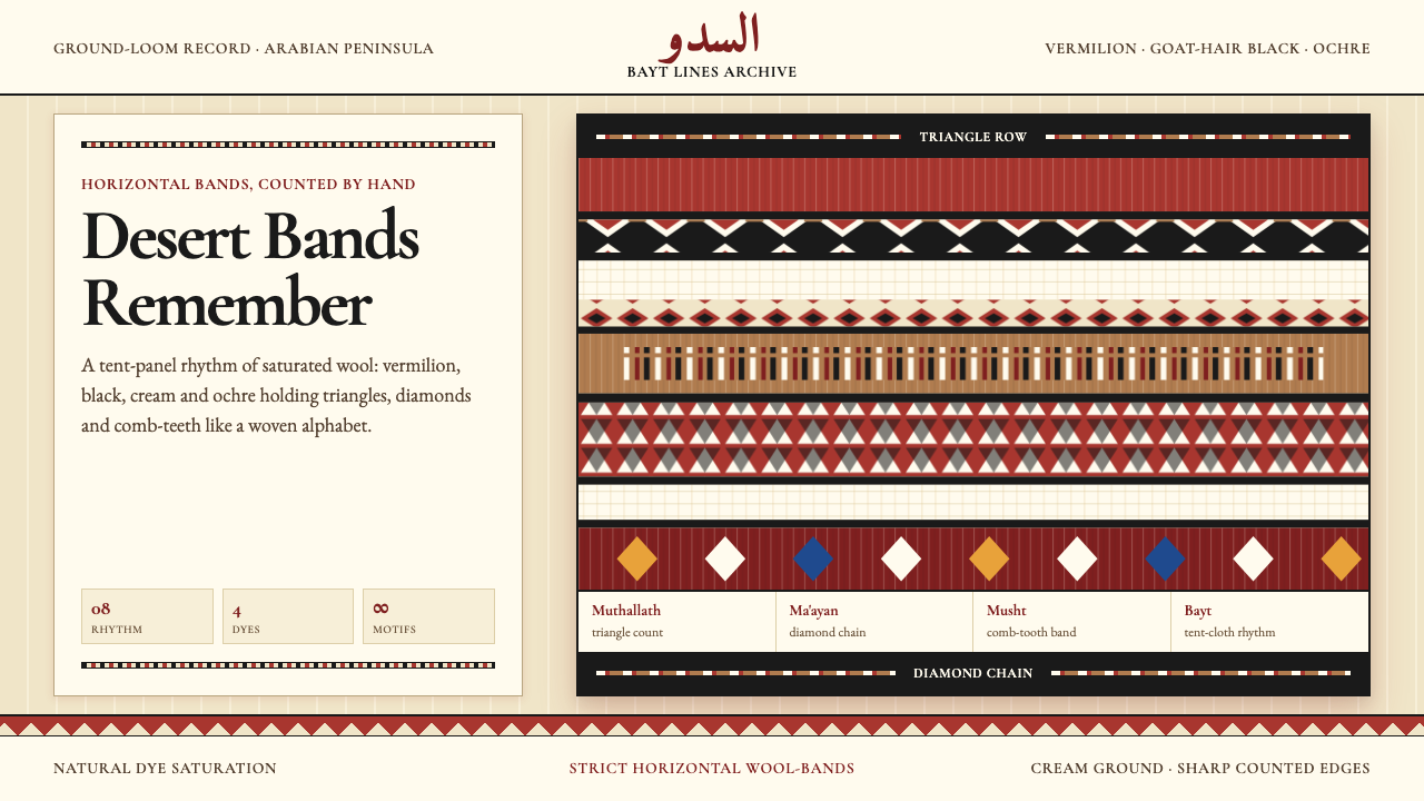 Bedouin Desert Textile (Sadu)Woven memory, not ornament. Vermilion-black bands count triangles and diamond…
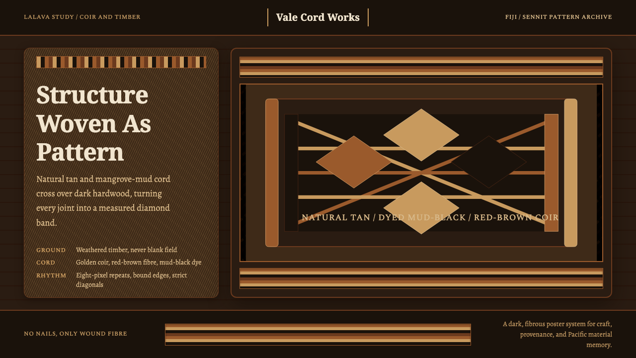 Fijian Magimagi LashingStructure becomes ornament. Tan coir diamonds bind mud-black timber in a stri…
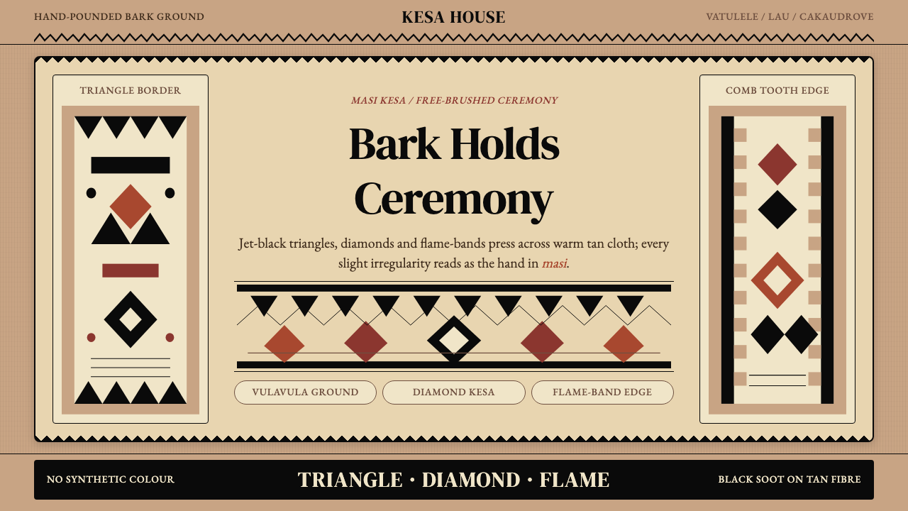 Fijian Masi (Tapa Cloth)Ceremony hits in black. Tan bark ground carries diamonds, zigzags and flame-b…
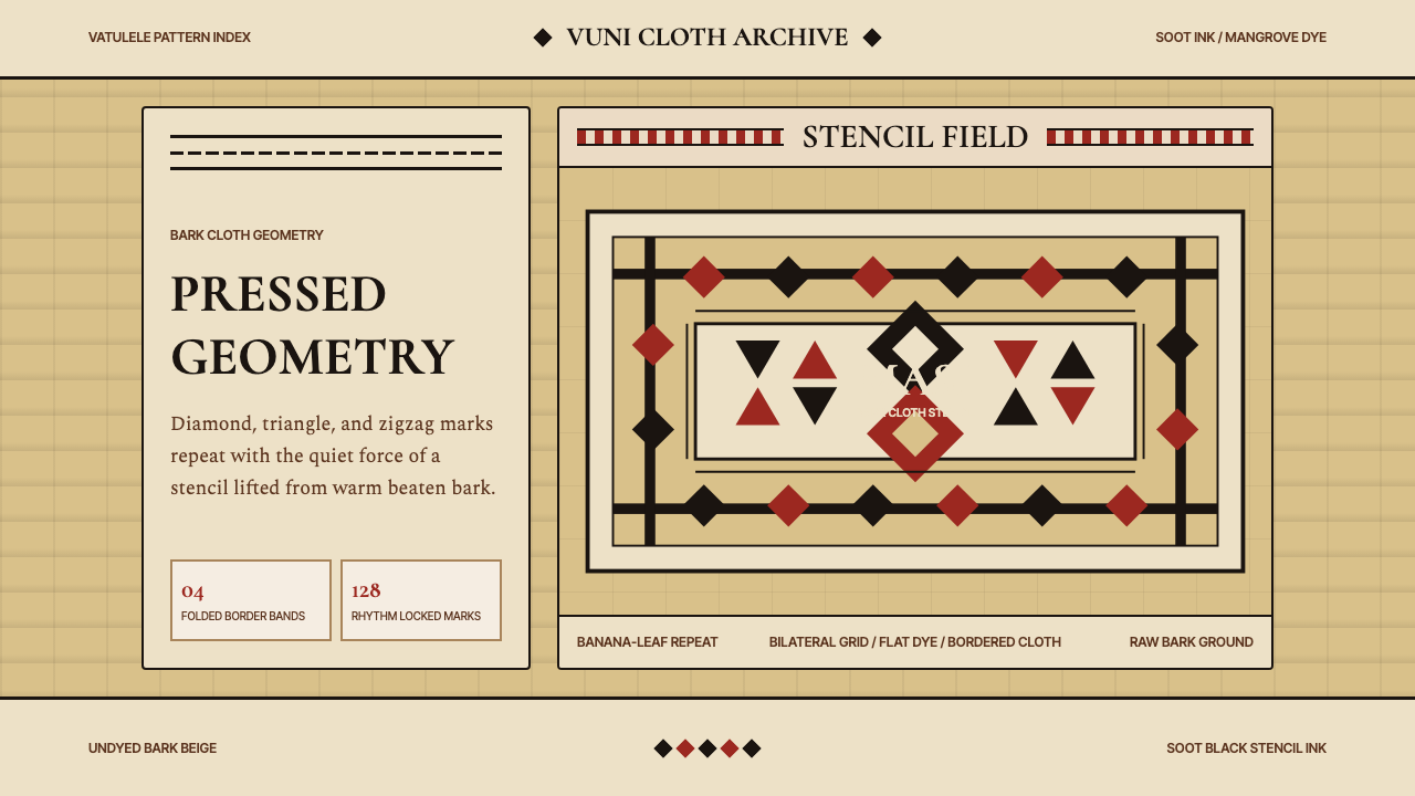 Fijian Masi Tapa StencilGeometry keeps ceremony. Soot-black diamonds repeat on bark beige with rust-r…
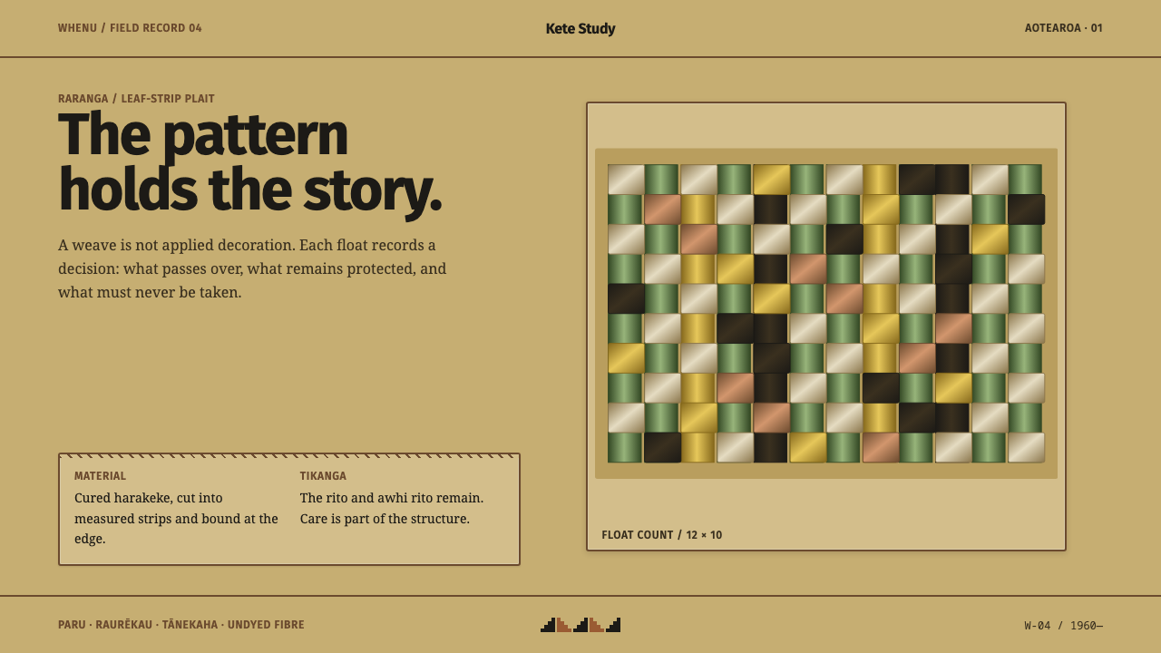 Harakeke Raranga WeavingStructure carries care. Honey-straw grids expose each green, bark and fibre s…
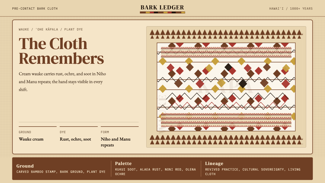 Hawaiian Kapa (Bark Cloth)Ceremonial geometry. Cream wauke, rust, ochre, and soot stamped in repeat.