What is Boston Dynamics Spot?
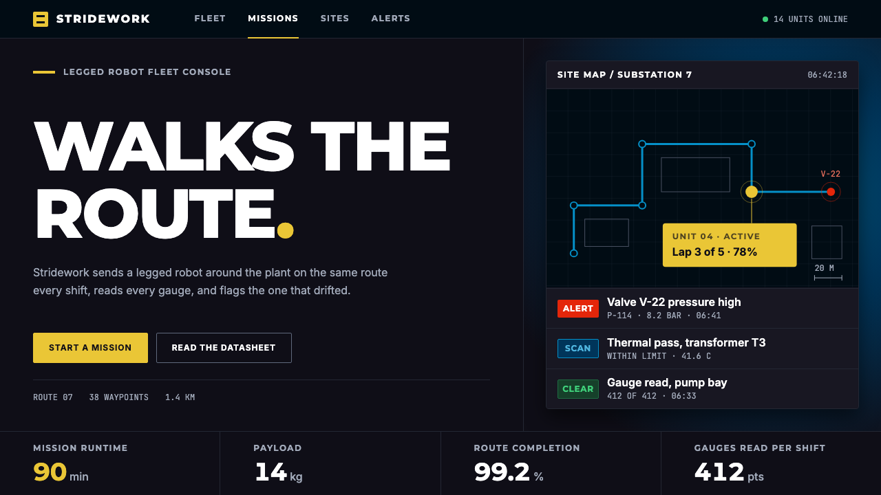
Boston Dynamics Spot design takes a working robot’s black chassis and safety-yellow shell and turns them into operator software where yellow is rare, earned and always meaningful.
Boston Dynamics Spot in brief
The Boston Dynamics Spot style is the visual language of an industrial inspection robot and the software that drives it. Spot is a four-legged machine that Boston Dynamics began selling to industry in 2019, with a black chassis and legs wrapped in bright yellow shells. Unlike the viral dancing videos that made legged robots famous, the photographs that define Spot show it working: walking along pipe racks, standing in substations and crossing muddy construction sites.
The style takes that machine and places it inside its own operator interface. Panels are near-black, like the body of the robot. A top-down site map carries a blue route line. A yellow robot card reports battery level and the current mission. Anomalies appear as red rows, and technical specifications are laid out in cells that read like a datasheet. Every colour has a job, and nothing is there to make the screen look futuristic.
The result feels like an industrial equipment manual crossed with a rugged handheld tablet. It is steady, precise and matte. There are no glowing science-fiction flourishes, no neon edges and no decorative gradients. The mood is one of quiet competence, which is exactly what a person wants from a machine that walks around a live plant while they watch a screen from a safe distance.

Where does Boston Dynamics Spot come from?
The style comes from Waltham, Massachusetts, the home of Boston Dynamics. The company is closely associated with dynamic legged robotics, the engineering field concerned with machines that balance, walk and recover from disturbances on uneven ground. Marc Raibert and Rob Playter are the key figures named in connection with this lineage. The visual system itself, however, is not a lab aesthetic. It belongs to the moment when legged robots left the research floor and became products.
That moment is dated by the Spot Early Adopter launch in 2019, followed by general sale in June 2020. A product that is sold to factories, utilities and construction firms needs a different face from a research prototype. Buyers are not impressed by spectacle; they want to know whether the robot is charged, where it has been, what it saw and whether something is wrong. The interface that grew up around Spot therefore borrows the grammar of instruments and equipment labels instead of the grammar of consumer technology.
The visual identity that is codified here belongs roughly to the years 2020 to 2024, the period of the Autowalk and Orbit software. Autowalk lets an operator record a route and have the robot repeat it, and Orbit is the fleet and site-management platform where results are reviewed. Both are tools in the sense of industrial inspection automation and mobile robot fleet management, two of the movements this style belongs to. The map with its blue route, the robot card and the alert rows are the visible face of those workflows.
The typography follows the same practical logic. Headlines are set in bold Montserrat capitals, standing in for the Gotham-like geometric sans associated with the brand, while the interface and data tables use Inter. The pairing gives a confident industrial voice for titles and a highly legible, neutral voice for numbers, which is what a datasheet-like screen requires.
What defines the Boston Dynamics Spot look?
Near-black operator panels
The ground of the whole interface is a near-black, taken from the robot’s own chassis and legs. It is matte rather than glossy, which keeps the screen calm under bright outdoor light and in dim control rooms alike. Cards and panels sit on this ground in slightly lighter steps of dark grey, so hierarchy is carried by subtle tonal layering instead of shadows or glows. Because the base is so dark and so quiet, every accent colour reads immediately.
Safety yellow, used sparingly
The yellow is a slightly lemony safety yellow, the colour of the robot’s shells. The defining rule of the style is that yellow earns its place: it appears on the robot card, on the primary action and on a handful of key markers, and almost nowhere else. A page that uses yellow everywhere has misread the system. Scarcity is what lets the colour behave like a hazard marking, something your eye goes to first because it has a job to do.
Functional colour coding
Beyond yellow, colour is assigned by meaning. Blue is the inspection route on the site map and the colour of navigation-style information. Red is reserved for anomalies and alerts, so a red row always means that someone should look. Green and neutral greys carry ordinary status. No colour is used just because it looks good next to another. A reader who learns the legend once can scan a dense screen quickly and trust what each hue is telling them.
The top-down site map
The map is the signature component. A top-down plan of the facility sits in a dark panel, with the robot’s route drawn as a clean blue line and checkpoints marked along it. It borrows from engineering drawings and surveys more than from consumer navigation apps: flat, legible, with no perspective tricks. The map turns the abstract idea of automated inspection into something a supervisor can point at and discuss.
Datasheet-style specification cells
Specifications such as battery, payload, uptime or mission progress are arranged in tidy cells, each with a small label above a larger value. The arrangement echoes an equipment datasheet or a nameplate on a machine. Labels are quiet and set in a neutral sans, values are prominent, and alignment is strict. The effect is trustworthy because it is dull in the right way: the page looks like documentation that someone has checked.
Bold geometric capitals and a neutral interface face
Headings are bold, uppercase and geometric, in Montserrat standing in for the brand’s Gotham-like face. They announce sections like labels on a piece of equipment. Everything else, from table cells to buttons and tooltips, is set in Inter, a face designed for screens that stays legible at small sizes. The contrast between a loud heading voice and a neutral working voice is part of why the style feels like both a brand and a tool.
Matte, flat and unornamented surfaces
Nothing in the style is glossy, glassy or glowing. Corners are modestly rounded, edges are defined by tone and thin rules instead of heavy shadow, and motion is limited to practical feedback. The absence of science-fiction decoration is deliberate. A robot walking through a substation does not need to look futuristic on screen; it needs the operator to feel that the machine is under control.

Who shaped Boston Dynamics Spot?
Raibert is one of the key figures named in connection with dynamic legged robotics, the field that Boston Dynamics grew out of. His name is tied to the long effort to make machines balance and move over rough terrain, which is the engineering premise that makes a product like Spot possible and that the style’s sturdy, practical tone quietly reflects.
Playter is the second key figure named for this style. His association with Boston Dynamics marks the transition the style documents: legged robots moving from research demonstrations to a commercial product that is sold, deployed and supported in industrial settings, which is exactly why the interface speaks like equipment documentation.
The robot itself is the central figure of the style. Its black chassis and legs, and its bright yellow shells, supply the entire palette logic: near-black ground, rare safety yellow. Seeing it photographed at pipe racks, substations and construction sites, rather than on a lab floor, explains why the interface is utilitarian instead of theatrical.
These two software products are the direct sources of the interface vocabulary. Autowalk, which records routes the robot repeats, and Orbit, the site and fleet platform, provide the site map, the blue route line, the robot card and the anomaly rows. They are less people than the working surfaces through which the style actually reaches users.
How do you use Boston Dynamics Spot today?
For slides, the cover works best as a near-black field with a single safety-yellow element, such as one bold uppercase title rule or a small robot-style card, and a short line of Inter beneath. Content slides can follow the datasheet idea: a label-and-value grid for key figures, a map or diagram in a dark panel with one blue line as the only route, and generous empty space. Data slides should use blue for the main series, red only for the exception you want the audience to notice, and yellow only for the one number that matters most.
For web and product interfaces, the style fits dashboards for robotics, inspection, industrial IoT and equipment maintenance. A fleet overview can place a list of robot cards on dark panels, each with battery and mission status, a site map beside it, and a table of recent findings with red rows for anomalies. On pricing or product pages, treat specifications as cells in a datasheet and let one yellow button carry the primary action. Keep the surface matte and avoid shadows, glow and gradients.
For editorial and marketing material, borrow the photographic honesty of the source: show the machine at work in real places, set bold uppercase headlines over dark backgrounds, and let yellow appear as a single accent in each layout. Copy should be plain and factual, closer to an equipment manual than to a launch keynote. A caption that says what the machine is doing and where is more in keeping with the style than any slogan.
The most common mistake is spreading yellow over the whole page. The look depends on yellow being rare. If every heading, icon and button is yellow, it stops behaving like a hazard marking and the screen loses its priority order. The second mistake is adding science-fiction decoration, such as neon outlines, glassy panels or glowing grids, which contradicts the matte, documentation-like honesty of the original.
A third mistake is letting colour codes drift. Blue means route or navigation information, red means an anomaly, yellow means the robot or the primary action. Reusing red as a decorative accent teaches viewers to ignore it, which defeats the purpose of an alert row. Keep each colour tied to one job and the interface will stay readable even when the screen becomes dense.

Boston Dynamics Spot — FAQ
What is the Boston Dynamics Spot design style?
It is a dark, matte interface style based on the Spot robot and its operator software. Near-black panels carry a rare safety yellow, a blue route line on a top-down site map, red rows for anomalies, and datasheet-like specification cells. It reads like an industrial equipment manual rather than a piece of science fiction.
Why is yellow used so sparingly?
Because it works like a hazard marking. On a robot, safety yellow shows where the machine is and what deserves attention. In the interface it appears only on the robot card and the primary action so that the eye goes there first. Used everywhere, it would lose that priority signal.
Which fonts belong to this style?
Headings use bold uppercase Montserrat, standing in for the Gotham-like face associated with the brand. Interface text, tables and data use Inter. The pairing gives a confident industrial headline voice and a neutral, legible working voice.
What kinds of products suit this style?
Robotics dashboards, inspection and site-monitoring tools, industrial IoT products, fleet management and equipment maintenance software. It also suits hardware product pages that present specifications in a datasheet format.
How do I avoid making it look like generic sci-fi?
Leave out neon outlines, glassy panels, glowing grids and decorative gradients. Keep surfaces matte, assign each colour a single job, and write copy that is plain and factual. The style succeeds when it looks like documentation someone has checked, not like a movie interface.
Related design styles
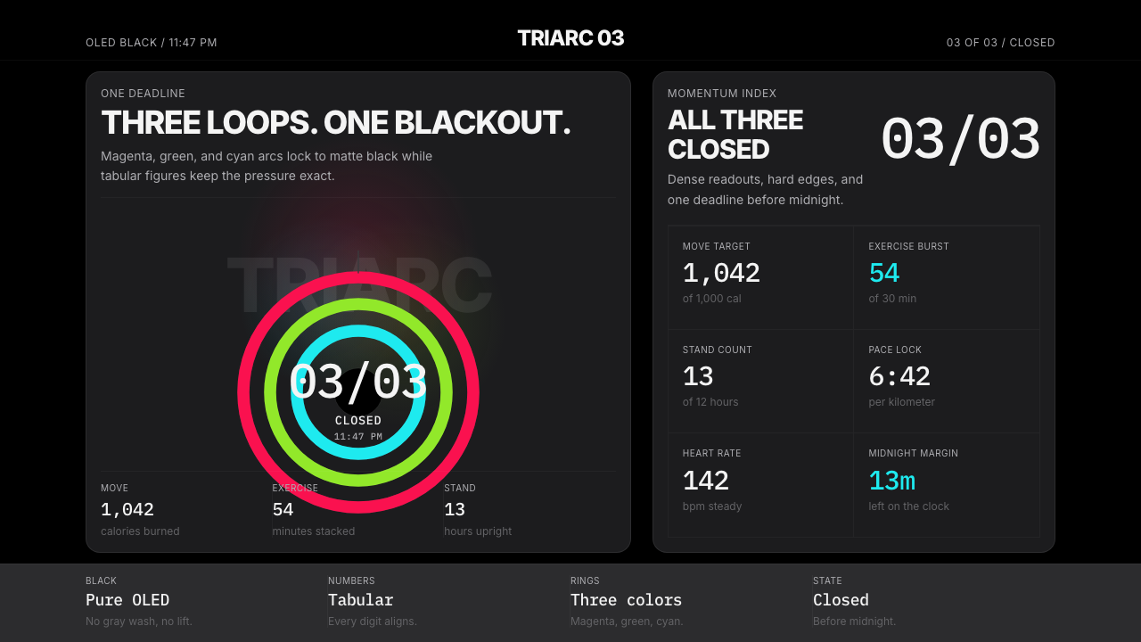 Apple Fitness Rings Closed (2024)Midnight feels exact. Magenta, green, and cyan rings lock onto OLED black.
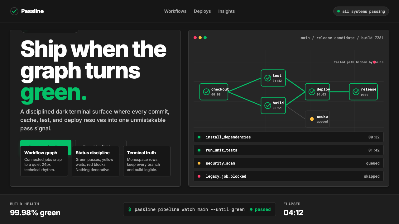 CircleCI Pipeline-GreenConfidence goes green. Emerald status lines cut through terminal-black pipeli…
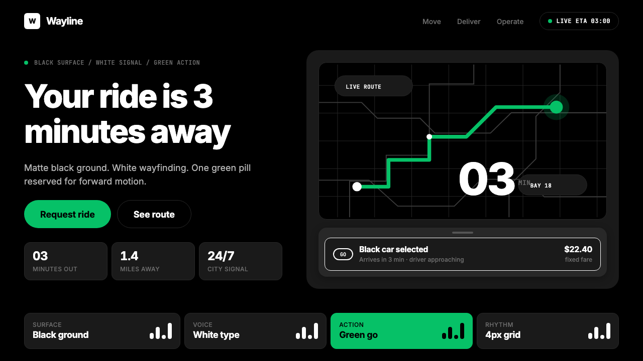 Uber 2024Motion made severe. Black surfaces, white Inter, one green pill turns the who…
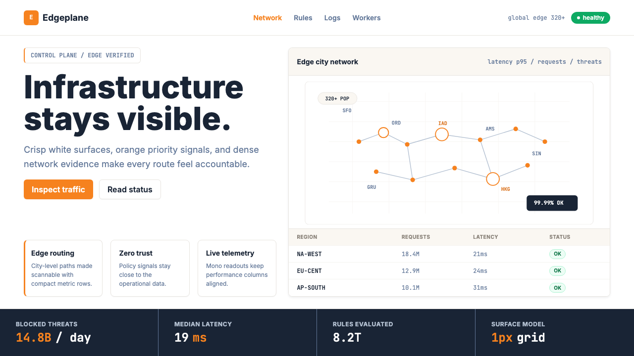 Cloudflare Orange EdgeOperational clarity wins. Orange accents, hairline grids, and mono metrics ma…
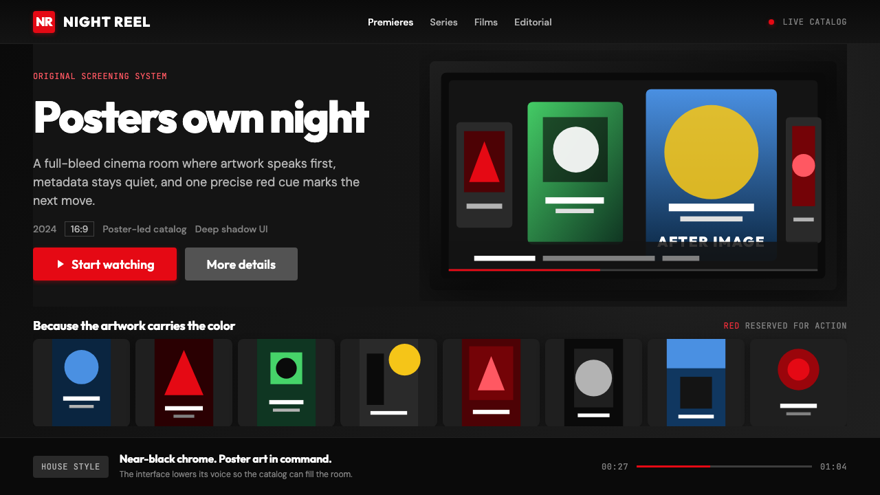 Netflix 2024Cinema UI goes dark. Near-black chrome, poster rails, and one surgical red ac…
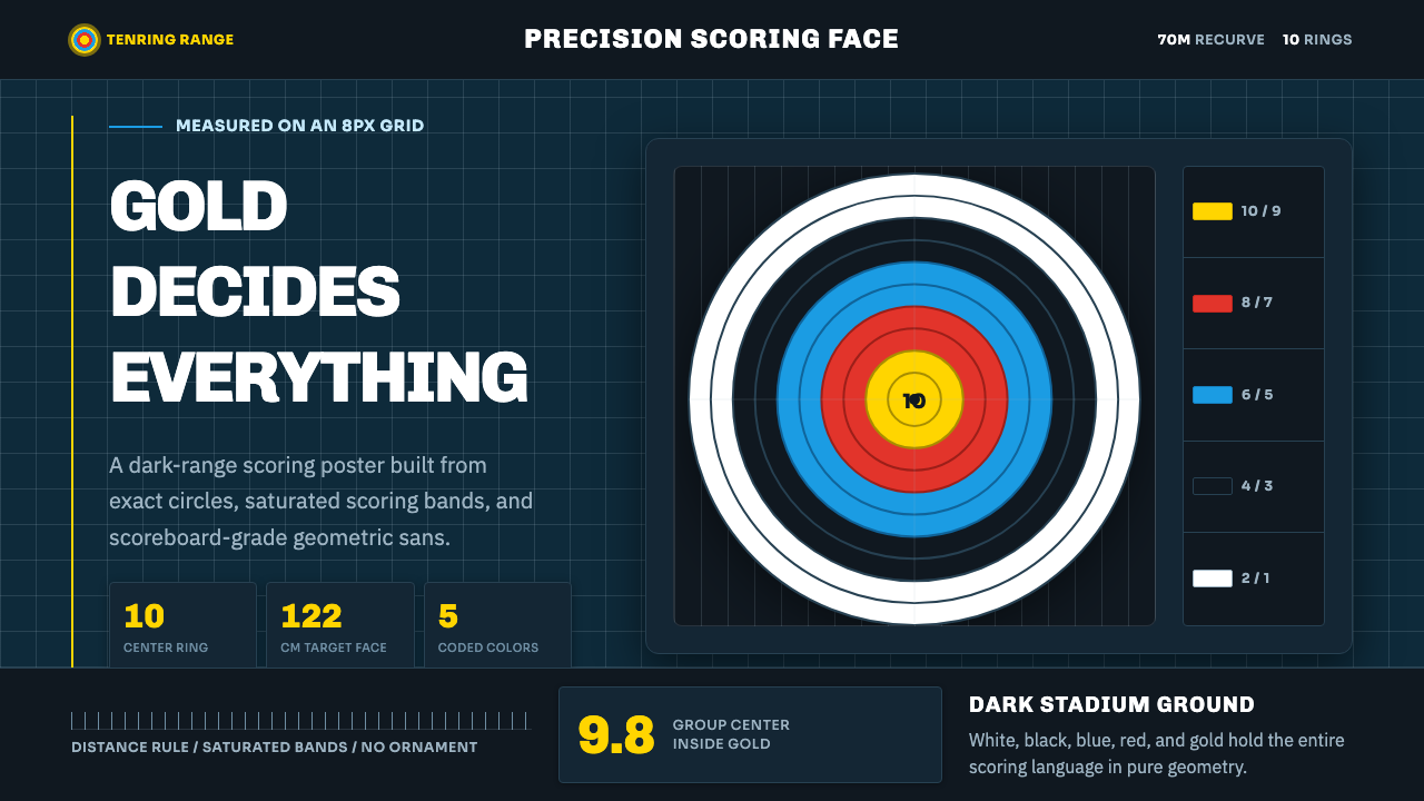 Olympic ArcheryPrecision is the drama. Gold-red-blue rings snap from a dark stadium grid.