What is Bluey?
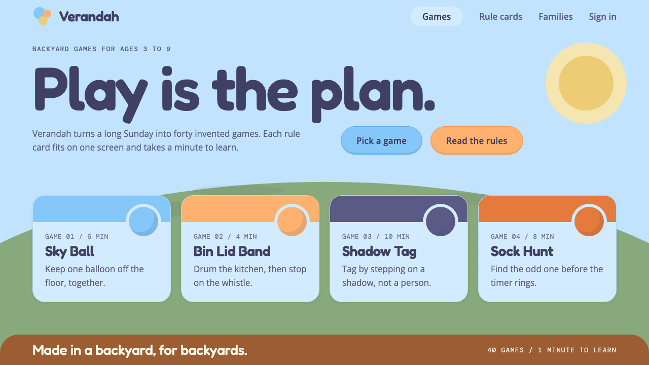
The Bluey style lifts the Heeler family's backyard into an interface: a huge pale sky, flat sunlit color, round shapes and a low strip of lawn.
Bluey in brief
The Bluey style comes from the Australian children's animated series, which premiered on ABC Kids in 2018. It takes its look from the Heeler family's backyard: a huge pale Brisbane sky, Bluey's light blue and Bingo's orange, a timber house standing on stumps, and a strip of lawn beneath a big tree. Everything is flat color, with only a whisper of painted shading at the edges.
The shapes follow the way the characters are drawn. Circles, ovals and large rounded rectangles are stacked together like a child's drawing of a house, so the interface feels built from simple blocks. Fredoka, a rounded typeface, carries names and headings, while Open Sans handles reading text, and deep navy keeps everything clear against so much sky.
The result is a clean, bright, playful system that still works. It is designed for play, but it remains useful, because the flat colors, big shapes and strong contrast make it easy for both children and parents to read. It suits family, picture-book and game-like products that want to feel relaxed without becoming messy.

Where does Bluey come from?
Bluey premiered in 2018 on ABC Kids, the children's channel of Australia's public broadcaster. It follows a family of Blue Heelers living in Brisbane, Queensland, and its stories are built around imaginative games that children play with parents. The series was created by Joe Brumm and made by a team that includes producer Charlie Aspinwall, executive producer Daley Pearson and composer Joff Bush, whose music is a major part of the show's feeling.
The look belongs to the tradition of Australian children's television and to flat two-dimensional digital animation. Instead of the soft gradients and glossy surfaces of many modern cartoons, Bluey favours simple color areas, clean outlines and generous empty space. Backgrounds are painted in broad washes, with a hint of texture, which gives the world an airy, sun-struck quality.
The setting has its own architectural source. The Heelers live in a Queenslander, the timber house raised on stumps that is a familiar vernacular form in Queensland. Verandas, slatted railings and steps up to the door appear over and over in the show, and they translate easily into layout ideas: raised platforms, horizontal bands and generous open space beneath. The low horizon of lawn under a huge sky is the show's signature composition.
The visual identity used here refers to the seasons from the first to the third, around the episode 'The Sign', and the style runs across 2018 to 2024. Across that period the show's flat, sunlit, round look has remained recognisable, and its popularity beyond Australia shows that the system works for a broad audience. In design terms, it is a lesson in how a few honest shapes and a limited palette can carry a very large imaginative world.
What defines the Bluey look?
Pale Brisbane sky ground
The base is a light, airy sky blue that fills most of the screen. It makes pages feel open and sunny. Because the ground is so pale, saturated characters and buttons stand out without being loud.
Flat color with a whisper of shading
Shapes are filled with flat color, with only a faint, painterly shadow at the edges. There are no glossy highlights and no heavy gradients. This keeps the style clean and makes it easy to reproduce across screens.
Bluey blue and Bingo orange
Two character colors anchor the palette: a light blue for the lead and a warm orange for the sibling. They work as a natural pair of primary and secondary actions, with blue for the main path and orange for a friendly alternative.
Rounded Fredoka headings
Names and headings are set in Fredoka, a soft, rounded typeface that feels friendly and easy for young readers. Reading text uses Open Sans, a calm and neutral face, so paragraphs stay comfortable for adults.
Circle, oval and rounded-rectangle blocks
Cards, buttons and illustrations are built from simple round shapes stacked like a child's drawing. There are no sharp corners and no intricate ornament. The stacked-block feel makes layouts easy to understand at a glance.
Low lawn horizon
A strip of lawn sits low along the bottom, under a huge sky, often with a tree or a raised house. It acts as a footer, a ground line for characters and a visual anchor, and it makes the composition feel stable.
Deep navy text
Text is set in deep navy, not black. It stays crisp against the pale sky and ties in with the blue world. Because contrast is strong, children and parents can read the same screen without strain.

Who shaped Bluey?
Joe Brumm created Bluey, the Australian series set in Brisbane that premiered in 2018 on ABC Kids. The flat, sunlit visual world of the show grows out of his original conception of a family and their backyard games.
Charlie Aspinwall is among the producers tied to the series. His role in the team that brought the show to screen helped carry the original look into a consistent production across seasons.
Daley Pearson is another key name behind the production. As part of the team around the show, he contributed to the consistency of its tone and presentation.
Joff Bush is the composer whose music is central to the show's character. The warmth and lightness of his score parallels the warmth and lightness of the visual style.
How do you use Bluey today?
For slides, the Bluey style suits family, education and playful brand decks: school events, children's product launches, parenting content, picture-book pitches. A cover can place a huge pale sky with a low strip of lawn at the bottom, a rounded Fredoka title and a simple circle character. Content slides use big rounded cards with navy text and one flat color per idea.
For data slides, keep charts flat and chunky. Bars with rounded ends, circles as data points and generous spacing make numbers feel friendly. Use blue for the main series and orange for comparison, and keep annotations short. The style is not meant for dense financial tables, so favour clear, single-message charts.
For web interfaces, think family apps, kids' learning games, picture-book readers, activity planners and community pages. Buttons are large and rounded, with blue for the main action and orange for the friendly alternative. Footers can take the lawn horizon, and sections can be separated by the gentle bands of sky and grass.
For editorial and marketing work, the look supports cheerful campaigns that want warmth and honesty rather than polish. Pair it with simple illustrated scenes, short sentences and plenty of space. It works well for seasonal family promotions and for brands that want to feel like a trusted backyard friend.
The most common mistake is adding gloss, heavy shadows or small detailed ornament, which breaks the flat drawn charm. Another is shrinking the shapes until they lose the child's-drawing feel. Keep the sky large, the shapes round, the colors flat and the navy text strong.

Bluey — FAQ
What is the Bluey design style?
It is a flat, sunlit style taken from the Australian series Bluey: a huge pale sky blue ground, Bluey's blue and Bingo's orange, round shapes stacked like a child's drawing, rounded Fredoka headings, Open Sans reading text, deep navy type and a low lawn horizon.
When did Bluey premiere and who created it?
It premiered in 2018 on ABC Kids in Australia. It was created by Joe Brumm, with Charlie Aspinwall, Daley Pearson and composer Joff Bush among the key names. The setting is Brisbane, Queensland.
Why does the style use a Queenslander house?
The Heelers live in a timber house raised on stumps, a common vernacular form in Queensland. Its verandas, rails and raised floor suggest layout ideas such as raised platforms and horizontal bands, and it anchors the show in a real place.
Which fonts does this style use?
Fredoka, a soft rounded typeface, carries names and headings. Open Sans handles reading text. Together they keep the page friendly for children while staying comfortable for adults.
Is it only for children's products?
No. It suits any product that wants to feel relaxed, open and friendly, such as family apps, education, community services and casual games. It is less appropriate for sober, luxury or highly technical products.
Related design styles
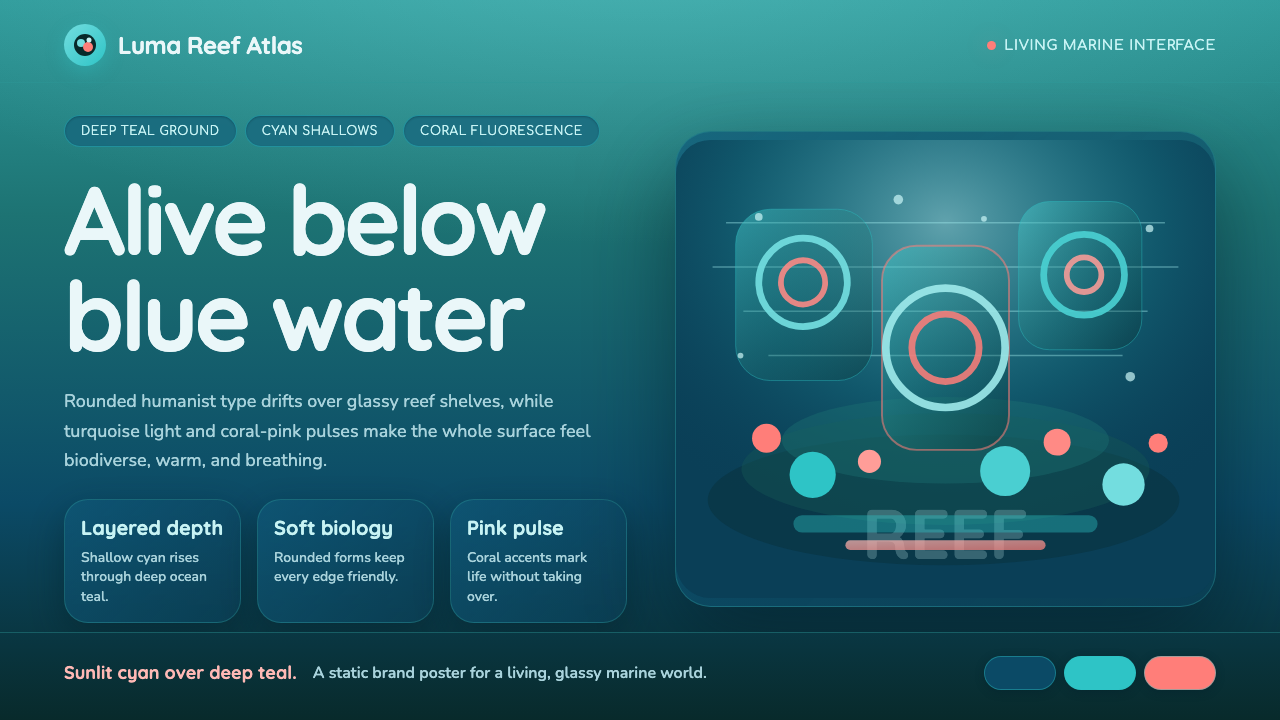 Great Barrier ReefAlive under deep teal. Quicksand curves, cyan glow, and coral-pink pulses bui…
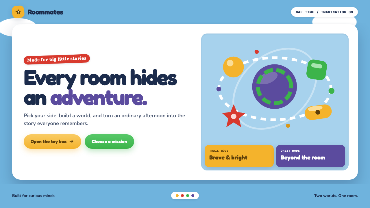 Toy Story (1995)Playtime becomes a whole world. Cloud blue, chunky type, and glossy two-tone…
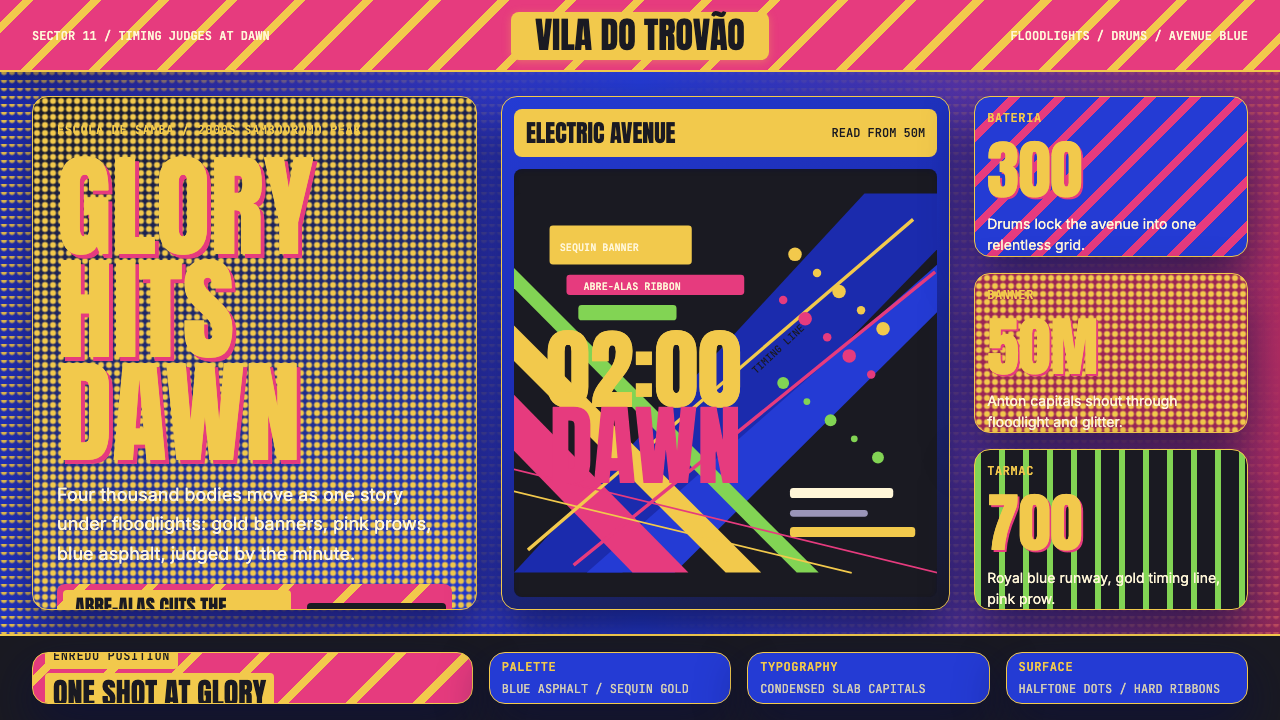 Brazilian Samba School (2000s Carnaval)Parade at floodlight volume. Royal blue asphalt, sequin gold type, pink ribbo…
 Pixar LuxoSincere story warmth. Cream paper, deep navy serif, and blue lamp geometry ho…
 Adventure TimeCartoon warmth, inked loud. Cream gutters, candy pink, cyan and mint lock int…
 Kung Fu Panda (2008)Ancient calm meets comic momentum. Vermilion, gold and paper-cut peaks glow i…