What is Balletcore?
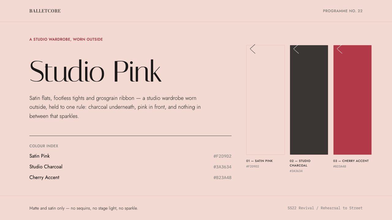
Balletcore is the rehearsal room walking outside: slipper-satin pink held in line by studio charcoal, hairline rules and a single cherry accent.
Balletcore in brief
Balletcore is the rehearsal room walking outside. Miu Miu's Spring/Summer 2022 satin flats pushed a studio wardrobe into everyday dress: footless tights, wrap cardigans, ribbed knit and grosgrain ribbon, all the working clothes of a dancer between classes. The look spread fast, and Pinterest searches for it climbed more than fifteen-fold that year. This design system distils that look into a page.
The system takes its ground from slipper satin pink and its discipline from a leotard. Type is studio charcoal rather than black, rules are hairlines, and every view is organised around one subject. A single cherry accent is allowed per view, a small flash of colour like a ribbon tied at the ankle. The rest of the page is calm, soft and exact.
Typography does much of the storytelling. Bodoni Moda supplies the ballet-programme Didone, with its sharp contrast between thick and thin strokes. Italiana is used for the single display line, and Jost carries the working interface. Surfaces are matte and satin only. Nothing sparkles, shimmers or glows, which keeps the softness of the pink from tipping into sweetness.

Where does Balletcore come from?
The trigger was a fashion show. Miu Miu's Spring/Summer 2022 collection, shown in October 2021 under Miuccia Prada, put satin ballet flats on the runway. Those shoes were the spark, but the idea behind them was larger: that the soft, disciplined clothing of a dance studio could be everyday dress. The trend then ran from roughly 2020 to the present, with a peak in 2022 and 2023.
The wardrobe that came with the shoes is specific. Footless tights, wrap cardigans, ribbed knit and grosgrain ribbon are all things dancers wear to warm up and rehearse, chosen for function: they keep muscles warm, stay out of the way and look neat at a distance. Rose Repetto, whose Paris house is a byword for the dancer's slipper, belongs to the story as a reminder of where the ballet flat comes from. Balletcore takes these working garments and treats them as a vocabulary of softness and order.
The look spread through the platforms that were best at carrying it. The runway was in Milan, but the amplification happened on TikTok and Pinterest, where the habit of naming an aesthetic with the suffix -core turned a single show into a movement. Balletcore sits beside the coquette trend, a neighbouring world of bows and girlish detail, and designers such as Sandy Liang and Simone Rocha moved in and around that territory. The two overlap in colour and sentiment, but balletcore is the stricter sibling.
That strictness is where the design system comes from. Balletcore's typographic reference is the printed ballet programme, set in Didone letterforms with fine hairlines and heavy verticals. It is a tradition of elegant, formal paper rather than of costume. The system combines the pink of the satin, the discipline of the leotard and the formality of the programme, giving a page that feels as if it were prepared for a performance, down to the last ribbon.
What defines the Balletcore look?
Slipper-satin pink ground
The ground is the pale pink of a satin ballet slipper: soft, slightly luminous and never saturated. It sets the tone of the whole page and defines the mood as gentle rather than loud. Because the pink is pale, it works as a surface, not as a statement, and everything placed on it must be calm enough to sit comfortably in that softness.
Studio charcoal type
Text is set in studio charcoal, a soft dark grey, not in pure black. It reads clearly on the pale pink but is gentler than a hard black would be, in the way a rehearsal leotard is softer than formal dress. This small choice keeps the page cohesive: the type and the ground feel like they come from the same room.
Hairline rules
Division is made with hairline rules, the thinnest lines the medium can carry. They separate sections the way a barre separates the studio, lightly and exactly, without adding visual weight. There are no boxes, heavy borders or filled panels. Because the lines are so fine, the page keeps its airiness even when a layout becomes fairly dense.
One cherry accent per view
A single cherry-red accent is allowed in each view: a button, a ribbon-like detail, a price or a small mark. It is the only strong colour on the page, and its job is to show where to look. Because there is only one, it acts like the bow on a pointe shoe, a tiny deliberate flourish, never decoration for its own sake.
Ballet-programme Didone
Headlines and key text use Bodoni Moda, a Didone with very fine hairlines and heavy verticals, in the style of printed ballet programmes. The contrast between thick and thin gives the type an elegant, theatrical sharpness that suits the pink ground. It is a formal voice, used sparingly and given room, so that each line feels like a title on a programme cover.
Display line and working interface
Type roles are kept separate. Italiana is reserved for the single display line, a slender, graceful voice used once per view. Jost handles the working interface, with clean geometric shapes that stay out of the way for labels, body text and controls. Dividing the jobs between three families keeps each one in its own lane, so the page never feels as if the fonts are competing.
Matte and satin, one subject
Surfaces are matte or satin and nothing else. There is no sparkle, glitter, metallic sheen or glassy highlight. Alongside this, each view tells only one story: one product, one headline, one idea. The effect is the quiet focus of a studio, where nothing is allowed to distract from the work at hand.

Who shaped Balletcore?
Miuccia Prada is the designer behind Miu Miu, whose Spring/Summer 2022 show in October 2021 put satin ballet flats at the centre of fashion. Her contribution to the trend was the central one: she took an item of rehearsal footwear and made it a luxury object, which gave everyday studio clothing a runway authority it had not had before.
Rose Repetto is the founder of the Paris house that carries her name, a byword for the dancer's slipper. She belongs in the story as the source of the ballet flat itself. Balletcore as a trend borrows a world her work helped define, one in which footwear is made for dancers first and for the street second.
Sandy Liang is a New York designer whose girlish, bow-trimmed clothing sits in the neighbourhood of the coquette trend that overlaps balletcore. She stands for the softer, more playful end of the spectrum. Her presence in the story helps explain why balletcore and coquette are often mentioned together, and where the design system draws a stricter line between them.
Simone Rocha is an Irish designer based in London, known for romantic womenswear with tulle and delicate trimmings. Her work shares balletcore's fascination with softness and ritual dress, and she is part of the creative air that surrounded the trend. For a design system, she is a reminder that softness and discipline can sit together in one object.
How do you use Balletcore today?
Balletcore suits subjects that want to feel gentle, poised and precise at once. It is not a loud style, and it rewards restraint: the fewer the elements on the page, the more clearly it reads as itself. Treat each view as a studio wall with one thing on it, and let space do the work of luxury.
For presentation slides, a cover can be a pale pink field with a single Didone title, a hairline rule beneath it and one cherry detail, perhaps a small mark or the date. Content slides carry one subject each, in charcoal type with plenty of margin. Data slides work with hairline gridlines and charcoal labels, using the cherry accent for the one series or number the audience must remember.
For web interfaces, the style fits fashion, beauty, wellness, dance studios and boutique booking pages. Product views should show a single item with a hairline-ruled caption. Dashboards stay quiet, with one figure per card and no filled containers. For pricing, present three columns divided by hairlines and place the cherry marker only on the recommended plan; keep buttons and form fields in the same matte, softly edged language.
For editorial and marketing work, the style suits lookbooks, programme-style features, performance and dance marketing, and campaigns for products that benefit from a feeling of ritual. Set long text in the working sans and reserve the Didone for titles and pull quotes. Photography should be soft, matte and uncluttered, with plenty of the pale pink ground visible around the subject.
The most common mistake is to read the pink as an invitation to pile on sweetness: glitter, gradients, shimmer, a ribbon on every corner. That turns a disciplined style into a pastel pastiche. Related errors include using more than one cherry accent per view, setting text in pure black, crowding the page with several subjects and adding fonts beyond the three assigned roles. The pink is soft; everything else on the page should be exact.

Balletcore — FAQ
What is balletcore?
Balletcore is an aesthetic built on the clothing and mood of the ballet studio: satin flats, footless tights, wrap cardigans, ribbed knit and grosgrain ribbon. It took off after Miu Miu's Spring/Summer 2022 satin flats, shown in October 2021, and was amplified by TikTok and Pinterest. The design system translates it into pale pink, charcoal type and fine lines, with a single cherry accent.
How does balletcore differ from the coquette trend?
The two neighbour each other and share a love of softness, but coquette leans toward bows, lace and girlish ornament, while balletcore is stricter. Its inspiration is the studio and the printed programme, with discipline, fine lines and one point of colour. In this system, that strictness is the whole difference: the pink is soft, and everything else is exact.
Why only one cherry accent per view?
Because a single accent can direct the eye, while several only compete. The cherry works like the ribbon on a slipper: a small, deliberate point that tells you where to look. On a pale pink ground with charcoal type, one saturated spot is enough to establish hierarchy. Adding more would blur the focus and make the page feel decorated rather than composed.
Why are there no sparkles or glossy effects?
Because the reference is the rehearsal room, not the stage show. Surfaces are matte and satin only, with nothing that sparkles. Shine would turn the soft pink into something sugary and break the sense of discipline the system relies on. Satin gives just enough softness to read as feminine and refined, and the matte finish keeps the page grounded.
Is balletcore only for fashion and beauty brands?
It is strongest there, but the principles travel. Any brand that wants to feel poised, calm and exact, such as a boutique service, a wellness practice, a stationery maker or an arts organisation, can use the pale ground, fine rules and restrained accent. It is a poor fit for products that need urgency, density or a loud, high-energy voice.
Related design styles
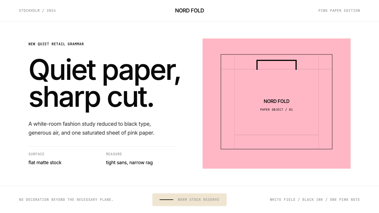 Acne Studios Pink-PaperQuiet luxury in one pink plane. Inter type floats on white with a bag-like re…
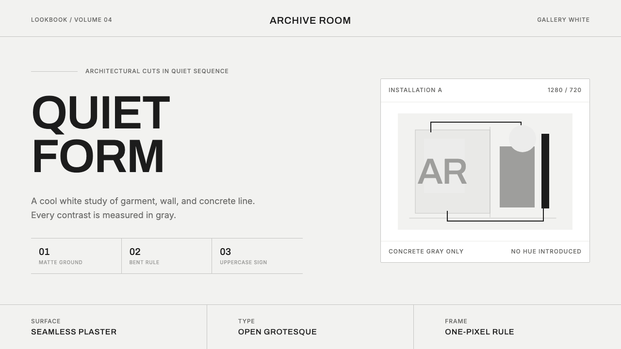 COS Gallery MinimalSilence has structure. Cool gallery white, Archivo uppercase, and concrete-gr…
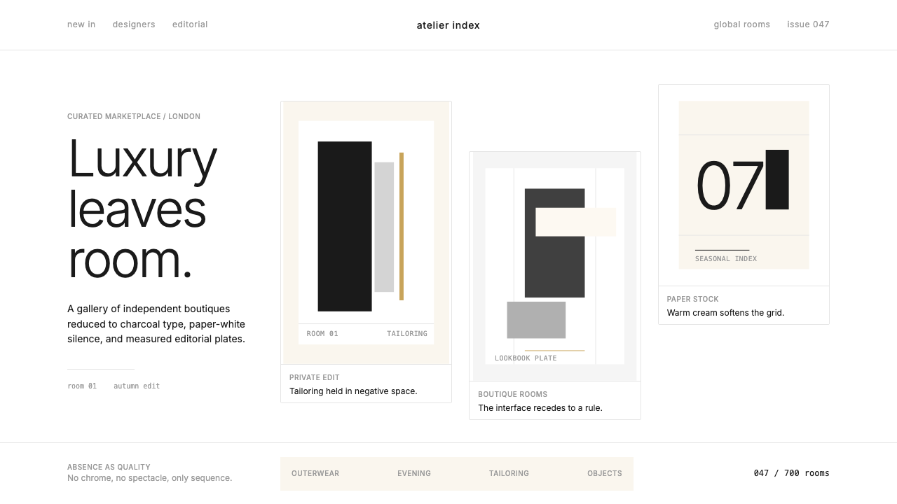 FarfetchLuxury as absence. Charcoal type, white canvas, and hairline editorial plates.
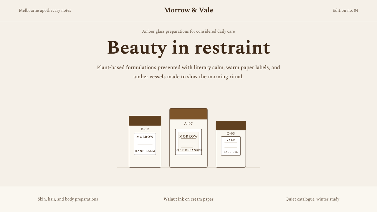 AesopRefuses urgency. Walnut serif on cream paper — every surface paced like a 19t…
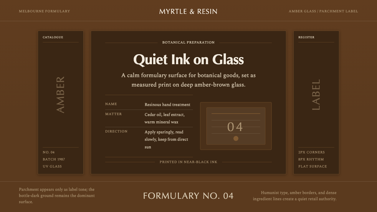 Aesop Apothecary AmberQuiet authority in glass. Amber-brown ground, parchment labels, and humanist…
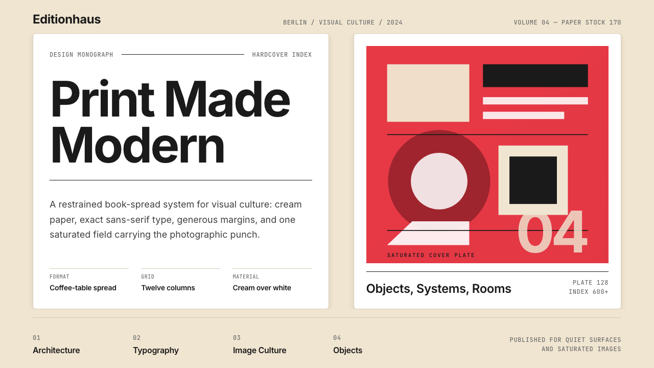 Gestalten Design BookCoffee-table calm. Cream paper, tight sans, one saturated block, and a strict…