What is Baháʼí Lotus Temple?
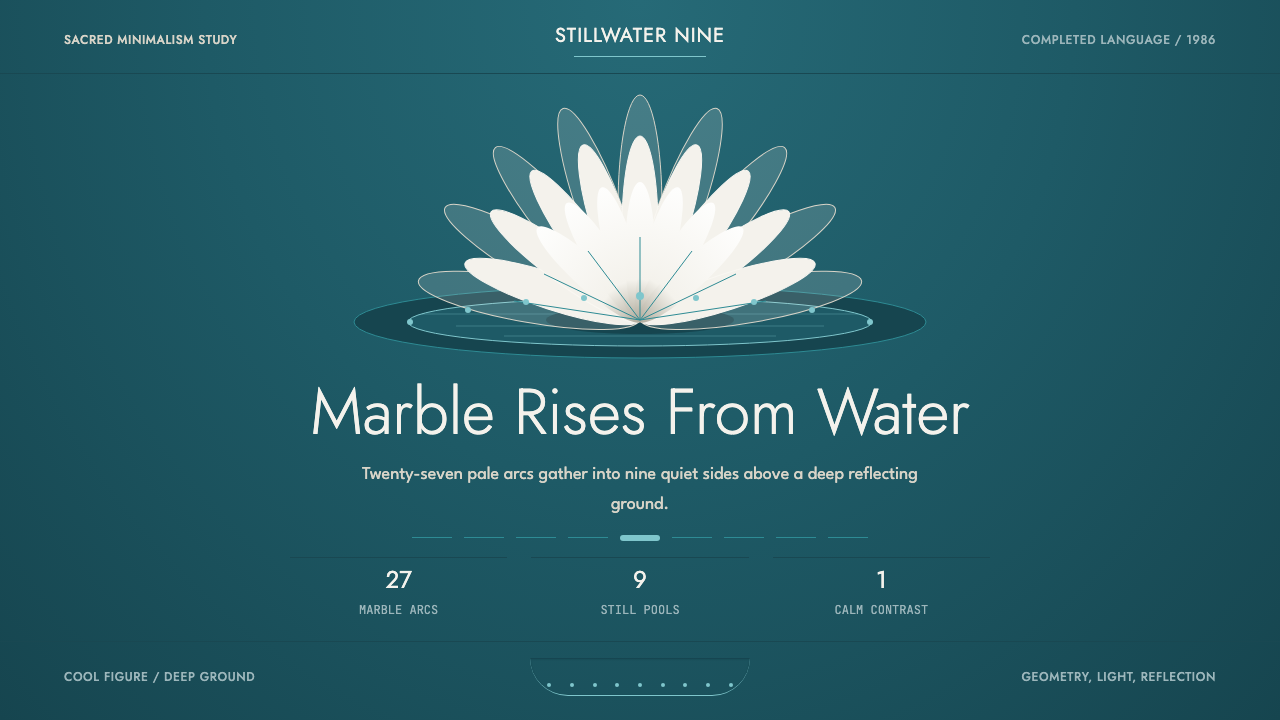
The Baháʼí Lotus Temple distilled a building into two elements — white marble and turquoise water — and made them the entire visual language. Sacred minimalism has never been more geometric, or more serene.
Baháʼí Lotus Temple in brief
The Baháʼí Lotus Temple style is a design system derived from the House of Worship completed in New Delhi in 1986, designed by Iranian-Canadian architect Fariborz Sahba. Its entire visual vocabulary rests on a single contrast: cool marble white deployed as figure against the deep turquoise of nine reflecting pools, structured through the rigorous nine-fold rotational symmetry of the building itself.
This is not ornamental minimalism — it is sacred minimalism. The system imposes severe restrictions: one white and one deep teal, generous negative space treated as an active compositional force, curves and arcs rather than hard rectilinear edges, and a nine-based structural grid that governs every proportion. The result feels simultaneously ancient and modern, botanical and geometric, serene and precise.
Visually, work in this style is defined by its restraint and its symmetry. Forms float rather than sit. Thin rules, if used at all, echo the vertical lines of marble petals rising from water. The tonal relationship between foreground and background is high-contrast but never harsh — white against deep teal reads as luminous rather than aggressive, carrying the quality of reflected light on stone.
Where does Baháʼí Lotus Temple come from?
The Lotus Temple was commissioned by the Baháʼí Faith, a religion founded in nineteenth-century Persia that holds the unity of all major world religions as a central tenet. The New Delhi house of worship, one of seven continental Baháʼí temples, was intended to be open to people of all faiths — its architecture needed to feel neither Hindu, nor Muslim, nor Christian, nor Buddhist, but universally sacred. This requirement shaped every design decision architect Fariborz Sahba made.
Sahba, who had trained in Tehran and worked on no previous project at this scale, spent years refining the lotus flower as the organizing metaphor. The lotus carries significance across multiple South and East Asian religious traditions — in Hinduism it represents divine beauty and spiritual purity; in Buddhism it signals enlightenment rising from muddy water; in Baháʼí symbolism it evokes the Manifestation of God. By choosing this botanical form, Sahba found an image that could speak across traditions without belonging to any single one.
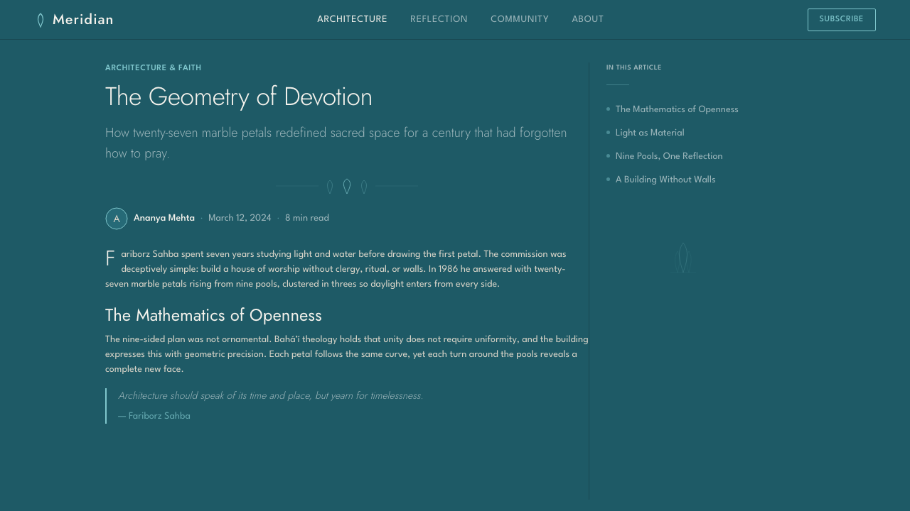
The technical execution of the building — twenty-seven free-standing marble petals arranged in clusters of three around nine sides, rising from nine turquoise pools — required an entirely new structural approach. Sahba worked with Indian engineering firm Flint & Neill to solve the shell geometry computationally. The Pentelic marble, quarried in Greece and used in the Parthenon, was chosen for its luminous whiteness and its historical association with structures intended to endure across millennia. Construction ran from 1980 to 1986.
The building opened in December 1986 and became one of the most visited structures in the world within its first decade. Its influence on design followed a different path from most architectural landmarks — rather than spawning a school of imitators, it created a recognizable visual signature so complete and so self-contained that it functions as a standalone system. The contrast of marble white and reflecting-pool teal, the nine-fold order, the petal curves: these are not generic modernist moves but a specific and irreproducible visual event translated into a reusable design language.
What defines the Baháʼí Lotus Temple look?
Color
The palette is binary and exact: marble white — not cream, not warm ivory, but the cool luminous white of stone in diffuse light — set against a deep turquoise that reads as water in shadow. No tertiary hues, no warm neutrals, no grey midtones appear in authentic applications of this system. The white functions as light itself; the teal functions as depth and reflection. Accent use is minimal: thin lines or typographic elements in either color against the other, never a third hue introduced for hierarchy or interest.
Form and Symmetry
Nine-fold rotational symmetry is the governing structural logic. Unlike bilateral symmetry, which reads as static or formal, nine-fold rotation produces a sense of continuous movement — of opening, of petals unfurling. Compositions built on multiples of nine have an organic wholeness that feels neither arbitrary nor rigid. Curves are the primary formal element: arcs rather than straight edges, tapering profiles rather than uniform extrusions, surfaces that appear to curve in three dimensions even when rendered flat.
Negative Space
The reflecting pools that surround the temple are not incidental — they are compositional. The teal water makes the white petals visible by contrast; without the dark ground, the marble form would be illegible against the sky. In the design system, this translates to a principle of generous and intentional dark ground: the deep teal field is not background filler but an active compositional element that gives meaning to whatever floats within it. Content that fills its container violates this logic; content that breathes within it belongs.
Light and Luminosity
The Lotus Temple is an architecture of diffuse light — its interior glows because light enters through the shell's openings and bounces off marble surfaces, never arriving as a harsh direct beam. The design system translates this into a principle of glow rather than spotlight: white elements should appear to emit light softly, not to reflect it harshly. This affects how shadows are handled — they are absent or barely present, because hard shadows would break the quality of even, sacred illumination that the system depends on.
Typography
Type in this system should reinforce the architectural qualities of the building: verticality, elegance, and ceremonial calm. Tall letterforms with generous line spacing echo the upward movement of the petals. Thin stroke weights — the typographic equivalent of the temple's fine marble edges — suit this palette better than heavy geometric sans-serif type. All-caps settings work well for headings when line-spacing is generous; dense paragraphs of text break the meditative quality the system requires.
Ornament and Restraint
The Lotus Temple building carries no applied ornament — its beauty is entirely structural and geometric. The design system inherits this discipline absolutely: no pattern fills, no decorative borders, no illustrative elements that exist for visual interest alone. Where visual complexity appears, it must arise from the geometry of the system itself — from the interaction of curves, the play of the two-color contrast, or the echo of nine-fold structure — not from added embellishment. This is restraint as conviction, not as poverty.
Scale and Proportion
The temple's power comes partly from the relationship between the vast sweep of its curves and the fine detail of individual marble joints — from the interplay of monumental scale and precise craftsmanship. In the design system, this translates to deliberate scalar contrast: very large primary elements (the white field, the dominant form) set against very fine details (thin rules, small type). Middle-sized elements that are neither monumental nor intimate tend to weaken the system's dramatic clarity.
Who shaped Baháʼí Lotus Temple?
The Iranian-Canadian architect who designed the Lotus Temple entirely from scratch, without prior experience at this structural scale. Sahba spent years researching the lotus form and working with structural engineers to solve the geometry of twenty-seven free-standing marble petals. He held that architecture for a universal faith required a form that transcended any single cultural or religious tradition, and his synthesis of botanical geometry, South Asian material culture, and late-modernist shell engineering produced a building with no direct precedent. His design decisions — marble over teal, nine-fold symmetry, unornamented surface — constitute the visual grammar of this style.
The organizing body that commissioned the Lotus Temple and established the design constraints Sahba worked within. The Baháʼí World Centre's requirement that the structure be open to people of every religion — and that it not read as belonging to any one tradition — was the generative constraint that produced the lotus form. This is a rare case in architectural history where a client's theological commitment produced a formally original solution; the design brief was essentially a philosophical argument about universality, and the building is its built translation.
The specific stone used in the Lotus Temple — quarried from Mount Pentelicus near Athens, the same source as the Parthenon's marble. Sahba's choice of Pentelic marble was not arbitrary: the stone's fine crystalline structure gives it a particular luminosity in daylight, a quality that made the petals appear to glow from within rather than simply reflect light. Its association with long-enduring ancient structures also carried symbolic weight for a faith concerned with spiritual permanence. The material choice is inseparable from the visual identity of the style — its cool white with subtle veining establishes the precise chromatic register that the design system depends on.
Not merely a landscape feature but the compositional foundation of the entire visual system. The nine turquoise pools that surround the building serve the dual function of structural engineering (they house the foundation drainage system) and visual composition (they create the dark ground against which the white marble is legible). Sahba's recognition that the building's readability depended on this tonal contrast — white needs deep teal as much as teal needs white — is the key insight that the design system inherits. The pools also introduce horizontal stillness against the building's vertical aspiration, a counterpoint that the design system replicates through the balance of expansive ground and rising form.
The British engineering firm that solved the structural geometry of twenty-seven free-standing marble petals, each a complex doubly-curved shell form. Without their computational approach to the shell geometry — working in the early 1980s, before digital parametric modeling became standard practice — Sahba's botanical concept could not have been realized at full scale. Their work demonstrates that the visual purity of the design depends on engineering precision: the seamlessness of the curves, the thinness of the petal profiles, the apparent weightlessness of the marble — all are achievements of structural calculation as much as architectural intention.
How do you use Baháʼí Lotus Temple today?
The Baháʼí Lotus Temple style is most persuasive in contexts where a quality of meditative authority is appropriate: wellness and spiritual platforms, cultural institutions, premium services that wish to signal elevation without aggression, and interfaces where calm focus rather than energetic urgency is the intended emotional register. It is a poor fit for high-frequency transactional environments — e-commerce checkout flows, dense data dashboards, notification-heavy mobile apps — where the generous negative space and slow compositional rhythm work against speed and scannability.
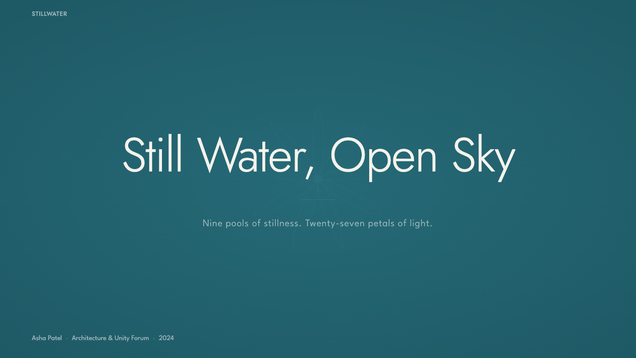
For presentation slides, the style works as a dark-ground system. Cover slides benefit most: a deep teal full-bleed background with a single white form — a geometric arc, a centered wordmark, a large numeral — achieves the monumental stillness that this system does well. Content slides require discipline: white type on teal ground, or teal type on white ground, with generous margins and never more than three levels of typographic hierarchy. Avoid filling slides; each slide should feel like one idea given room to breathe. Data slides are the hardest context — bar charts and line graphs should be reduced to their essential geometry, using only the two-color palette and avoiding all chart junk.
For web interfaces, apply this style to long-form reading experiences, brand landing pages, and institutional about pages rather than to functional application interfaces. The dark teal can serve as a hero section background with white text and arcing SVG decorative elements; the white-ground sections that follow should carry abundant line spacing and wide margins. Interactive elements — buttons, links — should be teal on white or white on teal, never a third color. Avoid hover states that introduce new hues; instead, vary opacity or invert the existing two-color relationship.
For editorial and marketing work, the style's strongest mode is the single-image spread: a large white form, precisely cropped, against a full-bleed teal field. This works for print covers, digital feature headers, and social media posts. Body text should appear in generous columns on white ground rather than on teal — the deep ground is for emphasis and framing, not for sustained reading. When using photography within this system, convert images to high-contrast duotone using the two brand colors rather than placing full-color photography, which will clash with the palette's deliberate restriction.
The most common mistake when applying this style is importing warmth that the system refuses. Beige neutrals, warm greys, amber or gold accents — these all signal luxury in generic premium design, but they break the specific cool luminosity that makes this system work. A second frequent error is introducing symmetry without the rotational, petal-like quality: standard bilateral symmetry feels bureaucratic where nine-fold symmetry feels sacred. If perfect nine-fold geometry is impractical, asymmetric compositions with circular or arcing elements better preserve the spirit of the system than balanced rectangular layouts.
Baháʼí Lotus Temple — FAQ
Is this style too specific to use outside of spiritual or cultural contexts?
It is specific, but that specificity is a strength in the right contexts rather than a limitation. The visual system — cool white against deep teal, nine-fold structure, generous negative space — carries associations of calm authority and elevating presence that transfer well beyond religious architecture. Premium wellness products, institutional identities for universities or museums, high-end editorial design, and brand identities for services that want to signal care and precision rather than speed and abundance all draw on exactly these qualities. The mistake is not using the style outside sacred contexts; it is using it in contexts where urgency, density, or warmth are the required emotional register.
Can I add a third color for hierarchy without breaking the system?
Resist the impulse. The system's power is entirely dependent on the two-color restriction. When a third color appears, the carefully constructed luminous tension between white and teal dissolves, and what remains is generic two-tone design with an accent rather than a specific visual system. The correct way to create hierarchy within this palette is through scale, weight, opacity, and spatial position — a large white heading versus small white body text on teal, or a full white section versus a white element floating in teal. These methods create distinction without contaminating the palette. If hierarchy demands a third visual channel, use texture or pattern drawn from the geometry of the building's petal structure rather than a new hue.
How does this style relate to other minimalist systems like Wabi-Sabi or Swiss International Style?
The three systems share a commitment to restraint but arrive at it from entirely different premises. Swiss International Style's minimalism is rational and industrial — it removes everything that cannot be functionally justified, following Bauhaus logic. Wabi-Sabi's minimalism is organic and impermanent — it finds beauty in the incomplete, the asymmetric, and the weathered. The Lotus Temple system's minimalism is neither rational nor organic but sacred — it removes everything that would distract from a quality of still, luminous presence. Swiss work is gridded and typographic; Wabi-Sabi is textural and irregular; the Lotus Temple system is geometric and bilateral in the deep rotational sense. They can inform each other — a Wabi-Sabi surface texture might appear within this system's framework — but they should not be blended wholesale.
What typefaces work with this system, and what should be avoided?
Tall, elegant, and low-contrast letterforms work best — letterforms with a quality of uprightness and fine craftsmanship that echoes the vertical aspiration of the marble petals. High-contrast classical serifs are unexpectedly compatible: their fine hairlines echo the building's thin marble joints, and their historical associations with permanence suit the style's register. Geometric sans-serifs are viable when used at very light weights and generous spacing. What to avoid: heavy display typefaces that compete with the architecture's visual weight, novelty scripts that introduce warmth or playfulness, and compressed faces that destroy the style's characteristic breathing room. The system requires type that knows how to be quiet.
Does the nine-fold structure have to be applied literally, or is it a more general principle?
It functions more as a generative principle than as a literal template. In the building, nine-fold symmetry means twenty-seven petals in nine clusters of three — but the underlying quality it produces is rotational organic wholeness, a sense that a form is complete because of its own internal logic rather than because it fits a rectangular container. In practice, this translates to a preference for circular or arcing compositions over rectilinear grid layouts, for elements that feel like they are parts of a larger rotating whole rather than items in a list, and for proportional systems based on the number three or multiples of three. You do not need literally nine elements — you need the quality of structured organic rotation that nine-fold symmetry produces.
Related design styles
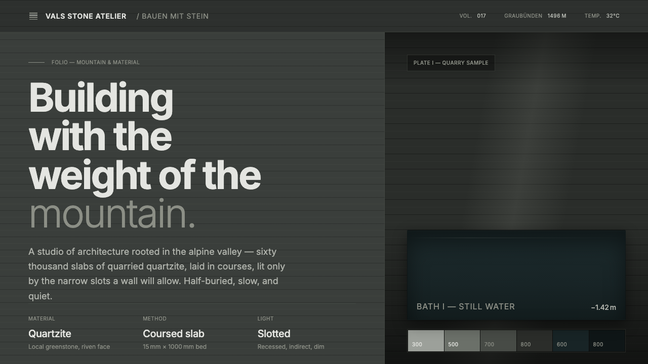 Zumthor Thermal BathsArchitecture as atmosphere. Greenish-slate stone, stratified courses, dim lig…
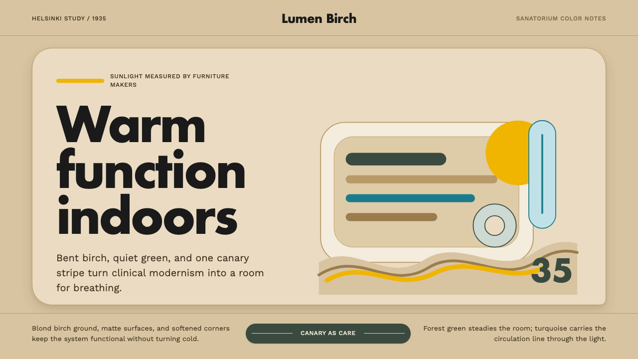 Aalto Finnish ModernModernism made humane. Birch fields, canary yellow, and soft plywood curves b…
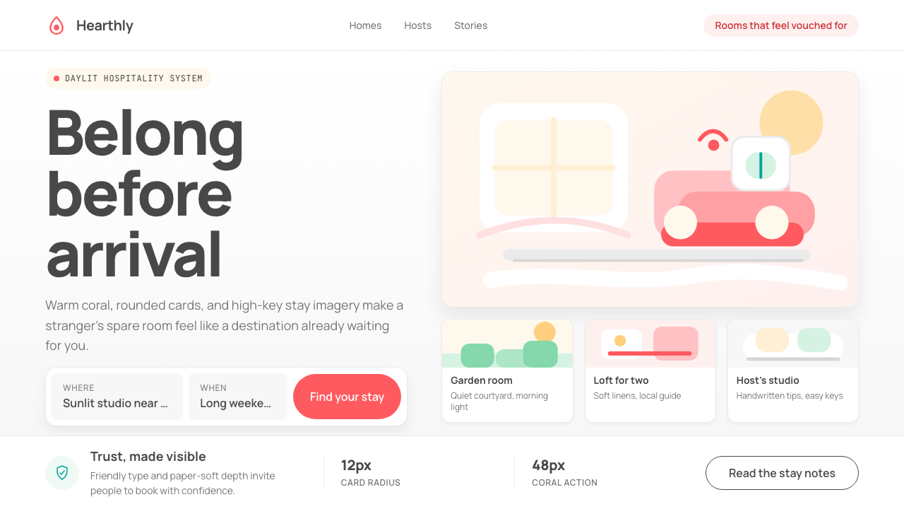 Airbnb 2014Coral red, soft pill cards, Cereal type. The Bélo wraps strangers in warm, da…
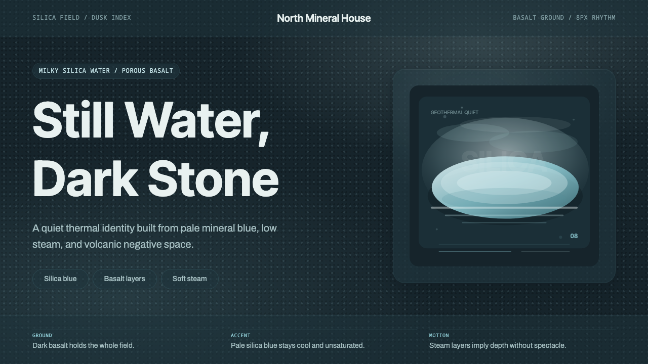 Glacial Teal LagoonQuiet feels elemental. Basalt darks and milky silica blue drift in a low-cont…
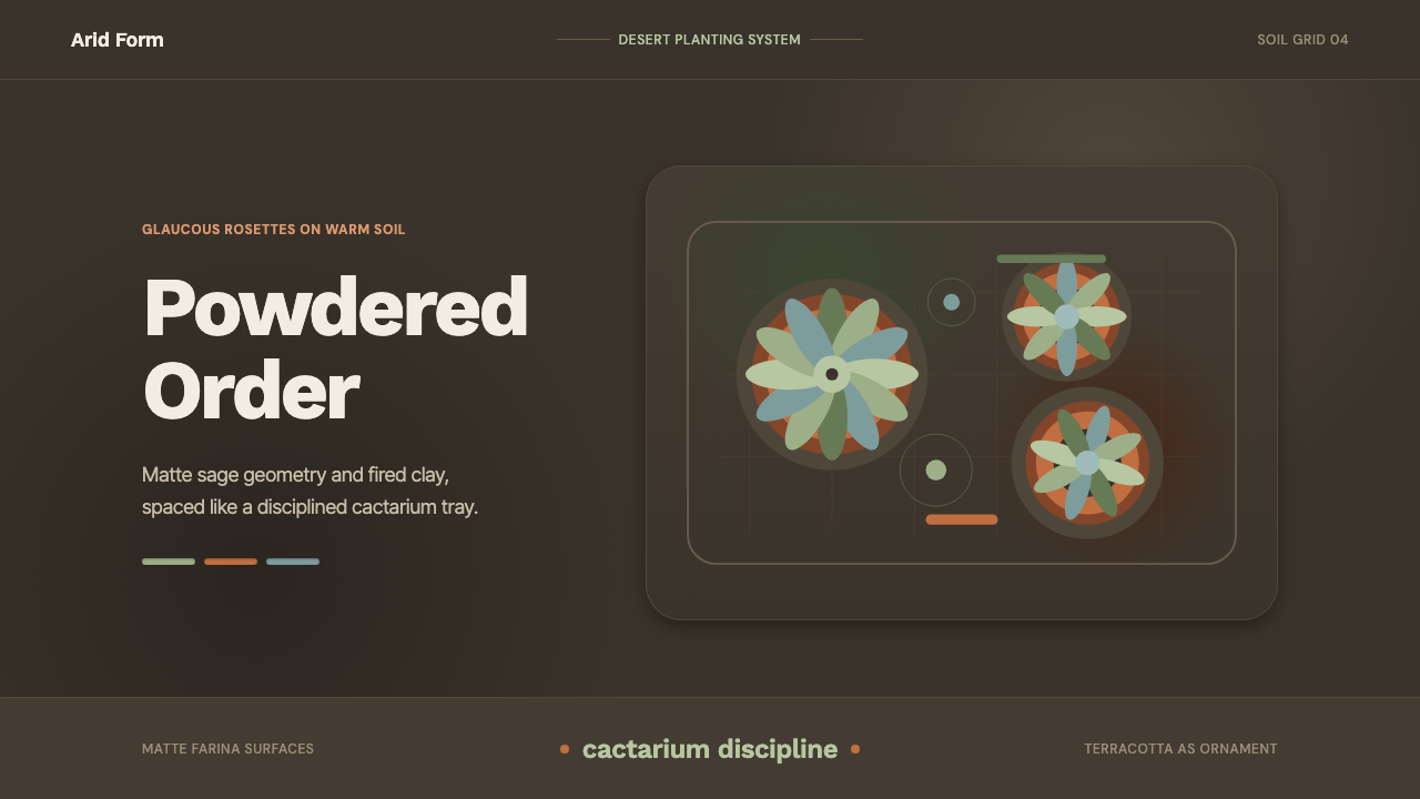 Succulent CactariumQuiet desert order. Sage rosettes and terracotta rings rest on dark warm soil.
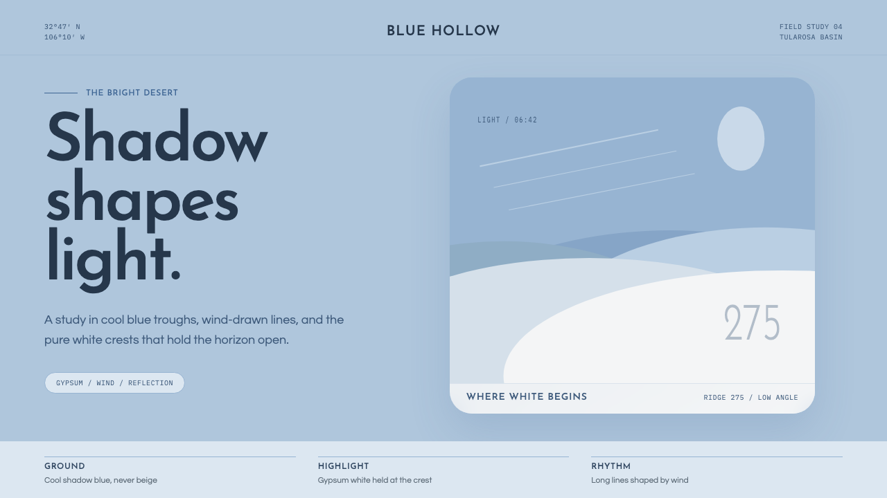 White Sands Gypsum DunesBlue shadow makes white luminous. Airy geometry follows wind-drawn gypsum cre…