Design style guide设计风格指南
What is Changi Jewel Airport?什么是 Changi Jewel Airport?
Jewel Changi Airport turned a working terminal into the world's most photographed indoor landscape — then distilled that spectacle into a flat graphic system precise enough to navigate five floors of living rainforest.星耀樟宜将一座运转中的航站楼变成全球最具辨识度的室内自然奇观,又将这一奇观提炼为足够精确、能引导五层热带雨林中旅客动线的平面图形系统。
Changi Jewel Airport in briefChangi Jewel Airport 速览
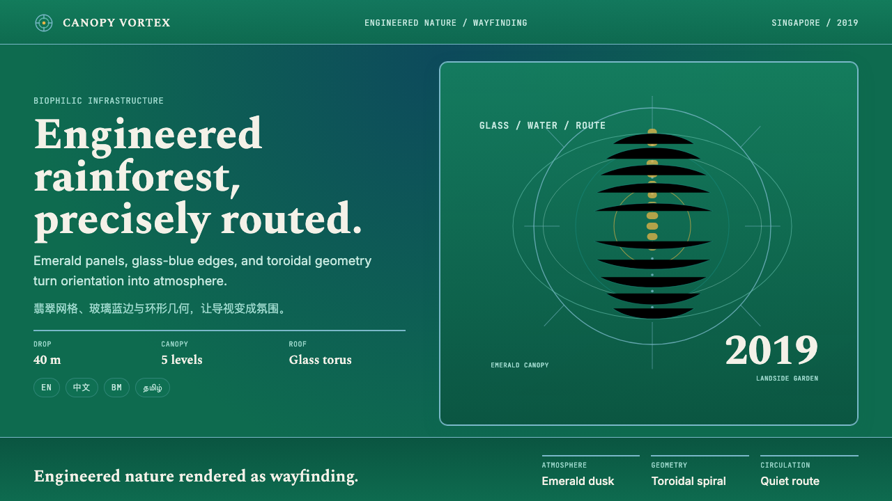
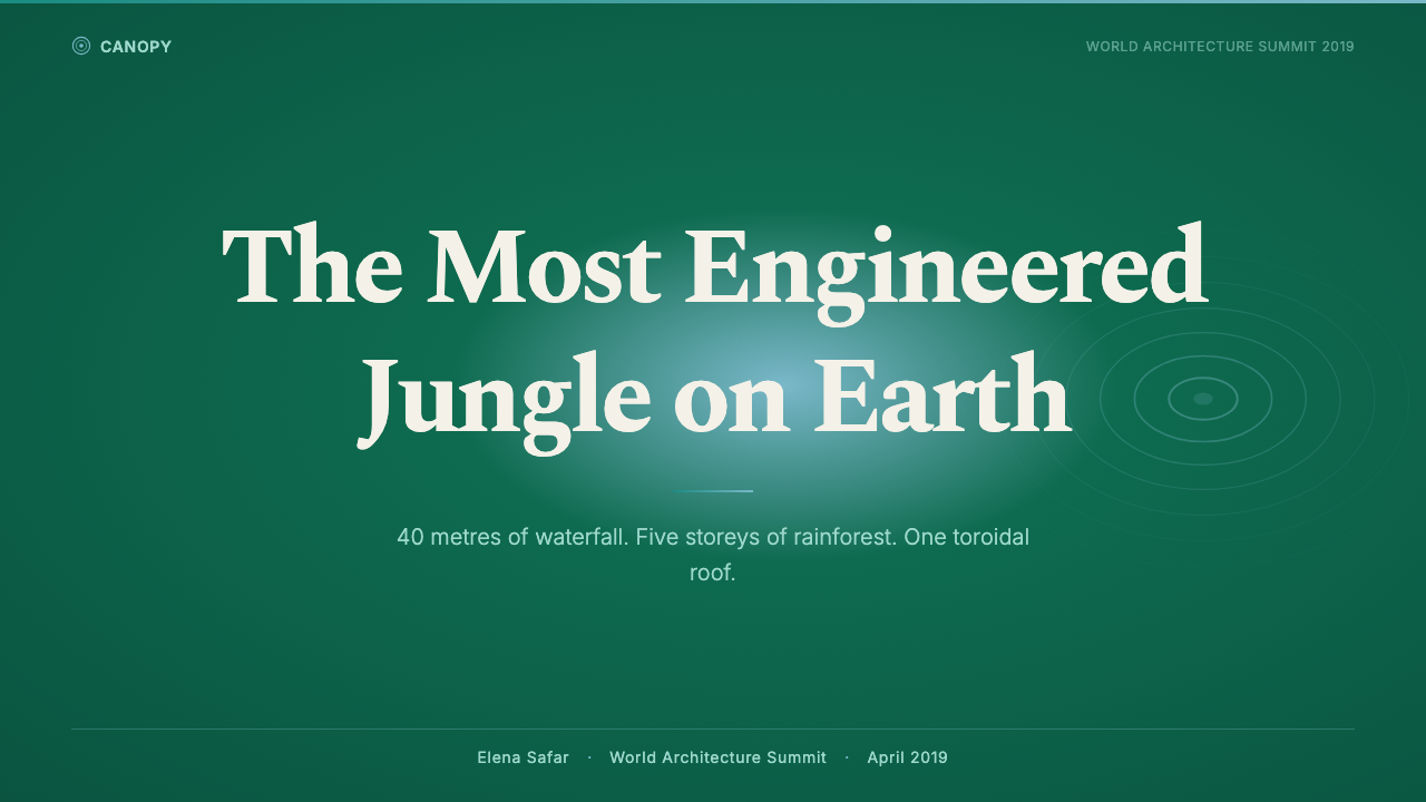
The Changi Jewel Airport design system is the visual identity that grew out of one of the most ambitious public infrastructure projects of the twenty-first century. At its physical core is the Rain Vortex — a forty-metre waterfall descending through the oculus of a toroidal glass-and-steel dome into a terraced indoor forest spanning five retail and leisure levels. The graphic language that surrounds this spectacle translates its essential qualities — living green, cascading water rendered in cool glass-blue, and the recurring ring of the dome itself — into a flat, scalable system deployable across wayfinding signage, digital touchscreens, retail graphics, and brand communications.星耀樟宜设计系统是从二十一世纪最具野心的公共基础设施项目中生长出来的视觉识别体系。其物理核心是汇丰雨漩涡——一道四十米高的瀑布穿过环形玻璃钢架穹顶的天眼倾泻而下,坠入横跨五层零售休闲空间的梯田式室内森林。围绕这一奇观的图形语言,将其本质品质——生命绿意、以冷调玻璃蓝呈现的流水,以及穹顶反复出现的圆环——转化为一套扁平化、可缩放的系统,部署于导视标牌、数字触屏、零售图形与品牌传播之中。
What makes the system distinctive is how faithfully it honours the architecture. Most airport visual identities are applied to a building; the Jewel identity emerges from the building. The toroidal spiral motif — a ring in continuous motion, referencing both the dome's cross-section and the waterfall's rotation — appears at every scale from floor-directory icons to full-facade banners. The palette of deep forest greens and translucent waterfall blues is not a brand decision imposed from outside but a direct transcription of the atrium's ambient light at dusk, when the canopy glows emerald and the vortex refracts into cool blue across the travertine floors.这套系统的独特之处在于它对建筑的忠实呼应程度。大多数机场视觉识别系统是被施加于建筑之上的;星耀识别系统则从建筑中生长而出。环形螺旋图案——一枚持续运动的圆环,同时指涉穹顶的横截面与瀑布的旋转——出现于从楼层目录图标到建筑外立面全幅横幅的每一种尺度上。深邃的森林绿与半透明的瀑布蓝色板,并非从外部强加的品牌决策,而是对中庭黄昏时刻环境光的直接转录——彼时树冠散发翠光,漩涡将冷蓝折射于石灰华地面之上。
The system operates in the tradition of what might be called biophilic graphic design — an emerging design discipline that uses imagery derived from living natural systems as the organizing logic for wayfinding and brand communication. Earlier airport identities tended to rely on abstract geometric motifs or typographic authority. Jewel instead reads more like a curated garden than a transit facility, with the graphic system serving as the bridge between the built engineering and the visitor's sensory experience of that engineering.这套系统延续了一种可称为「仿生图形设计」的传统——一个以源自自然生命系统的图像作为导视与品牌传播组织逻辑的新兴设计领域。早期的机场视觉识别体系倾向于依赖抽象几何图案或排印权威;星耀读起来更像一座精心策划的园林,而非一处交通设施,图形系统在建筑工程与访客对工程的感官体验之间架起了桥梁。
See the Changi Jewel Airport design system →查看 Changi Jewel Airport 完整设计系统 →
Where does Changi Jewel Airport come from?Changi Jewel Airport 从何而来?
The project was announced by Changi Airport Group in 2014, with Moshe Safdie appointed as lead architect. Safdie, whose career had long been defined by the intersection of mass housing and public landscape — Habitat 67 in Montreal, Moshe Safdie & Associates' subsequent civic buildings — brought to Changi a thesis he had been developing for decades: that large public buildings could and should incorporate living natural systems, not as decoration, but as structural and psychological infrastructure. The Jewel brief gave him the first opportunity to test that thesis at the scale of a working international airport.该项目由樟宜机场集团于2014年宣布,任命摩西·萨夫迪为首席建筑师。萨夫迪的职业生涯长期由大规模住宅与公共景观的交汇所界定——蒙特利尔的Habitat 67、此后一系列公民建筑——他为樟宜带来了一个酝酿数十年的命题:大型公共建筑能够也应当将活的自然系统纳入其中,不是作为装饰,而是作为结构性与心理性的基础设施。星耀的任务书给了他在运转中的国际机场尺度上检验这一命题的首个机会。
The engineering challenge was considerable. A toroidal glass-and-steel dome of that span had no direct precedent in climate-controlled interior landscapes. The steel lattice structure had to carry both the skin of the building and the concentrated dynamic load of water falling continuously at that rate and height. Landscape architect Kathryn Gustafson, who had previously worked on the Diana Princess of Wales Memorial Fountain in London and the Millennium Park Lurie Garden in Chicago, was brought in to design the interior forest — a curated tropical environment composed of hundreds of species selected for their ability to thrive under the specific quality of light passing through the glass dome.工程挑战是巨大的。那个跨度的环形玻璃钢架穹顶在气候控制的室内景观领域没有直接先例。钢结构格架必须同时承载建筑外皮与以那种流量和高度持续跌落的水流所产生的集中动态荷载。景观建筑师凯瑟琳·古斯塔夫森——此前曾参与伦敦戴安娜王妃纪念喷泉与芝加哥千禧公园卢瑞花园的设计——被邀请参与室内森林的设计:这是一个由数百个物种构成的策划热带环境,所有物种的选择依据是它们在穿过玻璃穹顶的特定光质下生长的能力。
The visual identity was developed by Wolff Olins Singapore in close collaboration with Changi Airport Group's in-house design team beginning around 2018, approximately a year before the facility's April 2019 opening. The brief asked for a system that would work across a remarkably demanding set of contexts: multilingual wayfinding at scale (the facility serves over fifty million passengers annually across multiple nationalities and scripts), high-footfall retail branding, digital and physical media simultaneously, and the ceremonial communications around what was understood from the outset to be a globally significant destination.视觉识别系统由Wolff Olins新加坡工作室与樟宜机场集团内部设计团队密切合作,从2018年前后开始开发,距2019年4月的开幕约一年。任务书要求一套能在极为苛刻的多重场景中运行的系统:大规模多语言导视(该设施每年服务超过五千万旅客,涉及多个国籍与文字体系)、高客流零售品牌、数字与实体媒介的同步呈现,以及围绕这一从一开始就被理解为全球性目的地的礼仪性传播需求。
Wolff Olins had already established itself as one of the leading identity practices for large civic and cultural institutions — their work on the London 2012 Olympics identity had shown an ability to build systems that could operate at both the intimate and the monumental scale. The Jewel assignment extended that capability into a context where nature itself was the primary architectural material. The challenge was not merely to brand a building but to translate the experiential core of that building — the sensory reality of standing inside an indoor rainforest beneath a forty-metre waterfall — into graphic language that could communicate at a glance, in motion, across ten languages.Wolff Olins此前已将自己确立为大型公民与文化机构的领先识别设计机构之一——他们为2012年伦敦奥运会所做的识别系统工作已展示出在亲密尺度与宏大尺度之间同时运作的能力。星耀委托将这种能力延伸到了自然本身是首要建筑材料的语境中。挑战不仅仅是为一座建筑做品牌,而是将那座建筑的体验核心——置身于四十米瀑布之下的室内热带雨林中的感官现实——转化为能在十种语言中一目了然、在动态中传达的图形语言。
What defines the Changi Jewel Airport look?Changi Jewel Airport 的视觉特征是什么?
Color System色彩系统
The palette draws from two dominant sources within the atrium: the layered greens of the forest canopy, which range from the deep shadow of the lower understory to the bright, light-catching fronds at the dome's apex; and the cool blue-whites of the Rain Vortex, a hue that evokes both running water and the quality of tropical sky glimpsed through glass. These are not decorative choices — each color corresponds to a distinct spatial zone within the building, functioning simultaneously as wayfinding signal and atmospheric reference. A third neutral anchors the system: the warm pale stone of the travertine flooring and interior walls, which prevents the palette from reading as purely graphic and grounds it in the material reality of the built space.色板从中庭内两个主导来源汲取:森林树冠层层叠叠的绿意——从底层下木层的深沉阴影到穹顶顶端捕捉光线的明亮蕨叶——以及汇丰雨漩涡冷调的蓝白色,这一色调同时唤起流动的水与透过玻璃隐现的热带天空。这些并非装饰性选择:每种颜色对应建筑内部特定的空间区域,同时发挥导视信号与氛围参照的双重功能。第三种中性色锚定整套系统:石灰华地板与内墙温暖的浅石色,防止色板读起来过于纯粹图形化,将其扎根于建筑空间的物质现实之中。
The Toroidal Motif环形螺旋图案
The system's most recognizable graphic element is a ring in continuous rotational motion — a reference to the dome's toroidal cross-section as seen from directly below, and to the spiral of water as it collects and accelerates through the vortex. This motif is extraordinarily versatile: at small scale it reads as a simple circle, signaling the brand; at medium scale the rotation becomes apparent, suggesting movement and the waterfall's kinetic quality; at large scale it can be used as a spatial framing device, a window through which the forest or the water is glimpsed. The motif is never treated as a static logo but always as a form in process.系统中最具辨识度的图形元素是一枚持续旋转运动的圆环——指涉从正下方仰视穹顶时所见的环形横截面,以及水流汇聚并在漩涡中加速时形成的螺旋。这一图案的适用性极为广泛:在小尺度下,它读作一个简单的圆形,传递品牌信号;在中等尺度下,旋转变得清晰,暗示动态与瀑布的动能品质;在大尺度下,它可被用作空间框架装置,一扇透过它窥见森林或流水的窗口。这一图案从不被当作静态标志处理,而永远是一个进行中的形态。
Wayfinding Logic导视逻辑
In a five-level indoor landscape without visible exterior reference points, conventional wayfinding logic — left, right, straight ahead — quickly becomes disorienting. The Jewel system responds to this by anchoring navigation to the vertical rather than the horizontal: the Rain Vortex itself serves as the primary landmark, always visible from most of the facility, and the graphic system uses its presence as an implicit compass. Floor directories use the vertical axis prominently; color bands associated with each level reinforce spatial memory. Signage is kept typographically restrained so that it competes as little as possible with the atrium's visual drama.在一座五层室内景观中,没有可见的外部参照点,传统的导视逻辑——左转、右转、直行——很快就会让人失去方向感。星耀系统对此的回应是:将导航锚定于垂直维度而非水平维度——雨漩涡本身充当首要地标,从设施大部分区域均可见,图形系统以其存在作为隐性的罗盘。楼层目录突出运用垂直轴;与每层楼相关联的色带强化空间记忆。标牌在排印上保持克制,以便尽可能少地与中庭的视觉戏剧性竞争。
Typographic Register排印语调
The typeface choices position the identity between the precision of international infrastructure and the warmth of a leisure destination — a balance that reflects the facility's dual function as transit hub and tourist attraction. Headline type is set with generous tracking in a contemporary geometric sans-serif, giving it an open, unhurried quality that contrasts with the urgency typically associated with airport signage. Body and informational text uses a slightly more neutral companion, optimized for legibility across multiple scripts including Chinese and Malay. There is no compression, no condensed type — the system breathes.字体选择将识别定位于国际基础设施的精确性与休闲目的地的温暖感之间——这一平衡反映了该设施作为交通枢纽与旅游目的地的双重功能。标题文字以宽松字距排印,采用一款当代几何无衬线体,赋予其开阔而不急迫的品质,与通常和机场标牌相关联的紧迫感形成对比。正文与信息文字使用稍显中性的配套字体,针对包括中文和马来文在内的多种文字的易读性进行优化。没有压缩,没有窄体字——这套系统充满呼吸感。
Scale and Layering尺度与层叠
The system must operate coherently across an extreme range of scales, from the small ceramic tile markings set into the floor to facade-wide illuminated installations visible from the taxi rank outside. Rather than designing different graphic solutions for different scales, Wolff Olins built the identity around elements that are inherently scale-invariant: the ring motif, which reads at any size; the color palette, which works in full saturation on a backlit panel as well as in a single-ink print on a tote bag; and the typographic hierarchy, which can be collapsed or expanded without losing its proportional logic. The discipline of working with a limited but highly elastic vocabulary means that the identity coheres even in unanticipated applications.这套系统必须在极端的尺度跨度上保持连贯——从嵌入地面的小型陶瓷砖标记,到在停车坪外即可望见的全幅外立面发光装置。Wolff Olins没有为不同尺度设计不同的图形解决方案,而是将识别建立在本质上不受尺度约束的元素之上:任何尺寸下均可读的圆环图案;在背光展板上以全饱和度呈现、同样能以单色印刷在帆布包上呈现的色板;以及可以压缩或展开而不失去比例逻辑的排印层级。以有限但高度弹性的词汇运作的自律,意味着这套识别即使在未曾预想的应用场景中也能保持一致性。
Photography and Image Treatment摄影与图像处理
Photography within the Jewel system is treated with a consistent editorial hand: images are selected and cropped to isolate particular qualities of light, water, and vegetation rather than to document spaces comprehensively. A single fern frond backlit to translucency, the mist rising from the vortex pool, the lattice of the dome reflected in standing water — these are preferred over wide establishing shots that reveal the full complexity of the atrium. This selective treatment makes the photography feel curated rather than promotional, and it maintains visual coherence with the graphic elements by limiting each image to a narrow tonal and chromatic range consistent with the palette.星耀系统中的摄影以一贯的编辑眼光处理:图像的选择与裁切旨在隔离光线、水体与植被的特定品质,而非全面记录空间。一片背光透明的蕨叶、从漩涡水池升腾的水雾、穹顶格架倒映在积水中的影像——这些比揭示中庭全部复杂性的全景建立镜头更受青睐。这种选择性处理使摄影感觉像是被策划而非被推广,并通过将每张图像限定在与色板一致的窄色调与色彩范围内,维持了与图形元素的视觉连贯性。
Multilingual Coherence多语言连贯性
Singapore's four official languages — English, Mandarin Chinese, Malay, and Tamil — plus the informal presence of dozens of others in an international transit context, make multilingual coherence a foundational rather than optional design requirement. The Jewel system handles this by separating the linguistic layer from the graphic layer: the ring, the color, and the spatial proportions of any given sign remain constant regardless of script; what changes is only the letterform. This separation is clean enough that the visual identity reads consistently even in cases where only one script is present, and it allows the system to be extended to additional languages without redesign.新加坡的四种官方语言——英语、普通话、马来语和泰米尔语——加上国际过境语境中数十种语言的非正式存在,使多语言连贯性成为基础性而非可选的设计要求。星耀系统通过将语言层与图形层分离来应对这一挑战:任何给定标牌上的圆环、颜色和空间比例,无论采用哪种文字均保持不变;改变的只是字形。这种分离足够清晰,使视觉识别即使在只呈现单一文字的情况下也能保持一致读感,并使系统能够在无需重新设计的情况下扩展至额外的语言。
See the Changi Jewel Airport design system →查看 Changi Jewel Airport 完整设计系统 →
Who shaped Changi Jewel Airport?谁塑造了 Changi Jewel Airport?
The Jerusalem-born, Montreal-educated architect whose career has been defined by the challenge of making large-scale public buildings feel inhabitable at the human scale. His Habitat 67 housing complex demonstrated that density and communal living could coexist with private outdoor space; subsequent civic projects in India, Israel, and North America extended this thesis. At Jewel Changi, Safdie resolved a problem that had eluded airport designers for decades: how to make transit infrastructure feel like a destination in its own right. His decision to centre the building on a living landscape rather than a retail concourse fundamentally shaped every visual and experiential decision that followed.这位生于耶路撒冷、在蒙特利尔接受教育的建筑师,其职业生涯始终被一个挑战所界定:如何让大规模公共建筑在人体尺度上令人感到可居性。他的Habitat 67住宅综合体证明了密度与公共生活可以与私人户外空间共存;此后在印度、以色列与北美的公民项目延续了这一命题。在星耀樟宜,萨夫迪解决了机场设计师数十年来未能攻克的问题:如何使交通基础设施本身成为一个目的地。他将建筑核心置于活的景观而非零售商业走廊的决定,从根本上塑造了此后所有视觉与体验层面的决策。
The American landscape architect who designed the interior forest of the Jewel — a commission that required not only horticultural knowledge but an understanding of how vegetation behaves as a spatial and experiential material. Gustafson, trained at the École Nationale Supérieure du Paysage in Versailles, had previously worked on public landscapes defined by flowing form and the deliberate staging of natural processes. Her work at Jewel demonstrated that an indoor planting scheme could function as primary architectural character rather than as amenity, and her species selection established the visual logic that the graphic identity later translated into color and motif.负责设计星耀室内森林的美国景观建筑师——这一委托不仅要求园艺知识,还要求理解植被作为空间与体验材料的行为方式。毕业于凡尔赛国立高等景观学院的古斯塔夫森,此前曾参与以流动形态与自然过程刻意演绎为特征的公共景观设计。她在星耀的工作证明,室内种植方案能够作为首要建筑特质而非便利设施发挥作用,她的物种选择建立了图形识别系统后来转化为色彩与图案的视觉逻辑。
The Singapore office of the global brand and design consultancy responsible for the Jewel visual identity system. Wolff Olins had previously developed high-profile identities for London 2012, GE, and Tata — each of which required building a system capable of operating across an unusually demanding range of contexts and scales. The Jewel assignment extended this capability into a new territory: a built environment where the identity had to coexist with an irreducibly complex natural landscape, and where wayfinding, branding, and environmental experience had to be resolved simultaneously in a single coherent graphic language.负责星耀视觉识别系统的全球品牌与设计咨询机构Wolff Olins的新加坡工作室。Wolff Olins此前曾为2012年伦敦奥运会、通用电气和塔塔集团开发备受瞩目的品牌识别——每一个都需要建立一套能在异常苛刻的多重场景与尺度中运作的系统。星耀委托将这种能力延伸至新的领域:一个识别系统必须与一片不可化约的复杂自然景观共存的建成环境,导视、品牌与环境体验必须在单一连贯的图形语言中同步解决。
The Singaporean government-linked company that owns and operates Changi Airport, widely regarded as one of the world's best-managed aviation facilities. Changi Airport Group's in-house design team played an active role in the development of the Jewel identity, ensuring that it satisfied the operational demands of airport management as well as the experiential ambitions of the design team. The Group's long track record of treating design as a competitive differentiator — Changi has won the Skytrax World's Best Airport award multiple times — gave the design team unusual latitude to develop a system that prioritised coherence and atmosphere over cost-driven standardisation.拥有并运营樟宜机场的新加坡政府关联公司,被广泛视为全球管理最佳的航空设施之一。樟宜机场集团的内部设计团队在星耀识别系统的开发中发挥了积极作用,确保其既满足机场运营管理的操作需求,又实现设计团队的体验抱负。集团将设计视为竞争差异化要素的长期积累——樟宜机场曾多次荣获Skytrax全球最佳机场奖——为设计团队提供了不同寻常的空间,得以开发一套将连贯性与氛围感置于成本驱动标准化之上的系统。
The Toronto-based firm that collaborated with Safdie Associates on structural and interior elements of the Jewel project. Their involvement in the technical resolution of the dome and the integration of the indoor landscape with the retail and transit infrastructure contributed to the spatial logic that the visual identity team later worked within. Their approach to material honesty — letting structural systems be legible rather than concealed — reinforced the identity design's emphasis on transparency and the visibility of natural processes.与萨夫迪事务所合作参与星耀项目结构与室内元素的多伦多设计机构。他们在穹顶技术解决方案以及室内景观与零售、交通基础设施整合方面的参与,贡献了视觉识别团队后来在其中工作的空间逻辑。他们对材料诚实的处理态度——让结构系统可读而非被遮蔽——强化了识别设计对透明性与自然过程可见性的强调。
How do you use Changi Jewel Airport today?今天怎么用 Changi Jewel Airport?
The Changi Jewel system is one of the most instructive contemporary models for any designer working on the problem of branding a destination where the architecture itself is the primary attraction. The key principle is correspondence: the graphic system should feel derived from the physical environment rather than applied to it. When working in this register, begin with direct observation — identify the two or three dominant visual qualities of the space and ask whether those qualities can be translated into graphic decisions that will reinforce and extend the experience rather than competing with it.星耀樟宜系统是当代最具启发性的案例之一,适用于任何面对「以建筑本身作为首要吸引力的目的地品牌化」这一课题的设计师。其核心原则是对应:图形系统应让人感觉是从物理环境中生长出来的,而非被施加于其上的。在这一语调中工作,应从直接观察开始——识别空间中两到三个主导视觉品质,并追问这些品质能否被转化为图形决策,以强化和延伸体验,而非与之竞争。
For presentation slides using this design language, the approach reverses the usual hierarchy: instead of a content-first layout with decorative edge elements, construct each slide as an environment. Use the deep green as a full-bleed background on section dividers; let photography of natural texture or light serve as the primary visual element on feature slides rather than an illustration or icon. Data slides benefit from the system's wayfinding logic — use color to assign each data series to a spatial zone, as if the chart were a floor plan, so that the viewer learns to associate color with meaning through repetition. The toroidal motif can anchor a corner of any slide without dominating it.使用这套设计语言制作演示文稿时,方法颠覆了通常的层级:不是以内容为首、装饰性元素为边的版面,而是将每张幻灯片构建为一个环境。在章节分隔页使用深绿色满版底色;在特性幻灯片上让自然质感或光线的摄影作为首要视觉元素,而非插图或图标。数据幻灯片得益于这套系统的导视逻辑——用颜色将每个数据系列分配给一个空间区域,仿佛图表是一张楼层平面图,让观者通过重复将颜色与意义关联起来。环形图案可以锚定任何幻灯片的角落而不主导全局。
For web interfaces and digital product design, the system translates naturally into layered backgrounds, translucent overlay panels, and depth-through-color rather than depth-through-shadow. A dashboard or landing page in this language would use the deep forest green for primary navigation, the cool waterfall blue for interactive and hover states, and the warm stone neutral for content areas and cards. Typography should be set with generous line height and tracking to maintain the open, unrushed quality that distinguishes a destination identity from a transit interface. Avoid hard-edged dividers; use color gradation and spatial breathing to separate sections.对于网页界面与数字产品设计,这套系统自然地转化为层叠背景、半透明覆层面板,以及以色彩而非阴影来营造深度的处理方式。以这种语言设计的仪表板或落地页,将使用深森林绿作为主导航,以冷调瀑布蓝用于交互与悬停状态,以温暖的石材中性色作为内容区域与卡片。排印应以宽松的行高与字距排列,以维持将目的地识别与交通设施界面区分开来的开阔而不急迫的品质。避免硬边分隔线;用色彩渐变与空间呼吸感区分板块。
For editorial and marketing work, the system supports an editorial mode that is simultaneously informational and experiential. A feature article or marketing page in this language layers photography — close-cropped fragments of texture, light, or water — with typographic blocks set in the palette's range of greens and blues. Captions and secondary information can appear in the warm stone neutral, keeping the primary visual field clear. The ring motif works particularly well as a full-bleed section opener or as a transparent overlay that frames an image without obscuring it.对于编辑与营销工作,这套系统支持一种同时兼具信息性与体验性的编辑模式。以这种语言呈现的特色文章或营销页面,将摄影——紧密裁切的质感、光线或水体片段——与以色板绿蓝色调排印的文字块叠加。说明文字与次要信息可以出现在温暖的石材中性色中,保持主视觉场域的清晰。环形图案作为满版章节开篇或透明覆层图像的框架装置效果尤为出色,既框定图像又不遮蔽其内容。
The most common mistake when working with nature-derived identity systems like Jewel is the temptation toward literal botanical illustration — adding leaf shapes, vein patterns, or floral motifs in the belief that this reinforces the natural theme. The Jewel system succeeds precisely because it abstracts nature into color and geometry rather than representing it. The ring is not a cross-section of a tree trunk; it is a mathematical curve that happens to share the dome's geometry and the water's motion. Keep the graphic vocabulary abstract, let the photography carry the naturalistic register, and resist every impulse toward decoration that the system itself would refuse.在使用星耀这类源自自然的识别系统时,最常见的错误是倾向于字面的植物插图——添加叶片形状、叶脉纹理或花卉图案,以为这强化了自然主题。星耀系统之所以成功,恰恰是因为它将自然抽象为色彩与几何,而非再现自然。那枚圆环不是树干的横截面;它是一条碰巧与穹顶几何形和水流运动共享形态的数学曲线。保持图形词汇的抽象性,让摄影承载自然主义语调,抵制系统本身会拒绝的每一种装饰冲动。
See the Changi Jewel Airport design system →查看 Changi Jewel Airport 完整设计系统 →
Changi Jewel Airport — FAQChangi Jewel Airport · 常见问题
Is the Changi Jewel identity a wayfinding system or a brand identity?星耀樟宜识别系统是导视系统还是品牌识别?
It is both, and their integration is what makes the system notable. Most large transit facilities separate these two functions: a wayfinding consultant develops the signage system, and a brand agency develops the marketing identity, and the two are loosely reconciled at the end. At Jewel, the decision to work from the architecture outward — using the rain vortex as a spatial anchor, the atrium's palette as the color vocabulary, and the dome's geometry as the primary motif — meant that the navigation logic and the brand logic were solved by the same formal moves. A visitor who learns to orient by color-coded floor levels is simultaneously learning the brand's visual language.两者兼而有之,而它们的整合正是这套系统引人注目之处。大多数大型交通设施将这两种功能分离:导视顾问开发标牌系统,品牌机构开发营销识别,二者在最后被粗略地协调统一。在星耀,从建筑向外展开的工作决策——以雨漩涡作为空间锚点,以中庭色板作为色彩词汇,以穹顶几何作为首要图案——意味着导视逻辑与品牌逻辑由同一套形式动作来解决。一个学会以色码楼层定向的访客,同时也在学习品牌的视觉语言。
How does the system handle the tension between the airport's transit function and its destination ambition?这套系统如何处理机场交通功能与目的地抱负之间的张力?
Through pace. Airport wayfinding typically uses urgency as a design principle — high contrast, large type, directional arrows that demand immediate response. The Jewel system dials back that urgency without sacrificing legibility. Type is set with space, signage is placed to invite reading rather than demand compliance, and the palette's depth and richness rewards a slower eye. The underlying message is that time spent in the Jewel is not time lost to transit — it is time in a designed destination. The graphic system enacts that message rather than merely advertising it.通过节奏。机场导视通常以紧迫感作为设计原则——高对比度、大字号、要求即时反应的方向箭头。星耀系统在不牺牲易读性的前提下降低了这种紧迫感。文字排版留有余地,标牌的摆放是邀请阅读而非强制服从,色板的深度与丰富性奖励更慢的眼睛。其底层信息是:在星耀停留的时间不是被交通侵占的时间,而是置身于一个被设计的目的地的时间。图形系统将这一信息付诸实践,而不仅仅是广告式地宣传它。
Can this design language work for projects that have no connection to nature or architecture?这套设计语言能用于与自然或建筑毫无关联的项目吗?
The underlying structural principles — deriving a palette from a dominant experiential reality, building a motif from the geometry of the core experience, using color as both spatial signal and brand marker — are transferable to any context. What does not transfer directly is the specific palette and motif, which are rooted in a particular place. Applying the Jewel's forest green and ring motif to an unrelated product would read as decoration rather than system. The lesson is not 'use these colors and this shape' but 'find the visual essence of the experience you are designing for and work outward from that.' The same method applied to a different starting point will produce a different but equally coherent result.其底层结构原则——从主导的体验现实中推导色板,从核心体验的几何形态中建立图案,将色彩同时用作空间信号与品牌标记——可以迁移到任何语境。不能直接迁移的是扎根于特定地方的具体色板与图案。将星耀的森林绿与圆环图案应用于毫不相关的产品,读起来会像装饰而非系统。这里的教训不是「使用这些颜色和这个形状」,而是「找到你所设计的体验的视觉本质,并从那里向外展开」。同一方法从不同的起点出发,将产生不同但同样连贯的结果。
What makes the Rain Vortex visually significant beyond its engineering feat?汇丰雨漩涡在工程壮举之外,为何在视觉上具有重要意义?
The Rain Vortex is significant as a designed image, not only as a structural achievement. A waterfall falling through the center of an enclosed space is inherently disorienting — water outdoors behaves according to recognizable landscape logic, but the same water indoors, falling through steel and glass, becomes something between natural phenomenon and installation art. This ambiguity is the experiential core of the Jewel, and it is what the graphic system is designed to preserve and extend: the sense that you are inside something that blurs the boundary between the engineered and the living, between the mechanical and the organic. The visual identity succeeds when it provokes the same productive uncertainty.汇丰雨漩涡作为一个被设计的图像而意义重大,而不仅仅作为结构成就。一道瀑布穿过封闭空间的中心跌落,本质上令人产生方向感的迷失——户外的水遵循可识别的景观逻辑运动,但同样的水在室内穿钢铁与玻璃而落,成为介于自然现象与装置艺术之间的某种存在。这种模糊性是星耀的体验核心,也是图形系统被设计来保存与延伸的东西:置身于某种模糊工程与生命之间、机械与有机之间边界的感受。当视觉识别系统激发出同样富有生产性的不确定感时,它就成功了。
Does the Jewel system age well, or is it tied to a specific moment in design history?星耀系统是否经得起时间考验,还是与设计史的特定时刻绑定?
The system's longevity rests on its architectural grounding rather than on trend alignment. Visual identities that derive from dominant aesthetic movements of their moment — the flat design wave, the brutalist web revival, the maximalist reaction — tend to feel dated within a decade as the trend passes. The Jewel identity is less legible as a trend than as a description of a specific place. As long as the building stands and the Rain Vortex falls, the palette and motif will remain accurate transcriptions of the physical reality they were derived from. The more interesting question is whether the building itself — a monument to indoor landscape engineering at a moment of heightened ecological consciousness — will read differently in twenty years. The graphic system is unlikely to outlast the building's cultural resonance.这套系统的长久性依赖于其建筑根基,而非与潮流的对齐。衍生自某一时刻主导美学运动的视觉识别——扁平设计浪潮、粗野主义网页复兴、极繁主义反弹——往往随着潮流的退去在十年内显得过时。星耀识别读起来与其说是一种潮流,不如说是对一个特定地方的描述。只要建筑矗立、雨漩涡流淌,色板与图案就将保持对其所源自的物理现实的准确转录。更有趣的问题是:这座建筑本身——在生态意识高涨的时刻建造的室内景观工程纪念碑——二十年后读来会否有所不同。这套图形系统不太可能比建筑的文化共鸣更短命。
Related design styles相关设计风格
 Cursor IDEAI-first code editor. Pure dark surfaces, off-white text, electric blue reser…以 AI 为核心的代码编辑器:近乎纯黑背景、柔白文字、唯一的电光蓝色专为 AI…
 Fly.io Edge-Compute PurpleEdge-cloud with discipline. Electric purple nodes, Inter type, and terminal b…克制的边缘云:深黑底、电紫节点、Inter 字体与终端块。
 NVIDIA GPU Green-BlackPure black turns compute theatrical. Acid green hairlines and chip geometry s…纯黑让算力成舞台。酸绿细线与芯片几何制造光感。
 Resend 2024Clean code becomes brand. Pure black, JetBrains Mono, and one green delivered…品牌像 clean code:纯黑、JetBrains Mono、唯一送达绿。
 Sky App Private Cloud (2024)Quietly frontier. Aurora purple on matte ink, italic serif meets mono proof.沉静前沿。极光紫落在墨色底上,意体衬线接入等宽证据。
 Vercel 2024Developer luxury by subtraction. Pure black, white Inter, rigid grid, triangu…以删减塑造开发者奢侈感:纯黑白、Inter 字体与刚性网格构成三角发布符号。