What is Vegemite Jar Label (1923)?
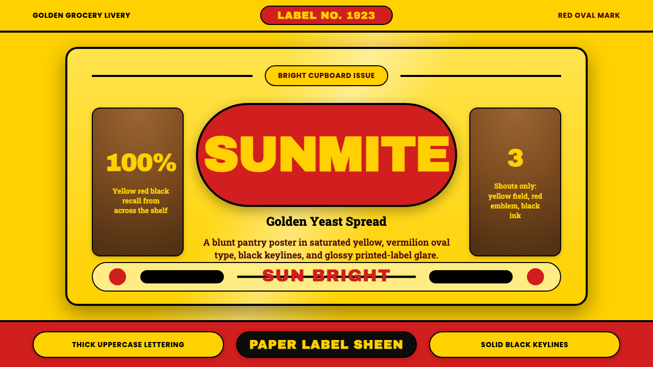
Vegemite turned a wartime pantry staple into instant recognition: a fearless golden-yellow ground, a vermilion oval, and thick black deco lettering that reads from across a room.
Vegemite Jar Label (1923) in brief
Vegemite Jar Label is a design system built for one purpose: instant recognition on a crowded pantry shelf, and it achieves that with a small, fixed vocabulary of shapes and colors rather than illustration or photography. A saturated golden-yellow ground carries a red oval, which in turn carries the product wordmark in heavy uppercase letters, with a black deco-era script anchoring the composition beneath it. Every element sits inside its own hard-edged container — nothing bleeds, nothing overlaps ambiguously.
The system's real engineering is in its shape vocabulary: an oval nested inside a rectangle, everything bounded by thick black keylines. That keyline treatment is what allows the composition to survive being shrunk down to the scale of a small jar label and still read clearly from a distance — the black outlines function the way a bold stroke does in signage, holding the shapes together as a single unit even when the fine detail inside them is too small to parse.
Nothing about the palette or the type is subtle, and that is the entire point. This is a system built to be recognized in under a second, not admired up close — closer to a traffic sign or a national flag in its design logic than to a considered piece of editorial branding. Any softening of the contrast, any gradient introduced to modernize it, works directly against the one job the system exists to perform.
Where does Vegemite Jar Label (1923) come from?
Vegemite was developed around 1922 by food technologist Cyril P. Callister, who worked for Melbourne food company Fred Walker & Co. Callister's task was to find a use for the yeast-extract byproduct of beer brewing — a dark, intensely savory paste — and to turn it into a spreadable product Australians could buy locally, at a moment when imported British yeast-extract spreads were harder to obtain. The product reached shelves in 1923 under a name chosen through a public competition; as company lore has it, the winning entry, Vegemite, was drawn from a hat by Fred Walker's own daughters.
The earliest label was not the bright golden design people recognize today. It leaned closer to the amber, red-and-black commercial branding conventions common in the early 1920s — heavier, more ornamental, and closer in spirit to a chemist's ink-on-paper product label than to the fearless, saturated yellow the brand would eventually settle on. The golden-yellow ground and the confident oval-and-keyline system familiar now were refined gradually over the following decades rather than arriving all at once.
Marketing did as much as packaging to cement the product in national memory. A jingle-driven advertising campaign built around the phrase Happy Little Vegemites, which ran from the 1950s onward, wove the product into the everyday soundtrack of Australian households, and generations of Australians can still recall its melody unprompted. Corporate ownership shifted repeatedly across the twentieth and early twenty-first centuries — Fred Walker & Co. eventually merged with the American company Kraft, and the brand passed through a series of large multinational food conglomerates — but the visual identity itself stayed remarkably stable throughout, even as the company behind it changed hands.
In 2017, the Australian company Bega Cheese acquired Vegemite from its multinational owner, returning the brand to full Australian ownership after decades under overseas corporate control. The visual system carried through that transition essentially unchanged, a decision that reflects just how much brand equity is stored in the yellow-and-red combination itself: surveys have found that Australians recognize that color pairing at a rate close to universal, a level of recall that makes any redesign of the core label a considerable commercial risk rather than a routine refresh.
What defines the Vegemite Jar Label (1923) look?
Color
A single saturated golden yellow covers nearly the entire ground, with a vermilion-leaning red reserved for the oval emblem and primary wordmark, and black used only for outlines and the deco-era script. There is no tertiary color and no tonal gradation within any single shape — every field is one flat, fully saturated value.
Typography
The wordmark is set in heavy, uppercase letterforms designed to be legible at very small physical scale — the size of a jar label viewed from across a kitchen. Letters are wide and evenly weighted rather than condensed or delicate, prioritizing distance recognition over any decorative subtlety in the strokes themselves.
Shape Vocabulary
The composition is built from just two geometric containers — an oval nested inside a rectangle — repeated with total consistency rather than varied. This restricted vocabulary is deliberate: a system built from only a few shapes is far easier to recognize instantly than one built from many, because there is nothing unfamiliar for the eye to parse.
Line Work
Every shape is bounded by a thick, unbroken black keyline. These outlines are not decorative details but structural ones — they are what allow the composition to hold together as a single recognizable unit even when reproduced very small, in poor lighting, or at a glance rather than a careful look.
Contrast
Contrast is kept maximal and hard-edged throughout: saturated yellow against saturated red, both against solid black, with no soft transitions anywhere in the system. This poster-like clarity is what makes the label legible in the split-second glance typical of grocery shopping, rather than the sustained attention a subtler design might reward.
Stability Over Time
Unlike most century-old packaging, which is gradually modernized across generations of redesign, this system has been kept close to frozen, with only incremental refinement rather than reinvention. That stability functions almost like a national emblem rather than an ordinary commercial identity — the value of the design lies specifically in never having meaningfully changed.
Who shaped Vegemite Jar Label (1923)?
The food technologist who developed the Vegemite formula around 1922 while working for Fred Walker & Co., turning a byproduct of beer brewing into a shelf-stable, spreadable paste. His work gave the brand its product; the label's visual identity was built entirely on top of what he created.
The Melbourne food company that commissioned Callister's research and brought the product to market in 1923, running the public naming competition that produced the Vegemite name and establishing the earliest version of the amber-toned label that later evolved into the bright golden design.
A jingle-driven advertising campaign that ran from the 1950s onward, embedding the product into Australian households' everyday soundtrack far more effectively than the packaging alone could. Its enduring cultural memory is a large part of why the brand's owners have been reluctant to alter the visual identity built alongside it.
The Australian company that acquired Vegemite from its multinational owner in 2017, returning the brand to Australian ownership after decades under overseas corporate control, and choosing to carry the century-old label forward essentially unchanged rather than use the ownership change as an occasion for a redesign.
How do you use Vegemite Jar Label (1923) today?
Because the system's entire value lies in maximal, instant recognizability, applying it correctly means resisting every instinct toward subtlety. The core discipline is committing to a small, fixed vocabulary of shapes and colors, used at full saturation and bounded by hard black outlines, rather than layering in gradients, photography, or a wider palette that would soften the poster-like clarity the style depends on.
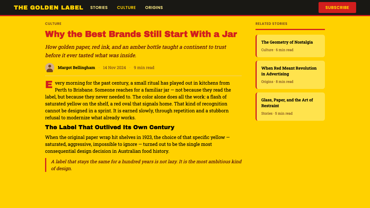
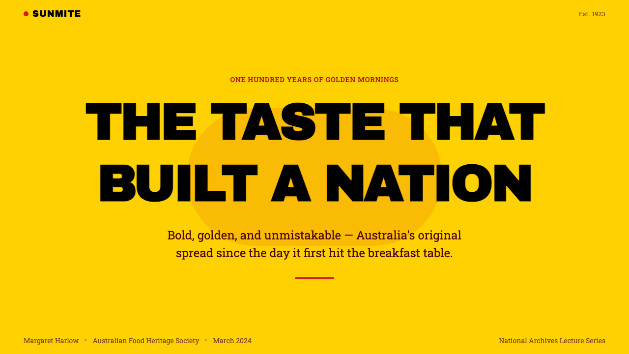
On presentation slides, a cover works well as a full saturated-yellow field with a single red oval or block carrying the title in heavy uppercase type — a composition built to be understood in under a second, even glanced at from the back of a room. Content slides should keep to two or three colors maximum, use bold black outlines around key shapes or containers, and avoid soft transitions between sections. Data slides benefit from the same shape discipline: a single number or bar rendered inside a bold, outlined container reads with the same instant clarity as the jar label itself.
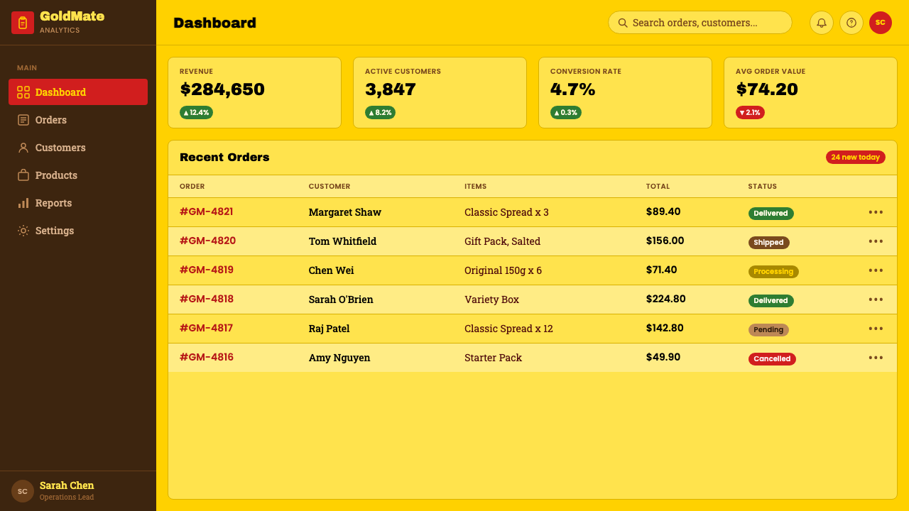
For web interfaces, the palette suits brands built on nostalgia, national or local identity, and category-defining confidence — heritage food and beverage brands, community platforms, or any product that wants to feel established and unmistakable rather than novel. Primary actions benefit from the same oval-and-outline treatment as the emblem itself; backgrounds should stay in the saturated yellow range rather than fading to white, and black keylines should be used consistently around cards, buttons, and panels to hold the interface together the way outlines hold the label together.
In editorial and marketing work, the system supports bold, declarative statements rather than nuanced storytelling. Full-bleed yellow spreads with a single red-and-black mark work well as section openers, and headlines benefit from the same heavy, wide letterforms the label uses. Marketing pages should lean into the style's stubborn, unfashionable confidence rather than trying to make it feel contemporary — softening it defeats the purpose.
The most common mistake is trying to modernize the system by introducing gradients, pastel tones, or a softer, thinner typeface to make it feel more current. Every one of those moves directly undermines the instant-recognition logic the system is built on, which depends on hard contrast and a completely fixed, unvarying vocabulary. A second frequent error is adding photography or illustrative detail inside the oval or rectangle containers — the system's clarity comes specifically from those containers holding flat color and type alone, nothing pictorial.
Vegemite Jar Label (1923) — FAQ
Is this style just 'bold yellow branding'?
No — the color alone is not the system. What makes it work is the combination of a fixed, restricted shape vocabulary, hard black keylines, and maximal contrast, all held completely consistent over a very long time. A bold yellow brand without that structural discipline and historical consistency will read as loud rather than instantly and unmistakably recognizable.
Why does the system rely so heavily on hard black outlines?
Because the label has to work at very small physical scale and under poor viewing conditions — a jar glimpsed from across a kitchen or scanned quickly among dozens of other pantry items on a shelf. A thick black outline holds a shape together as one recognizable unit even when fine internal detail is too small to read, functioning the same way a bold stroke does in road signage.
How is this different from generic Art Deco branding?
Broad Art Deco branding tends toward ornamental flourishes, symmetrical geometric patterning, and a wider decorative vocabulary drawn from architecture and fashion of the era. This system keeps only a narrow trace of that era — the heavy black script accent — and otherwise strips everything down to two flat colors and two nested shapes. It is closer to mid-century commercial packaging discipline than to full decorative Art Deco design.
Does this style work for brands outside food, or outside Australia?
Yes. The transferable idea is not the yellow-and-red color pairing specifically, but the underlying discipline: a restricted shape vocabulary, hard outlines, maximal contrast, and total consistency over time, all in service of instant recognition. Any brand willing to commit to a similarly narrow, unvarying visual system — regardless of category or geography — can borrow that logic, though the specific color pairing should usually change to fit the new brand.
What is the biggest risk in 'modernizing' this style?
Losing the instant recognition the entire system exists to protect. Because so much of the brand's value is stored in an exact, unvarying visual pattern recognized almost universally by the audience it targets, even well-intentioned refinements — softer colors, a lighter typeface, a subtler outline — can measurably reduce recognition rates. The style rewards restraint applied to consistency over time far more than it rewards restraint applied to any single execution.
Related design styles
 Toblerone Matterhorn (1908)A mountain compressed into a mark. Foil gold, alpine red and strict triangles…
 Bavarian Beer HallHearty regional ceremony. Deep flag-blue, Fraktur signage, gold trim, and whi…
 Fiji Bula Floral ShirtLoud cloth, zero quiet corners. Teal ground carries orange blooms and magenta…
 Ghanaian HighlifeMusic before words. Marigold ground, black keylines, red-green signboard bloc…
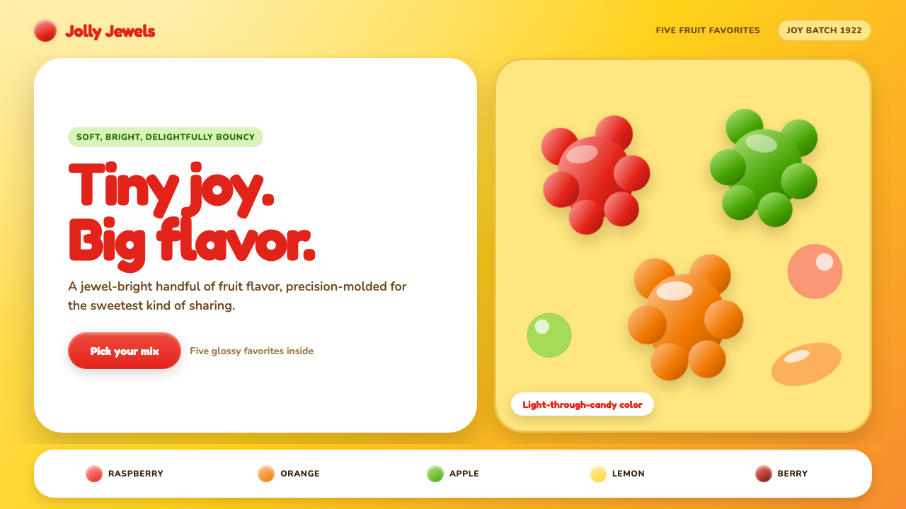 Haribo Goldbears (1922)Childhood joy, precision-molded. Glossy fruit colors tumble across a foil-gol…
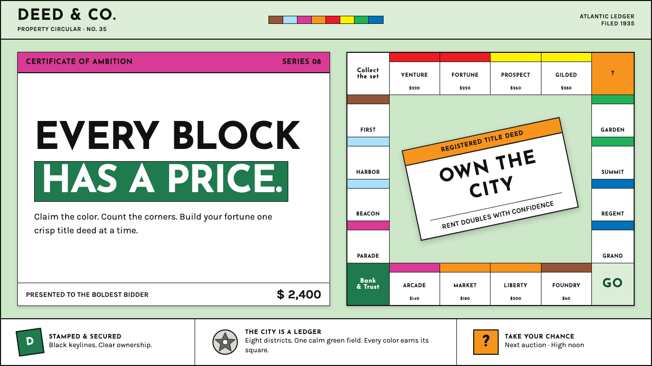 Monopoly (1935)Everything is ownable. Candy-bright deed bands snap across a calm sage board.