What is Surf Life Saving Australia?
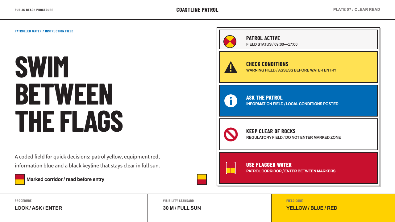
Surf Life Saving Australia turns the beach sign into a design system: coded colour fields, heavy pictograms and condensed capitals, all built to be read from far away, in glare, by someone with salt in their eyes.
Surf Life Saving Australia in brief
Surf Life Saving Australia, usually shortened to SLSA, is a sport with a public safety service attached, and its visual language belongs to the service rather than the sport. The look is the one you meet on the sign board staked at the top of an Australian or New Zealand surf beach: a white powder-coated plate carrying flush rectangular panels in patrol yellow, equipment red and information blue, each panel holding a heavy pictogram silhouette and an imperative caption set in condensed capitals.
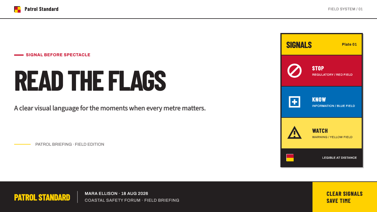
The defining idea is that colour is a code, not a mood. Yellow warns, blue informs, and a red ring on white forbids. These hues are not chosen by a designer's eye but specified against the Pantone system in the organisation's equipment manual, so the same signal reads identically on a sign, a flag, a cap or a rescue board from one beach to the next. Black carries the type, and white is the plate that holds everything together.
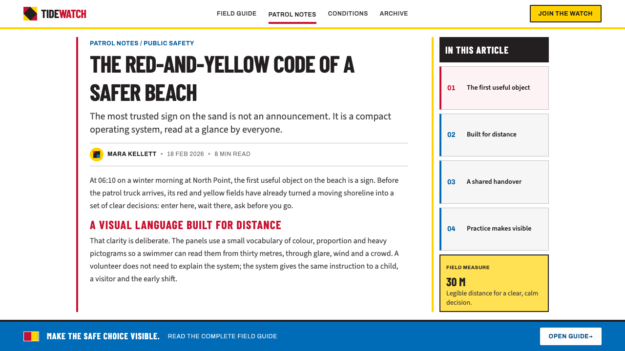
Everything else follows from the conditions of reading. The viewer may be far down the sand, in midday glare, on the move, with wet eyes. So nothing tilts, nothing fades and nothing decorates. Edges are the square corners of cut aluminium. There are no gradients, no shadows and no seascape photographs, and the only test applied to any element is whether it can still be read from a long way off. The one romantic note in the whole system is the channel of water between the red and yellow flags.
Where does Surf Life Saving Australia come from?
Surf lifesaving as an organised movement starts with the first clubs at Bondi and Bronte in 1906 and 1907, on the Sydney coast. Those clubs made patrolling a beach a collective, rehearsed activity and gave it its own equipment and its own vocabulary. The visual identity that grew out of it was never designed in the modern sense. It accumulated from the practical need to be seen, understood and obeyed on a crowded, noisy, sun-struck shoreline.
A flag and cap convention settled between the 1910s and the 1930s. The reasoning is easy to reconstruct: a swimmer in trouble, a patrol member on the sand and a crowd between them have to find each other across surf and distance, so the signals were made blunt, bright and unmistakable. Club boats and surfboats carried their own signwriting, bold lettering painted by hand, which set a bluntness of voice that the later sign boards would inherit.
The second layer is standardisation. Beach signage today follows the Australian standard AS 2416, which governs water safety signs, and that standard sits in the wider ISO lineage of pictogram design: simplified human silhouettes meant to be understood without a shared language. Surf Life Saving Australia and its counterpart in New Zealand, together with the International Life Saving Federation, are the institutions whose conventions run through this system. The practical aim is that a visitor who cannot read English can still tell a warning from an instruction from a prohibition.
That makes the system unusual among heritage design languages. It has no founding manifesto and no single author, only more than a century of rescue practice, equipment manuals and public-safety standards pressing in the same direction. Its beauty is a by-product of a job done well, which is exactly why it rewards literal-minded translation: the closer a designer stays to what a sign board is for, the better the result looks.
What defines the Surf Life Saving Australia look?
Colour as code
Patrol yellow, equipment red and information blue each carry a fixed meaning, with black for type and white for the plate. Colours arrive as full opaque fields rather than tints, and the same hue is never asked to mean two things: yellow warns, blue informs, red marks equipment and prohibition. A palette this strict is its own grammar. Once the reader has learnt it, a glance at the colour says what kind of message is coming before a word has been read.
The white plate
Everything sits on a white powder-coated aluminium plate, matte and slightly hard, the kind of surface that throws back sunlight without glare. The plate is the neutral ground that lets the coloured panels read as separate, deliberate signals. It also makes the whole design behave like a physical object staked in the sand rather than an image floating on a screen.
Flush rectangular panels
Panels stack edge to edge, flush, as strict rectangles with the square corners of cut metal. There is no overlap, no rounding and no gap that is not a deliberate joint. The panel is the unit of meaning: one idea, one colour, one pictogram, one caption. A sign is simply a column or grid of such units, and the reader moves through them in order.
Heavy pictogram silhouettes
Figures are solid silhouettes with no interior detail: a swimmer, a wave, a flag, a raised hand. They descend from the ISO tradition of pictograms, where the aim is recognition at a glance rather than illustration. Strokes are thick enough to survive distance, glare and the occasional smear of sand or salt.
Condensed capitals
Captions are short, imperative and set in condensed capitals. The narrow letterforms let a long word run large inside a panel, and all-caps setting gives every line the same flat silhouette, which helps recognition at range. Verbs lead, so the caption tells you what to do. Long paragraphs of lower-case copy and lyrical headlines have no place here.
Flat, matte, no atmosphere
Nothing fades, glows or casts a shadow. There are no gradients, no soft lighting and no photographs of waves or sunsets. The absence is functional: any effect that softens an edge costs legibility at range, and a rescue sign cannot afford the loss. Where depth appears at all, it comes from panels stacking against the plate, not from simulated light.
Distance-first hierarchy
Hierarchy is set by colour block and position rather than subtle shifts in type. The most urgent message gets the most saturated field and the largest silhouette, and the reading order runs top to bottom through the panels. Secondary information is allowed to be small, but it is never allowed to compete in colour with the primary warning.
Who shaped Surf Life Saving Australia?
The national body and, in practice, the author of the system: its equipment manual fixes patrol yellow and equipment red against Pantone, and its patrol, flag and cap conventions supply the vocabulary. Treat it as an institution rather than a studio. The look is a by-product of rescue practice, which is why it has the discipline of an operating manual rather than the polish of a brand book.
The New Zealand counterpart, whose beaches share the visual conventions of this system. Its place in the story is a reminder that the look is a regional one held in common across the Tasman, with signage that a swimmer moving between the two countries would recognise at once.
It stands for the international layer of the story: the wider lifesaving community whose shared practice and pictogram conventions help explain why a beach sign in one country is intelligible in another. Through this layer the Australian sign board connects to the global ISO tradition of silhouette pictograms.
Formed in 1906 and 1907, these clubs are the origin point of organised surf lifesaving in the story. They are where the colour and lettering habits that the later system would formalise began to take shape. No single person is credited with the look; the clubs themselves are its authors.
How do you use Surf Life Saving Australia today?
Surf Life Saving Australia is one of the most literal design languages in any library. It translates best when you treat the screen or the slide as a sign board and ask the same question of every element: can it be read at a glance from far away? It suits any content that has to instruct, warn or sort information, and it is least forgiving of decoration.
For presentation slides, a cover works as a single sign: a white plate, one large coloured field, one title in condensed capitals written as an instruction, and one silhouette in place of an illustration. Content slides become stacks of flush panels, each carrying one idea and one caption, with colour used to assign category rather than add variety. Data slides take naturally to the colour code, with yellow for caution, red for stop or critical and blue for neutral information, so a bar or a cell carries its meaning before the axis is read.
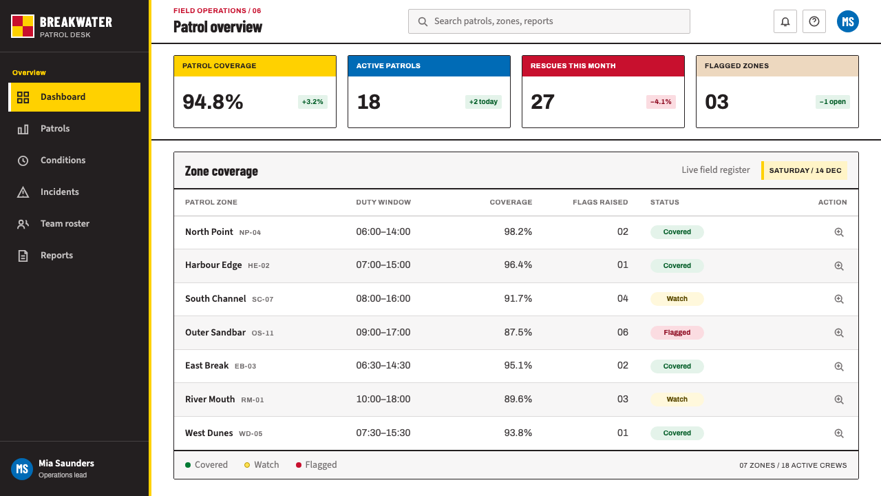
For web interfaces, the system fits status pages, incident dashboards, safety and compliance tools, permission screens and any product where a state has to be recognised in an instant. Build cards as flush rectangular panels with square corners, make buttons into labelled panels with imperative verbs, and set pricing tiers as a row of coded panels. Navigation can be as plain as a column of captions. Skip hover glows, soft cards and rounded friendliness; they belong to a different grammar.
For editorial and marketing work, the style suits rules, guidelines, public-service explainers, event information, wayfinding and campaign posters that give instructions. A page can be laid out as a tall sign board, a stack of panels each beginning with a verb. It is a poor match for atmospheric storytelling or luxury positioning, and an excellent one wherever trust and clarity are the brand.
The common mistake is treating the three colours as a cheerful beach palette. Colour in this system is a signal, so spreading yellow, red and blue across a page for variety dilutes every warning on it. If every panel is yellow, nothing is a warning. The second mistake is softening: adding gradients, rounded corners or drop shadows turns a sign into a sticker and loses the discipline that gives the style its authority. The third is surf nostalgia, with sunsets, waves and sand textures, all of which the system conspicuously leaves out.
Surf Life Saving Australia — FAQ
Is this the same as generic hazard or warning signage?
The logic is shared, since both come from the same ISO tradition of pictograms, but this system is more specific. Generic warning signage tends to use colour to grade danger in industrial settings. Surf Life Saving Australia adds a coastal patrol identity: the pairing of patrol yellow and equipment red, the white powder-coated plate, the condensed capitals and a silhouette vocabulary that belongs to the beach. The family resemblance helps people understand it at once, while the particular colours and plate make it recognisably Australian and New Zealand.
Can it work on a dark background?
The system is built around a white plate, so the safest dark-mode move is to keep the plate light and treat it as an object set on a dark surround, rather than inverting everything. If the whole page must go dark, keep each panel a full opaque colour field with the strongest available contrast for its type, and never use tints or glows to compensate. The legibility rules matter more than the polarity.
Why condensed capitals rather than a friendlier typeface?
Because the job is reading at distance. Narrow letterforms let a longer word fill a panel at a large size, capitals give every line the same flat outline, and imperative phrasing keeps the message short enough to take in at a glance. A friendlier, rounder typeface would reduce the size at which a caption fits and soften the outline that makes it recognisable from afar. Friendliness is a different goal from the one this system serves.
How many colours can one layout use?
Think of colour as an alphabet in which every letter has a meaning. A layout can use all three signal colours if it has all three kinds of message to deliver, but each should appear only where its meaning applies, and one of them should lead. Black for type and white for the plate do the structural work, so the coloured panels stay rare enough to stay urgent.
Where does the style struggle?
It struggles where warmth, softness or personality is the point: wellness, lifestyle, children's products, luxury and long-form reading. It also becomes tiring when applied to dense text, because condensed capitals are designed for short instructions. Use it where the message is a command or a status, and let a gentler system carry the rest.
Related design styles
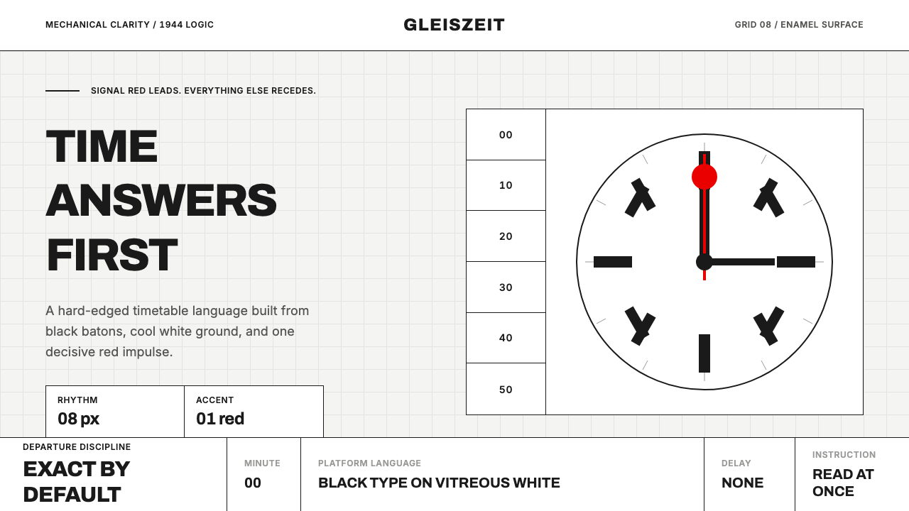 Swiss Railway ClockPrecision refuses decoration. Black batons and one red hand cut through ename…
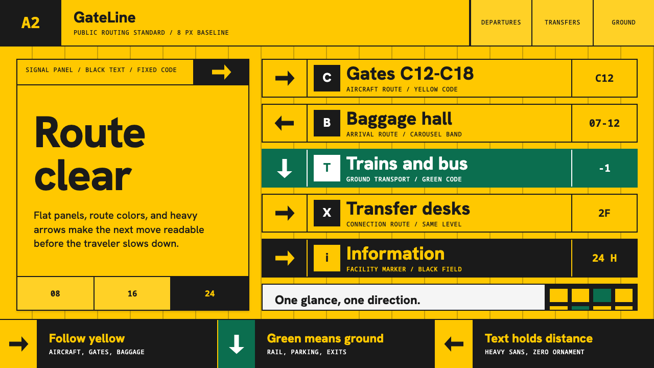 Airport Wayfinding GeometricLegibility becomes command. Signal yellow, black sans, and green route bands…
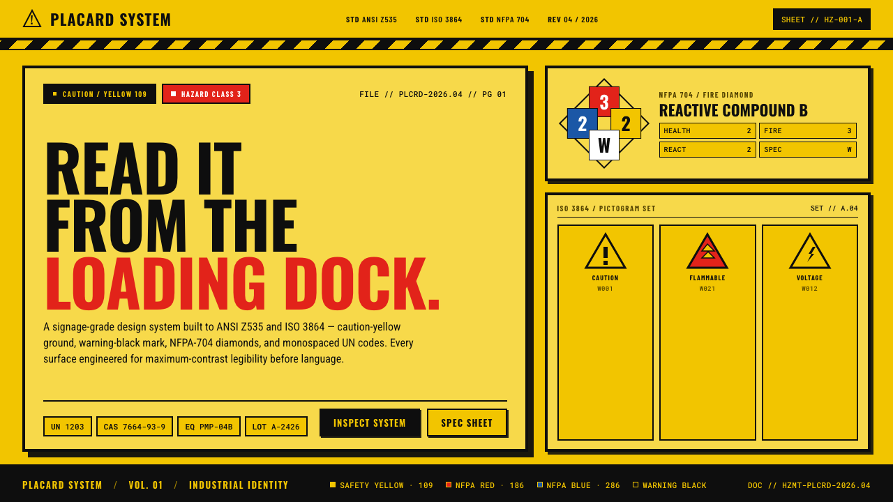 Hazmat SignageRead it from the loading dock. Caution-yellow ground, NFPA diamonds, monospac…
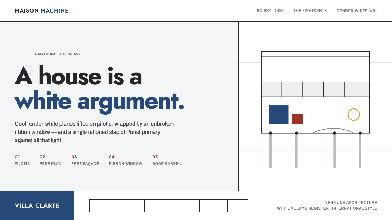 Le Corbusier Purist WhiteA house is a white argument: render-white planes, ribbon windows, one slap of…
 All Blacks Silver FernOne colour, total force. Jet-black field, a single metallic-silver fern, whit…
 CircleCI Pipeline-GreenConfidence goes green. Emerald status lines cut through terminal-black pipeli…