What is Astro Boy?
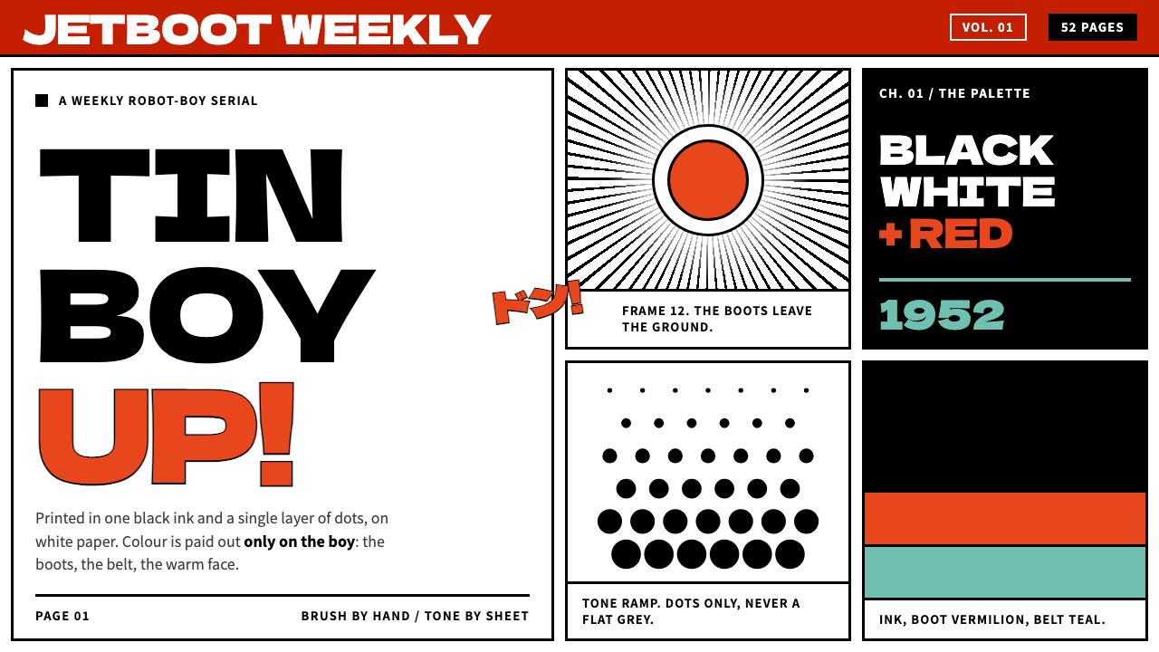
Astro Boy's printed page is white paper, black brush ink and mechanical dots, with colour spent only on the boy himself.
Astro Boy in brief
This design system is built from the printed page of Tetsuwan Atomu, known in English as Astro Boy, the manga Osamu Tezuka serialised in Kobunsha's Shōnen magazine from 1952 to 1968. The ground is white paper. Everything else is black brush ink and a mechanical benday dot, the dot screen that does all of the shading. There is no wash, no airbrush and no gradient anywhere on the page.
Colour appears only where the character is coloured: vermilion boots, a teal waistband and warm skin. The rest of the page stays monochrome, so the boy is the only thing the eye can find at once. Layouts read as a spread of panels separated by hard gutters of bare white, and now and then a figure breaks through a border. The sense of speed in those moments comes from concentration lines, never from blur or gradient.
The result is a style that is graphic, lively and disciplined at the same time. It looks like a page that was meant to be printed cheaply and read quickly, and it turns that constraint into character. It suits any project that wants a confident, narrative, slightly retro-futurist look without relying on glossy rendering or a crowd of colours.

Where does Astro Boy come from?
The source is a manga serial. Osamu Tezuka's Tetsuwan Atomu ran in Kobunsha's Shōnen magazine from 1952 to 1968, a span of sixteen years that took in much of Japan's postwar recovery. It belongs to the tradition of postwar story manga, a form Tezuka did more than anyone to shape, in which a long narrative unfolded over many instalments and a serial page had to hold a reader's attention on its own. The shōnen serial, aimed at young readers and published in a magazine, was the vehicle that made that kind of storytelling a habit.
The page logic comes from print. A page produced with black ink alone has no colour to spend on shading, so tone is built from a mechanical dot screen laid over the drawing. That is where the benday dot comes from, and it explains the look: line work in brush ink, flat areas of black, and tonal passages made of regular dots rather than blended grey. The system keeps that logic intact. Shading is a pattern you can see, not a gradient you cannot, and edges are decisions made by a hand with a brush.
The character then moved to television. On 1 January 1963, Mushi Production turned the series into Japan's first weekly television animation, and it was broadcast in black and white. The programme belongs to the history of limited-animation TV anime, in which economy of movement was part of the style, so that held poses, strong silhouettes and speed lines carried the energy. The English-language version reached audiences through the American television adaptor Fred Ladd, and a colour remake followed in 1980.
Each stage left something in the design system. From the magazine page comes the white paper, the brush ink and the hard-gutter panels. From the print process comes the dot screen. From black-and-white television comes the habit of letting a strong shape do the work that colour might otherwise do. And from the character's colour life, including the remake of 1980, comes the logic of the palette: vermilion boots, a teal waistband and warm skin, the only places on the page where pigment is allowed.
What defines the Astro Boy look?
White paper ground
The ground is plain white paper, with no tint, no texture overlay and no simulated ageing. The paper is a working surface, not a mood. Because nothing competes with it, every ink mark has full contrast, and the large untouched areas become part of the composition. The emptiness of the page is as deliberate as the drawing on it.
Brush ink line
Outlines are black brush ink, confident and slightly varied in weight, with solid black used for heavy masses such as hair and deep shadow. The line is never softened or tinted. It gives drawings and interface edges alike a handmade authority, a sense that each contour was put down once, in a single decision, rather than adjusted until smooth.
Benday-dot shading
All tone comes from one mechanical dot screen, regular and visibly printed. Mid-tones and shadows are patterns of dots, not gradients and not blur. The dots are a texture you can see up close and a flat tone from far away, which makes them a quiet signature of the system. Using a single screen throughout keeps the page coherent; mixing several would look noisy.
Colour only on the boy
Pigment belongs to the character: vermilion boots, a teal waistband and warm skin. Nothing else on the page may be coloured, including backgrounds, panels and decoration. This is the system's central rule and its most effective trick. Because colour is so scarce, wherever it does appear it means this is the protagonist, and the eye goes there before it reads anything else.
Hard-gutter panels
The page is divided into panels separated by gutters of bare white. The gutters are firm and consistent, and the panels are different sizes to control pace: a small panel quickens, a wide one slows. Layout is therefore a form of timing. Reading order is clear without arrows or numbers, because the grid itself tells the reader where to go next.
Breaking the frame
Occasionally a figure steps out of its panel and overlaps the border. This is the page's way of shouting. The break is rare enough to carry weight, and the speed it implies comes from concentration lines drawn with the brush, not from motion blur or gradient trails. In interface terms, it is the single element permitted to ignore the grid.
Monochrome broadcast logic
The original television series was broadcast in black and white, and the system inherits the discipline that implies. Shapes must read as strong silhouettes, contrast must come from black against white, and nothing may depend on colour to be understood. A page that works in monochrome first is one in which colour, when added, is a bonus and not a crutch.

Who shaped Astro Boy?
Tezuka created Tetsuwan Atomu and serialised it in Kobunsha's Shōnen magazine from 1952 to 1968. He is the central figure of postwar story manga, and the series set many of its habits: cinematic panel pacing, expressive brush line and a character defined by a few bold visual choices. The design system borrows his page rather than his character, taking the discipline of ink, dots and panels.
Fred Ladd was the American television adaptor through whom the series reached English-language audiences. His role marks the point at which a Japanese serial page became an international television property. For design purposes, he is a reminder that the style travelled well: black-and-white broadcast and a strong visual identity were enough to carry it across languages.
Mushi Production was Tezuka's animation studio, and on 1 January 1963 it launched the series as Japan's first weekly television animation. Working at a weekly pace pushed the studio toward limited animation, in which strong poses, held frames and speed lines replaced constant motion. Those economies of drawing are part of the visual language the system takes on.
Kobunsha's Shōnen was the magazine in which the manga ran from 1952 to 1968, and it stands for the shōnen serial publishing model: young readers, regular instalments and a page that had to be legible at a glance. The constraints of that format, a fixed page, limited printing and quick reading, are the real source of the system's economy and its confident layouts.
How do you use Astro Boy today?
The Astro Boy style works best when a project has one hero and everything else exists to support it. Its rules are simple enough to apply anywhere, provided they are applied strictly: white ground, ink-black structure, dots for tone, and colour reserved for the one thing that deserves it.
For presentation slides, a cover can be a single large panel on white with a heavy black frame and one coloured element, such as a logo mark or key object, set against it. Content slides work as panel grids, each panel holding one idea, with hard gutters between them. Data slides suit the style well: fill bars and areas with a dot screen rather than solid grey, and give colour only to the series the audience must notice.
For web interfaces, cards become panels with thin black borders and firm gutters, and the layout reads like a comic spread. Dashboards benefit from the rule that colour marks the protagonist, for example the selected account or the current state, while everything else remains in ink and paper tones. For pricing, use three equal panels and colour only the recommended plan. Replace soft shadows with solid black offsets or none at all.
For editorial and marketing work, the style is a natural match for sequential storytelling: product explainers, onboarding flows, case studies and educational material that move step by step. It also suits science, robotics and retro-futurist subjects, where the page can borrow a sense of optimism from its source. Let one image per spread break its frame to give the page a moment of speed.
The most common mistake is to spread colour across the page because it feels dull without it. The dullness is the point; the colour on the protagonist only works against a monochrome field. Other errors include using smooth gradients and soft glows where dots belong, mixing several dot sizes, rounding every corner into a soft card and filling the gutters with decoration. Hard gutters and a single screen are what keep the page honest.

Astro Boy — FAQ
What is a benday dot, and why does the style avoid gradients?
A benday dot is one of the regular dots of a mechanical screen used to produce tone in print. Because the original page was printed in black ink alone, every mid-tone had to be built from such dots. A gradient would contradict the source. Dots keep the page flat and honest: you can see how the tone is made, and the result stays crisp at any size.
Why does colour appear only on the boy?
Because the printed page is monochrome and the character is the only thing that carries colour: vermilion boots, a teal waistband and warm skin. Restricting colour in this way makes the protagonist unmissable and gives colour real meaning. In practice, it translates into a rule that only the hero element, whether a product, a selected state or a key figure, may be coloured.
How does the style relate to the anime series?
The system is built from the printed manga page, not from the television programme. Still, the programme shaped the design in two ways. It was broadcast in black and white from 1 January 1963, which reinforces the monochrome discipline, and the colour remake of 1980 put the character's palette on screen. The style borrows the page's visual grammar rather than the character's artwork.
When should a figure break out of its panel?
Rarely, and only for the most important moment on a page or screen. The break works because everything else respects the border. Use it for a hero image, a key announcement or a call to action, and no more than once per spread. If several elements break the frame, none of them reads as exceptional and the layout loses its pace.
Is this style only suitable for comics, children's content or retro projects?
No. The visual rules, which are white ground, ink line, dot tone, hard panels and rationed colour, are structural and work in any context that benefits from clear hierarchy. They suit education, product walkthroughs, technical explainers and brands with an optimistic, human-scale view of technology. They are less suited to luxury, atmospheric or soft-focus branding that depends on blended colour.
Related design styles
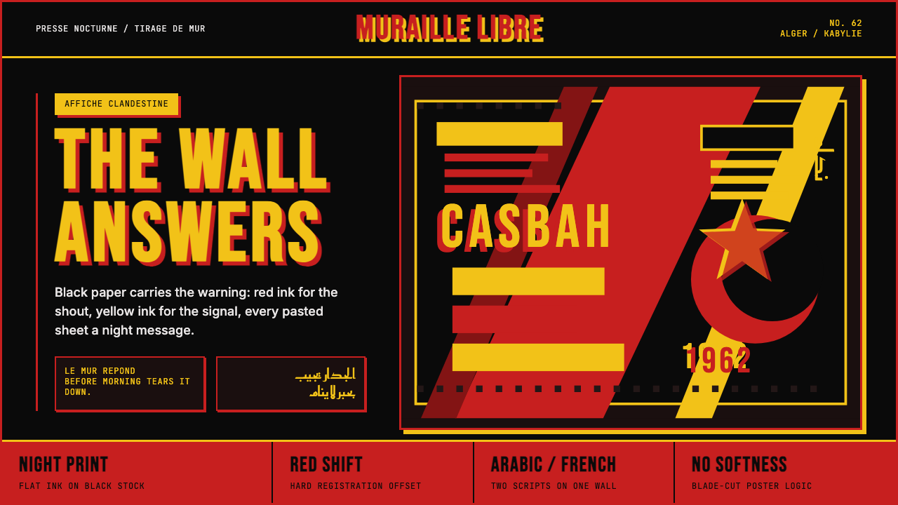 Algerian Casbah Poster (1954–1962)Every surface is a manifesto. Blood red, warning yellow, and stencil type hit…
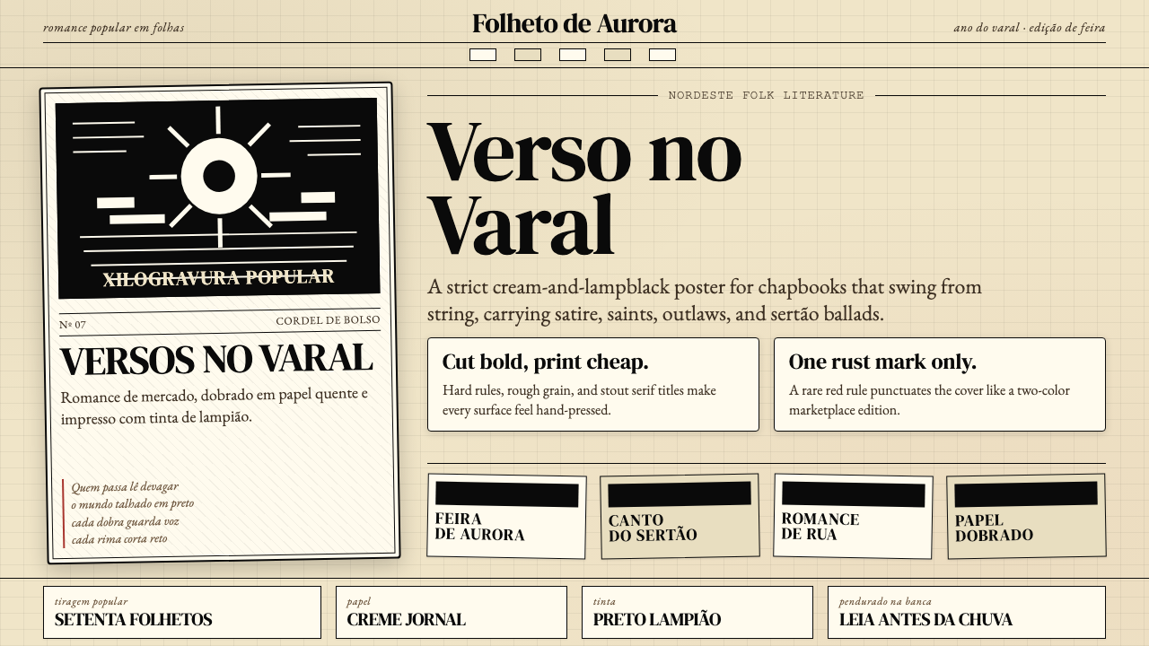 Brazilian Cordel (Northeast Folk Literature)Folk poetry, cut in lampblack. Cream newsprint, bordered chapbooks, one rust-…
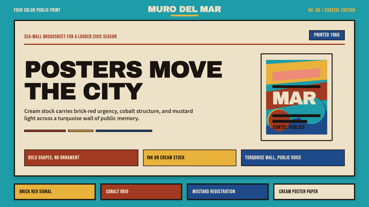 Cuban Malecón 1960 PosterPublic voice in flat ink. Turquoise wall, cream stock, brick red and cobalt b…
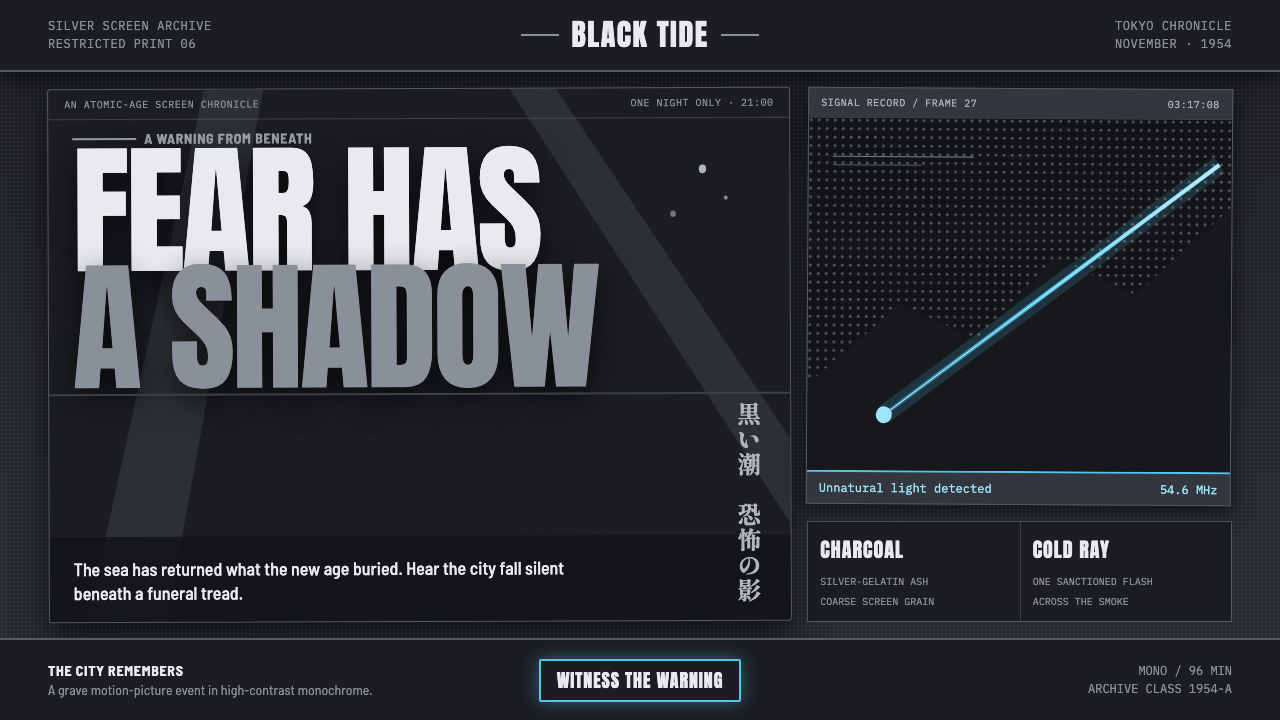 Godzilla (1954 Showa)Fear takes monumental form. Charcoal halftones split under one atomic-blue ra…
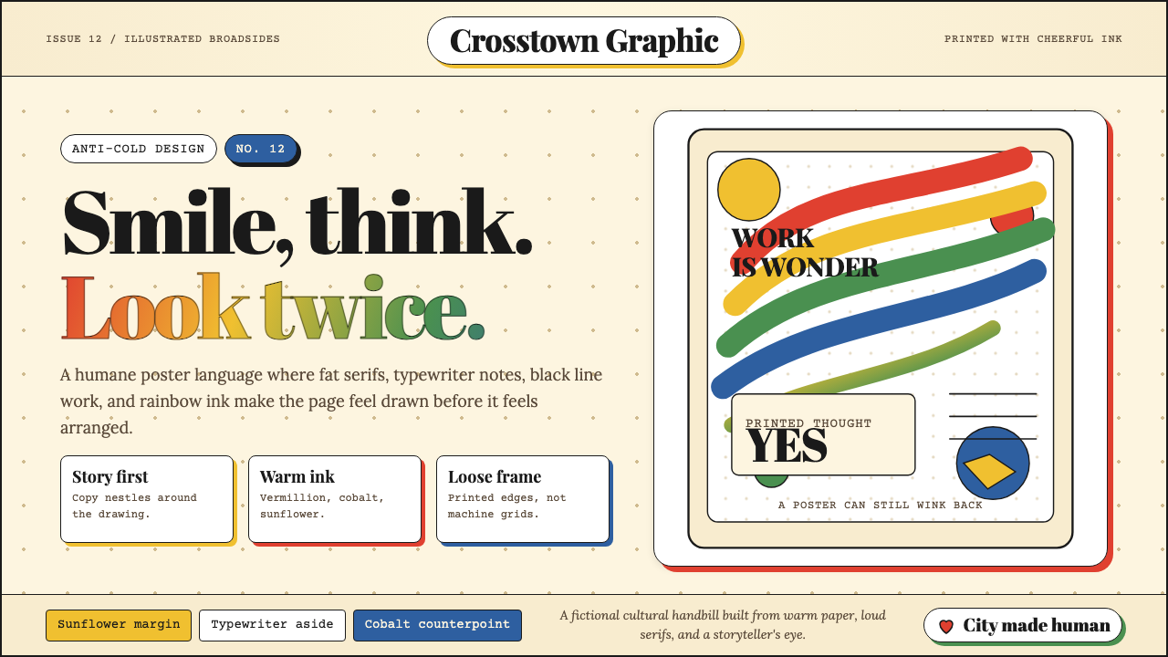 Milton Glaser / Push PinWarm counter-Swiss joy. Vermillion, cobalt and sunflower arcs orbit fat serif…
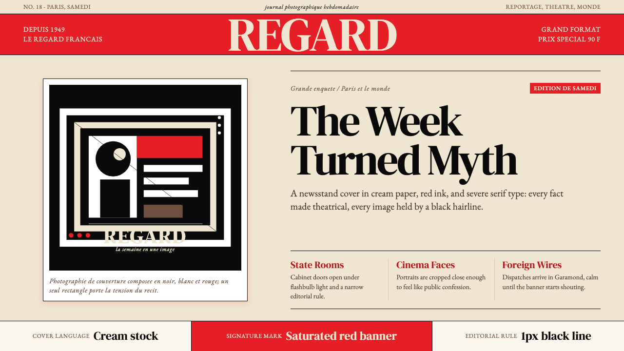 Paris MatchThe cover shouts in one red slab. Cream paper, serif headlines, and black rul…