What is Asmat Bisj Ancestor Pole?
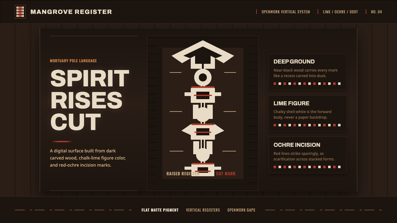
Asmat Bisj Ancestor Pole turns mourning into vertical force: pale ancestral bodies rise through dark carved wood, cut by red-ochre marks of memory and obligation.
Asmat Bisj Ancestor Pole in brief
The Asmat bisj pole is a ceremonial monument from the Asmat region of southwest New Guinea. Carved from ritually felled mangrove wood, it arranges openwork human figures in a continuous upward stack and culminates in a pierced tjemen wing-board. It was raised during bisj feasts to honor the dead and call upon their avenging spirit.
Its visual authority comes from sequence rather than decoration. Bodies, limbs, voids, and carved intervals are bound into a single vertical ascent: the viewer reads the monument from its grounded base through ancestral figures toward the open crest. The pole is not an object with an image placed on it; its silhouette, carving, and ritual purpose form one inseparable structure.
As a digital design language, the tradition becomes a near-black carved-wood field, lime-white figures that appear to emerge from it, and red ochre reserved for cuts, scars, emphasis, and ceremonial tension. The result should feel matte, carved, and upright rather than glossy, paper-like, or softly atmospheric.
Where does Asmat Bisj Ancestor Pole come from?
The bisj pole belongs to the ceremonial tradition of the Asmat region in southwest New Guinea, now Papua, Indonesia. Its recorded source context places it within mortuary observance and ancestor-veneration: a monument made not merely to remember someone absent, but to make the claims of the dead present within communal ritual.
Bisj feasts, practiced in the ceremonial tradition described from the early twentieth century through the middle of that century, gave the pole its purpose. The dead were honored and their avenging spirit summoned. This function explains the work's concentrated physical language: stacked figures do not behave as detached portraiture but as an ancestral presence made cumulative, insistent, and public.
The carving process established the visual code. Asmat master carvers, known as wow-ipits, worked deeply into mangrove wood and coated the surface in white burnt-shell lime. Red ochre marked scarification lines, while black soot indicated hair. The pigments were not a loose decorative palette; they clarified carved form and ritual identity across a dark, matte wooden body.
For contemporary interpretation, the most important historical lesson is that the visual system carries ceremony rather than exotic surface pattern. The tall silhouette, pierced crest, layered human forms, lime-white coating, red-ochre cuts, and soot-dark details all derive their force from a mortuary tradition of honor, remembrance, and avenging imagery.
What defines the Asmat Bisj Ancestor Pole look?
Vertical Ascent
Composition should read as an uninterrupted climb. Stack figures, marks, and openings along a firm central axis, allowing the eye to travel from a dense lower field toward a more open crest. Broad horizontal bands weaken the reference because they interrupt the pole’s ritual rise.
Carved Darkness
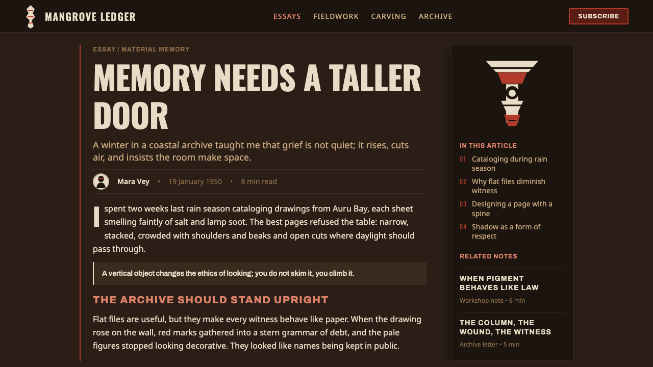
The ground is near-black wood, not an empty black screen. It should feel absorbent, dense, and materially carved, with negative space treated as depth cut from a solid body. Keep surfaces matte so pale forms appear revealed from within the wood rather than illuminated by a digital glow.
Lime-White Figures
Lime-white is the figure color. It belongs to burnt-shell lime coating and should read as mineral, ceremonial, and slightly severe, never as soft cream or ordinary paper white. Use it to establish bodies, major symbols, and the clearest informational layer against the dark ground.
Red-Ochre Cuts
Red ochre works best as incision and emphasis, echoing scarification lines rather than filling large decorative fields. Apply it where an ancestral form needs tension, where hierarchy changes, or where the composition requires a deliberate wound-like interruption. Its scarcity gives it ceremonial force.
Openwork Silhouette
The pole’s carved openings and pierced tjemen crest suggest that absence is active structure. In a layout, use cutouts, apertures, and framed voids to separate figures and imply carving. These voids should be purposeful and upright, not airy decoration or a generic rounded pattern.
Matte Ritual Restraint
Every element should look placed, carved, or coated. Avoid simulated shine, soft atmospheric depth, and ornamental texture layered merely for richness. The system gains intensity through hard distinctions between wood-dark ground, mineral-white form, ochre cut, and soot-dark detail.
Who shaped Asmat Bisj Ancestor Pole?
Wow-ipits are the Asmat master carvers identified in the source tradition. Their role matters because the bisj pole is not a generic sculptural object: its deeply cut mangrove body, openwork figures, and pigment treatment depend on skilled carving knowledge joined to ceremonial purpose.
Bisj feast sponsors are named as key participants in the ceremonial setting that raised the poles. They locate the monument within collective responsibility: the pole’s memorial and avenging function belongs to a feast and its obligations, rather than to private display or individual decoration.
Clan elders are likewise central to the source context. Their presence frames the pole as an ancestral and communal form, linking carved human figures to continuity, remembrance, and the ritual recognition of the dead. A respectful design adaptation should preserve this collective gravity.
How do you use Asmat Bisj Ancestor Pole today?
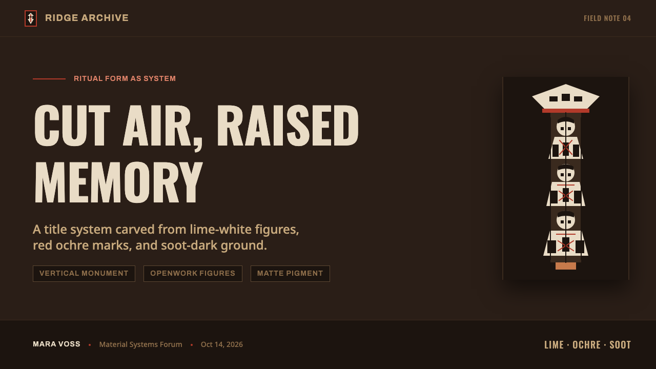
For presentation covers, use the full height of the frame as a ceremonial field. Let a pale, simplified ancestral figure or stacked silhouette rise from a dark carved ground, with the title aligned to that upward movement rather than centered as a neutral label. On content slides, retain a strong vertical spine and let section labels, supporting notes, and dividers attach to it. Do not turn every slide into a carved illustration; the structural ascent is often enough.
For data slides, treat charts as carved marks within the same hierarchy. The clearest figures can use lime-white, while red ochre calls out a decisive comparison, threshold, or exception. Keep labels direct and calm against the dark field. A dense chart should still feel organized by vertical grouping and intentional voids, not by glowing effects or a crowded collection of colored categories.
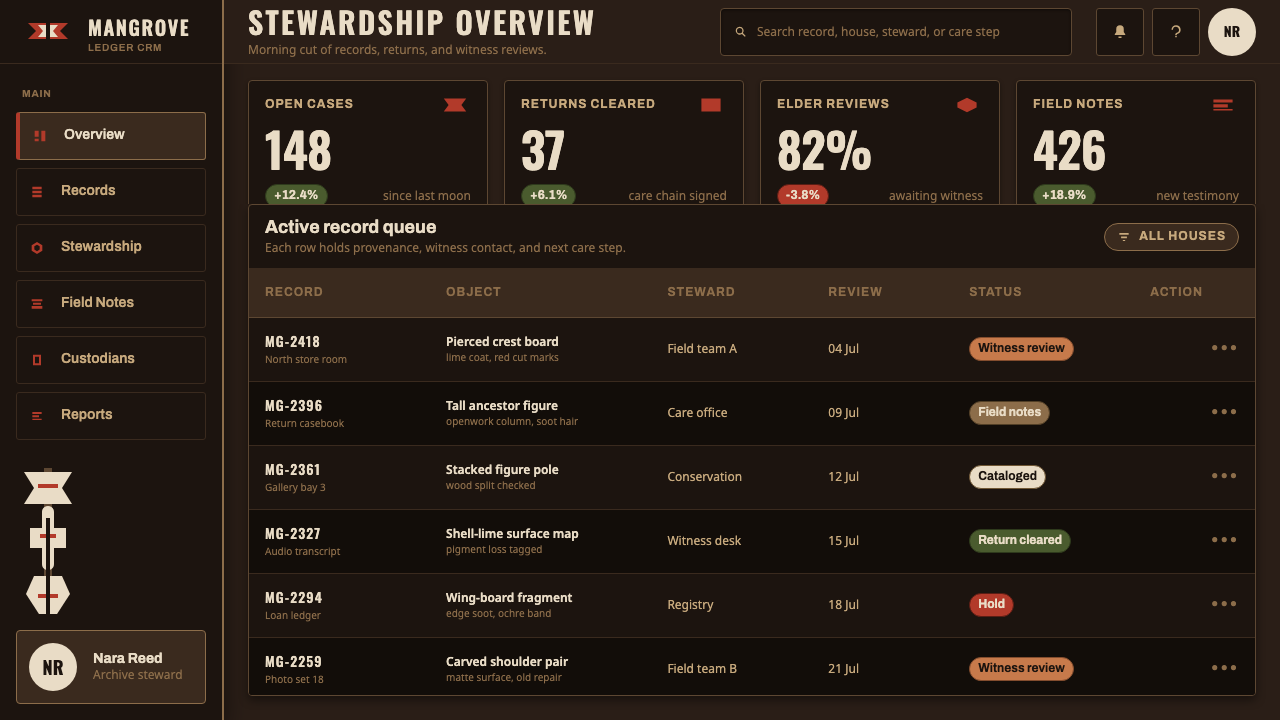
For web interfaces, this language fits dashboards, archive experiences, cultural education, and pages that benefit from solemn hierarchy. Establish a dark matte foundation, use pale figures and typography for primary reading, and reserve ochre for active states or consequential actions. Panels should feel like sections cut from a single field. Navigation can follow a vertical rail or stacked sequence, making the interface feel coherent without reproducing a pole literally.
For editorial and marketing work, use the style to frame a story with gravity. A long article can move through dark sections punctuated by pale figure-like motifs, while a campaign page can use red-ochre cuts to identify key moments, calls to action, or transitions. Keep the language explanatory and culturally specific; this is better suited to contextual storytelling than to using ancestral imagery as a fashionable texture.
The common mistake is reducing the system to a dark background with red accents. That loses the relationship among carved wood, lime coating, scarification marks, soot details, vertical stacking, and mortuary purpose. Another mistake is making the white read as luxury paper or adding shine and soft depth. The reference works when restraint lets the dark field, pale emergence, and rare red cut carry distinct roles.
Asmat Bisj Ancestor Pole — FAQ
Is this style simply a dark tribal-inspired visual treatment?
No. The source material identifies a specific Asmat mortuary tradition with particular objects, materials, pigments, participants, and ceremonial purposes. A responsible application starts from the bisj pole’s vertical ancestral structure and ritual context. Treating its forms as an interchangeable tribal motif removes the very meaning that gives the system its visual discipline.
Why should lime-white not be treated like cream or paper white?
Because the pale color refers to burnt-shell lime coating applied to the carved monument. Its role is material and ceremonial: it makes figures and carved structure legible against dark wood. In a digital adaptation, it should feel mineral and assertive. A soft paper-like white shifts the reference away from coated carving and toward a conventional editorial palette.
How should red ochre be used without overwhelming the composition?
Use it as a cut, a line of scarification, or a precise signal of changed importance. The source associates red ochre with scarification lines, so its strongest digital role is selective interruption rather than broad filling. When pale figures already carry primary recognition against dark wood, ochre becomes more powerful by remaining rare and deliberate.
Can the visual language work for a light interface?
A light interface can borrow selected ideas, especially vertical sequencing, cutout structure, and restrained ochre emphasis, but it will no longer reproduce the central contrast described in the source. The digital system is founded on lime-white figures emerging from a near-black carved-wood ground. If the background becomes light, preserve the distinction through dark carved fields rather than flattening all surfaces into paper-like neutrality.
Related design styles
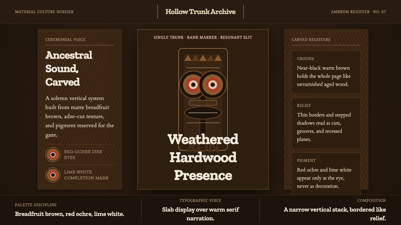 Ni-Vanuatu Slit Gong AmbrymSolemn wood made digital. Dark breadfruit brown, carved borders, red-ochre ey…
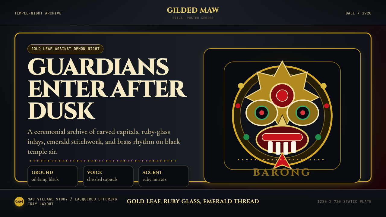 Balinese Barong Mask (1920)Protection glows after dark. Cinzel capitals frame gold, ruby, and emerald ge…
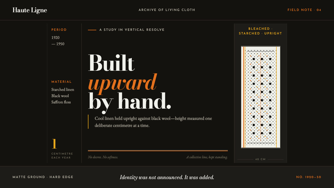 Bigouden CoiffeIdentity stands tall. Starched linen rises over matte black, edged in saffron…
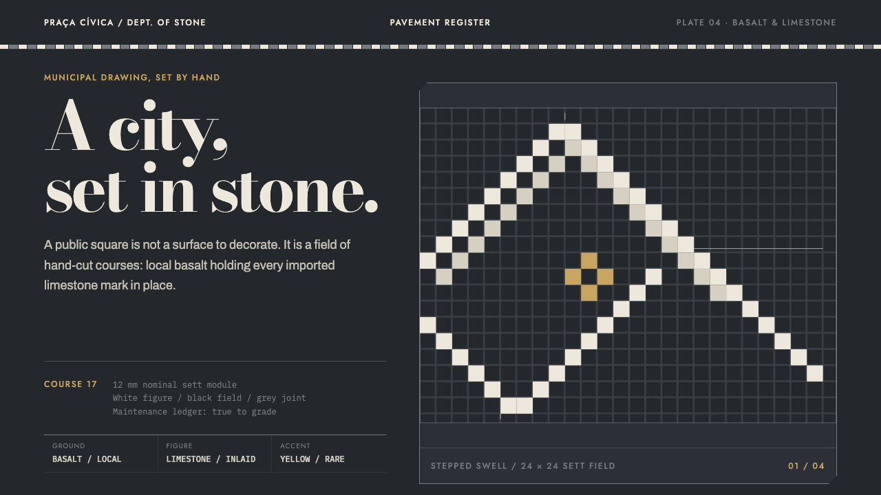 Calçada PortuguesaA city drawn in stone. Stepped limestone courses cut across a basalt grid.
 Greenlandic KalaallisuutColour, kept by rule. Hard-edged bead bands blaze symmetrically across a seal…
 Guatemalan Huipil Maya WeaveMemory is woven dense. Cochineal red, black selvage, and brocade bands hold t…