What is Asahi Super Dry?
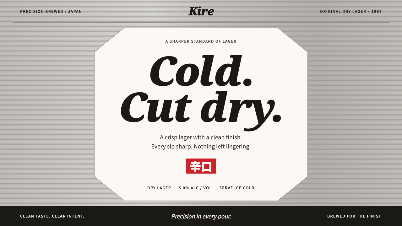
Asahi Super Dry turns a beer can into a lesson in cold precision: brushed silver, fine pinstripes and one white octagon that reads from across the room.
Asahi Super Dry in brief
Asahi Super Dry is the visual identity of a Japanese beer launched in March 1987. The design takes its cues from the can itself: a brushed silver ground, fine horizontal pinstripes, and a white octagonal label that carries the black italic Asahi logotype, a serif italic 'DRY' and heavy black Japanese characters for the words karakuchi, meaning dry or sharp in taste, and nama, meaning draught.
The system is industrial and spare. Everything is centred and strictly symmetrical, colour is almost entirely silver, white and black, and the only warmth is a single red seal that appears one at a time, for example to mark a limited edition. Lettering is sized to be read from across a room, because a can in a bar or on a convenience-store shelf has to be recognised in an instant.
As a reference for interfaces, its value is a kind of cold, sharp clarity. It shows that a design can feel premium and modern with almost no colour, by relying on material texture, one strong shape and large, confident type. It suits product launches, beverage retail and anything that needs to look chilled, crisp and decisive.

Where does Asahi Super Dry come from?
The Super Dry story begins in Japan in the mid-1980s, when Asahi was a brewer in a difficult position and the market was ready for something new. The beer launched in March 1987 and quickly set off what the Japanese press called the dry beer war, a rush by competing brewers to release their own dry-tasting beers. The word dry became the dominant idea in the category, and Asahi's can became its most recognisable picture.
The visual identity was part of a larger change at the company. A corporate identity renewal took place in 1986, shortly before the launch, and was carried out with the Nippon Design Center. Such programmes were characteristic of the bubble era in Japan, when companies invested in a unified logo, typography and colour system to express a modern, international character. The black italic Asahi logotype that sits on the can is a product of that period.
Several people are associated with the beer's rise. Kotaro Higuchi is remembered as the Asahi executive who led the company's turnaround and the push behind Super Dry, and Yasuo Matsui is another key figure from the same effort. Their strategic choices, a clear single taste idea and a bold, simple package, are part of why the design is so direct. The design values a message that could be understood in a second.
The can went through stages. The pinstripe can is associated with the years 1992 to 2022, a long run in which the silver, striped surface became familiar across Japan and abroad. In 2022 the brand carried out a global renewal, adjusting its look while keeping the elements people recognised. That continuity across decades is a strong sign of how well the original structure, a silver ground, a white label and large dark type, had been conceived.
What defines the Asahi Super Dry look?
Brushed Silver Ground
The base is a cool silver that imitates brushed aluminium, with a slight directional sheen. It is the whole mood of the system: metal, cold, factory-clean. Because the ground is neutral, every dark element placed on it gains sharpness. In digital work it is best handled as a flat, cool grey with a faint gradient across it, never as a fussy photo texture.
Fine Horizontal Pinstripes
Thin horizontal lines run across the silver surface at an even spacing, giving it the feel of a machined metal can. The stripes are subtle enough to be a texture, yet regular enough to read as a deliberate pattern. They emphasise width and stability, and they lend rhythm to what would otherwise be an empty field. Keep them faint so that the type remains the loudest thing on the page.
White Octagonal Label
The core shape is a white octagon placed at the centre. It is the brightest area in the composition and therefore the focal point. An octagon sits between a circle and a rectangle: it looks sturdy and badge-like, and recalls both a stamp and a stop sign. In layout terms it is a strong container, one big shape that holds all the identifying text.
Italic Logotype and Serif DRY
The Asahi name appears in black italic lettering, forward-leaning and energetic, while the word DRY is set in a serif italic with a more traditional, almost editorial feel. The pairing of a sans-style logotype with a serif word gives the label both speed and authority. The italic angle is the system's one gesture of motion, set against otherwise static symmetry.
Heavy Japanese Characters
The words karakuchi and nama are set in very heavy black Japanese type, large enough to be read from across a room. These characters carry the product's promise, dry and draught, in a way that Latin letters alone could not for a Japanese consumer. The weight is deliberate: the strokes look cut rather than drawn, which reinforces the feeling of sharpness.
Strict Centred Symmetry
Every element is aligned on a single vertical axis. There are no offsets, no asymmetric tension and no decorative surprises. This is why the label reads in an instant: the eye has one place to start and moves straight down. Symmetry also communicates reliability, a quality that matters for a mass-produced product that is supposed to taste the same every time.
One Red Seal at a Time
The system's only warm colour is a small red seal, used one at a time, for example to flag a limited edition or a special message. Because red appears so rarely, it works as a signal rather than a decoration. This is the discipline to copy: choose a single accent, keep it small, and never let two compete for the same moment.

Who shaped Asahi Super Dry?
Remembered as the Asahi leader who drove the company's recovery and the launch of Super Dry. His commitment to a single, clear taste idea explains why the package is so direct and why the design treats a one-second message as a goal.
Another key figure associated with the Super Dry effort and the company's renewed identity. His work sits alongside the 1986 corporate identity programme and the March 1987 launch, which together defined the brand's modern character.
The Japanese design studio associated with Asahi's corporate identity renewal. Its involvement ties the can to the bubble-era practice of building a unified logo, typography and colour system, which is the source of the label's discipline.
How do you use Asahi Super Dry today?
Asahi Super Dry is useful whenever a design has to feel cold, precise and instantly recognisable, with very little colour. Its method is portable: one neutral metallic field, one strong container shape, large dark type, centred alignment and a single, rare accent.
For presentation slides, it works best for product launches and brand reveals. A cover can be a silver-grey field with faint horizontal lines, a white octagon at the centre and a short title set in heavy black type. Content slides should stay on the single axis, with one headline and one supporting line per slide, nothing wider than the central column. Reserve the red seal for a single callout such as a new release, and avoid adding a second colour.
For web interfaces, the style fits product pages, launch microsites, event sign-ups and beverage or consumer-goods retail. A silver-grey page background with subtle stripe texture, a white central container, big dark headings and a single red badge for the featured item will read immediately. Buttons should be black with white text or white with black text, and the layout should keep a clear vertical flow. On dashboards, use the system sparingly, as a calm cool frame for numbers set in large type.
For editorial and marketing work, it suits posters, packaging mock-ups, out-of-home and retail displays where recognition at distance is the priority. Large type, a central shape and strict symmetry carry well in print and in the street, and the single red seal gives a clean way to flag promotions without clutter. It is also a good fit for campaigns that want a Japanese industrial flavour without relying on cliché imagery.
The common mistakes are to add more colours, which destroys the chilled feeling, and to make the stripes or the metallic gradient strong enough to fight with the text. Another error is to break the symmetry for the sake of interest. The system's force comes from its rigidity, so keep the axis, keep the label dominant, and use the red seal only once per view.

Asahi Super Dry — FAQ
What is the Asahi Super Dry design system based on?
It is based on the Asahi Super Dry can, launched in Japan in March 1987: a brushed silver ground, fine horizontal pinstripes and a white octagonal label with a black italic logotype, a serif italic DRY and heavy Japanese characters.
What was the dry beer war?
After Super Dry launched, competing Japanese brewers rushed to release their own dry-tasting beers, a period the press called the dry beer war. Dry became the dominant idea in the category, and Asahi's can became its most recognisable image.
Why is the layout so symmetrical?
A single vertical axis lets the eye start in one place and move straight down, so the label reads in an instant. Symmetry also signals reliability, which suits a mass-produced product meant to taste the same each time.
How should the red accent be used?
As a small seal, one at a time, to flag something special such as a limited edition. Because it appears rarely, it works as a signal rather than decoration. Using it more than once per view weakens the whole system.
Which projects suit this style best?
Product launches, beverage and consumer-goods retail, event sign-ups, posters and packaging mock-ups, and any design that must look cold, sharp and recognisable from a distance with very little colour.
Related design styles
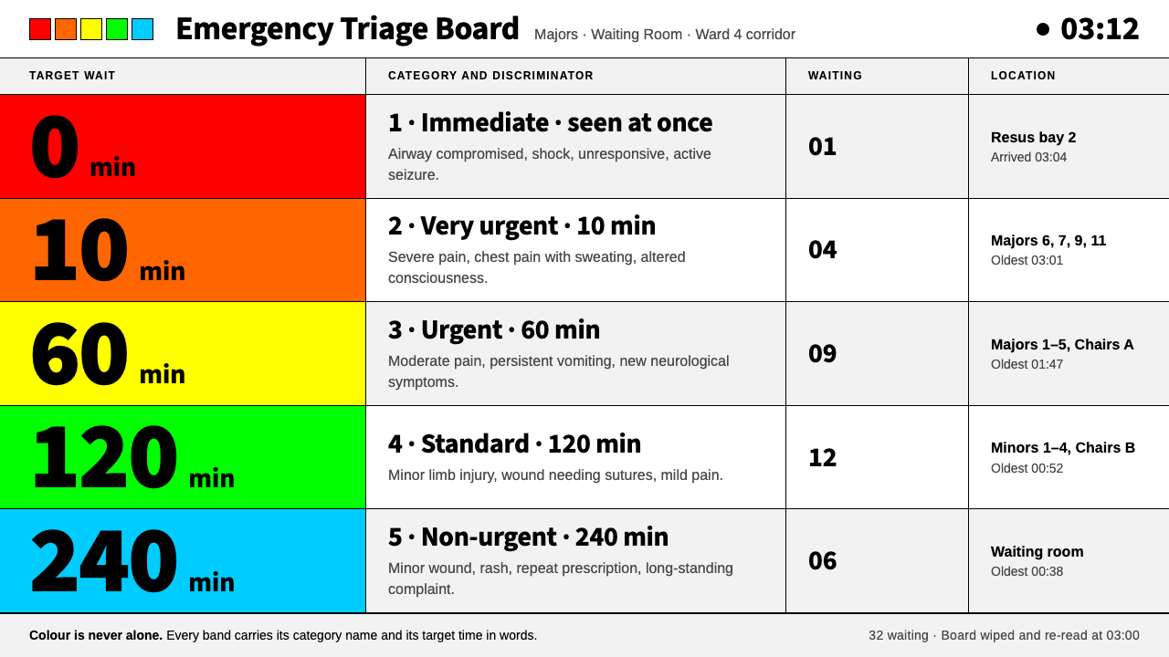 Emergency Triage BoardColour never speaks alone. Five flat priority bands on white, black signage s…
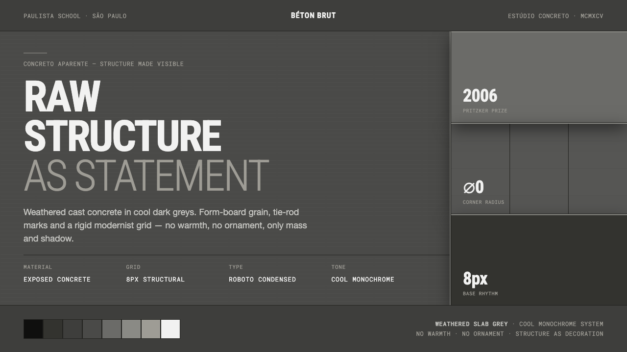 Brazilian Paulista ConcreteStructure made visible. Weathered béton-brut greys, hard cast shadows, conden…
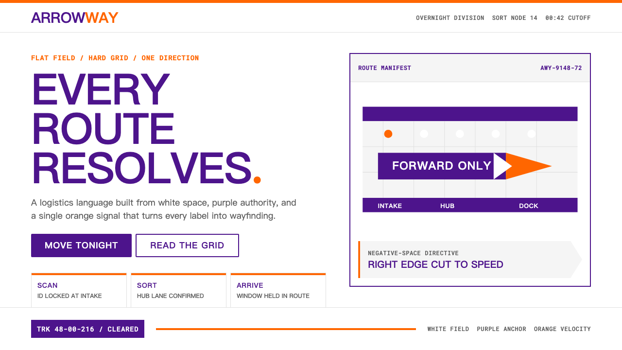 FedExDirections, not decoration. Purple authority and one orange bar organize a fl…
 Tokyo 1964 (Kamekura)Ceremony reduced to a mark. Crimson disc and gold rings lock to a black axial…
 Tokyo 2020Order as public service. A ring of 45 indigo chequer blocks and hard-edged co…
 2001 — A Space OdysseyAbsolute restraint. Black void, white monolith geometry, one HAL-red signal.