About Asahi Super Dry
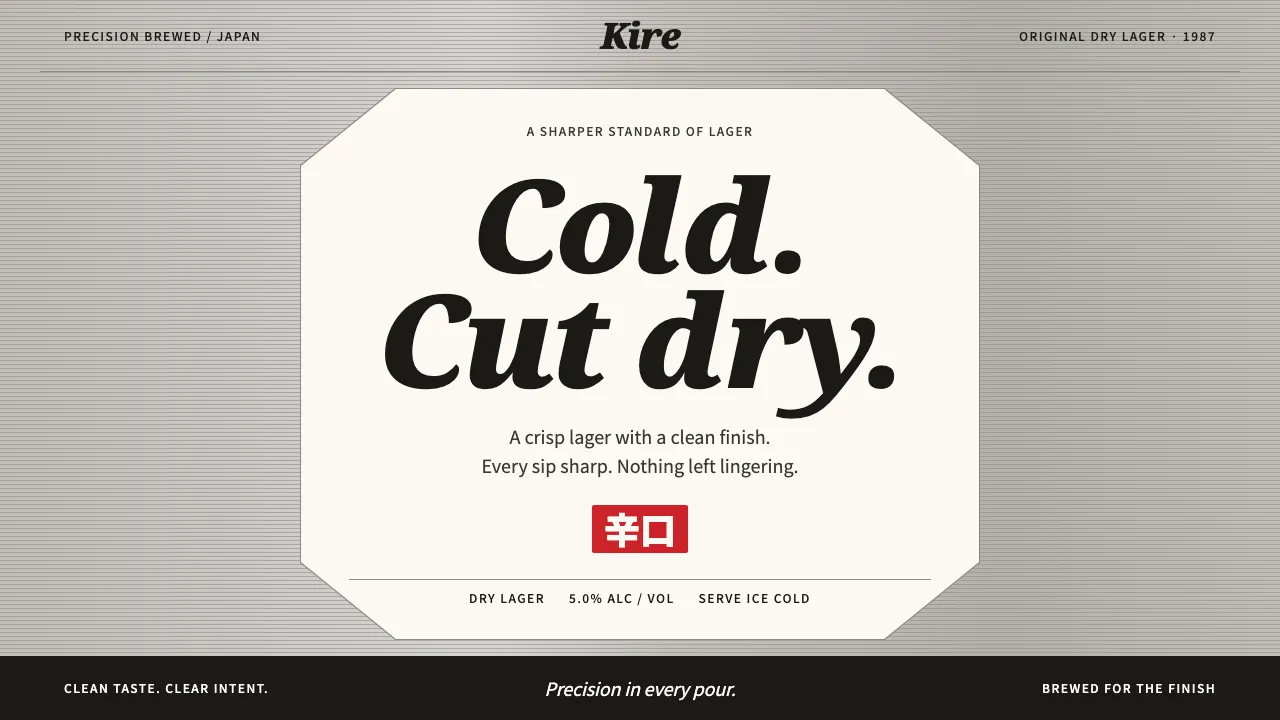
A design system taken from the Asahi Super Dry can: brushed silver ground, fine horizontal pinstripes, and a white octagonal label carrying the black italic Asahi logotype, a serif italic "DRY" and heavy 辛口 type.
It is industrial and spare, with strict centred symmetry, one red seal at a time, and lettering sized to read from across a room. Use it for product launches, beverage retail and anything that has to look cold and sharp.
- Origin
- Tokyo, Japan
- Era
- 1986 Asahi CI renewal; March 1987 launch; pinstripe can 1992–2022; global renewal 2022
- Key figures
- Kotaro Higuchi · Yasuo Matsui · Nippon Design Center
- Movements
- Japanese dry beer war (ドライ戦争) · Bubble-era corporate identity programmes · Metallic can packaging
Asahi Super Dry design spec
Colors
Background
Surface
Primary
Secondary
Accent
Text
Typography
Noto SerifHeadings
Noto Sans JPBody
OswaldMono
Unlock for 1 credit
The other 11 sections — buttons, cards, spacing, motion, techniques and more — open once you unlock. Download the DESIGN.md or send it to your AI in one click. Unlock once, yours forever.
Sign up nowHave an account? Sign in
Styles similar to Asahi Super Dry
Also inspired by brands & products, with a close feel.
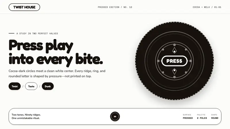 Oreo (1912)Contrast you can feel. Cocoa-black discs and milk-white rings turn every surface into relief.
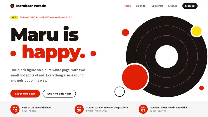 KumamonA black circle on pure white. Official red lands only on cheeks, buttons and date badges.
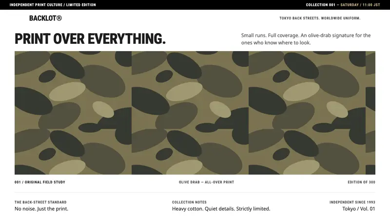 A Bathing ApeThe print does the talking. Olive-drab repetition dominates a white, condensed-type frame.
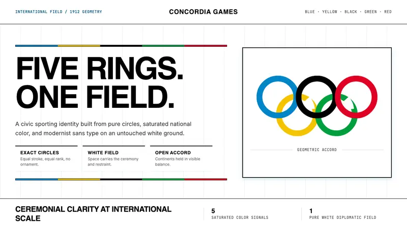 Olympics Five Rings (1912)Ceremony without noise. Saturated five-ring color on pure white, locked to a civic grid.