What is Tokyo 2020?
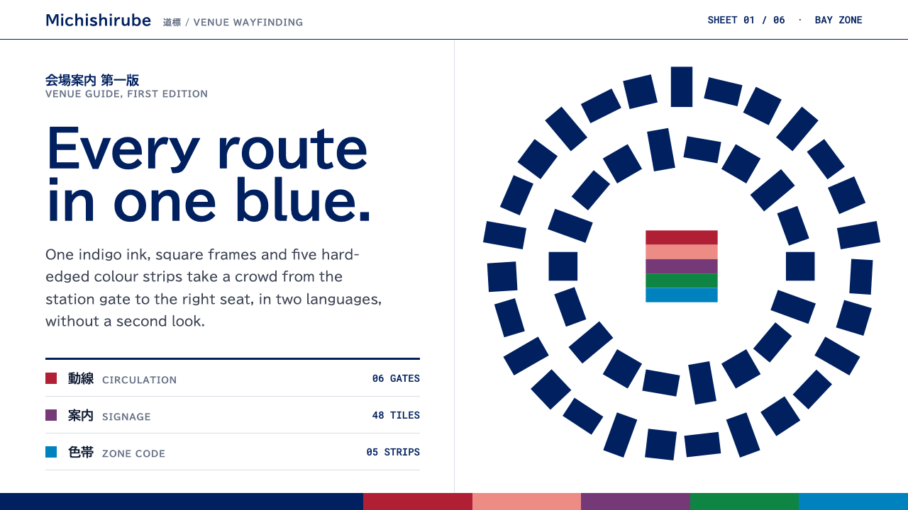
Tokyo 2020 treats order as a public service: indigo chequered blocks, framed pictograms and flat colour strips on white wayfinding sheets.
Tokyo 2020 in brief
Tokyo 2020 is a visual system built from indigo rectangles. Asao Tokolo's Harmonized chequered emblem arranges 45 pieces of three different rectangular shapes into a ring, each filled with ai, the traditional Japanese indigo blue. Masaaki Hiromura's sport pictograms freeze athletes in mid-motion inside a strict square frame, rendered as indigo on white or white on indigo.
This theme carries that discipline to the screen. Surfaces are white wayfinding sheets, layouts follow orthogonal grids, and fills are flat and solid, with no gradients. Hard-edged colour strips from the Look of the Games, based on the traditional kasane colour combinations, are stacked as section markers, giving the page a clear, ceremonial rhythm.
The feeling is calm authority. It is the visual language of a place that expects thousands of strangers to find their way without effort, so everything is legible at a glance. Yet it does not feel cold, because the indigo, the strips and the expressive human figures in the pictograms bring warmth and a sense of occasion.

Where does Tokyo 2020 come from?
The look draws on two layers of Japanese design history. The first is the ichimatsu moyo, the chequered pattern popular in the Edo period, which Asao Tokolo reinterpreted for the Games emblem. His version was selected in April 2016 and uses three rectangular forms in indigo, arranged so that the pieces appear to expand and connect, a visual statement about diversity brought into harmony.
The second layer is kasane no irome, the Heian-period practice of layering coloured garments so that the edges showed in subtle combinations. The Look of the Games drew on this idea to build a palette of colour strips, among them red, cherry blossom, wisteria, pine and a bright indigo. The result links a modern global event to a very old Japanese sense of colour, without relying on cliché imagery.
The sport pictograms have their own lineage. Masaaki Hiromura's set was unveiled on 12 March 2019 and deliberately honours the 1964 Tokyo Games, whose pictograms by designers including Masaru Katsumi and Yoshiro Yamashita are widely regarded as a founding moment of modern public pictogram design. The new set gives athletes more fluid movement while keeping the strict framed discipline of the original.
The Games themselves were held from July to September 2021 after a postponement. Along the way the visual identity matured into a universal-design wayfinding system: bold, flat, comprehensible without words, and consistent across venues. It sits within the tradition of public information design in which clarity is itself a form of hospitality, and it remains a strong reference for interfaces that need to guide many different people.
What defines the Tokyo 2020 look?
Indigo as the base colour
Ai, a traditional Japanese indigo, carries the system. It fills the emblem pieces and the pictogram frames, and it appears as text and blocks on white. The colour feels deep, calm and unmistakably Japanese.
Chequered rectangles
Layouts are built from rectangles in a chequered rhythm, echoing the ichimatsu pattern. Blocks, tiles and cards all sit on a visible grid, which gives pages a sense of order and modular completeness.
Framed pictograms
Icons are placed inside a strict square, with the figure in motion rendered in a single colour on a contrasting ground. The frame provides discipline, while the posture of the figure provides life.
White wayfinding sheets
Pages sit on clean white panels like signage boards. The white ground maximises legibility and makes every indigo element stand out as a deliberate signal.
Kasane colour strips
Hard-edged strips in kurenai red, sakura pink, wisteria, pine green and bright ai are stacked as section markers. They come from layered garment colours of the Heian period and give the page a ceremonial rhythm.
Flat, solid fills
There are no gradients, soft shadows or textures. Every area is a single solid colour with a crisp edge, which keeps the system clear, printable and easy to read from a distance.
Orthogonal structure
Edges and alignments run horizontally and vertically, with few diagonals or curves apart from the figures themselves. This gives the interface the steady calm of well-designed public signage.

Who shaped Tokyo 2020?
Designer of the Harmonized chequered emblem, selected in April 2016.
Designer of the sport pictograms unveiled on 12 March 2019.
A designer associated with the pictograms of the 1964 Tokyo Games, the precedent the new set honours.
A designer associated with the 1964 Tokyo Games pictograms alongside Katsumi.
How do you use Tokyo 2020 today?
In slides, the style suits civic, institutional and event presentations: public programmes, conference wayfinding, annual reports and sports briefings. A cover can be a white slide with an indigo chequered block pattern, a clear title and a stack of colour strips along one edge. Content slides should follow a visible grid, with pictogram-style icons in square frames, and data slides can use flat indigo bars with one strip colour marking the key figure.
On the web, it fits wayfinding-heavy products: event sites, transport and venue guides, government services, university portals and anything where many different people need to find something quickly. Use white panels, a modular grid, framed icons and strips as section markers. Keep buttons solid and rectangular, and make every fill flat so that the page remains clear in print and on low-quality screens.
For editorial and marketing work, it serves cultural and sporting publications, festival programmes and design writing about Japan. Headlines can be set plainly, with indigo used as the main text and block colour, and the strip colours reserved for section signals. Photography works best when cropped into rectangles that join the grid rather than floating over it.
The usual mistake is to make it decorative. Adding gradients, drop shadows or rounded blobs removes the public-service clarity that defines the style. A second mistake is to use all the strip colours at once without hierarchy, which turns a ceremonial rhythm into confetti. A third is to ignore the frame discipline of the pictograms, letting icons spill and vary in size. Keep it flat, gridded and consistent.

Tokyo 2020 — FAQ
What is the Tokyo 2020 visual style?
It is a system of indigo rectangles: a chequered emblem ring of 45 pieces by Asao Tokolo, framed sport pictograms by Masaaki Hiromura, white wayfinding sheets, flat solid fills and kasane-inspired colour strips.
What is the ichimatsu pattern?
Ichimatsu moyo is a traditional Japanese chequered pattern that was popular in the Edo period. The Tokyo 2020 emblem reinterprets it with three rectangular shapes in indigo, arranged to suggest diversity coming together.
What are kasane colour strips?
Kasane no irome is the Heian-period practice of layering coloured garments so that edges showed in combinations. The Games' Look drew on it to create strips in red, cherry blossom, wisteria, pine and bright indigo.
How do the pictograms relate to 1964?
The 2019 set deliberately honours the pictograms of the 1964 Tokyo Games, associated with designers such as Masaru Katsumi and Yoshiro Yamashita, while giving athletes more fluid motion within the same strict frame.
What products does this style suit?
Wayfinding-heavy and public-facing products: event sites, venue and transport guides, government and university portals, and institutional reports. It suits any interface where clarity for many different people matters most.
Related design styles
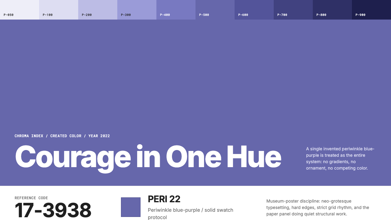 Pantone Very Peri (2022)Color becomes authority. Periwinkle field, reference codes, and white paper i…
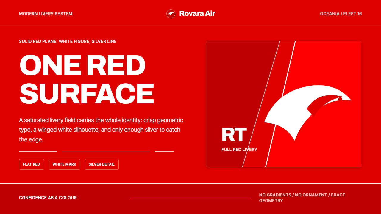 Qantas Flying KangarooConfidence is one red field. White silhouette, Archivo type, silver hairlines.
 Retool Internal-Tools RedPrecision ships fast. Electric blue panels, Inter type, and bordered UI mocku…
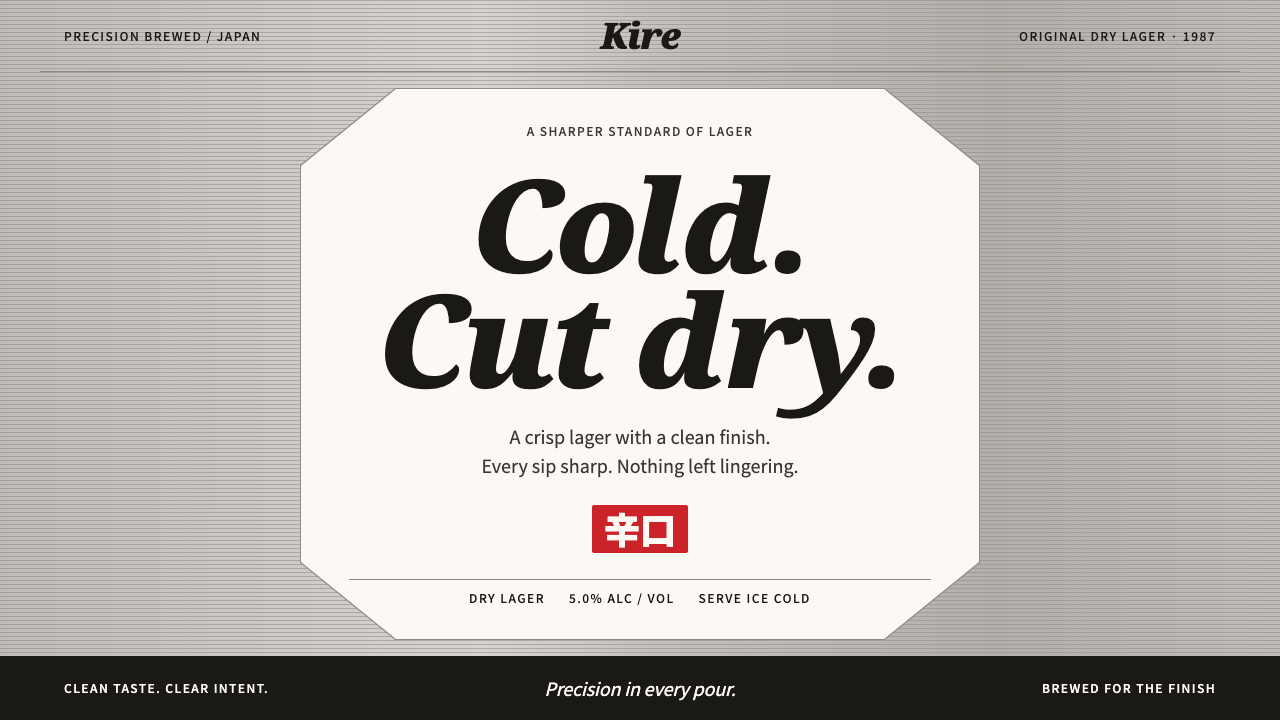 Asahi Super DryCold precision at a glance. Black italic type on a white octagon and pinstrip…
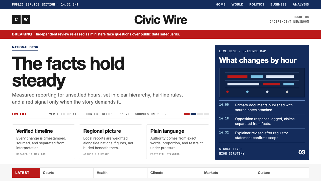 BBC NewsPublic trust, stripped bare. Red alerts, deep navy and hairline grids make ur…
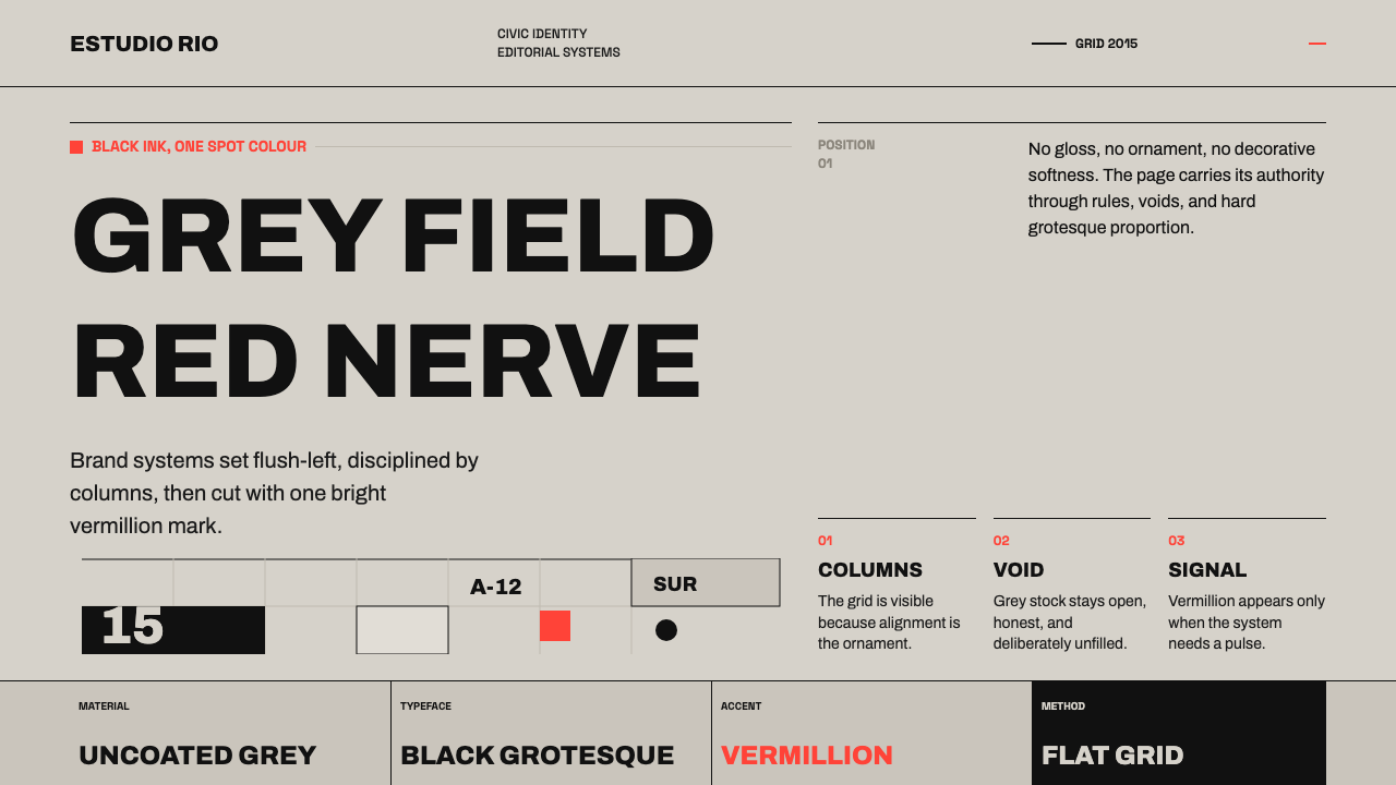 Buenos Aires Branding StudioRigour with nerve. Black grotesque on warm grey, pierced by one vermillion ma…