What is Qantas Flying Kangaroo?
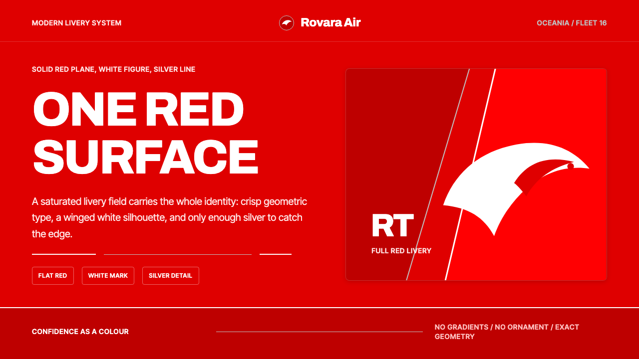
Qantas turns absolute confidence into a single plane of red: a white kangaroo silhouette on a saturated field, finished with precise geometric type and quiet silver detailing.
Qantas Flying Kangaroo in brief
Qantas Flying Kangaroo is a design system built on a single decision: let one saturated, glossy field of red be the entire brand surface, rather than treating red as an accent on a white or neutral ground. The modern identity, refreshed in 2016 under design director Hans Hulsbosch, wraps a leaping white kangaroo silhouette across the tail and fuselage of the aircraft, with fine silver line detailing as the only other visual element allowed into the composition.
The logic is proportional as much as chromatic. Earlier airline liveries of this kind typically treat white as the dominant surface and use color sparingly, as a stripe or a tail marking. This system inverts that ratio: red becomes the majority field, and white is reserved almost entirely for the kangaroo mark itself, which reads as a confident cutout rather than a printed logo sitting on top of a background.
Type and metal accents are used with the same restraint as the color. A custom, geometric wordmark in crisp white sits cleanly against the red, built for legibility at a distance rather than for personality or flourish, while thin silver hairlines mark structural edges the way rivets or panel seams do on the aircraft itself. Nothing gradients, nothing textures — the system depends on the boldness of one flat, fearless surface.
Where does Qantas Flying Kangaroo come from?
Qantas was founded on 16 November 1920 in Winton, Queensland, as Queensland and Northern Territory Aerial Services — the initials that give the airline its name. Its founders, aviator Hudson Fysh and Paul McGinness, had served together as pilots during the First World War and returned to Australia convinced that air travel could connect the country's vast, sparsely populated interior in a way roads and rail never could; grazier Fergus McMaster provided the early capital that got the airline off the ground. None of this founding identity had anything to do with red livery or a kangaroo — the airline's earliest branding was plain and utilitarian, built around function rather than visual signature.
The kangaroo entered the brand during the Second World War, adopted in 1944 as a national identifying mark painted onto Qantas aircraft. A distinctly Australian animal silhouette served a practical purpose in a wartime context, giving aircraft an emblem that read clearly as civilian and Australian rather than being mistaken for a military insignia at a glance. That original mark was more illustrative and detailed than its modern descendant, but the core idea — a kangaroo as the airline's sole identifying creature — has never changed in the eight decades since.
Across the second half of the twentieth century, the livery was refined repeatedly as the airline moved from propeller aircraft into the jet age and then into wide-body international travel. Each refinement tended to simplify the kangaroo further, flattening it from a detailed illustration toward a cleaner silhouette, while red slowly grew from a minor accent color into an increasingly dominant field — a trajectory that anticipated, but had not yet completed, the inversion the brand would eventually commit to fully.
That inversion was completed in 2016, when Qantas engaged designer Hans Hulsbosch to refresh the identity to coincide with the introduction of a new long-haul aircraft to the fleet. The update made red the clear majority surface across the tail and fuselage rather than a supporting color, rendered the kangaroo as a larger, cleaner white silhouette, replaced the previous lettering with a bespoke geometric wordmark, and added fine silver detailing as a nod to precision engineering. The result reads less like a decorated white aircraft and more like a single confident red object with one white mark on it — the culmination of a shift that had been building for decades.
What defines the Qantas Flying Kangaroo look?
Color
A single saturated, glossy red functions as the majority surface across nearly every application, not as an accent on a white or neutral ground. White is reserved almost entirely for the kangaroo mark and key type, which keeps the palette to essentially two values used with total conviction rather than a wider range used cautiously.
Iconography
The kangaroo appears as a single, confident silhouette — a flat cutout of negative space rather than a detailed illustration. It is used sparingly, typically once per composition, and its outline is simplified enough to read clearly at very small sizes or from a considerable distance, closer to a national emblem than to a decorative motif.
Typography
A custom geometric wordmark, set in crisp white against the red field, prioritizes distance legibility over personality. Letterforms are even in weight and free of flourish, functioning closer to aircraft signage or wayfinding type than to an expressive display typeface, so the wordmark never competes with the kangaroo mark for attention.
Metallic Accent
Thin silver hairlines appear sparingly, marking structural edges — a panel seam, a border, a division between surfaces — rather than decorating open space. The metallic accent nods to precision engineering and aviation manufacturing without ever becoming a secondary color field in its own right.
Composition
Layouts commit to one bold field of color occupying the majority of the space, with the mark and wordmark placed decisively rather than centered cautiously. There is no gradient, no secondary background pattern, and no competing visual element — the composition depends entirely on the confidence of a single flat plane.
Contrast
Contrast is binary and absolute rather than graduated: white against red, with almost no midtone step between them. This hard-edge, high-contrast relationship is what gives the system its sense of confidence and instant recognizability, even in the smallest applications or at a glance from a distance.
Who shaped Qantas Flying Kangaroo?
Co-founded Qantas in 1920 alongside fellow World War I pilot Paul McGinness, drawing on wartime aviation experience to argue that flight could connect Australia's vast interior. Fysh went on to lead the airline for decades, steering it from a regional mail and passenger service into an international carrier long before the red-and-white livery existed.
A grazier and pastoral businessman who provided the early capital that allowed Qantas to launch in 1920, and who chaired the company through its formative decades. His financial backing turned an idea shared by two returned pilots into an operating airline, long before the airline had any fixed visual identity to speak of.
The airline's operating identity during the era when the kangaroo mark was first adopted, in 1944, as a national identifying symbol painted onto aircraft during wartime. That original decision — a distinctly Australian animal as the airline's sole emblem — is the direct ancestor of the modern flying-kangaroo mark still in use today.
Design director who led the 2016 refresh of the Qantas identity, inverting the historical color ratio so red became the dominant surface, simplifying the kangaroo into a cleaner silhouette, and introducing the current geometric wordmark and silver detailing. The update was timed to coincide with a new long-haul aircraft joining the fleet.
How do you use Qantas Flying Kangaroo today?
Because the system's power comes from proportion and conviction rather than detail, applying it correctly means resisting the instinct to balance red and white evenly. The core discipline is letting one color dominate almost completely, using the second color only for a single sharply defined mark or block of type, and refusing any gradient, texture, or secondary hue that would soften the confidence of the composition.
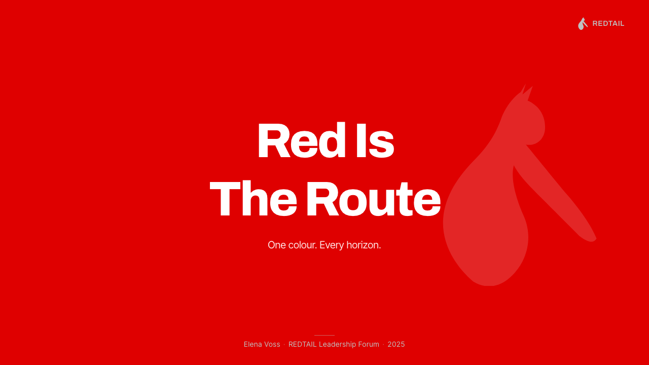
On presentation slides, a cover works best as a full-bleed red field with a single white mark or a short, bold headline placed decisively rather than centered timidly — the same logic as a kangaroo silhouette owning the tail of an aircraft. Content slides should keep red as an occasional, forceful accent — a single highlighted word, one section divider, one call-out box — against a mostly white or neutral working surface, since a fully red content slide quickly becomes fatiguing to read. Data slides benefit from binary contrast: a single red bar or number against a field of neutral gray reads as immediately important.
For web interfaces, the palette suits brands built on confidence, national identity, or category leadership — travel, logistics, sports, and consumer brands wanting to project authority rather than approachability. Primary actions and hero moments should take the full red treatment; supporting UI — forms, secondary navigation, body text — should stay in white, black, and neutral gray so the red retains its impact when it does appear. Pricing pages benefit from using red exclusively on the single recommended plan, leaving every other option in a quiet neutral register.
In editorial and marketing work, the system supports bold, poster-like statements rather than dense storytelling. Full-bleed red spreads with a single white headline or mark work well as section openers or campaign key art; body copy is better served by a plain white or neutral page with red reserved for pull quotes, section markers, or a single strong call to action, so the color keeps its rarity and force.
The most common mistake is treating red and white as roughly equal partners, producing stripes, split layouts, or evenly balanced two-color compositions that dilute the system's central idea. A second frequent error is adding a second bright accent color — the system depends on a strict two-value palette plus a quiet metallic detail, and any additional saturated hue competes with the red rather than supporting it.
Qantas Flying Kangaroo — FAQ
Is this the same as any generic red-and-white corporate palette?
No — the proportion is what distinguishes it. Many red-and-white brands treat white as the dominant surface and red as a stripe or accent. This system inverts that relationship so red becomes the clear majority field, which reads as considerably bolder and more confident than a white-led palette with red highlights, closer to a single fearless surface than to a two-color balance.
Does this system require an actual kangaroo silhouette to work?
No. The transferable idea is a single, simplified, confident mark placed as a flat cutout on a dominant field of color, not the kangaroo specifically. Any sufficiently distinctive, simplified icon — a national symbol, a mascot, a monogram — can occupy that same role, as long as it stays singular, flat, and legible at a distance rather than becoming a detailed illustration.
Is the silver accent essential, or optional?
It is a refinement rather than a load-bearing element. The system works with just red and white alone; the silver hairlines add a layer of precision and technical credibility appropriate to an aviation context, but a version of the system without any metallic accent still reads correctly as long as the color proportion and the single flat mark remain intact.
Can this palette work with a dark or black background instead of red as the base?
Only with real care, because the system's identity depends specifically on red being the majority field, not merely on a bold single-color field in general. A black-based variant would need to keep the same binary, high-contrast logic — one dominant field, one flat white mark, minimal metallic detail — but it would read as a different, more severe mood than the original, which is built specifically around the warmth and energy of saturated red.
What is the most common mistake people make when trying to imitate this style?
Reaching for Australian national colors — green and gold — instead of the airline's own saturated red. The two are frequently confused because both signal 'Australian', but they carry entirely different moods: green and gold reads as sporting and national-team energy, while this system's saturated red and white reads as corporate confidence and precision engineering. Mixing the two palettes together undermines both.
Related design styles
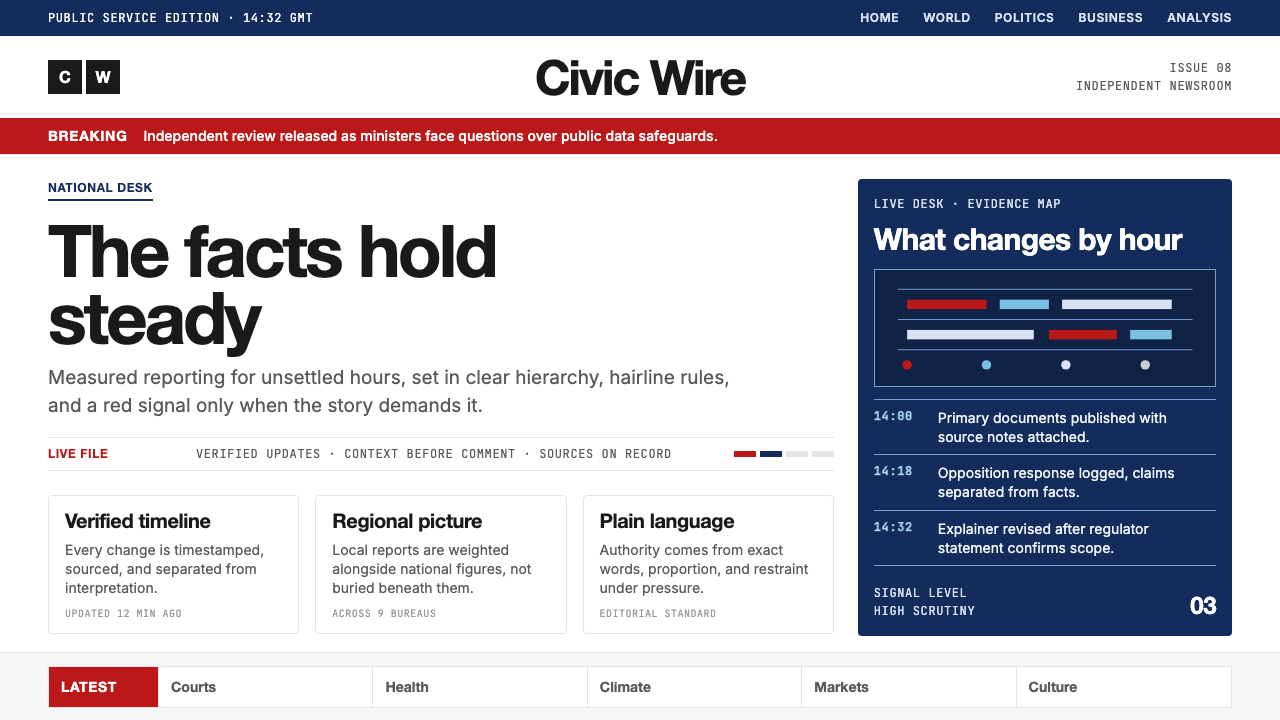 BBC NewsPublic trust, stripped bare. Red alerts, deep navy and hairline grids make ur…
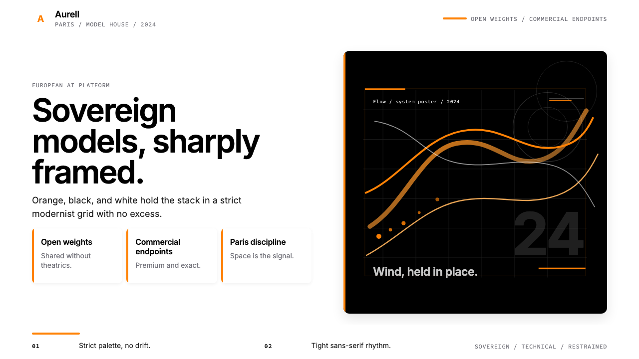 Mistral AI OrangeSovereign AI with restraint. Orange, black, and white lock the grid.
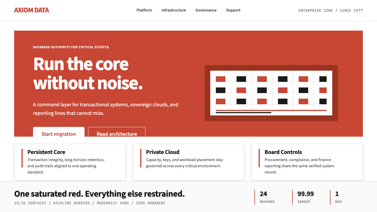 Oracle Corporate RedEnterprise certainty. Saturated red, tight sans, and white space do all the w…
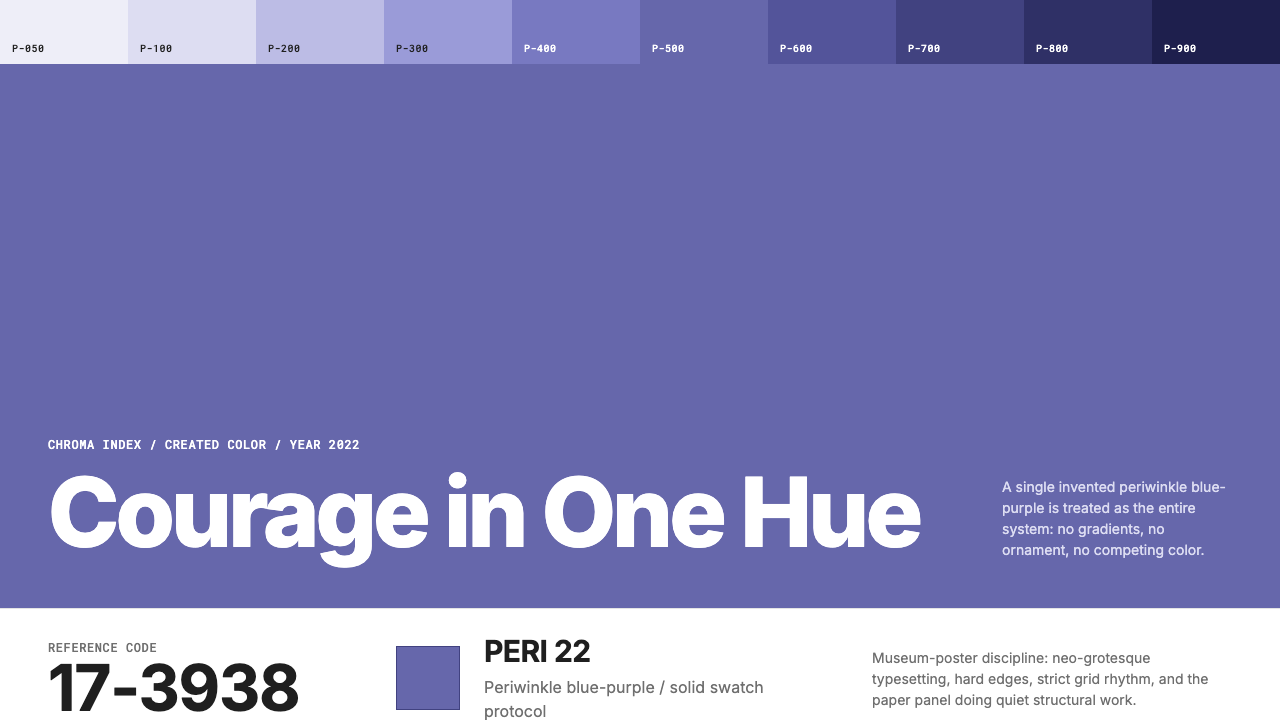 Pantone Very Peri (2022)Color becomes authority. Periwinkle field, reference codes, and white paper i…
 Redis Cache RedWarm database rigor. Vermilion cube, slate type, and white-space grids make s…
 Singapore Merlion BrandPrecision with civic warmth. Flag red and geometric sans lock into a four-scr…