What is Arequipa White City?
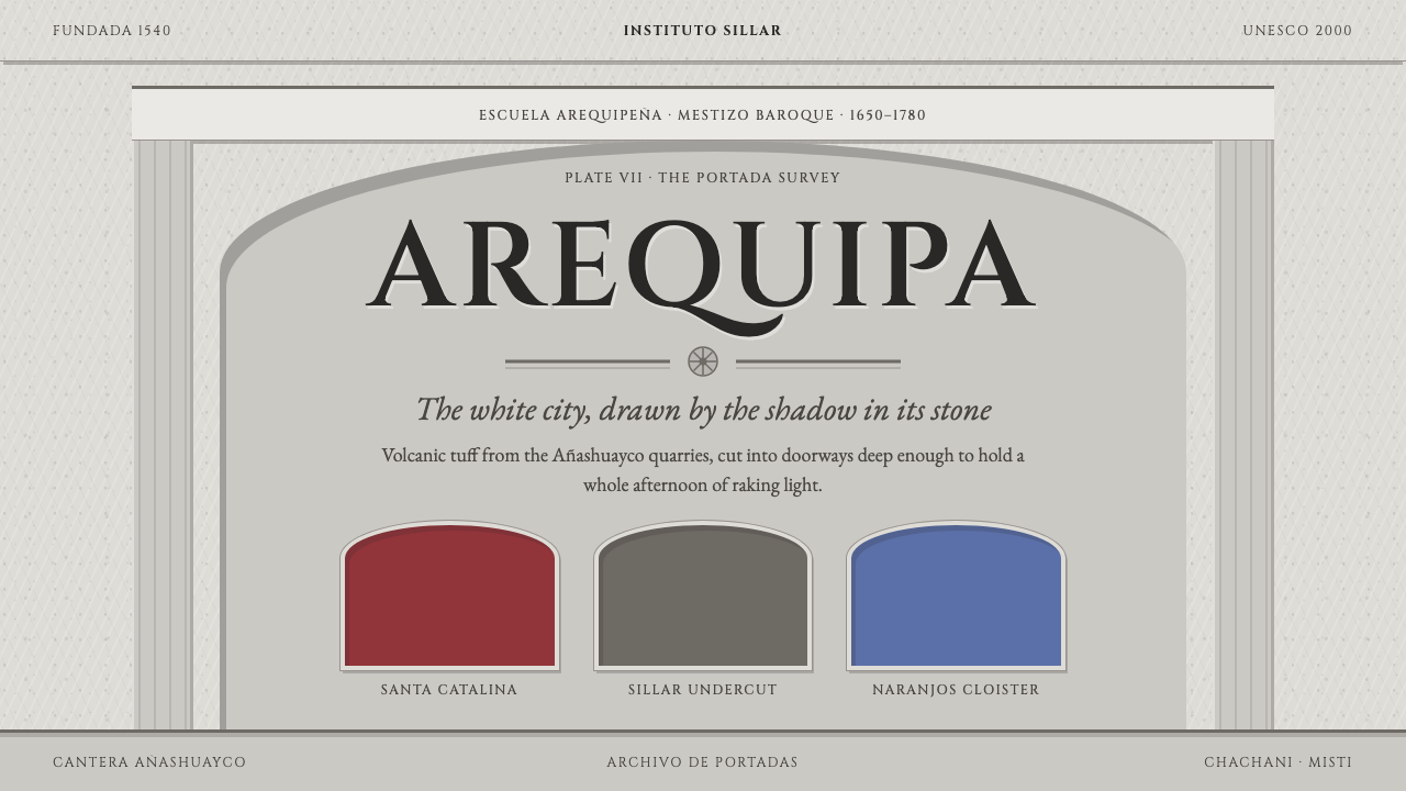
Arequipa's White City is built from pale volcanic stone, and this style uses that stone as the page: contrast comes from carved shadow, not from ink.
Arequipa White City in brief
Arequipa White City is a design system cut from sillar, the pale volcanic tuff that built the old town of Arequipa in southern Peru. It treats stone as the page. The ground is sunlit stone, a chalky neutral grey rather than a clean paper white, and the primary colour is not a pigment at all but the shadow that settles inside deep relief carving. Contrast comes from depth, not from ink.
Layouts are framed like portadas, the carved doorway facades that give Arequipa's streets their character. That means thick walls, pilasters on either side, an entablature above and small, deep-set openings where content lives. Headings are set in inscriptional capitals in the manner of the Cinzel typeface, which gives titles the weight of lettering cut into a lintel.
Colour is held back and given a place. Red ochre and indigo appear only as painted wall panels, the way they do inside the Monastery of Santa Catalina, and never as full-page fields. The result is a style that feels monumental, calm and tactile, suited to museums, architectural heritage, historical publishing and cultural brands that care about texture and permanence.

Where does Arequipa White City come from?
Arequipa is known as the White City because its historic centre is built of sillar, a volcanic tuff pale enough to throw back the Andean sun. The rock was ejected by the Chachani volcano more than two million years ago and has been quarried by hand in the Añashuayco canyon. Its great virtue for builders and carvers is softness. That makes it easy to cut with simple tools, and its pale, even tone is what unifies the whole town.
The city was founded in 1540, and Garcí Manuel de Carbajal is the figure associated with that founding. During the colonial period, stonemasons discovered that sillar invited ornament. In the seventeenth and eighteenth centuries they covered doorway facades with carved grapevines, pomegranates, rosettes and Andean motifs, setting local content inside a European architectural frame. The result is known as Mestizo Baroque, or the Escuela Arequipeña, the Arequipa School, and it is one of the clearest cases of Andean and European traditions fusing in stone.
Most of the carvers are anonymous. The portadas are credited collectively to indigenous and criollo master carvers, Andean craftspeople and locally born workers of Spanish descent whose hands and vocabulary met on the same wall. This anonymity matters for the design system. The style does not belong to a famous author but to a vernacular tradition, which is why it emphasises material, structure and craft over personality. Another touchstone is the Monastery of Santa Catalina de Siena, founded in 1579, whose painted wall surfaces in red ochre and indigo supply the system's only colour.
The historic centre was inscribed by UNESCO in 2000, which cemented the city's standing as a living example of volcanic-stone vernacular construction. Three strands meet in this design system: the Mestizo Baroque carving tradition, the Andean and European syncretism it embodies, and the plain building habits of a town made from the rock beneath its feet. The system translates all three into a page where stone is the surface, shadow is the ink and ornament is confined to frames.
What defines the Arequipa White City look?
Stone ground
The page is sunlit stone, a chalky neutral grey, never a clinical white. This gives the whole layout the look of a surface that was quarried rather than printed. Large areas stay quiet and even, so that the eye reads them as wall, and the few things placed on that wall gain their emphasis from where and how deeply they are cut into it.
Shadow as ink
The primary colour is the shadow sitting inside deep relief carving. Outlines, dividers and emphasis are made by recessing a shape and letting it cast a dark edge, rather than by drawing a line in pigment. This is why the system always needs a consistent light source: shadows must fall the same way across the entire page, otherwise the stone stops looking carved and starts looking merely smudged.
Portada framing
Layouts follow the logic of a carved doorway. Thick walls enclose the content, pilasters rise on either side, an entablature caps the top and the actual openings are small and deep-set. Information lives inside those openings rather than sprawling across the page. The effect is a strong sense of enclosure and hierarchy, in which the most important thing is the one that sits inside the most carefully built frame.
Inscriptional capitals
Headings are set in capitals with the proportions of Roman inscriptions, in the manner of the Cinzel typeface, with open and dignified spacing. They read as lettering cut into stone and sit comfortably beside carved relief. Body text stays simple and readable beneath them, so that the capitals can carry ceremony while the running text carries information.
Ochre and indigo wall panels
Red ochre and indigo are the only pigments, and they appear as painted wall panels in the way they do inside Santa Catalina. A panel is a bounded area set into the stone, a place for a quotation, a featured object or a key action. It is never a full-page field and never a gradient. Keeping paint confined to panels is what lets the stone remain the dominant material.
Mestizo ornament
Where decoration appears, it draws on the vocabulary of the carved portadas: grapevines, pomegranates, rosettes and Andean motifs. It is kept to frames, borders and the edges of important panels, and it is carved in rather than printed on. Ornament here is a mark of place and craft, not a pattern for filling space, so large areas of plain stone are always left around it.
Mass and void
The proportion of solid wall to open space tilts decisively toward the wall. Small windows of content sit in large areas of mass, which is the reverse of most contemporary layouts that maximise open space. This produces a feeling of shelter and weight, and it teaches the designer to be selective: if something does not earn one of the small deep openings, it does not belong on the page.

Who shaped Arequipa White City?
Carbajal is the Spanish founder tied to the creation of Arequipa in 1540. He stands at the beginning of the story, not the style itself: the city he established would, over the following centuries, become a workshop for carvers who turned the local volcanic stone into one of the most distinctive urban surfaces in the Andes.
The true authors of the style are the unnamed master carvers who cut the portadas in the seventeenth and eighteenth centuries. Indigenous and locally born workers of Spanish descent, they placed grapevines, pomegranates, rosettes and Andean motifs inside a European frame. Their anonymity is part of the design lesson: the style is a collective craft language, and it asks the designer to serve the material rather than sign the work.
Founded in 1579, the monastery supplies the system's only colour. Its painted wall surfaces in red ochre and indigo explain why those two pigments belong in this system as panels rather than as page-wide fields. It is the reference for how paint and stone can share a wall without either losing character.
The Escuela Arequipeña, or Arequipa School, is the name given to the regional Mestizo Baroque tradition of carved facades. It is not a person but a lineage, a shared repertoire of motifs and methods passed along between workshops over generations. Understanding it as a school explains why the design system is rule-based and repeatable: it follows a vocabulary, not a single genius.
How do you use Arequipa White City today?
This style is at its best where weight, permanence and a sense of place are the point. It is a poor fit for fast, playful or disposable messages, and an excellent fit for anything that wants to feel built rather than assembled. The key is to treat the stone as the main material and to ask of every element whether it has been carved in or merely laid on.
For presentation slides, a cover works as a portada: a stone-grey field, the title in monumental capitals set between two pilaster-like vertical edges, and a single recessed panel for the subtitle or date. Content slides should be framed with the same logic, one idea per opening. Data slides can use recessed panels for charts and reserve a single ochre panel for the number that matters, keeping everything else in stone tones.
For web interfaces, think of museums, heritage sites, archives and ticketing pages for cultural venues. Cards become recessed niches with a consistent light direction. On a dashboard, keep density low and let each metric sit in its own deep-set opening. For pricing, present tiers as adjacent bays of the same facade, and use one ochre painted panel to mark the recommended plan, so that colour stays an exception rather than a habit.
For editorial and marketing work, the style suits exhibition catalogues, architectural and historical publishing, travel writing about the Andes, and cultural brands that trade on craft and provenance. Captions and section labels in capitals give a quiet institutional voice. Marketing pages can alternate large areas of plain stone with single framed images, letting generous mass around each frame signal confidence.
The most frequent mistake is to colour the whole page ochre or indigo because those are the system's pigments. They are meant for panels only. Other errors include faking carved depth with heavy, mismatched shadows, mixing light directions across a page, adding glossy or metallic effects that stone never had, and filling every border with ornament. If the page begins to look decorated rather than carved, remove things until the stone is back in charge.

Arequipa White City — FAQ
Why is it called the White City, and is the page actually white?
The nickname comes from the pale sillar stone that Arequipa's historic centre is built from. The page is not a clean white, though. It is a chalky neutral grey, the colour of stone in sunlight, which gives the surface a material quality that pure white lacks. White City names the city's look; the page translates that look into a more tactile ground.
What does shadow as the only ink mean in practice?
It means contrast and emphasis come from recessed, carved shapes casting dark edges, not from coloured lines or fills. A heading panel is pushed into the stone and its depth is what you see. This keeps the palette neutral and gives every emphasised element a physical logic. It also means every shadow must follow the same light direction, since inconsistent shadows break the illusion of carving.
What is Mestizo Baroque and why does it matter here?
Mestizo Baroque is the name for colonial-era architecture and carving in which European Baroque frames were filled with local Andean content. In Arequipa it produced the Escuela Arequipeña, whose portadas carry grapevines, pomegranates, rosettes and Andean motifs. It matters because it explains the structure of the design system: a formal European-style frame that holds something distinctly local.
Why are headings set in capitals?
Because the system borrows from the logic of inscriptions. Capitals in the manner of the Cinzel typeface have the proportions of letters cut into stone, and they look right beside carved relief in a way lowercase text does not. Capitals are used for headings and labels only. Body text stays in an ordinary readable setting so the page remains comfortable to read at length.
Is this style only for museums and heritage content?
It is strongest there, but it is not limited to it. Any brand that wants to project permanence, craft and provenance can use it, such as a publisher, a restorer, a boutique hotel or a cultural foundation. It struggles with products that depend on speed, novelty or playful interaction. As a test, ask whether the message would feel natural carved over a doorway. If it would, the style suits it.
Related design styles
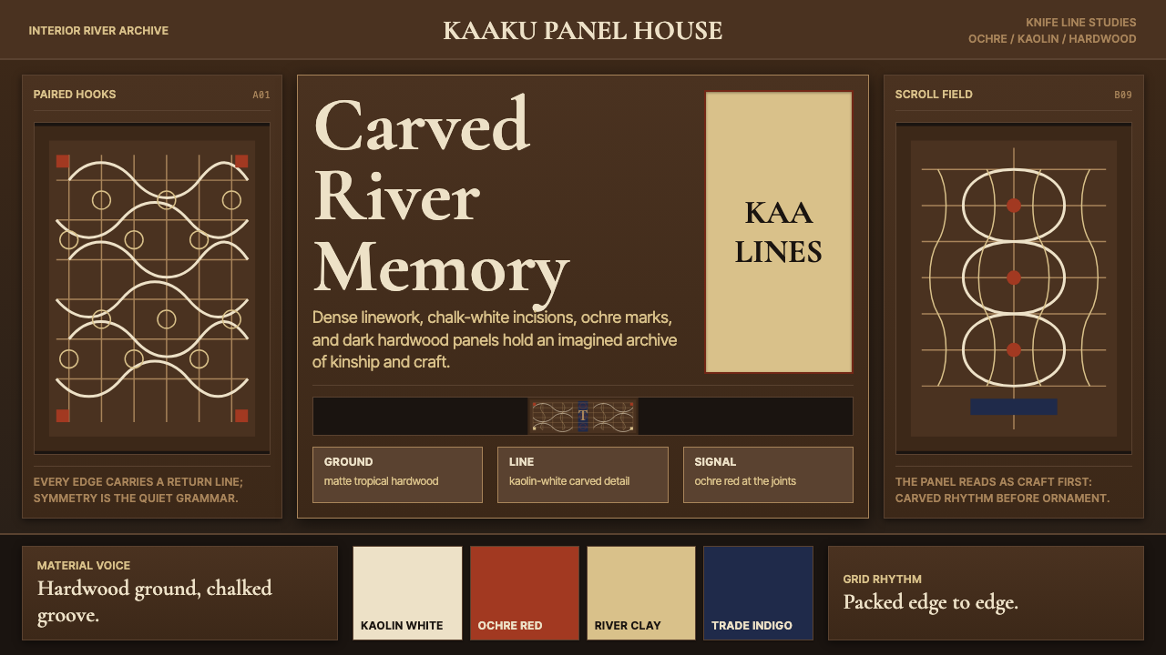 Suriname Maroon TembeDense memory, carved in rhythm. Kaolin lines cross hardwood brown in bilatera…
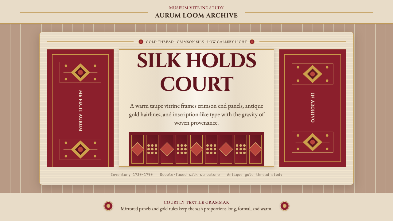 Belarusian Slutsk SashCourtly silk, vitrined. Taupe ground, crimson panels, Cinzel type, antique go…
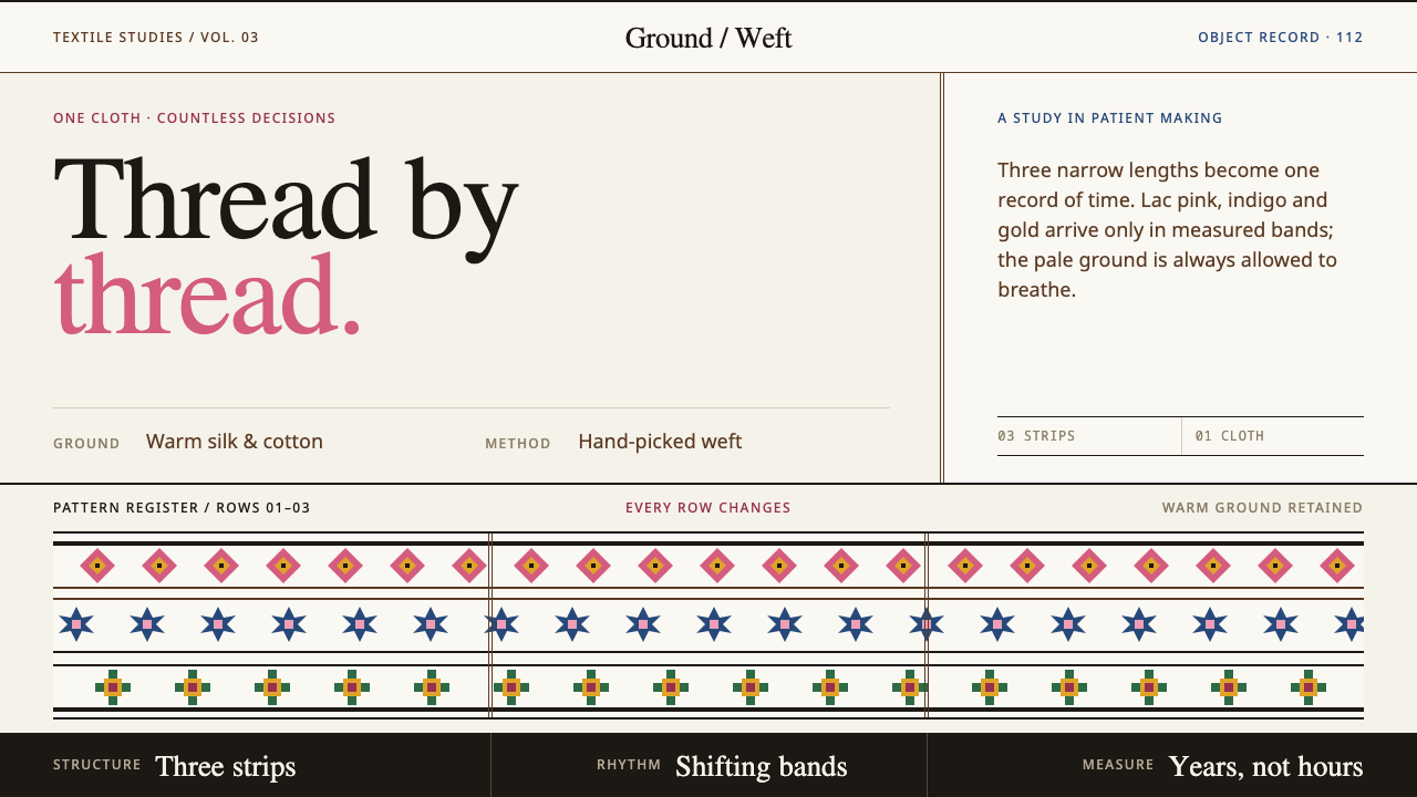 Bhutanese KushutharaPatience made visible. Lac pink and indigo bands shift across a warm silk gro…
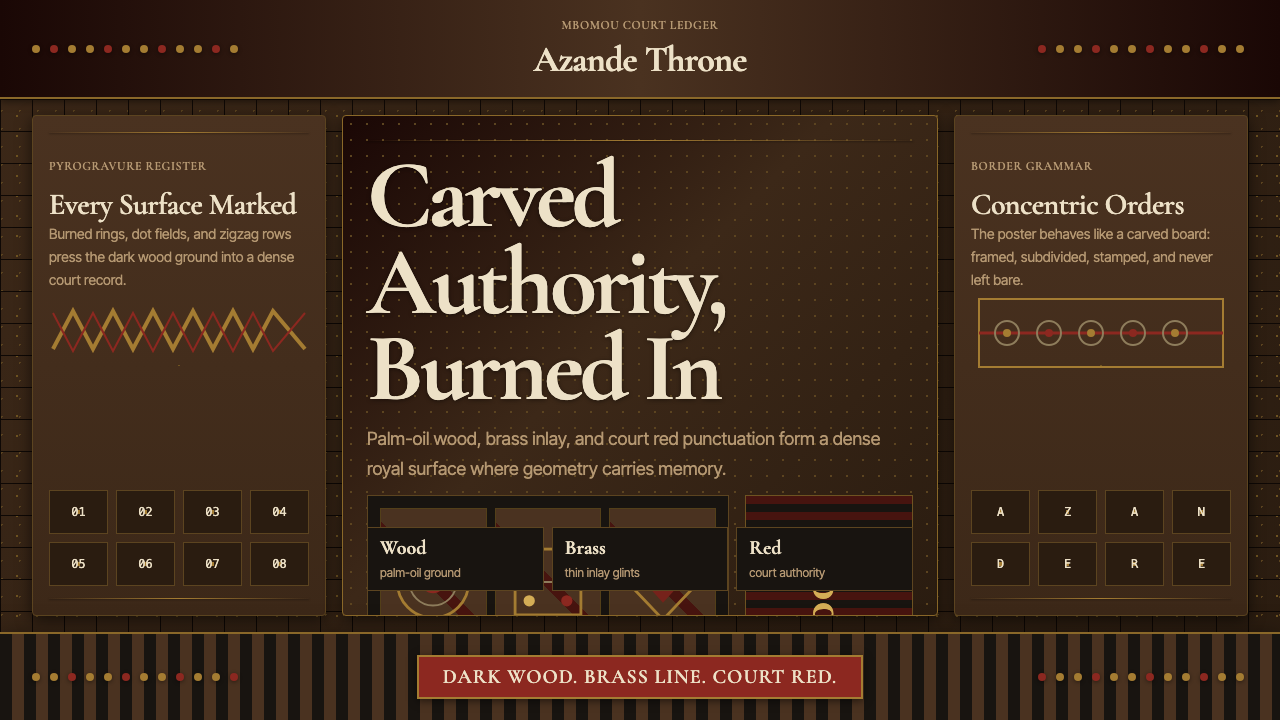 Central African Azande ThroneDense court gravity. Dark wood grids, brass dots, and court red cover every s…
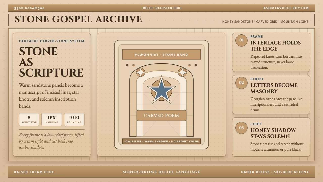 Georgian Nikortsminda Stone-CarvingStone becomes scripture. Cinzel caps and Georgian bands carve honey-sandstone…
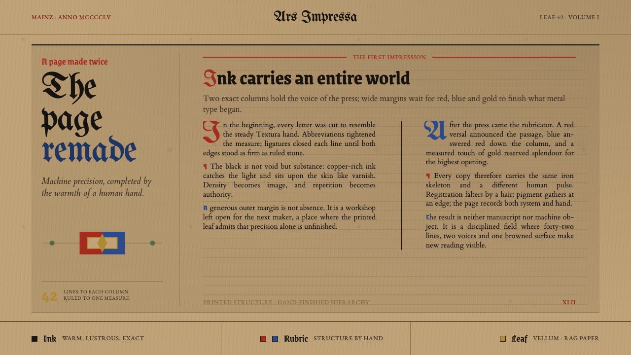 Gutenberg 42-Line BiblePrecision awaits the hand. Dense black columns open into red, blue and gold o…