What is Are.na?
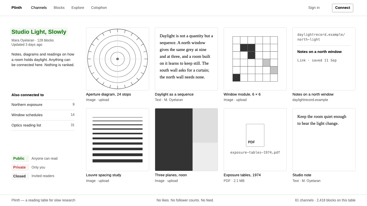
Are.na lets the interface step back behind the material: Arial on white, grey hairlines and a grid of square tiles, built for collecting slowly rather than performing publicly.
Are.na in brief
Are.na is a New York tool for collecting and connecting ideas, used by researchers, artists and designers. You save blocks, which can be images, text, links or files, into channels, and any block can sit in many channels at once. There are no likes, no follower counts and no algorithmic feed deciding what you should see.
The design style described here follows the interface of the 2014 redesign. It is almost pure absence: Arial everywhere, a white page, grey hairlines, small grey and black text, and a grid of square tiles with their captions underneath. Channel titles are colored green, red or grey depending on whether the channel is public, private or closed, and that is nearly the only color the interface uses.
The central idea is that content outranks the brand. The interface exists to hold what you have gathered, and it is designed to be forgotten while you look. This makes it a model for any product whose real value is the user's own material, such as a library, a reading list or a long-running archive.

Where does Are.na come from?
Are.na was created in New York around a research-based art practice. Charles Broskoski is the founder most associated with it, and Chris Barley and Daniel Pianetti are also credited in the project's early life. The platform grew out of the habits of people who gather references for long projects and wanted a place that reflected how thinking actually accumulates: slowly, through association, with items belonging to more than one thread.
The 2014 redesign is the version this style captures. For more than a decade the interface relied on Arial alone, a decision that looks stubborn and works because it avoids having a personality that competes with the user's collections. That Arial-only period ran from 2014 until August 2025, when the typeface was replaced by ABC Areal. This style preserves the earlier look.
Culturally the tool belongs to a cluster of ideas: research-based art practice, the independent or slow web, and post-social-media tools. These movements share a distrust of metrics and feeds. Where mainstream platforms reward attention and reaction, this interface rewards care and connection, and its visual restraint is a form of position-taking.
The result sits closer to a well-kept archive or a library catalog than to a social network. Its grid recalls contact sheets and index cards; its small type recalls footnotes. Nothing in it tries to be a brand moment, and that refusal is the brand.
What defines the Are.na look?
Arial and nothing else
A single typeface throughout, in a few sizes and in plain black or grey. Arial is the default sans-serif of the digital world, so it feels like no choice at all, and that neutrality keeps attention on the images and words being collected.
Pure white page
The background is white, without tint, texture or gradient. White gives every kind of content equal footing, whether a photograph, a scan, a screenshot or a paragraph, and it avoids imposing a mood on the collection.
Grey hairlines
Structure is shown with thin grey lines instead of boxes, shadows or fills. Hairlines separate sections and outline blocks lightly, giving the page order without weight. They are visible if you look and invisible if you do not.
Square tiles in a grid
Blocks appear as equal squares in a regular grid, regardless of what they contain. A tall image, a wide image and a text snippet all become the same footprint. This democratizes the collection and makes scanning easy.
Captions underneath
Titles and metadata sit under each tile in small type, never overlaid on the image. The image stays untouched and the caption is a quiet label, as in a museum wall text or an archive index.
Status in three colors
Channel titles are green when public, red when private and grey when closed. This is the only color the interface applies, and it carries information rather than decoration. A user learns the code immediately and can read the visibility of a channel from across the page.
No social signals
There are no like buttons, no follower counts and no ranked feed in the visual vocabulary. Without them, the layout can stay simple, and the user is not nudged into performing for an audience.

Who shaped Are.na?
The founder most closely associated with Are.na. His vision of a tool for collecting and connecting, rather than broadcasting, shaped the structure of blocks and channels and the quiet look that accompanies it.
A contributor credited in the project's early life. The restrained interface of the 2014 redesign belongs to the collaborative effort of this small founding group.
Another contributor associated with the platform's beginnings. Together with the other founders, he helped give the tool its research-oriented character.
How do you use Are.na today?
For slide decks, this style suits research presentations, reference boards and portfolio walkthroughs. A cover can be nothing more than a white slide with a short title in Arial and one hairline. Content slides can be a grid of square images with small captions beneath, which makes a deck feel like a curated collection. Data slides should be plain: a table or a simple chart in black and grey, with the green, red and grey code used only if it carries real meaning.
On the web, it is ideal for archives, reading lists, personal libraries, moodboard tools, documentation of long projects and anywhere the content is the product. Use a square tile grid, small captions below, thin dividers and as little color as possible. It is a poor fit for conversion-driven pages such as pricing or promotion, which need hierarchy, emphasis and persuasion that this style deliberately omits.
In editorial and marketing work, think of a catalog or a bibliography. A page can be a set of images on white with sparse text, and the restraint reads as confidence and seriousness. It suits cultural institutions, independent publishers and research projects that want to signal that the material matters more than the brand.
Typography is the simplest of any style: one sans-serif, a handful of sizes, black for primary text and grey for secondary. Rely on spacing and alignment for hierarchy. If you find yourself adding a second typeface for personality, you are working against the grain.
A common mistake is to treat the plainness as emptiness and then add decoration to compensate: shadows, rounded cards, accent colors, hero banners. Each addition makes the interface more of a brand and less of a container. Another is to crop tiles inconsistently or to overlay captions on the images, which breaks the even, archival rhythm. A third is to use the green, red and grey status code for decoration, which erases its meaning.

Are.na — FAQ
What is the Are.na design style?
It is the interface of the Are.na collecting tool as redesigned in 2014: Arial throughout, a pure white page, grey hairlines, small black and grey text and a grid of square tiles with captions beneath. Channel titles are colored green, red or grey by visibility. The goal is for the interface to recede so that the collected material takes the lead.
Why use only Arial?
Arial is so common that it carries almost no personality, which is the point. A distinctive typeface would compete with the images and words users save. From 2014 to August 2025 the interface relied on Arial alone, until it was replaced by ABC Areal, and this style preserves the earlier look.
What do the green, red and grey channel titles mean?
They show a channel's visibility: green for public, red for private and grey for closed. It is the one place color is used, and it works because color is so scarce elsewhere. Use the same restraint if you borrow the idea in your own interface.
Is this the same as minimalism?
They overlap but differ in motivation. Minimalism is often an aesthetic preference. This style is a position: the interface should not compete with the user's collection, and social signals such as likes or feeds are left out on purpose. It is closer to archival or library design than to a polished minimalist brand.
What kinds of products suit it best?
Products whose value is the user's own accumulated material: archives, reading lists, moodboards, research libraries and portfolio documentation. It works poorly for conversion-driven marketing pages, which need strong hierarchy and calls to action that this style deliberately avoids.
Related design styles
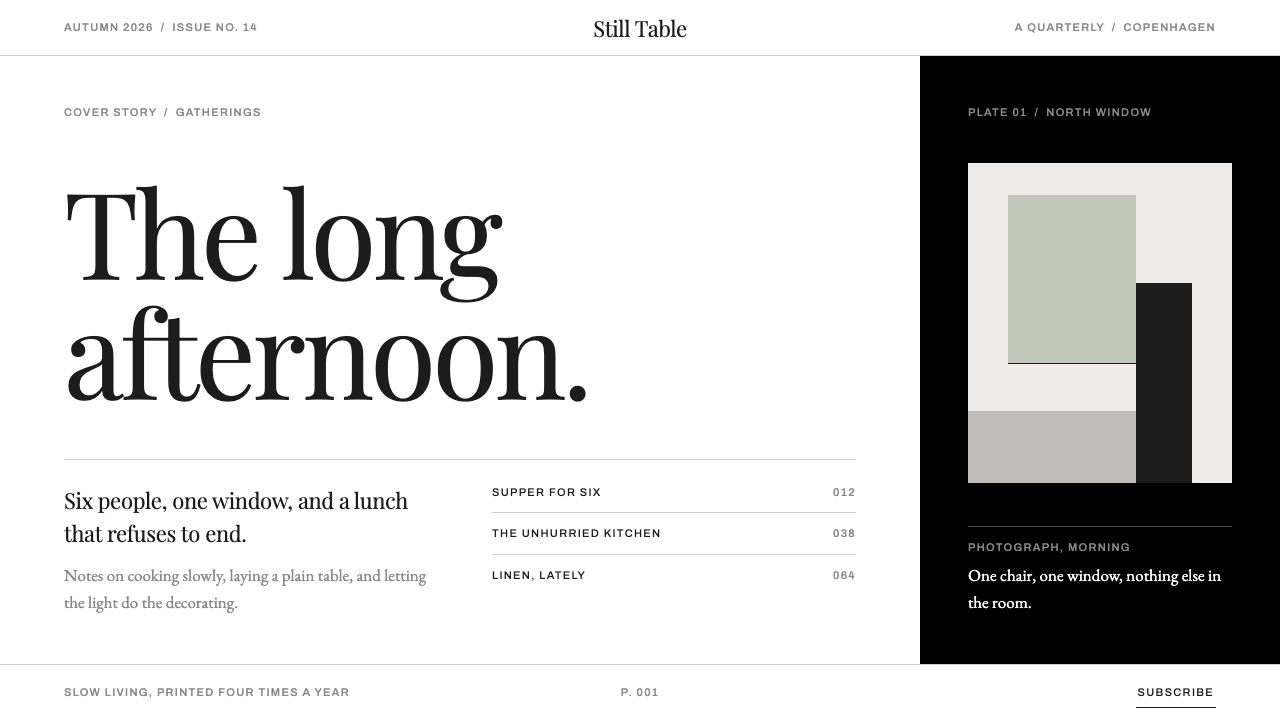 KinfolkA quarterly of mostly margin. Hairline serif on true white, broken by one ful…
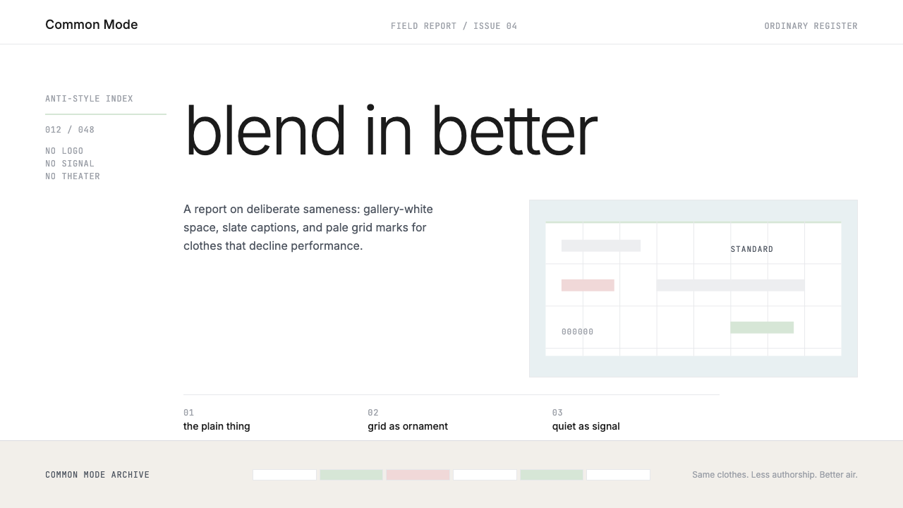 Normcore (2014)Quiet is radical. Inter, slate captions, and pale mint grid marks make refusa…
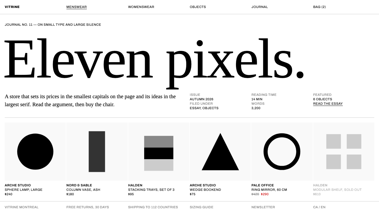 SSENSELuxury as a wall label. Eleven-pixel caps on pure white, answered by a huge e…
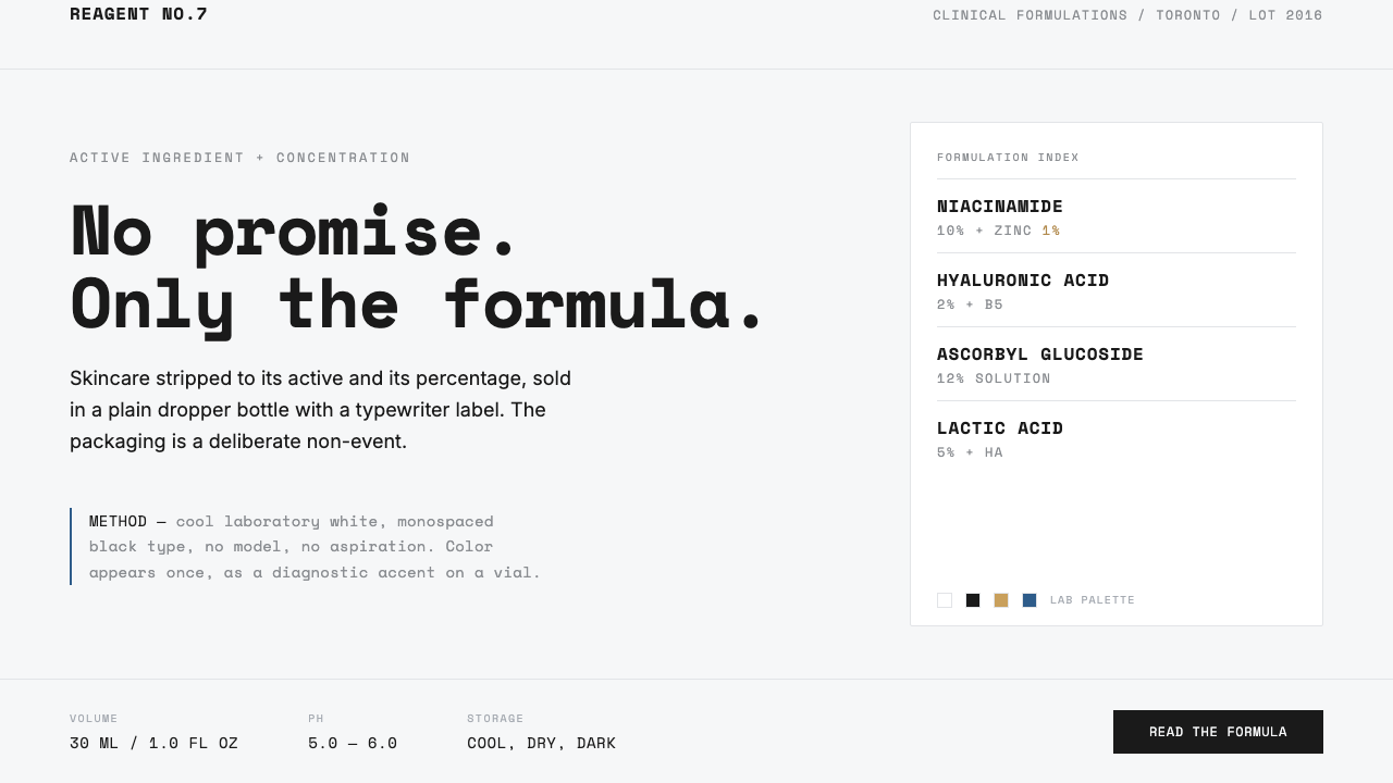 The OrdinaryNo promise, only the formula. Cool lab white, Space Mono labels, color as rar…
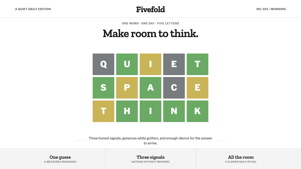 Wordle (2021)Quiet becomes addictive. Olive green, dusty gold, and gray score a strict gri…
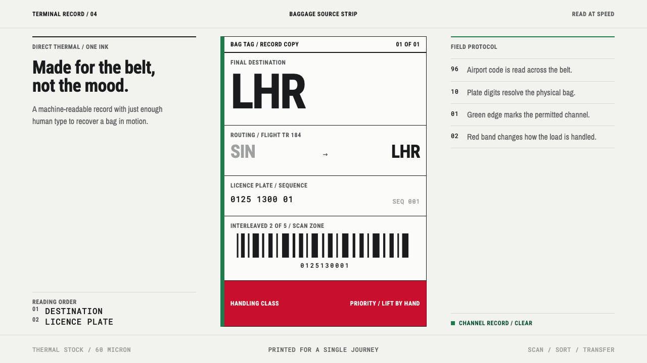 Airport Baggage TagBuilt to be read in motion. Burned-black codes, hard rules and functional cha…