What is Ant Design?
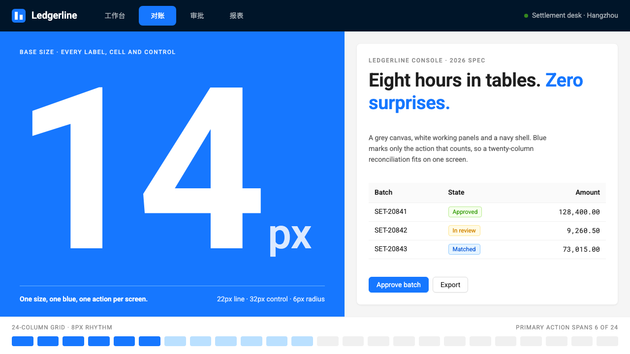
Ant Design chose certainty over charm: a grey canvas, white panels, a navy shell and one blue saved for the action that matters, built for people who live in tables and forms all day.
Ant Design in brief
Ant Design is an enterprise design language open-sourced in 2015 by Ant Financial from Hangzhou. It began as the foundation for the back-office screens behind Alipay's business products and grew into one of the most widely used systems for admin interfaces in China. Open almost any management console there and there is a good chance it is recognizable at once.
Its audience is not a casual visitor. It is built for people who spend a working day in tables, filters and approval forms, so it values density, predictability and speed of scanning over visual delight. A light grey canvas carries white panels, a navy sider and header frame the workspace, and a single shade of blue marks the primary action and the selected menu item.
The system is deliberately quiet. Text is compact, controls share one height, labels are aligned and punctuated the same way every time, and required fields carry a small red star. Tables arrive with sorting, filtering, selection and pagination built in. The ambition is that a dense Chinese form or a table with twenty columns still fits comfortably on one screen.

Where does Ant Design come from?
Ant Design came out of the practical needs of a very large financial technology company. Ant Financial, working from Hangzhou, had dozens of internal and merchant-facing tools that needed to feel like one product. Rather than leaving each team to improvise, the company wrote down a shared language of components, layout and behavior, and in 2015 released it as open source. Version 1.0 followed in 2016.
Three engineers are closely associated with its early growth: Yu Bo, known by the handle Yu Bo (玉伯), afc163 (偏右), and zombieJ. Their work turned an internal convention into a public library that other companies could adopt, and the community around it expanded the component set and the surrounding tooling steadily.
The style belongs to the broader tradition of enterprise design systems, but it also defined a regional genre of its own, often called the zhonghoutai or back-office console genre. In this genre the user is a trained operator, the screen is a workplace, and the quality of the design is judged by how little friction it adds to repetitive work. Ant Design gave that genre a recognizable look and a reusable codebase.
Its current visual form is based on the version 5 design-token system, in use from 2022 onward. Tokens turn color, spacing, radius and type decisions into named, themeable values, so that a team can adopt the whole system and then adjust it without breaking consistency. That shift moved Ant Design closer to the wider design-token movement, while the visual attitude stayed what it had always been: sober, dense and dependable.
What defines the Ant Design look?
Grey canvas, white panels
A light grey page ground holds white content panels. The difference in tone is enough to separate regions without borders or heavy shadows, which keeps a dense screen from feeling boxed in. Panels group a filter bar, a table or a form so each task has a clear territory.
Navy sider and header
A dark navy sidebar and top bar form the shell of the application. They anchor navigation and give every page the same frame, so a user moving between modules never wonders where they are. The contrast with the light work area keeps attention on the content.
One blue for the action that counts
A single saturated blue marks the primary button and the selected navigation item. Because it is not spent on decoration, its appearance tells the user what the page expects them to do. Secondary actions stay neutral, and destructive ones use a separate warning color.
Compact text and uniform controls
Body text is small and tight, and inputs, selects and buttons share one standard height. This uniformity lets forms align into clean rows and lets a table hold a large number of columns. It trades airy comfort for the ability to see more at once.
Form conventions
Labels sit to the left of their fields and are followed by a colon. Required fields carry a small red star. Validation messages appear directly under the field. These repeated rules mean that a user who has completed one form in the system can complete any other without relearning.
Tables with built-in behavior
Tables are the heart of the system. Column sorting, filtering, row selection, expandable rows and pagination are standard, and the visual treatment is plain: thin dividers, subtle row hover, aligned numbers. The table is designed to be read for hours rather than admired for seconds.
Restrained motion and states
Hover, focus, disabled and loading states are clearly defined, and transitions are brief and functional. Motion confirms that something happened rather than entertaining the user. Skeletons and spinners show that data is on the way, so a slow request never looks like a broken page.

Who shaped Ant Design?
One of the engineers closely tied to the early growth of Ant Design at Ant Financial. His involvement is part of why the project grew from an internal convention into an open-source system with a large public following.
A core maintainer associated with the project since its early years. The steady care of maintainers like this is what made Ant Design's documentation, components and releases dependable enough for companies to build on.
Another engineer closely tied to the project's development. His work helped carry the component library from its first public release through the later move to the token-based version 5 system.
How do you use Ant Design today?
For slide decks, Ant Design works best for internal product reviews, operations reports and anything that should look like a real back-office screen. A cover can be a white panel on a pale grey slide with a navy band and a single blue accent. Content slides should reproduce the product's logic: a filter row above, a table below, one blue action. Data slides can use plain tables with aligned numbers instead of decorative charts, which gives the deck a credible, work-in-progress feeling.
On the web, this is the natural choice for admin consoles, management systems, CRM and ERP tools, approval workflows and any interface where users repeat the same tasks all day. Keep the navy shell, use panels to separate regions, put the single blue on the primary button, and let tables carry the main weight. Pricing pages and public marketing pages are a weaker fit, because the style is optimized for efficiency and not persuasion.
In editorial and marketing work, the style can support case studies, documentation and product tours for enterprise software. Screens rendered faithfully look credible to buyers who will eventually use similar systems. Avoid stretching it into brand-led campaign pages where emotion matters more than clarity.
Typography should stay compact and consistent. Use one interface sans-serif that handles both Latin and Chinese characters gracefully, a small number of sizes, and clear weight differences between headings and body. Numbers in tables should align so that columns can be compared by eye.
A common mistake is to soften the system with large radii, soft gradients and airy spacing, which defeats the density the system exists for. Another is to spend the blue on decoration, so that the primary action no longer stands out. A third is to mix in the conventions of a consumer app, such as floating labels and hidden controls, which breaks the predictable form rules that make the system fast to use.

Ant Design — FAQ
What is the Ant Design style?
It is the enterprise design language open-sourced by Ant Financial in 2015, centered on a light grey canvas, white panels, a navy sidebar and header, and one blue reserved for primary actions. It prioritizes information density, predictable forms and feature-rich tables, and it defines the look of a large share of Chinese back-office software.
Why does it look so dense compared with consumer apps?
Its users work with the interface for hours and need to see many fields and rows at once. Compact text and uniform control heights let a form or table show more without scrolling. The density is a deliberate answer to the needs of repeat users rather than a lack of polish.
What are the zhonghoutai or back-office console genre?
It is the family of interfaces used for operating a business behind the scenes: management consoles, review queues, data maintenance tools and internal dashboards. The design priority there is efficiency and consistency, and Ant Design became the best-known visual and technical reference for it in China.
What changed with the version 5 design tokens?
Version 5 expresses color, spacing, radius and type choices as named tokens that can be themed. A team can adopt the full system and adjust a handful of values to match its brand while staying consistent. The look stayed sober and dense; what improved was how easily the system can be customized.
Can I use it for a public marketing website?
It is not the best fit. The style is tuned for operators doing repetitive work, so it lacks the expressive typography and generous space that persuasion needs. Use it for product screens and documentation, and choose a more expressive style for brand pages.
Related design styles
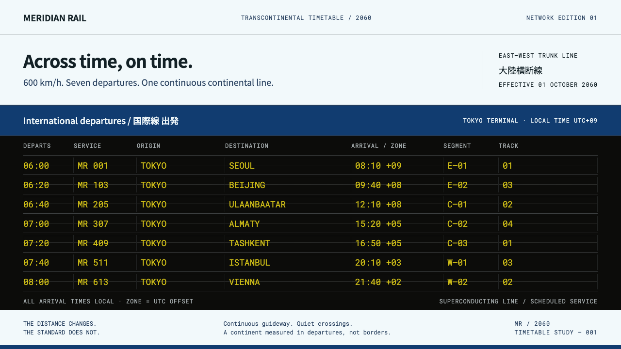 Transcontinental MaglevQuiet livery, dense departures. Cool white and blue frame a black board of ch…
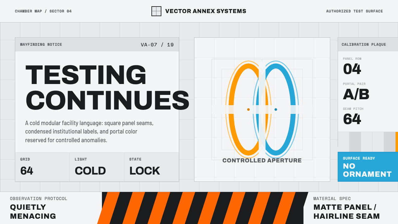 Aperture ScienceSterile authority. Cool panel seams, Archivo signage, and sparse orange-blue…
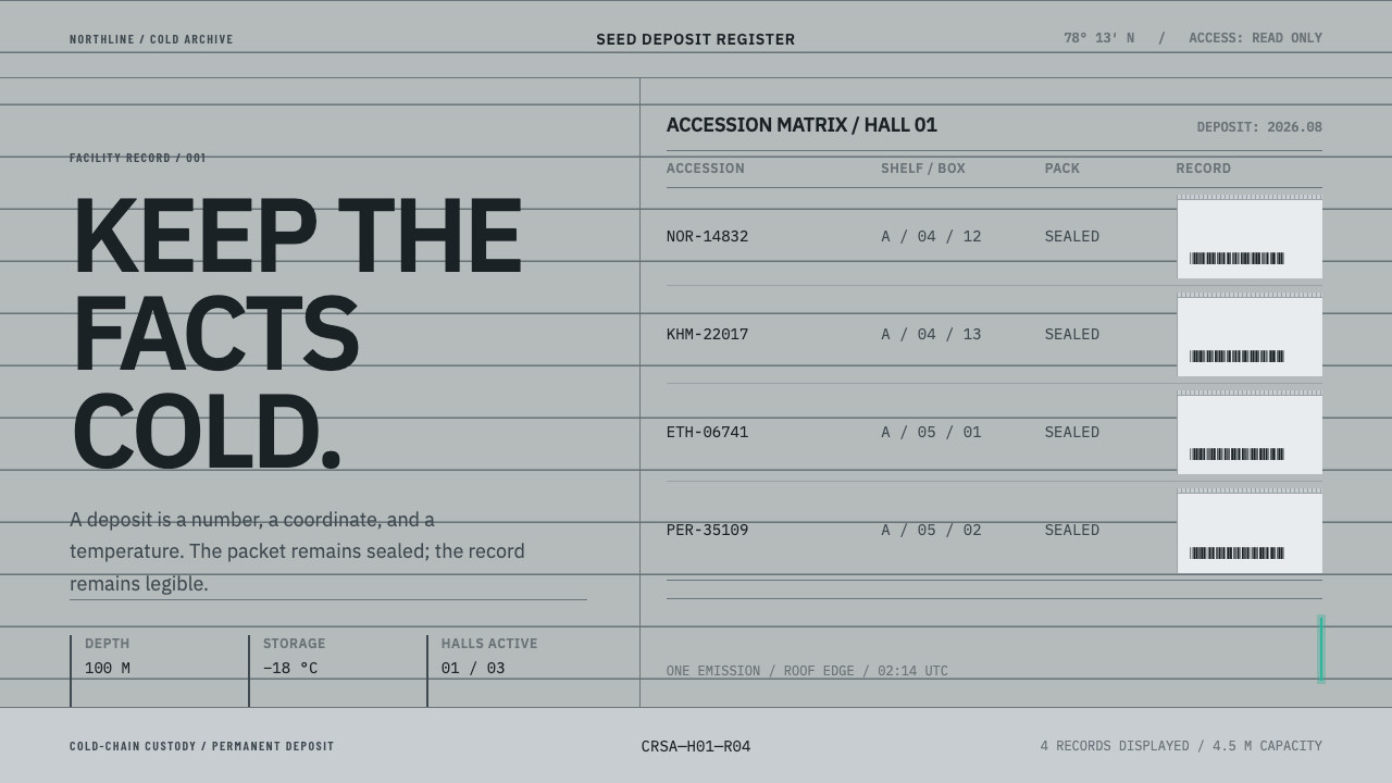 Climate Refuge Seed ArchiveFacts stay cold. Concrete-grey accession rows meet one turquoise fibre-optic…
 Cloud Brightening FleetBrightening becomes evidence. White ship-track lines score a cool-grey satell…
 DJI PhantomWhite on white, one blue allowed. Hairline spec tables make the hardware the…
 IBM CarbonGrey page, white tiles, one blue. Square corners and Plex Light on a strict 1…