What is Afterpay?
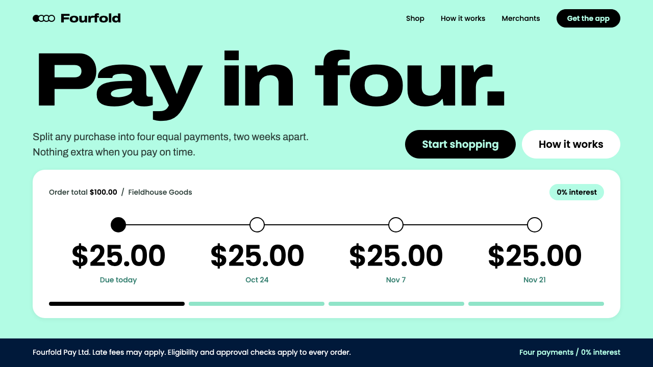
Afterpay turned one commissioned green into the floor of an entire interface: mint underfoot, black type on top, and a four-dot schedule that shows exactly what you will pay.
Afterpay in brief
Afterpay is the visual identity of a buy-now-pay-later fintech founded in Melbourne in 2014, built around a bespoke Pantone called Bondi Mint. As a design style it is defined less by any single ornament than by one structural decision: the brand colour is not an accent but the ground. A full-bleed mint field fills the page, and everything else, from type to cards to buttons, is arranged on top of it.
The palette is deliberately small: mint, white and black. Nothing else is invited in, and the system works precisely because it refuses to add more. Headlines are set in black, expanded letterforms directly on the mint; content lives on white cards with rounded corners that float over the field; every action is a black pill-shaped button. Three colours, three roles: ground, container, action.
The most recognisable unit is not the logo but the instalment schedule: four circles joined by a thin line, the first one filled in, each carrying a large amount. It makes a financial promise legible at a glance, what you pay now and what comes later, and it gives the style its signature graphic device. In stylistic terms it belongs to the family of flat-colour brand fields, where a single owned colour does the work that photography or illustration does elsewhere.

Where does Afterpay come from?
Afterpay began in Melbourne in 2014, one of the companies that built the buy-now-pay-later category: a way of splitting a purchase into a short run of smaller payments instead of paying everything at the till. Nick Molnar and Anthony Eisen are the two names the origin notes attach to that beginning. The Bondi Mint identity that this style documents stayed in use through the 2020s, and its logic is the logic of the product itself: make the schedule simple enough to see at a glance.
The decisive design choice was chromatic. Afterpay commissioned its own Pantone, Bondi Mint, rather than picking a shade from the existing swatch book. That is a small administrative act with large visual consequences: a colour that belongs to one company can be used at scale without any fear of resembling someone else. Other payment companies tended to treat their brand colour as an accent, a tint on the logo or a highlight on a button. Afterpay did the unexpected thing and made the colour the floor everything stands on.
That decision places the style in two overlapping lineages named in the source notes. One is bespoke-Pantone brand ownership, the practice of commissioning a proprietary colour so that the colour itself works almost like a trademark. The other is flat-colour brand fields, the family of identities in which one saturated hue covers the entire canvas and carries the personality that photography or illustration carries in other systems. Mint is an interesting choice for the job: it reads as fresh and light rather than severe, which sits comfortably with a product that wants money to feel approachable.
The identity also travelled. In the United Kingdom and Europe the service trades under the name Clearpay, yet it uses the same visual system, so the mint field and the four-dot schedule remain recognisable even when the name on the screen changes. In 2022 the company was acquired by Block, the last event in the origin notes. The style documented here belongs to the Afterpay brand as it stood across those years, from the 2014 founding to the Block acquisition, and its lesson for designers is how much recognition can come from structure, meaning a colour, a type voice and a repeated diagram, rather than from a logo alone.
What defines the Afterpay look?
Colour as ground
Mint is not an accent here; it is the page. A full-bleed field of the commissioned mint fills the viewport, and every other element is placed on it rather than beside it. This reverses the usual hierarchy of a white background with a splash of brand colour. The effect is instant recognition: even a screenshot cropped to a corner reads as Afterpay, because the surface itself is the signature.
Three-colour discipline
Mint, white and black make up the whole primary palette, and the system works because it refuses to add a fourth. Each colour has one job: mint is the ground, white is the container, black is the voice and the action. Because the roles never overlap, a viewer learns the grammar in seconds, and the interface stays calm even when it is carrying financial information.
Expanded black headlines
Headlines are set in black, in wide expanded letterforms that sit directly on the mint with no panel behind them. The width gives the type a confident, friendly stance and lets even a short phrase fill a line. Contrast is high and the weight generous, so the headline does the work that a decorative graphic might do in a busier system.
White rounded cards
Content that needs close reading, such as order summaries, amounts and forms, lives on white cards with generously rounded corners. They float over the mint instead of being outlined, which separates information from atmosphere. The softness of the corners echoes the pill buttons and the circles of the schedule, so rounded forms become one consistent family across the page.
Black pill actions
Every action is a black pill: a fully rounded button with light text. Because every call to action takes the same form, the viewer never has to decide which element is the primary one; only one kind of element can be pressed. Black on mint is also the highest-contrast pairing in the palette, so the thing you are meant to do is always the most visible thing on the screen.
The four-dot schedule
The signature diagram is a row of four circles joined by a thin line, the first one filled in. Each circle carries a large amount, set in the open rather than tucked into small print. It explains the product without a paragraph: what is due first, what follows, how the total divides. As a graphic device it is also easy to reuse, a line, four dots and four figures, which is why it can appear in banners, cards and checkout steps alike.

Who shaped Afterpay?
Named in the origin notes as a key figure of Afterpay, the company that started in Melbourne in 2014. For this style his name stands for a company-level decision rather than a drawing: to commission a proprietary Pantone and then use it as the page itself. The result is one of the clearer examples of how a business choice about colour can define an entire visual system.
The second name attached to Afterpay's beginnings in the origin notes. Together with Molnar he represents the fintech side of the story: a product that splits a purchase into a few payments, whose interface had to make that promise instantly understandable. The four-circle schedule at the heart of the identity is the visible form of that requirement.
The name under which the service trades in the United Kingdom and Europe. It matters to the style because it shows the identity is portable: the market name changes, but the mint field, the expanded black type and the instalment diagram stay the same. Clearpay is the proof that the recognition lives in the system rather than in the wordmark.
The company that acquired Afterpay in 2022, the final event in the style's origin notes. Block appears here as a marker of time: the Bondi Mint identity ran from the 2014 founding through the 2020s and outlived a change in ownership, which says something about how durable a single owned colour can be as a brand asset.
How do you use Afterpay today?
Afterpay's system is a good fit whenever a product wants to feel optimistic and transparent at the same time. Its strength is that so much of the identity lives in structure, a ground colour, a handful of roles and one repeating diagram, so it translates cleanly into new formats. Applying it well means keeping the three-colour discipline and letting the mint do the work.
On slides, fill the whole title slide with the mint and set a short headline in black expanded type, large and left-aligned. A single white card or a black pill-shaped label is enough for secondary information. Content slides keep the mint ground and place the substance on white cards, one idea per card. For data slides the four-dot schedule is a ready-made template: replace payments with milestones, quarters or phases, fill the first circle, and let each carry a large figure. Charts should stay inside mint, white and black so the page keeps its voice.
In web interfaces the style suits checkout flows, pricing pages and account dashboards, anywhere money must be understood quickly. Use the mint as the page background, white cards for the order summary or plan details, black type for numbers and black pill buttons for every action. Show amounts at a large size and never hide them in captions, because the style's credibility comes from putting the figures in the open. Dashboards can use the instalment diagram as a progress indicator, with a filled circle meaning paid or complete.
For editorial and marketing work the full-bleed field is a poster in itself. Landing pages can alternate between mint sections and white sections, with a large black headline and a pill button doing all of the persuading. Email headers, social tiles and banner ads benefit from the same recipe: ground, headline, one action. Photography, if used at all, works best as a contained element on a white card rather than bleeding across the mint, so that the colour field remains the brand's constant.
The most common mistake is diluting the ground: adding a gradient, a second brand colour or a tinted mint in order to add depth. The style relies on a single flat colour; once the field is shaded or mixed, it stops reading as a floor and starts reading as decoration. A related error is setting headlines in a narrow, light typeface, since the expanded black type is half of the identity, or turning the pill buttons into outlined or white ones, which dissolves the one-action rule. When in doubt, remove rather than add.

Afterpay — FAQ
What is Bondi Mint, and why does it matter to the style?
Bondi Mint is the Pantone that Afterpay commissioned for itself instead of choosing a shade from the existing range. It matters because ownership of a colour allows it to be used at scale without resembling anyone else. The entire style is built on that freedom: the colour is not a highlight but the surface on which type, cards and buttons stand, and that is only possible when the colour is distinctive enough to carry the brand alone.
Is the style only suitable for finance and payments?
No, although it was born in fintech and shows its logic most clearly there. Any product that wants to appear friendly, direct and numerically honest can borrow it: ticketing, subscriptions, marketplaces, delivery and sign-up flows. It is less suited to contexts that depend on heritage, luxury or quiet sophistication, where a bright flat field and wide black type can feel too cheerful and too loud.
Does the style have a dark mode?
The documented style is a light one: the mint field is the ground and the whole logic depends on it. A dark inversion would remove the defining decision rather than adapt it. If a dark surface is unavoidable, the safest approach is to keep the mint in a contained role, as a card or a highlight, and keep the three-colour grammar intact. But at that point you are borrowing the vocabulary of Afterpay rather than reproducing the style.
Are Afterpay and Clearpay two different designs?
No. In the United Kingdom and Europe the service is called Clearpay, but the origin notes record that it uses the same visual system. The mint field, the expanded black headlines, the white rounded cards and the four-dot schedule carry across. Only the name changes. For design purposes you can treat the two as one style.
How strict is the three-colour palette? Can I add accent colours?
The strictness is the point. The source describes a palette of only three primary colours and says the system works because it refuses to add more. Status signals such as errors can be handled with typography and layout before colour, and if an extra hue is truly unavoidable it should be tiny and rare. As soon as a fourth colour competes with the mint for attention, the floor stops being a floor.
Related design styles
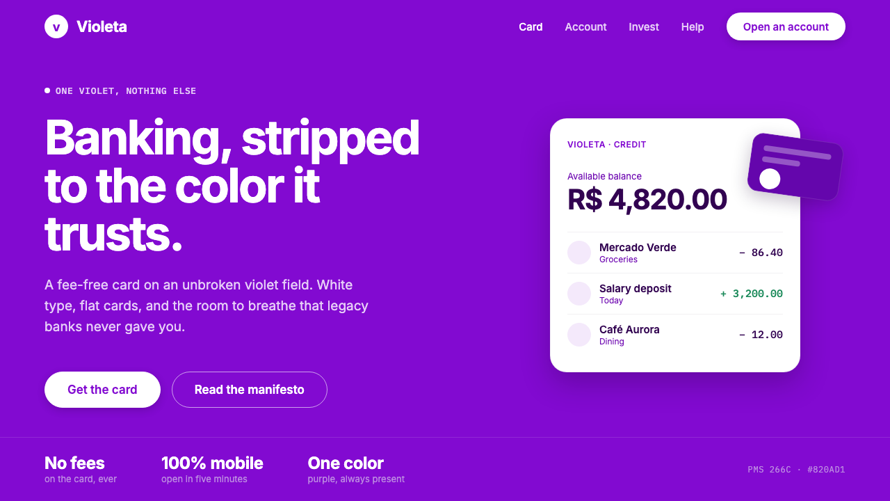 Nubank PurpleBanking stripped to one color. Full-bleed Nupurple ground, white type, genero…
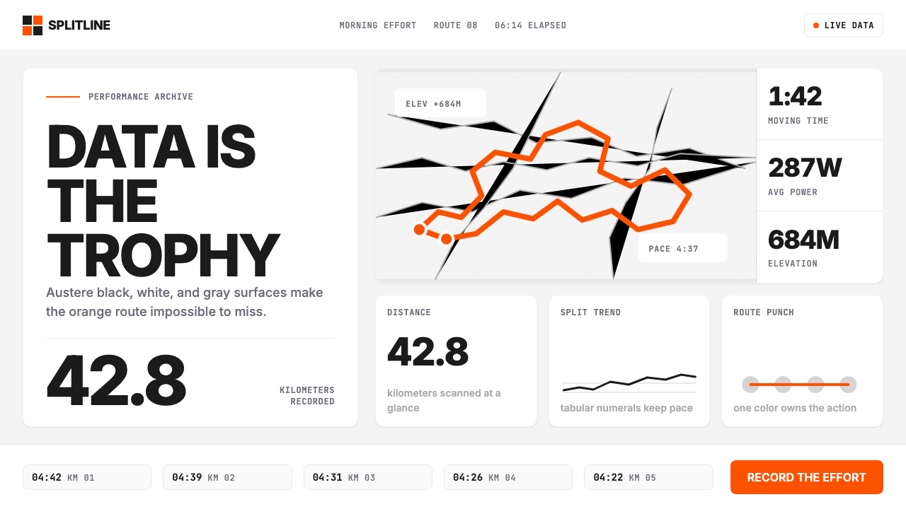 Strava Orange FitnessData becomes trophy. Inter numerals, gray metric grids, and one orange route…
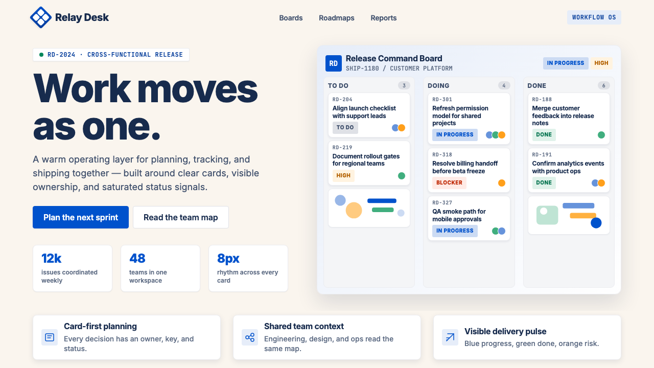 Atlassian Jira BlueWarm enterprise teamwork. Saturated blue cards on cream make status feel huma…
 Canva 2024Confidence feels draggable. Purple-blue gradients and floating white template…
 CareemNo page without the green. Flat green planes cropped by the edge, Arabic and…
 Coupang Rocket DeliveryUrgency made trustworthy. Rocket red, flash yellow, mono prices and packed gr…